
 Posts


Did you know that one of the biggest reasons to use a Mac is it's search ability? At any point you can do a search to help you find the file you are looking for. The search takes less than a second, to cover all your hard drives. This compares to up to several minutes on a PC - search on a Mac works, search on a PC is too slow to be useful.
So what?
Well, the ability to find things fast and painlessly at any point makes the Mac a lot more productive. Specific to photographers - the search ability across multiple hard drives almost instantly makes the mac your picture organizational tool - you can search for dates, ranges, names, part names - all instantly - want to do a backup of all your raw files, do a search on the raw suffix and every raw file can be backed up, likewise it's painless to search for every .psd image.
You remember the name of the image was 'rock something' - no sweat. I use search on a daily basis, for finding images, for finding text files that describe the images, whatever.
Wednesday, August 16, 2006


Tuesday, August 15, 2006
Techy to Artsy # 2
Right, I left you with a portfolio of images in the style of your favourite photographer and you were comparing them. there are two possibilities. First, your images are just as good as your favourite - in which case congratulations, you might want to try copying a few more styles until you start to develop your own style - this is not something you have to work at - it simply comes from having your own preferences - some things will move you, others won't. Any attempt to force a new style is I suspect doomed from the start.
The far more likely scenario for most of us doing this exercise is that our images don't hold a candle to our hero's. The deficiencies can be in several different areas - and working backwards - it could be a question of print quality, composition, subject matter, subject presentation and or timing (including waiting for better lighting or clouds or whatever).
With the above information you now go out again for several weeks and reshoot, all the while thinking about what made your idol's pictures better. Don't concentrate on the deficicencies of yours, rather look at the strengths of his/hers. it's better to have a target to aim for rather than a place to run away from.
If the problem is print quality - you can try reprinting.
If it's composition, then it's a matter of returning to the scene of your crime and seeing if you can move around and find a position in which the elements of the image come together in a stronger, more pleasing or more balanced relationship.
Perhaps the problem is that your images try to say too many things in which case, you work on simplifying your images. There is a risk that as you reduce the number of elements, those remaining are not strong enough to make a picture, in which case all you can do is move to a different location - the world is full of 'almost made a good image' sites and the ability to recognize when a spot doesn't quite have it can save tremendously on time, film, frustration and lets you move on to something with hopefully more possibilities.
The far more likely scenario for most of us doing this exercise is that our images don't hold a candle to our hero's. The deficiencies can be in several different areas - and working backwards - it could be a question of print quality, composition, subject matter, subject presentation and or timing (including waiting for better lighting or clouds or whatever).
With the above information you now go out again for several weeks and reshoot, all the while thinking about what made your idol's pictures better. Don't concentrate on the deficicencies of yours, rather look at the strengths of his/hers. it's better to have a target to aim for rather than a place to run away from.
If the problem is print quality - you can try reprinting.
If it's composition, then it's a matter of returning to the scene of your crime and seeing if you can move around and find a position in which the elements of the image come together in a stronger, more pleasing or more balanced relationship.
Perhaps the problem is that your images try to say too many things in which case, you work on simplifying your images. There is a risk that as you reduce the number of elements, those remaining are not strong enough to make a picture, in which case all you can do is move to a different location - the world is full of 'almost made a good image' sites and the ability to recognize when a spot doesn't quite have it can save tremendously on time, film, frustration and lets you move on to something with hopefully more possibilities.
Monday, August 14, 2006
Cape Breton Granite
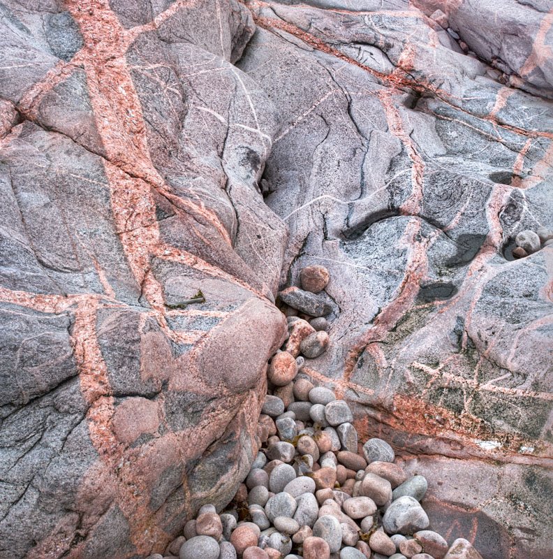
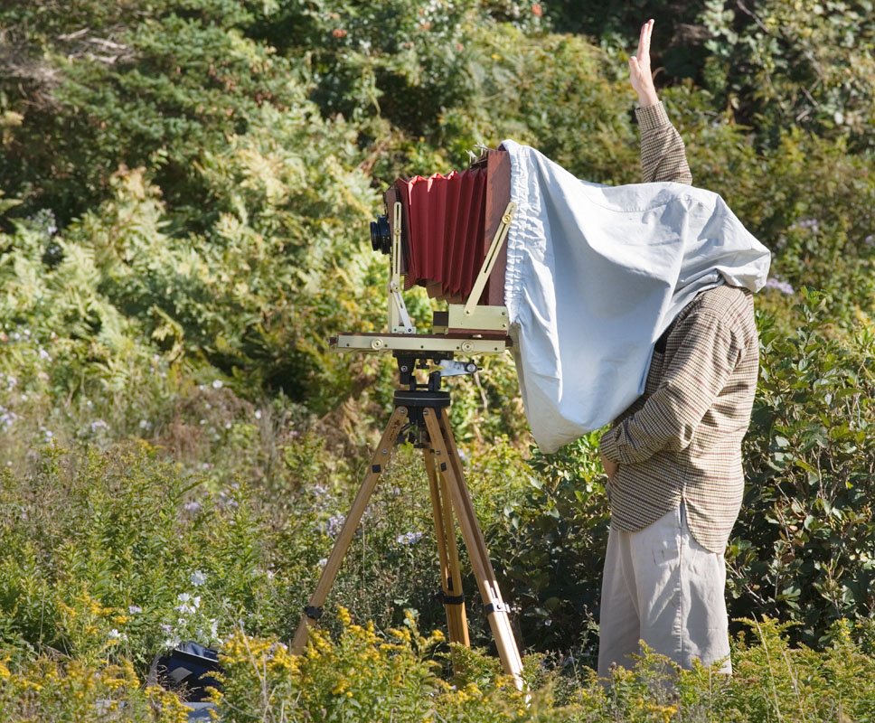
From our trip to Nova Scotia last fall. I was attending a Bruce Barnbaum, Tillman Crane workshop - highly recommended, my wife was touristing - we both had a great time and loved Nova Scotia. I found the combination of Tillman and Bruce ideal - if Bruce got a bit carried away, Tillman was there to provide an alternate opinion which nicely put things in perspective. Seeing Tillman run around with his 12X20 camera was more than a little amusing. his baby camera is his 5X12 which was used for his Scotland pictures.
Here for your entertainment are pictures of Bruce and Tillman in action - if you can't figure out which is which, reread this blog.

Moving From Techy To Artsy # 1
So, you have been photographing for a while, you have some adequate equipment, you can make competent snap shots, but your images lack a certain something - well actually several somethings. What to do now?
Pick a well known photographer who's work you like and see what you can learn about his photography and how you could go about emulating him or her. This might mean a trip to the library, it could be internet searches, checking indexes for magazines.
You want to know how he does it. Don't worry about his equipment, equipment only determines the size of the print you can make, not the quality of the image so if you aren't greedy, you can make faboulous images with any old camera, film or digital.
What you do want to know is where does he get his subject matter, is there a time of day he likes to photograph, is there a certain style to his prints - light, dark, moody, contrasty, whatever. Study the type of images he shoots and that you particularly admire. Is there a favourite focal length, does he shoot things at infinity, middle distance or up close, or does he work on the near far type image.
If you have a choice between going to the exotic places he shoots or choosing a local city park at the same time of day and light he shoots in, pick the time and lighting every time. You are far more likely to get a good image in the city park at 5 am than you are near the top of the mountain, hanging from a cliff at noon. Several of my landscape images have been taken within the city (Calgary is 1 million pop.).
SO you try to emulate your selected photographer. You shoot for a few months and you make the best darn portfolio of 10 or more images that you possibly can - and now it's time to find out how you performed.
Take your 10 images and compare them to 10 from your selected successful photographer. Compare images that are as similar as possible.
Chances are you are going to like his images a lot more than yours - but it's the why that counts here.
You are looking for:
a) the overall tone of the prints - ignoring subject content and composition, are your prints as rich as his (be sure you are comparing small prints so techincal quality isn't a major component of the comparison - chances are you are looking at his in a book anyway.
b) shadow detail
c) subtlety of highights
d) composition - how well did you place the important parts of the subject compared to your guru.
e) lighting - did you time it as well as your hero - perhaps you slept in a bit late or got lazy.
f) subject matter - don't worry about how exciting it is, that could have to do with location more than skill - look rather to how well it is displayed - is it shown in the optimum way - this could be a matter of an uncluttered background or selective focus
g) does the expert's image say something to you that your images don't and if so why and how could you change your images to speak as clearly.
For example, lets say that you shoot industrial and that your idol is David Plowman, so you go out shooting for several weeks and you put together a set of your strongest 10 images. You print them small, say 5X7 on 8X10 paper - perhaps you even crop to emulate his use of medium format square images most of the time. David's industrial images are elegently simple - not a lot of clutter - are your images as clean? They are as strongly composed - check the balance, the use of foreground and background, does it show the subject as well as his images. Most of his images are shot on cloudy days and with soft lighting then the contrast is increased to make rich prints - rather than the more typical hobbyist approach which is to shoot on a sunny day then spend hours trying to rescue the shadows and highlights. When David shoots a ship, it really says ship - it's a clear message - is your message clear?
Next time I will discuss what do do once you have done this comparison.
Pick a well known photographer who's work you like and see what you can learn about his photography and how you could go about emulating him or her. This might mean a trip to the library, it could be internet searches, checking indexes for magazines.
You want to know how he does it. Don't worry about his equipment, equipment only determines the size of the print you can make, not the quality of the image so if you aren't greedy, you can make faboulous images with any old camera, film or digital.
What you do want to know is where does he get his subject matter, is there a time of day he likes to photograph, is there a certain style to his prints - light, dark, moody, contrasty, whatever. Study the type of images he shoots and that you particularly admire. Is there a favourite focal length, does he shoot things at infinity, middle distance or up close, or does he work on the near far type image.
If you have a choice between going to the exotic places he shoots or choosing a local city park at the same time of day and light he shoots in, pick the time and lighting every time. You are far more likely to get a good image in the city park at 5 am than you are near the top of the mountain, hanging from a cliff at noon. Several of my landscape images have been taken within the city (Calgary is 1 million pop.).
SO you try to emulate your selected photographer. You shoot for a few months and you make the best darn portfolio of 10 or more images that you possibly can - and now it's time to find out how you performed.
Take your 10 images and compare them to 10 from your selected successful photographer. Compare images that are as similar as possible.
Chances are you are going to like his images a lot more than yours - but it's the why that counts here.
You are looking for:
a) the overall tone of the prints - ignoring subject content and composition, are your prints as rich as his (be sure you are comparing small prints so techincal quality isn't a major component of the comparison - chances are you are looking at his in a book anyway.
b) shadow detail
c) subtlety of highights
d) composition - how well did you place the important parts of the subject compared to your guru.
e) lighting - did you time it as well as your hero - perhaps you slept in a bit late or got lazy.
f) subject matter - don't worry about how exciting it is, that could have to do with location more than skill - look rather to how well it is displayed - is it shown in the optimum way - this could be a matter of an uncluttered background or selective focus
g) does the expert's image say something to you that your images don't and if so why and how could you change your images to speak as clearly.
For example, lets say that you shoot industrial and that your idol is David Plowman, so you go out shooting for several weeks and you put together a set of your strongest 10 images. You print them small, say 5X7 on 8X10 paper - perhaps you even crop to emulate his use of medium format square images most of the time. David's industrial images are elegently simple - not a lot of clutter - are your images as clean? They are as strongly composed - check the balance, the use of foreground and background, does it show the subject as well as his images. Most of his images are shot on cloudy days and with soft lighting then the contrast is increased to make rich prints - rather than the more typical hobbyist approach which is to shoot on a sunny day then spend hours trying to rescue the shadows and highlights. When David shoots a ship, it really says ship - it's a clear message - is your message clear?
Next time I will discuss what do do once you have done this comparison.
Do We Really Have To Love What We Photograph?
Frequent advice is photograph what you love. If that's really the case, then great art would have a lot more pictures of girl friends and hot fudge sundaes. it completely ignores the creative photographer who photographs raw material which in itself is boring but he knows that in the darkroom or computer he can make it sing. A look at Ansel's proof sheets and you might suggest he not give up his day job - though come to think of it, that was commercial photography.
It might be better to think of a photographer as someone who is very observant and that we have to find the things we look at interesting to take a photograph. This better explains the behaviour of most ammateur photographers who are in love with the process of photography and who may or may not become observant over time.
In my experience, photographers who pick up a camera to use as a tool to capture what they observe (the artsy types) become good photographers a hell of a lot faster than the techy types who obcess about films, developers, pixels and profiles. The arty type knows what he wants and only needs to find the path to get there - the techy type doesn't know where he is going, but he has maps for everywhere and lots of gadgets to help him on the way - if only he could figure out the destination. This process can lead to a huge amount of frustration.
I think that many of us started out as techy types and now want to be artsy types and there isn't a lot written about the move from one to the other. I'm going to address this issue in the next while - how to move from techy to artsy.
It might be better to think of a photographer as someone who is very observant and that we have to find the things we look at interesting to take a photograph. This better explains the behaviour of most ammateur photographers who are in love with the process of photography and who may or may not become observant over time.
In my experience, photographers who pick up a camera to use as a tool to capture what they observe (the artsy types) become good photographers a hell of a lot faster than the techy types who obcess about films, developers, pixels and profiles. The arty type knows what he wants and only needs to find the path to get there - the techy type doesn't know where he is going, but he has maps for everywhere and lots of gadgets to help him on the way - if only he could figure out the destination. This process can lead to a huge amount of frustration.
I think that many of us started out as techy types and now want to be artsy types and there isn't a lot written about the move from one to the other. I'm going to address this issue in the next while - how to move from techy to artsy.
Sunday, August 13, 2006
Why Images Work # 6 - Tenaya Creek, Dogwood
Right Click Here for one of my favourite Ansel Adams images. While not as graphic as 'Moon Over Halfdome' or 'Aspens', this image is entirely about light - the sunlight pouring through the trees. You'd think this would be a fairly easy shot to get but I understand from talented photographers who have found Ansels tripod holes that it isn't. This is no surprise. On the average sunny day with the sun behind this must be quite boring and with the sun coming towards the camera 'soot and chalk' is the order of the day.
No, this image is about recognizing that very special light that sometimes happens, often after rain, in which the landscape glows. All you have to do then is capture this wonderful light. Ansel took advantage of thick emulsion films which recorded a greater dynamic range than modern films, processed it appropriately and then printed superbly. We can emulate this kind of film and processing by shooting more than a single digital exposure and either blending the images or bringing them into the new Photoshop HDR mode - 32 bit high dynamic range recording - I had occasion recently to reprocess the 'Church Through Church Window' image and it was a lot easier to get a good print with the HDR image than the previous two layer sep. exposure combination that I have been doing for several years. Tutorials about HDR imply that you need many exposures to blend but this is absolutely not true - two did very nicely here covering a good 14 stop range.
While not a bold composition, it is none the less well composed. The rock balances the tree on the left, the bright leaves on the right (?Dogwoods) balances the bright leaves on the left side. Note the trees angling slightly towards each other and framing the distant tree snag which iteself shows well against the fluffy light background of leaves. Even the evergreen in the background is positioned well - can you imagine if the large tree on the left hid half of it - ugly-so.
The foreground gravel makes a nice triangle at the bottom of the image - so much better than a straight line across the bottom seen in so many images.
The dark snags in the upper right are perfectly placed. Shadows are not harsh yet are rich.
This is the kind of image that you don't want to jump out at you and slap you - it says peaceful, quiet, light.
No, this image is about recognizing that very special light that sometimes happens, often after rain, in which the landscape glows. All you have to do then is capture this wonderful light. Ansel took advantage of thick emulsion films which recorded a greater dynamic range than modern films, processed it appropriately and then printed superbly. We can emulate this kind of film and processing by shooting more than a single digital exposure and either blending the images or bringing them into the new Photoshop HDR mode - 32 bit high dynamic range recording - I had occasion recently to reprocess the 'Church Through Church Window' image and it was a lot easier to get a good print with the HDR image than the previous two layer sep. exposure combination that I have been doing for several years. Tutorials about HDR imply that you need many exposures to blend but this is absolutely not true - two did very nicely here covering a good 14 stop range.
While not a bold composition, it is none the less well composed. The rock balances the tree on the left, the bright leaves on the right (?Dogwoods) balances the bright leaves on the left side. Note the trees angling slightly towards each other and framing the distant tree snag which iteself shows well against the fluffy light background of leaves. Even the evergreen in the background is positioned well - can you imagine if the large tree on the left hid half of it - ugly-so.
The foreground gravel makes a nice triangle at the bottom of the image - so much better than a straight line across the bottom seen in so many images.
The dark snags in the upper right are perfectly placed. Shadows are not harsh yet are rich.
This is the kind of image that you don't want to jump out at you and slap you - it says peaceful, quiet, light.
Friday, August 11, 2006
Symmetry

Sometimes it pays to make an image perfectly symetrical - emphasizing the power and structure of the object.
Thursday, August 10, 2006
The Ethics Of Cropping To Order
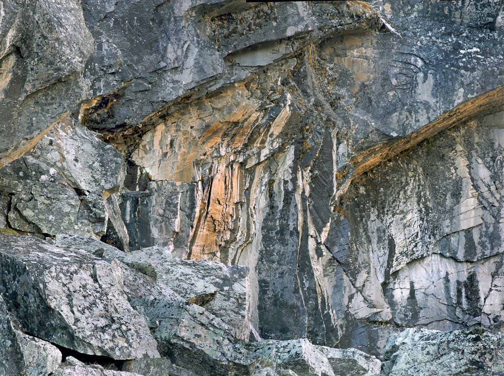

I have a customer who is interested in four 24X24 inch prints to fit between a series of bookcases. She selected four images but one of them is very definitely rectangular - what to do?
Arguably the concept of asking Monet to trim off a few inches from one end of his paintings would be ludicrous - having Ansel shorten Moonrise absurd. I didn't immeditately tell the customer to drop dead though, I looked at the image and thought it might work quite well as a square image, and in fact might even be stronger than the rectangular original - is this a cop out?
Probably, but see for yourself what you think both about the ethics of agreeing to crop and the particular image pair here.
Is it in fact unreasonable when buying a photograph which can so easily be adjusted to ask for such a change - after all, they could easily have done the trim job themselves after purchase - at least this way I have some control over how it is cropped, and I do have the veto over saying, you know what - I don't want my name associated with what I think is a weaker image.
In this case I had a suspicion it might work out well and in hindsight believe it did.
This raises questions about the value and use of a photograph - is it inherently wrong to think of photographs as decoration - if we do, we eliminate 90% of our market for our photogrpahs. Should we in fact treat the images as holy relics, to be handled with white gloves and kept in a humidity and temperature controlled vault and only to be shown to a select few. What does this have to do with The Mona Lisa with Donald Ducks head?
Why Images Work # 5 - Brett Weston
Heresy of Heresies, I actually prefer many of the images of Brett to his father Edward, both his abstracts and his landscapes. This particular image appeals on several levels. To access the image, right click Brett Weston: Cracked Glass, 1955 to bring up the image in a separate window. Resize as needed so you can see both windows at the same time.
Right off the patterns are interesting. The glass shows well against the almost black background and the glass has interesting shading. Note the large horizontal s curve starting top left then down the middle and curving back to horizontal in the lower right and hinting at curving up the right with the edge of the glass.
The delicacy of the pattern is intriguing - we all know such patterns even in glass can't last forever. Ask yourself which part of the image is surplus to requirements - I think they all work together.
Re cropping, he's almost touched the edge of the glass on the top near the left (but not quite) while giving a bit more generous space to the glass on the far right - I think this was almost certainly deliberate and the right choice.
Can you imagine the image without the two tendrils of glass that are hanging almost straight down in the large dark area in the upper left - they are essential to the image - such a large dark area would be hard to justify otherwise but in fact here provides the perfect background for them - too cluttered would have spoiled their dramatic appearance.
It's hard to see on a small web image but even here we get hints that the dark areas still contain some detail and are not absolutely black. The curve of the lower left corner matches the curve in the upper left and is of course the inverse of the curves on the right.
Altogether a very nice image.

Right off the patterns are interesting. The glass shows well against the almost black background and the glass has interesting shading. Note the large horizontal s curve starting top left then down the middle and curving back to horizontal in the lower right and hinting at curving up the right with the edge of the glass.
The delicacy of the pattern is intriguing - we all know such patterns even in glass can't last forever. Ask yourself which part of the image is surplus to requirements - I think they all work together.
Re cropping, he's almost touched the edge of the glass on the top near the left (but not quite) while giving a bit more generous space to the glass on the far right - I think this was almost certainly deliberate and the right choice.
Can you imagine the image without the two tendrils of glass that are hanging almost straight down in the large dark area in the upper left - they are essential to the image - such a large dark area would be hard to justify otherwise but in fact here provides the perfect background for them - too cluttered would have spoiled their dramatic appearance.
It's hard to see on a small web image but even here we get hints that the dark areas still contain some detail and are not absolutely black. The curve of the lower left corner matches the curve in the upper left and is of course the inverse of the curves on the right.
Altogether a very nice image.
Monday, August 07, 2006
Why Images Work # 4 Shaun O'Boyle
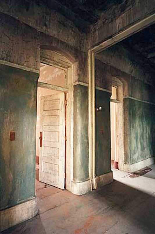
Copyright Shaun O'Boyle
After my industrial images appeared in Lenswork last year, I got a very nice email from Shaun O'Boyle, who amongst other things indicated he too had an interest in industrial and old building images. I visited Shaun's website and found lots of interesting locations. I felt at the time that he had some way to go to refine his seeing, yet there were a few very good images and one outstanding image which I feel priviledged to have swapped for and now have on my wall.
One might be tempted when a few images are strikingly better than their bretheren to assume it was luck, yet this type of image is constructed. There are lots of ways he could have photographed these same doors and hallway which wouldn't have had nearly the impact.
I am delighted to see on Shaun's site some more recent work indicating that the promise of stronger images to come is being fulfilled - I'm not surprised. His vision is becoming stronger, he knows better what he wants to say in a given subject and concentrates on the parts of the scene which help make that statement. He showed this in this earlier photo though I don't think that at the time he knew just how exceptional this image was and is. He knows now and has been able to build from this.
So, on to discussing the image above which Shaun has given me permission to show.
We have to discuss the colour - it's wonderful - the rusty red of the floor, door knobs and light switches, the well weathered rich cream of the doors, baseboards and archways, the textured green of the walls all work perfectly together. Exposure is spot on - always a challenge in colour - no detail is lost in the brightest highlights to the deepest shadows.
Note the diagonal lines of the baseboards, floor boards, and upper wall as well as those of the shadows on the floor and the sun coming in, also the archway. How about the darker edge on the right keeping your eye from wandering off to the right. I like the archway which gives a sense of this being a mirror and not more corridor to the right - yet the sunbeam clearly indicates it isn't a mirror. That it is a long shut down mental hospital makes you wonder who lived behind these doors and what stories the building could tell.
I like the way the lines come to the corners, perfectly on the bottom left and between two lines in the upper right. The upper left doesn't come perfectly to the corner and I actually prefer it this way - it's possible to be too clever.
I did wonder if the perspective should have been corrected so the vertical lines are in fact perfectly vertical - an easy job in Photoshop, but that would have been more of an architectural shot and less a tale of mood, story and statement.
The textures are wonderful. There is a painterly quality to the image which is no Photoshop trick.
I've had the image for a year and like it every but as much as I did when I first saw it - wish I had taken it but sure glad Shaun did.
DeJa Vue All Over Again

Sometimes you get a chance to reshoot an image and improve on it - the original was shot with my 10D and a consumer grade 28-105, this time I shot with the 1Ds2, three overlapping images with the tilt shift 90 T-SE. I can print it about 3X linear bigger and no longer is the gear on the left slightly cropped (which always bothered me).
Sunday, August 06, 2006

Base of wooden through truss bridge near Atlas Coal Tipple Historic Site, E. of Drumheller.
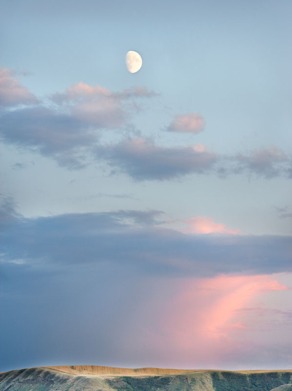
Moon Over Badlands, Red Deer River Valley, E. of Drumheller, 300 mm. lens.
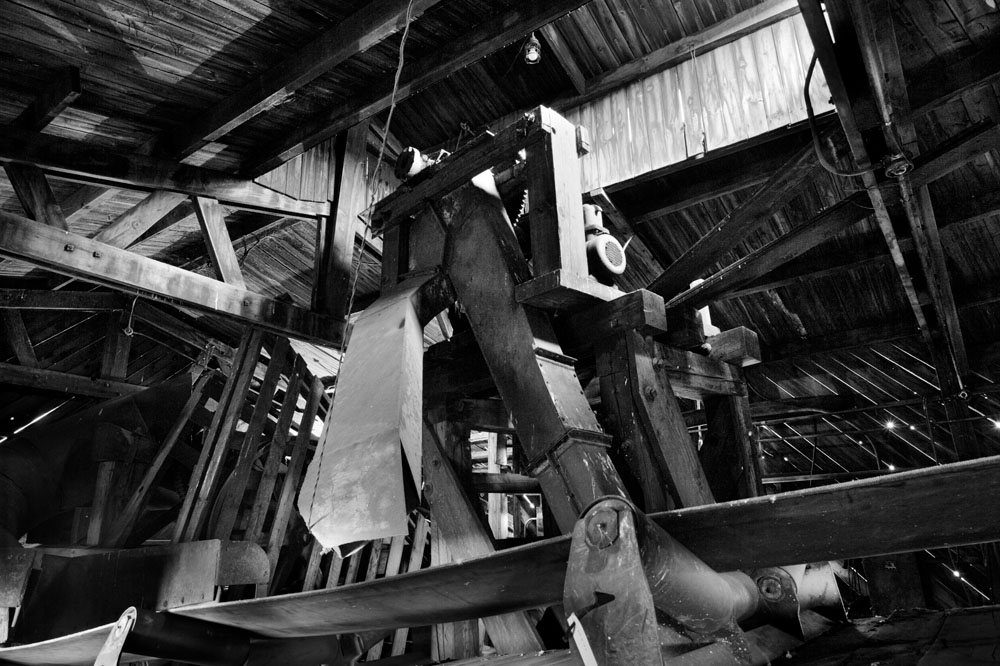
Inside of top of coal tipple at Atlas Coal
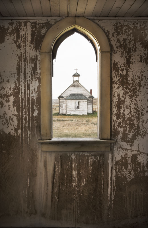
Church through church window, Dorothy, Alberta, two images combined and masked - haven't masted HDR yet.

Truss Bridge, sev. images combined using Helicon Focus.

Church, Dorothy, Alberta - 17-40 mm. lens @ 17 mm. and corrected using photoshop distortion/lens correction to correct barrel distortion and vertical perspective.
Friday, August 04, 2006
Why Images Work # 3 - Huntington Witherill
Today I am going to discuss the work of one of my favourite currently working photographers, Huntington Witherill. There were a number of images I could have picked to discuss but I finally elected to choose this one of a sand dune. Right Click here to view the image in a separate window so you can read and view together.
To my mind, dune images of the usual type with bright highlights and deep shadows shot in early morning have been done so often that I really don't want to look at another typical dune image. So my first reaction to this image was 'what cool shapes' and my second was wow, someone has actually done something different with dunes.
High key images are hard to do well. I own a print of this image and trust me the highlights are superbly printed - and it's inkjet. This image certainly puts paid to the rule of images having to contain a full range of tones.
OK, so I like high key images done well and this is one, but what makes it an exceptional image? Well, the subtle tones are important, the shapes define the image.
There is something pleasing about the lines in this image - the foreground dune and its ridge, the shadowed dune on the upper left, the very subtle sweep of the dune in the upper right. While not showing well in the web image, there is good texture throughout, showing micro ridges.
I had talked before about sketching (in your mind) or for real a very simple 6 line drawing of the image you are about to take to see if it works - I think you can see here it would show very nice balance and interesting juxtapositions.
The high key gives a sense of brilliance to the light. The subtle tones make it a very peaceful image with a calming effect.
Had the foreground ridge been straight, or the foreground dune top line been convex instead of concave, the image wouldn't have been nearly as effective. Note the balance between the edge of the shadow in the upper left with the ridge line in the bottom of the image.
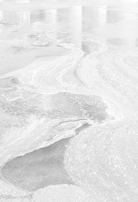
Below find a couple of my own high key images. You can decide for yourself whether they work and is this a technique that is worth exploring for you.
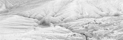
To my mind, dune images of the usual type with bright highlights and deep shadows shot in early morning have been done so often that I really don't want to look at another typical dune image. So my first reaction to this image was 'what cool shapes' and my second was wow, someone has actually done something different with dunes.
High key images are hard to do well. I own a print of this image and trust me the highlights are superbly printed - and it's inkjet. This image certainly puts paid to the rule of images having to contain a full range of tones.
OK, so I like high key images done well and this is one, but what makes it an exceptional image? Well, the subtle tones are important, the shapes define the image.
There is something pleasing about the lines in this image - the foreground dune and its ridge, the shadowed dune on the upper left, the very subtle sweep of the dune in the upper right. While not showing well in the web image, there is good texture throughout, showing micro ridges.
I had talked before about sketching (in your mind) or for real a very simple 6 line drawing of the image you are about to take to see if it works - I think you can see here it would show very nice balance and interesting juxtapositions.
The high key gives a sense of brilliance to the light. The subtle tones make it a very peaceful image with a calming effect.
Had the foreground ridge been straight, or the foreground dune top line been convex instead of concave, the image wouldn't have been nearly as effective. Note the balance between the edge of the shadow in the upper left with the ridge line in the bottom of the image.
Below find a couple of my own high key images. You can decide for yourself whether they work and is this a technique that is worth exploring for you.
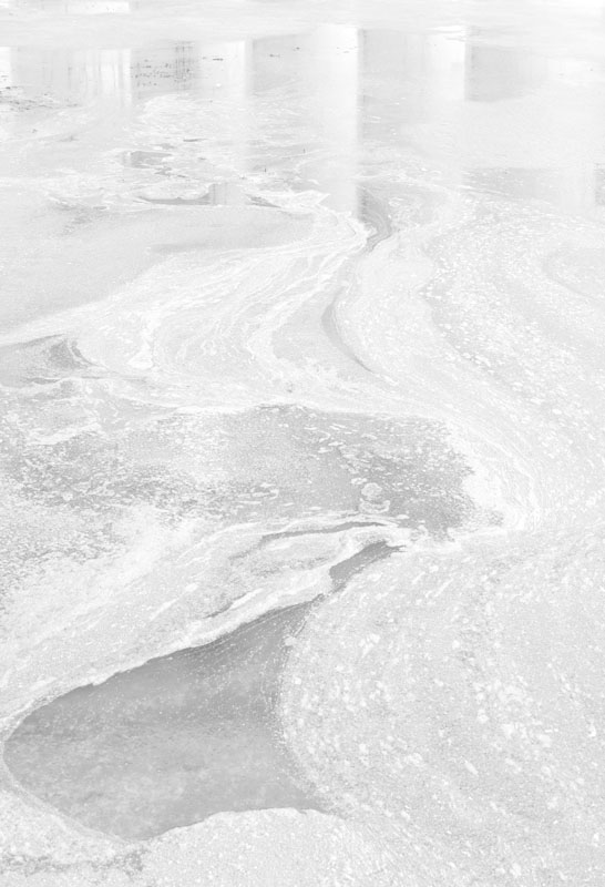

Wednesday, August 02, 2006
Why Images Work # 2 - Andre Kertesz
You will find the image here and by right clicking (or control clicking on a mac) you can open the image in a separate window.
This Andre Kertesz photograph is another of my favourites. Here are some of the things that work for me.
First, the photograph is is of an older era as indicted by the board floors, the straw boater, the less than rectangular door frame. It seems to describe a simpler time or place - there is no clutter, the elements of the photograph are simple and clear. the flower vase and flower nicely balance the stairs on the right. The dark on the left works with the light on the right. The position of the flower is perfect against the dark background and not intersecting the door frame. Likewise the stair railing is well positioned not quite coming to the edge of the wall and recess. On both left and right you have light dark, light. The wall that the hat hangs on nicely balances the recess on the right in the distance. Note the triangles created by the door frame on the right and again on the top, also triangles created by the shaddow of the flower pot on the table. Note the matching shadows at the bottom of the door, both angling down and to the left. The door mat doesn't quite come to the edge of the door frame. The light coloured wall in the distance is needing a paint job and has some real substance to it. The white of the right edge of the vase is brilliant. The hat on the left works nicely, you have the hat, then down and right to the flower vase then up and right to the stair railing and your eye is kept from wandering off by the recess and door frame. In fact it's hard for your eye to leave the image in any direction.
Emotionally it evokes a time and place. Even without the title, we wonder about who lives there, what's up stairs, who wore the hat. I can feel the sunlight pouring in.
I just find that every single element of the photograph is in exactly the right place. This does raise a point. Kertesz could only control some of the element of the image - he could move the vase and change his camera position and even wait for the right time of day. he could move back and forth and select a suitable lens to put foreground and background in the right relationships. He could even have purchased the straw boater just to help the left hand end of the image. Yet many of the elements that work had to be luck - the shape of the door frame, the shade of the light wall, the bannister and stairs. What if they had not worked as well - my guess is we wouldn't have seen the image - it would be consigned to the photogaphers 'almost worked' pile, or had he a lot more discipline than I have, he would have moved around the location, noting the elements, lining them up as best possible and when they didn't fit perfectly, folding up the camera and moving on. Personally I would have shot the best I could get, hope that some extra magic would happen inside the camera or that somehow I could correct the deficiciencies in the darkroom or computer. OF course, 99% of the time this doesn't happen and too many of these almost images can be discouraging. there's nothing worse than coming home with a bunch of almosts and puting a lot of effort into processing the film and making contacts only to realize you got squat. It's enough to make you put your camera away if it happens too often.
This Andre Kertesz photograph is another of my favourites. Here are some of the things that work for me.
First, the photograph is is of an older era as indicted by the board floors, the straw boater, the less than rectangular door frame. It seems to describe a simpler time or place - there is no clutter, the elements of the photograph are simple and clear. the flower vase and flower nicely balance the stairs on the right. The dark on the left works with the light on the right. The position of the flower is perfect against the dark background and not intersecting the door frame. Likewise the stair railing is well positioned not quite coming to the edge of the wall and recess. On both left and right you have light dark, light. The wall that the hat hangs on nicely balances the recess on the right in the distance. Note the triangles created by the door frame on the right and again on the top, also triangles created by the shaddow of the flower pot on the table. Note the matching shadows at the bottom of the door, both angling down and to the left. The door mat doesn't quite come to the edge of the door frame. The light coloured wall in the distance is needing a paint job and has some real substance to it. The white of the right edge of the vase is brilliant. The hat on the left works nicely, you have the hat, then down and right to the flower vase then up and right to the stair railing and your eye is kept from wandering off by the recess and door frame. In fact it's hard for your eye to leave the image in any direction.
Emotionally it evokes a time and place. Even without the title, we wonder about who lives there, what's up stairs, who wore the hat. I can feel the sunlight pouring in.
I just find that every single element of the photograph is in exactly the right place. This does raise a point. Kertesz could only control some of the element of the image - he could move the vase and change his camera position and even wait for the right time of day. he could move back and forth and select a suitable lens to put foreground and background in the right relationships. He could even have purchased the straw boater just to help the left hand end of the image. Yet many of the elements that work had to be luck - the shape of the door frame, the shade of the light wall, the bannister and stairs. What if they had not worked as well - my guess is we wouldn't have seen the image - it would be consigned to the photogaphers 'almost worked' pile, or had he a lot more discipline than I have, he would have moved around the location, noting the elements, lining them up as best possible and when they didn't fit perfectly, folding up the camera and moving on. Personally I would have shot the best I could get, hope that some extra magic would happen inside the camera or that somehow I could correct the deficiciencies in the darkroom or computer. OF course, 99% of the time this doesn't happen and too many of these almost images can be discouraging. there's nothing worse than coming home with a bunch of almosts and puting a lot of effort into processing the film and making contacts only to realize you got squat. It's enough to make you put your camera away if it happens too often.
Update On Pepper # 30
Although I discussed the compositional elements and the wonderful shapes, I didn't discuss perhaps the most important part of the image, the wonderful tones. That pepper glows, it's three dimensional. Intererstingly it does this even in cheap mechanical reproductions and on the net. I did once however see a very light version of the image and the rich tones were ruined, it was less than half the image it normally is, yet arguably it was well exposed and showed normal tonality - were it an illustration for a gardening catalogue, it would have been just fine and arguably preferably to Edward's interpretation of the Pepper.
This does raise the question though which every photographer struggles with - just how dark to make a print. In the wet darkroom days it was all too easy to make the whole thing too dark - some of the tones would be rich, but at the sacrifice of others. Ansel went through stages of printing much darker or more contrasty so even with the masters some variation over time is normal and part of the creative process. These days with digital printing, it's easy to nail the dark and light end of things with curves or levels, yet we can dramatically affect the overall brightness of the print by how we interpret the midtones.
Prints that look right at the time you make them sometimes look completely wrong the next day. In the wet darkroom we had issues of dry down and how bright an inspection light to use and such, we still have some of those issues today. Dry down is much less (though with some papers and inks it still happens to some degree) and the quality of the viewing light is a problem.
I once went to a camera club to give a talk and after they had a print competition. They set up two flood lights one on either side of the print and about three feet away and blasted light onto the prints. Any print that was right for that lighting would be hopeless in just about any normal lighting situation from galleries to home.
Some people have never ever seen subtle highlights or rich shadows and literally don't know what they are missing. I highly recommend subscribing to lenswork magazine even if you yourself work in colour. It's superbly printed and is as close to original photographs as you can get with mechanical reproduction.
This does raise the question though which every photographer struggles with - just how dark to make a print. In the wet darkroom days it was all too easy to make the whole thing too dark - some of the tones would be rich, but at the sacrifice of others. Ansel went through stages of printing much darker or more contrasty so even with the masters some variation over time is normal and part of the creative process. These days with digital printing, it's easy to nail the dark and light end of things with curves or levels, yet we can dramatically affect the overall brightness of the print by how we interpret the midtones.
Prints that look right at the time you make them sometimes look completely wrong the next day. In the wet darkroom we had issues of dry down and how bright an inspection light to use and such, we still have some of those issues today. Dry down is much less (though with some papers and inks it still happens to some degree) and the quality of the viewing light is a problem.
I once went to a camera club to give a talk and after they had a print competition. They set up two flood lights one on either side of the print and about three feet away and blasted light onto the prints. Any print that was right for that lighting would be hopeless in just about any normal lighting situation from galleries to home.
Some people have never ever seen subtle highlights or rich shadows and literally don't know what they are missing. I highly recommend subscribing to lenswork magazine even if you yourself work in colour. It's superbly printed and is as close to original photographs as you can get with mechanical reproduction.
Tuesday, August 01, 2006
What Makes A Good Photograph?
The correct answer is it depends on who's asking. What works for me won't necessarily work for you, or your neighbour, family or the dog (he wants a fire hydrant). For example, lots of people insist that a photograph have a centre of interest, even if it isn't in the centre. Some of my most popular photographs don't so clearly it isn't just me who feels this is not essential.
So given this significant limitation to my ability to answer the question, let me make it very personal and say what works for me.
There is no single characteristic of a great photograph which makes it a winner. Were that so, the lovely tonality of large format contact prints would make every single one a winner - trust me, they aren't. It could be an interesting subject - but poor photographs of interesting subjects don't work either. But telling you all the things it isn't can't be very helpful so we'll quit while we are behind and concentrate on what it is instead.
Let me say that a good photograph is interesting. That may seem self evident, but I think there is something to be learned here. Can we agree that there are great photographs of fairly mundane (dare I say uninteresting) subjects. Is it possible that the dirty underside of a railway bridge, something you might cycle past daily and not pay attention to, could actually be interesting. What about peppers, dead birds, rocks, weeds, grass, cracked roads, etc. etc.? So somehow it would seem possible to make an interesting picture of an uninteresting subject. How is that done?
The interst could come from showing details that aren't normally seen (or more likely just ignored), or isolating parts of something to make interesting patterns or shapes. The interest could come from comparing two things - I think of Ansel Adams picture of fresh grass in front of a burned stump - alive and dead. The interest can come from seeing places we have never been to, or a time of day at which we are normally tucked in bed so miss out on.
Think of portraits. A picture of a beautiful woman (or drop dead gorgeous man if you lean that way), merits a quick look but normally most adults don't give it much time, don't tear it out of a magazine and don't frame it - yet there are portraits which cause us to do all of those things. Migrant Mother (by Dorothea Lange - so you can find it on the net) is a beautiful portrait and one could say that the woman shows a special kind of beauty but really, it's a picture of a tired, worn out woman who's given up hope, yet has the strength to struggle on. It is such striking image of those things though that the photograph is beautiful even if the person photographed isn't.
A news photograph might not be considered beautiful at all, but a good one is certainly interesting - interesting because it shows something we haven't seen, or is so representative of the problem that it serves as an icon for our feelings about a situation - say war, or natural disaster, politics or whatever.
As my particular interest is in landscapes and as my background is in black and white , lets limit our discussion to this. What makes a landscape picture interesting?
In Europe, landscapes are often photographed with high speed film in 35 mm. cameras and the results can be wonderful, so it isn't the format that's the answer. Prints poorly reproduced in books can still be interesting so it isn't print quality (at least not always).
Our eyes read photographs. We may read a page left to right, top to bottom, but in looking at photographs, we start at the centre and then wander around, following lines, stopping at points of interest and wandering right out of the photograph if there is not enough to hold us. The centre of interest can be anywhere but if there are not elements to support it, the eye quickly moves on and loses interest.
I'll now take you through some specific photographs that are considered classics and discuss what makes them work. As I don't have permission to reproduce the images, I'm simply going to provide the link to the sites.
Pepper # 30, Edward Weston
The image consists of some light coloured blobs, a line down the middle and a dark background. It's just a pepper, but the way the light reflects is wonderful, the shapes are interesting. I have always thought of it as a nude woman with her bottom to the lower right and her back extending upwards but looking at it today I also see a right hand grasping something and the thumb on top. The shapes themselves even without sexual inferernces are interesting. Despite the limitations of the internet and book reproduction, all images of this print look good and some look wonderful so the fact that it was shot on 8X10 isn't really relevent.
It was photographed in a funnel and you can see the circular scores in the tin funnel at the bottom of the image, giving the pepper a base and allowing our eyes to come back into the centre.
The dark background shows off the pepper nicely, a well lit scene would not have been nearly as interesting. The reflections on the surface of the peper are not so white as to be glaring yet are bright enough to be dramatic.
Notice a third of the way down the left hand side you can see a little of the background letting you know the pepper is not in isolation. Even this line keeps your eye in the image.
Look at the knobby ends of the folds of the pepper - they face each other so your eye can't wander off. S bends are generally attractive and this image has several.
Though it varies depending on your monitor, the shadows while deep are not black - no underexposure here - in fact it was something like a two hour exposure due to slow film, low light and bellows factor this close with the 8X10.
Well, that's probably enough discussion for tonight but I think I might just pick some other classic images and discuss why they work. Let me know if this is something you find useful. Leave a comment or email me directly. My email is george dot barr at shaw dot ca (you will have to type the real thing in).
Good shoting, see you next time.
George
So given this significant limitation to my ability to answer the question, let me make it very personal and say what works for me.
There is no single characteristic of a great photograph which makes it a winner. Were that so, the lovely tonality of large format contact prints would make every single one a winner - trust me, they aren't. It could be an interesting subject - but poor photographs of interesting subjects don't work either. But telling you all the things it isn't can't be very helpful so we'll quit while we are behind and concentrate on what it is instead.
Let me say that a good photograph is interesting. That may seem self evident, but I think there is something to be learned here. Can we agree that there are great photographs of fairly mundane (dare I say uninteresting) subjects. Is it possible that the dirty underside of a railway bridge, something you might cycle past daily and not pay attention to, could actually be interesting. What about peppers, dead birds, rocks, weeds, grass, cracked roads, etc. etc.? So somehow it would seem possible to make an interesting picture of an uninteresting subject. How is that done?
The interst could come from showing details that aren't normally seen (or more likely just ignored), or isolating parts of something to make interesting patterns or shapes. The interest could come from comparing two things - I think of Ansel Adams picture of fresh grass in front of a burned stump - alive and dead. The interest can come from seeing places we have never been to, or a time of day at which we are normally tucked in bed so miss out on.
Think of portraits. A picture of a beautiful woman (or drop dead gorgeous man if you lean that way), merits a quick look but normally most adults don't give it much time, don't tear it out of a magazine and don't frame it - yet there are portraits which cause us to do all of those things. Migrant Mother (by Dorothea Lange - so you can find it on the net) is a beautiful portrait and one could say that the woman shows a special kind of beauty but really, it's a picture of a tired, worn out woman who's given up hope, yet has the strength to struggle on. It is such striking image of those things though that the photograph is beautiful even if the person photographed isn't.
A news photograph might not be considered beautiful at all, but a good one is certainly interesting - interesting because it shows something we haven't seen, or is so representative of the problem that it serves as an icon for our feelings about a situation - say war, or natural disaster, politics or whatever.
As my particular interest is in landscapes and as my background is in black and white , lets limit our discussion to this. What makes a landscape picture interesting?
In Europe, landscapes are often photographed with high speed film in 35 mm. cameras and the results can be wonderful, so it isn't the format that's the answer. Prints poorly reproduced in books can still be interesting so it isn't print quality (at least not always).
Our eyes read photographs. We may read a page left to right, top to bottom, but in looking at photographs, we start at the centre and then wander around, following lines, stopping at points of interest and wandering right out of the photograph if there is not enough to hold us. The centre of interest can be anywhere but if there are not elements to support it, the eye quickly moves on and loses interest.
I'll now take you through some specific photographs that are considered classics and discuss what makes them work. As I don't have permission to reproduce the images, I'm simply going to provide the link to the sites.
Pepper # 30, Edward Weston
The image consists of some light coloured blobs, a line down the middle and a dark background. It's just a pepper, but the way the light reflects is wonderful, the shapes are interesting. I have always thought of it as a nude woman with her bottom to the lower right and her back extending upwards but looking at it today I also see a right hand grasping something and the thumb on top. The shapes themselves even without sexual inferernces are interesting. Despite the limitations of the internet and book reproduction, all images of this print look good and some look wonderful so the fact that it was shot on 8X10 isn't really relevent.
It was photographed in a funnel and you can see the circular scores in the tin funnel at the bottom of the image, giving the pepper a base and allowing our eyes to come back into the centre.
The dark background shows off the pepper nicely, a well lit scene would not have been nearly as interesting. The reflections on the surface of the peper are not so white as to be glaring yet are bright enough to be dramatic.
Notice a third of the way down the left hand side you can see a little of the background letting you know the pepper is not in isolation. Even this line keeps your eye in the image.
Look at the knobby ends of the folds of the pepper - they face each other so your eye can't wander off. S bends are generally attractive and this image has several.
Though it varies depending on your monitor, the shadows while deep are not black - no underexposure here - in fact it was something like a two hour exposure due to slow film, low light and bellows factor this close with the 8X10.
Well, that's probably enough discussion for tonight but I think I might just pick some other classic images and discuss why they work. Let me know if this is something you find useful. Leave a comment or email me directly. My email is george dot barr at shaw dot ca (you will have to type the real thing in).
Good shoting, see you next time.
George
Sunday, July 30, 2006
Returning To The Scene Of The Crime

Yesterday I didn't have a lot of time (promised the wife we'd go out to a movie - The Devil Wore Prada - I liked it, she didn't), anyway that pretty much determined that I'd stick around town. I could have checked out a new spot but I hadn't done much photography lately and didn't want the spot to turn out to be a dud so I chose a location I'd had success at before.
I think this is a strategy that can sometimes be useful, though it should be combined with exploring new territory.
The advantages to returning to a previously successful spot are several - you know how to get there - it can't be a complete wipeout - perhaps you will see something even better than before or at least different - it's efficient - it gets your day off to a good start - arriving at a different time, day, season means the original shot probably isn't even there and it's like working the scene all over again.
The downside would be if you only ever returned to successful spots and didn't push your boundaries, but if you have time and it's on the way, there's nothing wrong with stopping off at a known spot before going on.
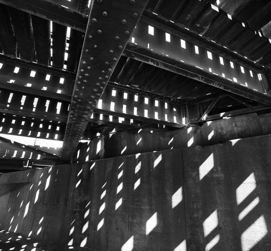
Next blog I'll discuss the process of working this particular spot.

Friday, July 28, 2006
An Experiment

Was playing tennis tonight, not a breath of wind and on the way home noticed some very nice Rudbeckia (Gloriosa Daisy) and wondered what would happen if I used a fairly long exposure and moved the plants part way through. I thought of hooking them with a coat hanger, then it occured to me I could blow on them and when actually shooting I actually used my arm to knock the stems and cause a real sway.
Of course the wind came up just as I arrived and getting complete stillness was impossible. Still, this is more or less what I had envisioned.
4 seconds, f22 (broke my own rule about not going below f16 so I could get long exposure - really must buy a neutral density filter), 90 mm. tilt and shift lens tilted to keep flowers in focus.
The Value Of Rechecking Old Proofs
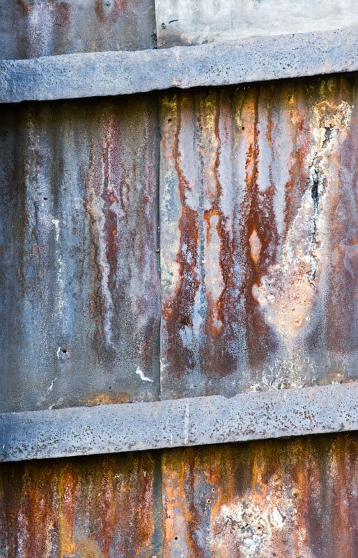
Shot a year ago and ignored, I went through the 'proof sheet' with Adobe Bridge and thought I might be able to do something with these two images. Perhaps you too can find some images you quite like now yet thoroughly ignored after the shoot.

Tuesday, July 25, 2006
On Attending Workshops
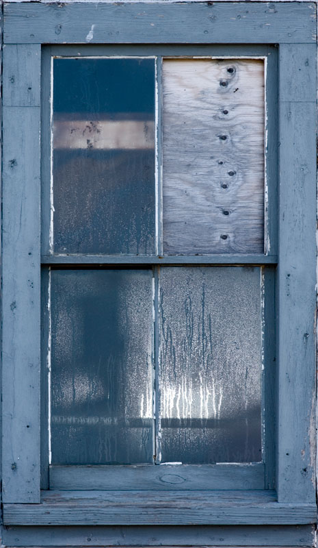


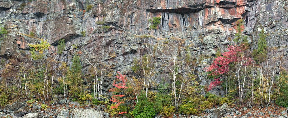
I heartily recommend going to workshops. You can go for one of a number of reasons - it's a great way to get back into creating if you have been in a slump for a while. You can go to learn from the teachers - but if that's the reason, be sure you like their work - after all that represents what they know. You can go to workshops because it's a fun holiday with a bunch of like minded photographers who love to talk shop. You can go because the workshop is being held in an area you haven't visited before and the leaders have and they can save you a lot of time and hassle by showing you the hot spots.
Over the years I have tended to bring to the workshop the idea that I'd work hard at my photography and shoot what I could. The images here were all obtained during a workshop - sometimes while actually with other photographers, other times by getting up really early or by standing in pouring rain while the rest of the group peered out of the fogged vehicle windows. I've made a fair amount of money from that particular shot - sorry guys, but if you were too lazy to get out of the car into the rain, you missed the best shot of the day.
Subscribe to:
Posts (Atom)