Thursday, June 29, 2006

Feedback on Pair Of Images

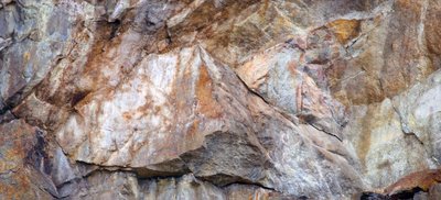
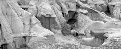
I recently had the chance to rephotograph one of my favourite abstract rock images and am interested in feedback as to which one people prefer. I reshow the original here for ease of comparison.


New Image


Old Image

The new image was shot with my 90 mm. tilt and shift, shifting vertically for three overlapping images and it prints quite well to 3X4 feet.

I have a show coming up Oct. 16 in Toronto at Leonardo Gallery and they want 'big' prints and the new image will definitely print larger. But the real question is which image is better?

My own first reaction was disappointment with the new image but I'm getting to quite like it but perhaps I'm deluding myself - a not unheard of phenomenon. I've been known to work hard to save an image that is basically crap and should have been abandoned at the beginning.

Wednesday, June 28, 2006

Printer Profiling and Soft Proofing

I have struggled for a long time to understand colour management and having finally understood all the more important pieces (and having had difficulty getting said information from any one site, here's my explanation of colour management.

In days of yore, to get really good colour you needed dedicated equipment, all calibrated against each other, unique and totally inflexible about making changes - no change in paper, printer, scanner, monitor, etc. Then there was light. Apple computer came up with Colorsync and we now have a definition of colours that can be shared, measured, adjusted to and from, and generally worked with to make colour management with personal computer realistic. It was this that gave Apple the huge lead in the graphics and photography industries.

Eventually colorsync was adopted by the rest of the world - people like Adobe and other major players and eventually even by Microsoft and Windows. Photoshop became colour savy.

You often see colourspaces as brightly coloured blobs representing in two dimensions the three primary colour world of shades and tints and saturation and brightness of colour. The bigger the blob, the more intense the colours are that can be described by this colour space. If it happens to be the colour space of a monitor, it's the colours you can see on your screen, if it is the colour space of a particular printer/paper combination, it lets you know what colours can be recorded by that printer and paper.

Once you have a defined colour space, you can translate from one colour space to another. That process is called a profile. For example. Lets say that your computer screen when asked to display red, actually displays a rather purplish red (magenta) instead. You need to know what signal to send the monitor so it will show a true red. The translation of the original red to what the printer needs to see to actually print red is controlled by the profile. It might tell you something like to get a real red on this particular monitor, send 95% red and just a bit of yellow on the side and voila - no more puple - just a nice bright red.

Of course I'm simplifying, but basically that's what it does.

There are lots of colour spaces and some of them are fairly standard, but the beauty is no matter which one you use, there are ways to translate to and from it any any other standard colour space.

For example, my previous blob article on adjusting colour space for the net told how to go from an image that looked good in Photoshop to one that looked good on the net. This involved converting the profile of the image from whatever Photoshop used to what the net uses (which is sRGB). The image doesn't change on screen but the tagged colour profile for the image does and when the image is put on the internet, the colours come out right (because the conversion undid the distortion built into the internet's own colourspace. Were you not to bother converting profiles, there would be a one way adjustment of the colours into the internet and there would be radical changes in colour.

You can have colour spaces that define cameras, scanners, monitors, printers and any other device. You have colour spaces that define what colours Photoshop is working with. sRGB is one of the more restrictive colour spaces - ie. it can't describe any of the more saturated colours. Adobe 1998 has been the standard computer colour space for several years (say from 1998 by coincidence...) though recently an even larger colour space has become fairly common, called Prophoto Colourspace.

When shooting digitally, images are converted in colourspace into what Photoshop is using (assigned in 'Colour Settings' in the edit menu of Photoshop. Photoshop can be told what profile you are using for your monitor (so colours are translated so the show true on screen). In printing, another profile is used for a particular printer/paper combination to convert the colours so they show up most accurately on paper.

Soft proofing is a way to simulate what the final print will look like, but on screen. This is done also through the printer profile (as well as the monitor profile). Printing profiles actually consist of two tables. The first describes the adjustments to the colour sent to the printer so that you end up with the colour you wanted (or started with), while the second table describes the limitations of the printing process - ie. just how bright and saturated colours can the printer, ink, and paper combination make?

So, that's the theory, here's what you actually do:

1) profile your monitor - this means buying a spectrophotometer that can read the colours and brightness on screen and create a profile to adjust that colour so it matches the image file. I use a Spyder.

2) set up your printer/paper profile. If you are using your printer manufacturers papers, you may already have the profile installed, but keep in mind the possibilty that there are better profiles out there or even an update of the manufacturer profile. Some manufacturer profiles are better than others - I have been disappointed with Epsons and there's quite a bit of work on the net by concerned and qualified people producing better profiles - for example Bill Atkinson of Macintosh and Hypercard fame (his are free for the taking). Paper manufacturers produce profiles for their papers in commonly used printers - I use Moab Entrada paper and have been delighted with it's profile for the Epson 4000. You can purchase profiles - either premade (can't really see the point unless not available any other way) or made to measure. In the latter case you download an image file and print it using exactly the settings they recommend, you return the print which they then scan with the spectrophotometer and produce a custom profile for your printer, your paper. These can cost $25 - $100 but you may well make that back in not wasting paper in a relatively short period.

On my Mac I simply download the profile then open colorsync and load the profile into it and the NEXT time I open Photoshop the profile is available for use. Usually they come with pretty clear instructions on where to put the profile if you are using Windows.

2) set the colour preferences in Photoshop by going under the Edit menu to Colour Settings. If you are doing colour the only important setting here is the first one - what colour space are you going to use. Adobe 1998 is what I use though prophoto is another possibility. All the other settings in this window are less important. Grey dot gain I set at 20% mostly because it doesn 't seem to matter what I set it at, black and white prints don't match the monitor without some major adustments on my part - someday I will invest in full profiling equipment that can do a printer profile for black and white, but until then...

3) You might want to go to proof setup under the View menu to select the printer profile with which you do your proofing. I'm note yet convinced that proofing is all that valuable but confess I'm new to it and will experiment further. It might in the end save some iterations of paper use.

OK, you have an image, you bring it into your raw processor (hell, if you are using jpegs, might as well not bother reading any of this, you are so handicapped already that this is way beyond you - the only possible exception would be when shooting action but you still need that football jersey the right colour.

You can specify the colour space in your raw processor but it will get converted to the colourspace you set in Photoshop once you bring it into Photoshop, no matter what. Of course you want to maintain 16 bit as long as possible.

You edit the colour image as desired until you have the perfect image on screen. You can then either print the image and compare, or you can soft proof by hitting command Y (or control Y on Windows), and you will see the image as the printer will make it (more or less). Keep hitting Command-Y and you will toggle back and forth.

To print an image, hit command-option P to bring up the print dialog box. You select the printer, then the paper size and orientation, then the magnification of the image (so it all shows up on the paper with an appropriate size white border. Then you go down to the area which is labeled 'colour management'.

You set the options to 'let Photoshop determine colours' and printer profile to your chosen printer paper profile you loaded earlier. Set rendering intent to perceptual, black point compensation on. Select print to bring up the second dialog box which then again selects the printer and the presets. The latter lets you choose the amount of ink to be applied to the paper. Plain paper can't hold much ink without turning to mush, good art papers can soak up a lot of ink and in fact without a lot of ink will look too pale. The settings basically should match your profile. In the case of papers by the printer manufacturer, there is no problem, just match the paper, but for third party papers like I use (Moab Entrada Bright White) you need to find out what the recommended settings are, or at least play with the settings till you find the one that makes the prints that most closely match what you see on your profiled monitor. Again you hit print, and this is it, you are on the way to making your first profiled print.

OK, now you know how to do it, but a few explanations will explain why you were choosing the various settings.

Rendering intent refers to the rules by which you deal with colours which exist in the original file but which cannot be reproduced by the output device, in our case, the printer.

You can choose:

Saturation - suitable for the graphics industry - so forget it

Perceptual - the normal and usual choice. In this case all colours are scaled down by a percentage based on the highest saturation in the image as compared to the highest the printer can produce with a given ink and paper. You will lose intensity of colour but everything will be in it's same relative position to the other degrees of saturation.

Colorometric (relative and absolute) leave colours alone if they are in gamut (ie. they can be reproduced by your printer), but compresses all the out of gamut colours till they are within the colourspace of the printer. This normally produces an artificial look but occasionally can actually help an image. Watch though for banding (sudden transitions from one saturation or brightness to another). I never use it - preferring to use Photoshops normal controls to work on an image rather than hoping this will rescue it.

You might wonder why you have to tell the computer twice which printer you are using - arguably you are telling it for different reasons, though there's no real reason why Photoshop couldn't have done it more intuitively. The first time you are telling the computer which printer because it affects the maximum paper sizes, the minimum border width, and even the maximum length of roll paper. My Epson 4000 on my Mac can only print 44 inches - try anything larger (and it lets you) and you get a tiny image on large expensive paper. With my 7600 it will print 96 inches long (and I have one image I print 17X60 inches centred on 72 inches of paper.

The second time you specify the printer, you are telling the computer which actual printer to use. A 'feature' of the Mac is that every time you change printers, you have to reset the presets too - even if the correct preset is now displayed. So remember, first set the printer, then the preset. If the preset is already correct, just click it and let go. Presets are printer specific and should be labeled as such as if you use a setting for the wrong printer, the settings don't take. I label my settings by the printer name - the paper type and if need be the dpi setting (dots per inch - 1440 or 2880) and possibly the ink type (eg. matte vs. glossy black). So '4000 Ent Br.Wh. 1440 man' tells me this is the 4000 printer, Entrada Bright White paper, manual feed, 1440 dpi (my usual setting).

In presets, the only parts that are of any concern are print settings and colour management. It is print settings in which you choose the paper, the dpi and the speed (high speed or not). I find that with modern printers they are so accurate that I can't see a difference between fast and slow printing. What happens in high speed is that ink is laid down as the head goes both left and right, while with high speed off, ink is only laid down as the head travels to the right, doing nothing as the printer head returns to the left edge. Of course to be able to choose these settings you click on advanced which then makes these settings selectable.

You can also set feed - roll, manual or tray feed.

Colour management is simple - it's off - you don't want your printer driver messing with all the careful work you did in Photoshop.

Of course settings for black and white printing are a whole other story and depend on whether you are using the regular printer driver or a rip. As anyone concerned about quality is using a rip and they vary, I will leave that to the appropriate instruction manuals.

Happy colour printing!

Sunday, June 25, 2006

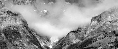
Ice and Clouds


From Highway 40 in Kananaskis yesterday.

Friday, June 23, 2006

Kananaskis Today


From this mornings drive through Kananaskis Country. This image is from the same rock face that 'wet shale' image came from (see below)

Tuesday, June 20, 2006

Photographing From A Balloon


Can't think of a good photo project - how about going on a balloon ride? Photographing is both more interesting and more challenging than you would think. Of course weather is important but you don't need a sunny day and you don't have to fly over the Serengetti Plains - though I guess it wouldn't hurt.

Cost of a balloon ride is typically $150-$300 so it's certainly not cheap but I was able to get several interesting photographs on my one hour ride.

I chose to shoot with my 1Ds2 and my 70-200 f4 lens. Had I realized how much the other passengers make the basket move around, I would have rented or purchased the 70-200 f2.8 IS lens instead (as I did for my tour of Vancouver Harbour by boat). Most, but not all of my images were sharp and of course it was the ones I really wanted that had the most problems so be warned.

The basket weighs 600 lb. - incredible. It's divided into segments so that two people are in each segment - I chose a corner. This does mean though that if something you want to shoot goes under the basket you are out of luck - it's almost like shooting sports - anticipate and grab the shot at peak positioning and move on to the next image. Most of my shots were taken aimed almost straight down, some at 45 degrees and very few horizontal - I did shoot the city skyline but the lighting and weather were less than perfect and frankly I have seen a lot better images done from ground level so...


There were a few times I could have used a shorter lens but not enough to warrant carrying the extra lens and taking the time to change - more likely to miss something even better. At the longer end there were more occasions that I could have used 300-400 mm. but who's to say I could have held it steady enough - perhaps the 100-400 might have been a better choice, though with it's push pull zoom and aimed straight down - and with the steadiness issues... Overall I was really happy with the focal length range of the 70-200.

Balloon rides often go early in the morning when winds tend to be least so coincidentally you also catch the early morning sun and long shadows - ideal for photography.

As to subject matter, it depends of course on your path - even within the city you are dependent on the wind to pick the launch point and the actual course - no chance to predetermine a particular image - on the other hand it means each balloon trip is different.

In my case, we launched from a local park in the Fall so there were fall colours, golf courses, a river valley, the local reservoir, railway yards, the Bow River and residential areas. The last I would not have predicted as being interesting but patterns of roofs and trees and roads can be interesting - things that are just roads at ground level are interesting patterns from the air.

I shot 156 images in the hour so take along enough CF cards to handle that kind of shooting. If you are lucky enough to find a great horizon, do consider doing a stitch for a panorama - as everything is at infinity, you can get away with hand holding and simply swing the camera. Don't take too long to do the shots though as the balloon can move along at a fair clip - at ground level there was no wind at all, at the height we were traveling at, we were moving at 10 knots (11 mph, 17 klicks).


A very enjoyable experience in itself and a real photographic challenge. What better - Oh, and by the way, you don't have any issues with fear of heights from a balloon, they told us on the way to the launch site that people don't have a sense of height and of falling - something about lack of a reference point - not like standing at a cliff edge - they were absolutely right.

Sunday, June 18, 2006

Seeing - Resources For Better Vision

I'm frequently told 'you have a good eye', whatever that means. That I hear if fairly often in almost exactly the same words does I think imply that I can spot interesting things when not expected, that I can compose fairly competently and that I present things in a way that is interesting.

So, if, after looking at my images; you agree (and there are lots of people who glance at my images and walk on so this is definitely not a given and is a critical question), then how did I get here and is there anything to be learned from the experience which you might find useful.

I didn't start attending workshops till I was already quite experienced so I don't think that was the answer for me. It wasn't having shows and getting feedback as most of my images have hidden in print boxes most of my life. I don't live in New York and have access to photo shows every weekend.

What I do have had though over the years is a number of bookstores which stocked the usual classic books. For a time I joined Aperture - till they got too weird, and Friends Of Photography. Through those two organizations I acquired a number of the important photographic books.

I started with the big names - Ansel Adams, Edward Weston, Minor White, Paul Strand, Alfred Stieglitz, Paul Caponigro, and "Brett Weston. I poured over these images time and again. I picked my favourites. I consciously decided why I didn't like some (knowing others did).

By this time I had a pretty good appreciation for the classic landscape, but about almost nothing else.

I took a photographic appreciation course. We spent an hour looking at a single image by Stieglitz, a picture of a porch - nothing else, boring photograph - I left the weekend course frustrated and disappointed. It hadn't been anything like what I had expected.

But, within six months I was looking at photographs in a completely different way. Hubert Hohn had taught me to look at a lot more than whether it was a pretty picture. He had us look at the edges, he pointed out coincidences - not the random kind, the kind where the photographer very carefully put things next to each other, or in the corner or opposite each other. He had us look at the shadows and their interesting shapes. He pointed out that when something was in front of something else, there was generally an excellent reason for it - not just dumb luck.

This experience of being given new information and thinking it total crap has happened a few times in my life, only to find months later that it has soaked in and changed me forever. Don't you hate people like that, and don't you wish that could happen to you more often?

Along the road, I found 'Zone VI Workshop' a very small book with some radical ideas about shooting, processing and printing which not only simplified my life, it dramatically improved the qualities of my prints. Fred was an extremely opinionated bastard and not occasionally contradicted himself over time, denigrating both his former and future opinions without ever recognizing or admitting to either. That said, he had some very good ideas. He was a great proponent of the KISS system - 'keep it simple, stupid', and was a great advocate of not taking anyone's opinion as gospel, his included - you had to test and find out for yourself - how far can you stop down - don't look up tables, don't look at formulae, definitely don't ask anyone else - find out for yourself.

With my Canon 1Ds2, stopping down beyond f16 results in absolutely no more sharpness in the out of focus areas and blurs the sharp ones - I tested it and found out for myself. Your results might be different - don't believe me!

Fred was not the easiest person to get along with and as such I think his photography has been under appreciated - his images tend to be rather quiet and take some time to appreciate, but were well worth looking at. His newsletter published for several years had a lot of interesting ideas and some of them were even useful - and the ones that weren't were entertaining to read. He had learned composition from the likes of Paul Strand and had some good things to say about framing and composing.

Other photographers I lucked into - on the remaindered pile I found a paperback book of images by David Plowden - I found myself identifying with his images even more than those of many better known photographers.

Over the years the usual collection of photo mags would occasionally publish images by masters and that would lead to a search for books of images from that photographer. In the early days and on a very limited budget the library was of some use.

A local photo gallery brought in someone called Bruce Barnbaum for a workshop and at the same time had a show of his work - 'wow', this man could PRINT. He had some lovely images.

The advent of the internet has been a real boon - there are a huge number of images on the net worth checking out. I found the work of Michael Kenna, Kerik Kouklis, Roman Loranc, William Neill

Somewhere along the way I discovered 'Lenswork' magazine - good photography and superb printing, three photographers per issue - a great resource for black and white photography. 'Black and White Photography' from Britain is another excellent resource especially for wet darkroom printers and with good photography in every issue. 'B&W' has become an invaluable resource and their recent Portfolio Annual (which just happened to feature my photographs first (joys of being at the beginning of the alphabet) was particularly well printed. A new magazine is 'Focus' which has been similar to 'B&W' but now features some colour in each issue (and also has four of my colour images in it this month).

I have to say though that the first time I saw a real Ansel Adams image, I was blown away with the quality - reproductions didn't do justice to the superb prints. Mind you, book printing has come a long way since. Screens have gone from 150 up to 600 line, dots are sometimes stochastic (random, instead of in neat rows - which show in skies and other smooth areas). Multiple inks are used for really good blacks. Even paper quality has improved. The gap is narrowing and a lot can be learned from the printed image - but I'd still grab every chance you can to see real images. If you can get a chance to see the prints bare, not behind glass, even better.

Many years ago, Fred Picker offered a set of four 'fine images' to use as examples of good quality printing. They weren't great images but they were certainly printed well and were a good start. There are a lot of photographers offering images on the internet often at quite reasonable prices and should they have a good reputation for their prints, you might well find it worthwhile to purchase a few images just to have as a target at which to aim.

Brooks Jensen (Lenswork Editor and photographer in his own right) recently offered one of his images for $20, shipping included - how could you possibly go wrong? Brooks, by the way, has some interesting and thoughtful insights into photography. He photographs, publishes, talks to the greats, and knows a lot about the industry of fine art photography (not all of it very encouraging - but it doesn't hurt to have a reality check).

Brooks makes comments like, "How can photographers expect people to pay hundreds or thousands of dollars for photographs when they themselves have never ever paid that kind of money for any art work?"

Well, hope these are some ideas for broadening your own perspective. If nothing else it should show you that not ALL landscape images have to be shot with a 17 mm. lens with an extreme near far composition and the horizon an inch from the top of the image - come on guys, you can do better than that.

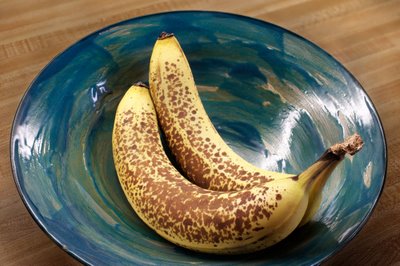
Yes, I Have A Banana


I prefer the colour image with less blurring of the background. Note the great depth of field created by using Helicon Focus, yet the blurred background by shooting at f5.6.

Thursday, June 15, 2006

Banana # 2


I've a long way to go to get to 'Pepper # 30' but you have to start somewhere.

Wednesday, June 14, 2006

60 New Images On Website


I finally got organized and went through my good images and compared the list to the images uploaded to my galleries - there are 60 new images added to Colour Landscapes and to Colour Industrial.

Tuesday, June 13, 2006

Angel Fish In A Rock


Another from my canyon series, shot on Saturday. A cropped single image from the 1Ds2.

Problem with a work in progress, is just that, it keeps progressing - it took 5 uploads before I was reasonably satisfied with what I have done with this image - adjusting brightness, toning down some areas that looked too over the top - even though the colour was real - it didn't balance the image.

In model railroading, we say 'there's a prototype for everything', that's to say, no matter how wild you make your model, somewhere there is the real thing that looks just as odd - only problem is no one will believe you - so where does that leave you.

Click On Image For Large Version

Just a reminder that all the images in the blog can be seen much larger if you click on then use the return arrow to get back to the blog.

Monday, June 12, 2006

Favourite Locations


This image was shot Saturday at Elbow River Canyon, about 40 minutes west of Calgary and a mile below Elbow Falls. It's 5 images stitched, from my 1Ds2 and my 300 mm. F 4 lens, stitching with PTMac.

The final image is 9000X4500 pixels or 40.5 megapixels.

Sunday, June 11, 2006

Don't Read This!


No One has ever purchased this image. This wouldn't be strange except that I get a lot of nice comments about it - then they read the back of the print, and that's it, end of story, no sale!

So, if you don't already know what the image is, think about what you could possibly know about the image which would make you change your mind about the image.

Personally I see a couple of skeletons or ghosts in the image, one facing each way. But then, I'm the person who when Batman came out, couldn't figure out why the logo was an oval with a couple of teeth hanging down - it was years later that I found out it was a bat - must be something to to with being left handed, or maybe just odd.

Anyway, back to the image.

So, do you want to know what it was that stopped all sales?

Are you sure?

Ok, I'll tell you.

Last chance, the image will never be the same again!

Right, you have been warned.

I was having a shower in our bath/shower cubicle with a glass block window and noted the interesting patterns through the glass block, supplied by various items outside providing the colour. In this case it was a blue tarp lying on the back patio, left there after cleaning the patio of leaves. The surface of the glass block was covered in beads of water. I dried off and retrieved my camera and had fun coming up with a variety of compositions.

See, I told you. Now, just to warp your mind, what if instead of an overweight 56 year old guy, I'd been a drop dead gorgeous young woman, think that would have affected the sales.

It might just be easier just to lie on the print blurb. Please forget you read this!

Saturday, June 10, 2006

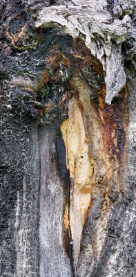
Wounded Trunk


I was photographing this morning at Elbow River Canyon, a spot about a mile below Elbow Falls in kananaskis Country, W. of Calgary. While my labrador retriever did his best to empty the fast flowing river, I was photographing the incredibly coloured rocks. On the way back to the car, this wounded Aspen caught my attention. Shooting with my 300 mm. lens and shooting six images which I subsequently blended with Helicon Focus
and adjusted the brightness with multiple adjustment curve layers in Photoshop.

Friday, June 09, 2006

Dodging And Burning


After dodging and burning


before dodging and burning (and removal of skid marks)

You will soon see part three of my four part article on black and white image processing at Outback Photo. In the mean time if you haven't seen parts one and two, you might find it useful. It is of course only one persons way of doing things and Photoshop being the amazing tool that it is there are many ways of doing things - it simply happens to work for me.

Anyway, just to whet your appetite, I enclose the two images from the article illustrating final dodging and burning above, with the final image above the undodged image.

Tuesday, June 06, 2006

Optical Brighteners

Uwe at Outback Photo has some interesting comments about optical brighteners. I found I had a particular problem with papers as illustrated below:

In selling at the local farmers market lit with a combination of incandescent and mercury vapour - I am unable to sell prints without OBA - they look strongly yellow, not cream like at home. Those with lots of OBA like Moab Entrada Bright White and Enhanced Matte look the best, Hahnemuhle Photo Rag is fair, Crane Museo was unusable (and I have a box of 32X40 paper!). Personally I like the bright white of the Moab paper though confess that finding a matte board that is even remotely as white is nigh on impossible, making white matting with the signature showing on the print problematic. I did find one board labeled 'digital white' but can't remember the manufacturer - not one I'd heard of before but app. fairly big in the art world. It wasn't quite as bright as the paper but had the same colour - all the others looked sickly next to the Moab paper.

I have not been overly concerned about optical brighteners since they have a 50+ year history of use in photographic papers that no one seems to have complained about. I personally don't like uv protective glass - I'm convinced it has a definite green tinge to it. Ordinary glass has some uv protection - try getting a tan through a window - can't do it. With ordinary glass, I don't notice a radical change in the paper brightness or colour behind the glass suggesting that the paper whiteness isn't just about brighteners. Photographic paper has a baryta coating which makes it white. OBA's are added to that. I'm sure that bright white papers also have a white coating which affects the colour and doesn't in fact fade. The OBA's are just the icing on the cake.

If you look at the back of enhanced matte, you will notice that the paper stock is very warm coloured - clearly the paper has a white coating that is independent of brighteners. Try putting the backside of enhanced matte under uv protective glass next to the front side and compare - I suspect they will still be radically different - ie. it isn't the oba's that make paper white - they just make it bright.

A check on the net shows that baryta consists of barium sulfate - the same thing patients get to drink for x-rays.

Saturday, June 03, 2006

Cool Pano Head


I think we are onto something here. While I have not yet purchased this very reasonably priced device ($75), or even laid hands on one, it sure looks like it would be ideal for anyone wanting to do stitching with point and shoot digital cameras and lighter digital SLR's. My thanks to the anonymous commenter who pointed this out to me.

Unfortunately one of the cameras that won't work with this device is my very heavy 1Ds2 - I had run into the same problem with the Liere medium format view camera - the 1Ds2 weighs 1.535 kg. without lens, more than the upper limit recommended for this device of 1.4 kg. lens and camera combined.

Perhaps they will consider manufacturing a heavy duty model for my camera.

The pano head is available from Panosaurus

On Where To Photograph


The flower above (Columbine) was against a fence in the back lane behind my house. I think that many of us started out wanting to photograph the grand landscape, and with limited time and equipment, found ourselves frustrated and photography not as much fun as we had expected - especially after a few photographic trips which didn't produce anything resembling the grand landscape.

This didn't have to be a flower - it could have been a weed or a rusting bicycle or a fence badly needing painting. It could have been about interesting shadows or odd shapes or funny colours or about the oddest things that people throw out, park or dump behind their houses.

Friday, June 02, 2006

Thoughts On Stitching


CP Freight Hwy. 1/1A Junction 2 blend, two stitch


There's already a how to article on my website on stitching, but I thought I'd discuss the whether to stitch issue. The image above illustrates some of the points. What you see above is a fairly wide shot - ideal for stitching - but it includes a moving object - no good - except that it's only in one half of the image - we're ok. Now, to complicate things, the frost was really great when I arrived but was disappearing while I waited. Fortunately I did a two image stitch after arriving, then took a third image with the train, blended the train with the right first image and blended the two with the left first image and voila. Of course you can't always get this lucky.


6 image stitch

Some things generally don't lend themselves to stitching - waves definitely comes to mind. Waterfalls aren't a problem so long as there is a decent overlap in images so you have some control over where the stitch occurs. The second image is a six image stitch - 2 columns, three rows with about a 50% overlap - from a Sony 707 and makes a quite nice 22X22 inch print. Borders between images had to follow lines of water, not across them.

I'm probably not the only person drooling over the incredible detail the new P45 and other similar medium format digital backs produces, yet at $40,000 cannot even imagine owning one unless I win the lottery (and I don't buy tickets). It's generally agreed that even good 35 mm. format lenses aren't up to any more pixels than the current 16 of the Canon 1Ds2. Think about it though. When stitching, you use a longer focal length lens (which is just as sharp) and by 'getting closer' this longer lens sees more detail than a similar resolution shorter lens (like using binoculars to look at a bird). So, when you multiply the focal length of the lens by 2 to crop to a partial image, which is then moved and repeated for other sections of the image, you get exactly twice the resolution of the ultimate image - cool huh? And remember, this is twice linearly, so that means the equivalent of 4 times as many pixels, each resolving as sharply as the original pixel.

Here's the math, just to confirm this:

16 MP camera, 5000X3300 pixels for a horizontal shot, now rotate the camera 90 degrees and zoom in or change lenses by a focal length increase of 5000/3300 or 1.5 to get the same field of view vertically as before. Now shoot 3 images overlapped to cover the old width of the original single image. This gives you 5000X7500 pixels =37.5 Megapixels which is almost the same as the P45 back. Remember though that you increased the image resolution by a factor of 1.5 by increasing focal length so you not only have the pixels of the P45, you have the resolution of the absolute best lenses around.

Now, depth of field changes too - since you are shooting longer focal lengths you have less depth of field so just like a regular medium format camera, you don't have the depth of field of 35 mm. That's the downside of stitching. Mind you, since Canon make shift and tilt lenses (24, 45, and 90 mm.) arguably you don't need to purchase both a Linhof 679 and a Hasselblad H2 as Michael Reichman did. Of course there are advantages to his system (apart from selling your house) for shooting people, waves, moving vehicles, moving machinery, and also for just plain convenience (you don't have to stitch).

I find shift stitching with my Canon TS-E lenses ok except that tiny changes in alignment as I move the camera over on my tripod head (Arca-Swiss) means that alignment isn't perfect and I still need to use a proper stitching programme. I can't simply bring the images into photoshop.

The two biggest problems for me with stitching are:

1) when you aim your camera up or down with your ball head, you have to either guess the nodal point, or you have to purchase a large, heavy and very expensive 3 dimensional stitching adapter for your tripod. Both Really Right Stuff and Bogen/Manfrotto make these devices.

2) and perhaps the biggest issue for me, in reviewing the images for consideration of printing, you can't pick out the winners without first stitching them - which means that it can be a year or more before I decide that a particular series of images will stitch together to make something worth while. I do sometimes let photoshop stitch the image but even that takes time and the temptation is to keep the Photoshop stitch but I absolutely cannot recommend that - the stitches are almost always flawed, don't align and often show seams. The simple solution is to shoot an initial single image, but this sometimes involves changing lenses, and I don't know who thought landscape photography was slow - for me things change way too fast - clouds move position, the wind picks up, the light changes. I don't want to blow the stitch by fumbling with a different lens first. I'm thinking that I might get a small light digital consumer camera with a big screen, put it on black and white and use it for viewing and for taking that initial image. Then of course I'd have to somehow relate the stitching images to this single image from a different camera - hmmn, not as handy as I thought. Back to the drawing board!

Now you know why most people aren't willing to stitch. Absolutely no question though - stitching with my previous 10D has allowed me to make some lovely large images. I recently restitched my columbia icefields image and made a 15X60 print that is very nice even up close. I confess that with the 1Ds2 I do get lazier and don't always use multiple images since it produces a very nice 16X20 but for bigger prints...


Columbia Icefield Jasper National Park


Crop of Above