

You'd think I'd take a break after finishing book 2, but I couldn't leave well enough alone. Some 40 photographers later and 37 essays written, the book is a go, the publisher on board, the project will fly.
It has been interesting communicating with as many famous photographers. The response has been overwhelmingly positive. I'm not ready to release names at this point - I still have to get formal agreements - hell, I still have to write the formal agreement, but lets just say a lot of very famous photographers think the book is a good idea and have been willing to support it by supplying an image free of charge.
I feel a significant weight of responsibility to them to do justice to their work and their generosity.
There have been some observations I have made in writing all these essays and over the next few months, I'll try to write about them.
Happy New Year to all and to all a good night.
Tuesday, December 29, 2009
Saturday, November 28, 2009
Another Old Find

Shot in 2005, I happened to be looking for another image and noted this three image sequence waiting for stitching.
Size Matters
Just picked up a print I made on the recent trip to Death Valley for the PODAS workshop, printed 17X22 on Epson Exhibition paper. I thought to myself, what a nice paper surface. Now, I had tried this paper before but in 8.5X11 and found it not glossy enough and also too textured for images at that size. Point is, the smaller the print, the smooother the texture you want, the larger, the more texture you can enjoy.
My standard gloss paper for 8.5X11 is Harman FBAL, but it is perhaps a bit too glossy and smooth for large prints. I can see myself using more of the Exhibition paper for 13X19 and up. Micheal Reichmann really likes Ilford Gold Fibre Silk which I find way too textured in small prints, but now I see why he likes it as he typically makes big prints (why wouldn't you with a 60 megapixel camera?)
It means that more than likely you won't have a single paper that is your standard for all sizes.
Wednesday, November 25, 2009
Recent Industrial Shoot


These images were made on a commercial shoot for a local industry and I now have permission to use the images for any artistic purpose.
Dearth Of Great Colour?
My next book is going to be "Why Photographs Work". It will consist of some 30 - 40 images along with a 3 page essay on why the images work - at least that's the theory - it isn't written yet.
In considering photographers and images to put in the book, I had no difficulty coming up with a goodly list of black and white photographers and colour landscape photographers - but when it comes to non landscape colour - boy it's not easy.
I get announcements from a few galleries and that hasn't given me much help. I get the book announcements from photo-eye but can't say anything they have sent me recently got me excited (about colour non-landscape).
So this begs the question - is there really a dearth of good colour work on subjects other than landscape? Does it mean that street photography and still lifes and portraits are more artistic when in black and white? Is someone automatically handicapped when doing this kind of work in colour?
The more immediate issue for me is I need suggestions. The editors of photo-net used to recommend photographers but now they just have their themes and the images aren't as original - and they too mostly chose black and white before and colour now - interesting.
If you have either a favourite photographer or image in colour and it isn't a landscape, please point me in the right direction.
I'm happy to receive one of your own images that you think qualifies as "wonderful" but I won't be able to give any feedback other than if I'm interested in the image I will contact you about permissions.
Monday, November 16, 2009


Sunday, November 15, 2009
First Review And It's A Great One!
Discovered that while I was away, my book not only started shipping, early copies started arriving and I had a few emails already from readers. Further, the first review is out at amazon.com and it's a five star rating for From Camera To Computer
You come up with an idea for a book, you think it is a good one, a useful book, but a year later and thousands of hours of writing and editing, you start doubting yourself - will it catch on - will people get what I'm trying to do. Such a relief to find out that the goals have been met.
You come up with an idea for a book, you think it is a good one, a useful book, but a year later and thousands of hours of writing and editing, you start doubting yourself - will it catch on - will people get what I'm trying to do. Such a relief to find out that the goals have been met.
Images for "From Camera To Computer"
I have just finished uploading the images from my book From Camera To Computer to my website as a series of zip files - one for each chapter. For those who have the book, they can bring 1000 pixel wide versions of the images into Photoshop for your own editing ideas = from cropping to tones and see how the results compare with mine. You can also load a series of editing steps as layers in Photoshop so you can see the more subtle differences that might not be as obvious in print.
Saturday, November 14, 2009
Back From Death Valley

I have just returned from a five day workshop, sponsored by PhaseOne and taught by Michael Reichmann, Mark Dubovoy, Bill Atkinson and Jeff Schewe. The PhaseOne staff were terrific ,working extremely hard to keep us happy and producing images. The facility, Furnace Creek Resort was great, an oasis of palm trees, surrounded by almost nothing living.
Highlights of the trip were the casual conversations, at lunch or in the classroom or while driving with the individual instructors as well as a series of lectures. Jeff showed some neat tricks for controlling midtone contrast, Mark talked about achieving maximum quality, Bill did a cool demo of how to stretch canvas prints for framing, while Michael showed us some of his prints, talked about fill flash and presented the opening talk.
That Claus Modegard, head of development at PhaseOne was there was great, that he was so open with us talking about various aspects of the PhaseOne camera and P65+digital back was exceptional. So young, so smart, so nice...
Kevn Raber and his group are to be thanked for a huge amount of effort that went into making sure things ran smoothly. That none of the cameras had focusing screens until the afternoon of the evening start of the workshop yet we had functioning cameras that night because one of the New York staff flew out with the screens to be sure they got there, well that's the kind of effort that was made.
Were things perfect? No. Personally I had trouble taking a sharp picture all week - my use of a centre post was blamed (even though not raised), I shouldn't have been using manual focus (but auto focus didn't work on all lenses, there being some teething problems with this brand new DF camera, of which we had the first batch shipped, and a variety of other issues were raised - probably it's a combination of a number of factors, most of them mine rather than Phase One.
The 210 lens sometimes locked up the camera after a while, with the fix being switching to the 80 and back and things would work for a while. These are firmware issues which will be addressed in the next few months.
I liked using the PhaseOne camera/back combination and despite our first shoot taking place in the dark of early morning, the cameras were quite easy to use. That 15 out of 25 photographers ended up purchasing a back or camera or both by the end of the week speaks to the experience.
I couldn't afford one, and even if I could, would probably wait for live view, which I found so helpful on my 5D2. Claus, whose obcession is image quality isn't happy about laving big sensors on for any length as heat adds noise and degrades the image.
Even though I personally had trouble getting the best resolution from the camera, others did not and the quality of the tones was exceptional - shadows areas were exceptionally rich. Dynamic range was excellent.
The above image was my find of the week, taken of some steel sheets lying on the ground at Death Valley Junction. Yes, I did take pictures of Zabriski Point and other classic landscape areas and yes, it seems odd to go to a national park and to be happiest with a junkyard image, but all that matters is the satisfaction of the image.

An important part of attending a workshop is chatting with fellow participants, comparing notes, looking at prints, discussing problems and how they have been solved.
Part of my hopes for the workshop were to rejuvenate my enthusiasm for picture taking after two years of slogging at producing the two books and the workshop did that in spades - this is one very satisfied customer.
Saturday, November 07, 2009
Viewer For Working The Scene

I'm off to Death Valley for the PODAS workshop and have made myself a new viewer, adjustable from square images to 2.5:1 ratio, which should nicely cover most images. It could be made of plastic or wood. I happened to use some 3/32 inch polystyrene I had lying around. You can get this at hobby stores - especially those catering to model railroaders. I imagine it wouldn't be difficult to make up a really beautiful one in wood.
Construction is simple. The size is 5X5 inches, the opening 2.5 inches, the top, bottom and sides obviously 1.25 inches wide by 5 inches or less. The slide is 2.5 inches by 3 inches.
Cut out the pieces for one layer 1.25X5Xtwo, 1.25X2.5Xtwo. Fit the next layer which is basically the same only rotated 90 degrees and with one of the small pieces missing (that's where the slider goes).Using appropriate glue (I was using styrene solvent glue) glue up the layers and either clamp or use weights to let things bond tightly.
Cut the slider so it fits snugly and lay it in place (it replaces the missing fourth piece from the second layer). Glue on another 1.25X5 inch piece to hold the slider in place.
Either trim some small pieces of styrene (or buy them) to finish both the top and bottome edges of the slider (thin piece on the bottom so it doesn't compromise the window, thick piece on top so you can grab the slider) and now the slider can't fall out. There should be enough friction so that the slider holds its place when the viewer is held upright.
File, sand or grind down the outside edges and round the corners and then drill one bottom corner of the viewer to fit in a shoe lace so you can hand the viewer around your neck.
If you really want to get fancy, you can put knots in the shoe string to represent the various focal lengths of lenses you are using - with an opening of 2.5 inches, you would need to divide the 2.5 by the width of your film or sensor and multiply that by the focal lengths of your lenses. The knot goes against your cheekbone, the viewer held out with the string tight. I haven't bothered, given that I use zoom lenses, but for fixed focal lengths (as when I shot 4X5, or next week with medium format digital) this can be very handy.
I'll let you know how the viewer actually worked in practice - perhaps it will need modifications but so far so good. Of course, the other viewer that can be used is a pocket sized point and shoot with a 3 inch LCD - I'm borrowing my wife's TZ5 for the event. Will see which is better.


Wednesday, November 04, 2009
Up Close Or Far Away?
The black and white rockform image I posted the other day is now up on my examining room wall and I get to see it every time I go in to see a patient. I have discovered that I really like it from a distance, but am less thrilled with the image when I stand right in front of it.
This raises issues of print size and viewing distance, but more important is the question of whether really good images need to work both at a distance and up close, or is it acceptable to work well on one level or the other, and if so, which is more important?
Not all of this has to do with size. Some of it is also about first impressions and careful study - an image can really catch your eye, but not offer a lot of fine details which reward close study, or it might only be appreciated on close study, not offering overall design to attract your attention.
I'm not sure that any of us plan images down to the point of designing initial impact vs. later rewards (ok, advertising photographers do)but it might pay to at least think about these concepts when looking through our own images, perhaps asking ourselves whether we are happy with how the images come across.
If too often we are disappointed with either initial impact or staying power of the images, then we could make this an added checkpoint on the list of aesthetic checkpoints I discussed a few blogs ago.
If what is lacking is initial impact then consider the following suggestions.
- bold patterns
- large blocks of colour
- simple designs
- plain backgrounds
- light subjects against a dark background, whether naturally or through burning in
- careful use of editing to make the iamge more dramatic without making it harsh
If on the other hand what is missing is staying power, then you need to give the viewer something to come back to or stay with - interesting detail, stories within stories, added layers of sophistication in composition - not just the big items.
Sunday, November 01, 2009
When To Convert To Black And White

This image is a good example of an image that does better in black and white. There isn't a lot of colour in the original (see below, it's largely about form and other than the relatively neutral rock, the only other interesting thing is the waves which are white.
Also, in the original colour image, the rocks are blue white (shade), while the water is brown - not generally an attractive combination. In the black and white image I have been able to print down the water so it acts as a background to the rock formation rather than as more subject matter, even though it's only a few inches further away.
The white waves in the upper left provide a bit of balance to the rock formation and the diagonal line formed by the left hand edge of the formation.
Saturday, October 31, 2009
Highwood River

Part of a 100 megapixel stitch (after cropping), I photographed this at the side of the Highwood River off of highway 541 in southern Alberta. I'd been wondering how to access the river since it all seemed to be private fenced off land - turns out they allow anglers down there - one of my patients is a fisherman.
You can't see the great detail in such a small image but at least click on it to bring it up at 1000 pixels wide.


Friday, October 30, 2009
More On Backup
I have just inventoried my processed images - my keepers if you will - 380 gig of images that I cannot afford to lose (after all they produced two books).
At 15 cents per gig per month, my monthly charge (assuming no access) would be $2 for Jungle Disk, $57 for the storage and extra fees if I upload or access any of my stored files. This amounts to something in the order of under $1000 per year including those upload fees. I can think of a lot of things I can do with $1000 and probably so can you. Certainly one more 1 TB external drive will be around $200, but doesn't automatically back up and disconnect from power and any other connections that could be damaged by a lightning bolt or major power surge.
I do take my image files to the office for off site storage, but do it far less often than I really should. Perhaps I should just cough up.
Now, the vast majority of those images don't get edited month to month - probably fewer than 5% get edited in a year - after all they have taken 6 years of digital work to collect. Put that way, the sensible thing to do would be to back up everything I now have to a hard disk, unplug it and take it off site (as well as keeping local backups with my Drobo). I could then use something like S3 to back up all the new edited images (and any changed images from before) and once a year, put them onto a new hard drive, delete everything at S3 and start over with new edited images yet again.
In 10 years I will have accumulated 10 partially filled off site hard drives but only paying Amazon to store one years worth of images. This way I get automated off site storage (almost no effort on my part) for a modest sum of money (and once a year I have to back up my images to a hard drive. Given that I can back up all my processed iamges to one drive, it probably even makes sense to back up everything to each yearly drive so there is redundancy even in the off side hard drives.
What are you thinking about reliable painless off site backup?
Backup
Luminous Landscape has an interesting new article on backing up. It is written by Geoff Baehr and he clearly knows what he's talking about. Problem is, he's explained the steps but missed the concept.
A good computer system requires two separate and distinct components - both reliability and backup and I don't think that Geoff made it clear enough which is which.
He talks of redundant arrays using Raid to make sure that data is reliable, but at the same time refers to this as backup. It should not be both.
Reliability means that when your next hard drive fails, how difficult is it going to be and how long is it going to take to get you back up running again. Using Raid 5 or 6, you have the capability to survive a hard drive failure - but of course usually these drives are your data storage drives, not the boot drive which contains your operating system and usually your applications.
Backup has nothing to do with reliability other than that when reliability fails you, that's when you need a backup of your data.
Backups aren't about failing hard drives and redundancy and raid 6 etc.. You don't need any of this because you back up to more than one place, at least one of those places which is then disconnected from your computer and any electrical or other connections so that it isn't subject to power spikes and lightning bolts. If one of the backups is off site, then you are even protected against theft and fire and flood and it doesn't get much better than that.
What it comes down to is how much time are you willing to spend on doing your backups, how long are you willing to wait to restore your system (which often translates into how much money are you going to lose, how many clients are you going to piss off if you can't access your images).
Geoff mentions using Amazon S3 which looks possibly interesting, though at the usual upload speeds of a cable modem, the initial backup could take weeks. He discusses backing up to a hard drive then mailing the hard drive to Amazon but frankly if I have the data on one or more hard drives, why do I need to then mail it - wouldn't it be easier to just store the hard drives at mum's house?
I use a Drobo for backup though Geoff does have a good point about a proprietary storage system which might some day be hard to fix if the company goes away. Still, there are enough people using Drobo's that I suspect that it's going to be accessable for a long time to come. In theory, a Drobo or a raid system is often a mix of both reliability and backup in that the drobo can regenerate the data from any failed drive and maybe even two, which arguably isn't strictly necessary in a backup. I don't believe I can regenerate a boot disk from Drobo because what's sending data to it is Time Machine which doesn't back up absolutely everything.
My next move will be to buy an extra external drive and make a copy of the boot drive via super duper. Mind you, I'm still using a G5 so will have to upgrade that first - just as soon as I have some money.
Thursday, October 29, 2009
New Book News
Well, a milestone, Fed Ex delivered my advance copy of my new book "From Camera To Computer". Bulk shipping to bookstores should take a week or two. I think it looks good but you'll excuse a little bias.
I have posted information on the book to my website. Click on the right book and you will go to the cover image, information on the book and then to a page from which you can download pdf's of Chapter 21 and also the table of contents. Those of you who follow my blog have probably seen almost all the images in the book and even many of the editing steps blog entries and you might wonder what the book can add to the blog. The book is 286 pages long, and contains a lot more detail than was seen in any of the blog entries, along with more tips and suggestions and explanations, and more about the process of working the scene and deciding what needs changed in editing an image.
A huge effort to edit the book by myself, then the new editor, then my original editor has made the book much better to read. In several images previously shown on my blog, I have completely redone the editing steps to result in a stronger image (and shown the difference). Much more care has been taken to explain steps, terms and so on.
For those starting out with Photoshop there is a short primer which covers the essential part of Photoshop - the part that I use in editing. There are brief discussions of stitching and blending for focus and hdr, explaining which methods are best and where. I explain the steps necessary to do good stitching and point out where specialized software does a better job than even Photoshop CS4.
I would not recommend the book to someone who wants help with working the scene, making aesthetic decisions, wanting to know straight forward methods of fixing images and even more importantly improving images. Someone with years of Photoshop experience is unlikely to find the book all that helpful, or at least the editing parts which is half the book. That said, I think a lot of people will find it an entertaining read as I describe my failures and how I worked towards successes, solving the same problems you likely face in your photography.
My original hope for the book was that it would make an interesting read, somewhat like Ansel Adams "Examples, the making of 40 images" upon which this is based, albeit in a digital vein and including colour. Several of the images are black and white and there is a fair amount of discussion about black and white workflow and decision making.
Wednesday, October 28, 2009
An Aesthetic Checklist
I don't want to suggest that we can reduce photography to a formula, but just as it doesn't hurt to confirm you have done everything you can technically to capture a good image - it doesn't hurt to quickly review some points to see if you have done your best with the subject in the area of making a strong image as well as a sharp one.
1) does the image show what interested you in the first place? For example, you might be photographing an interesting face. You found the face interesting because of the person's smile - so have you done everything possible to capture that smile - from making the model comfortable to duplicating the angle from which you first saw the smile.
2) is anything interfering with showing what interested you to its best? Perhaps harsh lighting has destroyed the enigmatic smile or a disturbing shadow from the nose creates problems or maybe the angle you have selected to best show the smile has now made the chin look weak. Sure photographs are compromises but they are also puzzles for us to solve - how to get the most of the good with the least of the bad.
3) are there any elements in the image which distract from its simplicity and power? Sure that curve on the right is wonderful, but it doesn't do anything for the shapes which make the image and thus distract from them.
4) have I done everything I can to place the main subject against the background in an effective way. Sure we know not to have trees sticking out of people's heads, but there's a lot more to placement, not just to avoid distractions but to enhance the image - for example, the placement of dark background against light parts of the subject while dark subject has a light background - sometimes in the same image.
5) foreground - does it in fact lead you to the subject or just confuse? Would less depth of field actually be better?
6) edges - is there anything I can do to make them work better, likewise corners?
7) message - what is it and is it being said as clearly as possible - ie. what could I do to make that message clearer - better lighting, adjusted positioning, hdr, focus blending
8) how am I going to treat the image - ie. previsualization - is there anything I can do now that will help that interpretation of the image? It could be contrast management with a fill light or reflector, waiting for a cloud to pass over the sun, an adjustment to the exposure.
Tuesday, October 27, 2009
How To Be Lucky
1)photograph often
2) be observant, especially for things that weren't on your agenda for today's shoot
3) don't blow a great shot with technical issues - that's just mickey mouse - get that crap out of the way through lots of practice and careful routines, even check lists and being careful - and if hand holding under borderline conditions, take several shots so at least one will be sharp.
4) give yourself several possible shots to choose from whenever possible - often I find that the penultimate shot that I so carefully positioned and framed is subsequently beaten by an even better shot as I literally and figuratively circle round to where I started, doing a better job on the second go round
5) really work the scene - don't leave until you are sure you have done the best you can
6) arrange as much as possible before the decisive moment so that when it comes you are ready
7) put the extra effort in so you arrive before sunrise, go out in bad weather, etc.
8) have an aesthetic check list too - background ok, light perfect, edges strongly composed, subject best framed, etc.
9) keep your equipment relatively simple so you aren't changing lenses when the perfect situation comes up
10) stop believing in luck - it's all sweat equity, with a few smarts sprinkled in
Monday, October 26, 2009
Making Vs. Improving Your Best Work
A followup to the other ideas of today is the recognization that to make our best work is not the same thing as trying to improve our best work. In the former, we use our strengths to produce the best possible work we can, while in the latter, we work on those areas which most need help. Are you aware of when you do one vs. the other? Perhaps you only ever try to do your best work, never putting much effort into trying to improve your work other than by trying harder - whatever that means.
I could imagine someone suggesting that one of my weaknesses is in putting all my effort into careful compositions instead of finding intrinsically interesting subject matter in the first place.
This would suggest that I put more effort into finding interesting things first and good compositions second. Any time we discuss interesting, it has to be asked - interesting to whom? To be a serious photographer with something to say, I'm absolutely convinced that it has to be interesting to the photographer, that tailoring your subject, style, or technique to suit the viewer is to prostitute yourself. Fine if you are charging $4000/day - for that kind of money I can do a lot of grovelling - but not suitable to someone who professes to be a fine art photographer.
Going With Your Strengths
It might seem obvious that you should photograph subjects and with methods which have been previously successful for you. It would appear that the opposite of the above is to never learn from our experiences and thus never advance as a photographer.
I think it is actually quite common for photographers to not even be aware of their strengths - or to put it another way, the strengths of their images. Sure the bigger problem would appear to be not being aware of their flaws, but in truth we need to work on both.
Both strengths and weaknesses in your images tend to show up when you hold up your work against that of others. This could be in a show, or simply at a camera club, or failing even that connection, holding up your work against what you find in magazines. Far be it for me to suggest you rip up your latest and pristine copy of Lenswork but it might pay to order an extra copy of one or two issues which feature work at least a little bit similar to yours. Remove individual pages and trim them, pin them to the wall next to similar sized images of your own - in other words have your own home show, your work and the published work side by side.
Workshops are an excellent way to get a sense of how your work holds up. Contests are not a good way - a few winners and hundreds if not thousands of "losers" which tells you almost nothing about your work.
Sometimes it's possible to sign up for a critique, or to have someone you respect look at your work, but you aren't looking here for a rating - this is how good your work is - rather you want to determine its strengths and with a bit of effort you should be able to determine these strengths for yourself.
Strengths can take a number of forms, from technical perfection to emotional impact, skills in composition, finding interesting subjects, the richness in your tonalities, the way you get your message across clearly and so on. Don't discount as a strength such simple things as wonderful colour, clever use of shadows, amusing images or simply being informative.
Having identified your strengths, it's time to think about what to do with this information.
Perhaps your strengths point to a particular kind of photography that would best make use of your skill set. Maybe your strengths are such that they apply to all your images, not some subset.Maybe now that you recognize your strengths, you can make them pay off more often. You might literally do an inventory of any scene to see how you could best use your strengths.
By the same token, you have to avoid or preferably overcome your areas of weakness. Do remember though that if you try to improve your strengths, it will take a lot more effort for much less return than if you work on your weakest areas, where there is so much room to improve.
My first book started with a series of articles on assessing your level in photography but in that we lump all your technical or aesthetic skills into one asessment. That concept remains valid but here I am suggesting that knowing the particular strengths (and weaknesses) of your images and yourself as a photographer can be of great help.
Stats And How It Could Influence Our Photography
If we take it as given that a busy and good photographer can make a dozen strong images in a year (as per Ansel Adams comments), it might pay to spend some time reflecting on the circumstances which led to those images. How many of them happened when you simply picked up a camera with no idea of what you were going to shoot, just wandering around some place?
Did you see something worth photographing and ran home for your camera and thus captured one of your best?
What percent were from an organized shoot - I'm going to place A to shoot subject B and I'm going to dedicate several hours if not multiple visits to do so?
Do you know what percent of your best images were made while photographing with someone else - perhaps company stimulates you to perform - or maybe it inhibits you - the answer to the question is quite relevant for planning future shoots.
How similar are your best images? - too much alike, close enough to be the start of a project, totally random, each begging for more work of the same theme?
Next time I'm going to discuss the problem of going with your strengths without simply being repetitive.
Thursday, October 22, 2009
Perfection
You may want to read what I previously wrote about perfection, but I wanted to expand on the subject.
Perfection 1
Perfection 2
Perfection 3
We may aim for the bulls eye but be happy that we got close. Really, all we need in an image is that the imperfections don't interfere with our enjoyment of the image. One could even make the case for an image being too perfect, shadows so open they look unreal, repetition so perfect you almost itch for just a little imperfection.
In practice, what we really want is for our images to be that little bit more perfect than the ones we have been doing recently- ever improving, strengthening, perfecting.
In order to make our images that little bit better than our current skill set, we are going to have to change something.
One option is simply to spend more time waiting for the perfect image. The difficulty with this is it isn't as much fun, can be very frustrating and besides you end up with fewer good images from which one or two are going to surpass the others - not a sensible option, yet one which many hobby photographers follow.
We could approach this in a logical fashion, carefully analyzing what makes our images less than perfect and working to improve those characteristics - efficient if a bit cold and methodical and not a lot of fun. Probably more sensible than a careful analysis of each image is simply to go with your instinct of the one thing that most obviously weakens an image or even better a series of images and work on that weakness.
How you go about working on your weaknesses depends on what they are. If you aren't sure, then a read of my first book "Take Your Photography To The Next Level" would be a darn good start but if you know what your images lack, then you simply have to come up with a battle plan to improve that.
For some it will be composition, for others tonal quality, or perhaps it's because it isn't clear what the image is trying to say, or perhaps you like to include the kitchen sink in all your compositions, firmly believing that more good stuff is better.
Wednesday, October 21, 2009
Are You ADD or OCD?
What kind of photographer are you? Do you see yourself as:
careful, methodical, efficient, cautious, organized, logical, productive, do you photograph in logical sequences and steps?
or, are you
spontaneous, thinks outside the box, easily distracted, fascinated by all manner of odd things, risk taking, creative?
In other words, are you attention deficit, or obcessive compulsive?
Some people are strongly one way or another. If you turn the first list into negatives, that's me, disorganized, messy, late, def. not sequential and I tend to go with my gut instincts photographically - it works because it works - I may be able to explain why afterwards but that's not why I'm attracted in the first place.
So, how could knowing your own tendencies help you in your photography? There are probably only a small minority of us who nicely straddle both groups - who are highly organized and efficient, yet spontaneous and creative and so on. In reality most of us lean one way or the other in either our strengths or our weaknessses. This being so, recognizing these will allow us to work on our weaknesses and take advantage of our strengths.
Now, human nature is such that we tend to practice what we are already good at, ignoring those areas where we 'suck', so breaking with tradition and improving those areas where you are weak will reap huge benefits.
For the illogical person, check lists - of equipment - of compositional steps or whatever may be useful. Rearranging so there is a labelled place for everything and insisting that you put everything back in place will help. I know that I am careless about picking up my backpack without checking to see if it's zipped - so I zip it up every time I remove or return something - might explain why I wore out the zipper in my last pack, but anyway, that's how I get around my weakness. It would be handier to leave the backpack open till I'm finished, but a lot harder on the lenses if I pick it up without zipping it (yes, I learned this the hard way).
You may be less familiar with ways in which you can become more spontaneous, creative, thinking non linearly, jumping ahead, thinking outside the box etc. There are books with creative exercises - for example those by Freeman Patterson. There are workshops like those by Jay Maisel and Craig Tanner which specifically encourage being creative and breaking rules and observing and letting yourself see in a non labeling, non judgmental way.
You can easily assign yourself a small project which takes you out of your comfort zone (not another damn landscape, etc.), which forces you to do things differently (like me locking up my tripod), or limiting you to one lens, or one location.
An oft recommended assignment is to photograph in a bathroom. The logical person looks round and sees a series of boring items - a toilet, sink, bathtub. The creative person wonders what it would look like to photograph the water coming out of the tap, at a variety of shutter speeds, or photographing the curve of the toilet bowl with shadow only, or climbs into the tub and photographs the shower curtain from below. They take a bath towel and try placing it in interesting folds, patterns and shapes. They undress, hang their slacks on a hook and photograph the belt hanging down.
The ideal photographer would look at the two lists above and declare that both describe him/her to a tee, but people like that are rare as in many ways the two lists are opposites of each other - like being both tall and short. The trick is to pick up enough of the skills and strategies of the other type of person to help you take advantage of the strengths you already have.
Sunday, October 18, 2009
Arbutus

The paper like bark of the evergreen Arbutus tree in Victoria had peeled back and exposed this interesting pattern.
Through A Fence

Some scrap steel from disabembling some sort of ship along the waterway in Victoria harbour, I was shooting through a chain link fence, hand held, lens hood off so that I could get the lens closer to the mesh (to at least blur it out if not eliminate it). No chance for full depth of field but I quite like the soft background - less distracting - in fact it makes me wonder if I should have used even less depth but then the main angle of steel wouldn't be quite as sharp - always a compromise.
Friday, October 16, 2009
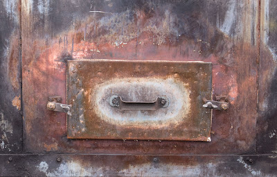
What An Image Is About
The image I showed the other day of the brass door with handle and pink surrounding corrosion raises an interesting point. The apparent subject, some old piece of equipment is really quite uninteresting and were someone to title the image "furnace door with corrosion", you'd really have little reason to want to look at it.
What I think the image is about is PINK. To me that is the subject. The colour is so unexpected and attractive against the bronzy background that the colour becomes the primary subject and where the colour came from is secondary at most.
The interseting question will be whether if you start thinking of it as a "pink" instead of as a door, will it change the way you think about the image.
Comments?
Not Our Cruise Ship

This tug upstream from the lift bridge crossing Victoria BC's inner harbour had a lovely patina of wear. The back end was rusted and dented and I struggled to make something of the colour and shapes, with no success. The bow on the other hand reflected nicely in the late afternoon sun and a tight cropping eliminated extraneous details (crap).

This old railway trestle crossed the inlet and from my rented kayak I was able to manouver to a suitable position, a very pleasant morning. it was harder than expected to get just the right overlap of logs and I spent about 40 minutes and a good 50 images trying for just the right shot - a lot of work for a simple image, worth while none the less.

Not exactly a new barge, located next to a metal scrap yard. Often you can get some really nice images on brilliantly sunny days with harsh shadows simply by shooting what's in the shade. Care in keeping the sun from the lens is essential. Especially on zoom lenses, the right hood is not enough, and remember that if you are using a lens with full frame coverage on a small sensor camera, the right hood is in fact the wrong hood (because of the image magnifcation factor (1.6 in the case of my 40D)).
I wondered about the placement of the ladder in dead centre, but it seemed somewhat artificial to place it in the one third position just because it's traditional - in the absence of any good reason to be there, it seemed more "right" to place it square on, dead centre.
Wednesday, October 14, 2009
Images Which Don't Rely On Composition
The following images are all I could find from my own images which do not heavily rely on composition, and even here, in several cases one could argue that there is an arrangement, an organization, a pattern to the elements that is not accidental.
Now it begs the question of whether it is my own bias towards strong composition which made it hard to find images which I feel work yet don't use composition to a huge degree. What is your own experience - how many of your images don't rely heavily on composition.
I note that all of the examples are colour - I could not quickly find a single example of a black and white image of mine which did not strongly rely on composition, though on the face of it, you'd think that tones could replace colours as the main feature of an image - it just doesn't in my images.
When Don't We Need Strong Composition?
Are there any circumstances in which composition isn't necessary and if so, what are they?
I don't think there is any image that couldn't or wouldn't be better if it were strongly composed. That said, there are a number of images in which other factors are more important than careful use of edges, leading lines, interesting use of negative space and so on.
The expression on a naughty child might well far outweigh any benefits from careful composition. In some images, colour is the overwhelmingly important element of the image and everything else comes secondary. A black and white image may have some wonderful tones which don't form any logical pattern or sequence yet are sufficiently strong to make composition of secondary importance.
Whether any of the above images would be even better if in addition to all its strengths it were strongly composed too is uncertain. For sure if you have two images of equal merit in other ways, then I'd select the strongly composed one every time. I can't think of any examples in which a strong composition interfered with the enjoyment of other aspects of an image - though I'd be interested in your thoughts on this. Often though, the circumstances are such that the great colour only comes without composition and if I insisted on strong composition, then the image wouldn't be. In capturing kids, often it's all you can do to catch the moment, never mind the composition, but Cartier Bresson sure managed it - by working on the composition first then waiting for the subject to place them selves just so - a matter of skill and perseverance and organization.
Thoughts?
Thursday, October 08, 2009
More On My Second Book And Discussing "Why"
GC Bakker wanted to know if the second book would in fact explain why I make changes rather than be another how to make changes book. Despite all the months writing and editing the book, I had to really think about the correct answer to his question. I certainly did show what to change and some basics on how to change it (but it isn't a photoshop manual, despite the one chapter quickie primer).
It would be easy to toss of a glib answer to the why along the lines of "Well, to make the images better, dude!" but of course that is neither helpful or friendly. I do think that anyone can learn from seeing the changes that I make to my images, but I think the short answer is no, this book does go into great detail about why I make a particular change though where there is a problem, it is often identified as to what the problem is - which is a way of explaining the why, all be it in one sentence. What my book does do is point out the problems and weaknesses and what you can do to improve images well beyond simply fixing them.
I wonder if CG really means why make the changes or does he in fact mean that he would like help knowing what to change. It's fairly easy with image problems to say why a change is needed. Over here is a yellow green tinge on the rocks and it needs fixed. The unwritten but implied "why" is that the change is because the yellow green tinge is unnatractive and doesn't balance the colour of the rocks elsewhere in the image. This is an example of what happens in chapter one.
It is a little harder to explain improvements in areas that already looked ok - or at least they did until you see the improved version. I tend to still talk in terms of there being a problem - needs more contrast, should be lighter, highlights need brightening.
Clearly CG Bakker is going to have to look at the book for him/herself to decide if the book is helpful. A few of the chapters are based on previous blog entries in which I took you through the steps in editing an image - all be it improved and edited - but if you check out the previous Athabasca Falls image discussion, you will find the basis for chapter one, the Bowl of Fruit image for chapter 3, for example. Most of the other chapters are similar.
This has been a complex answer to what seemed like a simple question. I look forward to GC Bakker giving us some feedback and further explanation behind what is meant by "Why".
How Small Should A Travel Camera Be?
I'm just back from Victoria and it seems a good time to discuss what is a good travel camera. What I took was my 40D, 18-55IS and 55-200 IS. I made good use of the full range, occasionally wishing I had wider than 18 - but probably not enough to want to carry an extra lens (and remember you can always stitch - even hand held if you are reasonably careful).
I have just read dpreview.com's review of the Panasonic GF1 which got me to thinking about camera size. No question that the GF1 is significantly smaller than the 40D, but what about the size of a 28-400 mm.(full frame equivalent) kit look like. Yes, that 20 looks small and cute - but no IS and frankly a lens that is smaller than my 18-55IS would not be all that helpful. The Panasonic 45-200 doesn't look all that much smaller than the 55-250 I have and would need an adaptor anyway. Net result is a very small camera would not make for an especially small kit. My case could be one size down but frankly that doesn't really make a difference.
What really happens with camera kits is that things change when there is a quantum jump in storage - from a carry bag to a belt clip on to a rain coat pocket to a shirt pocket.
My wife's Panasonic TZ5 (now replaced by the ZS-3) is shirt pocketable and covers better than the same range. Of course I lose a view finder, manual controls, high ISO, rapid focusing, and the ability to make larger than 11X17 prints. The GF1 will still require an over the shoulder case and two lenses and won't make a fundamental difference to carrying, storing and accessing the camera - so is it worth both the money and the compromises to have such a system? I suspect the answer for me is no. I guess it might be a nice carry around camera when you don't want to have more than one lens and are willing to live with the size of a zoom or the lack of zoom and IS in the 20 mm. lens. For some, that is all they need, it just wouldn't work for me - I'd miss the longer focal lengths.
What have you been thinking about these new small camera, decent size sensor models?
Tuesday, October 06, 2009
Victoria B.C.

This image was shot from a kayak - near ideal way to tour the harbour, but I did find that the kayak had to be pointing at the subject, not always easy in wind and current, but a lot steadier than twisting sideways and shooting. Having learned the lesson of multiple exposures when you aren't sure about hand holding, I shot several images of this particular composition. You see it with very little adjustment - the colours were wonderful.
Thursday, October 01, 2009
My Second Book
Book 2 exists as a stapled together version from the printer, so it's real, it will come out - probably mid November. The book is called "From Camera To Computer".
It consists of 23 chapters and a Photoshop Primer, plus introduction and notes on the book, and a small index.
There is a chapter on on people pictures (unlike in my first book which was quite reasonably criticized for being all landscape and industrial. There are travel pictures. There are other chapters on abstracts, sculpture and architecture, manipulations and so on. There are short discussions on stitching and focus blending.
Mostly the book is full of chapters which discuss and illustrate either working the scene and or editing images beyond simply fixing problems.
There are a few tricks, many suggestions and tips, and dozens of example images shown from raw output to final image. There are proof sheets so you can see the failed attempts as well as the successes.
There's a chapter on pairs of images, comparing two somewhat similar images, discussing why one works better than the other.
The book is aimed at enthusiasts who want to make better images, who don't really know how to go about improving images beyond simply fixing things like colour balance and overall brightness and contrast. It's for the person who wants more information about working the scene and looking for solutions to real world problems in image taking.
The book is specifically geared to image editing in Photoshop and the concept of adjustment layers.
Unlike books by commercial photographers for whom a single trick can be applied to one thousand similar images so is worth learning and using, I show you techniques that can be used with all your images.
The photoshop primer shows you the 10% of Photoshop that is needed to edit 100% of your images - making it a practical and relatively painless tool for your image editing.
I plan to put the table of contents as well as a sample chapter up on my website closer to the release date.
My first book has sold 7,400 copies, is into it's second printing, and has been translated into German, Italian, Swedish, Polish, and two different forms of Chinese. none of which has made me rich but it has generated more income than print making ever did. I understand the break even point for a publisher is somewhere around 2000 books sold - guess that's why they were happy to do a second book. Wait till they find out I have an idea for a third book - a topic for another day.
Which Camera Shall I Take?
I'm off to Victoria with my wife for a few days of R&R, but of course I'll take a camera with me. Do I take the 5D2, the 40D or even something pocketable?
The 5D2 isn't sig. larger than the 40D and has wonderful resolution and high ISO performance - but the lenses are so much larger. I'd have to take my 70-200, a 2X converter, and a 24-105 to get the equivalent of my two lens combo for the 40D 18-55 and 55-250.
I could take a traditional tiny sensor consumer grade camera but if we go whale watching, forget them for their poor focus speed. I could use a Panasonic GF1, but by the time you carry lenses that cover the same range as my 40D kit, they aren't a whole lot smaller and besides, I don't have one.
Once before in Victoria I took a Canon S3IS, at the time a decent camera, but could only make 5X7 prints with it - and I made a lovely image at Buchart Gardens that I could have sold many times over had I shot with a decent sized sensor camera. So far, what I have seen of the G11 and S90 test shots suggests that they are not going to be the panacea of a small camera, small zoom, general purpose carry around. My Panasonic FZ50 was decent but not great - great 8X10 prints but not 13X19 - so no, it will have to be the 40D. I think I'll pack my lightweight tripod too, for just in case. Will I regret not having the 5D2 - probably not - the 40D did very well for me in San Francisco and again in Germany and the two lens kit in a sling bag from Tamrac was easy to carry.
I have two batteries, just in case, and the small charger fits in a pocket of the camera bag. I'll probably take along my Epson 2000 both to view images and to back them up - it's a lot smaller than lugging along a lap top for what is supposed to be a holiday.
Tuesday, September 29, 2009
White Balance
Why do people get so het up on white balance - it is absolutely meaningless in your camera if you are shooting RAW and why wouldn't you be?
I leave my camera on auto white balance just so the thumbnails are of a reasonable colour, then when I take the raw file into Camera Raw, use the gray balance dropper (upper left) to neutralize the image. If you happen to have some tones that are supposed to be neutral then you are laughing - this weekend I was shooting white lab coats. More often you won't have a neutral colour. In that case I will do one of two things, play with the colour temperature slider (top right) or I will use the gray balance dropper on the most neutral colour I can find, then make small adjustments to the colour temperature sliders (there are two, a main one and a cyan/magenta one).
Once in Photoshop, one can do an Auto Colour in the Image menu or do a curves adjustment layer, using the gray balance dropper once again on the most neutral colour. Here I can use the layer opacity slider to tone back the colour effect and often this is just exactly what is needed to get the colour adjustment where I want it.
There are many other ways to colour balance - this is simply the method that works for me.
Tilting LCD
I was very sorry to see that the recent Canon 7D did not come with a tilting LCD screen. I have no ambition to shoot movies but Michael Reichmann mentions on Luminous Landscape that a tilting LCD is really essential for shooting video - after all the viewfinder is blacked out.
For myself, I'd find it great for low and high shots and some of those awkward positions we sometimes find ourselves in, camera jambed between a rock and a hard place, and no room for my eye behind the viewfinder - ok, it's an industrial thing - between a pipe and a ledge, right?
Anyway, I'm curious about how other people feel about a tilting LCD screen - let me know what you think - and just to guage interest level - how many of you would be willing to pay an extra $100 for a model that did have a good tilting swinging screen?
Monday, September 28, 2009
Commercial Assignments
Occasionally I have taken on a commercial assignment. A few years ago I shot Mount Royal College. There were no questions about who owned the images - I did, and I simply charged for the images produced, the prints made. I have used those images in my first book and any time the college wants to use the images in a new way, they need to get my permission and I charge accordingly. It was an arrangement that worked well for both parties.
This last weekend however, I was asked by one of my patients to handle an industrial assignment - they are redesigning their website. I was escorted and had access to the entire complex, inside and out.
It was clear from the start that they wanted to control the images, that I could not use these images for my own purposes - not unreasonable because that's what they were paying for. In fact, I did ask that if I were to find something of artistic merit, would it be possible to get permission to use specific images. Already I have found two that I would like to show you, to make prints, to publish or even to sell.
You might be wondering why I'd even agree to such an arrangement which could limit my use of the images. Simple. They wouldn't agree to the assignment under any other terms - take it or leave it. Actually they didn't say that, but it was understood.
Some time ago I was photographing a log pile and the plant manager was concerned that his competition could do a log inventory on the basis of my images and so he wouldn't let us into the middle of the plant but did let us photograph from the driveway - given the speed those log carriers whipped round corners with gigantic loads, I was very happy to be where I was thank you very much.
I was refused access to ADM flour mill - apparently there are proprietary methods and machines which they don't want their competitors to see.
In the case of this weekend, the largest concern was of inadvertently photographing a safety issue, not because they are careless, rather the contrary, because they are very aware of safety and rule issues and work hard to have a good plant, but human beings being what they are, anyone can make a mistake now and again and a photograph taken at just the wrong moment before someone else catches the mistake could create problems for the plant. I fully sympathize and simply hope that the images that I particularly like and want access to are not ones to raise any concerns.
When presenting a customer with images, it really isn't practical to hand over 1000 unedited full resolution images which might require 40 DVD's or their own hard drive. You can either set up an action in Photoshop or the equivalent in Lightroom to process the images to small jpegs and put those on a single CD, or you can publish the images to a private website, password protected for client use. In the case of my weekend customer, head office is elsewhere and so publishing to a private website makes the most sense.
You probably don't want to give your customer every image - why should they have to plow through all your mistakes or closed eyes or whatever. In fact, what I'm doing is I have gone through every image taken so far (900 or so) and marked them in Bridge as being either useable or not (zero or one score). I am now in the process of editing the one score images and saving them to a separate folder. So far I have corrected colour balance, perspective, and tonality on about 100 images, selecting the best of the one score images, and I'm about half way through. Anything for printing will likely need more editing work, but these edits are useable already. Some are cropped but keep in mind that clients often need to do their own cropping to specific shapes and so coming in really tight on the subject is going to create problems for them - one thing to crop out something that spoils the image, another to eliminate excess sky or wall when it might just be handy.
I swore that as soon as I was finished with my second book (that was last week), I'd start to switch over to Lightroom with suitable keywords for searching for my several thousand images, but it looks like it might be after this assignment. I may have to get tough on myself.
Before accepting an assignment, make sure that both parties understand who is going to hold the original files, have publishing rights to them and who is going to get printing done. For my assignment this weekend I am simply charging for my time and have given them some sample prints 13X19 on epson enhanced matte - relatively cheap, easy to stack feed, easy to look at in any light. They are welcome to pin them to the wall but have already warned them that before spending money on framing and whatnot, I'd recommend they let me make "final" prints with more editing and care in printmaking. Still, they served to let the customer know where he stands in terms of useable quality.
Anyway, these are issues you need to consider if you contemplate taking on a commercial assignment.
Sunday, September 27, 2009
Abstract In Cracked Paint

Found a dumpster with interesting patterns of rust and cracked paint this afternoon. Once the image was recorded, the biggest question was where to crop.
Shot it with my 70-200 f 4 IS at f 11, using live view instead of mirror lock up - no initial shutter opening to shake the camera. If extended use of live view causes problems, they have been too small for me to see, but I have not done any formal testing.
Thursday, September 24, 2009
Tilt And Shift Lenses
I quite often use my 90 ts-e lens and you might reasonably wonder how important is it that one purchase a tilting lens. Perhaps you don't even know how they work but are curious.
Canon and Nikon and Hartblei sell lenses that tilt or tilt and shift. Many people are under the impression that lens tilt increass depth of field. This is incorrect. Tilting a lens does not add any depth of field at all, it just changes the plane of focus. In a normal photographic situation, when you focus a lens at 10 feet, there is a spot 10 feet directly in front of the lens which is sharp, and usually the area of sharpness extends left, right, up and down perpendicular (90 degrees) to the line from the lens to the centre of the image focussed at 10 feet. This invisible wall is usually flat but sometimes curves nearer at the edges as a flaw often seen in wide angle lenses (my 17-40 certainly has a curved plane of focus, focussing nearer at the edges and corners of the image. Anything in front of the plane of focus (that invisible wall) is progressively more and more out of focus the further from the "wall". The same thing happens behind the wall (ie. further away).
It is possible however to take that invisible wall, the plane of sharp focus, and tilt it in any direction we want. If the thing we are photographing is relatively two dimensional, ie. all in the same plane, it should be possible to shift the plane of focus to match the plane within which the subject lies.
So, for example, if in the foreground we have some short plants, in the middle distance some medium height flowers and in the background some tall ones, the flowers (but not the bases of the plants) lie more or less in a single plane from near low to far high, and it would sometimes be helpful to change the plane of focus to match the position of the flowers. This is what happens when we tilt the lens.
If I tilt the lens downwards, it is at an angle to the sensor or film instead of being parallel to it. The distance from centre of lens to top of sensor is now larger, the distance from centre of lens to bottom of sensor is shorter. As shorter distsances focus further and longer distances between lens and sensor focus nearer (think extension tubes to focus close), you now have a situation in which the top of the sensor focuses far, the bottom near. Remember of course that the image is upside down on the sensor so what is really happening is that the low foreground is focused sharply on the top of the sensor, the far high background flowers are sharp on the bottom of the sensor. Since the middle distance flowers are also on the same tilted plane, they too are sharp.
What isn't sharp is anything that lies above or below this tilted plane - so the bases of the plants are blurred, and any plant that is exceptionally tall compared to the others will also stick up out of the plane of focus and the stem will be sharp but neither base nor flower will be in focus. At wide apertures this can look quite bizarre, but with a small f stop, the unimportant parts are sufficiently sharp that the odd plane of focus isn't problematic.
In table top photography especially, it can be very effective using wider apertures and a tilted plane of focus, sometimes keeping the plane vertical but tilting it from parallel with the sensor so it is near on one side and far on the other.
When photographing landscapes with a tilting lens, the amount of tilt needed to shift the plane of focus from vertical to nearly horizontal can be very small, fractions of a degree. On the other hand, in close up photography, you can run out of tilt quite easily.
Focusing into the corners of an SLR image has always been problematic - at least until live view with magnification came into place. The ability to place the area of magnification anywhere in the image means that you can check absolutely that the plane of focus is exactly where you want, and at least on my Canon 5D2, you can stop down and confirm that the depth of field on either side of the tilted plane of focus is sufficient to handle any important part of the subject which projects above or below the tilted plane.
With my 90 ts-e lens, the tilt does not exactly centre on the sensor and so there is some shift in the image as you tilt, which will require reframing the image (or using the shift). I usually just do a minor reframing.
Given that focus blending with Helicon Focus does in fact result in greater depth of field and copes beautifully with three dimensional subjects (that don't lie in one plane) the obvious question is - so what's the point of a tilting lens?
The advantages are several and may or may not be important to you.
1) there is some loss of resolution in focus blending - not a lot, but perhaps enough that if a tilt will do the job, then it may be preferable. Mind you since any lens can focus blend...
2) you can stitch with tilting for higher resolution images where this would take a huge number of images in a combination focus blend stitch.
3) With tilting, you see what you are going to get.
4) Tilting can be used with shallow depth of field to blur areas of the image. This can be done to some degree with focus blending but in different ways.
I quite often use the shift ability of my 90 mm. lens to do a stitch, shifting the lens one direction and the body by and equal amount in the opposite direction to capture a series of three images (left, right and centre) to make a square image which would otherwise have required a crop - so instead of a 3000X3000 pixel image, I get a 5000X5000, which does make a significant difference, to wit prints that are 67% longer on a side. This is the difference between a 10X10 print and a 16X16 print.
I don't tend to use the shift capability for correcting perspective very often, preferring to correct perspective in Photoshop, though a recent demonstration of loss of resolution in the stretched part of the image was impressive - at least in theory - in practice, I have not noticed substantial quality issues in my usual print sizes (13X19) even when stretching a 17 mm. image (ie. severely leaning backwards).
I like my 90 for its close focusing and high resolution, but I probably wouldn't rush to buy it again, now that I'm happily focus blending. Then again, I sure wouldn't mind having one of those new 24 ts-e II lenses - so who knows. not going to pay $2500 for one any time soon.
Tuesday, September 22, 2009
Camera Height
We naturally see the world from eye height. Of course, children do too, just not the same eye height. It is so easy and natural to take photographs from eye height that shooting from any other height takes some conscious effort. Even with a tripod, it seems natural to crank the legs to eye height and set up the camera.
Not that many years ago, people photographed with twin lens reflexes which naturally worked best at waist level and the viewpoints offered were often very effective.
The downside to photographing from really low is that you can't avoid capturing a lot of foreground which invariably is out of focus (unless you are using focus blending or a tilting lens). Perhaps more importantly things like grasses get in the way of seeing the subject.
However, there are lots of times that a blurred foreground isn't a problem, that a low position isn't comprommised by tall grasses and the view of the subject with a plain sky background can be very effective.
Bottom line is that we should ask ourselves with every shot - what is the most effective height?
Sometimes the best height is two feet above eye level - do you travel with a small stool to shoot from a high position - might be a good idea.
Monday, September 21, 2009
Emphasizing The Important
What we see in a scene may not be what the viewer of our images takes away from the print. It is therefore important to use our skill to direct the viewer to how we want them to "read" the image, where to look first, and what to concentrate on.
We can choose subject (or at least an example of this subject) which tends to stand out from the surrounding and background. We can wait for or supply lighting that emphasizes what we feel is important. Often however, this kind of viewer direction doesn't come to us until we are editing the image (even though it would have been better to consider this from the start).
A light object against a dark background stands out, as does a dark object against light, though perhaps not to quite the same degree. A blurred background helps emphasize the important while a cluttered fairly sharp background is a nightmare for emphasizing the important. However, by reducing the contrast in the less important parts of the image, while also darkening them, we stand good chance of emphasizing the important.
While deliberately blurring a large background (or foreground) often looks artifical, done subtly or in small areas it can be useful. More importantly, you could deliberately only add sharpening to the important elements of the image. Of course, it would have been better in the first place to have given yourself a choice, one shot at f16, another at 5.6 so you could choose the best effect for this image.
Occasionally a very odd looking Curve adjustment layer can be very effective ad de-emphasizing parts of the image. The same curve might look horribly unnatural for another image but works for this one - you just have to experiment.
Local contrast enhancement is exactly what you don't probably want to do to the things you don't want emphasized, but doing it to the important parts can be very helpful. By the same token though, using local contrast to lighten shadows and tone down highlights can, if carefully applied, reduce distraction from bright highlights and deep shadows, even though there is more texture there.
Careful tonal adjustment of the important objects can render them more three dimensional and therefore more noticable.
We often use lines in our compositions - a fallen log, a linear shadow, or whatever to direct the eye of the viewer from one part of the image to the next. Sometimes the "object" used isn't obvious enough and lightening the whole thing can be helpful or even better is to use Dodge Highlights to highlight part of the object to emphasize the line. Adding highlights to the important elements can really help them stand out, without having to change the overall tone of the object. Dodge Highlights, if done well, can create highlights where there were none before.
The goal of all this image manipulation must be that the viewer isn't even aware that it ever happened. Too often, things are taken too far - if a little bit of dodging or burning is good, then a lot must be wonderful - well, no, it doesn't work that way. The viewer doesn't want to feel manipulated, doesn't need to have a sense of fakery, Not all skies have to look like the end of the world is nigh.
Saturday, September 19, 2009
Vincent de Groot
Check out the street and portrait photography of Vincent de Groot, made during his travels - some very nice work. Perhaps we can encourgage him to write about how he approaches all these fascinating people.
Back Photographing

The book is off to the printer - too late to change anything, no point in worrying so guess what - I want to photograph again - and blog.
Several very old oak barrel planters were no longer in use and sat out this summer drying. I liked the texture in the barrel but also the stack of them with a wooden picnic table leaning against the background.
Shot this morning with my 5D2, live view, focus blending and somewhat cropped.
I had to increase contrast to make the uploaded jpeg look good - was fine before in Photoshop, hope it looks right to you.
Don't forget, as usual, you can click on the image to see it substantially larger in its own window.
Friday, September 18, 2009
Borders
It seems such a waste to purchase a large printer only to make a smaller image on a more expensive large piece of paper - but damn it, the images look so much nicer if we are handling the prints, pinning them to the wall, placing them in a folio or just thumbing through a stack. With my 13X19 prints and larger I normally use about 2 inches of white on the long sides, more on the ends - obviously depending on the aspect ratio of the image.
For me, a nicer print beats a larger print. What are your thoughts?
For me, a nicer print beats a larger print. What are your thoughts?
Thursday, September 17, 2009
Colour
As photographers we tend to photograph things, or people, but what about dedicating yourself to photographing colour - combined with shallow depth of field or even with the use of a wide open lensbaby, this could be a very interesting project. You might not become famous, or rich, or even get published (though you never know), but you could create a lovely set of images. Think of either a series of small framed prints for a wall or a folio of 8.5X11 prints with generous white borders - could be lovely - get to it. Time to haul out that "normal" l=50 mm. f 1.4 lens you never use any more.
Wednesday, September 16, 2009
No Need To Avoid Flaws
It might be an interesting idea to deliberately work with the flaws in our normal imaging systems - flare, dirty lenses, out of focus, distortion, exaggerated perspective, areas that have been driven to pure white or complete black, super low contrast or almost two tone.
Can you think of a project in which you might take advantage of one or more of these normally avoided flaws? Hmmm?
Can you think of a project in which you might take advantage of one or more of these normally avoided flaws? Hmmm?
Tuesday, September 15, 2009
All Your Eggs In One Basket
The editing and image processing for my second book is almost at an end and it should be at the printer within the week (please) and it's time to think about photography again. One of the things I'm going to do is to make sure that I have more than one project in mind. There will be days when any given project isn't practical - wrong conditions, not enough time, lack of inspiration, subject not available, who knows. Further, any project that you involve yourself in intensively tends to come to an end at some point. Certainly that was the situation with Independent Machinery - after about 17 visits, I felt I had done what I could do. Doesn't mean that I might not check back with them a year later to see "what's up" but for all intents and purposes it has wound down. If you don't have some ideas or already a prolonged project on the go, then you could be in trouble.
For example, I'm starting a project on wind - capturing things that move in the wind - whether it be plants or flags or clouds or hair or water, but obviously that requires windy days, so I'll need a minimum of one and far more likely several other short or long term projects to keep me going.
How many projects do you have on the go at one time, both long and short term? Do you ever find yourself frustrated with nothing worth photographing?
Thursday, August 27, 2009
How Long Should A Photograph Keep Your Interest?
It occurs to me that if we think about how long we want people to remain "focused" on one of our images, it might tell us something about how to design that image, how to compose and frame it, perhaps even how to approach the subject. As I often do, I'll relate the photography situation to other creative endevours to see if we can learn anything.
If we relate attention to a photograph to attention to a piece of music, some of the catchiest songs on the radio are a minute long, while a symphony might be an hour. Jingles that advertizers use can be 30 seconds in length yet leaving us humming the damn thing for the rest of the day. Does this mean that a symphony is automatically better, just because it's longer? It probably takes more work to write one, but more inspiration? More genius? More talent? Not necessarily. Some of the most moving music ever written is short.
In literature, the length of the story relates similarly, from the shortness of a joke to "War and Peace". An editorial cartoon can create a powerful political message in a simple sketch and a few words, something you can get the entire meaning of within a matter of a few seconds.
I suggest that the worth of a photograph is not in how long people continue to look at it, rather it is in how much it makes them feel, or think or react.
A reaction to an image can be an accumulation of little things or it can be a big wallop in the first 10 seconds.
If you want to keep people looking, then you need to offer multiple layers of discovery. On the other hand, there's nothing wrong with a simple image with a lot of immediate impact, but which doesn't require extended viewing to fully "get".
An image which provides a puzzle will keep people looking at the image as they search for clues as to scale, subject, circumstances. Another image may make someone think , but the thinking can be done away from the image since the message of the image was quickly and clearly transmitted.
I would discourage you from trying to figure out which type of image your audience wants - leave that to the commercial photographers - instead make the kind of images which you need to make, which satisfy you. Should you pick through your images to arrange a show however, you might well decide to use some attention grabbers at both ends of the exhibit with your more thoughtful images scattered throughout.
Subscribe to:
Posts (Atom)