Sunday, December 31, 2006

More From Clothing Project


This is getting to be fun. I particularly like the first of the three images. Of course, no one would ever buy a photograph of an old pair of my workpants, but it's fun creating the images (or finding them).

Had no idea just how much cat fur coats everything in this house - thank god for clone and heal in Photoshop. I need to be careful with alignment else there are errors in the lines of threads but it hasn't been as hard as I had anticipated, it's just that there's hundreds to do on each image. Wonder how many cat hairs I ingest on the average day?

Clothing As A Project


A long time ago I was lying in bed and noticed that the patterns and shapes made by my hanging pants in the corner and on a stand were interesting. An attempt to photograph them failed but the idea persisted. I decided during Christmas that it was time to resurect the idea and see if I could make it fly.

Here's the first two attempts.

The moire patterns don't in fact show in prints - they are a result of the size reduction for web posting.

Perhaps this is as far as the experiment will go, but I hope not.

Friday, December 29, 2006

Thursday, December 28, 2006

Here's A Subject To Consider


Fair game since the beginning of photography, churches can make for interesting subjects, old, new, assorted denominations, and it doesn't matter if you are religious - though I dare say a donation would be appreciated and a good investment to support some very lovely buildings.

This cathedral was located in Cheticamp, Cape Breton Island, Nova Scotia and was all the more beautiful for it being unexpected in a small commercial fishing town. Nothing particularly creative about this shot but it shows the building to advantage and the uncorrected verticals help give it the feeling of soaring, rather than simply falling backwards as so often happens when you don't correct verticals.

New Years Resolutions

Hey, this is my list - go make your own. Still reading? Well, maybe my list isn't all that different from your list, so here goes.

1. Photograph more often. Instead of taking several hours to photograph seriously, I want to do small projects - around the house, in the garden, the neighbourhood, etc.

2. I want to add at least one more class of photographs to my current landscape and industrial images - I'm thinking of still lifes as it meshes nicely with 1. above, requires no travelling, can be done while on call, isn't dependent on daylight, etc. It will be hard to do something not already done before, but I think I'll just photograph things I like to look at and if they happen to have been done before, well too bad.

3. This is the year I HAVE to back up all my raw files. I have already learned that raw processors improve over time as do sharpening techniques and black and white conversions so there are three good reasons to keep the raw file indefinitely! I even purchased the hard drive upon which to place them.

4. I'm going to try to be tidier - but I don't hold out muc hope - currently the desk upon which this computer sits has less than six square inves of space visible - and that includes where I move the mouse round. I tell myself that the payoff for being a slob is that I'm creative - yeah, right, nice try. I really do have to try harder.

5. I'm going to submit my work to at least four different galleries, 4 different publications, and at least four other places that can take work, before the end of the year.

There, that will do for a start. Now work on your photographic best intentions list.

Sunday, December 24, 2006

Merry Christmas

The Art Of Cropping-The Before


It takes guts to crop - you have to throw away everything that doesn't make the image stronger. It doesn't matter how interesting the cropped material is - if it doesn't strengthen the image, it has to go. Ideally that process should happen when you shoot rather than later in the darkroom or on the computer.

In the case above, you are looking at the output from PTGui. Since I wanted to choose where to blend the falling water, the output was in layers and no attempt to match brightness was made by the software. Although exposures were the same, the edge falloff and uneven cropping of the two images results in the dark seam (most of the right hand image was included, only half of the left hand image so the middle of the picture is actually the left hand end of the right hand picture and is therefore suffereing fall off.

Anyway, back to the issue of cropping. You will note that the above image includes a lot more than the cropped black and white version of the previous post. What I noticed first was an asymmetry - the right side bottom is very white, the left upper side dark. This bothered me. Next I noted that while the fine patterns of water on the right are nice, the far right isn't as interesting. I decided to crop the far right and much of the bottom out.

While this meant cropping out some lovely icicles on the left lower part of the image - see above for 'if it doesn't strengthen the image...', it had to go.

Elbow Falls Ice


The companion photograph to the one of yesterday, shot from below the fall instead of above. Canon 1Ds2, 24-70 @ 24 mm. and two images stitched with PTGui then cropped.

Saturday, December 23, 2006

Friday, December 22, 2006

Medium Format


Actually this is an interesting experience. I'm going through my old 6X6 cm. images, shot either with my Zeiss Ikonta or my later Yashicamat 124G (twin lens reflex). Scanning seems to be working quite well - 3200 pixels per inch on my EPson 4870 produces quite nice results and seems to be handling the dynamic range of my negatives fairly well. I had problems with Silverfast - crashing Photoshop on about every second scan, and even the Epson driver sometimes scans results in a blank image and I have to scan again. Tried updating my SIlverfast to the latest version (hoping that would fix the bug) but there was a bug in the visa accepting software so couldn't do that. Tried installing the demo but that didn't work either - they sure don't make it easy.
Anyway, ignoring the occasional blank scan, the epson driver seems to do a reasonable job. Of course I have to spend half an hour removing dust from the resultant scan but that's easy - just tedious and arguably no worse than time spent making backups of digital files. I have been using the 'minimize grain' 'unsharp mask' settings which work nicely. I'd like to try the multiscan feature of the latest silverfast but that will have to wait for another day.

I have a number of images I like from the Yashicamat - the twin lens part was never much of an issue (you can always raise the centre column of your tripod to get exactly the original view). Lack of depth of field in images which are near-far compositions is an issue. There's a lot to be said though for a simple camera with only one focal length lens to choose and making the best of it. Productivity actually goes up and it's amazing how if you only have a normal lens, you can find a lot of compositions which work with it.

I think that were I working strictly in black and white, it might be tempting to go back to 6X6 medium format. I love the square format.

Small Fall


From my medium format days back in the late 70's and early 80's. I was using a Yashica 124G, nice camera, good lens, easy to use, stopped down to f32.
This shot was taken at laurel Lake spillway, w. of London, Kentucky.

Overpass

Wormwood

Thursday, December 21, 2006

Last Minute Christmas Ideas To and From Photographers

Here's a few ideas to give as a photographer.

1) Write up a contract to do a family portrait
2) photograph the family pet
3) take a picture of their house
4) make a small (read 8.5X11 or smaller) print and put it in a frame and give that as a gift - giving a print that then needs an expensive print is not only not appreciated, if they don't like the picture - they are in an awkward spot.
5) too late for this Christmas, but how about a book of prints - they don't have to occupy wall space, they get better selection of prints so there are bound to be some they like, and it takes up little space.

Here's some last minute gifts for the photographer.

1) Visible Dust Cleaning system, portable spinning brush, etc.
2) an extra 1 - 4 gig compact flash card make a nice stocking stuffer
3) any of the books on photography by Freeman Patterson
4) reflector
5) lens cleaning brush

Johnston's Canyon Mountainside


From the end of my 4X5 days, Linhof Color Kardan, Red Dot Artar 19 inch (480 mm.) on an apple sauce can wired and glued to a technika board giving me another five inches extension on a very rigid camera. Lots of flare - I had to redesign baffling afterwards and getting this image was not easy.

Wednesday, December 20, 2006

Ugly Is Beautiful?


Can't really say why I like this image, I just do, well, maybe I can. I like the symetry of the image being divided in half (so much for rule of thirds), I like the symetrical buckets but I particularly like the balance between the curved hose on one side and down and the diagonal pipe on the other side and up, one straight, the other curved. The floor and wall have great texture and the lighting makes for dark edges without having to burn them in. I like the highlighed area of the floor under the open pipe coming out of the wall. That said, sure is ugly though.

Auto Download Photos

I was thinking that it would be nice if our dSLR's could use bluetooth to automatically download images to a portable hard drive in our pocket. If we had two pockets we could download to both drives and have backup in the field without any effort at all. The camera could even give us a message to say that the downloads have been checked and confirmed ok and do we want to erase the onboard memory. This would not require any currently undeveloped technology and seems to me it would be really useful. Anyone listening?

Tuesday, December 19, 2006

Is Home or Away Better - Where To Photograph

I can only speak to my own experience here but it's my conclusion that I do my best work in areas I have visited before so I suspect the philosophy of 'do France and move on' wouldn't work for me. I'd have to be able to go back. Certainly if you factor the amount of time spent photographing and the number of good images - travel isn't as successful for me as shooting locally. I can produce an image I'm happy with somewhere between every second and every trip photographing for 3 hours each. Travel photography has been less than half as productive. Now my wife is pretty understanding - I can disappear for hours at a time photographing while she strolls on the beach so that isn't the issue. I can get pretty excited about the material I'm photographing so finding stuff isn't the issue. It seems that being excited about the possibilities of subject matter isn't enough. A return visit will pay dividends. There's a lesson there, at least for me.

Monday, December 18, 2006

Selling Prints

Scott Jones sent an email and I thought it worth showing everyone. It was in response to my discussion on print pricing. he refers to Brooks Jenson of Lenswork. With his permisssion here's his description of selling prints. I have to say I'm impresssed with the work he does. He is selling these prints by the way, for $50 for an 8X10 matted to 14X17 - very very reasonable.

Ya know the easiest way is the way Brooks does it. Just sell the bare print in a plastic bag and a backing board and put it in a priority mailer box (free) and charge an extra mailing fee. No fuss; no muss as we Yank say. I thought long and hard about this method, but had two concerns. It just didn't seem very special to sell the loose print and I really like to have my work shown in the traditional way. That is, dry mounted on rag bright white board and then over matted with a window that has a reveal all the way around the print and a weighted space for me to sign my name. Also this protects the surface of the print from scratches and marks that people are quite likely to make on the surface of the prints. I use EPSG paper which I love but it is fragile to scratching.

I handle the work part of this choice by using my local framer who works out of his house. I email him a "map" of how I want him to make my back board and window over mat. He cuts the window on a computerized cad/cam machine so the cut is perfect to the 1/16 inch. He also applies the archival tape hinge to the sandwich. I then drymount my trimmed image into the windowed space, sign and mail. This way I do not have to keep mat board in the house, or spend the time cutting it and making windows, and the cad/cam machine can make a better window than any human can. The cost for all of this is: $17 for a 16x20 sandwich and $15 for a 14x17 sandwich. After I factor in the cost of mounting tissue, paper, ink, crystal clear plastic bag, I clear a profit of approximately $30 which interestingly is more than Brooks gets for his easier method. I also then continue to control presentation. I include a "care and feeding" sheet that tells people how to take care of the print and my suggestion on how to frame it with a specific molding suggestion that any framer can order.

I then charge $10 for shipping fees and materials which I have just realized should be $12 to really cover all the costs of parcel post mail of my 4x corrugated cardboard sandwiches that I mail the matted print in. I haven't tried masonite. I buy the cardboard from our local framer supply store. I have an inch of extra space all the way around and tape it to survive a bomb blast.!

Well at least this is hat I am doing now. If I could just give up the control/presentation factor, then Brooks' method would be an absolute breeze. Hmmmm...

So yes, after reading your comments below again, perhaps that bare print method really makes sense. I am going to have to ask all the people I run into how they feel about bare prints for cheaper cost. Be interesting to see what the non photographer public says.

This is lots of fun talking to a kindred soul. I am enjoying your blog; wish more people would leave comments...

Happy Solstice (yes, it IS getting dark!)


So: thanks Scott for your description. I'm sure Scott is right that people do appreciate the matted prints. My own concern is less the large amount of work that Scott has to do to sell one print than it has to do with the difficulties of shipping larger prints flat through the mail. I have had very well packed prints destroyed by the post office - corners bashed, packages folded in half, despite packing them the same way that Scott describes. I'm open to more suggestions.

Critiquing My Own Efforts

Andy was nice enough to post a complementary comment about the second (the cactus) image posted yesterday as a bit of a self assignment. I thought it might be worth seeing what I could say about my own work.

Before I do that though, Andy commented on it being tack sharp - it is in fact a series of five images blended with Helicon Focus - with the focus shifted gradually from the nearest tip to the middle of the plant (but not the back). It did a superb job. It doesn't always. I tried the same technique with the egg and it resulted in ovelapping and blending errors - I suspect because of the lack of sharp lines upon which to align (I know it was hard enough to manually focus).

Rather than provide a pedantic description of various aspects of the print quality, I'm going to take you through some of the thoughts that I had as I edited the image.

I had great difficulty cropping the image just right - often a warning that compositionally it is weak (otherwise there would likey be an obvious way to crop), I just didn't feel that the shapes of the image quite came together. I was bothered by the lack of balance. The light from outside was coming from the right, the fill was from the left and above. The left side of the picture was much darker than the right and considerable work had to be done to correct this.

I'm still not happy with the blurred areas in the right bottom which isn't complemented by an equivalent blurred area on the left, but at least in editing I matched the brightness to this isn't as obvious a flaw.

Tonally was quite happy with the image and even more so after applying Akvis Enhancer. My first attempt I increased the highlights control but while it separated the highlights (the needles) better it increased contrast too much and I redid the enhancing with the default settings and toned them down to about 50% and was much happier.

I think I have cropped it the best way I could but were you to make a sketch of the major shapes of the image, I don't think you'd see interesting patterns (see prev. blog about this technique for composing).

Does the image excite - hardly, but it's nice. It shows things closer than we normally see, it turns the cactus into a pattern rather than a plant. I'm happy enough showing it to people but I'd not include it in any submissions to galleries, magazines or whatever.

Sunday, December 17, 2006

As Promised


Neither image excites me but I did promise I'd show you what I came up with. Perhaps you might want to try a similar exercise. The egg, by the way, was photographed sitting on a toilet paper roll. It had been my intention to photographit sitting on top of the tines of three forks but I'm going to have to find a better way to support the forks than I have so far. Silly putty or even plaster comes to mind.

Print Offer


Shamelessly copying Mike Johnston, who's The Online Photographer gets 20,000 viewers per day to my 50 so hoping he doesn't mind, I am announcing that once a month I am going to offer one of my prints for sale. For now I'm going to keep things simple - the print will be on enhaned matte (now called premium matte in it's third name in the last four years), 8.5X11 with an approximately 1 inch border. The price is $40 Canadian and shipping is included.

The first print is 'Ship's Bow From Side', photographed in Feb. of 2006. I will include a technical and circumstances info sheet with the print. Prints will be signed and carefully packed. Right now my intention is to place the print in a mylar bag, stiffening the package with 1/8 inch masonite/hardboard and protecting the other side with cardboard. The package will then be placed in a padded envelop for mailing, express within N. America.

Giving Myself An Assignment

I have two projects for later today - I'm going to see if I can produce a picture of an egg that doesn't look like all the other pictures of eggs we see. I am going to photograph a pot of cactus we have sitting in the window. I'm telling you to force me to carry through and to make it clear that by tonight I will post the best I can do, come hell or high water, success or failure. Wish me luck.

Saturday, December 16, 2006

Russell Brown

If you haven't already discovered the wonderful quicktime Photoshop tutorials of Russell Brown, you are in for a real treat and now he even has tutorials for Photoshop CS3.

I used his black and white conversion routine until now and he has a tutorial on the new black and white adjustment layer that is well worth watching - CS3 is going to be amazing.

Enjoy!

Friday, December 15, 2006

Print Prices

I'm guessing that you are probably like me and don't purchase multi thousand dollar photographs and are not a 'collector'. Still, it's interesting to look at the prices of photographs. We read in the papers that such and such a print sold for $500,000 or more yet I'm just back from visiting a gallery site which posts it's prices and Arnold Newman's Igor Stravinsksy portrait (the one with the grand piano silhouette to the right) is only $3000. Many of you will have spent that on a new TV in the last year so purchasing such a print is not completely impossible.

Other prints were in the same ballpark - all of them famous images that most photographers and even the general public would recognize.

I think this puts in perspective how much we might consider charging for our work and it raises questions about the whole gallery process.

My recent show in Toronto was I think fairly typical of gallery experiences. They charged me for the framing of the prints (it wasn't practical for me to ship framed work, and besides I couldn't have done it cheaper here). They also took half of all money taken for the prints, but if a frame was sold, I got back the full value of the frame.

Now, my normal prices for bagged prints is $69 for a 13X19, $149 for a 17X22 (both with generous white borders), and $300 for 24X24 inch prints and the like. To be able to get this much money (and to have any hope of breaking even if I did have a successful show), I had to double these figures for the show, then add on top the cost of the frame. This meant that a 24X24 image which cost $200 to frame was being sold unframed for $600. These are inkjet prints which it is fairly easy for me to make more and almost no one knows these images at all, yet I'm selling for one fifth of the price of an icon of photography, someone who has in fact passed away and more prints won't be forthcoming.

It raises issues about the process of selling through galleries (yet they had to pay rent on the place and pay for staffing it 8 hours a day seven days a week as well as pay for the framing guy and his supplies so it's not that I begrudge them their fee, I think it is quite fair and simply the cost of doing business with a gallery and the cost of having a place like a gallery to see the work for the purchaser.

The other issue it raises is that of unrealistic pricing by 'unknown' photographers. They may well have sweated in the darkroom or even made platinum prints but the buyer doesn't care, he just sees an unknown trying to charge the same per print as the recently deceased Arnold Newman for a famous image. Kind of puts things in perspective.

Bottom line is that it suggests the need for marketing that is inexpensive and for prices that are realistic. The internet is an ideal way to keep prices down - people can see the work far better than in any printed catalogue while incurring little cost for the photographer. So how well does the internet work for selling photographs? IT STINKS!.

I don't know anyone who makes a significant amount of money off of selling their work primarily by the internet. For myself I have sold less than half a dozen prints via web contact. My wesite made an excellent catalogue for when I was at the Farmers Market - people could go home and look up images before selecting an image, they could show them to their significant others and they could see my full range of work even if I didn't at the time have on display every single image I ever sell.

The only possible exception to poor internet sales that I know of is Alain Briot but he got started with and I believe continues with art shows and markets aggressively with mailouts and coverage on Luminous-Landscape and The Online Photographer. People who simply put up a site and wait for the money to roll in are usually disappointed.

So if the best way to sell prints is on the internet and the worst way to make money is on the internet, what does that suggest? I think it suggests that we should be making inkjet prints so we can make lots of them. I think it means we need to keep prices very reasonable. I note that Mike Johnston over on The Online Photographer is now selling prints (and I just ordered one of his prints of 'migrant mother' and he's selling prints for between $40 and $90, shipping included. Brooks Jenson is selling his for a flat $20 plus shipping so not so very different. Even people like Alain who is very financially aware have monthly specials they sell for $100.

Seems to me that what we need people in the know and with the ear of the buying public to review images and make recommendations. Can you imagine if we had the equivalent of Roger Ebert making recommendations on the purchase of hot $40 prints?

In theory you could have people like Michael Reichmann (Luminous Landscape), Uwe Steinmuller (Outback Photo), Mike Johnston (The Online Photographer, and Phil Askey (DPreview) making recommendations. The only catch is that their audience is us, the photographers, not necessarily people with interest in and money to spend on art.

I wonder what it would take to get the local newspaper to review available images each week just like they review books or movies. I wonder if anyone has even suggested they try. Reviewers of books get sent free copies - maybe we need to be thinking about sending free prints to reviewers. I would be concerned that they would be absolutely flooded with everything from snapshots to fine art. At least with books and movies, someone has invested considerable time, energy and money to make the book or movie. That's not necessarily the case with pictures.

There has to be a way though. Can you imagine if your local paper reproduced four good fine art photographs every week with the web address supplied, a review of the image and information about purchase?

I guess I'm dreaming here but there isn't really any reason why it couldn't work. The flaws should have solutions. Oh well, we can only hope.

Thursday, December 14, 2006

Photoshop CS3

Adobe has information available about Photoshop CS3 and boy I'm impressed - if half of what I'm reading is true - this will be an awesome upgrade.

Features like vastly improved camera raw, much better black and white conversion, split toning, improved cloning, better bridge, tidier toolboxes and palettes, ok, hit me.

Possible Article

I'm in the process of writing an article for possible future publication elsewhere. The premise is that there are levels of skill in photography and that if we knew which level we are at, we'd know better what steps to take to improve our skills. I suspect that we spend hours honing skills that don't need honed and ignore skills that are lacking because lacking them we don't appreciate what acquiring those skills would do to improve our photography. A matter of "I don't know what I don't know' and the question will be first is it possible to find out what it is we don't know and then correct the situation. Stay tuned for further developments.

Selecting Images, Shipping Images

You will remember I had 20 images to select for submission. I had them chosen, based on screen reviews and my next step was to make the prints. Several images that I had created before finding Akvis Enhancer I tried with this Photoshop plug-in. Sometimes it improved things - sometimes way over the top and requiring toning down the effect (previously discussed), other times it didn't help or actually spoiled the image. It's clearly not a tool to be used on all images and certainly not always at full strength or over the entire image, but it does improve images in ways that simple burning, dodging and curves cannot. I'm still a fan.

Anyway having printed all 20 images, I felt that a few of them didn't hold up as well as I had hoped. I did however have some alternatives for consideration and in fact ended up with about 24 images from which to choose 20.

I picked the ones I thought should be included to replace the rejects but I then had my wife give her opinion on which of the 8 images to use to fill 5 places. Interstingly she pretty much picked the same ones I had tentatively planned, so feeling more confident I bundled up the images and sent them off.

By the way, my favourite way to ship 8.5 X 11 images is to place them inside one of my crystal clear mylar bags then sandwich the images between cardboard on one side and masonite on the other, cut ever so slightly larger than the print size. Normally I place them inside a print paper box but in this case I was anticpating a fed ex padded bag (which the driver didn't have any of so the ended up in a box, padded with some bubble wrap I happened to have for a new chair. In the past, this kind of shipping has worked well and I've not had returns. I cannot say the same about using refrigerator carton corrugated cardboard (three sheets, stripes alternating) which the shippers have managed to fold in half and collapse the corners.

I have sucessfully received prints packed similarly. When it's cruicial that corners not get bashed, even better is to cut the masonite (hardboard) larger than the print and tape the mylar envelop to the board so the print can't slide around inside and get bashed in the corners. This is particularly true when sending a single image but does of course increase the shipping cost.

Tuesday, December 12, 2006

Leonard Freed

With the recent passing of Leonard Freed, Magnum has a very nice 'slide show' of his images here.

Portfolios, Critiques and Reviews

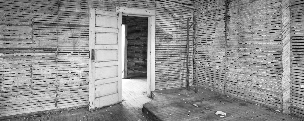
Had a three day weekend off, you'd think I could have got out and photographed but other than the grass image of Friday, I haven't had a chance. Christmas shopping, plumbing problems, time with my wife, they all add up, and I have it easy, my only child is 24, grown up and away from home - but hey, she's coming home for Christmas.

Sometimes I use statcounter to check to see who's visiting my site and from where. Not uncommonly this leads to someone else's blog and yesterday I read about the impending deadline for Review Santa Fe, a juried (90 applications accepted out of several hundred) to have your portfolio reviewed by a series of professionals from the art, museum, gallery, publishing, and professional photographic world.

Even if you aren't about to present your work to be juried or hoping for publication, it can be a worthwile exercise to decide on a theme and collect a series of images which you could present as a portfolio.

I chose to use the ranking facilities of Adobe Bridge (though in the future that might be Lightroom or some other cataloguing programme. I had a large collection of images that I'd prepared for the web so used that as a catalogue.

I had to pick a group of related images that could be explained by a single theme. Rules specified it could be either colour or black and white but not both which is pretty standard. I elected to choose colour images rather than black and white. This is not a trivial decision as I think I have some strong images in both media. I elected to go with colour for several reasons. First is that I suspect there will be a lot more black and white than colour work being shown at what is largely a fine art venue - it doesn't hurt to differentiate myself from the herd. Second, I picked industrial as my theme for two reasons. First is that colour landscapes run the risk of being better suited to calendars and postcards than galleries, but also the industrial images are less commonly seen and a particular interest of mine. I also had to take into consideration whether I have enough good images of any given category to provide enough images to make a strong portfolio. The rules for Review Santa Fe specify 20 images or less but imply that less could be conceived as a photographer lacking depth and in some circumstances would be a disadvantage. Right so I have my goal - 20 colour industrial images, reasonably compatible with each other and all strong enough to withstand critical reviews (and even get past the jury in the first place).

I selected out the colour industrial images and then added a few more I set the star rating on all to zero. I then set up a slide show and went through the images a few times and on the third trip through, started assigning stars to the images. Images I knew I'd want for the portfolio got five stars, possibles got 3 stars. I could now show only the three and more star images and went through several more times, raising and lowering the star count for images.

I'm sure you have your own way of rating pictures and making selections, what I really wanted to talk about is the issue of 'good enough' and 'nice' and 'wow'.

I ended up with a collection of about 30 images, all colour, all more or less industrial in theme.

First I eliminated images which while popular locally, really only work if you happen to live in Calgary. Next I eliminated a couple of images that while having lovely colour , were lacking compositionally.

I eliminated an image of window reflections downtown since it wasn't really 'industrial'. I added several images which while never popular in terms of sales, are I think good work. This portfolio is about my work, my creativity, my art, not about my sales. I wouldn't include work that has been received poorly by more than one critic but an image can be creative, strongly composed, meaningful and still not be something even I would hang on my living room wall.

I had read that the reviewers would be asking why a lot - why did you take this picture?, why did you compose it this way?, why does it mean something to you?, why did you think I needed to see it?

I imagined myself having to justify each of the images, and a few more that were just 'pretty' hit the dust.

Even if you aren't planning a submission, you might want to 'justify' a collection of your images like this. Imagine a stern looking reviewer peering over their bifocals an down their nose (can you do both?) and asking in a less than friendly tone one of the following questions.

1) why did you take this picture?
2) what makes you think someone else, anyone else, I, should look at this photograph?
3) what was important about the subject matter to you?
4) how does this image relate to the others you have shown me?
5) what are you trying to say with this image?

If you have ever presented your work at a workshop or to a gallery you are familiar with the types of questions that are asked. Note that they never ask about f stops, focal lengths or the number of pixels. That would be too easy. No they ask the tough ones, the ones that put you on the spot, the ones that can leave your jaw hanging, glassy eyed and tongue tied.

You could reject these questions as irrelevent but the answers are I think important, educating and self revealing. I think having answers will help you be a better photographer, more discriminative but also more focused on images that work.

If the only thing you can say about an image is it's nice, how the hell are you going to find more 'nice' images other than through luck? If on the other hand you can say it's nice because I like the solitude, or the power of water to erode this canyon, or the effect of time on this rusting machinery, or the feeling of power from this old locomotive; then you are in a much stronger position to make another strong image.

You may tell yourself that you take pictures because the alternative was cleaning the furnace room, that your doctor told you you needed a hobby, that you do it because you like 'playing' with beautiful tools.

ALl those points are right (not that you'd want to tell the reviewer that), but if you think about it, some things make you raise your camera and others don't. Some images make you think the trouble and expense were worth it, others do not. There are more profound reasons to shoot and to select certain images. You just need to do a little digging to find out what it might be, and you will be on your way to taking other good images.

Monday, December 11, 2006

Looking For Photographs

We've discussed what to look for, when to go photographing, even how to compose, but I haven't addressed the actual process of looking around and arguably that could be the most important skill. Both customers and other photographers comment that they know they wouldn't have seen the things that I have seen (and by implication missed the photograph). Here's some observations on looking:

1) he who chats isn't looking - nothing wrong with photographing with a friend, but finding photographs requires full attention.

2) cameras have only one eye, you should be looking through only one - many subjects which seem ordered, when seen without stereo vision become a jumble.

3) Observer movement separates things - once you stop to take the photograph, the important subject separation may not be there.

4) the odds of finding great photographs while only looking at your feet is poor at best - trudging along trails concentrating on where you place your feet may be vital, but you need to look up.

5) not all great subjects are at eye level - exercise those knees by squatting occasionally, by looking up and down.

6) the great shot may be over your shoulder - frequently look behind to check the view in the opposite direction.

7) Don't use your camera to look at the world until you have found something to photograph. You could miss the shot entirely or not see it because you have the wrong lens on.

8) If in an interesting area, set down camera and tripod and wander around without gear in hand. Use a viewing filter or cutout if you see something.

9) Squint - it's easier to sort out main compositional features through a dark viewfinder or darkish filter or just plain squinting.

10) If like me you have poor vision, try taking off your glasses and see the world in a blurr to look for interesting patterns and shapes.

11) consider using one of the 3 inch screen digital cameras as a viewing aid. You can even shoot a picture and turn the camera upside down to check composition), note though that it doesn't work as well if you don't shoot the picture first!

12) Think of what you are looking at as a series of forms and shapes rather than objects - that clump of birches on the left is a series of light coloured vertical lines rather than trees. That fallen log receding into the distance is a triangle.

13)and this is a tough one, try not to have preconceived ideas of what photographs you are looking for or going to find - fixating on the preconceived means you are likely to miss something that is even better. Besides, often the thing you expect has already been done by yourself or someone else - do you really need to do it again?

Saturday, December 09, 2006

More Dinosaur Provincial Park


Photographed before sunrise, the sky is lighting up but the sun hasn't shown yet. Shot with my 300 mm. lens in horizonal format, three images stitched with some cropping at either end to strengthen the composition. The mud above was significantly brighter and needed some toning down and warming up to blend in with the rest of the image.

Dinosaur Provincial Park


It was a difficult image to process. The 'bridge' blended almost exactly into the background gulley making it look like there was no bridge at all. Judicious darkening of the shadowed edge of the bridge then lightening of the background, using a brush with about 50% sharpness - enough to deliniate the edge without creating sharp lines where the manipulation occured.

Foam Patterns Below Dam

More From My Winter Garden


Learned something today - if you output in PTGui as a single layer, the images are blended with soft edges between and you run the risk of a double expsoure look if stitching didn't go well. Fortunately the software warns you if this is likely. On the other hand and what I now realize, if you output as layers with the idea of blending them yourself, all edges are razor sharp and even if alignment is perfect, the edges need softened. This is easy to do with a round brush with 80% hardness (to give adequate control to where the brush goes, but enough softness to make seams invisible).

Dead Grass V.2


Restitching turned out to be a nightmare, not because of software problems but because in making the three image stitch, I had been careless about aligning the camera/lens. With considerable effort in blending and then some cloning work I was able to remove all (I hope) of the noticeable stitching errors.

This kind of photograph is just about as difficult a stitch as you will find and does require careful alignment. It's close, it's 3 dimensional, the near and far cross each other and it's full of lines which really show stitching errors.

Note too that I included more of the image this time round. Although there is a bit of a pine on the left, in black and white it blends in so much that it doesn't interfere with the composition so I included it.

Friday, December 08, 2006

On The Way Out Shopping


OK, so I'm on my way out to do some Christmas shopping, and the next door neighbour wants to talk to me about her wrinkled eyes that she blames on a rash, and I'm looking past her at the garden that I never cleared up in the Fall, and there's this plant, and as she keeps talking, I'm thinking, that plant looks gorgeous and I bet it would photograph well (see prev. article on what photographs well), and so she leaves and I'm on the way shopping, and like, I'd rather be photographing, and well, the shopping can wait...

Seriously, the light coloured leaves photographed very well. There's a flaw in the stitching - one or more of the leaves have moved between exposures so can't be blended. For serious prints I will restitch with the output in layers so I can set the border between images manually and avoid the 'double exposure' look this shows in larger sizes. PTGui asks me whether I want a single output image or each masked part of the stitch as a separate layer. It's not difficult to adjust the borders between images by editing the mask of the overlying image.

Thursday, December 07, 2006

What Photographs Well?

We can discuss landcsapes versus street photography, abstract vs. glamour, but what I wanted to discuss here is what kinds of material photograph well, and for that matter which ones don't.

Ever think about whether dark subjects photograph better than light or the other way round. Do gradations have to be smooth or can they be harsh? Do patterned objects photograph ok?

I can spout off about my own theories but it might be more instructive to analyse the great photographs and see if there are any patterns. I'm going to make some observations from my experience looking at good photogtraphy

Observations

1) Light objects are much more important than dark. Think of Moonrise over Hernandez - it's the light buildings, the gravestones and the clouds that make the image. In Pepper # 30, it's the silvery highlights that make the image, not the dark tones. Far more good images have the light tone as the focus of the image. There are exceptions, but if you were a betting man...

2) Gradual changes in tone photograph better than sudden changes, other than to define a pattern. Think of the way that water photographs, or driftwood, peppers, skin, round objects...

3) Triangles photograph better than squares.

4) Light things look better against zone III - IV background than they do against a Zone V.

5) Diagonal lines generally look better than horizontal lines - and do a better job keeping your eye in the picture.

6) Wet photographs better than dry - makes you wonder why we all scurry indoors when it starts to rain.

7) Long soft shadows are generally better than short sharp deep ones (not much of a problem here in Calgary in December - we have decent shadows most of the day.

8) Partial sun is better than full sun.

9) Uneven clouds are better than completely even cloud cover as a light source.

10)Patchy sunlight (as in a noon day forest) is very hard to photograph.

11) Light coloured rocks photograph better than dark coloured ones. On the east coast we had lovely granite, on the west coast dull almost black rock covered in white bits (not all of which was bird poop) - guess which photographed better.

12) Age photographs better than new (except in people, and sometimes then too if you aren't trying to please the subject).

13) Tidy photographs better than clutter.

14) Circles photograph well and when shot off to one side are ovals which are even better.

15) S bends look great.

I'm sure you can think of exceptions to all of the above 'rules', hell, so can I, but they're a good place to start.

Wednesday, December 06, 2006

Toronto With Sony 707


From a trip to Toronto - my conference was over and my plane not due for a few hours so I wandered around the campus of U of Toronto including a war memmorial and the legislative buildings.

Optical Viewfinder Compromises

I wrote the other day about features I'd like in my next camera. Ever think about how much we 'pay' to have an optical viewfinder in our dSLR's and what would happen to camera design if we had a really good electronic viewfinder?

First, you could throw away the mirror - it's only function is to feed the view to the optical view finder - no mirror - no bounce - no noise - no blackout - no mechanical limits on 'motor drive'. Lenses could come closer to the sensor, just as they do in the new Leica M8.

Second, you could remove the shutter - consumer digital cameras don't have a shutter - they simply clear the sensor light wells of electric charge and let it build up for a period of time which is the equivalent of the open shutter time, then download a reading. At this point there are still advantages to having a mechanical shutter, but for how much longer?

An electronic view finder is easy to make tilt - how about a camera with a big sensor but built like the Sony 707, 828 series with the back of the camera tilting relative to the lens and sensor - I sure miss that feature since going to a dSLR.

So how close are we to an electronic view finder good enough for a pro grade camera? I'd have to say it can't be too long - certainly less than 5 years away. I have a Canon S3is for snapshots and family and it's electronic viewfinder is adequate at best. The other day a friend showed me his Panasonic FZ-50 - boy, very nice electronic view finder - almost enough to make me willing to give up the optical view finder.

So if they are that close, why haven't they offered a large sensor camera with interchangeable lenses and electronic viewfinder? Well, a couple of reasons.

First, although they are improving and the Panasonic and the Minolta A2 series viewfinders aren't bad, they aren't exactly great either - odd sparkles and not really fine enough for good focusing manually (except in magnified view). Perhaps more importantly they don't cycle the image fast enough for shooting action, and none so far can handle 'motor drive' mode without blanking out or freezing the image. Forget following your subject at 3 frames a second.

Once those problems are solved, your typical dSLR is sure going to look and work a lot differently and I for one am looking forward to it. That old bouncing mirror puts a lot of constraints on camera design and features and in the future people will shake their heads at the awkward temporary compromise of the flying mirror.

Consumer Digital As My Ideal Camera?


Andy has left a comment saying that in many ways his Sony 828 is very close to the ideal camera I discussed the other day, wishing only for a better sensor. Actually I had recommended the 828 for a friend who needed a camera for recording his engineering work, then turned round and asked him if I could borrow it to try it out. and one of the images from that afternoon is amongst my more popular prints.

Just yesterday I was looking at an 18X18 inch print I have which was shot on my Sony 707 (predecessor to the 828) taken with 12 shots from the 707 and stitched with PTGui. While 12 shots is a lot of effort, it's sure a lot easier than shooting 4X5 and in all other aspects it fits my ideal camera - tilting back (both lcd and viewfinder), live preview, magnified manual focus, etc.

Something else to consider in shooting landscapes with a consumer camera like this is that depth of field is terrific because of the small sensor. You lose a little in shooting multiple images (because to do so, you use a longer focal length setting and therefore get less depth of field for the larger prints you end up with) but still have a lot less problem getting everything in focus in comparision to full frame DSLRs. You don't need tilt shift lenses to keep things sharp, nor do you need multiple images for processing in Helicon Focus.

Your camera bag weighs 3 lb. instead of 30 lb. - it is a thought. I wouldn't move back to a 707, 828 style camera for normal shooting, but not everyone is prepared to drop $10,000 for a camera.

Tuesday, December 05, 2006

Monday, December 04, 2006

Dreams Of Cameras Future - Live Preview

Ever give much thought to what live preview would do for digital SLR's? It's not like it would take a fundamental change in technology - after all these cameras are capable of shooting at several frames a second - even if that didn't speed up - a live preview that updated three times a second would be useful in many situations. Here's a few of the things it would bring.

1) Histograms would happen before taking the picture - what a concept - the point and shoot's have this now - in fact it would open a whole new way of metering - you could specify ahead of time that you want to preserve highlights and the camera would show you the results of such plans before taking the picture - giving you the chance to either sacrifice some specular highlights or even to take more than one exposure to cover the whole dynamic range.

2) Accurate framing - no longer would less expensive cameras with only 90% viewfinders (a left over of the days when people shot slides and the slide mount trimmed about 10% so people were willing to live with this innacuracy) have no way to frame exactly - you'd used the lcd.

3) No more dark depth of field preview - you could see a bright well exposed image on the lcd at the actual f-stop.

4) Can you imagine what live preview would do for focussing? How about being able to put the focus check cursor on any part of the image desired and have a 100% magnification image appear on screen for either manual or auto focus or manual focus with auto confirmation. Wow! And with good depth of field preview, you could actually see if the f-stop is adequate.

5) Boy, would I like a tilting viewfinder on my dSLR.

There are lots of things I can think of adding to my 'dream' camera, but with one camera on the market already featuring live preview - it won't be long before many of them feature this.

Sunday, December 03, 2006

Underpass


Road Underpass, Calgary, Canon 1Ds2, 17-40 mm. @ 17 mm.

More From Hospital Construction


Saturday, December 02, 2006

Rockyview Hospital Construction


Two images from a tour this morning of the additions to our nearest hospital.

Ship's Bow Without Detail


Andrew asks the very pertinant question about leaving in clues to reality vs. removing them and obtaining a very abstract image. I confess I had thought of removing that little triangle of lettering (after I'd posted the picture) but not the others - here's the version without any of the lettering on the left hand side of the ship (I didn't remove the other side lettering as it isn't nearly as important.

Thoughts?

And just to remind you, here's the original straight on colour shot that I produced months ago.

Container Ship Bow Black and White


Vancouver Harbour in February, shot from the water on a chartered boat. Despite the sense of movement, the ship is in fact at dock and loading containers at the time (I wasn't that crazy). I like the straight on bow image seen on the blog previously but I also really like this image in black and white.

Friday, December 01, 2006

Ice Swirls


River Ice photographed after sunset, Elbow River, W. of Calgary. Looks rotten, wouldn't want to walk on it.

Thursday, November 30, 2006

Customers

Selling photographs at the local farmers market for two years was enjoyable and interesting - interesting because if you haven't worked retail before (not since a summer job many years ago), you learn a lot about customers.

I learned that:

People over 50 usually have little wall space for art so only buy if they are enthusiasts.

Young people are more likely than older to buy black and white.

Customers who almost buy but don't sometimes come back as much as a year later to purchase images - so be nice.

Chatting is a big part of selling images - which may go a long way to explain why I don't sell dozens of images in galleries but do well in person.

The information on the back of the print is as important as the image and often commmands more time of the customers than the images themselves - I describe the image and the circumstances of taking it. I used to go into the technicalities of shooting but now compact that into a single sentence. Customers like a story with the image and make a point of taking the 'blurb' and attaching it to the back of the frame and in one case to the front below the image.

People like to thumb through baskets of prints. If they see prints on stands, they often assume every print behind the first one is the same image and won't browse.

Women show more interest and buy a more prints than men, probably 2:1.

Young people tend to like abstract images more than middle aged people but it's not a hard and fast rule.

People surprise you with their ability to appreciate what you were trying to do in your images and it is quite common to get some very perceptive comments.

Colour far outsells black and white (even when they occupy equivalent space in the display - but much of the colour work is sold as decoration rather than as art so if you look only at 'art' purchases, probably black and white holds it's own. Mind you a fair amount of my colour work is abstract 'artistic' and wouldn't be purchased by the calendar liking public. Otherwise black and white would probably far outsell colour to art loving customers.

Some people insist on haggling about price but most do not, mind you I advertise substantial discounts for multiple print purchases.

A significant number of customers do subsequently come back to buy more artwork so it's vital to leave them feeling this was a good experience.

I offered an iron clad guarantee - they could return any print they didn't like, within a month, they could exchange any print within 3 months, they could purchase additional prints at discount for a month after purchase (and I would extend it quite happily for returning customers). I let customers pay for two prints but take four home with the idea that they'd pick the ones that worked best for them in their home. I took cheques and Visa and while a couple of times people didn't have room on their credit card when I ran it though, I was never once stiffed and no cheques bounced.

In two years I had one print come back that wasn't subsequently replaced with more or bigger prints. No one ever brought a print back and wanted a smaller one, fairly often though they would upgrade to a larger one.

I never sold enough small prints at $19 to even break even, but my daughter swore that looking through the cheap prints led to purchases of bigger prints and I think she is right - they'd stop for the $19 prints but purchase the larger ones.

Customers often wanted larger prints and I was able to pay off the cost of my 24 inch Epson 7600 selling large prints.

Panorama prints were quite popular and sold well despite the added cost - and of course it's a way to make larger prints without a bigger printer - bonus!

Some customers know their own mind but others really do need help.

Predicting which images will be popular is iffy at best and the images which generate the most positive feedback aren't necessarily the ones that are purchased most often.

It's rare for a customer to take home a particular image and change their mind - more often they come back looking for a companion image for the first one.

People amaze me at how quickly or slowly they decide on what they want - ok I can understand someone coming back and within seconds confirming that they want print 'A', but there are customers who discover you by accident and purchase a print in less than a minute, others who agonize over several prolonged visits - human nature at it's most varied.

Customers are interesting and interested and I regret none of the time spent talking with them.

Don't You Just Hate...

People who dent every single page of a book - did they not learn how to turn pages by age 5? Do they not see the mark they leave with their finger creasing the images? Of course, the short answer is NO - they are totally clueless and boy they ain't gona see any of my photography magazines or books. I cringe if I have left a book out on a table and one of my wife's friends starts thumbing through.

This reminds me of a comment by Fred Picker of people looking at photographs at an Art Gallery or museum or who are even handed a print to look at. Those who care about images are seen to move themselves or the image into a position which results in the fewest reflections. Those that don't, don't.

That's one of the beauties of inkjet matte paper - it doesn't matter which angle you view it from, unless of course you put it behind glass.

Which reminds me, it's bad enough having to look at photographs behind glass but I really hate non glare glass - sure you can see the image better but the quality of the image that you do see is less. Were the print to actually touch the glass, the quality isn't bad but the problem is that normally we try to avoid the print touching the glass in case of humidity issues and ferrotyping (less of an issue with inkjet than silver gelatin prints) and that distance is what causes image contrast degredation and masking of fine details.

Getting Your Work 'Out There'

Just received an email from Derek announcing an upcoming 'show' of his work at a local coffee shop. Another friend is a supporter of a French Lanuage School and has a show next Spring of his pictures of France. This summer I had the proprietor of a Truck Stop want me to place my photographs in his Restaurant (I had visions of grandeur through galleries at the time so said no, now I'm thinking I made a mistake).

there's only one certainty - if you don't look for venues, you aren't going to get your work seen. Here's some suggestions for getting your work 'out there'

1) display your work in your own home - so at least friends can see it - you never know who might have a useful idea.

2) display your work at work - even if you are a janitor and can only put up work in the storage room - anywhere's better than no where.

3) don't be afraid to ask - the school janitor might progress from the storage room to the main hallway and be seen by a local arts supporter.

4) anywhere with a wall is a possible venue.

5) while traditional glass framed prints is 'the norm', it's also expensive - it cost me $5000 for the framing for my recent show. Consider instead framless glass, plastic lamination, foam board mounting, cheap frames from Ikea, Walmart, Costco, etc. Standardizing on frame size is good, standard matte openings doesn't work or at least I think is too limiting.

6) Consider malls, libraries, restaurants, coffee shops, book stores, schools.

7) there are entire books on getting published and some useful free information in some of the audio blogs at Lenswork as well as in articles in back issues of Lenswork Magazine. The editorials in Lenswork are well worth reading.

8) Be ready to get your work out there - have a series of good prints always ready to show. At the very least these could be loose prints in a printing paper box. I'd strongly encourage a large white border for the prints (as if they were matted)and on real paper - not plastic and please not gloss. A heavier art paper will look a lot more impressive (unless you are talking wet darkroom in which case glossy dried matte will be just fine thank you). Better would be a portfolio box from somewhere like Light Impressions. A recent article on Luminous Landscape referred to printing on Epson enhanced matte then binding up to 110 images at the local bindery. the result was an attractive book of images for around $60. Moab Paper makes leather bindings for their paper to make an attactive presentation book though it isn't cheap either and I think I'm going to try the local binding method. If a lot of people are going to handle the prints, loose is probably better in so far as if one gets damaged, it's easy to replace. Don't make the prints so large that they can't be held easily - paper that is too thin or too large to support itself between the hands is an invitation to damage.

Feel free to add your own comments on venues that have worked for you, either generating sales, interest or feedback that has been helpful.

Wednesday, November 29, 2006

Atlas Coal Tipple II


I found Akvis Enhancer better for opening up shadows than Conectrix Tone Mapper (which perhaps is best reserved for multiple varying exposure images that need blended into hdr. Even with Enhancer, noise in the shadows is a problem with my 1Ds2 using Enhancer with the shadow slider turned up (they do warn you this is an issue).

Tuesday, November 28, 2006

Overseas Photographers Recommended?

Over at The Online Photographer Mike Johnston is celebrating one year of his blog with a list of 10 best photographers. I have already sent Mike a note of thanks and made a donation as over the last year I've had great enjoyment from reading his blog almost daily. Not surprislingly, since Mike is American, his 10 best list heavily favours Americans (and one Canadian). As I know that my blog is read at various times from dozens of countries around the world, I'd be curious as to who you would nominate from your country as the absolute best, and do you have a website we can refer to to see some images?

Suggestions please!

Monday, November 27, 2006

Inside Church At Dorothy


I thought I might show you some of the steps in making this image.

The first image is the result of Camera Raw, note that it's quite dark in order to preserve the highlights in the doorway.


The second image shows the results of Akvis Enhancer. More often I'd make some basic adjustments to the image first then enhance but I was curious to see just how much it could make of this image.


The third image shows a conversion to black and white - given the minimal amount of colour, I simply used a hue/saturation adjustment layer, saturation set to -100 (ie. none)


Here the image has been cropped - I felt the rooflines did not add to the composition and I was already seeing this as long and narrow.


I used free transform in Photoshop to correct the tilting right hand side.


More cropping and I lost some of the foreground floor so the floor lines would meet in the corner - I'm still not 100% sure that I did the right thing, but I think I did - time will tell.


I lightened the image with several ajustment curves, some increasing contrast, others just lightening. I also did some darkening on the floor.


For final adjustments I duplicated the image in a second layer and applied burn and dodge as needed. Dodging was all done with 'dodge highlights' which is the equivalent of bleaching. Burning was mostly done with 'burn shadows' but there was also a little bit of 'burn midtones'

As this is a recreation of what I did, you will see some minor differences between the bottom and top images, but it gives you the idea of the steps I went through.