Thursday, September 25, 2008

Guess Where I Am


I'm at Photokina in Cologne, soon to be on my way to Prague to photograph for a few days. The trip was complements of my publisher and it has been interesting meeting the various authors, including some who have 30 or more years experience teaching photography at university level - eg. Harald Mante, who is a photographer of incredible sense of colour and composition.

Not much chance for serious photography but the image above is a hand held ei. 800 image from the Aachen Cathedral - home to the throne of Charlemaigne - yes, that one!

By the way, it's really dark in there and you can't see this much detail by the naked eye.

Sunday, September 14, 2008

Art In Photography

A great deal of fun can be had, if you are inclined that way; in debating art and photography, art in photography, art vs. photography, art isn't photography (or more properly photography ain't art) and so on. The problem with such discussions (which often generate heated and passionate debate) is that they really don't serve any useful purpose than to entertain, said entertainment mostly supplied to those doing the debating, not the poor reader.

So the question today is - is there any role at all for discussing photography as art that can actually make a meaningful difference to the individual photographer? I think it can - I think that contemplating art in photography can make our images stronger and can increase the chance that images thereafter are more likely to have meaning for those viewing.

Although in my blog I have tended to write about the creative or artistic side of photography, seeing and composing and such, it could well be argued that these topics remain the purview of craft rather than art. That being the case, what can or should be said about the art in photography?

Without getting into a (meaningless) debate about what is art, it might be possible to discuss how one experiences art in general and then apply that to photography and usefully discuss ideas for making images with better artistic elements.

Let's take an imaginary trip to a painting gallery. There are some two dozen landscape paintings displayed, by a number of local artists. Prices are actually affordable so it's not inconceivable that if something really caught your attention, you could actually consider purchasing it for that spot over the sofa. There is no consistency in style (after all it's a group show of "landscapes", technique and interpretation up to the painter.

We make a quick tour around, suspecting as we do that local talent may be lacking and our expectations aren't terribly high. Still, you never know, and the greats were once unknown and so with at least the hope of seeing something interesting, we survey the works.

There are several pretty scenes which would not disgrace our living room, some that are just plain odd and a few which don't seem to display much skill, in colour or composition or whatever.

A couple of the images are just plain disturbing, and one image reminds you of some of your best hikes - odd because what it reminds you of is the smell of rotting leaves in the fall - almost like tea, and the sharpness of the cool yet sunny fall air. You can almost hear the rustle of leaves in the trees. Odd, because the image is semi abstract and clearly doesn't show a hell of a lot - so how could the artist possibly have put all that into his painting. Perhaps he didn't even know he'd done so. Maybe someone else seeing the painting gets an entirely different feeling from it.

It so happens that this is opening night and while most people are gathered round the wine and munchies, talking to each other, the artists are standing round the walls, just waiting for some interested person to talk to them. You find the painter of this semi abstract image apparently representing fall and start a conversation.

Rather than offer a leading question like "how did you get the rustle of the leaves into the painting", you ask the more open ended question of "what did you want me to see in this painting?".

Unlike some artists who have been "got to" by gallery owners and been taught to to talk "artspeak", this fellow is rather naive and gives quite straight forward answers. Turns out he didn't have an agenda. He feels interpretation is entirely up to the viewer and he can tell you that this evening he has already had several interpretations offered, each incompatible with all the others, and none having the least to do with the thoughts of the painter at the time.

You want more than this so and you press the artist to explain why he made this particular painting. He hesitantly explains that he was sitting on the toilet, looking out through the frosted bathroom window at leaves of a maple actually brushing up against the window, shifting somewhat in an apparent breeze. Obviously he has sat here on many occasions, but something makes him pay attention. It might be the light or the particular variation of fall colours (though they hadn't changed much in the last few days and only on that particular day had the urge struck to make a painting.

He suggests it might just be his mood on the day, a little wistful, a few days after his girl friend has gone on a trip to Europe. He was feeling restless and empty. Did he consciously plan to paint that - hell no, he'd only just thought of it when you asked the question, and the explanation wasn't likely any more accurate than the suggested interpretations offered by the other gallery goers.

You still aren't satisfied - there must have been a reason to not only pick up a brush but to select those colours, paint them in that particular way, with the composition chosen and painted in the style selected.

The artist stumbles on this, and finally, recognizing the failure of his answer, admits that "it just seemed right".

It's clear that there is no great existential "truth" in this image for the painter, and even learning of his frame of mind at the time doesn't really explain how you came to interpret the image the way you did, and it occurs to you that perhaps had your mood been different, you might have interpreted the image in an entirely different way.

You leave the gallery with some idea of the creative process and wonder how you can apply what you have learned in your own photography.

Lessons learned:

1) It isn't essential for a work of art to have a message, only that it be capable of interpretations, the latter being entirely personal to the viewer.

2) There needs to be a reason to take the picture, and thoughts of "it will sell well" aren't good enough. It has to be a reason that relates to the artist. In the case of the photographer, it probably isn't necessary to understand why, just enough that you thought something needed photographing, that it intrigued you in some way you aren't even aware of, or perhaps even the feeling of "gee, I can do something with that".

3) We have no trouble ascribing the term "artist" to a painter, but similar thoughts and drives and needs seem to happen to photographers, so why shouldn't we apply the term to photographers?

If we are willing to ascribe the term artist to at least some photographers, then to whom do we apply the term? Who clearly does or doesn't qualify and now does one decide? Does it matter if the photographer was on contract and being paid to produce the work? Well, most certainly almost all of the famous artists from Michelangelo to Rembrandt were most certainly on commission. Many modern artists have commissions from government agencies to work on a project, just as Edward Weston and Ansel Adams had Guggenheim Fellowships to explore projects. It's beginning to look as if there isn't a lot of difference between painters and photographers after all. Maybe photographers are artists after all, and perhaps even hobbyist photographers who see something interesting and photograph it and edit it are artists too, even if not terribly experienced, or talented ones. Just maybe there's a little bit of artist in all of us and we should stop worrying about whether we are being artful or not.

A lot can be learned from listening to great photographers speak about the motivations for their work. Sure a few, like Caponigro, couch their work in "artspeak" but the vast majority do not and their motivations and pathways seem not a lot different from ours.

I can highly recommend Edward Weston's Daybooks as useful reading to understand the mind of a great photographer. Attending workshops and conferences where you can be exposed to several great photographers can be helpful.

If nothing else, you are likely to learn that great photographers are human too, that their thought processes are typically similar to ours when out photographing - it's just that they have a better eye for the interesting, have more skill in composing and editing an image and perhaps most of all, are better at not bullshitting themselves into believing an image is "good enough" when your heart says no.

It is fascinating to look at proof sheets of the greats - that their proofs really don't look all that different from ours, except we didn't make that one image on the proof that really stands out compared to the rest. They knew they "hadn't got it yet" and kept striving till they did "get it" where we quit without perhaps even knowing that we could have gone further. They had the tools (mentally that is) and we didn't - therein lies the difference between the great and the good.

The difference between good and great isn't one of kind, but of degree, of effort, experience, skill, determination, and perhaps a recognition of a journey completed - "ahah, that's what I wanted".

Wednesday, September 10, 2008

On Photographing The Beautiful

Luminous Landscape has an article I wrote on the problems of photographing things that are already spectacular, and how one might deal with this problem. In the forum discussion there is an interesting thread in the site section at the top following up on the article that once you get past the nice things said starts to get interesting.

Monday, September 08, 2008

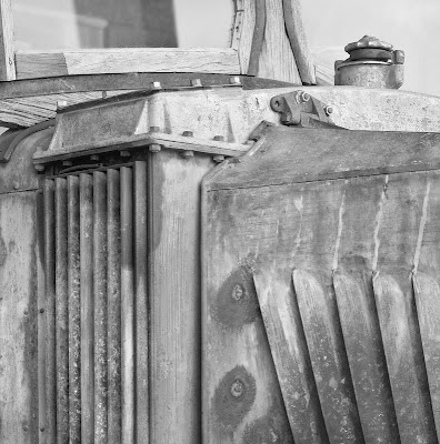
Truck


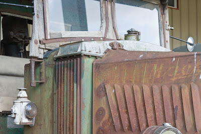
To make the image above, I started with the image below. I knew at the time that I'd be cropping either end. Perhaps I should have stitched a more tightly cropped image so nothing would be thrown away but fortunately with 16 mp, I can afford to do some cropping.


In the end, the headlight was problematic so I took a little off the bottom, and I ended up with too much sky reflected in the upper right hand corner so cropped the top a little too. I consider this fine tuning and was glad to have the option to crop just exactly so. Had I framed it "perfectly" in the original file(s), then perhaps I might have regretted it later (see previous blog entry for mistakes I make).

I worked on the colour image for a while, balancing the tonalities (too dark on the left bottom. I added some contrast and then added local contrast with Akvis Enhancer. I immediately backed up a step though and used the history brush on the enhanced step to apply the enhancement at a reduced degree (around 30%) as and where needed, including in a few areas stroking more than once so going beyond 30% as needed. Most of the image had no enhancement in the end, but other parts varied from 30-100% of the effect.

In the end I had a nice image, but the green and rust and pale blue of the sky clashed and I thought that the image might work better in black and white.

I darkened the blue slider to work on the sky reflected in the windshield, while using yellow and red sliders to increase tonality in the rust and green (in real life most green is far more yellow than green).

I liked what I saw but as often happens, needed even more contrast now that colour was not part of the information in the image. I added this selectively (not on the windshield) and used a couple more layers to lighten and darken as needed.

I didn't like the texture in the windshield on our left and so duplicated the flattened image and used gaussian blur of around 7 pixels to de-emphasize what was coming through the glass. A lot of blurring tends to look unnatural but this much carefully applied only to the windshield worked perfectly.

I decided that I still had a little bit too much almost white in that upper left corner so cropped even tighter than originally planned and feel the result is stronger.

That the end result is close to a square is just coincidence - it just worked out that way, but as you perhaps know from previous blogs, I am very fond of square images, so it certainly doesn't hurt.

Sunday, September 07, 2008

Success And Failure

After being out photographing yesterday and making a few prints today that I showed my wife and getting little enthusiasm for the results and realizing myself that though they worked out and were decent images, they certainly weren't great images, it occurred to me that it might be worth discussing the differences between a day in which really great images are produced, and one in which the images are ok but no more.

Regretfully, the most noticeable observation is that there isn't a lot of difference in the two days. I start out with equal enthusiasm and energy, my eye seems no more tuned on the great days than the others, my technique doesn't differ and the amount of effort I put in to working the locations doesn't vary.

Often but not always, I recognize a really great subject when I find it and know for the rest of the day that whatever else I find, it doesn't really matter because the day is a success already.

I felt that way when I photographed the rusty side of a boiler a couple of weeks ago and even though I have continued to refine my editing of the image since then, nothing has made me change my mind about the image.

For better or worse, I suspect that all one can do to make more of these kinds of images is to at least be prepared for them, to capture them properly and not screw up and offer ourselves the best possible negative or digital file we can.

Yesteday I was photographing with my friend Robin and he'd borrowed my 400 Tele-Fujinon for his 4X5. He found an image he was quite excited about, one of the old trucks, and was trying to capture the image with his 135 mm. lens (wide normal for a 4X5). I suggested trying the 400 on the grounds that he'd include a lot less background (ridged metal siding) if he could shoot from further away. Robin set up and determined his expusure which was for f22. Perhaps you don't use 4X5 but let me tell you that at f22 with a 400 mm. long lens on 4X5 you "ain't got no damn depth of field".

Robin has done this before, with his medium format equipment, finding out after the fact that his depth of field wasn't nearly enough to cover what he needed - I suspect that in the past he photographed things at infinity and I have been corrupting him with my work close up, but anyway, I suggested he stop all the way down to f64. Diffraction will limit the size of prints he can make, but I suspect that he will get a really good 8X10, which he wouldn't have at the wider aperture.

The other, harder and probably more important part of being ready for the great images is to not screw up the composition. There is nothing worse than getting home and looking at the proofs and realizing that you should have been a 1/4 inch to the left, that something sticks up from the background which in hind sight glares out saying careless. In a digital world, one can often shoot several attempts to ensure that "I got it", subject to wind and weather of course, but Robin had 10 sheets of film yesterday for a day's shooting - something he spent much of the day regretting, yet represents typical previous practice for him. Even with his limited amount of film, Robin tended to see something he liked and would then set up at that spot. I noted that in every case, Robin had his tripod (a rather short one) at full extension and that he didn't spend a lot of time working the scene, bending his knees or stretching to see if he really was in the best spot. If you do shoot large format film, even less can you afford to not work the scene.

If you truly fear that you might lose the shot - to changing weather or rotation of the sun, or the wind picking up - then go ahead and use a single sheet of film on that first setup, but rather than duplicating the image with a second piece of film as backup insurance, start working the area to be sure that you get the best possible image and use that second sheet for the "new and improved" setup. Perhaps the original will be the best, maybe you won't even get the chance for a second shot as the situation changes, but most of the time you will and some of the time, the second shot will be substantially better than the first.

Below is a list of screwups that even in the last few years have bitten me in the ass and prevented the recording of a great image. In days past it used to be exposure, but in a digital world there really is no excuse, and of course you can't have any darkroom accidents - every so often two sheets of film would stick together in the tank probably during aggitation - but that's history for me, for now, unless I succumb to the temptation to try out ultra large format with a 7X17. Anyway, on with the list:

1) depth of field - before I started shooting multiple images for blending in Helicon Focus, this was by far the most common problem. Depth of field scales on modern lenses are either useless or often just plain missing (no great loss). As I don't use the multiple image technique for the majority of my images, I still sometimes screw up.

2) cropping too tightly - I can blame the joys of looking through a relatively small viewfinder - and perhaps if my next camera has a 3 inch or bigger LCD I can be more exact, but even yesterday I shot an image in which I ended up cropping out the corner where two important lines met - not by much, but missing is missing. Sure it's important to use every pixel, but better you can't make quite as big an image but at least you captured all you intended. This issue depends somewhat on your viewfinder. As a lot of lower and medium level cameras have viewfinders which show less than 100% of the image, you may not even be aware of this problem. My camera viewfinder shows all, but can you really be sure it captured the last 1/4 inch in a scene that was perhaps 20 inches across - that's 1/80th of the image width in the viewfinder.

3) near to far alignment - again at the size of the view finder, can you be sure you aligned the two objects perfectly - perhaps you should use the playback zoom to check on the lcd that you did in fact get the alignment perfect.

4) the uncluttered background - it's not enough for you to think that telephone pole is hidden, you need to be sure, and did you remember to avoid the wires? It sounds silly, but in the excitement of a really good image, it's all too easy to screw up details like this.

5) Clipped highlights - if the light parts of the image are really important, it's not enough to assume that the recovery slider in Camera Raw is going to save your ass - make sure they are within range and if need be shoot a second exposure for the shadows.

6) flare. While I generally use lens hoods, the problem with zooms is that the hoods are of course designed for the widest focal length the zoom goes to, on a full frame camera (assuming it isn't a reduced frame only lens). If you go longer or you use an APS-C sensor sized camera, then assume the hood isn't going to be adequate. With really wide lenses, every speck of dust on the front surface is going to produce a diaphragm shaped flare in your image if there are bright spots either within your image or nearby - no matter how careful you are to use your hand or hat to block the sun from the front of the lens. Even sun on the side of the hoot creates problems if the shot you are recording is of something really in deep shade. A final brushing of that front element can reduce or eliminate hours of attempting to edit those flares in Photoshop - I speak from experience.

7) Vibration - in the excitement - did I really wait long enough after touching the camera for all vibration to settle, to then trigger the mirror release and wait again for a couple of seconds for vibration to settle. Some camera setups are more vibration prone - obviously long lenses for a start. But how about long exposures with IS turned on - IS isn't designed for 1 second exposures so turn it off. I found that even though my 70-200 f 4 zoom was small enough that it didn't have to use the lens bracket and I could mount the camera to the tripod, lens to the camera, in fact it stuck out enough that it really did magnify vibrations and using a lens mounting bracket has made a big difference. Besides, that's usually all I need for stitching with longer lenses as now I can rotate the camera around the lens. Sometimes a lens hood catched a cross wind and creates vibration. In windy conditions I sometimes hang onto the camera during exposure even though it's tripod mounted and I'm using a $1000 tripod. Yesterday, I noted that though Robin was using an older metal goodly sized Gitzo tripod, the ball head he was using was much too light for the purpose and considerable play and therefore vibration was set up between the top of the tripod and the camera base. Thou shalt not ever use rubber mats on tripod heads to protect your camera - either you want to save your camera as a collectors item, or you want to use it - you decide.

I dare say I make a hell of a lot more mistakes than that, but the above list consists of real problems I have and continue to face on a regular basis.

Do you even know what the problems are that you face - if you haven't done the detective work to figure out where your problems lie, then thinking about that might be your fist step to success.

More From Pioneer Acres


Saturday, September 06, 2008

Pioneer Acres Colour


Into The Country


The church was on the way, the other two images photographed at Pioneer Acres, a local club who collect, work on and play with tractors and trucks going back many years. We'd been shown the shiny like new indoor collection but soon found ourselves having a lot more fun and success with the as yet not restored vehicles outside.

Monday, September 01, 2008