

Being that time of year, it might be a worthwhile exercise to go through the images you made this year and pick out your best. I decided on 12 but it could be any number between 5 and 20. These should be the images you like best, not the ones you think will impress others or win contests or get published - simply the set of images you like most from the year's work. Although I am going to share mine, you certainly don't need to do so - simply making up a collection of your best of the year for yourself is just fine.
Having made the collection though, it would be a shame not to take advantage of the experience to learn and to move onwards.
1) what makes these images better than the others - is it better composition or a more interesting subject, technical matters or artistic?
2) is there a pattern to the images we have selected - in style, colour vs. monochrome, focal length, subject matter? If like a lot of hobbyist photographers you shoot a little of this, a tad of that - perhaps one or more of these images points to a possible project - something that interests you and that can be explored in depth?
3) how much do you really like these images - can you imagine still liking them 10 years down the road? If despite selecting your best they don't satisfy - can you figure out why - perhaps comparing them to some images of others that you particularly admire and spending some time analyzing the differences between yours and theirs.
Is it because they got up earlier and hiked harder, or waited for unique weather or were more observant, luckier or whatever - there's things to be learned here.
I'm not all that excited by my year in photography. I haven't been hiking as much, writing the second book has been distracting, it's been a stressful and distracting year all around, but I have put together the 12 best images of my year and you can see them here.
I note that 7 are black and white, 5 colour, though a couple of the black and white I also like in colour so there doesn't seem to be a pattern there.
There's only one landscape in the 12 reflecting my recent enthusiasm with industrial subjects. Sure my arthritis has limited my hiking but I could have worked within city parks so I don't think that's the answer.
There's only one person picture but shooting people is very new - who knows where that may lead.
There's certainly a hodge podge of images, from architectural to still life, portrait to grand landscape, quite abstract to very literal. When I look at the work of Michael Levin and admire his elegant clean simple and unified images I wonder what that says about me and me eclectic selection. Should I be settling down into either monochrome or colour and one style, and at most a few subjects, or does it really matter. I don't know the answer to this though have a nagging feeling I should be more consistent - but would that be to please someone else or myself? All very complicated.
Anyway, that's my year in images. See how you make out and what you can learn from the images you select.
Tuesday, December 30, 2008
Monday, December 29, 2008
The Perfect, Boring Picture
Imagine if you will an image which is beautifully printed, rich tones, well balanced. The image is perfectly composed, the lighting ideal, yet the subject matter is boring. Sound familiar? The above is what happens when the experienced photographer tries too hard. He or she uses all the skills they have but no matter how hard they (we) try, the image falls flat.
In some ways, there is give and take in the matters of composition and printing and number of pixels or size of film or lighting, so long as the subject is interesting in the first place. The more interesting the subject and situation, the more we are inclined to give in on the other aspects of image quality - up to a point anyway. Who hasn't at some time been affected by a picture in a newspaper. Clearly printing quality is minimal, lighting is usually irrelevant and composition very much secondary to the subject.
The problem is that no matter how well all other aspects of the image are executed, an interesting subject is fundamental.
One can argue - "interesting to whom?", since if it is a subject that interests you, there is sure to be at least one other person in this world who is also interested. What you have to do though is ask yourself whether even you were all that interested in the subject, or did you shoot it because you thought it would make a good picture (or at least hoped so).
By this point you may be asking yourself what is the difference between something that is interesting and something that photographs well? You might further be excused for asking "who the hell cares?".
I don't think there is a single sentence answer to the question above, well at least the first part, but I suspect that exploring the question could be useful the next time we go out looking for images.
First here's an example. I find an interesting shadow. It might be interesting because of it's shape or tone or because of how it interacts with something else. It isn't, of course; real yet it can certainly be photographed. Paul Strand took a photograph of a woman walking down the street next to a flat wall in New York. It was the shadow projected on the wall that made the image - the woman was essentially irrelevant to the image - or at least easily replaced. From an ordinary picture of an ordinary woman, the image is transformed because of the shadow into something trudging, weary, ominous perhaps. I can't find the image on the web so you will have to use your imagination.
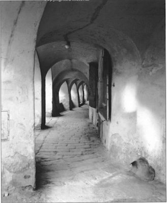
The image above is by George Todd - from his book Elements Of Black And White Photography. I think this an exceptional image and I would like to know more about this photographer. Anyway, the image above contains a number of elements that work for it - leading lines, interesting shapes and textures and a path leading to where? tends to add to interest. The little extra that makes the image is the light on the wall to the right nicely balancing the lighter parts of the subject on the left and also an interesting shape. Would this have been a decent picture without the light - certainly - would it have been a great image - I don't think so. It would be interesting to ask the photographer whether he in fact saw the arches and looked for a composition or did indeed see the interesting light projection then look for a composition within which to use it. Did he walk by her many times, possibly even taking pictures, until one day the light was perfect.
The above image, one of mine, is frankly pretty boring. It was almost the first image on a photo excursion in which the light was bad and the snow cornices, our ostensible reason for heading out, were nowhere to be seen. Often in this situation, the first scene you come across is one of "well, it isn't great, but let's get those cameras out and hope for the best, or at least get the first images out of the way so we can go find something really interesting"
I quite like the hills opposite the duck pond here. I have driven past many times and photographed here more than a few - never with any great success and frankly this day was no different.
The hills are vaguely interesting but it is the whole range of hills that is attractive, not just one segment, yet there are sufficient flaws in the scene to make a panoramic image less than ideal so one is left to photograph sections, which never have the appeal of the whole.
This particular image does have some things going for it but there isn't enough of a pattern to make a good image. I really dislike the two spruce trees at either side, one partially cut off. The lighting is totally flat. There's nothing wrong with soft lighting but this is taking things too far.
Bottom line is if you take something vaguely interesting and divide it into quarters, you should have little expectation that the quarters will offer up much for the viewer and so it is.
It is possible to make photographs for the edification of others - commercial photographers do that all the time - often with great creativity and talent and even in advertising photography it is possible to glimpse some of the photographer some of the time. Many setups though are the work of the advertising director and the skill and talent lie in translating their wants into a finished image, which pleases them.
In fine art or hobbyist photography it is most certainly possible to apply the same strategies. You decide that a particular subject or style sells well and that you ought to use it. Your pick your subject for it's reputation. Thus you decide to photograph in Yosemite and use large format in emulation of the greats of the past. To be fair, you like the outdoors but it is your first trip to Yosemite and as such you have no idea whether you have caught it on a "good" day or not, whether you have scouted the best possible images. The only thing you know of Yosemite is the images of others - from books and websites. You get frustrated when you can't find the same compositions - because the weather or season is wrong or bushes have grown or it was a dry summer. You can't find any compositions at all that don't remind you of the work of others. Emulation being one thing, outright plagiarism another. You do shoot, though not as many images as you had hoped, and on returning home you find them disappointing. You ended up with nothing that Ansel would have taken, yet nothing that you can really call your own and be excited about.
Bits and pieces of this story are repeated all over the world, all the time, by millions of serious minded photographers, many of them puzzled in the end as to what went wrong.
If you want to be excited by your own images (and who else should be as excited by them?) then you have to start with your own ideas. We can certainly borrow from the greats of history but in the end, if we aren't interested in the subject, or in doing something with the subject, then I fear we are doomed to disappointment.
This is all very well but so far it's a litany of what not to do and nothing of what could and should be done, other than the obvious "find something interesting".
I could give you a list of interesting things, but it would be my list, not yours, and were you to pick a subject from it, could you be sure you are tackling it for yourself and not because I thought you should. No, you are going to have to find your own definition of interesting. And it's not enough to say that you are interested in landscapes - do you like near, middle distance or distant vistas? Are you obcessed with near far compositions like Joe Cornish, or tightly cropped compositions like myself? Are you happier with drama in your images or do you prefer subtlety? Is it really the subject that matters or the way that light plays off a subject, regardless of what and where it is? Do you like straight lines or curves, dark tones or light, contrast or soft textures? Perhaps you are interested in S bends, whether they be highway or plant or human form? Are you mostly interested in shadows? Mayhap you most prize that which others cannot or will not see or are you most fascinated in puzzles - what is it, which angle is it viewed from and from how far?
Some are lucky and come to photography with ideas of what interests them, and like Michael Levin featured in this months Black and White Photography magazine, you are able within a relatively short time (in Michael's case, five years) to produce a body of work any of us would be proud to show. I don't know Michael but would bet that he was "seeing" long before he took up photography.
Those of us who come at serious photography from the angle of liking to mess with cameras and stuff before we learn to see have a much greater struggle. We assume our problem is equipment and we spend years and many dollars searching for the right answers. Far better we should have spent a year wandering around without camera, just to learn to see, to find out what we like, what makes us curious. When you get to the point that you absolutely can't stand not creating an image, then it's time to start shooting.
Perhaps a more reasonable suggestion would be to spend that year, with the camera you have and the lenses you own and without making a single extra purchase, to photograph the things you cannot stand not to record and at year end, make a portfolio of small prints, say 5X7 inches or so (or even to make a web folio without making any prints at all) of your year's work. Far better a folio of lovely small images than mediocre large ones. If you must spend money, then buy books, attend courses, go to workshops, immerse yourself in the work of really good photographers.
I'm going to risk telling you what interests me - though perhaps you already know from looking at my images. Remember though that this isn't your list, only an idea of how you figure out what interests you.
O.K, so I like clean simple design - whether it be a car, living room furniture or art. I like regularity - verticals that are vertical, else they are sufficiently diagonal not to pretend to be vertical. I like things with weight to them - A Henry Moore sculpture rather than something made of wire and air.
The above image by Lewis Baltz is one of my all time favourites. It's simple, geometric, monochrome, painterly, in a way abstract. How can a man who time after time has recommended and referred to Pepper # 30? I don't really know. They are certainly different in just about every way but who said I had to have only a single interest - wouldn't I be the dull boy if it were true, not to mention frustrated?
Here's an exercise for you to try - let me know how it works for you.
From the following list of values, select one or two possibilities from each list.
Your favourite:
1) tone, from black to white
2) shape
3) line
4) texture
5) lighting
6) compositional tool
7) shadow or light
8) painterly or realistic
9) flat or three dimensional (at least in appearance)
10)colours (remember saturation and luminosity)
11)warm or cold
12)sharp or rounded
13)soft or stiff
14)light or heavy
15)mobile or fixed
Feel free to add any other descriptors you can think of, without naming a subject matter.
Write out the list and read it through several times. Now, without picking up your camera and with the limitation of not leaving your property and with list in hand, spend an hour wandering around looking for things which have some of those characteristics. No cheating now - one full hour - sixty minutes of looking, searching, comparing with your list.
At the end of an hour ask yourself if you didn't see something you could imagine taking a photograph of. Even better, do take photographs of the things you found that had a connection with your list. Make yourself a little slideshow on the computer of these images, with only the most basic adjustments.
Now spend some time looking at the images you made and instead of evaluating each image for it's worth in the world of fine art photography - look at the body of work and ask yourself if it says anything about you - did the list mean anything, and does it perhaps suggest to you future avenues to explore.
I warn you that I have not done this exercise myself, nor recommended it previously and don't know how it's going to turn out. It's my feeling that it will be revealing and helpful but that's all.
I don't expect any of the images produced by this exercise to make it into your portfolios of best images of the year - that wasn't the point, but has it suggested what to look for in the future - that is the question of the day.
Do let me know if you try it - I'd be happy to see small samples of the images you produce and hear of the outcome of the experiment.
Next time I want to address the subject of "Interesting, but is it photographable?" which is, I think, our second biggest stumbling block.
In some ways, there is give and take in the matters of composition and printing and number of pixels or size of film or lighting, so long as the subject is interesting in the first place. The more interesting the subject and situation, the more we are inclined to give in on the other aspects of image quality - up to a point anyway. Who hasn't at some time been affected by a picture in a newspaper. Clearly printing quality is minimal, lighting is usually irrelevant and composition very much secondary to the subject.
The problem is that no matter how well all other aspects of the image are executed, an interesting subject is fundamental.
One can argue - "interesting to whom?", since if it is a subject that interests you, there is sure to be at least one other person in this world who is also interested. What you have to do though is ask yourself whether even you were all that interested in the subject, or did you shoot it because you thought it would make a good picture (or at least hoped so).
By this point you may be asking yourself what is the difference between something that is interesting and something that photographs well? You might further be excused for asking "who the hell cares?".
I don't think there is a single sentence answer to the question above, well at least the first part, but I suspect that exploring the question could be useful the next time we go out looking for images.
First here's an example. I find an interesting shadow. It might be interesting because of it's shape or tone or because of how it interacts with something else. It isn't, of course; real yet it can certainly be photographed. Paul Strand took a photograph of a woman walking down the street next to a flat wall in New York. It was the shadow projected on the wall that made the image - the woman was essentially irrelevant to the image - or at least easily replaced. From an ordinary picture of an ordinary woman, the image is transformed because of the shadow into something trudging, weary, ominous perhaps. I can't find the image on the web so you will have to use your imagination.

The image above is by George Todd - from his book Elements Of Black And White Photography. I think this an exceptional image and I would like to know more about this photographer. Anyway, the image above contains a number of elements that work for it - leading lines, interesting shapes and textures and a path leading to where? tends to add to interest. The little extra that makes the image is the light on the wall to the right nicely balancing the lighter parts of the subject on the left and also an interesting shape. Would this have been a decent picture without the light - certainly - would it have been a great image - I don't think so. It would be interesting to ask the photographer whether he in fact saw the arches and looked for a composition or did indeed see the interesting light projection then look for a composition within which to use it. Did he walk by her many times, possibly even taking pictures, until one day the light was perfect.

The above image, one of mine, is frankly pretty boring. It was almost the first image on a photo excursion in which the light was bad and the snow cornices, our ostensible reason for heading out, were nowhere to be seen. Often in this situation, the first scene you come across is one of "well, it isn't great, but let's get those cameras out and hope for the best, or at least get the first images out of the way so we can go find something really interesting"
I quite like the hills opposite the duck pond here. I have driven past many times and photographed here more than a few - never with any great success and frankly this day was no different.
The hills are vaguely interesting but it is the whole range of hills that is attractive, not just one segment, yet there are sufficient flaws in the scene to make a panoramic image less than ideal so one is left to photograph sections, which never have the appeal of the whole.
This particular image does have some things going for it but there isn't enough of a pattern to make a good image. I really dislike the two spruce trees at either side, one partially cut off. The lighting is totally flat. There's nothing wrong with soft lighting but this is taking things too far.
Bottom line is if you take something vaguely interesting and divide it into quarters, you should have little expectation that the quarters will offer up much for the viewer and so it is.
It is possible to make photographs for the edification of others - commercial photographers do that all the time - often with great creativity and talent and even in advertising photography it is possible to glimpse some of the photographer some of the time. Many setups though are the work of the advertising director and the skill and talent lie in translating their wants into a finished image, which pleases them.
In fine art or hobbyist photography it is most certainly possible to apply the same strategies. You decide that a particular subject or style sells well and that you ought to use it. Your pick your subject for it's reputation. Thus you decide to photograph in Yosemite and use large format in emulation of the greats of the past. To be fair, you like the outdoors but it is your first trip to Yosemite and as such you have no idea whether you have caught it on a "good" day or not, whether you have scouted the best possible images. The only thing you know of Yosemite is the images of others - from books and websites. You get frustrated when you can't find the same compositions - because the weather or season is wrong or bushes have grown or it was a dry summer. You can't find any compositions at all that don't remind you of the work of others. Emulation being one thing, outright plagiarism another. You do shoot, though not as many images as you had hoped, and on returning home you find them disappointing. You ended up with nothing that Ansel would have taken, yet nothing that you can really call your own and be excited about.
Bits and pieces of this story are repeated all over the world, all the time, by millions of serious minded photographers, many of them puzzled in the end as to what went wrong.
If you want to be excited by your own images (and who else should be as excited by them?) then you have to start with your own ideas. We can certainly borrow from the greats of history but in the end, if we aren't interested in the subject, or in doing something with the subject, then I fear we are doomed to disappointment.
This is all very well but so far it's a litany of what not to do and nothing of what could and should be done, other than the obvious "find something interesting".
I could give you a list of interesting things, but it would be my list, not yours, and were you to pick a subject from it, could you be sure you are tackling it for yourself and not because I thought you should. No, you are going to have to find your own definition of interesting. And it's not enough to say that you are interested in landscapes - do you like near, middle distance or distant vistas? Are you obcessed with near far compositions like Joe Cornish, or tightly cropped compositions like myself? Are you happier with drama in your images or do you prefer subtlety? Is it really the subject that matters or the way that light plays off a subject, regardless of what and where it is? Do you like straight lines or curves, dark tones or light, contrast or soft textures? Perhaps you are interested in S bends, whether they be highway or plant or human form? Are you mostly interested in shadows? Mayhap you most prize that which others cannot or will not see or are you most fascinated in puzzles - what is it, which angle is it viewed from and from how far?
Some are lucky and come to photography with ideas of what interests them, and like Michael Levin featured in this months Black and White Photography magazine, you are able within a relatively short time (in Michael's case, five years) to produce a body of work any of us would be proud to show. I don't know Michael but would bet that he was "seeing" long before he took up photography.
Those of us who come at serious photography from the angle of liking to mess with cameras and stuff before we learn to see have a much greater struggle. We assume our problem is equipment and we spend years and many dollars searching for the right answers. Far better we should have spent a year wandering around without camera, just to learn to see, to find out what we like, what makes us curious. When you get to the point that you absolutely can't stand not creating an image, then it's time to start shooting.
Perhaps a more reasonable suggestion would be to spend that year, with the camera you have and the lenses you own and without making a single extra purchase, to photograph the things you cannot stand not to record and at year end, make a portfolio of small prints, say 5X7 inches or so (or even to make a web folio without making any prints at all) of your year's work. Far better a folio of lovely small images than mediocre large ones. If you must spend money, then buy books, attend courses, go to workshops, immerse yourself in the work of really good photographers.
I'm going to risk telling you what interests me - though perhaps you already know from looking at my images. Remember though that this isn't your list, only an idea of how you figure out what interests you.
O.K, so I like clean simple design - whether it be a car, living room furniture or art. I like regularity - verticals that are vertical, else they are sufficiently diagonal not to pretend to be vertical. I like things with weight to them - A Henry Moore sculpture rather than something made of wire and air.

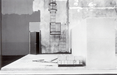
The above image by Lewis Baltz is one of my all time favourites. It's simple, geometric, monochrome, painterly, in a way abstract. How can a man who time after time has recommended and referred to Pepper # 30? I don't really know. They are certainly different in just about every way but who said I had to have only a single interest - wouldn't I be the dull boy if it were true, not to mention frustrated?
Here's an exercise for you to try - let me know how it works for you.
From the following list of values, select one or two possibilities from each list.
Your favourite:
1) tone, from black to white
2) shape
3) line
4) texture
5) lighting
6) compositional tool
7) shadow or light
8) painterly or realistic
9) flat or three dimensional (at least in appearance)
10)colours (remember saturation and luminosity)
11)warm or cold
12)sharp or rounded
13)soft or stiff
14)light or heavy
15)mobile or fixed
Feel free to add any other descriptors you can think of, without naming a subject matter.
Write out the list and read it through several times. Now, without picking up your camera and with the limitation of not leaving your property and with list in hand, spend an hour wandering around looking for things which have some of those characteristics. No cheating now - one full hour - sixty minutes of looking, searching, comparing with your list.
At the end of an hour ask yourself if you didn't see something you could imagine taking a photograph of. Even better, do take photographs of the things you found that had a connection with your list. Make yourself a little slideshow on the computer of these images, with only the most basic adjustments.
Now spend some time looking at the images you made and instead of evaluating each image for it's worth in the world of fine art photography - look at the body of work and ask yourself if it says anything about you - did the list mean anything, and does it perhaps suggest to you future avenues to explore.
I warn you that I have not done this exercise myself, nor recommended it previously and don't know how it's going to turn out. It's my feeling that it will be revealing and helpful but that's all.
I don't expect any of the images produced by this exercise to make it into your portfolios of best images of the year - that wasn't the point, but has it suggested what to look for in the future - that is the question of the day.
Do let me know if you try it - I'd be happy to see small samples of the images you produce and hear of the outcome of the experiment.
Next time I want to address the subject of "Interesting, but is it photographable?" which is, I think, our second biggest stumbling block.
Saturday, December 27, 2008
Vase

Lensbaby on the 1Ds2, wide open, hand held - the computer says 1/2500 but I know different. Did learn that the lensbaby doesn't work well with extension tubes - better to get the close up filters Lensbaby sells - not only did it not work electronically (the camera refused to take a picture), the tilt is now even further from the sensor rendering the tilt mechanism even more problematic. This was shot with the +4 close up filter.
Saturday, December 20, 2008
Web Site Updated
It's -28 Celsius and I'm not happy about it, but did take the opportunity to finally update some of the images on my website.
There are another 100 or so images between colour and black and white industrial in
Gallery 5
and
Gallery 6
colour industrial and
bw industrial gallery 2.
Most of the images have been in the blog but are now all together.
There are another 100 or so images between colour and black and white industrial in
Gallery 5
and
Gallery 6
colour industrial and
bw industrial gallery 2.
Most of the images have been in the blog but are now all together.
Tuesday, December 16, 2008
Imitation Holga

Billie expressed concerns that she might not be able to get results equivalent to her previous very successful use of a Holga 120 film camera with her new Lensbaby Composer.
The above image was shot with the Composer, full frame camera, 5.6 cropped to square, masked along the edges and some blurring of a duplicate layer, then faded back with the layer slider. It looks a bit like a Holga image and perhaps with more work we could do better.
Lensbaby Adventures 2

The image above is with the lensbaby centred and f 5.6 on a full frame sensor camera.

The image above is f 2 (ie. wide open).

Now we have the lens baby tilted up so only the upper edge has any sharpness

and in the last image above we see the lensbaby tilted modestly to the right.
I had forgotten that in a lens with peripheral aberations, the size of the sensor would make a huge difference and it does - at 5.6 and centred and small sensor, looking through the lensbaby you have to look to see the blurring in the viewfinder (though it's more obvious in the images themselves) but with a full frame sensor, the edges are extremely blurred.
Monday, December 15, 2008
Lensbaby Composer

- image above from Lensbaby website

I've been considering a Lensbaby for some time and a recent cold snap was the final impetus to go out and purchase one. It seemed sensible to pick up the latest (and presumably best) Lensbaby, the Composer model.
The original Lensbaby came with a plastic corrugated tube which could be flexed and stretched and shortened as desired. Another model added Sputnik like appendages to the outside to control the positioning of the tube. The most recent Lensbaby Composer uses a ball and socket arrangement to rotate the lens, while beyond the ball and socket is a standard rotating focusing mechanism that moves the lens in and out, much more like a traditional lens.
I had understood that one could swing the lens to align plane of focus as needed but that's not quite accurate. In reality, there is no plane of focus, rather a central sweet spot with surrounding and ever increasing blur and stretch of the image. The degree to which this happens is a function of depth of field but of course if you stop down to increase the size of the sweet spot, you reduce the blurring at the edges of the image.
What really happens as you tilt the lens is that the sweet spot moves from the centre of the image to the outside and possibly beyond the image so that nothing is sharp. It's a little more complicated though. At least some of the blurring off centre is due to a change in the plane of focus (this with the lens all squared up - by eye, there are no marks or centre detent). This change in focus means that things nearer the camera are sharp and the closer to the edges of the image, the nearer is the plane of focus. It mght be more accurate to describe it as a cone of focus, or perhaps even better a bowl of focus.
In theory this sharpness of nearer things should allow you to tilt the lens to get two things sharp at the same time which are not equidistant, but in fact the way the lens is built (unlike a regular tilt and shift lens) is that as the lens is tilted, nothing is sharp at any distance as you move away from the now off centre sweet spot. All this has to do with the fact that the centre of rotation of the ball and socket is in fact well forward of the sensor and tilting the lens puts you well into the periphery of the lens' coverage. A normal tilt and shift lens doesn't pivot around anything, rather it slides over a curved surface designed so that the curve would be centred on the sensor - thus maintaining lens maximum resolution when tilting.
Now, none of the above is necessarily a disadvantage, just a bit of a surprise to me and not quite what I had expected. It would be better to think of lens tilt in this case controlling the amount of blurring and the placement of same rather than trying to control a plane of sharpness. After all, you buy the lens for it's blurring capabilities, not its off axis sharpness.
I haven't had much chance to explore the lens capabilities but look forward to doing so and you can be sure you are going to be subjected to anything I find interesting.
I welcome comments from those who have made more use of their Lensbabies. Before purchasing it I did spend some time searching the net for images which make good use of the Lensbaby. Unfortunately there are far more bad examples than good and even most of the images on the Lensbaby site leave something to be desired. It isn't a digital Holga, but I am still hopeful it can be used effectively.
Friday, December 12, 2008
Placing The Subject/Moving The Photographer
In any given photograph there are a number of elements which make up the subject which you are capturing. At times they are fixed relative to each other - for example you are photographing a rockface or graffiti on a wall - there is nothing to arrange. Your job in that case is to find the best angle to record the image and to frame it in the best way.
Often however, the various elements of the subject are not on a single plane and your camera position will affect how they relate to each other - overlapping, next to and just touching or near by. Through height of camera position you can affect the same issues vertically as you can horizontally by moving around.
In one camera position two objects can be equidistant, but as you move left or right, one is going to be closer than the other and their relative positions change, sometimes significantly. You have to decide what relationship works best for a given image. This can be relatively painless if there are only two separate objects in the image - say a tree and a rock, but becomes much more complex as the number of objects increase. In this case you find that while moving to the left will increase the spacing of one pair of objects, it narrows the gap between others.
How do you decide where to place all these objects relative to each other through camera position? What happens if this is a still life and you can physically pick up the objects and move them where you will? Are there rules that you can follow?
Before getting to what you should do, lets first contemplate what the significance is of relative position - perhaps that will give us clues as to what to do with them.
Remember too that while I write of "objects", they may in fact not be real, touchable, things. They might be a shadow or a highlight on the background.
At a most fundamental level, placement of the objects helps us understand the image. Since an image is two dimensional, placement helps us understand the relative positions of the objects. When one overlaps the other, it is clearly in front, while if they are next to each other, we don't know that. They might touch in the image but it doesn't mean they are next to each other. You may want to use this ambiguity to supply your viewer with a bit of a puzzle - something to wonder about, or you might prefer to make it clear where the objects are to enhance understanding.
Where the objects are located within the image has some bearing on how we interpret the image. We live on a planet surface and virtually all the time we can assume that what is at the bottom of what we look at is near, and the top far. As the photographer you have the possibility to confirm that or litereally turn it on it's head.
More subtly though, we tend to see bright objects as nearer, dark as further, large as near, small as far. To some degree you can filter or manipulate the image to lighten and darken objects in the editing to change that - for example two rocks of equal brightness could have one darkened and the other lightened and now there is a strong sensation of the light rock being nearer than the dark one.
Because of atmospherics however we also have the sensation that things that are light and soft and low in contrast appear very distant, while objects that are sharp contrasty and with a full range of tones including some good blacks are relatively near. This gives you the opportunity to use depth of field to give a sense of distance to objects - being out of focus and being light and with no good blacks would mean the object is assumed to be distant.
It is natural for the viewer to go from object to object as he or she looks at the image and the relative positions offers a chance for the photographer to tell a story or to introduce the main object or to explain it. The positions of the other objects will contribute significantly to how well that explanation, introduction or story comes across.
Fundamentally some arrangements are more attractive than others and create a visual path through the image, whether this is an S shaped path or the four corners of a rectangle or three of a triangle. "Placing" the objects in one of these patterns can give an image a sense of rightness, balance, peace or just the opposite.
Placing two objects next to each other in the image creates a connection between them, whether you wanted it or not, so you need to know if that is in fact what you want.
The more experienced the photographer, the more fine photographs that have been studied, the more images made, the better a photographer becomes at simply looking at the subject and knowing what seems right. Even after years however, it is often not obvious what is right and you actually do have to think about all of the above as you move around the scene trying to find the best viewpoint. For novice photographers it can be a nightmare trying to arrange things rightly. In fact novices often don't even know when they have done it wrong - or if they do, why, which can lead to a lot of frustration. The more levels you understand your images on, the better you can find your viewpoint.
Monday, December 08, 2008
Thoughts on Inclement Weather
After shooting yesterday in a snowstorm, a few points occurred to me.
1) wide angle lenses will show closer snow with less blurring
2) distance from subject will determine the amount of snow between you and the subject - use accordingly to control the atmospheric effect you want - keeping # 1 above in mind.
3) lens hoods are essential. Do remember, if you use a lens which covers a full size sensor on a small sensor camera that the lens hood is not restrictive or long enough. You may want to use one for a longer lens or extend it, especially on top to keep snow and rain out.
4) nothing is more frustrating than getting rain or snow on the viewfinder, and it's darn hard to reach in there and wipe off. Carrying a cloth dedicated to cleaning the viewfinder and LCD can be handy.
5) a hat with a goodly brim can avoid some of the precipitational issues.
6) wet fingers get cold really fast and even around freezing can get darn cold.
7) most cameras will handle a modest sprinkling of rain or snow especially for short periods of time but if you plan to spend two hours photographing in the rain, you want to think of protective coverings.
8) misery loves company - take someone else out shooting with you - it's harder to back out.
Sunday, December 07, 2008


Saturday, December 06, 2008
Another Find From The Archives

My appologies for my absence from the blog in this last two weeks. I have two excuses, for what it's worth. I have been busy on my second book, tentatively called "Camera To Computer". It consists of a series of images and how they were made - either dealing with in the field issues or image processing from raw to finished. There are manual blends, Auto blends, there are even people images!
My deadline for the manuscript is May 31, and while that sounds like a long time off, previous experience tells me I'd better get my butt in gear.
Anyway, I had to reprocess one of my images for the book which meant going back to the raw files of 2003. Stitching is a lot easier these days and it took minutes to put together a stitch I'd overlooked previously and the above is the result.
I'm not too sure that the image may be too complicated, with a whole series of nice things, which don't quite come together. So far I have persuaded myself they do, but this may not stand the test of time. Fact is it's near the limit of complexity - I'm just not sure which side of the limit it stands on - yet.
In fact it is a crop of a larger pan of even more great things which clearly didn't work for me - see below.

Oh, the second excuse - I have had a fourth year medical student with me the last two weeks which while challenging and interesting, also eats up any spare minutes at the office and then some.
Friday, November 21, 2008


Back Photographing Logs


Not really all that different from the images made the other day, but it never hurts to have a choice. I was dropping off a couple of prints for the business so decided I might as well see what I could shoot.
You don't want to be standing on the road photographing - the special lifts come flying round the corner carrying half a dozen sixty foot poles at 20 miles an hour, I was very careful to stand on the grass and back off any time I saw the loader coming anywhere near.
I used my 70-200 as well as my 300 mm. lenses for these shots, using focus blending with Helicon Focus for depth of field.
Thursday, November 20, 2008
As Good As Your Heros Without Copying Them
Who wouldn't like to produce an image every bit as good as something one of your heroes made, without simply reproducing it? It's a bit like the "How Do You Get To Carnegie Hall" anecdote. But is there a way to make an image of this quality without simply waiting for it to happen naturally and over time?
I think that if you have the competence to get focus right and produce sharp images and know how to make prints with rich tonality then it should not be that difficult to make an image as good as one you admire. Now, it might not have that little extra magic ingredient that takes an image from admirable to wonderful as I wrote about in my book, but most of us would settle for admirable images on any given day.
So how would you go about making an image as admirable as the one you admire?
Consider the following attributes of the image you admire:
Subject matter - well, you can certainly copy the subject matter since no subject is new, although perhaps you can find an analagous subject which you could treat in a similar way.
I'm at the office and have no access to my files, and perhaps I shouldn't use one of my images as an example, but here goes anyway:
My "ship's bow" images, both the black and white and colour one are often admired so how would you go about making another image as good (hey, I struggle with that too, guys and gals)? The towering ship is about power and threat and force - perhaps you could photograph a locomotive or truck, a building or a machine with similar attributes. Hell, you could even find a person who represents those feelings and photograph them in a similar way.
These two images of mine have particularly strong, simple, bold design - well you might have to do some searching to find a subject that fits the first criteria and now matches these requirements. I didn't say you could pull it off on a 15 minute coffee break.
SO if you found a powerful imposing, threatening, looming machine in which you could photograph it in a bold simple design - you'd be well on your way to producing an image as good as mine.
If you further could do so with a limited colour palette or interesting tonalities in black and white you'd really be cruising. Add some shadows of interest and you have a winner.
Now, wasn't that simple? At least in theory? Assuming you could find such a subject?
I actually don't think it would be all that hard to get most of the elements solved. It might be the local garbage truck or maybe the air conditioner on top of your apartment, or maybe a local weight lifter carefully lit. The looming object might even be six inches high and you just made it look like it's looming. Of course most of us just see the container ship and sigh for a lack of opportunity to shoot the same thing. Maybe the container ship isn't in fact the important part of the image that we want to copy.
Tuesday, November 18, 2008
What Photographs Do
Perhaps you haven't thought about what your photographs actually do. OK, I know they just sit or hang there, but the image has a relationship to the original scene so one could say that the image does something to the original scene.
Let me explain:
an image could be illustrative - it simply shows what was going on. It can evocative - that is it represents a whole class of things and reminds you of them - for example the expression of a child with a hand in the cooky jar - it doesn't have to be your kid yet we make a connection with that scene.
An image can be explanatory - showing how something works or why it's there or how it got in that condition. It can be interpretative in that the scene means something to the photographer and what he photographs is that meaning more than the scene itself. The image could show the risk or pain, fear or pride.
The connection of an image to the scene can in fact be quite loose as the photographer simply uses the scene as raw material for a creation, which through framing, editing, blending or whatever results in an image with very little connection to the scene.
Do you know what your images do? Do you even care? Is this similar to how you see images you admire? If your images are illustrative and the ones you admire are interpretive, just maybe this might explain your frustration with your own images, or why you haven't been published.
Why don't you look up some of your favourite images by the greats and ask yourself what those images are doing and see if your images are doing the same thing. Might just be interesting and informative.
Saturday, November 15, 2008
Wokring The Scene


It's a bright overcast morning today, quite warm for November and very little wind - ideal photographing weather. I decided to start out by photographing the dead plants in my own back garden. I was attracted to the light iris leaves lying in interesting patterns and tried several compositions. I think they are ok but am bothered that the patterns aren't as strong as I would have liked, nor the image as uncluttered as would photograph best - a matter of the eye and brain being able to ignore the unimportant while the camera pays equal attention to all.
The other thing against these images is that frankly, it isn't very original and even if technically competent, the images don't have a huge amount to offer. The grasses in an old oak barrel with the horseshoe of snow I found more interesting, more original (remembering that nothing is ever totally original in photography). I'm not sure that the image doesn't need more contrast - it looks a bit flat in my web browser, but it might print very nicely = time will tell.
Anyway, not a bad start to the day.
Thursday, November 13, 2008
Lenswork News
Big news from Lenswork with the return of their special editions. You may remember that in the past Lenswork made selected images available inexpensively - they took original photographic prints and scanned them, made digital negatives from them and then contact printed onto silver paper to produce high quality silver prints which were a close match for the original print. Over time the materials and expertise to make the digital negatives disappeared and so we haven't had Special Editions for a few years.
Brooks Jensen has brought back the idea only better and cheaper. Now what Lenswork is offering is a folio of images, anything from 5 - 20, inkjet Epson K3 on Harman FBAL glossy (mostly) paper enclosed in one of his lovely folio cases he has developed for his own work.
The absolutely amazing thing is that he's selling the folios for anything from $95, that for a 10 print folio - that's $9.50 a print! Keep in mind that if the photographer shoots digitally (or if he even prints digitally) these are as original as the prints he or she normally sells, presumably for a whole lot more.
Photographers might not include their most famous images for use in folios but to get a chance to own, admire, learn from and compare top quality images from great photographers is a wonderful opportunity.
Even impoverished students can afford images - several could get together and share images if they are really broke but lets face it, $95 is the cost of a single concert these days.
Frankly at this price, even if the folio only included one image that you particularly liked it would be worth it, and besides, the other images in the folio have been selected for their quality and perhaps it would be a good idea to study them to see why others think they are good - you might learn to like them, you will almost certainly learn from looking at them.
And guess what, Lenswork are even doing colour images - of course there's no reason not to but it will be interersting to see what this means for Lenswork accepting colour portfolios. Don't forget that Lenswork Extended already accepts colour work.
Sunday, November 09, 2008

Cropping And Framing 2


I thought I'd take you some of the issues with this image involving framing and cropping. First off, you'd be absolutely right if you thought I should have done this all in camera - but I'm nor perfect, and fair chance you aren't too, so more than likely you are going to face the same issues - besides, the same issues exist whether framing in the camera or cropping after - thus the title.
First and most obvious is the fact that the final image isn't the same ratio as the captured image - something that couldn't be handled in framing unless I stitched. In fact many of the images from the morning were stitched, just not this one.
The next issue is the large amount of sky. I don't remember why I selected so much sky and didn't choose more logs at the bottom - I presume that must have been the bottom of the pile or there was something in the way, but regardless, there is too much sky - it doesn't add to the image. Sure I could filter it and increase contrast and make it dramatic but this image isn't about sky so frankly I think it would be distracting.
On the right side, the top log on the right looks like an afterthough - just a small part of the log showing - I felt that either more should show - too late for that - or less - so I cropped the right hand side.
On the left, I was disturbed by that big black hole in the pile of logs - I hadn't noticed it when photographing but now it bothers me so I cropped the left hand side. This was a compromise decision because it meant that I would have less of that diagonal log with snow touching the left hand edge of the print - but enough would remain I felt and I really wanted rid of that black space which isn't balanced by anything equivalent on the other side of the print.
Don't get me wrong - when "balancing" a print - it isn't a matter of "weighing" the amount of black - conceivably a small black area on the right could balance a much larger one on the left, but with nothing over there...
Finally, though I was quite pleased with what I had, I also recognized that what makes the image is the bright orange log end and the blue snow covered logs on the right and that the number of stacked logs along the bottom isn't all that important to the image and more isn't necessarily better. I made a final crop along the bottom. I still wasn't sure this was a good move so used the do/undo a dozen times or more flipping back and forth from cropped bottom to not cropped and in the end felt the cropped version is stronger.
Do I wish I'd seen this before shooting? Darn right I do - by cropping on all sides I have reduced the size of print I can make - but a small print is better than no print. This is, I confess; one of the nice things about having a camera with lots of pixels - you really do have options and rescues.
Saturday, November 08, 2008


Friday, November 07, 2008

Photo Excursion

We had plans for where we'd shoot today, but in fact on our way to our planned spots, we found other things more interesting. A local utility pole company were good enough to let us photograph from the edge of the property and here's the first of the images that I like. Others are blended or stitched and it will be a while before I see all the possible images from the shoot, but I'm quite happy with this one.
Thursday, November 06, 2008
Voting With Your Wallet, Or Not
Perhaps I'm unique (though experience suggests not) but there are a lot of images I admire that I am not necessarily willing to pay for and there are very few images out there that I would be willing to fork over large sums of cold hard cash for, and of those most are just out of my price range. Yes, I could in theory purchase Pepper # 30 for $10,000 - a print made by Cole Weston, still currently available even though he passed away a few years ago, Edward of course having died in the 1950's. I'd have to forego the repair to our back deck, the one with the holes in it, that has needed replacing for several years, and no doubt my wife would kill me - so it won't be happening any time soon and the price seems to magically go up as I earn more, always just a little out of reach.
But getting back to images which remain affordable, which I could purchase without going to the bank first - why is it I don't buy one of these every few months over the years so that by now I have a collection of perhaps 100 fine images.
Well, I could make the argument about lack of wall space - but I could always rotate the prints. The cost of framing is an issue and storing framed images is frankly a pain - they are so easily scratched, but these are really excuses. The truth is that I don't have an especially strong desire to OWN most of the images I admire - it's enough to see them in print.
What does this say to my commitment to photography? Does it mean I really don't have my heart and soul involved with photography? I don't think so. Knowing that most photographers own few images I suspect I am in good company.
If this is common, then what does it mean when we value great images so little that we are unwilling to spend money to own them? I think there are several things going on here.
1) variety
2) got it, now move on
3) repeat rather than continuous
4) quality of reproduction and the nature of photographs
Truth is, it doesn't take long to "get" a photograph - we are incredibly visual creatures and we can get most of what an image offers in a split second and 99% within 15 seconds - so why would we want to linger? It's like reading a joke, you get it and you move on.
We crave variety - we want to look at other images - in most situations we can come back to the ones we particularly like. Most photographers would find it pointless and probably painful if they "had" to look at an image they like for fifteen minutes straight.
I have written in the past about how sometimes when you are photographing, the first recognition of the image is exactly the right one and no further positioning and fiddling will improve the initial seeing. While this happens only occasionally when photographing, it happens all the time when looking at images - after all, it's too late to change anything, what's in the image is all you get - and you get it in that same quick glance, recognizing the rightness of the image - even though it could take you some time to analyze why it's right.
There are problems with purchasing an image apart from the pain in the pocket book. Buying an image implies that you are not allowed to change your mind, not just about the photographer, but about which particular image is best. The best image may only be best this afternoon. Tomorrow in a different mood I may have made an entirely different selection - but of course I only purchased one image. Often it can be so difficult to decide which image to buy of a handful of favourites, that if you can't have all, it's better to have none (and see them in a book or on the web or whatever).
And let's not forget the baser motives - like most of us would rather spend money on a new camera or lens than a print and lacking infinite funds so we can do both, well...
From a practical point of view, we can buy several books containing hundreds of images for the price of a single print, which hasn't yet been framed.
Would it be reasonable to take all of the above to it's absurd end and decide that no photographers should purchase any prints? I don't think so. Having a dozen or so really good prints around from our betters is a very good idea. Sure book reproduction is much better than 20 years ago, but having some prints as a reference point is a good idea. It's also good to support fine art photographers, especially people who have helped us - often we purchase prints when attending workshops. Paying for some prints also says something about your commitment to your art but I doubt that purchasing 27 really says a whole lot more than purchasing 15.
Wednesday, November 05, 2008
Graffiti

Found this door on my meanderings in Germany. Of course it raises questions of originality when the painting was done by someone else. Arguably the painter didn't anticipate the passage of time and the stripping of paint especially noticeable in the dark areas but really, is that enough? I console myself with the knowledge that photographers have been shooting graffiti for years. Ansel himself was known to do it as was Walker Evans and many of the greats.
Perhaps the best way to think about it is that when photographing a flower, I cannot take credit for the beauty of the flower, only for how I posed, lit, framed and printed the image, which is what I did here. Gee, maybe I can stop feeling guilty.
Photographic Education
I was asked:
I would be interested in defining what "better educated" means. Are we talking art history classes, more time at museums, more time just looking at other photographers work?.
The obvious answer is all of the above but I thought I'd give some thought to just how and where one can improve one's "education" Of course I'm not talking about going to school, though if you have the time or are young, that's not unreasonable too - especially a fine art photography programme as opposed to a commercial photography bias.
a) Books
Books can be of or about photography. Firstly books of photographs. If you don't own 100 books of photographs then you aren't educated. OK, maybe you can get them from the library but you need ready access to lots of images that others consider among the best.
The following list is highly biased to my interests in black and white and landscape but hey, it's my blog, not yours, so take it for what it's worth - oh and it's also biased to who has been recommended to me by English speaking north americans for the most part, so it's a bit isolationist. Feel free to add names from your neck of the woods. But with that said, I'd recommend any library at least include the following:
Edward Weston
Brett Weston
Paul Strand
Ansel Adams
Michael Kenna
Huntington Witherill
Ryuijie
David Plowden
Andre Kertesz
Henri Cartier Bresson
Bruce Barnbaum or John Sexton
Joel Myerowitz
and I'm absolutely sure I have missed many great photographers, but it's somewhere to start.
Books On Photography
well of course you have to start with my book (hey, I did say it's my blog) so
Take Your Photography To The Next Level
I highly recommend the books of Freeman Patterson
I have not read but understand that the books by Michael Freeman and Bryan Peterson are considered good.
The classic Looking At Photographs by John Szarkowski is considered a classic although I find it spends sig. time on alternative processes. The Photographer's Eye is a classic also by Szarkowski though is just images.
I highly recommend Art And Fear
On Being A Photographer - Hurn and Jay - essential for anyone who dreams of becoming a pro
The Photograph: Composition and Colour Design by Harold Mante I recommend with reservations - the images are great and laid out in a sequence which can teach you a lot about colour and design however the text is philosophical, difficult to read and not very practical - if you like reading philosophy books then... But the images are good enough on their own that I can still recommend the book and predict you will learn from it.
Magazines
Lenswork - and I'd highly recommend you invest in as many back issues as you can afford. Alternatively you can get all on a CD.
Black and White
Black and White Photography (U.K.)
Phot'Art
Silvershotz
Workshops
Not all great photographers can really teach you to see better. Freeman Patterson is one. Craig Tanner who used to do Radiant Vista is another. Do remember that the field sessions in most workshops are fun but not especially educational while the lectures in many are basic and often covered in the writings of the photographers doing the teaching - for those too lazy to read the book, this is ideal, for the rest of us...
Sometimes art galleries offer workshops or clinics or simply lectures on photography. I took a photographic appreciation course which was fundamental to my growth as a photographer but I don't see courses like this listed very often.
Mentoring - going out shooting with a more experienced friend can be a good idea but of course depends on their generosity in sharing and their skills in communicating ideas.
Exercises - some books and magazines and websites offer exercises and assignments and even if you don't normally like photographing cabbages, you are likely to learn from the experience. I confess I tend to be too lazy to photograph things I don't particularly like but there's good evidence that they work if you are willing.
Gallery Visits - if a gallery is willing to show the work of a photographer, they are basically puting their reputation on the line and you would do well to study the images even if your first impression is that they are junk. In fact the more you dislike the images, the more it would be worth while talking to the curator of the show to find out what he or she sees in the images that you do not - you might just be surprised at how your own attitudes change.
Portfolio Reviews - in truth it is extremely difficult to provide meaningful feedback and direction to a photographer when reviewing their images. Feedback along the lines of "like it, don't like it..." are essentially useless. Advice about how I would have done it differently or if only that rock had been 10 feet to the right are almost as pointless. It takes skill and tact and experience and teaching ability to look at a series of images and formulate suggestions which will help the photograher move forward. Such talent is unfortunately uncommon (aren't most good things in life?). The only way to know is to do enough reviews that you begin to recognize the good ones from the bad, or at least to ask other photographers if their reviews actually changed anything. Sometimes all you need is a sense that you are heading in the right direction and to keep on trying - which doesn't in fact change anything, yet the message can be critical at times when you are full of doubt. That kind of feedback can be great but you need to know if in fact the person giving the advice is simply being nice or actually sees something in your images worth developing.
The above suggestions are based on personal experience or recommendations of others I respect but is very much incomplete. If you have personal experience of educational methods, books, etc. that have helped you, do add your comments below.
Tuesday, November 04, 2008
Enjoying An Image On Many Levels
Yet again I'm going to foist a music analogy on you to make a point about images. there are many levels on which one can enjoy music - at a most fundamental level it can be a jolly good tune - the kind of thing you find yourself humming in the shower after hearing it. It can be stirring, possibly without even knowing why. Amazing Grace on the bagpipes does it for me and interestingly it does for a lot of others who unlike me weren't born in Scotland. The 1812 Overture rouses most people and Beethoven's 6th, the Pastoral Symphonie does relate to the countryside, both peaceful and stormy. (different sections though).
People more educated than I in the art of music can appreciate music on other levels - the mathematical progression of Bach, the inversions and complementary notes and such of other composers. I'm sure if I knew more about music I could describe more levels of appreciation. I quite enjoy listening to conductors and musicians talking about their music, even if I don't always understand their explanations of the subtleties and intricacies of what they are talking of.
People viewing our images come with varying levels of visual education. Some can inherently appreciate a really well composed image while others look only at the subject. Some may appreciate the composition even though they don't understand why, others don't get the point of careful placement, framing and relationships to other objects in the print. Lots of people don't get the subtleties of tonality or fine detail, our efforts in that direction wasted on them. Some are both very visual and educated and are capable of seeing what I wanted to do in a particular image and can tell me about it.
As photographers we are presumably the most visual, the best educated in the photographic process and techniques and artistry and therefore presumably the most fussy about what we see in images - is it any surprise that when flipping through the work of another photographer, perhaps only 10% of the images do anything for us and something like 1% get us excited, and that's of really good photographers. We're just so damn picky.
So is this a philosophical discussion or is there a point to this and a practical message someone might take home and apply to their photography?
1) We need to be more visual and better educated than our audience. If you are hoping to persuade a magazine to publish your work, then you are sending your images to someone who is likely very educated in the visual arts and very visual themselves. For this person, a good tune is not likely to be enough and while you might get lucky with an image, it would be not unreasonable to assume that you need to be as educated, as visual, as experienced in the myriad of images out there, and who the greats are and what their work is like in order for you to produce images of a quality which will satisfy the editor.
This goes a long way to explaining how it is that friends, neighbours and relatives can praise your images and mean it, yet getting published is a whole other story. Of course it also helps if what you are submitting is a bit different from what has gone in the magazine before. You don't have to be original to be good but if an editor has two choices of equal quality, one with a fresh viewpoint, can you doubt which the editor is likely to choose.
2) The better we get, the more selective we are - so while with our experience we may see images where someone else does not, we also bypass a whole lot of potential images because they don't offer us enough - they work on one or more planes but clearly don't in others and it isn't enough for us.
3) while to some degree we can create on various levels without actually thinking about them, it wouldn't do any harm to actually enumerate the possible levels on which an image might or could work - interesting subject (a good tune), well composed (good orchestration), offering interesting detail on top of the big picture (intricate melodies).
Next time I'm going to discuss what those various levels might be above and beyond the ones mentioned above.
Sunday, November 02, 2008
Birch Tree

Several tree stitches have not worked out - just because one side of a tree looks good does not mean that more of same will be better. I quite like this tree however. I can see that the image needs work - areas that should be darkened in the dark gray for example but as it looked better before shrinking it for the web, the next step is probably to live with a print for a day or two before making further changes. This is a 17 image stitch, now that it's trimmed and flattened it's 7000X5000 pixels - 16X23 inches at 300 dpi.
My biggest fear with such complicated stitching is that after hours of editing and flattening, I'll find a flaw in the stitching. I have gone over the image carefully but am well aware that I could very easily have missed something. Mind you, I did save the unflattened 17 layer image (1 GB).
Saturday, November 01, 2008
More Trees

This is a local Laurel Leaf Willow, most likely planted in the 1960's and now about two feet in diameter - pretty good for Calgary, not known for growing big trees. Oddly even Edmonton, 200 miles north grows trees a whole lot better because of the snow cover and less violent swings in temperature during the winter.
As you can see, this isn't a 360 degree stitch, more like 120 degrees, limited because of branches coming out and because this was the more interesting side.
The jury's still out on whether this is a viable source of portfolio quality images, but I will explore further and look harder for interesting trees. So far one is in colour, the other black and white - so I'm not sure which direction this will eventually lead - instinct tells me black and white, but we'll see.
How are you coming along with your current project? Do you even have one - I know it can be pretty frustrating when you really don't have a clue where your next interesting image is going to come from - a sense of desperation creeps in - hardly conducive to creativity. Remember that like my idea, at the beginning you really won't know whether it's going to fly and it might take considerable time and effort before you know - but what the hell else are you going to do?
Thursday, October 30, 2008
Another Medical Analogy - Response To Images
If you get excited with your images, there are almost certainly other people who would feel as you do. Of course you may not have met them yet!
I treat Attention Deficit Disorder and use Ritalin and Dexedrine. They are both stimulant medications, far more alike in their effect and side effects than they are different, yet the individual response can be dramatically different. One person can find one useless and the other great, while the next person finds the exact opposite. I don't have a good explanation for this other than to say that everybody's different, and some of you (us?)are more different.
So it is with images. One person will really get your images while another person is left completely cold by them, so much so they can be quite rude about the quality of your images. If you don't believe me check out some of the comments on my book at amazon.com.
It can certainly be frustrating when you receive such negative comments about your work but if we can please some of the people some of the time, well, we're doing pretty well.
If you have not found an appreciative audience yet (mum doesn't count), then it doesn't mean you have to give up what you are doing, but perhaps you do need to fine tune your seeing, selecting and editing, without dropping your subject or your style. Maybe you just need to shoot more and be pickier. Lots of photographers have overly high expectations of their success rate and perhaps should be happy to get one or two really nice images a year, or go out shooting a lot more often.
Pixels
I was listening to a medical lecture and the doctor mentioned a study which showed that women had statitically fewer hot flushes on a particular medication but that it didn't make the women exactly pleased about the difference - the change? they had 11 hot flashes a day instead of 12 - but hey, it was a statistically significant difference.
This reminds me of some of the pixel wars and differences in number of pixels from one camera to the next. Anything less than a 25% difference and you probably can't even see it in tests and in real world shooting it's totally irrelevant - eg. the difference between 10 and 12 megapixel cameras, or for that matter, between 12 and 15 megapixels. Of course we know that to double print linear size (ie. 16X20 instead of 8X10 requires 4 times as many pixels for the same nose on print resolution (you are dealing with both length and width).
DPReview has just released their review of the 15 megapixel 50D, saying that in their opinion, the 50D is not sig. better than the 40D and in some ways not as good. Now, I couldn't quickly tell what lenses they used but it was clear from the examples that whatever lens they used, it wasn't good enough to take advantage of that many pixels. Additional sharpening might have made things look better but would not of course have added any more information to the images.
This finding, if it is replicated by other reviewers, will have profound influence on the future of the industry - specifically because it suggests that cameras which extend the pixel density of the 50D to full frame will be pretty much at the limit of useable pixel density. Frankly high resolution lenses which are only high when used at 5.6 and wider are not much help to a landscape shooter (or industrial or architectural).
It will be interesting to see how this plays out. It would seem that the limiting factor is diffraction but if that's the case, why is it that you can take the tiny sensor of a Canon G10 with 14.7 megapixels and produce decent images yet the far larger sensor of the 50D struggles - odd that. But how else can you explain that 60 megapixel medium format sensors can show improvements over the previous 39 MP backs.
I'd like to think that somewhere here is a loophole which will allow ever higher resolution ina 35 mm. format camera. Perhaps if the resolution is high enough we won't need fuzzy filters to avoid moire patterns but a recent interview with the head of Canon development suggested they aren't going to get rid of them any time soon. The assumption seems to be that medium format users are willing to take the time to shoot a reference colour card, to use software to fix moire etc. but that 35 mm. users aren't. There may well be some truth to that but for us landscape shooters it sure would be nice to have the option. Then there are those of us who'd seriously consider buying a full frame high pixel count camera that had no colour filters at all, ie. a full frame no bayer black and white sensor of 21 megapixels. Now that would be cool!
Wednesday, October 29, 2008
Tree Trunk

Not sure if this is going to be a good idea but I will explore further. I photographed a large old tree nearby - 23 images as I circled the tree, trimming each image into a high narrow slit and then stitching to produce the equivalent of peeling the bark and laying it out flat. Clearly some trees are going to be more interesting than others but we'll see. Stitching had to be done by hand in Photoshop as neither Photoshop or PTGui could deal with the change in position and viewpoint.
Tuesday, October 28, 2008
A Small Walk Around Camera
With the publication of Michael Reichmann's review of the Canon G10 and Nikon P6000, it might be a good time to consider the whole genre of small portable cameras - something small enough to fit in a coat pocket or smaller, one not to be used with a tripod, with no interchangeable lenses to worry about or carry, yet capable of producing a decent 13X19 print. I'm not going to get into a discussion of which is better than what - I haven't tried most of them - but I thought it might be worth considering how such a camera might be used.
My experience at home and while travelling is that every single landscape or architectural image I was able to capture hand held would have been better had I a tripod and I have gone back and recaptured the image where possible, with tripod.
It seems to me that a small unobtrusive camera would be best for people pictures - fast moving or developing situations in which a tripod would not be practical, even if you were willing to carry one.
This would suggest that maximum resolution and quality at low ISO's are of significantly less importance than they might be otherwise. Things like fast accurate focusing become a lot more important as do things like shutter lag and how fast you can take a second shot after the first. I don't need continuous fast shooting, but I'd sure like to be able to take three consecutive pictures without the camera getting in my way - something that many present small cameras cannot do.
Interestingly I have noted a real trend in small cameras - they can capture fine details in a landscape but often do a terrible job reproducing a face with any kind of resolution - I think the problem may lie with being unable to use edge sharpening to capture soft rounded faces and low contrast detail in the eyes but admit that's shear guesswork.
Quite frankly, my Canon 40D is pretty close to ideal for this kind of shooting apart from being a bit large and needing at least two lenses to cover a decent range of focal lenghts - it focusses fast, can take multiple images in a hurry, has relatively small zoom lenses in black which don't stick out a mile and aren't terribly noticeable (the 55-250).
It will be interesting to see how effective people find cameras like the G10, P6000 and LX-3 are for people imaging. I look forward to reviews which stress these aspects of the cameras.
In the mean time, I'll trouble to change lenses and use my 40D where someone else might consider a G10.
Monday, October 27, 2008
Success
The other day on the radio, some interviewer asked his subject, a musician, which they would want most, a million dollars, huge popularity or respect of the critics. The musician pointed out that critics often don't get it right and can't predict future success so were not to be sought, being popular was nice, but money sure was handy, artists typically being short of same.
Arguably money is a very good marker for the greatness of your images - it's one thing to say nice things about your pictures, but to actually lay out cold hard cash to acquire them, well that puts things on a whole other level.
The problem with this thinking is that financial reward is often a matter of luck but it's hugely connected to marketing yourself and most photographers are not marketers, by inclination, energy or resources. The small number who are marketers, who push their work every opportunity and sometimes when there isn't one, who spend far more time selling their work than making it, who have absolute confidence in their ability and have the balls to persuade everyone else of the value of their work, even in the demonstrably clear evidence to the contrary, well they are the ones who sell individual large prints made by someone else and for huge sums of money.
Who wouldn't want to sell a single print for $30,000? After all, it really doesn't take any more talent or even effort to make a large print than a small one these days, with inkjet printers. But do you really want to give up creative time for marketing - yes, that's the problem.
To have the critics keen on you - well I'd guess it would depend on who the critics were, what kind of work they like and what their track record is. to have a single critic enthusiastic doesn't really mean a lot but what if most seem to like your work? I'd guess it would make a difference why they like your work - whether for originality or strength of seeing or just because you photograph the hot topic of the period.
Popularity is unquestionably nice - there's not a photographer alive, not even the hermits, who doesn't like someone admiring his or her work, but let's face it, some of those people buy black velvet paintings on street corners and only like the pretty pictures, not the ones you put your heart and soul into.
Perhaps the greatest appreciation comes from fellow experienced photographers, who can recognize the effort, see the tonality, appreciate the compositional efforts and get the message. But if the admiration comes from novice photographers who are only impressed with how expensive your camera is and how many pixels are in the image, then give me an informed non photographer audience every time - someone who may not appreciate the toning and paper surface and printer quality but who has an eye and can see and understand images. Someone who likes black and white and who likes images other than pretty landscapes and baby pictures. I have been impressed that these are not that uncommon. Among my patients there are a number who can tell me what I was trying to achieve in an image, who see what I see. I was back at the lime plant on Friday and took a copy of my book and they thumbed through it and the comments on images were perceptive.
Bottom line is we take our kudos were we can get them, but some are appreciated more than others.
Where Things Go Wrong
I've just finished judging a photographic contest for medical residents (doctors in post graduate training). Not uncommonly I get asked to evaluate photographs and I look at the photographs of photographer friends.
Often I can see what they are getting at, what attracted them to the scene, yet somehow the image is lacking. It isn't a matter of compositional "tricks", lines that cross, things that go to corners, etc.. Rather the problem appears to be that the message is masked by extraneous detail, distracting elements or perhaps most commonly the sin of taking on more good stuff at the price of complicating, not to say muddying of the message.
So, if your images aren't as strong as you'd like, go through your images and see if you have committed some of the faux pas listed above. Have you been guilty of adding the fifth fence post only to accept a tree that spoils the repetitive pattern, did you add that lovely rock on the left only to get a distracting bright sky through the trees in the background, or did you find something interesting but not find a position from which to photograph it that is uncluttered?
Unfortunately sometimes you won't find the ideal view and then you have a choice - shoot the image anyway or walk on. When I'm shooting, if I'm not sure about the strength of an image, I might well shoot it anyway. If I know that there is a fundamental flaw with the image and I can't think of a way to overcome it in the field or in post processing, then it's time to walk.
Subscribe to:
Comments (Atom)