Saturday, November 28, 2009

Another Old Find


Shot in 2005, I happened to be looking for another image and noted this three image sequence waiting for stitching.

Size Matters

Just picked up a print I made on the recent trip to Death Valley for the PODAS workshop, printed 17X22 on Epson Exhibition paper. I thought to myself, what a nice paper surface. Now, I had tried this paper before but in 8.5X11 and found it not glossy enough and also too textured for images at that size. Point is, the smaller the print, the smooother the texture you want, the larger, the more texture you can enjoy.

My standard gloss paper for 8.5X11 is Harman FBAL, but it is perhaps a bit too glossy and smooth for large prints. I can see myself using more of the Exhibition paper for 13X19 and up. Micheal Reichmann really likes Ilford Gold Fibre Silk which I find way too textured in small prints, but now I see why he likes it as he typically makes big prints (why wouldn't you with a 60 megapixel camera?)

It means that more than likely you won't have a single paper that is your standard for all sizes.

Wednesday, November 25, 2009

Recent Industrial Shoot


These images were made on a commercial shoot for a local industry and I now have permission to use the images for any artistic purpose.

Dearth Of Great Colour?

My next book is going to be "Why Photographs Work". It will consist of some 30 - 40 images along with a 3 page essay on why the images work - at least that's the theory - it isn't written yet.

In considering photographers and images to put in the book, I had no difficulty coming up with a goodly list of black and white photographers and colour landscape photographers - but when it comes to non landscape colour - boy it's not easy.

I get announcements from a few galleries and that hasn't given me much help. I get the book announcements from photo-eye but can't say anything they have sent me recently got me excited (about colour non-landscape).

So this begs the question - is there really a dearth of good colour work on subjects other than landscape? Does it mean that street photography and still lifes and portraits are more artistic when in black and white? Is someone automatically handicapped when doing this kind of work in colour?

The more immediate issue for me is I need suggestions. The editors of photo-net used to recommend photographers but now they just have their themes and the images aren't as original - and they too mostly chose black and white before and colour now - interesting.

If you have either a favourite photographer or image in colour and it isn't a landscape, please point me in the right direction.

I'm happy to receive one of your own images that you think qualifies as "wonderful" but I won't be able to give any feedback other than if I'm interested in the image I will contact you about permissions.

Monday, November 16, 2009

More Images From Trip


Both images used Helicon Focus to increase depth of field.

Sunday, November 15, 2009

First Review And It's A Great One!

Discovered that while I was away, my book not only started shipping, early copies started arriving and I had a few emails already from readers. Further, the first review is out at amazon.com and it's a five star rating for From Camera To Computer

You come up with an idea for a book, you think it is a good one, a useful book, but a year later and thousands of hours of writing and editing, you start doubting yourself - will it catch on - will people get what I'm trying to do. Such a relief to find out that the goals have been met.

Images for "From Camera To Computer"

I have just finished uploading the images from my book From Camera To Computer to my website as a series of zip files - one for each chapter. For those who have the book, they can bring 1000 pixel wide versions of the images into Photoshop for your own editing ideas = from cropping to tones and see how the results compare with mine. You can also load a series of editing steps as layers in Photoshop so you can see the more subtle differences that might not be as obvious in print.

Saturday, November 14, 2009

Back From Death Valley


I have just returned from a five day workshop, sponsored by PhaseOne and taught by Michael Reichmann, Mark Dubovoy, Bill Atkinson and Jeff Schewe. The PhaseOne staff were terrific ,working extremely hard to keep us happy and producing images. The facility, Furnace Creek Resort was great, an oasis of palm trees, surrounded by almost nothing living.

Highlights of the trip were the casual conversations, at lunch or in the classroom or while driving with the individual instructors as well as a series of lectures. Jeff showed some neat tricks for controlling midtone contrast, Mark talked about achieving maximum quality, Bill did a cool demo of how to stretch canvas prints for framing, while Michael showed us some of his prints, talked about fill flash and presented the opening talk.

That Claus Modegard, head of development at PhaseOne was there was great, that he was so open with us talking about various aspects of the PhaseOne camera and P65+digital back was exceptional. So young, so smart, so nice...

Kevn Raber and his group are to be thanked for a huge amount of effort that went into making sure things ran smoothly. That none of the cameras had focusing screens until the afternoon of the evening start of the workshop yet we had functioning cameras that night because one of the New York staff flew out with the screens to be sure they got there, well that's the kind of effort that was made.

Were things perfect? No. Personally I had trouble taking a sharp picture all week - my use of a centre post was blamed (even though not raised), I shouldn't have been using manual focus (but auto focus didn't work on all lenses, there being some teething problems with this brand new DF camera, of which we had the first batch shipped, and a variety of other issues were raised - probably it's a combination of a number of factors, most of them mine rather than Phase One.

The 210 lens sometimes locked up the camera after a while, with the fix being switching to the 80 and back and things would work for a while. These are firmware issues which will be addressed in the next few months.

I liked using the PhaseOne camera/back combination and despite our first shoot taking place in the dark of early morning, the cameras were quite easy to use. That 15 out of 25 photographers ended up purchasing a back or camera or both by the end of the week speaks to the experience.

I couldn't afford one, and even if I could, would probably wait for live view, which I found so helpful on my 5D2. Claus, whose obcession is image quality isn't happy about laving big sensors on for any length as heat adds noise and degrades the image.

Even though I personally had trouble getting the best resolution from the camera, others did not and the quality of the tones was exceptional - shadows areas were exceptionally rich. Dynamic range was excellent.

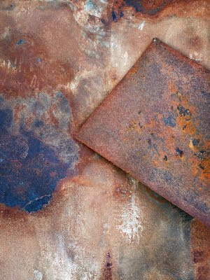
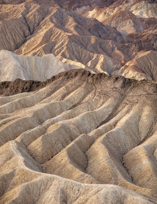
The above image was my find of the week, taken of some steel sheets lying on the ground at Death Valley Junction. Yes, I did take pictures of Zabriski Point and other classic landscape areas and yes, it seems odd to go to a national park and to be happiest with a junkyard image, but all that matters is the satisfaction of the image.


An important part of attending a workshop is chatting with fellow participants, comparing notes, looking at prints, discussing problems and how they have been solved.

Part of my hopes for the workshop were to rejuvenate my enthusiasm for picture taking after two years of slogging at producing the two books and the workshop did that in spades - this is one very satisfied customer.

Saturday, November 07, 2009

Viewer For Working The Scene


I'm off to Death Valley for the PODAS workshop and have made myself a new viewer, adjustable from square images to 2.5:1 ratio, which should nicely cover most images. It could be made of plastic or wood. I happened to use some 3/32 inch polystyrene I had lying around. You can get this at hobby stores - especially those catering to model railroaders. I imagine it wouldn't be difficult to make up a really beautiful one in wood.

Construction is simple. The size is 5X5 inches, the opening 2.5 inches, the top, bottom and sides obviously 1.25 inches wide by 5 inches or less. The slide is 2.5 inches by 3 inches.

Cut out the pieces for one layer 1.25X5Xtwo, 1.25X2.5Xtwo. Fit the next layer which is basically the same only rotated 90 degrees and with one of the small pieces missing (that's where the slider goes).Using appropriate glue (I was using styrene solvent glue) glue up the layers and either clamp or use weights to let things bond tightly.

Cut the slider so it fits snugly and lay it in place (it replaces the missing fourth piece from the second layer). Glue on another 1.25X5 inch piece to hold the slider in place.

Either trim some small pieces of styrene (or buy them) to finish both the top and bottome edges of the slider (thin piece on the bottom so it doesn't compromise the window, thick piece on top so you can grab the slider) and now the slider can't fall out. There should be enough friction so that the slider holds its place when the viewer is held upright.

File, sand or grind down the outside edges and round the corners and then drill one bottom corner of the viewer to fit in a shoe lace so you can hand the viewer around your neck.

If you really want to get fancy, you can put knots in the shoe string to represent the various focal lengths of lenses you are using - with an opening of 2.5 inches, you would need to divide the 2.5 by the width of your film or sensor and multiply that by the focal lengths of your lenses. The knot goes against your cheekbone, the viewer held out with the string tight. I haven't bothered, given that I use zoom lenses, but for fixed focal lengths (as when I shot 4X5, or next week with medium format digital) this can be very handy.

I'll let you know how the viewer actually worked in practice - perhaps it will need modifications but so far so good. Of course, the other viewer that can be used is a pocket sized point and shoot with a 3 inch LCD - I'm borrowing my wife's TZ5 for the event. Will see which is better.


Wednesday, November 04, 2009

Up Close Or Far Away?

The black and white rockform image I posted the other day is now up on my examining room wall and I get to see it every time I go in to see a patient. I have discovered that I really like it from a distance, but am less thrilled with the image when I stand right in front of it.

This raises issues of print size and viewing distance, but more important is the question of whether really good images need to work both at a distance and up close, or is it acceptable to work well on one level or the other, and if so, which is more important?

Not all of this has to do with size. Some of it is also about first impressions and careful study - an image can really catch your eye, but not offer a lot of fine details which reward close study, or it might only be appreciated on close study, not offering overall design to attract your attention.

I'm not sure that any of us plan images down to the point of designing initial impact vs. later rewards (ok, advertising photographers do)but it might pay to at least think about these concepts when looking through our own images, perhaps asking ourselves whether we are happy with how the images come across.

If too often we are disappointed with either initial impact or staying power of the images, then we could make this an added checkpoint on the list of aesthetic checkpoints I discussed a few blogs ago.

If what is lacking is initial impact then consider the following suggestions.

- bold patterns
- large blocks of colour
- simple designs
- plain backgrounds
- light subjects against a dark background, whether naturally or through burning in
- careful use of editing to make the iamge more dramatic without making it harsh

If on the other hand what is missing is staying power, then you need to give the viewer something to come back to or stay with - interesting detail, stories within stories, added layers of sophistication in composition - not just the big items.

Sunday, November 01, 2009

When To Convert To Black And White


This image is a good example of an image that does better in black and white. There isn't a lot of colour in the original (see below, it's largely about form and other than the relatively neutral rock, the only other interesting thing is the waves which are white.

Also, in the original colour image, the rocks are blue white (shade), while the water is brown - not generally an attractive combination. In the black and white image I have been able to print down the water so it acts as a background to the rock formation rather than as more subject matter, even though it's only a few inches further away.

The white waves in the upper left provide a bit of balance to the rock formation and the diagonal line formed by the left hand edge of the formation.