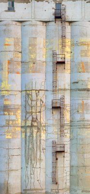
While it might vie for the unappealing software name of the week award, this photo stitching software seems to be very good. I have done several stitches with it, two of which gave me trouble in the past. Not only was the process easier, the result was better. For whatever reason PTGui seems capable of coping with minor parallax errors which drove PTMac wild. There is still a risk that in large prints I will discover matching flaws that I haven't seen so far but tentatively I give this a thumbs up. Thanks to Roger Hein who suggested it to me.
In the image above, since I was moving vertically and didn't have a 3D pano head, rotating through the nodal point couldn't be done and eventually I had to align the ladders manually through cut and paste after the stitched image was brought into Photoshop. Errors have been common enough that I have been outputting to multiimage tiff's which created huge files and slow bringing together of the layers in Photoshop.
With this image this time, I brought the images into PTGui, did the alignment automatically (I didn't have to find the matching points in the images, hell, I didn't even have to tell the software what focal length I was using, what magnification factor, whether the images were horizontal or vertically oriented and whether they stacked likewise. The resultant image in the editor showed some rotation of the building. This was easily corrected with the editing tools in PTGui. I subsequently found that I could enlarge the editor window and the image automatically got bigger and one could do an even better job. I asked it to make the maximum size stitch (pixels 1:1) and it did this quickly and painlessly.
Once the image was in Photoshop, I did a fine tuning of the image rotation and perspective correction (I could probably have done that in the PT Gui editor with the larger version of the image but the alignment grid in Photoshop distort, lens correction made it easier and I was even able to deal with a little chromatic aberration. The result looks really good to me.
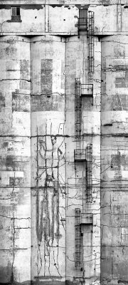
Image wise I still like the black and white version which I did originally.


No comments:
Post a Comment