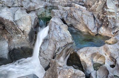
The picture above is one of the beautiful spots which I found very difficult to photograph - the rocks have lovely greens and blues and even magenta tinges in them, there are pools and falls, carved rocks, multiple levels. The image above encompasses less than a quarter of the rocky area which is interesting.
Even this image suffers from some clutter. The right upper corner is too fragmented. I haven't decided if I like the tip of the rock on the bottom at the left - I was tempted to crop it but doing so weakens the bottom left.
I used Akvis Enhancer but found the effect too 'over the top' but managed to 'Step Backward' so I could no longer fade the effect. No problem, I simply clicked on the prev. step and used the history brush with 30% effect to undo the parts that were overdone in Enhancer.
The rocks in the upper left were in shade and a lot cooler in colour than those in the upper right so some colour balancing was done along with reducing saturation specifically for blue, again with masking to avoid removing blue from the pools.
I like the effect of the pool at the top left, the pool in the middle to the right, then the white water bottom left, forming a triangle. The stagnant pool contrasts nicely with the fall.
I wonder if I lightened the reflections in the upper pool too much - after all the reflection shouldn't be brighter than what it is reflecting - I think its ok, but living with the image for a while will tell me.
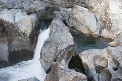
Below is the original image - frankly it doesn't look anything like what I saw - the colours are washed out, the variation in rock colour is missing. I might have gone too far with the final image but it will be interesting to see actual prints.
Having just made my first print, the colours were so over the top I have toned them down and replaced my 'good' image above.


1 comment:
I agree with your comments re the 'clutter' in the top RH corner. For me, the main compositional elements are (A) a triangle consisting of the pools at the top, right and bottom(left), and (B) the rock in the middle. A severe crop from the right and a slight crop from the left would strengthen the photo.
I have taken the liberty of cropping your image and putting it in my flickr site at
http://www.flickr.com/photos/alanrew/
with the name 'fall-4636.0_crop'.
I will be happy to remove this if you don't like the idea, or after discussion.
Regards,
Alan Rew
Post a Comment