Saturday, June 30, 2007

Centre Street Bridge


Not a perfect image but I do like the repetitive curves and the diagonal 'braces'. I don't like the barely visible other arch to the left of the centre buttresses and the fact that I inadvertently cut off the curve of the arch in the upper left isn't acceptable.

I think in hind sight I should have moved back if possible, shooting with a longer lens and also moved closer to the line of the bridge to hide that arch. The image has enough potential to make that worth while. Next time round I might want to blend two exposures so the detail in the darker areas shows less noise - the shadows have been opened dramatically and even the 1Ds2 exhibits considerable noise and sometimes linear lines when I manipulate the shadows that much. Mind you, don't suppose the bridge is going anywhere - will see if I can reshoot this weekend.

Friday, June 29, 2007

Comments On The Gallery Experience

I highly recommend anyone considering gallery shows read the comments appended to my article of yesterday on my gallery experience. Comments vary from 'you were taken' to 'scam!' to that sounds about right and various shades in between. Reading all the comments though gives a very good picture of gallery experiences and I think will be helpful. I hope more people will comment on their gallery experiences, expectations, successes and failures.

I'd be curious about how much room there is to negotiate with gallery owners - as to % commission and who pays what and working down the framing costs - or simply telling the gallery that no, I won't supply huge expensive prints. DO photographers have any power in this area or is it like it or lump it?

A Different Selling Experience

Having related yesterday my less than stellar gallery experience of the last year, let me give you a different experience and you can make of it what you will. Some of the story has been discussed before but here's a bit more detail.

Three years ago a new 'farmers market' started up, not far from my home - on a retired military base. It was to be a bit more upscale than the usual market. I really hadn't paid much attention but my tennis partner had been over a few times and suggested I might want to consider selling my photographs there since they did in fact have a number of crafts on exhibit already. he even went to the trouble to talk to the manager and gave me some basic information.

With some doubts I decided I should at least check it out. On my afternoon off I wandered by and talked to the manager. The first thing I found out was the market was open Friday through Sunday which was impossible for me - I'm a full time family doctor. She did say though that a few of the booths were owned by hutterite colonies and one group didn't want to either work Sunday or hire someone to sell for them on Sunday - and a booth would be available Sundays only.

She liked my work and would be glad to have me at the market. We discussed amongst other things whether I should sell framed work and the consensus of people that day was that framed would sell a lot better.

I invested several hundred dollars in frames over the next few weeks (inexpensive Ikea wood frames) and got a matte cutting device (another $300) and mattes. I had a friend shrink wrap a starter pack of prints which I displayed in wicker baskets from Ikea. There were display cases for vegetables so I bought some cheap velvet curtain material and draped it over the benches and laid my framed prints on this as well as the basket of prints.

Not surprisingly sales were slow to get started. There was a fair amount of interest and it was quite pleasant right from day one talking photography with people who said nice things about my work, and every so often someone would buy a print. I started with a couple of prints a day and slowly sales picked up. After a year I was selling about a dozen prints a day and making about $500 for the day. My costs were substantial - it seemed like every few weeks I was having to buy another case (or two) of acid free foam core at $150 per 20 sheets, and more mylar bags, at about $1 each. I was purchasing ink and printing paper about every two weeks and spending about $1000 a month on supplies in total.

I sold 8.5X11 prints in the mylar bag, with foam core backing for easy handling at $39, 13X19 at $59. I quickly found that people much preferred to purchase the bagged prints, even though it was going to cost them a lot more to get frames and in the end I had a large quantity of unsold frames. Lugging them to the market was gradually marking them and after several months I gave up on framed prints entirely.

Rent for the booth was quite cheep $50 for the day. There came a day though that I had a tough decision. I was going to lose my booth and be relegated to the dark back of the market unless I went 3 days a week. I was getting enough requests for large prints that I invested in a 24 inch 7600 printer. The 7800 was already out but as I was doing most of my work with the 4000, I felt that it didn't make sense to purchase a printer whose main claim to fame was the ability to do glossy when I was using matte paper only, and which would require an entirely different set of inks - so the 7600. That cost me about $2500 (the Candian dollar was quite low at the time).

I debated and decided I'd invested enough by this point and sales were picking up that I'd go for the three days. Now I had to hire staff and I had to build display cases since the vegetable racks weren't there in the winter. I needed extra lighting so I did a deal with the Hutterites to share the cost of installing flood lights to augment the overhead mercury vapour lights.

At one point I purchased $600 dollars of 32X40 Crane Museo paper only to find out that under the mercury lights it took on a very yellow cast not seen at home - making sales virtually impossible - I still have it - unused exc. the first few sheets, and unreturnable. I needed more wicker baskets as I dropped framed prints and went to baskets for 8.5X11, 13X19, 17X22, colour and black and white, and also vertical prints. I was now buying foam core 3 boxes at a time (which at least got me a professional discount that helped) but my expenses if you amortized the new printer were keeping up with income.

By the end of last August I was pretty tired - I'd often be printing Saturday night until 3 am Sunday to get ready for the market. I'd often have to make prints Thursday night after working at the office till 10 PM, then deliver them to the market Friday morning before going to work at the office. My wife started to complain that I was exhausted and cranky and that perhaps I should end the market. Unfortunately she was right.

In the end I sold about $40,000 worth of photographs but if you include the cost of the two printers, my expenses were almost exactly the same. had I been a bit closer to retirement - doing the market three days a week by myself could have paid quite nicely (after all I didn't have a lot of capital costs any more) but it was all a bit more hassle and hours than I really could afford to put in.

Work around the house and garden had virtually come to a stand still because of the market and time to photograph was getting harder to arrange. Pressure though to have new work for the next Sunday did keep me going though so was a bit of a mixed blessing.

Meeting people at the market during that two year period did result in one gallery show at the University when I met an old sailing buddy, and a local publisher suggested that there might be a book in my work, if only we could find a company to underwrite the publishing costs - never happened but perhaps if I'd continued.

I have no regrets that I did it and some that I gave it up, but I know I made the right decision. I put in a hell of a lot of hours doing it to break even but suspect that in the end it would have produced a decent income had I only been working in my office 3 or 4 days a week. There were even days at the market that I made more money selling photographs than I did practicing medicine - I think that in the end I could have anticipated netting $10,000-$20,000 a year, not unreasonable for 2 days work a week but hardly generous.

Would it have led to greater things - possibly, but no gallery is going to touch you when you have established your reputation for selling images for $59 to $500. It might have led to some corporate deals - there was certainly talk - supply my entire company with artwork kind of idea - but it might not. I certainly wouldn't have had time for this blog had I stayed at the market. I wouldn't have had time to write those articles for outbackphoto or luminous landscape.

Perhaps this will make you think outside the normal markets for your work. Certainly when I wrote about galleries I got lots of horror story comments, perhaps this time someone can tell us of how they made a fortune selling their work.

Thursday, June 28, 2007

The Gallery Experience

9 months ago a gallery contacted me (I'd never heard of them) from across the country suggesting that I might want to exhibit at their gallery. they were looking for around 20 very large prints (the bigger the better), colour landscape only and were pretty firm about which images they wanted - reasonable - it's their gallery - though I did wonder about some of the choices.

They explained that the images needed to be framed and offered to do it at a good price (it was reasonable and certainly solved the freight problem). They wanted to display the images in frame but without glass - a little nerve wracking since unlike oil or acrylic paintings, the least finger print or paper scratch would ruin an inkjet print - but they're right the prints do look better without glass.

In the end I made 24 prints. At their request I borrowed (rented) an Epson 9800 to produce four 36 inch square prints (which really did look gorgeous). two 44 inch rolls of Entrada, purchase of some ink and recompense to the owner of the printer and I was out $500+. Total cost for producing the prints for the show was probably $1500 all up (all you need is one blotch of ink on the white border of these large prints and you have to start over). Framing and other gallery costs for the show came to $5100 which broken down was competitive with framing done locally. Costs for advertising and invitations and so on were shared with the gallery, my share was about $1000. I had elected not to travel to the opening and spend the trip money on the advertising.

SO, before the show opens, I'm out about $6000. I write them a cheque for half ($3000), the rest is going to hopefully be made out of sales. the good news is as of this month I'm down to owing them $800 which with a few more sales will be erased.

Sales for the show and after were a grand total of 3 prints, none of which were the biggest prints. The only image that has sold from the show is 'Peggy's Cove' about which I wrote a few weeks ago under the title 'Photographing Cliches'. The prints sell for $900 plus frame, are approx. 24X36 including white border.

So, I still owe the gallery $800, I paid them $3000, I spent $1500 making the prints so my net income for the show is a minus $5300. The odds of me breaking even with the gallery are slim at best.

Welcome to the real world of gallery exhibits.

You might wonder if I'm bitter, or if my experience is unusual, if the gallery ripped me off or if this is what should be expected.

Let me make it clear - I think the gallery was entirely reasonable. They have ongoing expenses in rent and staffing, they shared in some of the advertising and opening costs. They did the work of the framing and supplied the framing and matting material (not inconsequential). Their income had to come from the sale of those three prints - they can't afford to be especially generous to photographers without a huge reputation.

I know that this experience is similar to that of many other photographers working with galleries and better than some.

I would remind you that being known amongst photographers doesn't count - photographers are generally not purchasers of photographs - now and then - sure, but the number of photographers who have spent over $1000 in their entire lives acquiring photographs is miniscule and not enough to fully support even the Barnbaums, Sextons, kennas and so on.

Burtynsky does well as do a limited number of others, because they have caught the public eye and offer a product that is different, topical, even controversial - no one has made a movie about my work - Burtynsky has - and it's quite good by the way.
His images tie in closely to current environmental concerns and even political ones with his images of China and Bangladesh, photographs of massive junk piles and old tires make a strong statement about our consumerism and waste and recycling and the environment which are hard to ignore and receive a lot of press.

One of the more successful photographers in the fine art world is ALain Briot but he works extrmely hard marketing his work, teaches workshops, writes books and spends considerable time doing mundane stuff to support his creative work.

One reads of gallery owners being crooks but frankly I'd not want to run a gallery - looks like a very risky business, subject to fashions and the whims of the public. In Calgary right now the economy is booming but oddly all that money isn't being spent on the arts - Winnipeg which is a working class town with a tough climate and lots of mosquitos has been a huge promoter and incubator of the arts for years. Go figure.

I think this is simply the reality of gallery work.

Did they pick the wrong prints - well the 4 extra that I sent them didn't sell so I'd guess not.

A novice photographer with some original ideas had a show in Calgary. She had the idea of hiring a publicist. She got on breakfast shows and talk shows and in the newspaper. Her show was such a success she paid off her costs the first night and made several thousand dollars by the end of the show.

You may get lucky, but I'd not bet on it. Many photographers cannot afford to take such a huge loss so gambling on suceess isn't even an option for them. For me it means one week of holiday a year (I can't afford more) and it means I won't be trying such an experiment again any time soon.

What can you do about it? Well, I have a friend who is displaying his images of France at a local French Cultural Institution. They mailed out very nice invites and are hanging a number of his images. The prints though aren't huge. He's buying frames in bulk - all the same size - and matting them himself. The show is local so there are no shipping costs and he will hang the show himself. The wall space comes free so his costs aren't huge and even though he stands to lose money, it will be a good experience and it won't take that many sales to even more than break even. The prints will be inexpensive and because of the cultureal tie in, he might just sell well.

You might find similar modest displays just right for you - a restaurant say, who can't afford to buy your prints but is happy to give you the wall space in return for decorating their establishment. A local movie theatre we like has original art on the wall - same idea.

So, consider relatively small prints in a standard size frame you can purchase in bulk cheaply, do your own matting and get your images hung locally and inexpensively.

Tuesday, June 26, 2007

Looking Back

Now and again it can be rewarding to look back at where we have come from and the journey we have taken, in this case, photographically. It's nice to remind ourselves that despite any day to day discouragement, we have in fact made progress, our images work on more levels, we have fewer technical problems. We may not have any more 'keepers' as we become fussier with more experience but our keepers typically are stronger.

Looking back can also give us a sense of how far we have to go and can point us to where we need to put more effort.

Looking back at our work over the last year can give us ideas of what works for us (and what doesn't).

It can even give us ideas for a project. It can be an excuse to print up a portfolio of best images of the year.

I suspect a lot of us would like to be remembered for our photography as much as our careers and leaving behind a series of boxes labeled 'best of XXXX' sure wouldn't hurt - maybe someone will publish a retrospective of our careers - well we can dream can't we. Of course, we'll be dead but perhaps our images will live on - that would be nice - even if it's only family members who ever get to see them.

If you have a website with dozens or even hundreds of images - it it clear which images you are prepared to stake your reputation on? I don't and now that I think of it, perhaps I'll do something about that.

Monday, June 25, 2007

Vertical or Horizontal

You probably figure that you orient your camera according to the subject matter - it if it composes better as a vertical, well that's the way you orient it - yeah, right!

Go through your images from the last month and count how many vertical and horizontal - want to bet that most are one way or the other and no where near 50% and likely you are a horizontal kind of person.

Arguably we live in a HORIZONtal world so that isn't too surprising, especially for snap shots. Also, only a limited number of professional level cameras are set up for vertical orientation and even then viewfinder information and lcd information don't match the orientation so in general cameras are a lot easier to orient horizontally.

Unless you use an L bracket (I do and find it invaluable), then leaning your camera way over to the side to orient vertically is awkward at best and unstable much of the time.

Still, when you think of all the full page magazine covers that are vertical you might just be a little bit curious about your own percentages - are you a horizontal kind of person or do you swing the other way?

Perhaps you should be asking yourself - 'am I picking my format out of habit, convenience or tradition?' and 'Is this an opportunity to shake things up a little and use the other format more often?'

Work Habits

Sometimes I think I have ADD (other times my wife is sure), but anyway, I'm not the most organized person in the world. As a result, I have had to learn to set up routines which reduce errors.

For example: in my backpack, I have two inside pockets. The one on the right always has memory cards ready to use, the left ones that have been exposed. I never break this rule and I never forget which is which.

When I set up the tripod, I always have one leg pointing forward, two back (so I can stand between the legs).

I prefer manual exposure for a number of reasons but one is I don't forget that I dialed in an exposure correction and forgot to remove it.

All my worked on images go into a documents folder, labelled sequentially and a new one added when the last one has a lot of images. this means that all my good photographs sit in one of (currently) 14 folders and I can quickly find an image to reprint. There are lots of ways to do this, this method happens to work for me. Every so often I burn a dvd set of backups of my good images (as well as a backup hard drive) and all I have to do is go to each folder and back up any images changed since the last backup. As these are in addition to the previous backup (not over it), if I find that I have made edits to an image which I regret, it's still possible to go back to how the image was a couple of years ago.

If I do something significant to an image, I will version the file so I can always go back to the previous version - eg. using Akvis Enhancer, I try to save an unenhanced version (which may become important if I am making larger prints than usual). Some people save output sharpened images by specifying size, as I print in a number of different sizes to suit the customer, I find that impractical so I don't save output sharpening at all - sure it takes a minute to sharpen the file before reprinting - but it's not a big deal and sure means less clutter on the hard drive.

When I sell an image, I use a 2H pencil to very lightly sign the back, date the print and indicated my web address. I include with the print an info sheet which gives some background to the image (and sometimes the techniques and equipment). It also specifies which printer and paper I have used, supplies my address and website and email (hopefully to generate future sales - it helps).

I find customers spend at least as much time looking at the back of the print (the info sheet) as they do the front. Even with close up and abstract images in which 'place' isn't really important, they like the story of the image (and for the most part couldn't care about the technical details. I think it was Alain Briot who said that customers are buying an experience, not a print. This may be one reason that personal sales generally far outstrip internet sales - it's not just a matter of inspecting print quality (which frankly probably means nothing to many of our customers anyway).

Sunday, June 24, 2007

Three Image Stitch


This is the three image stitched version of the previous post, slightly different framing and with the addition of Guinness, our Humane Society black lab. To give you an idea of resolution, in the full size version 6500X5100 pixels (about 34 megaxixels), you can see the braiding on the dog's collar. We both had a great day, though he sure had a lot less trouble hoofing it up those steep canyon sides. Must have been the backpack....

Badlands


Horseshoe Canyon, on way to Drumheller, Alberta. Small size it definitely looks too complicated but at larger size the details sort themselves out. Do click on the image to see a larger version.

Rock Cut Abstract

Friday, June 22, 2007

Evolution


The image above is the recent result of deciding I didn't like the original colour image - it was well put together but left me cold. At the last minute I decided, what the heck, what if I converted to black and white, and what if I trimmed the excess light areas left and right, even though it meant clipping the end of the ladder.


In the colour version, I'm not happy with the end of the ladder - it seems to me it should have been spaced equally or at least proportionately in the corner whereas it touches the bottom of the image but not the side - small detail? sure, but petty, no I don't think so - it's a whole bunch of these little decisions that make a big difference to an image.

Thursday, June 21, 2007

Full Range Of Tones? Not Always

Two days ago I posted the image of a windshield, covered in raindrops and rivulets and vaguely showing the outline of the car interior. The first version of the image was almost straight, a little bit of Akvis Enhancer is all (ie. applied then faded back). I made my first print, then the next day decided it was too dark and I should zip it up a little bit. My first thought was to check to see how close to white I had got the highights and so I applied my threshold 250 layer on top of the image and not a single pixel reached that level - there was going to be NO white anywhere on the print. I then added a curves layer below the threshold layer (see Outback Photo for my article on using threshold layers to check highlights and shadows) and moved the white limit to the left until a few pixels hit the 250 mark - it took a lot of adjustment suggesting that the lightest tone in this print is actually quite dark - zone VI, say. I could see from the histogram that comes with the curves adjustment layer that the shadows too were no where near black - so I tried moving the black point to the right to meet the curve. I made some adjustments to the curve - and hated the result - way too contrasty - you could see too much of the car insside - I'd lost all subtlety. I decided on a compromise - I'd adjust the highilght position but not the shadow, and use a curve to reduce contrast - and made another print.

After 24 hours I realize that that print lacks the subtlety of the original image and that in fact I didn't need or want either a solid black or a solid white for this image.

Unusual? Sure it is, but the point is that rules like always having a full range of tones is like every other photographic rule - sometimes it's meant to be broken, in this case smashed entirely.

Tuesday, June 19, 2007

What's Not To Like

In writing about the characteristics of good photographs, it generated some interesting discussion and various photographers were suggested whose images might not fit my criteria and I have added further comments of my own in response.

That said, it raises other issues and to illustrate the point, I'll start of by referring to music.

I don't like all kinds of music - most Jazz leaves me cold, for example. I recognize that it's clever, skilled and I can even see why some people like it, but the reality is that a lot of jazz sounds all the same to me.

I seethat this is a deficiency in me and not the music since clearly other people really like it, can see the differences and appreciate the subtleties. A lot of 'new' music is actually painful to my ear.

If the analogy holds, then I shouldn't expect to like all photography or even be capable of seeing the things which make some images apparently great to others (enough to hang them in museums).

This is quite disturbing because is basically means that it's hard to make judgements about any photography at all. In the end I can only decide what I like and to look at it and purchase books and even prints. I can recommend the work of photographers I like but knowing my judgement may be based on ignorance, I am really putting myself out on a limb to say that any photography is crap and you should avoid it.

Kinda makes you wonder about critics - is something bad because it lacks what the critic defines as good , or is it that even the critic is ignorant because this is a new type of photography which simply hasn't been learned yet.

Is that an ugly car or do I just not 'get it'? Disturbing.

Monday, June 18, 2007

Rainy Day Shot

What Makes A Photograph Good?

Below are some characteristics common to many (but not all) good photographs. There are definitely great images which break one or even all of the rules, but you'd be well advised to consider these rules and ignore them only when you have a specific reason to do so.

1) the photographs are interesting - I don't mean the subject matter - there needs to be something in the print to catch your eye. You may photograph your lover, but for us to be interested in the photograph, there has to be something that we can see that is interesting - we can't see their personality - the interest has to come from the composition, the pose, their appearance. the print has to be interesting minus the feel of the wind, the warmth of the sun, the smell of the pines.

2) compositions are simple - any item in the picture has to reinforce the main theme, not stand on it's own as another interesting detail

3) a good photograph tends to have a sense of rightness to it - the various parts are arranged in a pattern which makes sense. It may not be harmony or balance since that's not necessarily what you aim for, but there has to be an organizing pattern to the arrangement.

4) It's uncommon for a great photograph to have harsh lighting. So unless you specifically want harsh lighting, you'd be well advised to avoid it. This doesn't necessarily mean you can't photograph at noon, you just need to plan.

5) Great colour photographs usually have a limited palette of colours which work together. When colours are similar, they have to be very similar, when not they need to be complementary - more or less opposite on the colour wheel.

6) Great photographs show the unusual or the unnoticed - either the subject is something most of us don't get to see (because of travel or not getting up early enough) or it's so ordinary that we tend to pay little attention until someone points out that the old warehouse has interesting shapes, patterns, shadows, etc.

7) The best photographs don't need big cameras and fine printing- I'm uncomfortable even writing that since I am a great believer in the highest quality printing standards, but there's some truth that the better the image, the less dependent it is on pristine quality. Yes, perhaps pepper # 30 benefited from being shot on 8X10 instead of 35 mm. with a fast film, but I'd bet it would still look great. I have never seen pepper # 30. Oh, I've seen many's the reproductions and certainly the better ones show you more of why it's a great photograph - but none look bad. I think we sometimes hide behind careful technique, using it as a substitute for making great images. I know for myself, when I was younger, I tried to solve my problems with going to 4X5 instead of learning to see better.

8) Great photographs often have a message - it may only be 'see how pretty this flower is' in which case the image better have shown the flower to advantage, revealing it's beauty. The message may be one of passing on a feeling - of tranquility or anger, disgust or excitement, joy or sadness.

9) A lot of really good images make you wonder - 'where is he going?', 'what's round that corner?'

10) And last and most importantly - the truly great photographs are mostly taken by people who take a lot of good photographs and who are ready for the rare great image, but greatness is also a matter of luck. There's a certain something in a truly great image which comes not from the photographer being clever. Sometimes photographers create magic.

Are you ready to create magic?

I will say again, all of the above 'rules' are open to deliberately breaking one or all of them (though it might be tough to create a great image that breaks every one), but for the most part, this is the way to bet.

Sunday, June 17, 2007

Playground


Rain


It's been raining much of the weekend and this afternoon I went out just as the rain stopped. The upper image is a slide at the local school, the lower a plant from my garden - Heuchera.

Practising In Your Own Patch


We've had a lively dialogue about the value of exercises, particularly exercises that take you away from your normal area of photography. The particular excersize was mentioned by Ed, from Freeman Patterson's Photography And The Art Of Seeing.

Not to rehash the argument but here's something to think about.

If you set up an exercise within your own area of experience - say you decide to shoot a series of 'different' landscapes at a location you have found fertile before. Here are some limitations and problems with that exercise (which isn't to say you shouldn't do it, just that you should strongly consider moving outside your expertize to practice.

1) Working within your own area, you already have such a strong idea of what works so that seeing anything new is problematic. The tendency is to keep shooting in the same style that has worked for you in the past.

2) Since you are photographing in your own area - it's hard to tell yourself it's just an exercise and the images won't be used to pad your portfolio - you tend to treat the effort too seriously and again limit your creativity. This isn't a problem in the bathroom since you have no intention of showing them to anyone.

3) If exercises are fun, you are more likely to do them. Hauling out my 1Ds2 and tripod to experiment in the bathroom is too much like work. Using my FZ50 on the other hand is painless and fun. That the images aren't recorded with my best camera doesn't really matter.

4) In such an odd location as a bathroom, it's unlikely you have a lot of preconceived idea of what to do or even what to photograph - everything is fresh and new. It's a blank slate. Were the exercise to shoot portraits in a studio, even though you are a landscape photographer, you likely have a pretty good idea of what portraits are meant to look like. Not in a bus, not in a bathroom. Ever seen a picture of the water swirling down the toilet bowl? Didn't think so - but it might make an interesting abstract.

The image above is a poor attempt at a self portrait and I clearly don't have it right yet - but you know, it's not a bad idea and I might just experiment a bit further. So far I don't like the picture on the wall in one mirror and the tile in the other, perhaps I can reshoot it with only the plain walls for background - even if it means taking the picture off the wall.

I'd show you my other bathroom attempts but I want you to have a chance to try this exercise on your own. Perhaps in a few weeks I'll show you mine if you'll show me yours.

Friday, June 15, 2007

Reframing

Great comments yesterday on Exercises and the subject of reframing came up as it refers to psychology. I want to discuss what that means in terms of taking pictures.

Reframing in psychology refers to thinking about events from a different viewpoint. People who are anxious or depressed tend to look at things in the worst possible light. Your boss criticizes you and you jump to the conclusion you are at risk of being fired, that he doesn't like you as a person, that you are no good.

The reframing comes when you look at the situation and realize that maybe your boss didn't sleep well last night and his grumpiness has nothing to do with you. You had a good appraisal last month so his grump today isn't likely to threaten you. He didn't say you were a worthless person, he simply criticised one specific issue - say your spelling. That doesn't mean he doesn't like or respect you.

In photography reframing is not so much about looking at things more accurately. Rather it's almost the opposite - not taking things at face value. You may be looking at a toilet, but can you see it as a series of sensuous curves instead (Edward Weston did). A rectangular object actually appears in a print as a triangle because of perspective - do you see it as a rectangle or a triangle - if the former, then that interferes with your ability to compose. In real world seeing, shadows are ignored. In images they are as substantial as the object that casts them - perhaps even more depending on the tone of the object.

In real life two objects may have no relationship but in an image, they have similar tones and can be arranged next to each other so they do have a relationship - can you see that? This is photographic reframing.

This discussion started with whether it's useful to shoot a subject you would normally have no interest in and so far it looks like the majority feel they can but none of us has been able to prove it.

Thursday, June 14, 2007

Do Exercises Have To Be Relevant?

Yesterday I suggested some photographic exercises you might want to try and Ed added the comment that he'd heard about locking yourself in the bathroom till you could fill two rolls of film with different images. Chuck felt that since he isn't a bathroom photographer by inclination or trade, it wasn't all that great an exercise.

So the question of the day is - do we learn enough from doing exercises that don't involve our own area of interest to justify them - are the skills cross applicable?

I remember reading Fred Picker's newsletter in which one assignment was to take formal portraits inside a bus - now most of these people were large format landscape photographers (rocks and roots types) so portraits were hardly their collective 'thing'.

The utility of learning to do portraits inside a bus has to be extremely limited if it doesn't somehow generalize to other kinds of photography. Was such an exercise a waste of time?

Are there examples which we could use to settle the question?

Well, being a painter or drawer or musician certainly seems to be helpful when it comes to learning photography but whether its simply that very creative people can do both well or whether it's the learning of the one that transfers to the other I don't know.

Certainly athletes do lots of training that isn't specific to their sport - basketball players lift weights, cyclists run, etc. but fitness is a long way from photographing - or do I have to start doing pushups?

I guess the question is whether creativity can be trained at all and if so is it specific to certain subjects - ie. if you are very creative at landscapes, are you unlikely to be creative at other subjects you haven't tackled before. My gut instinct is to say that creativity is in fact trainable, that exercises to flex your creative muscles are a good idea and that in fact it does generalize. I'd go further than the bathroom exericse and say that I suspect that practicing creativity in any medium - whether coming up with catchy ads or writing limericks is probably helpful to some degree and that visual creative exercises generalize even more strongly, but I'm not aware of any proof of this.

I wonder if any psychologists amongst us know the answer to that.

10 Reasons To Work In Black And White

My background is in black and white though I now do half or more of my work in colour, thanks to shooting digitally. I thought that for those of you who predominantly work in colour, I might point out some reasons to at least occasionally work in black and white.

1) some images just don't work in colour because the colours are wrong or an object sticks out like a sore thumb

2) some images just look better in black and white - you might just want to convert some and see. In Lightroom and Camera Raw and Photoshop this is easy.

3) Black and White prints last longer - whether silver or inkjet. The black in inkjets is carbon which is about as permanent as you can get so printed on a good art paper, should last hundreds of years.

4) Black and White isn't real. You'd think that might be a disadvantage but when you want to create artwork, you want to dissociate yourself from the reality of the scenery and black and white is very effective at that. Colour risks looking too much like a postcard.

5) Black and white images can be highly manipulated and still look good. Colour manipulation taken too far looks unreal and therefore disturbing. Black and white was unreal to start with which was expected so going further isn't an issue.

6) Black and White can be wonderful for portraits and nudes. You can use colour filters to alter the skin to look darker or lighter (green or red filter).

7) A good black and white print can have a richness that is magical and can't be reproduced in colour. Can you imagine Pepper # 30 in colour? Horrible!

8) Black and white prints don't have any colours that will clash with your living room paint - trust me - it's easier to decorate with black and white.

9) Black and White is just different - we live in a world of colour - most of the images we see, whether in magazines, on the net or on television are in colour - sometimes it's just a nice change to look at black and white.

10) some subjects lend themselves well to black and white - they don't look so damn cheerful as can colour images.

If you are shooting digitally, don't forget to photograph in colour and do the black and white conversion after the fact so that you can 'filter' as desired in computer. There are no advantages to setting your camera to black and white except one - if you use a consumer digital camera rather than dSLR, then the LDC will show you what the black and white images are going to look like - but in general it isn't worth it and doesn't work with most dSLR's except after the fact.

Tuesday, June 12, 2007

Exercises To Improve Your Photography

If you're one of the lucky few for whom everything is going just right in your photography, then read no further. If on the other hand you are like me and feel your photography could always use a hand, here's some exercises you might consider trying.

1) see how creative you can get photographing an egg. It's rounded and slightly dimpled surface responds well to lighting, shadows can be very useful, you might need to figure out how to stand it on end - of course it's been done before - this is about being creative, not about selling photographs. Go for it.

2) Try some night photography. If shooting digitally, you are really in the money here as light meters are sensitive enough for streetlight photography, distracting backgrounds by day can be hidden. You might even see what you can do without a tripod.

3) Even though your interest lies elsewhere, choose subject matter foreign to your experience - normally shoot landscapes - make a serious attempt at photographing portraits or even nudes. Normally shoot sports and consider landscapes boring, well guess what, here's your chance to prove yourself wrong. You might want do do a bit of looking at good images in that field before you head out, but don't try to duplicate the work you have seen. Normally shoot car races, how about really challenging yourself with birds - now you have to fast AND sneaky.

4) Whatever your interest, what about coming up with some really good self portraits - after all the price is right, you can hire the guy for the price of a beer or two. Actually, the images might be better after the beer - test the theory.

5) How about going out for your usual subject matter but hobbling yourself in some way. For example:

- shoot landscapes without your tripod
- only take one lens, at a focal length you don't normally use
- take a mini tripod and only shoot from 1 foot off the ground
- go out shooting with only a few exposures worth of film or memory card (here's your chance to use that 32 meg card that came with your camera)

Maybe you won't make any prize winning photographs, but I can't help feeling that it will give your creativity a boost and help your normal photography.

Portrait Of Neil


Had my FZ50 with me for an outing with my model railway group. Not usually into portraits but I noticed both the pose and the background and felt it needed recorded. As Neil in his retirement is a bit of a writer and thinker, I felt this does present him in a fairly revealing image.

Monday, June 11, 2007

Ready To Be Lucky


A patient today made some nice comments about my Columbia Ice Field picture then stated that I must have had to wait for hours for the light to be just right I joked and said, no, I was just lucky. That's true, we were on our way to Jasper for a weekend, had stopped in the parking lot of the ice field and not seen anything worth shooting and were on our last stretch to Jasper. Fortunately though, I looked back once on the road and from a position not normally used to photograph the glacier, and barely showing any of the glacier anyway, I was able to stop the car, hike less than 100 yards, catch the late afternoon November light just skimming the glacier and touching the rocks that cradle the glacier on either side and then take an 8 image stitch from my then 10D which makes a print 56 inches long by about 15 high which looks very nice thank you.

It's good to be lucky, but it's better to be ready - ready with equipment, eyes open and scanning, and sensitive to the circumstances and possibilities. I suspect that had I showed up in the morning, I wouldn't have seen this potential image and moved on, so waiting for hours for the light to be just right may be dedicated, admired and respected, but it doesn't always work. Sometimes you just need to be looking.

Hobbyist To Artist - Journey Or Incompatibility?

Many of us started out as hobby photographers. Somewhere along the line we started to take our hobby more and more seriously and started to talk about art and having pretensions to create a lasting legacy of good works.

A small number of photographers have come to the craft from other visual arts, often showing the most creative work at workshops even if they don't yet have mastery of the technical aspects of photography.

So I'm wondering what implications the typical hobby pathway has for those of us who aspire to greater things.

- Are we different from those who still call themselves hobbyists - ie. did we mutate somewhere along the line?

- Are we just being pretentious in trying to call ourselves artists instead of hobbyists?

- Is there a fundamental difference between an artist and a hobbyist?

- Is there a pathway leading from one to the other and if so can someone show me the map?

- One could imagine defining the difference by the dedication involved - but does this mean that anyone who holds down a full time job is by definition not taking things seriously and therefore can't be an artist or taken seriously?

Well, lets tackle some of these questions, the last one first - should part timers be taken seriously? Over the years and in many artistic fields, artists have had to support themselves by doing other work. Many's the waiter who's an aspiring artist and no one criticises him or her for putting some food on the table by doing so. Thus it can't be the hours spent in other activities - hell a lot of artists spent a goodly part of their lives, sitting around, drinking too much and bullshitting with other artists - about politics - so the number of hours spent does not define who is an artist.

Are those of us who call ourselves 'fine art photographers' fundamentally different from hobbyists - after all most of use got here from there? I certainly don't remember being struck by lightning or having a religious experience or waking with an epiphany. Perhaps this means I'm being pretentious after all. I suspect though that it's a matter of degree, that there isn't a sudden and definite transition. As I discussed in my articles on 'taking your photography to the next level' on Luminous Landscape, at some point, fairly early in the hobby, we gradually switch from simply recording the moment to wanting to create something more than a good record.

Is calling ourselves artists simply being pretentious? Well, we've already established that the hours devoted to our art isn't it - might it be the quality of the work? Were that the case, there'd be a lot of BFA (batchelor of fine art) holders who shouldn't be calling themselves artists. Quality is very subjective and even sensitive to the times and fashion and so on.

It can't be the amount of time it takes to make a single image - there are famous (and expensive) artworks that took only a few minutes to make, the credit going to the genius coming up with the idea.

If one gets credit for being old, then I'm a shoein, with my thinning white hair but seriously that isn't the answer - most great artists were great at a relatively young age.

Is there a fundamental difference between an artist and a hobbyist? Yes, it's all down to the hat you wear - baseball cap - you're a hobbyist, beret and you're an artist - so there! So where does that leave my Tilley hat?

Is there a pathway from mostly hobbyist to mostly artist? I'd like to think that I'm on that path as we speak, so to speak. The more effort made in creating an image as opposed to taking one is I think one indicator of being on that path. The more that an image stands on it's own rather than as a representation of something, the further down the path. I guess that means that the more effort I make to create something beautiful or exciting or evocative of experiences in general rather than that one instant in particular, the more I'm being an artist. I was going to add that trying to say something new is part of it, but I'm not sure about that one. If one slaves to create a wonderful image, only to have someone point out that unknown to you it's been done before, does that automatically invalidate my attempt to create a piece of art? That doesn't make sense. How can it be art one minute and not the next?

Of greater importance is whether there is a prescribed pathway to becoming an artist, a formula that's applicable to hobbyists in general. I hope not, I'd not like to think that artists somehow come out of an assembly line, do this, then that, then the other and voila, out comes an artist. There are things you can do to become better, but that's not the same as having a prescribed path.

I don't know how you should become an artist and even if I thought I knew, following my path might be a terrible fit for you and frankly when I think of the time I wasted experimenting with different films and developers and envying large format cameras and Hasselblads instead of learning to see, I'm amazed I have come as far as I have (wherever that is).

Saturday, June 09, 2007

Curves For Previoius Image

this first curve was to downplay the almost white areas - I'm not sure if it was the rock or dirty snow. It's unusual for me not to have a white point on the curve (note the top right of the curve doesn't reach the top of the graph representing white) but for small areas that need to be downplayed, this can be helpful.
S curves simply increase contrast - in this case I wanted to downplay the outsides of the image so I didn't want increased contrast there.
And in downplaying the edges, I wanted to darken them.
I was left with a couple of areas that were way too blue (because of the increase in contrast also increasing saturation - so I toned it down.
This curve lightened some of the important areas of the image.
Note the very small shift in hue - warmed the yellow in the rocks to an orange. Changed the tone of the blue slightly but not enough to be objectionable.
I bumped up the red in the image.

And a final subtle lightening of the lighter tones and increase in contrast.

And remember that after that I flattened the image and applied Akvis Enhancer and then toned it down a little and used the history brush to revert to unenhanced for the outer and darker areas.

Starting Over

The image above is one I made a few years ago. For reasons I am unaware of, it caught my eye this morning and I did a search for the original raw file and reprocessed it in Camera Raw 4.1 with subsequent work in Photoshop and then Akvis Enhancer. I faded it a bit then used the history brush to deactivate the effect in the edges of the image.

Below you can see the layers used to make the image up to the point of flattening it for application of the enhancer.


Below is the original image straight from Çamera Raw.

Friday, June 08, 2007

Is Framing A Better, Or Is It B?

Perhaps I'm indecisive, well, ok, I am indecisive, but perhaps you too find this a problem when shooting. You find something interesting to photograph and you work the scene and several possible viewpoints and framings seem possible. How the hell do you decide which one is best?

With digital and large memory cards and portable hard drive backups, the easy solution is to photograph each and every one and make the decision after you get home. To a significant degree that is in fact what I do, often taking a dozen different minor variations of the same image, sometimes even taking so many I forget by the last one which ones I have already done and duplicating already recorded compositions.

It's been my experience that doing so has saved my 'butt' on numerous occasions as only after the fact is it apparent that one of these viewpoint/framing combinations works really well and the others aren't nearly as good.

Still, one could imagine being so indecisive that you end up taking hundreds of pictures, creating a nighmare of storage problems down the road, if nothing else. Too, you have to take into consideration that the process of recording all these 'second class' images takes time. Even in landscape photography, lighting is often fleeting, the wind comes up, things change and you need to be relatively efficient at getting the image - besides you'll drive anyone with you crazy if you keep them waiting that long.

So, somehow we need to be able to pick the good compositions from the bad - at some point, you need to look through the viewfinder and tell yourself, In can do better, I can find more, this could be improved, and not take the picture.

It's as if there is a threshold below which the quality of the image isn't enough to bother pressing the button, even if you can't subsequently improve on the viewpoint or framing. Our automatic eye that I wrote about last time in 'writing photographs' finds the possible winners, not the absolute ones. The 'automatic' eye tends to look at what works, rather than what doesn't, so that having found a possible image, we need to scan the scene for the elements that don't work as much as those that do. Our 'automatic' eye might have found an intersting S bend in the image, but our discriminatory brain rejects it as not being strong enough, or as being compromised by other elements in the image which can't be eliminated.

Learning to be discriminating and to raise that threshold of 'possible image' gradually higher is a major part of becoming a good photographer. Being aware that this threshold even exists helps I think speed the process of improving. Still doesn't in the end tell you whether A or B is better, but perhaps you can cut down your film and backup costs.

I can't imagine myself working with a single sheet of very large format film for any given scene, praying to get it right in one. Guess that's why I shoot digital.

Writing Photographs

In a recent entry, I discussed the process of reading a photograph. I didn't make clear that this wasn't a linear and prescribed sequence of analysis which should be undertaken to enjoy a photograph. It was meant rather as a learning tool, to look at good photographs and to figure out what makes them good, what might have been put into the image to make it work that you hadn't noticed before, even though you might have reacted to it at an unconscious level, the whole point being that you could then use similar techniques in making your images.

Truth is, looking at pictures this way isn't fun - it's like when I took a speed reading course years ago to do better in my university courses (worked a treat), but it sure wasn't the way to enjoy a good novel - for that I went back to my old slow 'normal' way.

That raises the issue of whether one should or could consciously use these techniques to compose a photograph. In my own case the answer is 'sort of'. I think that what happens is I'm attracted to particular image by all sorts of subliminal messages and I consciously fine tune the image with a selected few of these techniques.

The result is an image in which some of the things that work were deliberately chosen, others while clearly being important to the image, were never planned. They're not pure luck though. Through looking at thousands of good images in a variety of styles and techniques covering many subjects, my eye sees these things and gets me interested, without me even thinking about them being there.

The bad news is that I don't know of a way to learn this other than pouring over lots of good work, including 'reading' the ones that interest you to undserstand why they work and how you too could use those techniques.

I suppose it's possible to learn these things in a short period of time and consciously try to work them in in the field. I suspect though that if you do it manually, it would be a bit like trying to recognize the face of your wife by going, ok, her nose is such and such a shape, right, this one matches, gee, the hair is different, could she have had it cut this morning, hmmn, that chin, sure looks like hers... and after several minutes you decide intellectually that odds are it's your wife, and you should say hi, and maybe even give her a kiss. It's simply not practical, and besides, see if you get any sex tonight after such a meeting. We just don't consciously process people's faces (as was mentioned in the comment by Matt to the previous blog entry) in a slow deliberate way, our brains learn from an early age to do it automatically and extremely fast.

This automatic technique filters perhaps millions of possible framings of a subject, and points out to you the ones that work on an unconscious level, and it's then up to you to polish the framing with the learned tools (or to reject the image as not having enough ways of working to make a good one).

Beginner photographers have very little 'automatic' ability to select good compositions and tend almost exclusively to simply notice things that are pretty or interesting or exciting, without any consideration to whether it photographs well, is suitably composed, or whether the reaction you have to it will ever show in the image. If they even bother to try to compose, it's a manual process with an incomplete knowledge of what works to make a good image. Is it any surprise they are then disappointed with the resulting images. Remember the old days when you had to get your colour prints processed and you'd get them back several days later, all excited at what you'd find, only to see a pile of images which contained none of the excitement you felt at the time or in anticipation. They'd be thumbed through and tossed in a drawer, never to see the light of day again.

Artists who lean to see, then who come to photography have all this behind them and 'pick up' photography at a demoralizing speed for those of us who grew into photography through the hobby way, as much interested in the equipment as the images.

Well, with effort, all of us can get both better and faster at automatically seeing good images, fine tuning them with knowledge acquired.

Wednesday, June 06, 2007

Reading Photographs

The ability to 'read' photographs is an essential skill on the way to making photographs. I'll not get into a chicken and egg discussion of which comes first, but simply to say that I think that to develop our skill as photographers it is essential to develop facility at reading photographs. it isn't just about seeing the good points of a great photograph, it is a subjective assessment of both the good and the bad about a photograph.

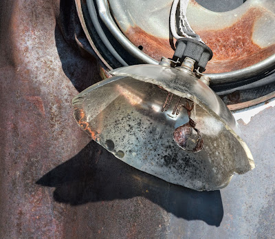
On that note, I'll introduce one of my images upon to base this discussion. It's one I like a lot, though it's never been a popular seller.

What's The Photograph About?

Well, in this case, it's a picture of a broken presumably old headlight (it's perfectly round and the body of the vehicle is very rusted so that makes it fairly old). The subject matter might or might not interest you. If you were into old vehicles, you might wonder what year vehicle, make, model or even what kind of vehicle. Perhaps you'd ask yourself where such a vehicle was found - on the street, in a junk yard or where. Curiosity about the subject of the photograph is an important component of an image - if it doesn't generate any curiosity in anyone, it's failed at a pretty fundamental level. There's also the repeated curves of the inner part of he bulb base, the outer part and that bright white rim around which is actually seen through the glass of the bulb as well as beyond it.

What's The Photograph About At A Deeper Level?

If of a philosphical or analytical bent, you might wonder about what the photograph says about aging, permanence, design, functionality or any number of other aspects of the image. It isn't even necessary for the photographer to have been either aware of those aspects of the image and certainly not to have deliberately inserted them into it. Whether the photographer might have been aware of it at a subconsious level really doesn't matter - if the photograph makes you think, does it matter if the photographer didn't. Can a blind person bake a cake that looks nice? Why not?

What Are The Parts Of The Image, And How Do They Relate?

Well, the hanging and broken headlight is an obvious major part of the image, but so is that dark and interestingly shaped shadow of the bulb sitting below it. Note the filament nicely located over a highlight so it stands out a bit, even though it is quite small. The body of the vehicle has several textures and colours - from fairly rusty to quite smoothe. Note though the colour tie in from almost purple in the rust on the left, to the bluish gray on the right, and the bluish tinge in the glass of the bulb, contrasted with the orangy rust of the headlight socket.

The wires curving down are important, particularly for their bright white. How about the complementary curves of the bulb and the bottom of the circular lamp fitting attached to the body of the vehicle.

Tonalities

Well, there's a painterly look to the image, particularly in the bottom half. The border between the white rim and that light blue on the right looks like it's a painting.

There's enough variation in tonality in the body of the vehicle to provide interest without adding distraction. The dent of the body even provides a bit of a specular highlight in the upper left where we're getting a bit of shine on the rusted metal.

Negative Space

If you look at the shapes surrounding the headlight and it's base, they are quite interesting in and of themselves. If you click on the image to bring it into it's own window, you can reach out with your fist and cover the base and headlight, leaving the shadow and body of the vehicle and still have some intersting shapes and textures, colours and tones.

Balance

The image does seem to be well balanced, with the base in the upper left, the bulb in the middle and it's shadow reaching to the lower left. Note the darker edges in the upper left and lower right, tending to keep one looking towards the centre of the image, almost acting as a frame to the parts of the image arrayed in a bottom left to upper right sequence, opposite of those two dark aeas which are on the opposite diagonal.

Framing

Not much to complain about - the bulb has breathing room - sure we could have cropped to the edges of the bulb, but the background works nicely and gives a hint of the old vehicle so is justified. Would the image have been better had the entire circle of the headlight base been included, or possibly more of the body (fender?) of the vehicle, perhaps even enough to help identify the vehicle? Well, this way it has more of an abstract feeling to it, a wider shot, even if it were well composed, would be more illustrative, certainly not the effect I wanted to portray - I don't give a damn what vehicle it was from, even though the viewer might.

Emotional Impact

Come on guys, it's a picture of a broken headlight, not a grieving widow after a massacre. Still, to me it has a sense of rightness, that things work together. I'd like to think that someone might react with surprise that such an ordinary subject could make an interesting photograph. If the emotional impact is nothing more than 'well, isn't that neat', that's quite sufficient. I don't suppose anyone is going to say that this image altered their lives, but perhaps someone remembers their Dad tinkering with old rusted vehicles, or that beat up old truck on Grandpa's farm you played in as a kid. Did I think of this as I took the picture? No, of course not. We don't even know what Da Vinci was thinking when he painted the smile on Mona Lisa - he may have reacted to it at a gut level rather than an intellectual one. Perhaps he had no idea of all the guesswork he would engender as people over the ages try to figure out what it's about - perhaps she had gas after the spicy sausage at lunch. Doesn't really matter - Da Vinci either saw it or created it from memory, thought it interesting and painted it in.

Flaws

There's not a lot that I'm unhappy with. The white of the wiring and of the surround for the headlight base is glaring white and is in fact pure 255 - overexposed, no detail recoverable. Does it matter - it bothers me, don't know if anyone else is bothered by it. I did use highlight recovery in an early version of Camera Raw - it's possible the latest version might work better, but probably over the top is still over the top. I can live with it. None of my images are perfect in every way. If we only read perfect novels, watched perfect films or listened to perfect music, we wouldn't have much to enjoy - a few masterpieces and we'd quickly run out of material, whatever the medium. It's too bad the filament isn't 10 times bigger but also against a white background so it would really stand out, still there's something to be said for giving persistent viewers more to see after the first cursory look. In fact, I'd say it's essential to give them more. It would be a pretty shallow picture that could be consumed in a glance.

Music And Photography

Unlike many of the greats in photography I have absolutely no musical talent at all, perhaps this means I'm never destined for greatness. Doesn't mean I can't write about parallels between music and photography.

When listening to good music, there is a fit between notes - the following notes just make sense. It may be that it's because it's a perfect fit for the previous note(s), it might even be because it was unexpected but provides an interesting contrast to the notes before, but somehow it works. We can't explain why it works, it just does. IF we hear lesser work, the notes that follow seem to have little to do with those before. One is left with the feeling it was a mistake, that the composer didn't quite get it right, or that the following passage has absolutely nothing to do with the previous - as if you were listening to chunks of different tunes. That sense of 'rightness' just isn't there.

Well, photographs are the same way. As we move our eyes around the image, in a good photograph one part leads nicely into the next, or contrasts it in a way that works. It just feels right.

In music, the more you learn, the more combinations and sequences of notes that feel right. Had one never heard jazz, the combinations would jar and feel wrong. With more experience and perhaps a music appreciation course, one learns to look for these 'different' patterns and on hearing them they start sounding right to us.

Now, if you don't have a lot of experience and or training looking at photographs, the same situation happens. Parts of the photograph seem to 'hit the wrong note'. Problem is, sometimes it is the wrong 'note', and other times it's our own ignorance, our limited experience which limits the range of acceptable combinations of lines, curves and shapes in a photograph. Often, rather than being disturbed as one is when a wrong note is played, we simply don't see anything interesting in the photograph and dismiss it as boring.

So what does this mean to yours and my photography. I think it means that if an image is much admired by people in the know and we can't see it, the problem may be ours - lacking the experience or education to appreciate what they're seeing, maybe. But perhaps it's just a bad photograph after all and it's being touted for reasons that have nothing to do with how well it's put together. Perhaps it's because the photographer is famous and anything coming from him 'has to be good', or maybe the subject matter is topical or disturbing, outrageous or obscene and that's it's claim to fame.

On a more practical note though, can we apply this sense of rightness from one note or passage to the next, to our photographs? In some ways photographs are trickier - music is linear, notes follow in a fixed sequence over time. The eye however can wander round a photograph in any pattern it wants. It can revisit areas, stop and hover, quickly skip past other areas, loop back and generally misbehave. It can in fact abandon the image in a fraction of a second if nothing catches it's interest (just watch someone flipping through a photo magazine).

Still, the analogy is a reasonable one - the bits and pieces that make up an image have to work together. Rather like one of those soduku puzzles in which numbers have to add up every which way, the elements of the image have to work together, whether being 'read' left to right, top to bottom, diagonally, or in the opposite directions.

It's necessary to work the scene, moving round till the 'notes' fall into a workable pattern, and even harder, to walk away when despite your best efforts, they don't. There are a lot more bad photographs out there than good ones and finding the good ones requres shoe leather, a good eye, and considerable patience. With a little luck, you will strike a right good tune.

Weather

With 72 mm. (almost three inches) of rain in two hours last night, I had to work but should have been out photographing. Water makes so many surfaces more photogenic, yet as a group we like our comforts and don't tend to photograph in the rain. Those few who venture out reap the rewards.

Perhaps you might want to organize now for photographing in the rain - plastic covers for the camera, suitable gear for yourself so you can see and stay relatively dry (you're more waterproof than the camera).

Rain storms can provide some wonderful light - especially just as the storm starts to clear. Wet roads become rivers of silver, trees turn inside out in the wind and rain, rocks that on a dry day are dull suddenly gleam, even concrete becomes more interesting.

Monday, June 04, 2007

Upper Deck


Just a small detail on the upper deck of a tour boat at Portal Glacier, obviously not what everyone else was looking at. Felt rather silly taking the picture was damned if I was going to let embarassment stop me from getting a picture. Hardly a masterpiece, but pleasing in it's way.

Sunday, June 03, 2007

Seen It All Before

The other day I read a criticism of Lenswork for not being innovative enough, keeping up with the times and not having exciting new photography. It wasn't long ago that I had written a blog bemoaning the decision of some editors to proclaim 'new' to the point that being different appeared to be the only requirement for selection.

I have great difficulty believing that the work showcased in magazines like Camera Arts is going to have lasting influence. Of course if they espouse enough 'new' photography, sooner or later they are going to get it right at least once and be able to say 'see, we showed you X before he was important'. Problem is, they do so to the cost of us poor readers who have to wade through a lot of photography that is frankly crap.

The problem is, some years ago I too dropped my subscription to Lenswork for a while, feeling that it didn't have much new to show me. I'd casually flip through each new issue and not getting much of a kick out of it, lost interest. After a few years though, I couldn't stand being without it and grabbed every copy off the newsstand I could find and when I missed some issues, resubscribed.

This whole business got me thinking. Does photography have to be new to be good? Is Bruce Barnbaum's photography good because he made some of the first slot canyon photographs, or showed English Cathedrals and monestaries as they hadn't been seen before? Do we then discount all his other work, in sand dunes and forests, mountains and shores because we've seen it before? IS someone like John Sexton incapable of taking a good photograph because he shoots in the style of Ansel Adams and so by definition 'it's been done before'.

Here's an alternative theory.

The more photographs we look at, the larger the reference bank of images we have in our mind, the more likely we are to see something quite similar to previous work. That's fairly obvious. But the other part is the more work we have seen, the higher we set the standard for new work. After years of pouring over landscape photography in Lenswork, we are pretty jaded and our standards so high that few images if any from a new photographer really excite us, unless his style is sufficiently different from those who went before to make us 'sit up and pay attention'.

One of the primary purposes of photography is to show us things and relatinoships we hadn't noticed before. If the only thing a photograph has to offer is that it's well composed, nicely printed and pretty, is it any wonder that we become jaded.

Does this mean, though, that the only alternative is to make photographs so odd, distorted, multiple exposed, muddy, unfocused, odd, even perverted that we can almost guarantee we haven't seen this before (or at least if we have, we threw them out years ago as a bad attempt and wouldn't in a million years have thought to submit them for publication)?

Does a photographer get credit for imagination without either purpose or execution? Seems like some editors think so.

Is it not possible to show a 'rocks and roots' image which is so well done that it takes our breath away? Should we all completely give up photographing the landscape becuse 'it's been done before". Does this mean we don't need any more war pictures or famine shots, portraits or nudes? Is it not possible to show us a photograph in one of these categories without covering the nude with post it notes, the landscape with ropes, the portrait with graffiti in order to make it new? God, I hope not.

Getting back to Lenswork, as we quickly flip through the magazine, looking for something different, we risk ignoring the strengths of the work which is presented. At something like 1 second per page or less, just how likely is it that we are going to learn anything from a photographer. With that kind of viewing time, the images really have to be very different to catch our attention.

Perhaps, dear Brutus, the fault lies within ourselves. Mayhap we need so spend some time with at least some of the images from each photographer presented, before discounting the work. Straight photography is hardly a passing fad, now out of fashion. It is the mainstay of photography and has been from the days of Fox Talbot - it's what photography does well and has been doing for 150 years and I suspect will continue to do so for many to come.

Friday, June 01, 2007

Cropping And Framing


I'm starting a new series of articles for Outback Print on cropping and framing. The image above is one in which I discuss cropping. Shot last Fall on Hornby Island off Vancouver Island. It's one of a series of images for stitching but I decided the other night that just this part of the image worked really well, possibly better than the full stitch. Sometimes when I shoot for stitching, I end up with weak ends - no real edge for the image. This was one of those series, but this one image was close to perfect, with a little cropping (but don't tell anyone).