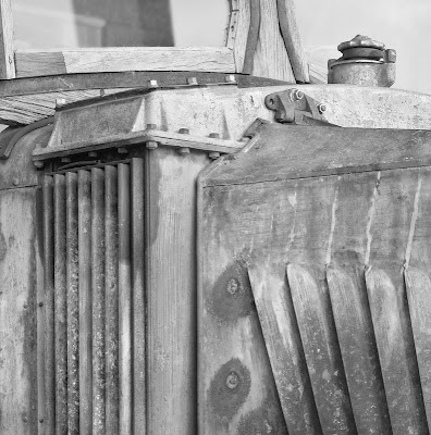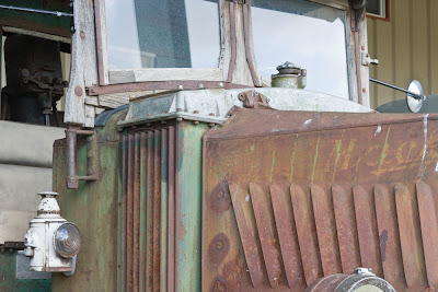
To make the image above, I started with the image below. I knew at the time that I'd be cropping either end. Perhaps I should have stitched a more tightly cropped image so nothing would be thrown away but fortunately with 16 mp, I can afford to do some cropping.

In the end, the headlight was problematic so I took a little off the bottom, and I ended up with too much sky reflected in the upper right hand corner so cropped the top a little too. I consider this fine tuning and was glad to have the option to crop just exactly so. Had I framed it "perfectly" in the original file(s), then perhaps I might have regretted it later (see previous blog entry for mistakes I make).
I worked on the colour image for a while, balancing the tonalities (too dark on the left bottom. I added some contrast and then added local contrast with Akvis Enhancer. I immediately backed up a step though and used the history brush on the enhanced step to apply the enhancement at a reduced degree (around 30%) as and where needed, including in a few areas stroking more than once so going beyond 30% as needed. Most of the image had no enhancement in the end, but other parts varied from 30-100% of the effect.
In the end I had a nice image, but the green and rust and pale blue of the sky clashed and I thought that the image might work better in black and white.
I darkened the blue slider to work on the sky reflected in the windshield, while using yellow and red sliders to increase tonality in the rust and green (in real life most green is far more yellow than green).
I liked what I saw but as often happens, needed even more contrast now that colour was not part of the information in the image. I added this selectively (not on the windshield) and used a couple more layers to lighten and darken as needed.
I didn't like the texture in the windshield on our left and so duplicated the flattened image and used gaussian blur of around 7 pixels to de-emphasize what was coming through the glass. A lot of blurring tends to look unnatural but this much carefully applied only to the windshield worked perfectly.
I decided that I still had a little bit too much almost white in that upper left corner so cropped even tighter than originally planned and feel the result is stronger.
That the end result is close to a square is just coincidence - it just worked out that way, but as you perhaps know from previous blogs, I am very fond of square images, so it certainly doesn't hurt.


No comments:
Post a Comment