In some ways, there is give and take in the matters of composition and printing and number of pixels or size of film or lighting, so long as the subject is interesting in the first place. The more interesting the subject and situation, the more we are inclined to give in on the other aspects of image quality - up to a point anyway. Who hasn't at some time been affected by a picture in a newspaper. Clearly printing quality is minimal, lighting is usually irrelevant and composition very much secondary to the subject.
The problem is that no matter how well all other aspects of the image are executed, an interesting subject is fundamental.
One can argue - "interesting to whom?", since if it is a subject that interests you, there is sure to be at least one other person in this world who is also interested. What you have to do though is ask yourself whether even you were all that interested in the subject, or did you shoot it because you thought it would make a good picture (or at least hoped so).
By this point you may be asking yourself what is the difference between something that is interesting and something that photographs well? You might further be excused for asking "who the hell cares?".
I don't think there is a single sentence answer to the question above, well at least the first part, but I suspect that exploring the question could be useful the next time we go out looking for images.
First here's an example. I find an interesting shadow. It might be interesting because of it's shape or tone or because of how it interacts with something else. It isn't, of course; real yet it can certainly be photographed. Paul Strand took a photograph of a woman walking down the street next to a flat wall in New York. It was the shadow projected on the wall that made the image - the woman was essentially irrelevant to the image - or at least easily replaced. From an ordinary picture of an ordinary woman, the image is transformed because of the shadow into something trudging, weary, ominous perhaps. I can't find the image on the web so you will have to use your imagination.

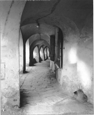
The image above is by George Todd - from his book Elements Of Black And White Photography. I think this an exceptional image and I would like to know more about this photographer. Anyway, the image above contains a number of elements that work for it - leading lines, interesting shapes and textures and a path leading to where? tends to add to interest. The little extra that makes the image is the light on the wall to the right nicely balancing the lighter parts of the subject on the left and also an interesting shape. Would this have been a decent picture without the light - certainly - would it have been a great image - I don't think so. It would be interesting to ask the photographer whether he in fact saw the arches and looked for a composition or did indeed see the interesting light projection then look for a composition within which to use it. Did he walk by her many times, possibly even taking pictures, until one day the light was perfect.

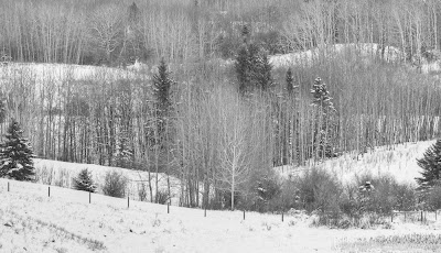
The above image, one of mine, is frankly pretty boring. It was almost the first image on a photo excursion in which the light was bad and the snow cornices, our ostensible reason for heading out, were nowhere to be seen. Often in this situation, the first scene you come across is one of "well, it isn't great, but let's get those cameras out and hope for the best, or at least get the first images out of the way so we can go find something really interesting"
I quite like the hills opposite the duck pond here. I have driven past many times and photographed here more than a few - never with any great success and frankly this day was no different.
The hills are vaguely interesting but it is the whole range of hills that is attractive, not just one segment, yet there are sufficient flaws in the scene to make a panoramic image less than ideal so one is left to photograph sections, which never have the appeal of the whole.
This particular image does have some things going for it but there isn't enough of a pattern to make a good image. I really dislike the two spruce trees at either side, one partially cut off. The lighting is totally flat. There's nothing wrong with soft lighting but this is taking things too far.
Bottom line is if you take something vaguely interesting and divide it into quarters, you should have little expectation that the quarters will offer up much for the viewer and so it is.
It is possible to make photographs for the edification of others - commercial photographers do that all the time - often with great creativity and talent and even in advertising photography it is possible to glimpse some of the photographer some of the time. Many setups though are the work of the advertising director and the skill and talent lie in translating their wants into a finished image, which pleases them.
In fine art or hobbyist photography it is most certainly possible to apply the same strategies. You decide that a particular subject or style sells well and that you ought to use it. Your pick your subject for it's reputation. Thus you decide to photograph in Yosemite and use large format in emulation of the greats of the past. To be fair, you like the outdoors but it is your first trip to Yosemite and as such you have no idea whether you have caught it on a "good" day or not, whether you have scouted the best possible images. The only thing you know of Yosemite is the images of others - from books and websites. You get frustrated when you can't find the same compositions - because the weather or season is wrong or bushes have grown or it was a dry summer. You can't find any compositions at all that don't remind you of the work of others. Emulation being one thing, outright plagiarism another. You do shoot, though not as many images as you had hoped, and on returning home you find them disappointing. You ended up with nothing that Ansel would have taken, yet nothing that you can really call your own and be excited about.
Bits and pieces of this story are repeated all over the world, all the time, by millions of serious minded photographers, many of them puzzled in the end as to what went wrong.
If you want to be excited by your own images (and who else should be as excited by them?) then you have to start with your own ideas. We can certainly borrow from the greats of history but in the end, if we aren't interested in the subject, or in doing something with the subject, then I fear we are doomed to disappointment.
This is all very well but so far it's a litany of what not to do and nothing of what could and should be done, other than the obvious "find something interesting".
I could give you a list of interesting things, but it would be my list, not yours, and were you to pick a subject from it, could you be sure you are tackling it for yourself and not because I thought you should. No, you are going to have to find your own definition of interesting. And it's not enough to say that you are interested in landscapes - do you like near, middle distance or distant vistas? Are you obcessed with near far compositions like Joe Cornish, or tightly cropped compositions like myself? Are you happier with drama in your images or do you prefer subtlety? Is it really the subject that matters or the way that light plays off a subject, regardless of what and where it is? Do you like straight lines or curves, dark tones or light, contrast or soft textures? Perhaps you are interested in S bends, whether they be highway or plant or human form? Are you mostly interested in shadows? Mayhap you most prize that which others cannot or will not see or are you most fascinated in puzzles - what is it, which angle is it viewed from and from how far?
Some are lucky and come to photography with ideas of what interests them, and like Michael Levin featured in this months Black and White Photography magazine, you are able within a relatively short time (in Michael's case, five years) to produce a body of work any of us would be proud to show. I don't know Michael but would bet that he was "seeing" long before he took up photography.
Those of us who come at serious photography from the angle of liking to mess with cameras and stuff before we learn to see have a much greater struggle. We assume our problem is equipment and we spend years and many dollars searching for the right answers. Far better we should have spent a year wandering around without camera, just to learn to see, to find out what we like, what makes us curious. When you get to the point that you absolutely can't stand not creating an image, then it's time to start shooting.
Perhaps a more reasonable suggestion would be to spend that year, with the camera you have and the lenses you own and without making a single extra purchase, to photograph the things you cannot stand not to record and at year end, make a portfolio of small prints, say 5X7 inches or so (or even to make a web folio without making any prints at all) of your year's work. Far better a folio of lovely small images than mediocre large ones. If you must spend money, then buy books, attend courses, go to workshops, immerse yourself in the work of really good photographers.
I'm going to risk telling you what interests me - though perhaps you already know from looking at my images. Remember though that this isn't your list, only an idea of how you figure out what interests you.
O.K, so I like clean simple design - whether it be a car, living room furniture or art. I like regularity - verticals that are vertical, else they are sufficiently diagonal not to pretend to be vertical. I like things with weight to them - A Henry Moore sculpture rather than something made of wire and air.

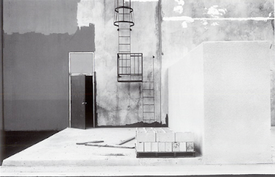
The above image by Lewis Baltz is one of my all time favourites. It's simple, geometric, monochrome, painterly, in a way abstract. How can a man who time after time has recommended and referred to Pepper # 30? I don't really know. They are certainly different in just about every way but who said I had to have only a single interest - wouldn't I be the dull boy if it were true, not to mention frustrated?
Here's an exercise for you to try - let me know how it works for you.
From the following list of values, select one or two possibilities from each list.
Your favourite:
1) tone, from black to white
2) shape
3) line
4) texture
5) lighting
6) compositional tool
7) shadow or light
8) painterly or realistic
9) flat or three dimensional (at least in appearance)
10)colours (remember saturation and luminosity)
11)warm or cold
12)sharp or rounded
13)soft or stiff
14)light or heavy
15)mobile or fixed
Feel free to add any other descriptors you can think of, without naming a subject matter.
Write out the list and read it through several times. Now, without picking up your camera and with the limitation of not leaving your property and with list in hand, spend an hour wandering around looking for things which have some of those characteristics. No cheating now - one full hour - sixty minutes of looking, searching, comparing with your list.
At the end of an hour ask yourself if you didn't see something you could imagine taking a photograph of. Even better, do take photographs of the things you found that had a connection with your list. Make yourself a little slideshow on the computer of these images, with only the most basic adjustments.
Now spend some time looking at the images you made and instead of evaluating each image for it's worth in the world of fine art photography - look at the body of work and ask yourself if it says anything about you - did the list mean anything, and does it perhaps suggest to you future avenues to explore.
I warn you that I have not done this exercise myself, nor recommended it previously and don't know how it's going to turn out. It's my feeling that it will be revealing and helpful but that's all.
I don't expect any of the images produced by this exercise to make it into your portfolios of best images of the year - that wasn't the point, but has it suggested what to look for in the future - that is the question of the day.
Do let me know if you try it - I'd be happy to see small samples of the images you produce and hear of the outcome of the experiment.
Next time I want to address the subject of "Interesting, but is it photographable?" which is, I think, our second biggest stumbling block.


5 comments:
Thank you for this great article! In those exciting times, when new thrilling gear pops up literally every week, it's too easy to forget what photography is all about: to go out and take pictures with a meaning for yourself.
In one point I slightly disagree. Photography consists of a technical part and a creative part. While copying the great masters of photography by going to the same places and trying to snap the same pictures with the same equipment certainly doesn't help to express your creativity, it may still be a good excercise to increase your technical skills.
It may also help to increase what Michael Freeman calls the photographers repertoire.
And yes, I've been to Yosemite with a large format camera :-)))
Great article (and I suspect an indicator that you are getting very serious about your next book ;) A closely related thought experiment is to take your n-dimensional feature space and populate it with data points that correspond to the photographs you have already taken; i.e., a plot of your aesthetic journey thus far. What shapes and forms have each of carved out in this otherwise enormous space of possibilities? And how will the path we trace itself change as a result of reflecting back on what we've thus far done? Lots of food for thought. (Indeed, I may have to follow up a bit on my own blog; you've got my creative juices flowing!)Thanks for a wonderful post, as always, George.
One thing that you hit on that I think is very important - is having sufficient vocabulary to articulate the "what's interesting" part. Jay Maisel would often ask a student "what's interesting about this picture?" and then, as the student struggled (often unsucessfully) to say something meaningful, would continue: "If it's not interesting to you, why would it be interesting to me?"
Nice article, here a link to the photograph of Paul Strand as mentioned in the article:
http://masters-of-photography.com/S/strand/strand_untitled.html
"The above image, one of mine, is frankly pretty boring."
Hmm. Well, when I clicked on it--for a larger image--it really didn't seem boring at all. Nice multiplicity of detail . . . if a big print was made of it, could be really impressive.
So, the issue of print size(?)
Post a Comment