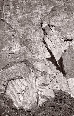
As usual, you can click on the image to see it larger. Worth it here as you can see the detail in the stone. Image toned with beige first then purple, and the percentages turned way down for a selenium look.
Musings on photography, the art of creating images, technical talk, useful tips, rants and ravings of a published photographer of 40+ years experience.
1 comment:
I like it. Helps to have a base with the dark ground at bottom. And the sharp shadows draw my attention to the interesting angular shapes on the right.
Post a Comment