There has been a heated discussion on the Luminous Landscape Forum about whether one can use f22. It would appear to be divided between those who theorize that this should never be done (and have not done so) and the few who actually have done it and found it to work, within the parameters of adequate depth of field combined with sufficient resolution to satisfy them.
I was curious to see just what sufficient to satisfy means, and in particular if it would satisfy me. I used the single central image of the stitch made today, shot with the 75 mm. lens, at f22.
I arbitrarily decided that a sharp up close 30X40 inch print would be my definition of sharp enough. As usual, I applied my normal amount of sharpening in lightroom, 58, .7, 70, 0 the same setup I had used with my D800e.
Once the image had been edited extensively, I applied output sharpening of 247, .7, 0 in Smart Sharpen. The result looked a tad over-sharpened at 100% on screen, an amount I was reasonably sure would produce a tack sharp print with no sharpening artifact.
The result - exactly as predicted. Inspection under a bright light as close as my bifocals will take me (8 inches).
So, f22 works just fine with the 75 mm. lens. Might it not work with other lenses - possibly.
Why didn't I compare it to 5.6 - because the question wasn't whether 5.6 would be sharper, the question I wanted answered (the same one Michael Reichmann wanted) is whether f22 works and it does.
Why 30X40 print - well, this was already going beyond 300 DPI - actually 206.4 pixels per inch. Printing larger would not be expected to produce perfect prints to be viewed from 8 inches at any aperture. In fact, the Pentax 645Z with 75 mm. lens did remarkably well and I completely agree with Michael - f22 is more than useable - it's just fine thank you.
Don't forget to click on this to see the whole section - which is about 3 inches across at 30X40!!!
Lessons learned:
Theory and Practice don't always match up.
Only the real world counts (ie. what happens in practice).
Diffraction is different from out of focus and responds much better to additional sharpening.
Sensor size controls the highest useable f-stop. I tested (in prints of real subjects - the only thing that counts) with my full frame 35 equipment and even with the 22 mp 5D2 and 3 and D800e, I could not go beyond f16, but I have proved to my satisfaction that I can with the modestly larger 33X44 mm. sensor of the Pentax.
So, how is this relevent to you? It isn't - except that you need to do your own test - with a real subject and in viewing prints. You might have better eyes (more than likely), or closer vision (almost certainly if younger) or higher standards (I'm pretty damn fussy) or you might not standardize on 30X40 prints with the Pentax, or use a different camera or sensor size.
If you do the test - with a real subject, and look at the print (on its own, not compared to anything) does it satisfy you - that's the only relevant question. If it does, great - if not, well you've answered an important question for you and your equipment specifically.
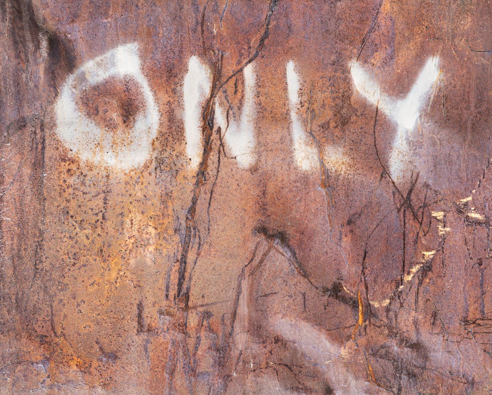
Feel free to write - but ONLY if you have done the test, as I have described.