

Yet again last night my 5000 refused to print. Eventually I had to unplug it when the vacuum wouldn't turn off but nothing else would happen. On plugging it in this morning, it once again tried to do an initial fill (which of course uses a vast quantity of ink). I really am getting fed up with it (fortunately on the Canon wiki there are instructions for bypassing the initial fill). If it weren't for the expense and for the excellent quality of the prints, I would have drop kicked it a long time ago.
I would be very leery of buying the newer Canon printers given the problems of dud cartridges and heads and Canon not covering them and the risk that the interface isn't any better - too bad they messed up an excellent printer.
I'm thinking that in the long run, I could use my 4000 and 7600 for big prints (which are generally not on glossy paper anyway) and pick up a 3800 and dedicate it to gloss prints. It would be slower than the 5000 but I'd be extremely surprised if it were anywhere near as much hassle.
as an aside, was given a sample pack of the Gold Silk Ilford paper and looking forward to trying it (after I stop kicking the 5000).
Tuesday, January 29, 2008
Camera Insurance
I learned the other day that even with a rider on your home insurance, if you even intend to sell any photographs (never mind selling any or turning pro), your coverage on camera equipment is null and void.
I got on the net to do a search for camera insurance and oddly it seems hard to come by. No problem in Britain where you have a few options, regularly advertized and on line. No such luck in North America. I did see something for photo.net users but not much information about coverage.
Anyone have useful information about getting camera coverage. Probably most of us could afford to replace any one lens or body at a pinch, but probably many of us would really be in a bind if we lost the whole camera bag. I'm going to talk to my insurance agent too.
In Praise Of A Modest Sized Over The Shoulder Bag
Last night I set out to photograph my model railway crew. I knew I'd be indoors, needing a wide angle lens. I wasn't about to lug my 30 lb. backpack with it's long and zoom lenses, macro and tilt and a variety of backets.
I carried just the camera, but didn't have anything to put it in or protect it. I'm going to pick up a moderate sized over the shoulder bag, something that can lie on the ground open, with the equipment readily available, yet if it is picked up without closing it, I can safely transport the contents short distances without complete disaster.
While the backpack is ideal for carrying large weights long distances, it sucks at just about every other function. Unless you open it entirely, stuff at the bottom is hard to reach. The parts that get dirty when it's open are the same parts that go against your back when you carry it, it isn't safe for carrying unless entirely zipped, even for short distances. The weight of large lenses or my 1Ds2 cause the velcro dividers to rip out of position if there are any empty spots below - it really only works well when every container has it's full contents, then the top spot (usually for the camera) has enough support. You can't access your camera without taking the bag off your shoulder (unless you are looking at those fancy new rotating bags which seem too small for my whole bag's contents.
Something in the way of a shoulder bag that would hold camera and three lenses and a few accessories would be ideal.
It should be light in colour so lying in the sun it doesn't bake - not that this is as big an issue as with film, but still...
It should have a really good grip on the shoulder and be sufficiently padded that I can swing my tripod over the shoulder strap. It needs to be waterproof and I damn well don't want two clips to close it, one will be just fine. It better be useable while on my shoulder.
Sunday, January 27, 2008
Learning - Scott KelbyTraining


One thing leads to another on the net and I somehow ended up at and found that for $200 a year, one could basically view as many 4 - 8 minute lessons as one cared to from around 20 instructors, includihttp://www.blogger.com/img/gl.link.gifng Scott himself, JP Caponigro, Don Margulis and a variety of others.
George Purvis had written me a while ago about the possible advantages of L.A.B. colour and recommended one of Don's books. Well, here I was on a site which offered video lectures on a variety of subjects including Don talking about L.A.B. Better yet, without even signing up you could try the first three lessons of any topic by any instructor for completely free - impressive.
I watched Don's first three lessons on L.A.B., enough to whet my appetite. I brought an image into L.A.B. via Image/Mode/LAB and tried an adjustment curve - wow - what power. Where in RGB one adjusts all the colours in creating a curve in the default setting, here you start out with L or lightness and can basically increase contrast without increasing saturation - an important tool. Better yet, you can flip in to A and B and use the same kind of contrast increasing S curve to separate colours further, without changing the overall balance of colours - somewhat akin to increasing saturation, but not quite.
In a matter of a few minutes I was able to dramatically improve a few different images, in what would have taken a lot more time back in RGB - hmmn, maybe this guy is onto something. No doubt you can overdo it but by using the opacity slider in the curves adjustment layer, you can tune it back and forth between zero and 100% opacity and choose what looks best - almost always less than 100% as it's hard not to go too far with such powerful controls.
Will this change my image editing, am I abandoning working with RGB for a life in LAB?
Certainly not any time soon - I might well buy his book, I may even break down and spend the $200 for a years subscription to ScottKelbyTraining, it's hard to believe I won't geet $200 worth of information out of these famous instructors.
A little more careful perusal of the site indicates they are just getting going and don't have a huge selection of lessons at this time - but I just purchased my first studio flash for some still life work and I see they have a studio lighting series - handy. Some of their listed authors don't even have lessons listed yet - eg. J.P. Caponigro. I guess this would make it a leap of faith that more will be coming and that by year end there will be plenty - but I think the concept is sound and the price fair and I don't see a reason for it not to fly.
Anyone have any experience with it yet - care to comment? Anyone who hasn't signed up, what do you think of the concept, the value, the practicality?
Getting back to the L.A.B. thing, the top image is after using LAB, the bottom before. I was able to warm up the sun, without yellowing the whole image and without needing masks, add a little punch without taking the colours over the top. I'm sure I could have done the same in RGB, but probably not nearly as quickly - there may be something to this LAB - I'll let you know as I work on real images whether it gains or fades.
Friday, January 25, 2008
Brett Weston
Brett is one of my all time favorite photographers, above even his father Edward, interestingly an opinion held by Edward himself. Although Edward's nudes and pepper # 30 and some other images have amazing power, when thumbing through a book of a hundred images from each of them, I find that Brett showed more consistent quality of images. I have a huge Aperture monograph of Brett's images which unfortunately showed them as contrasty and with seriously blocked shadows, nothing like the detail available in original prints or good reproductions.
Unlike his father, Brett travelled the world and some of my personal choices are from overseas - a forest in Britain, Italian hillside towns. I am not as enamoured of his work in Hawaii but that's probably personal taste. I feel he had a stronger sense of design than Edward and on the whole Brett's images are especially well composed.
Brett tended to isolate subjects more than Edward and he liked patterns and so not surprisingly his images became more abstract. You can perhaps see where some of my own interest in more abstract and close up images comes from.
I thought I'd pick one of his more ordinary images to discuss what works. Open the link below in a second window so you can read and view at the same time.
http://brettwestonarchive.com/images/ny and go to the 47th street image (second image).
The subject matter is hardly exciting, New York Apartment Buildings, the backsides. It is strictly an exercise in graphic design, yet also shows a side of New York few are privileged? to see. The image has a number of things going for it despite this inauspicious start.
The obvious features are the bright white lines of the roof and corner combined with the near white of the window blinds, all against a relatively dark yet highly detailed dark tonalities. The repitition of shapes in the walkway at the back and the zig zag roofline are critical to the image.
I'd also draw your attention to the management of the corners. There is a single line that leads right to the corner but most in fact simply come close, but in a staggered pattern. That is, a diagonal line goes from near one corner to not quite so near the other. Note the continuation of the white building corner on the top left to the zig zag roof and on down the side of the smaller building to the bottom.
There is framing left and right via these strong diagonals and the top and bottom are divided by more diagonal lines reaching from one vertical frame to the other. Even the streaks in the far wall contribute to the repretive lines. There are a lovely selection of textures from the flat roof, the slanted roof and three brick walls as well as the roof of the covered walkway.
There's a tiny highlight - too small for me to identify in this web picture, located on the small area of ground showing between the zig zag roof line and the top of the flat roofed wall bottom left.
The windows work well with dark windows against light brick, light against dark and the window on the right wall outlined with the white above and below matching other diagonals in the image.
The image works as a mystery - does anyone go out on that flat roof, why the fancy covered walkway and to where - the other building sure doesn't look like apartments, is this a dangerous back alley, does someone live or work behind some of the windows. It's a window into New York architecture and perhaps life of the first half of the 20th century.
Anyway, for a very unassuming photograph that some might not notice, it has a lot going for it - there's a valid reason Brett hauled up his 11X14 camera. He perhaps could have corrected perspective (though 11X14's are not known for excessive lens coverage so perhaps not) but the diagonals would have been lost and they work perfectly in this image.
Wednesday, January 23, 2008
Parts Department

Soon to be cleaned up and probably thrown out, these shapes have probably been sitting there for more than 30 years collecting dust.
San Francisco Workshop
In conjunction with Uwe and Bettina Steinmuller and Brad Polt-Jones of Future Light Digital Workshops, I am teaching a workshop in San Francisco April 12 and 13 this year (2008). The material is loosely based on my book but will call on Uwe's expertise in image editing tools (having created several including his updated Detail Extractor and his Tonality Tuner). Bettina is the artist of the duo and will bring her creative side to our street photography while Brad has created a super facility for doing workshops, with 12 internet connected workstations and is himself a professional photographer.
Should be fun and hopefully enlightening.
Should be fun and hopefully enlightening.
Tuesday, January 22, 2008
Viewing Frame
I've already had a couple of emails about my use of a viewing frame, asking how to make one or where to buy one or how to use it. My current frame is a simple cutout, but I have been thinking for a long time that what's really needed is an adjustable viewing frame.
I gave it some thought and realized that the most efficient way to do this was to use styrene (which can be scored and snapped and easily glued), that only two sides need to be adjustable, from perfectly square to reasonably panoramic.
A little work with pencil and paper and I think I have come up with a possible design. I'm going to build it in the next few days but thought I'd share the idea and perhaps someone else will come up with an even better design.
Cutting out that rectangular hole was a hassle, so better is a bunch of rectangular pieces that can be snapped and don't need drilled or filed or anything, so here's the idea.
The total size is 6X6 inches, the maximum opening is 3X3 inches, the minimum 1/2X3 inches. There are two vertical pieces 6X 1.25 inches, held with two horizontal pieces across the top and bottom, making for a 6X6 inch square. There are 2X3.5 inch 'sliders' which sit between the verticals and act as curtains which slide up or down as needed. Fully apart they make for an opening 3.5 inches high, closest together they are half an inch apart. They are held in place by a narrow cover sheet from top to bottom.
I'll finalize the design and show you pictures of the assembled viewer if it works as expected. I'm thinking it would be nice if it had a detent of some sort so that unless you deliberately change things it will sit at the 2X3 ratio of the typical dSLR.
Reality Vs. Fiction
Though there hasn't been much time for model railroading in the last year or so, I'm still involved. An oft heard comment is 'there's a prototype for everything', by which modelers mean that no matter how odd a model looks, somewhere in the world, there is somewhere that does it that way in the real world. While this may be true, it's also true that while it may be justifed by being a copy of something real, if it doesn't look real, it doesn't work well in a model railway. The same is true in photography. It's quite possible to capture an image which even though unaltered, doesn't look real. This is one reason why editing images is vital.
Real is a brightness range in the hundreds of thousands to one while a matte print may be 50 to one and a glossy print a bit better than that but still miles from the real world. You could simply compress the brightness ratio to fit the print, but often the result is very dull and flat looking, the life sucked out of it, especially if there isn't a lot of bright colour.
Looking through the latest 'View Camera', the author was discussing the complex unsharp masking needed to tame the contrast in colour slide film in order to make good ilfochrome prints. A local photographer, Keith Logan, does incredible work with a 4X5 including bird photography. He too goes to great lengths with masking to convert reality into something that works in a print.
Some of this taming happens behind the scene and starting in the camera so that digital photographers don't face the same struggles as slide film users, yet there remains a sense of unreality about unaltered images straight from the camera. Auto adjustment filters like Akvis Enhancer help to some degree, but being 'dumb', they need some assistance so that while some shadows are left dark, others which wouldn't have been dark to the eye, are opened up for printing.
All this of course presumes that what you wanted in the image is 'reality'. In the two workflows that I showed recently, Athabasca Falls and then the Fruit Bowl, reality was what we wanted.
Using the fruit bowl example (I'm at the office so can't show it so you will have to flip back in blog entries to find it), you will note that in the end version there is a white spot on the lower apple. When looked at at high magnification, this looks like a perfectly good reflection, yet at normal viewing scale, it looks more like a dust spot or flaw in the apple.
I'm going to use some cloning and dodging to extend this small 'spot' into a real sized reflection. Of course it won't be real, but it will look it while the real reflection doesn't look real.
Monday, January 21, 2008
Checking On My Book
It may just be me (though I suspect most new authors are guilty),but I desperately want the book to be a success, less to make any money (though don't tell the publisher that), but for it to be well accepted, for the publisher to have been right to have faith in me, and simply the idea that I have written a useful book.
In some ways the success of the book won't really be measured for months or possibly years as hopefully people improve their photography beyond what they would have expected anyway, but in the mean time, sales, feedback, reviews and emails are it, and I'll take what I can get.
I regularly check Amazon to see how the book is coming along - never even knew you could find out such information - currently it's book # 1633 overall. Given that Amazon sells hundreds of thousands of books and calendars, that doesn't sound too bad. Better yet, it's listed as the # 21 photography book, of which there are hundreds, right behind Scott kelby's Lightroom book, though miles away from his highly successful 'The Digital Photography Book, Vol. 2' which sits in number 1 in photography books, # 44 overall,giving it sales of a top best seller novel - incredible.
One week into sales, the publisher had taken orders for or sent out 1700 books and at least a few of them have actually been sold as I've heard from the purchasers, from all over the world.
So there's hope, and yes, I'll keep neurotically checking on Amazon to see how things go - at least till they announce a second printing - if and when, and probably then too.
Have a nice day.
George
Sunday, January 20, 2008
Small Differences, Big Differences

Above is today's edit while below is the previous edit of a similar but not quite identical shot.

Diffferences include more dodging on the spokes of the half circle whatnot, inclusion of the top of the whatnot, moving the circular collar in the bottom left, a slightly higher viewpoint and also I suspect a longer lens (the inner half circle doesn't look as rotated as in the earlier shot which I assume to be from the change in perspective.
In most ways I prefer the newer version exc. for that less obvious rotation. These wre subtle differnces impossible to see through the viewfinder. The single image of today was a 120 second exposure at f 16, the camera wouldn't focus and manual focussing was as much luck as skill.
I could re edit the earlier shot to look more like the latter, but I prefer the space above the whatnot and I like the two diagonal braces of the outer half circle.
The original version of today's shot actually included a post reaching up to the upper left corner and while 'clever', I decided it didn't add to the image.
The end result is consistent with my philosophy of 'simplify, simplify, simplify'. 'If in doubt, don't', 'if you aren't sure if it adds, it doesn't' and 'it's almost never worth adding something if it comes with excess baggage'.
Alex, Where Are You?
I received an email this morning from Alex asking about use of the plastic viewer (page 40 of my book) and I wrote the following reply. Unfortunately the email address he gave me doesn't work and nor do various combinations and permutations of what looks like two email addresses lumped together. Anyway, for Alex and anyone else out there not familiar with using a viewing device:
Alex:
you are talking about the elbow zoom feature (you straighten your elbow to zoom to a longer focal length) - it also has digital rotate - take your digits and rotate the damn thing.
Back in the days of 4X5 film, if I used a 4X5 inch cutout, then the distance of the rectangle from the eye gave you the focal length of the lens you'd need to capture the same scene - very handy. With the small sensors in digital cameras, I find a hole that size to be too small, too close to the eye and the edges too blurred (especially to my 58 year old eyes) so I prefer a much larger hole, say 2X3 inches or a bit bigger. In theory you could then do the math
sensor width
---------------- X distance from eye = focal length of lens used.
viewer opening width
In truth, with zoom lenses I don't really worry about it too much, I just guess which lens will be needed - occasionally I get it wrong but it's not much of a deal to change lenses.
I have wondered about creating a viewer which has slides to close off either length or width so that I could 'crop' in the viewer - so far I just use my other hand if need be.
The rectangle doesn't have to be plastic - I just happened to have some around - in the past I have used mount board, but they get beat up relatively quickly - even my plastic has had to be glued. Arborite would be good (counter top material) but is hard to cut without chipping), aluminium would probably be best though would take a little longer to make.
George
Saturday, January 19, 2008
Clutter - Can It Be O.K.?

I'm not sure about the above image. Instinct tells me I like it, intellect tells me there's too much junk.
Of course, the place is about junk, there's stuff lying all over, some of it probably sitting there for 30 years or more, but perhaps I should have made more effort to make order out of chaos, maybe I should have just walked away. I'll think about it for a few weeks before making any rash decisions.

Oddest Shapes

Hidden behind and under a giant press, very much in the dark was this odd assortment of shapes. I used my 90 ts-e but didn't tilt it - instead I blended three images in Helicon Focus. Exposure was f8 at 30 seconds for each of the images.

Still Finding Things At The Machine Shop

It was nice to be back at the machine shop again today. Rosco greeted me with a handshake and smile, old friends now. I asked if he would mind signing a model release so that I can use his picture for fine art sales, competitions, submissions and publications and he had no hesitation in doing so. I suggested that if Kelloggs calls to put the image on their corn flakes boxes, he and I would work out a deal. He seemed to think this unlikely. He showed me his overalls which had "assholes" on the breast - apparently the name of his motorcycle 'gang'. I'm pretty sure he's the kind to stop and help a little old lady across the street, while wearing his leathers. Perhaps he's right.
There's been a lot of cleanup since I was there a month ago - walls painted white, machinery moved, lots of things just plain gone. I'd say a good 1/3 or more of the images I already have would not be possible now - good thing I started this project months ago.
I'm going to head back tomorrow to see what else I can do before the cleaners up do more 'damage'.
Friday, January 18, 2008
Same Steps, Different Result

I thought I'd compare the results of the two editing sessions, the original and the recreated for documentation that I outlined in my workflow in the last blog entry.
On the left is the recent result when I recreated all the steps to illustrate my workflow. Even though to the best of my recollection I duplicated the steps, the results are quite different. I suggest you click on the image above to get the bigger version in its own window. Note the highlight in the upper apple and the greater contrast and peppier highlights in the bottom apple.
The differences simply reflect the best I could do at the time. Changes might reflect more experience with the image, being braver in taking things a bit further, or possibly just a change in mood - one day I wanted to emphasize subtlety, the next a bolder more dramatic image with glowing highlights.
This is reminiscent of my days in the wet darkroom where for technical reasons like developer exhaustion and temperature changes, reproducing an image was nigh impossible, you simply had to make the best image possible on the day.
I see this as a good thing. If you are asked to make a print of an older image, it could well be worth your while to start over. You might just end up with a significantly better image, you will almost certainly end with a different image which will be interesting even if not fundamentally better.
The only warning I would give you is that if someone has seen the original print, even if you are convinced the new is better, you run the risk that they will be disappointed with it. You might need to ask which they prefer. Still, I don't suppose that Ansel made that offer as his printing styles changed quite dramatically over the years.
Fruit Bowl Workflow
As requested, here's the workflow for the recent fruit bowl image. As this is a 'redo', the results are not exactly the same as previous, but it's close and it will give you the idea.
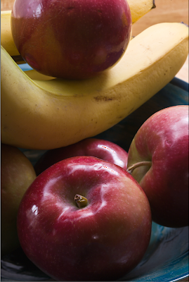
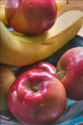
From the start, I wanted a black and white image with rich tonalities and nice reflections off the apples. I like the circular patterns of this bowl, reminiscent of the curves Edward Weston used in the funnel in which he photographed pepper # 30.

The image above shows the first appearance of the colour image in Camera Raw. We can see immediately that my lighting was a bit harsh and the shadows should have had more fill - I'd simply turned on a light across the room, I probably should have used a reflector board just under the camera to bounce the light behind the scene into the shadows. A lot of editing of images is compensating for the deficiencies in the image - the fewer deficiencies in the raw file, the less work there is to do in editing.
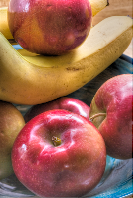
The second image above shows the results of using Recovery in Camera Raw to tame the blocked highlights. As you can see, the raw file in fact contained a lot of useful information in what seemed like pure white highlights.
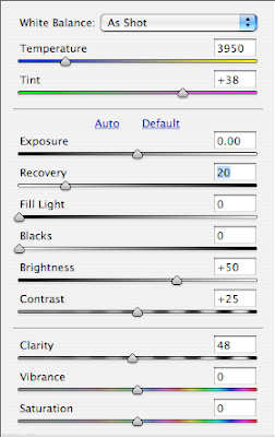
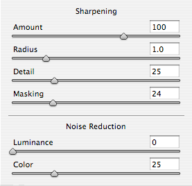
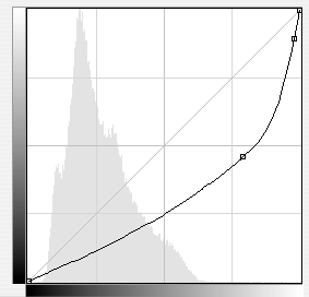
The two diagrams above show the settings in Camera Raw, first for overall settings of exposure, contrast and so on, while the second shows the sharpening I use in Camera Raw as a default for almost all my images coming in to Photoshop.
Above you see the image as it first appears in Photoshop. Clearly the shadows are too dark. I elect to control the contrast by using Photomatix Tone Mapping Photoshop filter. I might have used fill in Camera Raw but anticipated this would produce a better result.
I still wasn't quite happy with the contrast control and wondered what would happen if I used Akvis Enhancer. I thought perhaps the banana might not look smooth enough, but in the event I liked the effect.
Above is the result after Akvis Enhancer. I applied it to a copy of the image as a second layer so I could undo parts if need be. As it happened I didn't have to undo anything. Such severe opening of deep shadows on my 1Ds2 produces some pretty severe noise and striping in the now very visible shadows but I plan to take care of them later with some judicious blurring.
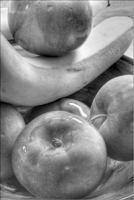
It's time to convert the image to black and white. While there are several ways this can be done, if you are using Photoshop CS3, I can't see any reason to use anything but the adjustment layer 'black and white' which provides a series of preset filters or even more powerfully a set of sliders.
I adjusted each of the sliders to make the best looking image possible. Some, like green, really didn't do much, others were surprising in their effect. You see in the image above the result of the various changes but with magenta set very low. Below are the settings.
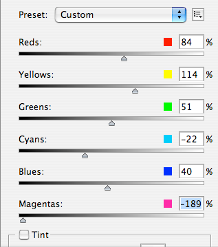
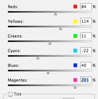
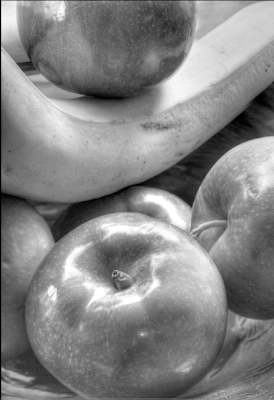
I then turned magenta up considerably.
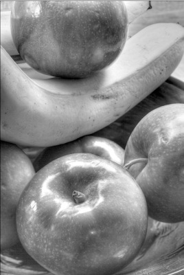
Notice the huge effect on the highlights in the bottom apple, simply by adjusting magenta as seen in the slider settings below.
By now, it's possible to see that I am getting to something vaguely resembling the subtle tonalities and rich highlights that were my stated goal in making the image, but there is a lot of work to be done yet. There are marks in the fruit that should be cloned out. I don't like the edge of the bowl showing in the right lower corner.
I'm not happy with the banana in the upper right corner. I decide to fertilize it a bit and grow it a bit longer with the cloning tool. and above you can see the result. It still has flaws but I can fix those. Notice that I have cropped a little of the top of the image too to clean up the background and have the banana come to the upper right corner. In doing this I would have lost the reflection in the top apple so I cloned it a bit further down the fruit before doing the cropping.
I like the overall shape of the image now, but it's a bit anaemic - the darker areas of the apples need to be made darker yet. Time for an adjustment curve.
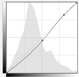
Above is the shape of the curve, a simple convex curve designed to darken but not do a lot to overall contrast. That will be achieved by applying the effect locally.
Above you see both the curve and the mask once it's been painted into. Almost all my masks start black and the effect is painted in, but sometimes I want the change applied almost everywhere and I paint black into a white mask - it's simply a matter of which is easier for any given image. Sometimes the shape that needs to be painted will determine whether it's better to paint the shape or the area around the shape, and thus whether a black or white mask should be the starting point before painting with the opposite.
I decide that I haven't darkened things enough. Rather than change the previous adjustments I decide to create a more dramatic curve.

And above you see the curve and mask after painting into it.
And above is the result.
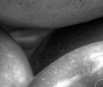
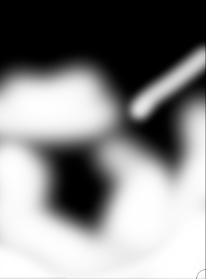
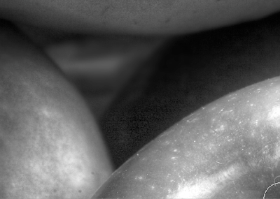
Above you see the problem with the shadows - very noisy and somewhat striated, the effect of grossly lightening the very deepest shadows recorded by the camera. It's time to apply a bit of gaussian blur to the parts of the image that show this problem.
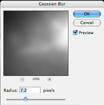
Above you see the noisy shadows then blow, the effect of blending in the blurred image in appropriate areas. This is simple. Duplicate the image in a new layer (you drag the flattened image to the second from the right icon in the bottom of the layers palette and voila you have the image in two layers. Blur the top one, black mask it and then paint light into the mask wherever you want the blurring to hide the noise.

And we are getting quite close to the image we want.
I'm still not quite happy with the upper right corner - it would be nice if the banana came right to the corner. I decide it's time to do a little stretching. Command (control for PC) - A selects the whole image. Then under the Edit menu I select 'free transform'.I then press down the command (control for PC) key and drag the upper right corner to the right as you can see below.

Since anything dragged off to the right is outside the canvas, it is lost.
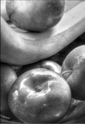
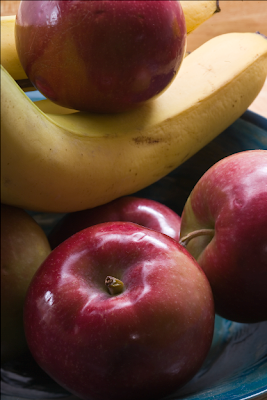
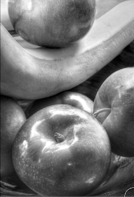
And here you have the final image above. There are a few other things of note - I cleaned up the various bruises to the fruit. I didn't like the bright parts of the bowl in the bottom two corners so I created a very steep curve in the highlights to darken them without radically altering the mid tones and shadows and now they are a bit more subtle. I have used the dodge highlights tool to improve the top apple highlights and work on the banana a little to give it more pop on the left side, while toning it down a bit on the right with the burn midtones tool.
There are a few other minor changes but there you have the significant steps in creating the image. Despite all the editing, it looks very nice at 13X19. As mentioned in an earlier comment, I did use my tilt and shift lens to focus on both of the apples. The alternative would have been to use Helicon Focus to blend a number of images as I focused through the fruit, while using a fairly wide f stop to keep the background severely blurred. This means making lots of images with only a little change in focus between each, but the software is cheap and you don't need a very expensive fancy lens.
From the start, I wanted a black and white image with rich tonalities and nice reflections off the apples. I like the circular patterns of this bowl, reminiscent of the curves Edward Weston used in the funnel in which he photographed pepper # 30.

The image above shows the first appearance of the colour image in Camera Raw. We can see immediately that my lighting was a bit harsh and the shadows should have had more fill - I'd simply turned on a light across the room, I probably should have used a reflector board just under the camera to bounce the light behind the scene into the shadows. A lot of editing of images is compensating for the deficiencies in the image - the fewer deficiencies in the raw file, the less work there is to do in editing.

The second image above shows the results of using Recovery in Camera Raw to tame the blocked highlights. As you can see, the raw file in fact contained a lot of useful information in what seemed like pure white highlights.


The two diagrams above show the settings in Camera Raw, first for overall settings of exposure, contrast and so on, while the second shows the sharpening I use in Camera Raw as a default for almost all my images coming in to Photoshop.

Above you see the image as it first appears in Photoshop. Clearly the shadows are too dark. I elect to control the contrast by using Photomatix Tone Mapping Photoshop filter. I might have used fill in Camera Raw but anticipated this would produce a better result.

I still wasn't quite happy with the contrast control and wondered what would happen if I used Akvis Enhancer. I thought perhaps the banana might not look smooth enough, but in the event I liked the effect.

Above is the result after Akvis Enhancer. I applied it to a copy of the image as a second layer so I could undo parts if need be. As it happened I didn't have to undo anything. Such severe opening of deep shadows on my 1Ds2 produces some pretty severe noise and striping in the now very visible shadows but I plan to take care of them later with some judicious blurring.
It's time to convert the image to black and white. While there are several ways this can be done, if you are using Photoshop CS3, I can't see any reason to use anything but the adjustment layer 'black and white' which provides a series of preset filters or even more powerfully a set of sliders.

I adjusted each of the sliders to make the best looking image possible. Some, like green, really didn't do much, others were surprising in their effect. You see in the image above the result of the various changes but with magenta set very low. Below are the settings.

I then turned magenta up considerably.

Notice the huge effect on the highlights in the bottom apple, simply by adjusting magenta as seen in the slider settings below.

By now, it's possible to see that I am getting to something vaguely resembling the subtle tonalities and rich highlights that were my stated goal in making the image, but there is a lot of work to be done yet. There are marks in the fruit that should be cloned out. I don't like the edge of the bowl showing in the right lower corner.

I'm not happy with the banana in the upper right corner. I decide to fertilize it a bit and grow it a bit longer with the cloning tool. and above you can see the result. It still has flaws but I can fix those. Notice that I have cropped a little of the top of the image too to clean up the background and have the banana come to the upper right corner. In doing this I would have lost the reflection in the top apple so I cloned it a bit further down the fruit before doing the cropping.
I like the overall shape of the image now, but it's a bit anaemic - the darker areas of the apples need to be made darker yet. Time for an adjustment curve.

Above is the shape of the curve, a simple convex curve designed to darken but not do a lot to overall contrast. That will be achieved by applying the effect locally.

Above you see both the curve and the mask once it's been painted into. Almost all my masks start black and the effect is painted in, but sometimes I want the change applied almost everywhere and I paint black into a white mask - it's simply a matter of which is easier for any given image. Sometimes the shape that needs to be painted will determine whether it's better to paint the shape or the area around the shape, and thus whether a black or white mask should be the starting point before painting with the opposite.
I decide that I haven't darkened things enough. Rather than change the previous adjustments I decide to create a more dramatic curve.


And above you see the curve and mask after painting into it.

And above is the result.

Above you see the problem with the shadows - very noisy and somewhat striated, the effect of grossly lightening the very deepest shadows recorded by the camera. It's time to apply a bit of gaussian blur to the parts of the image that show this problem.


Above you see the noisy shadows then blow, the effect of blending in the blurred image in appropriate areas. This is simple. Duplicate the image in a new layer (you drag the flattened image to the second from the right icon in the bottom of the layers palette and voila you have the image in two layers. Blur the top one, black mask it and then paint light into the mask wherever you want the blurring to hide the noise.

And we are getting quite close to the image we want.
I'm still not quite happy with the upper right corner - it would be nice if the banana came right to the corner. I decide it's time to do a little stretching. Command (control for PC) - A selects the whole image. Then under the Edit menu I select 'free transform'.I then press down the command (control for PC) key and drag the upper right corner to the right as you can see below.

Since anything dragged off to the right is outside the canvas, it is lost.

And here you have the final image above. There are a few other things of note - I cleaned up the various bruises to the fruit. I didn't like the bright parts of the bowl in the bottom two corners so I created a very steep curve in the highlights to darken them without radically altering the mid tones and shadows and now they are a bit more subtle. I have used the dodge highlights tool to improve the top apple highlights and work on the banana a little to give it more pop on the left side, while toning it down a bit on the right with the burn midtones tool.
There are a few other minor changes but there you have the significant steps in creating the image. Despite all the editing, it looks very nice at 13X19. As mentioned in an earlier comment, I did use my tilt and shift lens to focus on both of the apples. The alternative would have been to use Helicon Focus to blend a number of images as I focused through the fruit, while using a fairly wide f stop to keep the background severely blurred. This means making lots of images with only a little change in focus between each, but the software is cheap and you don't need a very expensive fancy lens.
Wednesday, January 16, 2008
Fruit Bowl More Editing

A bit more contrast, tidying up the upper left corner, burning in the banana a bit, changing the reflection in the upper apple to be a bit rounder. Not final, but enough for tonight.
Subscribe to:
Posts (Atom)