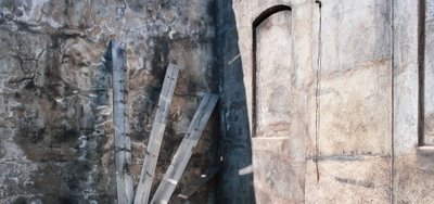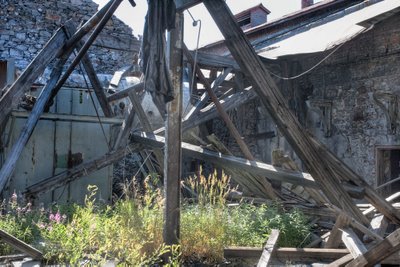


The above image from Coleman Colliery is illustrative of the need to keep things simple. The bottom image tried to include the kitchen sink - it has way too many things going on. it has harsh lighting, cloth hanging, textured walls, backlit grass, beams lying at odd angles, altogether too much. One can see some interesting things in the image and perhaps we can forgive me for trying to shoot it, but really, I should have realized there was way too much going on.
You can look through the bottom image and find some things which might have worked on their own, had I been able to find a clear sight line - but I couldn't. Perhaps if instead of shooting this image I should have spent the time wandering around trying to isolate some of the details. I quite like those shelf brackets on the wall - against the textured wall there might have been an image. I wonder what would have happened had I moved in close to the grasses so they filled the frame, with the jumble very much in the background.
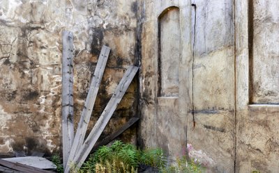
Fortunately, in the opposite corner of the building things were much less cluttered. I really liked these boards leaning against the wall and the fake window openings in the other wall. I did try shooting with more of the base included whch showed some weeds but felt this image was cleaner. The third image is the alternative crop, also shot before the sun was on the wall.


No comments:
Post a Comment