


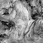
Over the years I have tried various techniques to review whether my dodging, burning, lightening, darkening etc. were done to best advantage. I recently stumbled on a possible tool. I have a Photoshop action which shrinks images for the web and I discovered that if the full size image all fit on screen, the shrunken file ended up less than an inch across on screen and that looking at the image that small gave me a good idea of the major shapes of the image and their relative brightnesses. The image in the last post for example looked really flat in it's shrunken version so I undid the shrink and did a bit more manipulation, lightening some areas and darkening others till it looked stronger.
You don't need to convert to web format to do this trick, simply shrink the image on screen with command - (minus) (control - for PC's) to a size less than an inch across. Does it look interesting? Is there balance to the tones?
I remember years ago publishing images to Photosig for feedback and noting that images that looked good as a thumbnail were of course the ones that got looked at, and while it's true that there are images which don't look good as a thumnail but do full size, they aren't common and if the thumbnail is boring, perhaps it's saying something about the full size image.
The flaw could be one of not composing strongly enough in the first place, or of not working on the image to best advantage. Either way I do think this can tell you something about the quality of the image.
2 comments:
Also a great trick that John Sexton got me doing is to turn the image upside down. This abstracts it and lets you analyze without getting hung up on the subject matter. It can of course easily and quickly be done in Photoshop. Nice image...
Scott
Absolutely, good point and since giving up large format I haven't done that - will start rotating 180 and see how I like things.
Post a Comment