

Selling photographs at the local farmers market for two years was enjoyable and interesting - interesting because if you haven't worked retail before (not since a summer job many years ago), you learn a lot about customers.
I learned that:
People over 50 usually have little wall space for art so only buy if they are enthusiasts.
Young people are more likely than older to buy black and white.
Customers who almost buy but don't sometimes come back as much as a year later to purchase images - so be nice.
Chatting is a big part of selling images - which may go a long way to explain why I don't sell dozens of images in galleries but do well in person.
The information on the back of the print is as important as the image and often commmands more time of the customers than the images themselves - I describe the image and the circumstances of taking it. I used to go into the technicalities of shooting but now compact that into a single sentence. Customers like a story with the image and make a point of taking the 'blurb' and attaching it to the back of the frame and in one case to the front below the image.
People like to thumb through baskets of prints. If they see prints on stands, they often assume every print behind the first one is the same image and won't browse.
Women show more interest and buy a more prints than men, probably 2:1.
Young people tend to like abstract images more than middle aged people but it's not a hard and fast rule.
People surprise you with their ability to appreciate what you were trying to do in your images and it is quite common to get some very perceptive comments.
Colour far outsells black and white (even when they occupy equivalent space in the display - but much of the colour work is sold as decoration rather than as art so if you look only at 'art' purchases, probably black and white holds it's own. Mind you a fair amount of my colour work is abstract 'artistic' and wouldn't be purchased by the calendar liking public. Otherwise black and white would probably far outsell colour to art loving customers.
Some people insist on haggling about price but most do not, mind you I advertise substantial discounts for multiple print purchases.
A significant number of customers do subsequently come back to buy more artwork so it's vital to leave them feeling this was a good experience.
I offered an iron clad guarantee - they could return any print they didn't like, within a month, they could exchange any print within 3 months, they could purchase additional prints at discount for a month after purchase (and I would extend it quite happily for returning customers). I let customers pay for two prints but take four home with the idea that they'd pick the ones that worked best for them in their home. I took cheques and Visa and while a couple of times people didn't have room on their credit card when I ran it though, I was never once stiffed and no cheques bounced.
In two years I had one print come back that wasn't subsequently replaced with more or bigger prints. No one ever brought a print back and wanted a smaller one, fairly often though they would upgrade to a larger one.
I never sold enough small prints at $19 to even break even, but my daughter swore that looking through the cheap prints led to purchases of bigger prints and I think she is right - they'd stop for the $19 prints but purchase the larger ones.
Customers often wanted larger prints and I was able to pay off the cost of my 24 inch Epson 7600 selling large prints.
Panorama prints were quite popular and sold well despite the added cost - and of course it's a way to make larger prints without a bigger printer - bonus!
Some customers know their own mind but others really do need help.
Predicting which images will be popular is iffy at best and the images which generate the most positive feedback aren't necessarily the ones that are purchased most often.
It's rare for a customer to take home a particular image and change their mind - more often they come back looking for a companion image for the first one.
People amaze me at how quickly or slowly they decide on what they want - ok I can understand someone coming back and within seconds confirming that they want print 'A', but there are customers who discover you by accident and purchase a print in less than a minute, others who agonize over several prolonged visits - human nature at it's most varied.
Customers are interesting and interested and I regret none of the time spent talking with them.
Thursday, November 30, 2006
Don't You Just Hate...
People who dent every single page of a book - did they not learn how to turn pages by age 5? Do they not see the mark they leave with their finger creasing the images? Of course, the short answer is NO - they are totally clueless and boy they ain't gona see any of my photography magazines or books. I cringe if I have left a book out on a table and one of my wife's friends starts thumbing through.
This reminds me of a comment by Fred Picker of people looking at photographs at an Art Gallery or museum or who are even handed a print to look at. Those who care about images are seen to move themselves or the image into a position which results in the fewest reflections. Those that don't, don't.
That's one of the beauties of inkjet matte paper - it doesn't matter which angle you view it from, unless of course you put it behind glass.
Which reminds me, it's bad enough having to look at photographs behind glass but I really hate non glare glass - sure you can see the image better but the quality of the image that you do see is less. Were the print to actually touch the glass, the quality isn't bad but the problem is that normally we try to avoid the print touching the glass in case of humidity issues and ferrotyping (less of an issue with inkjet than silver gelatin prints) and that distance is what causes image contrast degredation and masking of fine details.
Getting Your Work 'Out There'
Just received an email from Derek announcing an upcoming 'show' of his work at a local coffee shop. Another friend is a supporter of a French Lanuage School and has a show next Spring of his pictures of France. This summer I had the proprietor of a Truck Stop want me to place my photographs in his Restaurant (I had visions of grandeur through galleries at the time so said no, now I'm thinking I made a mistake).
there's only one certainty - if you don't look for venues, you aren't going to get your work seen. Here's some suggestions for getting your work 'out there'
1) display your work in your own home - so at least friends can see it - you never know who might have a useful idea.
2) display your work at work - even if you are a janitor and can only put up work in the storage room - anywhere's better than no where.
3) don't be afraid to ask - the school janitor might progress from the storage room to the main hallway and be seen by a local arts supporter.
4) anywhere with a wall is a possible venue.
5) while traditional glass framed prints is 'the norm', it's also expensive - it cost me $5000 for the framing for my recent show. Consider instead framless glass, plastic lamination, foam board mounting, cheap frames from Ikea, Walmart, Costco, etc. Standardizing on frame size is good, standard matte openings doesn't work or at least I think is too limiting.
6) Consider malls, libraries, restaurants, coffee shops, book stores, schools.
7) there are entire books on getting published and some useful free information in some of the audio blogs at Lenswork as well as in articles in back issues of Lenswork Magazine. The editorials in Lenswork are well worth reading.
8) Be ready to get your work out there - have a series of good prints always ready to show. At the very least these could be loose prints in a printing paper box. I'd strongly encourage a large white border for the prints (as if they were matted)and on real paper - not plastic and please not gloss. A heavier art paper will look a lot more impressive (unless you are talking wet darkroom in which case glossy dried matte will be just fine thank you). Better would be a portfolio box from somewhere like Light Impressions. A recent article on Luminous Landscape referred to printing on Epson enhanced matte then binding up to 110 images at the local bindery. the result was an attractive book of images for around $60. Moab Paper makes leather bindings for their paper to make an attactive presentation book though it isn't cheap either and I think I'm going to try the local binding method. If a lot of people are going to handle the prints, loose is probably better in so far as if one gets damaged, it's easy to replace. Don't make the prints so large that they can't be held easily - paper that is too thin or too large to support itself between the hands is an invitation to damage.
Feel free to add your own comments on venues that have worked for you, either generating sales, interest or feedback that has been helpful.
Wednesday, November 29, 2006
Atlas Coal Tipple II


I found Akvis Enhancer better for opening up shadows than Conectrix Tone Mapper (which perhaps is best reserved for multiple varying exposure images that need blended into hdr. Even with Enhancer, noise in the shadows is a problem with my 1Ds2 using Enhancer with the shadow slider turned up (they do warn you this is an issue).
Tuesday, November 28, 2006
Overseas Photographers Recommended?
Over at The Online Photographer Mike Johnston is celebrating one year of his blog with a list of 10 best photographers. I have already sent Mike a note of thanks and made a donation as over the last year I've had great enjoyment from reading his blog almost daily. Not surprislingly, since Mike is American, his 10 best list heavily favours Americans (and one Canadian). As I know that my blog is read at various times from dozens of countries around the world, I'd be curious as to who you would nominate from your country as the absolute best, and do you have a website we can refer to to see some images?
Suggestions please!
Suggestions please!
Monday, November 27, 2006
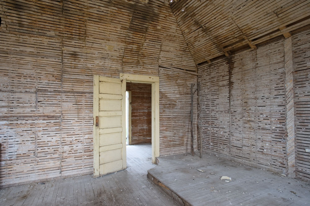
Inside Church At Dorothy
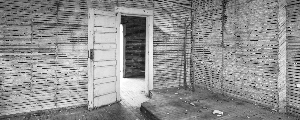
I thought I might show you some of the steps in making this image.
The first image is the result of Camera Raw, note that it's quite dark in order to preserve the highlights in the doorway.

The second image shows the results of Akvis Enhancer. More often I'd make some basic adjustments to the image first then enhance but I was curious to see just how much it could make of this image.
The third image shows a conversion to black and white - given the minimal amount of colour, I simply used a hue/saturation adjustment layer, saturation set to -100 (ie. none)
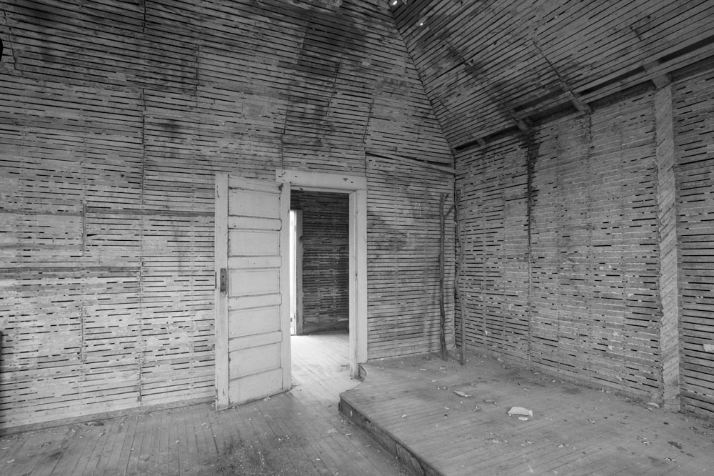
Here the image has been cropped - I felt the rooflines did not add to the composition and I was already seeing this as long and narrow.
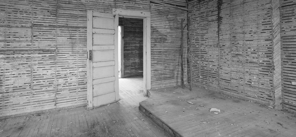
I used free transform in Photoshop to correct the tilting right hand side.
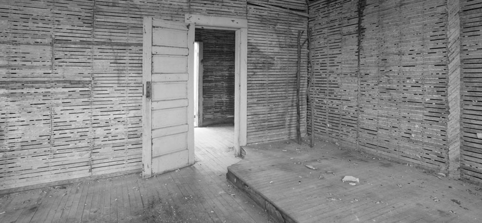
More cropping and I lost some of the foreground floor so the floor lines would meet in the corner - I'm still not 100% sure that I did the right thing, but I think I did - time will tell.

I lightened the image with several ajustment curves, some increasing contrast, others just lightening. I also did some darkening on the floor.

For final adjustments I duplicated the image in a second layer and applied burn and dodge as needed. Dodging was all done with 'dodge highlights' which is the equivalent of bleaching. Burning was mostly done with 'burn shadows' but there was also a little bit of 'burn midtones'

As this is a recreation of what I did, you will see some minor differences between the bottom and top images, but it gives you the idea of the steps I went through.
In From The Cold
An unseasonable minus 27 c. is keeping me indoors (yes, I know, I'm being a wimp). Here's a few things you might do when you can't or won't go out shooting.
1) Back up your important images to DVD. Back up your raw files too, in case future raw processors improve (they did already compared to two years ago).
2) Throw out images you are sure you will never use - start with all the technically flawed images, the duplicates in which the grass hadn't stopped swinging, etc.
3) Scan some old and favourite images.
4) Try a still-life. The winner of this years's 'Black and White Photography' magazine award is a still-life of some tulips.
5) Submit a series of related images for publication.
6) Dust that sensor, clean your lenses.
7) Make a viewing frame to hang round your neck (cardboard or plastic with cutout window shape of your camera format)
8) Pad those cold metal tripod legs.
9) Pick up some photography magazines - no not the ones full of ads and with very little content - get ones with images in them - for example 'Camera Arts', 'B&W', 'Focus', 'Lenswork', 'Silvershots', 'Black and White Photography'
10) This is your chance to create, update, spiff up or generally improve your website.
Sunday, November 26, 2006

Think Small To Check Balance

Over the years I have tried various techniques to review whether my dodging, burning, lightening, darkening etc. were done to best advantage. I recently stumbled on a possible tool. I have a Photoshop action which shrinks images for the web and I discovered that if the full size image all fit on screen, the shrunken file ended up less than an inch across on screen and that looking at the image that small gave me a good idea of the major shapes of the image and their relative brightnesses. The image in the last post for example looked really flat in it's shrunken version so I undid the shrink and did a bit more manipulation, lightening some areas and darkening others till it looked stronger.
You don't need to convert to web format to do this trick, simply shrink the image on screen with command - (minus) (control - for PC's) to a size less than an inch across. Does it look interesting? Is there balance to the tones?
I remember years ago publishing images to Photosig for feedback and noting that images that looked good as a thumbnail were of course the ones that got looked at, and while it's true that there are images which don't look good as a thumnail but do full size, they aren't common and if the thumbnail is boring, perhaps it's saying something about the full size image.
The flaw could be one of not composing strongly enough in the first place, or of not working on the image to best advantage. Either way I do think this can tell you something about the quality of the image.
Framed Before Photographed
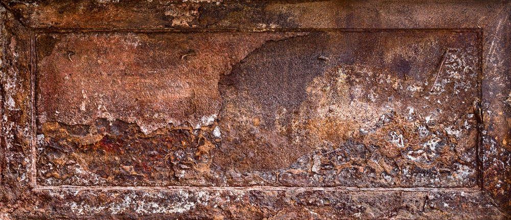
This preformed piece of 'art' was another late discovered and stitched set of images from the Turner Valley Gas Plant.
Saturday, November 25, 2006
A Find!

I've written before about the value of going back over old files. The image above really pleases me and it's actually two images which I had not bothered to stitch in the past and neither on it's own made a good photograph - together, well I think it works.
Partly I have to give credit to PTGui because it's made stitching so easy that I'm stitching things I hadn't realized would work.
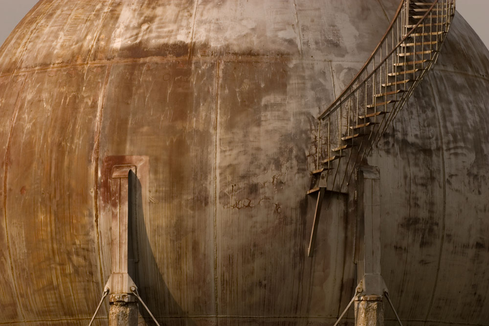
Gas Tank

Shot with a Canon 10D, a single image, cropped on either end, used Akvis Enhancer to increase local contrast, curve adjustment layers to lighten some areas and darken others, flattened, duplicate layer and burning and dodging applied to the duplicate and once satisfied flattened again, a couple of minor dodges applied after, sharpened with smart sharpen in Photoshop, converted to 8 bit, then grey, then duotone and created a custom quadtone using marroon and beige in two of the positions to give this result.
More Perspective Correction
Two more images from Mount Royal College - both with perspective correction which was very important to the result, using lens correction under distort under filter in Photoshop. In fact I had thought the reading room image was right but noted slight bulge on the right side even after correction and did it one more time for today.
Friday, November 24, 2006
Per Volquartz -Photographer
Here's something a little different and quite stunning. Per Volquartz has photographed fighter aircraft and other insturments of war as well as the more usual variety of photography. Well worth a visit.
Frankenhorns

Had a chance today to visit a music store service department and see the scrap brass they had soldered, blended, twisted and otherwise mutilated into what they refer to as Frankenbrass. The beat up horns of the instruments interested me the most.
Thursday, November 23, 2006
Free Transform In Photoshop
It's possible in Photoshop to select the entire image with command-A (control-A PC) and then go to the edit menu and down to free transform. If you then hol down the control (alt PC) button while dragging one of the corners of the image, you can distort the image. The area that you drag outside of the original will be clipped so you are throwing it away (save the image first) but this can make simple corrections in perspective or it can be used to line up corners perfectly.
In my recent image of the leaves in the clay pot, I hadn't in fact got the camera exactly directly overhead and the pot showed the pot as leaning away from the camera - one edge was shorter than the others and two edges leaned in to each other. It was an easy correction to drag each corner until I got exactly what I wanted. I did this before cropping so I would have a little bit of image to play with.
I sometimes use this technique to remove an object from near the edge of the print. I have to be careful that the result doesn't look distorted but for many landscape images it works just fine - 'subtlety in all things'
It works a lot faster than lens correction in the filters menu and I had worried that it would result in significant image quality loss but I've not seen it and there have been a few times I have even done it more than once to get the final correction.
Once you get the image the way you want it, press return to actually do the transform. Should you not like what you see after dragging the corners and before hitting return, you can cancel with command period (control period PC). If you don't like it after, then you do the usual undo in Photoshop.
Perspective Correction In Photoshop
Perhaps you haven't yet discovered the power of Photoshop to correct an image. First off it's located in the filters menu, select distortion, lens correction. You won't find it if you are working in 8 bit so if that's the case convert the image to 16 bit beforehand.
Lens Correction allows you to correct the look of buildings falling backwards because the top of the building is further away than the bottom. It can correct horizontal perspective in which one corner of the building appears to be further away than the other. It can also correct barrel and pin cushion distortion often present in images created with a zoom lens. It can even correct for chromatic abberation - that red and green fringe thing in (usually wide angle) shots. there is also a control for rotating the image. You might think it is straight but I have found that .2 (thats point two) degrees of rotation can spoil a picture particularly if the vertical is near the edge of the image.
In practice, one has to adjust image rotation, vertical perspective and pin cushion/barrel distortion all at the same time - ie. you have to find the combination of settings that provides the best correction. I usually will correct vertical perspective first (so that verticals are all parallel to each other (even if they are a bit curved at top and bottom), then pin cushion, then rotation. Once rotation has been corrected, I then again adjust the other two and I might go three or four rounds of doing this till I get the best possible correction.
You need to be aware that lensmakers attempt to correct for barrel distortion in wide angle lenses and in doing so unfortunately produce compound curves that have elements of both pin cushion and barrel distortion - ie the lines end up with s curves on either side from centre. This cannot be corrected by this software but fortunately I have found that I can get close enough that it doesn't usually show. Likewise if you are stitching three wide angle images together, each of which has barrel distortion, the resultant stitched result might have straight lines that appear curved and in a pattern across the image that cannot be corrected by this Photoshop filter. Here the trick is to go back to the individual images and manually set the correction for barrel distortion for each image rather than relying on the stitching software to do so. For a given lens and focal length, this will be a constant so once you have it figured for a particular focal lengh on a certain zoom lens, record it for future reference.
Once you have all the settings in 'lens correction' to your satisfaction, click on OK. You will first see the uncorrected image in Photoshop, then the corrected version.
This brings up a point. Some people feel that it is better to correct perspective distortion (falling backwards buildings)with lens shift rather than Photoshop correction, arguing that with shift you don't lose pixels whereas in Photoshop you throw away pixels and stretch others so you get less resolution. They are right, at least in theory, but it must be remembered that in shifting the lens, you are moving further from the centre of the projected image circle and closer to the edge which is never as sharp as the centre - personally I'm quite happy to use Photoshop to do my correction for me.
Next time I'll talk about 'free transform' which can also be used to correct perspective distortion but has better uses.
Architecture
Lost for a photographic project, how about finding a building complex that is interesting and see if you can create a portfolio of pictures which use the buildings as the basis for some creative images. This image was shot at Mount Royal College in Calgary, shot with a 17 mm. lens on my full frame sensor Canon 1Ds2. Note that I didn't choose to correct perspective because it made for more interesting lines and angles.
The image below is a stitch of 17 mm. images.

Wednesday, November 22, 2006
Experiments I Do Recommend
Although in a previous post I railed against a life in photography spent experimenting with films, developers, new cameras etc., there are in fact some experiments that I do think worth doing - they are fairly simple, can produce a result in an afternoon, and make your life easier in the future.
Depth Of Field
Modern cameras often don't have depth of field scales and frankly the ones that do aren't much good anyway - adequate for 5X7 prints but nothing larger. You need to do a test for your equipment and your size prints. I wouldn't be difficult to shoot a fence or long brick wall or even a road. Remember though to make your decisions based on the print, not on what you see on screen at 100% - do that and I guarantee you will be very frustrated (it will show you that you have no depth of field at any f stop). What I think you probably want to find out is the hyperfocal distance for the f-stops you commonly use when you need depth of field - say f8 - 16. Hyperfocal distance is the distance at which you focus the lens so that everything is in focus from half that distance to infinity. I'd assume that infinity is 100 feet for a normal focal length lens and longer and shorter proportionate to the change in focal length (eg. if normal is 50 mm. lens, then a 25 mm. lens is going to use 50 feet as infinity but a 200 mm. lens is going to use 400 feet as infinity).
Diffraction Limits
Don't guess what f stop is the smallest you can use - actually find out and having found out never ever use a smaller one. What happens is that you get to the point that the out of focus areas don't get any sharper and the in focus area starts to get fuzzier - what is your limit - again check prints, not the screen!
Hand Holding
Do you know for sure what your limits are for hand holding - both vertically and horizontally (they are often sig. different)? Can you do anything to change it - an extra strap or grip, a battery pack? Do the test with a normal focal length lens, a really long lens that is heavy to hold and a really wide lens (if you have one). For other focal lengths just adjust shutter speed by the change in focal length (eg. 100 mm. instead of 50 mm. is going to need twice as fast a shutter speed).
E.I.
Do you know just how much difference to a print it makes if you increase the exposure index in your digital camera - what is the maximum you can get away with for your standard print size?
Tripod Stability
Check to see if it really makes a difference to use mirror lock (if you have it) and how long after letting the camera go (with a bit of a tap for luck) before it settles down.
D.P.I.
A recent article on The Online Photographer suggested that the number of pixels didn't matter and used as an example a downrezed image of a child - there are two flaws in such a test - downrezing is not the same thing as shooting with a camera with fewer pixels and a nice round soft edged child is about as undemanding of resolution as you can get. Test with a landscape. Crop it to a modest size so you can run your test with 8.5X11 prints. Print an image so you get the centre of a quite large print in the 8X5X11, simply using the print driver to enlarge the image to the right size (the actual size will depend on your camera but for example you might take a 6MP dslr and print the central portion of what should be an 10X15 enlargement. Now go back to photoshop and uprez so the image can be printed at 300 dpi for the 10X15 and print again. This time you won't have to use the print driver to upsize the image. TO do the upsizing you can use dedicated software but I'd suggest simply using Photoshop's image/image size/resample smoother, then do a final sharpening on the upsized image. You want to know if upsizing really makes any noticeable difference in the print.
Tuesday, November 21, 2006
More About Leaves In Bowl Image
it occured to me you might want to know that the bowl image is actually six photographs - I found when taking it that the depth of field at f16 was not enough to keep the rim of the bowl sharp when the leaves were the focal point so I shot two sets of images. As
I was using the 90 ts-e and shot the image as a three shot stitch (left shift, neutral, right shift), that actually made 6 images. I wasn't sure how well things would come together but in fact I took each pair of images (near and far focussed) and blended them in Helicon Focus, then saved them as tiff's and then brought the three output blended images into PTGui for stitching. There was no difficulty with the stitching and the result looks good.
There's no reason to rush out and purchase a tilt and shift lens though - the same thing could have been done with any lens that focused down to about 2 feet at 90 mm. Zooms have pin cushion and barrel distortion but most stitching software can take this into consideration when stitching the images.
I'm not sure that PTGui is set up for the flat stitches (where you slide the sensor over but don't rotate the whole camera) or not but as it hasn't had any difficulty with the 90 ts-e, I'm fine with it the way it is. It might have more difficulty with one of the wider tilt shift lenses as there is more correction for perspective at the edges of the image as you go wider. Actually a quick visit to the PTGui website showed that in fact they have a fix for wide angle shift lenses here
Bowl Of Autumn
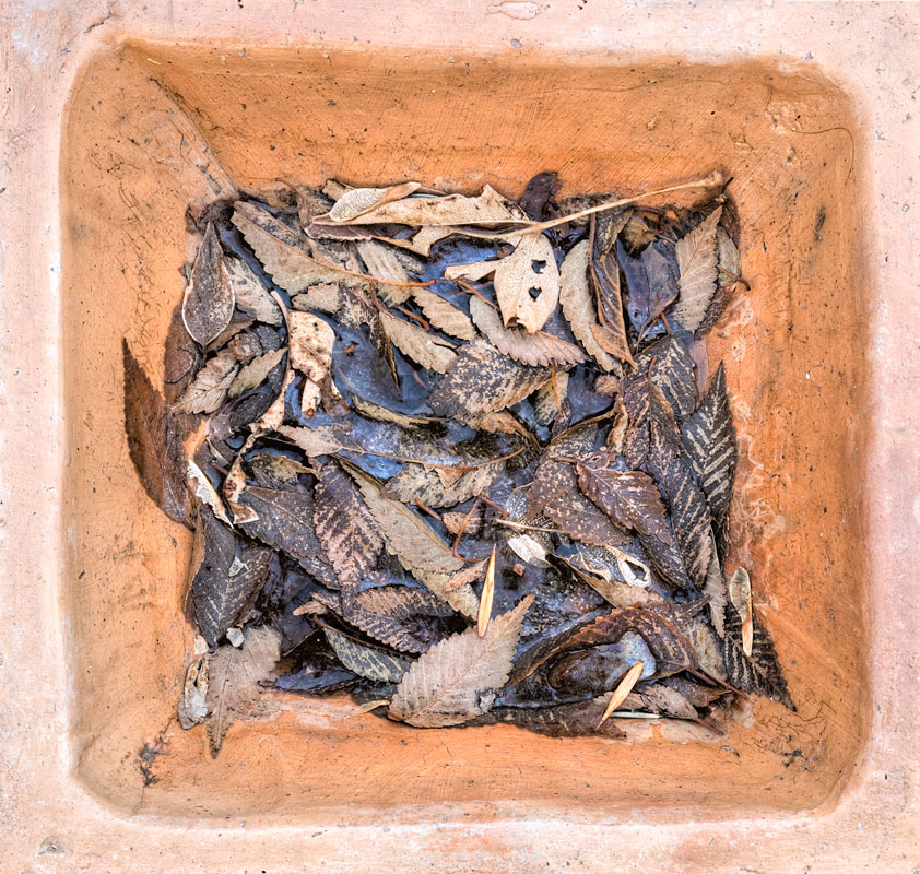
Desperate to shoot a picture, I wandered round the back garden looking for interesting fallen leaves and as I returned to the house found this bowl lying on the picnic table.
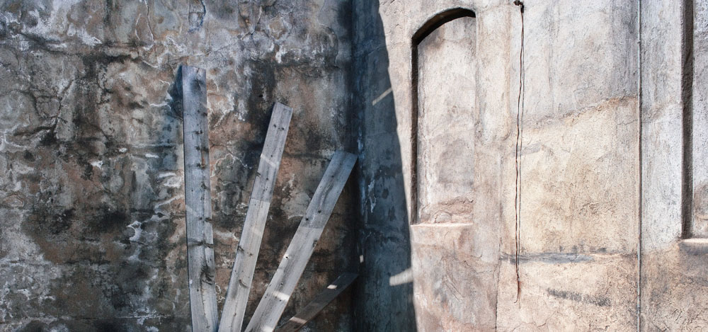
Keep It Simple
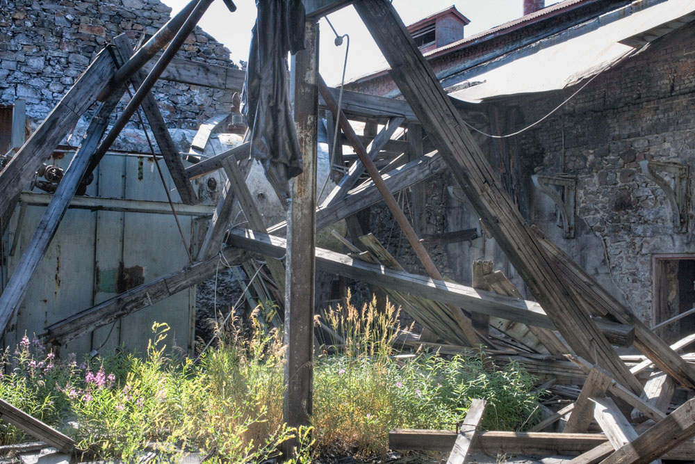
The above image from Coleman Colliery is illustrative of the need to keep things simple. The bottom image tried to include the kitchen sink - it has way too many things going on. it has harsh lighting, cloth hanging, textured walls, backlit grass, beams lying at odd angles, altogether too much. One can see some interesting things in the image and perhaps we can forgive me for trying to shoot it, but really, I should have realized there was way too much going on.
You can look through the bottom image and find some things which might have worked on their own, had I been able to find a clear sight line - but I couldn't. Perhaps if instead of shooting this image I should have spent the time wandering around trying to isolate some of the details. I quite like those shelf brackets on the wall - against the textured wall there might have been an image. I wonder what would have happened had I moved in close to the grasses so they filled the frame, with the jumble very much in the background.
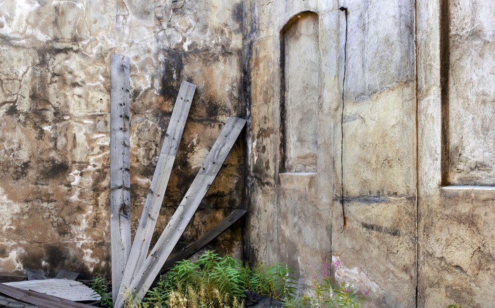
Fortunately, in the opposite corner of the building things were much less cluttered. I really liked these boards leaning against the wall and the fake window openings in the other wall. I did try shooting with more of the base included whch showed some weeds but felt this image was cleaner. The third image is the alternative crop, also shot before the sun was on the wall.
Who Says I Can't Take People Pictures?

From a Renaissance Fair held in Calgary, my daughter's boy friend - would you trust this man? Some of Rasputin in him, methinks.
Monday, November 20, 2006
Looking For Perfection
if there's a hallmark for the frustrated ammateur photographer it is the amount of experimentation that is performed. As I'm guilty of this I do know whereof I speak.
Not only is experimenting time consuming, it often means that even when we aren't conducting an experiment, we are in fact using tools we have not yet become skilled with. Any poor results obtained are so tied up with technical aspects that it's hard to know or at least recognize that the real problem with the photograph is you pointed it in the wrong direction. We fuss about excess grain, lack of sharpness, we worry about lens quality, enough pixels, we can't decide which format is right for us. That much worrying sure takes away from the important question of how do I make a meaningful photograph.
Another problem with experimentation is that the average photographer has minimal scientific training and either hasn't a clue about setting up a useful experiment, or doesn't bother to.
I'm a doctor and I treat depression. Sometimes patients end up on several medications and counselling and if they continue to struggle, I have to decide what to do next. I commonly point out to patients that in doing an experiment, if you change more than one variable at a time, it's a lot harder to assess the significance of results.
Another issue in experimentation is that of cause and effect. Were I to put a patient on penicillin for a cold, I could reasonably predict that within a week or so they'd be better. Of course, since colds are viral and don't respond to penicillin, the 'response' in fact is simple resolution of the infection on it's own and despite the penicillin - colds naturally get better.
So what happens when you change films for example for a new project, and you like the results - is it an effect of the film change or is it simply because you are getting better or because this particular film suits the new project? This kind of experiment where you change something but then simply use the new tool and hope that you can see a difference.
Few of us have the time, money or inclination to do the rigorous testing which would truly show the differences between two products or methods. We read about using high contrast copy film with low contrast developers for the ultimate resolution, but we forget to check to see how many successful photographers use that method (none that I know of). We agonize over the perfect large format camera, even though the majority of sucessful 4X5 landscape photographers use Technikas (Bruce Barnbaum, John Sexton, Craig Richards, etc. It's true that Technikas are not perfect and no, they aren't particularly pretty, and some people hate the four knob back tilt system, and using 90 mm. lenses and shorter is problematic, especially if the lens has excess coverage and you want to take advantage of it. So we hunt for the ideal camera - we hear that nothing is better than a $5000 Ebony so we agonize over how to justify such a huge outlay of cash (and stay married).
Sometimes we try to copy the successful photographers in their equipment choices, not realizing the reasons for their choices may have little if anything to do with the quality of the pictures and more to do with the kinds of pictures they get paid to do or with the demands for very large prints that they receive.
There's little point in drooling over a 16 mp camera if the only printer you own is 8.5 by 11 and you are hoping for 13X19 one of these days. The only landscape photographers who use a medium format digital back are people who are rich enough (from other occupations) to afford a luxury item. These are the same people who drive luxury cars, live in big houses and can afford exotic holidays - and more power to them for having earned that money. But they aren't like most of us and they aren't like most sucessful photographers who haven't gone that route.
A common error is to seek perfection in prints from images that are inherently boring - if the image is boring, the only thing you can do to it is at least make a perfect print - but at the end it's still a boring image.
Yes, an 8X10 contact print looks better than a blow up from 35 mm. but if the subject matter wasn't worth recording, was it really worth it?
So:
1) Ask yourself if you are experimenter or a photographer.
2) If you do decide to experiment, then limit the variables, eliminate the distractions (like camera shake) and ask yourself if you can reasonably expect an answer to the question you have asked with the experiment you have designed.
3) Don't use experimements to do real photography - they should never mix.
4) Limit the number of experiments you do and take as a guide the photographers whose work you admire.
5) Ask yourself sensible questions - asking whether 4X5 makes better pictures than 35 mm. isn't the issue - the real question is which format is best suited to your needs. If you truly hate using a tripod, then use equipment well designed for hand holding. If you prefer to take pictures when you see something interesting, rather than deliberately going out shooting, then you need equipment that is easy to carry so you can always have it with you.
6) Instead of experimenting at all, get out and photograph - with whatever you have to hand. It doesn't really matter whether it's minox or 8X10, cell phone camera or full frame digital - it can't take good pictures if it isn't being used and using it to photograph brick walls to check resolution doesn't count.
Sunday, November 19, 2006
The Large Format Journal
Yes, I know, I'm shooting digitally, but good photography is worth viewing no matter the methods used. Besides, I never did dismantle the darkroom, how about 7X17 contact prints? Or maybe a compromise 5X12? Some day...
Have a look at The Large Format Journal.
Anyway let me highly recommend purchasing this online pdf format magazine for it's photography and because you never know when you might want to try out large format. Equipment is inexpensive and a 4X5 negative is lovely to work with. You can pay for a single issue (that's what I originally did) but after reading the summer 20006 issue, you are likely to want to subscribe (which I have done).
Saturday, November 18, 2006
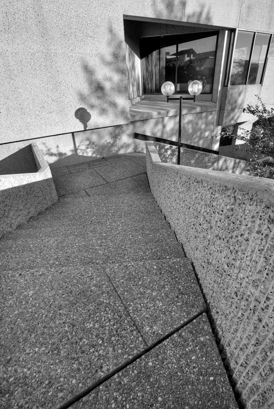
Tall and Skinny
It's not often that I create an image this tall and narrow but there's really no reason why not. Sure, it flies in the face a flat world in which we spend more time looking left and right than up and down, but if the subject matter fits, go for it.
By the way, the highlights were a bit washed out so I tamed contrast with Connetrix tone mapper, then increased local contrast with Akvis Enhancer. Oh yeah, the shot had too much depth subject to be covered by the 70-200 lens so it's actually five shots with focus shifted slightly between shots to cover the full near to far range then blended in Helicon Focus. But I did take the picture so give me some credit.
Vibration
Do you know how long it takes your camera to stop shaking after you remove your hands? Do you know how long after using mirror lock up it's ok to take the picture? Do you know how much shake the shutter induces in the camera that won't be prevented by mirror lock up? Unfortunately my answer is I don't know either, but I had an interesting experience today.
I was using my Gitzo 1348 tripod - more sturdy than most people use - an Acratech V2 head (will do a review in a few weeks after more experience with it), an extension arm for nodal rotation for stitching from Really Right Stuff, my Can on 1Ds2 and a 24-70 lens. I had recently purchased a right angle finder for the camera ant it was in the upright position. I was absolutely amazed to see in the eyepiece view while my eye was six inches away, just how much camera shake there was that I hadn't noted before. It took at least 3 seconds for the visible shake to settle down after removing my hands and I saw shake from the mirror going up and from the shutter release (though as that is immediately followed by the mirror return, I'm still not sure if the shutter release (cable of course) actually induces shake.
I guess I'm going to have to be more careful to give the camera at least two full seconds after mirror lock up before releasing the shutter and probably 4 seconds after letting the camera go before doing the mirror up. With the wides I was shooting with today, it turned out not to be a problem, but I will have to watch with longer lenses.
Winter's Coming...
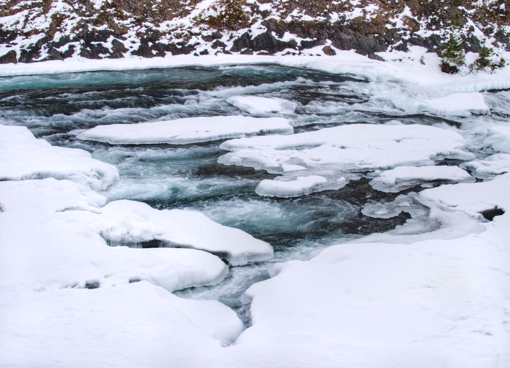
Winter's coming and it will soon be time to bundle up and head outdoors. Bow River above Bow Falls and just below Banff Springs Hotel. Shot a couple of Winters ago.
Thursday, November 16, 2006
Changing Colour
Ever stop to think about how many different ways there are to change the colour of an image in Photoshop. Sometimes two different paths lead to the same result, other times one tool is clearly superior to others.
Here's a list of ways and some particular uses to which they can be put.
Image/Auto Colour - does an auto colour balance and auto contrast adjustment to the image. I most often use it as a quick preview of what an image would look like without a strong colour cast it has now. I never end up using the adjustment it makes, but I could see doing so if I had hundreds of images to present to a client - especially as proofs.
Colour Profle - not really a way to adjust colour - even though assigning a profle does sometimes radically alter the colour - its simply that without a profile the computer has no reference point. For example, some stitching programmes (PTMac) forget the profile when doing the stitching and when you reassign it in Photoshop the colour warms up considerably. Likewise Akvis Enhancer in it's preview does not take into consideration the colour profile and shows the colours as quite different. Fortunately it has no effect on the actual image that is enhanced.
Levels and Curves - increasing contrast in an image also increases colour saturation unless you deliberately set the layer effect to luminosity instead of normal (top left in the layers palette). Both levels and curves allow you to adjust each colour independently and so potentially can be used to adjust colour. Frankly I never do this as I find it way to difficult to adequately control. It's too powerful to use often though it does allow you to control colours in highlights separately from shadows (but so does colour balance tool).
A really powerful tool though is to use the grey balance tool of the curves adjustment layer to click on part of the image that should be but isn't neutral. Sometimes the result is way over the top but I can then use the layer opacity slider to tune down the colour adjustment just made. This is often better than trying to click on a different 'wanabe white' till I find the right amount of shift.
Colour Balance - this is nice to affect overall colour, or to match colour between two image layers (say in stitching (most stitching programmes do some colour balancing between image segments for you but sometimes you have to fine tune). WHile in theory you can colour balance the highlights separately from the midtones and shadows, the overlap in the control is such that really the entire image is affected regardless of which you select.
The nice thing about colour balance is that it can be used easily for subtle colour changes and it's easy to get back to the baseline by resetting to zero. Normally I use colour temperature in Camera Raw to affect the warmth of the image but if I can fine tune this with colour balance.
Hue/Saturation - is a powerful tool because you can adjust each individual colour. You can even define which part of the spectrum is covered by each individual colour slider by adjusting the range sliders on the bottom. Since it makes a difference in which order colour layer adjustments are made (which layer comes first), I usually will do an overall saturation adjustment in one layer, individual colour adjustment with a second layer. Whether it goes on top or underneeth the general adjustment depends on the effect I want. I'm afraid that if I drive saturation up to max. with one layer, tuning it down in the layer above will not restore the selected colour. It's rather like dodging till you get pure white - no matter how much you burn, you ain't gona get your image back.
Colour Channels - lets you modify the colour of individual colours. With this you can make an orange flower green or red or blue - which while cute, hopefully you don't do too often. Where I find it handier is where I want to make some more subtle changes to a colour. Let's say I'm photographing a rock and either I remember the streaks in the rock being red, or I want them red and the camera recorded them as orange. In theory I could use a masked colour balance adjustment to affect selected areas, but it's less work to take the oranges and downgrade their yellow content and increase their magenta content and voila I have red instead of orange. I did this with Sundance Rose in which the camera recorded some of the streaks in the background rock as orange instead of red. To be honest, I can't even remember whether that was accurate or not, all I know is it clashes with the red/magenta colour of the rose hips and so I modified it with the colour channels control. I commonly combine this with a hue saturation layer to really control the kind and amount of colour in a particular part of an image. I can get further control if I use masking.
Colour Filters - I confess I rarely use these but for example if you wanted just a little warming of the image without distorting the overall relationship of the colours, using a warming filter can be more subtle than adjusting colour balance.
I'm quite sure I have left out many ways of adjusting colour (eg. working on the red, green and blue image channels (which has nothing to do with the colour channel adjustment layer control) but in fact lists the controls for colour that I use.
The History Tool In Photoshop
How much use do you make of the history tool in Photoshop?
The history tool can be used serveral ways. First, you might add an effect to one part of an image only that is normally global - that is to say it applies to the entire image - eg. sharpening, blurring, ehnancing or whatever. You have two choices. You can apply the effect then remove it from selected areas by clicking on the history pallete to set the history brush, then paint into the areas you want to undo or tone down the effect just applied. You can also do the opposite. Select the last change as the history marker then highlight the prev. step as being the current one. Now when you paint with the history brush, you apply the effect only to where you paint.
Examples of where this can be helpful is sharpening. You might want it everywhere but over the water or clouds.
I save my burning and dodging for after I have done all my curves work. I normally do this by duplicating the image a second layer, apply all the dodging and burning, then turn it on and off to see if I have improved the image. I can add a mask to the top image layer and paint black in it to undo or tone down the dodging and burning in a selected area. I could have used the history brush though to do the same thing - so long as the change is within the memory of the history - I have my computer set at 20 history steps. In theory you could set this at 200 steps but the amount of hard disk space and or memory taken up becomes nothing short of absurd - every local change to an image increases storage requirements by the size of the image so you could theoretically end up using 200 times the memory size of the original image file.
The history brush can be used when you have done 10 things since you did what you want to undo - rather than undo 10 times and have to redo all the good work you did after the thing you want changed, you can apply the history state to this one step, paint it locally and you are done. Of course, this only works if the subsequent steps didn't drastically change the area you applied the history brush to. It wouldn't work if you were to do a global colour balance adjustment which renders the history painted area a different colour from the rest of the image. More often though, the changes are not such that the small area painted 10 steps backwards are significant.
Sleeping On It
One of the most powerful tools we have as photographers is the ability to sleep on an idea, or in this case a picture, and come back to it the next day. This is one of the real beauties of the digital darkroom - you CAN come back the next day, and pick up where you left off. Sometimes as we work on a print for a few hours, we get carried away and don't realize we have got the image way too dark or too contrasty or in an attempt to sharpen the image adequately have spoiled it. While I normally don't save images with multiple layers because of file size, it can definitely be helpful to do so sometimes, thereby protecting your ability to back off on the editing if need be.
Initial Disappointment


I have found that after a trip, it's not uncommon to be very disappointed in the images made. If this happens often enough, you start to question your skills and whether it's worth persisting. Not uncommonly this can lead to periods of weeks, months or even years without photographing.
It's well worth while over several months going back to the images made from the disapointing trip and seeing if there is something there after all to work with. It seems to me that discovering the good images can be a gradual process. Partly this is an issue of buiding false hopes but partly it's that the raw file like the negative or even the contact sheet shows so little of the possibilities of an image that it isn't always recognized as being worth while. This is especially true from a multi day trip in which hundreds of images were taken and the excitement of a specific image and it's potential is forgotten amongst so many other images so that when looking at the 'proofs', the potential is missed.
My initial reaction to coming home from Vancouver Island was that I got nothing worth while, and while it's still true that none of the images have that 'wow' factor, it is not accurate to say I 'got nothing'. Above are three more images from that trip and you have gradually seen me produce a series of images of at least some merit.
Wednesday, November 15, 2006
Selecting Images For Presentation
I know some of you have been choosing images to submit to 'Black And White' magazine. This process of selecting and weeding out images happens often - whether for a contest, a publication, a portfolio or to show to a gallery. It happens when you decide what images to hang on your wall or show to a friend or even to post to your blog or website.
In the case of 'B&W' they were looking for 8 - 12 images and we know from last year that they prefer images that have a theme to them - random 10 best ever collections were typically not selected for publication. It's quite common to be looking for a theme or style of photographs. It's much easier to produce a random selection but whether a publication or a gallery, they like to know the photographer has depth and nothing shows this better than the ability to produce a collection of work on a single subject.
OK, so how do you select images to present?
Is it true that you are defined by your weakest image?
First I start by selecting every image which could reasonably fit the theme I am presenting. I make copies of the images into a special folder for the porfolio and then I use Adobe Bridge to make a slideshow of the selected images.
First time through I elminate any images with technical flaws. Keep in mind that even if you sneak a small copy past the selectors, sooner or later you are going to be asked to make a print of the image - do all the images hold up in print? If you haven't printed every image by now, then print those you haven't to confirm quality and check for any printing difficulties.
Look for flaws like:oversharpening, lack of resolution, less than subtle image manipulation, bleached out highlights and blocked up shadows. Is focus spot on? Any hesitation and it's out of there.
Next run through pick the obvious winners - the images by which you define your photography. They don't have to be crowd pleasers - you may only be trying to impress a single person whose taste you are not priviledged to prejudge. Remove these from the possibles pile so you don't have to keep going through them.
Probably by now you are down to 50% of the original images - having passed through the top 25% and rejected the bottom 25%. Now it gets harder.
The middle of the pack images are there for several possible reasons - an idea that almost came off and you hate to give up, a sort of nice image, an image that others like but you don't, an image that is terrific in every way except that one little flaw that keeps bugging you, and doubtless other types - hopefully each of your images don't all fit into every one of these categories.
The images that you really like except for that 'one flaw' are probably best bounced off of someone else. Lastnight I had an image I showed my wife (non photogrpaher) and she said she liked it, then I asked her about the out of focus areas (which if truth be known weren't out of focus enough) and she said yes, they were distracting - so out with that image. Other times though something that bugs you about an image may not be seen by others as distracting from an otherwise wonderful image. If you look through the published images of the greats, there are lots of minor imperfections which had they obcessed about it, we would not have had the opportunity to view the work - we expect perfection from ourselves but are more forgiving of someone with a proven reputation. That said, subtle imperfections this year may turn out with a couple more years experience behind you to be glaring errors - I have been in that situation looking at prints I made a few years ago and thinking, 'my god, I've come a long way'. At least, that's what I think on a good day. On a bad day, it's god, I was awful, how did I ever have the nerve to show that in public.
Regarding images that are good but not great - when I submitted my work to Lenswork, I sent them about 25 images. Having accepted me, they then asked for everything along the same theme (black and white industrial). I sent them everything I had that I though anway reasonable and even processed a few more images that hadn't excited me previously. Know what, they didn't consistently print the images I would have picked as my strongest and several images published were from the extra images I sent. Interesting as they printed 17 images and I originally sent them 25 so they chose not to publish about 11 of my original images and replace use four of the extras. Of course, I'd already been accepted, there was nothing to lose, but do consider the possibilty that you are not necessarily the best judge of your own work. Some of your 'goods' are 'greats' to other people.
At this point you might well want to show the work to someone else for their feedback. This is especially helpful if they are pretty honest about their reactions. I am blessed with a wife who while not making derogatory comments about a picture, will let me know how interested she is in it and if it doesn't work isn't afraid to say so. This is a great assset and though she doesn't have a visual arts background, I find that if she isn't excited by an image, I'd better have a pretty darn good reason to over rule her. You too might want to find someone who could play that role. I would suggest it might be better if it weren't a photographer. Uusally our work is being judged by people who aren't themselves photographers, but they are skilled lookers.
Right, we needed 8 - 12 images and we are down to 15. Lets do a double check for consistency of theme - sure all the images are from the badlands, but 11 are close and middle ground images with no skies, one has a dramatic thunderstorm over the badlands, and the last is an old truck dumped into a gully in the badlands. It would make sense to eliminate the last two images no matter how strong they are since they are jarringly different from all the other images.
Here's another check - are any of the images too much like each other - enough so that it's repetitive?
And now for the last check - lets say you are down to 13 images of the 8-12 we need. it's time to stop thinking about the images and just react to them. By now you have looked at them dozens of times - flip through them and rank them according to emotional response. If you haven't had a chance to 'sleep on your selections', come back the next day and see if you still feel the same way.
Now you have to ask is it better to provide 8 really strong images, or show your depth by providing the full 12. It depends a bit on the situation. In the case of 'B&W' we know they are only going to print four images so having 8 to select from is pretty good and if they are strong images, there is nothing to appologize for beause you don't have 12. This would be a much bigger issue if you had simply included your all time greatest hits, in which case running out at 8 has some pretty significant implications, but you can tell a lot about a subject in 8 photographs, so my inclination would be to see if I can determine where the breakpoint is in quality and if it falls between the 8th and 12th image, that would become my cutoff, no matter what.
Of course, after doing all this, you may come to the point where you decide your work is not good enough for publication and lose your never and never submit it. Since it is very unlikely that you are magically within a few months going to produce dramatically better work, why not go ahead and stand behind your work and say 'this is as good as I can do'. The worst that could happen is some derogatory comments from a gallery owner about bird cage liners, but even here there may be something in the feedback that you can take and work with. In other cases, it's a matter of 'no news is bad news', but hey, you can only guarantee results when you don't submit and guarantee you won't be published, displayed, sold or whatever.
Good luck in selecting a portfolio of your own work. Show the world the best you can do, then move on.
Another Hornby island Image
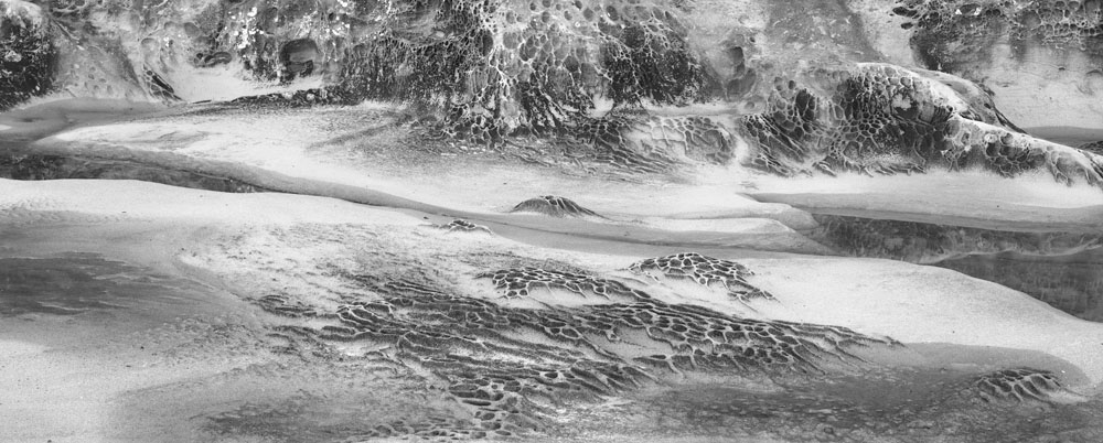
From Hornby Island, located betweeen the coast of B.C. and Vancouver Island.
Monday, November 13, 2006
Simplify, Simplify, Simplify!

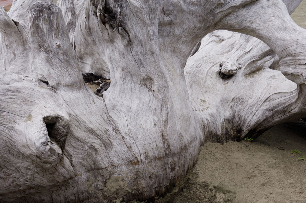
THis is an example of less than careful analysis of the scene. This absolutely gorgeous piece of driftwood was lovely to behold, but that doesn't necessarily mean that it is easy to photograph. The whole shot is seen below but it has a number of problems with it.
There is too much sand in the bottom right, yet if I crop out the bottom, I lose the line across the bottom of the 'bulb' and where it meets the sand - which I like. There are distractions in various black lumps on the 'bulb' which really don't add to the composition.
Sometimes the larger whole just won't make an image. Usually when you try to crop - either before shooting or after, the pieces turn out to be too week to stand on their own, occasionally you get lucky. Far better to crop before shooting than after. For one thing, you can possibly prevent the parts being too week to make it and for another, you are recording a bigger more detailed file.
Lenswork Podcasts
If you are a photographic artist, not only is Lenswork Magazine, an absolute essential (whether you do colour or black and white), Brooks Jenson is an intelligent, observant fellow artist who has some very interesting observations on the whole process of being a photographic artist, from aiming the camera to getting published. I highly recommend his audio blogs available at Lenswork Podcasts/Audio Blogs.
Lenswork Extended is his CD Publication whch by the way does include colour work.
Lenswork Extended is his CD Publication whch by the way does include colour work.
Where To Point The Camera
When shooting the 'grand landscape' there is often only one place to aim the camera and the issues are around timing and where to plant the tripod more than what to shoot, but a common scenario is to be wandering around looking for photographs in an area of interesting material. This could be an outdoor farmers market, an old abandoned industrial plant, an interesting bridge, a canyon, a field, an abandoned farm yard, a street somewhere in an exotic country, or a junkyard.
So where do you point the camera, or more specifically, what should you even look at?
Common to all these subjects is the need to make order out of chaos. An attempt to photograph the whole invariably leads to dissapointment, leaving the viewer with none of the excitement you felt while there. A picture of an entire bazaar in Morroco would look more like an illustration for a report on traffic congestion. It wouldn't even make a good travel brochure illustration as it gives nothing of the experience of being there.
To make a good travel brochure picture, you'd want one or more vendors and their wares, colourful clothing and exotic backgrounds. You probably wouldn't include the tacky tourist in the awful hat, too bright shirt and bad shorts. As a creative artist though, you might want to make a study of tourists and their garb. If you did want the vendor, it would be because of an interesting face, because of patterns in his wares displayed, because of an interesting shadow across the scene, because of repetitive shapes or colour contrasts, balance, etc.
Let's pick a less exotic scenario. You are wandering around a junk yard. There are heaps of rusting cars, piles of old parts, broken glass, puddles of dubious liquids, and scattered around, people searching through the junk for treasures. Your aim is to produce a series of pictures which represent the 'junk yard' experience.
We've discussed the process of composing a picture in the past but that assumes you have found something worth photographing - what about the process of finding the pictures. I think you can imagine without too much difficulty two camera carrying photographers wandering through the junk yard. One is a hobbyist of little experience and no background in art, the other is Cartier Bresson reincarnated. The former wanders through, almost randomly taking snapshots of colourful piles of junk, gets bored and heads home having decided that the problem is the junkyard, Once home none of the images look even vaguely interesting. The other photographer is kept extremely busy and in fact is frustrated when at the end of the day, the gates are closed and he goes home tired and happy. On looking at his images, there are many which show the elements of good photographs. More to the point, he had no trouble finding subject matter.
I've discussed before the difficulty people have had trying to reproduce the photographs of Ansel Adams in Yosemite. Another point though is that it's not that uncommon to be disappointed with Yosemite because it doesn't look like what Ansel photographed. He made order out of chaos.
This leaves the question of whether it's possible to explain where to look. Never being afraid to shoot my mouth off, here goes.
Rules For Looking
1) Almost always you are looking to simplify. So look around for areas that are less confusing. I was going to say less cluttered, but perhaps that is what you are photographing but even there you are looking for a representative area of clutter with an element of consistency of clutter.
2) Look for the part that represents the whole. You might be photographing the junkyard experience, so how about concentrating on the expression on someone's face as they discover the hubcap from a 1952 Rambler they are refurbishing. If the junkyard is about rust, then look around for the best rust.
3) Look for something that CAN be photographed. Some things won't work - harsh lighting, inadequate depth of field, cluttered foregrounds or backgrounds. If you can't see a way round these 'flaws's, then move on.
4) If you can't see anything interesting to photograph, you have to ask why you are there, and if you aim your camera to please the audience rather than yourself, then you are not being an artist. Find something interesting. It might be the plant life of a junkyard but before finding the photograph, find the interest. backwards just doesn't work - yet many of us have spent much of our lives shooting that way - looking for the great photograph which will then hopefully be interesting - the gods will not favour you!
5) Instead of trying to say something different (let's face it, you aren't the first photographer to visit a junkyard), try to say something about your experience of the junkyard - are you intrigued by the shapes, the decay, the people, pollution, the amount of waste. Do you in fact have any reaction at all to wandering around the place? If you have no emotional reaction to wandering around, the outcome of your shoot is dubious at best. you could treat it as an exercise but don't build your hopes for great art.
6) Explore - get down on your knees, look inside the cars, climb if you can. Limiting yourself to the world seen from standing eye height and looking ahead is to deny yourself most of the world. What about straight down? Can you truly say 'I have seen' by the time you leave?
7) Stop! After wandering around for a while and likely finding nothing interesting to photograph, pause for a minute and analyze the scene. OK, so you found nothing intersting to photograph, but did you find nothing interesting, full stop? If the answer is truly 'nothing', then perhaps you should go home. If your reaction though is 'cool place', then ask yourself what's cool about it and resume your wandering now focussed on what's intersting.
These are not rules I photograph by. In fact I can see in my shooting some of the 'wrong headedness' discussed. Nevertheless, I think if I start using these 'rules' more often, I will spend less time frustrated - and that's a good thing!
Sunday, November 12, 2006
More From Parkade
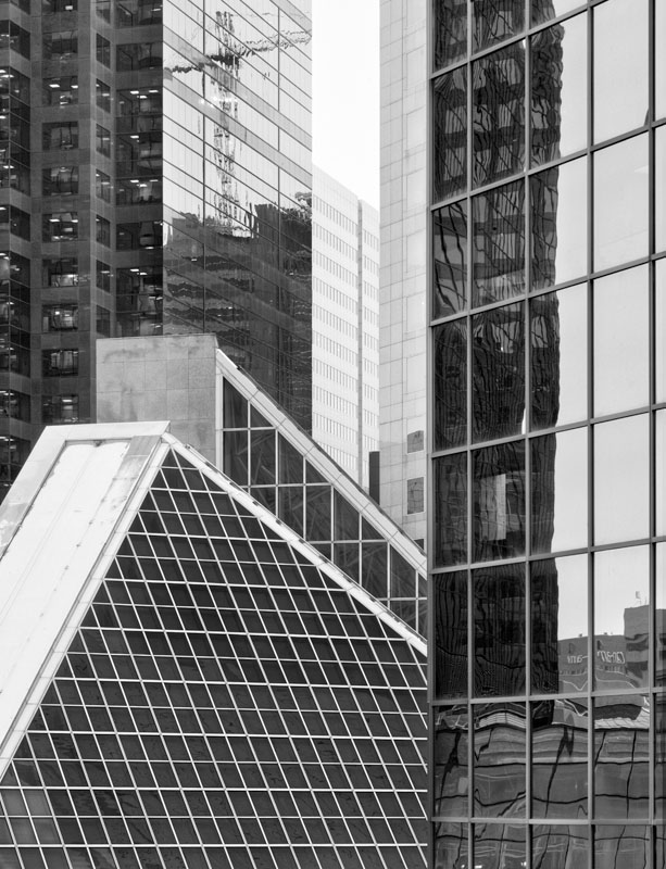
A single image on my 1Ds2, 70-200 2.8 IS, Camera Raw, 'upsized to 25MP with Camera Raw, toned down Akvis Enhancer, Black and White conversion a la Russel Brown. Minor Perspective distortion corrected with Filters/Distort/Lens Correction, rotate 359.4 degrees and small vertical perspective adjust. Sharpened with Smart Sharpen 300/1.1 with the anticipation of a final output sharpen before printing using Photokit Output Sharpener. This will print 13X17 @ 300 dpi for top quality but will likely print half again larger without too much difficulty oweing to the subject matter - large blocks of tone, no lacey detail.
Saturday, November 11, 2006
Linear Vs. Cylindrical Perspective
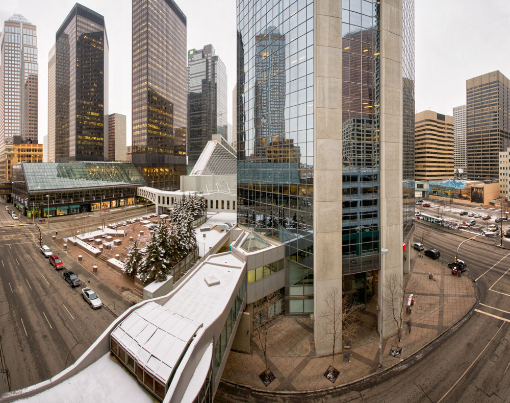

From my shoot at the parking garage this afternoon, the first image is the result of PTGui deciding that 4 images from a 17 mm. lens is too wide to stitch in a linear fashion - it is. What you see is a cylindrical perspective. This is the kind of view you used to get with Roundshot camera and other cameras which have a revolving mechanism. The net result is that everything that is the same distance from the camera is represented as the same size. You might think this is how an ordinary camera works, but not if you think about it.
In a normal camera, let's say that you photograph a group of 20 guys from a rugby team (not very tall, crooked noses, bashed ears, covered in bruises and grinning), in a line, facing the camera. Let's assume you are going to use a moderate wide angle, say a 35 mm. lens. (though it doesn't matter what focal length). With a modest wide angle lens, the middle person facing you is perhaps 12 feet away, but because they are in a straight line, the two fellows on the end are actually 18 feet from you. Since you are using flat film and a lens which focuses on a flat field, all members of the group are shown in a print as being in a straight line - thier heights are kept proportionate across the screen. The fellows on the end however appear to have gained a few pounds (they are slightly wider).
Were you to do the same exercise with a 17 mm. lens, you might have the middle fellow 6 feet away, and the end fellows 15 feet away, heights are still maintained and the end fellows have gained even more weight. This is simple optics. Were you to photograph a building from across the street and from half the height of the building, it would be recorded as rectangular.
In a cylindrical perspective image, the end fellows appear much smaller (after all they are further away). The lens makes no adjustments for perspective and the end fellows don't look fat. The building on the other hand becomes a very overweight rectangle, bulging out on top and bottom, but not sides (the camera is rotated horizontally, not vertically).
When you stitch, you actually rotate as if you were working with one of those rotating type cameras used to make 360 degree panoramas. When you rotate the camera to stitch, you aim the camera at the left end fellow, the middle fellow and then the right end fellow. Clearly the images will show the middle fellow as larger (since he's closer) and so the stitching software has to translate the images into linear perspective. It uses the knowledge of the angle of view of the lens (using exif info). The end result when using wide angles is the outside images are magnified in comparison to the middle image (to keep the rugby players the same height and to keep the rectangle from bulging outwards at top and bottom).
Note that in the top image, what appears to be two streets in the bottom corners is in fact one straight street, curving because the further parts of it show as smaller without linear perspective correction (remember the short rugby players). Note too though that the buildings aren't distorted, the cars not stretched by the nature of linear perspective (the rugby players don't look fat).
The last image below shows the result. The red areas show how the outer images are magnified. The non vertical sides reflect the adjustment PTGui made for the fact that the camera was aimed down slightly.
I continue to be very impressed with PTGui.
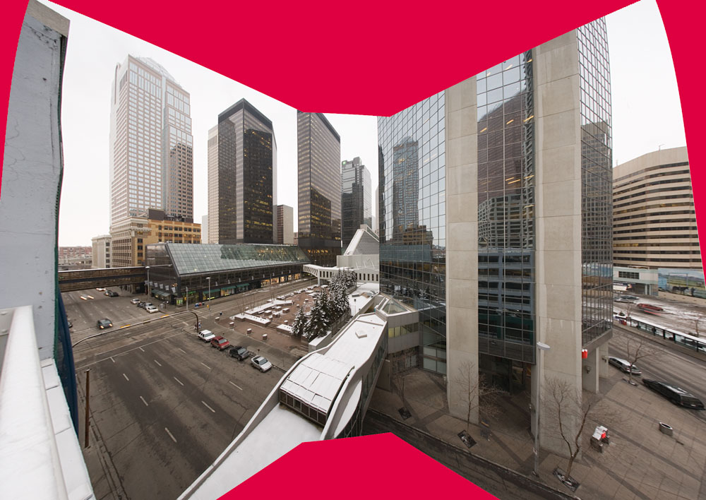
Humble Projects

Stuck for a project, light not right, weather not cooperating for a 'grand landscape' image - here's what I did this afternoon. I have shot from parkades before and I have even photographed the parkades themselves before (late one night at the hospital). I was desperate to get out this afternoon but couldn't mount any enthusiasm for wilderness on a very dull dark winter day - so I headed downtown.
Akvis Enhancer did a great job bringing out the texture in the driveway but also dramatically opened up the shadows and strongly emphasized the flaws in the 1Ds2 sensor resulting in vertical stripes in the shadows. A bit of work with the history brush after using fade toned things down nicely. A Hue Saturation adjustment set for yellow only and a bit lighter too brightened the yellow to the left which wasn't as bright as the yellow elsewhere.
Friday, November 10, 2006
My Industrial Work


Having recommended the work of Edward Burtynsky, and the film about his work and about man's effect on the landscape, here's a few of my industrial images.
My style is quite different - getting in closer, avoiding the clues which give you a frame of reference for the images where he would include them to give you a sense of scale.
Subscribe to:
Posts (Atom)