Friday, August 31, 2007
Persistence
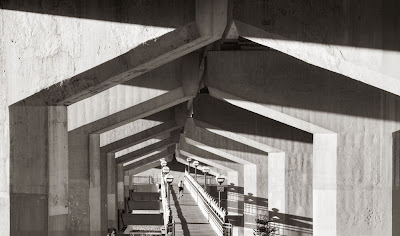
The other night I showed you the pathway within two hours of shooting it. With a bit of time, I used the slideshow feature of Bridge to look at the images, giving stars to those with potential, eventually including this version which is better than the original in two ways - the sun has moved round a bit and is just barely shining on this side of the concrete. Instead of a single cyclist in the distance going away, now I have two cyclists, one in each direction and significantly closer.
I stayed with the walkway shot for the better part of half an hour. I grabbed the first shot less than a minute after pulling up - afraid something would go wrong with the light.I later moved a bit closer and switched to a shorter lens to get a less obstructed view of the bottom of the walkway at the near end. I took a number of shots, adjusting exposure as I went and watching the histogram for blown highlights as I went. A couple of cyclists decided to stop on the pathway near the bridge, spoiling the clean lines of the composition. They were a bit far away to ask them to move and I waited them out for more than 15 minutes before they slowly got their act together and rolled off. Fortunately I still barely had the right light and was able to catch this image within seconds of them leaving.
Exposure was 1/50 at f10 Of course I'd have liked to use f16 for maximum depth of field but that would have involved too slow a shutter speed. I could have raised the ISO of the camera but my 1Ds2 is fairly noisy at higher ISO's and even 400 is a compromise. The other issue is that in the failing light I was having to adjust things - a camera with a dial in ISO selector sure would be nice - there was no time after the layabouts finally moved off to fiddle with menus.
Anyway, the image worked, it makes a nice print and if the furthest pillars aren't absolutely crisp, it hardly matters. It's actually pretty amazing how well the cyclists turned out for 1/50 second, the joys of them moving straight at and away from the camera.
So, Just How Good Are You Anyway?
Over the years I have spent way too much time worrying about whether I'm any good as a photographer and I have a sneaking suspicion a lot of you have too. It doesn't matter what recognition we might receive, we keep on worrying - ok we know we are good enough to get in a magazine, but do we have a place in the history of photography, do we add anything meaningful to the art, will anyone remember us after we're gone, just how do we compare to famous photographers we can name?
In my article on assessing your level in photography, I gave broad categorizations with the idea that they strictly be used to help you figure out what you need to work on to move forward. It certainly wasn't designed to 'rate' yourself.
Let's imagine that someone (it won't be me), took my concept of levels a whole lot further and actually developed a rating scale, zero to one hundred, rank novice to supreme almighty. All manner of questions arise, not the least of which is why bother. But you know the internet, you can rate your IQ, your personality, the kind of lover you are, who you should marry, what job you are suited for, so it isn't very far fetched to imagine someone coming up with such a scale.
Here's the problem, well actually a whole lot of problems.
1) Even assuming such a scale were 'accurate' in any fashion, so what - does it really help you or anyone else to know that you scored an 87 while some famous photographer scored only 86. It won't make you more famous, I suppose you could advertize your score in your ads in "Black and White" but can't imagine anyone using it to decide if they like your work. It doesn't tell you how to move on.
2) Any rating scale has to take on the likes and dislikes of the designer of the scale and who the hell made him God of values? Can you imagine someone who doesn't like jazz coming up with a music rating scale?
3) Perhaps the biggest concern is that even if somehow we overcame the above problems and could with reasonable accuracy tell someone "this is how good you are", is it actually helpful to know? Would it make a difference to know that you are at the 87th percentile (better than 87% of all photographers). I mean, if that included the millions of snap shooters, it would hopefully be a given, if the rating placed you on a skill rating rather than a population position, would knowing you are an 87 help?
Perhaps someone might find out they are better than they thought, and therefore might make more effort to get their work out in public, but I don't see it making them a better photographer. What if the opposite happpened and you scored lower than you thought you should - you could get defensive, or give up trying to get your work out there, but again, it won't help you improve.
The real answer is that worrying about our "place" in photography is a chumps game - completely unproductive - really, we are only as good as the next image we take, and our limited energies should be brought to bear on making that image every bit as good as possible.
A photographer might have only one or two really good images in him, the rest being quite mediocre and he doesn't know how he managed those two images. But the fact is, he did manage those and presumably can therefore do it again, sooner or later, and if he can learn from his successes, is likely to produce strong images at an ever increasing rate.
A photographer might have several portfolios of great images, but that's no guarantee the next one is going to be even passable.
No, it's time to stop worrying about how good we are, open our eyes to the world and get looking for interesting possibilities.
Wednesday, August 29, 2007
Good News and Bad News
Well, got an email today from the publisher of
Take Your Photography To The Next Level
indicating that my concern about time frame was correct, we'll need to put the publishing date back to mid November. The good news, hey, it's listed on Amazon.com, now that really makes it feel like it's happening.
The link above will take you to the amazon.com page, hey, I'm excited.
Tuesday, August 28, 2007
Youtube Is A Photographic Resource?
have been checking out youtube for a variety of things from sailboats to Paul Potts to photography - there was a good interview with Michael Kenna and a multipart series on the history of photography including film of Edward Weston in the darkroom - called Exposures. Some of the stuff is pretty low quality, but other material is enough to make you look up better copies of the images you see. Check it out, you might be pleasantly surprised.
Doubt
Doubt creeps into photography everywhere, from thinking that you won't find anything today, to pessimism over the weather, to thoughts about the quality and volume of your photographs, to how you think others will perceive our work. Doubt can literally keep us home when we should be out shooting, or giving up, just before the sun finally breaks through and highlights the subject.
Doubt makes us abandon working on an image. It keeps us from showing our work to someone else, afraid it won't be good enough.
Doubt in fact causes a hell of a lot of damage. I suppose there are a few positive things you can say about doubt - if you don't ask, you won't be put down, and if you doubt that there's anything worth photographing, you might be right, but look at the cost.
How many times have you set off in less than ideal light, with no prospects of it improving, only to find clouds blow in or you find a ravine in shade so it doesn't matter that there are no clouds, or the high sun works for the image.
If the answer to the above question is never, then I suspect you don't get out enough. Some of this comes down to luck but if you don't go out at all, you will never be lucky, so the fellow who is prepared to be lucky is the one taking home the great images.
If you genuinely think your images aren't very good, well, you're probably right, and you have work to do - the worse the images, the easier it is to make big strides in quality. If on the other hand you compare your images to well known photographers and feel they hold up, but are simply afraid that you might get rejected, well, the sooner you put those doubts behind you and go for it.
If you are good and fear you aren't, testing the waters by submitting your work or showing it at a workshop is a great idea. If you think your work is good, and it isn't, because you haven't yet learned about the ways in which it could be better, well, that needs found out too, and the sooner you get it over, the sooner you can start improving.
Monday, August 27, 2007
Customers
As artists we are supposed to be above mundane things like actually selling our images, promoting our business, advertizing and encouraging sales, but in the real world some of us at least hope to support our craft through sales, and a limited number actually need the income, lacking any other source.
This means that some of us, perhaps a lot of us, are going to have to come in contact with customers.
Customers are an odd breed and it won't do you any harm going in to know a bit about their peculiarities, foibles and predilections.
I base my experience largely on selling at the local farmers market, admittedly quite different from a high end gallery, but I don't suppose that's where you personally will deal with customers anyway.
So, with that in mind, here's some observations about "the customer".
1) Some customers see something they like and within seconds out comes the money and they're off before you can say thank you.
2) other customers spend literally hours trying to decide which image they want - then just as you're back is turned, they disappear and you can't believe how much time and effort you spent showing them images only to not get a sale. The good news is they often come back - sometimes months later and make that purchase.
3) Many customers are looking for decoration more than fine art, and it's important that the image fit in both shape wise and colour wise with their decor.
4) Some customers need really large prints but you are unlikely to sell many of them until you have enough of a reputation selling smaller ones - my advice is to hold off on buying a larger printer until you can pay for it out of profits.
5) Some customers need long prints so having the occasional panorama can help sales.
6) Customers like choice, but too much choice can make it difficult for them to decide. Displaying around 50 photographs works and more can be in a catalogue book or on a computer.
7) Sometimes customers want a series on a theme and so it's good to have available a series of images on a subject.
8) some customers can't decide and need help, a few can't even then. I have been known to suggest they pay for one with a visa card and take two or three home and return the ones they don't need. Never been ripped off yet.
9) You don't sell enough small cheap prints to make any real money, but it does get people looking and when they see the larger prints, they are impressed and you will sell those because of having the small ones on display.
10) customers spend as much time reading the blurb that comes with the print as they do looking at the images - so make a point of supplying a 'history' with each image describing the circumstances and location, but don't bother with technical details, that's not what interests them - few care what lens you took it with or what f stop. They do care about how you found the image and where it was shot and any anecdotes you can tell about the circumstances really help.
Anyway, there's a few thoughts on customers.
Saturday, August 25, 2007
Modern Construction
Modern construction may not have the lovely patina that old buildings have, but even relatively new concrete can be quite interesting. I'm not sure if I have the best shot here and I was only out with my little camera, not sure what I'd find, so I think I'll go back tomorrow with the big'n and see what I can do.
Friday, August 24, 2007
Jura Canyon ReEdit
Verve Gallery
I had commented recently on the wonderful photography of Ryujie but lamented the awkwardness of his site with his scrolling thumbnails and small images. Verve has let me know that they have some of his images up and I have to say it's a nice clean site with thumbnails that don't wander off and good sized images when you click on the thumbnails and an unobtrusive watermark in the bottom left. A couple of arrows to negotiate from one image to the next and it would be perfect but it's pretty darn good as it is.
Check out Verve Gallery and the work of a number of photographers and particularly Ryujie.
Wednesday, August 22, 2007
Editing Never Stops
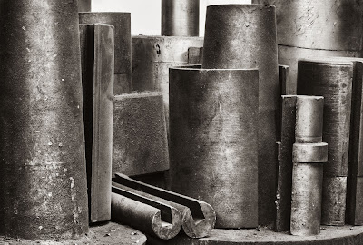
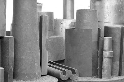
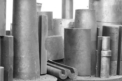
After writing about small changes and reading Andy's comment about the huge number of selections we have to make from before we shoot to well after, I decided to fiddle with this image a bit more. The new version is above, the old below.
Keep in mind that the lower one is in fact version 3, with each version having dozens to hundreds of adjustments made to it - for better or worse. I think I like the new one - but will have to live with it a while to see.
Small Changes Can Make A Big Difference
Several times in the last month I have noted that very small changes to camera position or to cropping an image or in image rotation, make a big difference to the outcome and appearance.
For example, in using image-distort to correct perspective in Photoshop, alignment has to be within 0.1 degree - anything bigger is noticeable - who would have thought that such a small angle wouldn't look right. Of course when straight lines are near an edge this shows more, but I know for a fact I cannot hope to align my camera to within .1 degree so that means that virtually all images that need to be spot on will need an adjustment - even if you have used a spirit level on the camera.
Sometimes cropping 1/8 inch off the side of an image can significantly change the appearance of an image, particularly when there are objects near the edge. There is a world of difference between being near the edge, touching the edge, or sneaking across the edge, the latter often being problematic and yet hard to see in a viewfinder, one of the advantages of large format.
Camera position too can be really critical - when I was photographing the steel cylinders, in the middle of the image two shapes crossed each other and I moved the camera to get them to just touch. In practice I might have been better with the camera another millimeter to the left, and on the right side of the image, one of the shapes was a fraction too close to the edge.
Things like rotation can be fixed in your editing programme but framing and positioning issues cannot. I guess the lesson is that if you can't be 100% sure it's right, then shoot more than one image and give yourself a choice. Either move back slightly or zoom out slightly so you can guarantee you didn't frame too tightly by that crucial 1/8 of an inch.
Days of 4X5, And Again?
This was quite a departure for me. I decided to haul out my 4X5 after not using it for more than a year - God was I slow! Still, I had fun, and it certainly works.
I don't know that the images are any better than I am getting with stitching and my 1Ds2 and when you factor the $10 per shot, film and processing included (and a hell of a lot more if you want it drum scanned), and the time it takes to make a single image, well I guess there's a reason I shoot digital.
But it was fun, and I might well do it again in black and white, but probably not colour. This was using my Shen Hao teak 4X5 with black fitting - an absolutely gorgeous looking camera and quite nice to work with, quite precise, well made except for the back on axis tilt which is a bit stiff (you still have base tilt which I normally use anyway).
If someone were interested in getting into 4X5, this would be an excellent way. ON a really tight budget, you could do what I did at first which is use a 4X5 crown graphic with a 135 optar lens - a pretty good combination for landscape work and more than enough to get you going in large format. But that teak camera sure is pretty, and with a shen hao 6X12 roll film back, well....
Monday, August 20, 2007
How Bright Is Right?
Here's four renditions of a single image. A case could be made for any one of them as being the best, well perhaps not the brightest, but all are acceptable, yet the mood is dramatically different. None is 'real' while the others not. The photographer is free to interpret the image any way he fancies.
Partly this is a function of black and white photography in general, but also it's a matter of subject - in this case who's to say how bright the lighting was, how light the paint. It's likely that this much manipulation in colour would give it a distinct sense of unreality - not necessarily a bad thing, simply something to recognize.
Sunday, August 19, 2007
Just Dreaming
I wonder what would happen if instead of going round various galleries begging for a showing, then being grateful for anything at all that they offer you, instead photographers would submit their portfolio of prints to an auction house who would advertise the work and galleries would bid on the portfolios.
The photographer would get a straight sum for his portfolio at the auction, minus the auctioneers commission - no framing costs, no shipping, no promises not kept, hidden expenses, net profits that turn out to be zero, and so on. The galleries would have lots of choices since the auction house could and would have hundreds of portfolios to pick from. The galleries would buy the prints at bulk prices (perhaps as little as 10 cents on the dollar.
But think about it - the photographer would produce a series of prints that he estimates should sell for $500 each, perhaps 20 of them, theoretical max. sales would be $10,000, but of course he'd never expect to see that in any current sales model. With current galleries, lets suggest that he is lucky enough to sell 7 prints of the 20, and that the gallery pays him 50% but charges him some show costs and framing, so his take is $1000 total for those 7 prints.
Under my hypothetical system, lets say that the gallery were to bid $2000 for the whole 20 prints - take away 20% for the auction house, that leves $1600, which the photographer gets within 2 weeks of the auction. The gallery paid $100 per print instead of $250 which means they can spend more on promotion or can sell for less. What if the gallery used a 100% markup - ie. sells the images for $200 each, but offers substantial discounts on multiple prints. It would be possible for a purchaser to come away with half a dozen prints, framed for $1000, thus decorating an entire wall - which after all is a much larger market than looking for collectors.
I don't suppose it would ever happen, but you do have to wonder if it doesn't make sense.
One could make the argument that the problem is the galleries and their high expenses but someone has to show the work to the public - internet viewing does not generate good sales unless you already have a reputation and not well even then. Someone has to do the framing - so I think the galleries need to continue to exist.
This idea would introduce more competition - a gallery might see work that they think is really hot and currently undervalued and pick it up for a song, yet sell each image for 10X what they paid for it - how's that for encouragement - it would be a bit like trying to pick up a used camera on ebay.
The idea in the end would be for retail print prices to be substantially less, thus dramatically increasing the market for images - a whole lot of people who currently know they can't afford anything in a gallery would start shopping for bargains there.
Collectors need NAMES - people with reputation, to protect and increase the value of their work, real people just want some lovely images for their wall, images that will tell their friends of their taste, not their financial acumen.
Oh, I know, it's a pipe dream, and what if the galleries only offered $200 for the entire portfolio - but I think that in this system of bidding, it would soon sort itself out.
Anyway, just a thought.
Thursday, August 16, 2007
Out Of Focus
This isn't a discussion of calculating depth of field, finding out best f-stops and dealing with diffraction. Rather it's a discussion of the whole business of whether everything should be sharp or not.
Let's look at some characteristics of having part of the image significantly out of focus.
1) it sure makes the sharp bits stand out
2) contrast in the blurred area is lower
3) specular highlights that might be distracting if sharp are blurred and not so white
4) details that would distract are hidden in the blur
5) progressive blurring (as in a portrait) makes you concentrate on the sharpest bits, usually the eyes)
6) out of focus results usually in smooth tonal transitions
7) lets not forget that accepting a shallower depth of field means a higher shutter speed or slower iso setting which may offer significant advantages
8) out of focus can actually be very attractive - there are whole discussions about bokeh and the ability of particular lenses to render out of focus areas attractively, but regardless of equipment and diaphragm shapes, blurred can be beautiful.
It's traditional in some subjects to try very hard for universal depth of field - ie the whole picture is sharp, while in birding and sports shots, photographers actually take advantage of the blurring to isolate the centre of interest.
Does this then mean that one shouldn't ever have blurring in landscapes, or that good depth of field isn't suitable to sports images? I can think of examples where the blurring was crucial to the landscape, the depth to a particular sports shot.
It might be time to start asking yourself is there a way to take advantage of shallow depth of field.
Extremely shallow depth of field, achieved generally with long lenses or really wide apertures or in macro situations. If most of your shots are sharp from near to far, perhaps you might want to deliberately try some out of focus blurring.
Tuesday, August 14, 2007
It's Official, Book Baby On The Way
I note that Rockynook Publishers now has my book listed as forthcoming so that makes it pretty official. The next milestone which should happen relatively soon is to see it listed on Amazon, and I'll let you know when it does.
The final cover will have the addition of foreword by Micheal Reichmann.
You can get a taste of the book by getting the latest fotoespresso online edition and scrolling to the essay Reading Photographs. This is one of approximately 45 essays in the book and is a substantial addition and modification of a blog entry and will give you a good idea of what the book is about.
I note that Rockynook has the book publishing date as October. I just a few minutes ago sent back chapter 1 to the copy editor with final corrections, 7 more to go, then we have to organize all the photographs, and some drawings, and create an index - so I'm hoping October and optimistic for before Christmas.
Not sure about ordering the book - I see that Rockynook has said the book is 200 pages - we'd originally agreed on 250 but preliminary estimates suggested smaller and cheaper. Final editing brought it back up and then some. Will Rockynook be changing the size (I hope so) and the price? - more than likely. Will they honour the current price if you preorder now and will that be any less than you can get it from Amazon once it gets listed - I don't know the answers to these questions but we're only talking $5-$10 here one way or another.
Guess what, I've read the book and I wish it had been there for me in the past. The topics are not radically different from sections of other books. The approach and practicality are I think a whole lot different and hopefully better and more useful.
Thanks all for your support and encouragement.
George
Saturday, August 11, 2007
After Making The Shot
There are lots of discussions, books, articles and even some of my own blog entries discussing how to manipulate an image once recorded. I thought I'd discuss today more the matter of why, after all, knowing how to saw a board isn't enough to build a house.
Before even getting to the point of manipulating the image, perhaps it's only fair to discuss how far it's legitimate to go. As you know from some of my images, I'm prepared to go fairly far in working on an image (the recent machine shop cylinders images are proof of that). Not everyone feels that they want to alter the original scene. Some are in fact obsessed with keeping the scene as true to the original as possible and eschew any manipulation at all. I have addressed this issue before as have others so I won't debate that issue. Rather, lets start by looking at manipulation done to modify the recorded image to match the experience the photographer had at the time.
Unless the photographer was on LSD at the time, we can make some basic assumptions. First is that the photographers eye is much better able to cope with a range of brightnesses than any camera and more than likely we are going to have to compensate for that fact. Second, the human eye adapts to strong colour shifts within seconds meaning that strong colour casts rendered by lighting a scene only with a deep blue sky won't be seen by the photographer and if left in the image, will look unreal. Third, the photographer saw the scene in three dimensions (unless he squinted) and things that separate out nicely on scene may look jumbled in the print. Likewise the eye looks at part of the scene at a time, placing much less emphasis on the whole scene, exactly the opposite of the camera and that too may affect the appearance of the print.
With these problems in mind, the question then is what to do about it.
1) contrast range - without getting into a discussion of HDR (see Outback Photo for discussions on HDR), if we assume that the camera managed to record the dynamic range of the scene, the question now is whether it portrayed that range in the same way the eye saw the scene. The answer is almost certainly not.
Whether HDR was used or not, the contrast and brightness are almost certainly going to need adjustment at a local level to make the scene look more realistic. When the eye saw the shadows, they had lots of contrast. Flattening overall contrast through HDR or through settings in camera raw or through an overall curve adjustment to the whole image results in parts of the image looking too flat. We need to restore contrast in those areas without affecting the others.
Put simply, first we lower contrast to contain the dynamic range, then we pump up the contrast back to normal within parts of the image to get closer to what the eye saw.
2) Colour balance - it may be convenient to use the colour balance determined in camera but really, that's at best a guestimate of what the scene should have looked like. Just as a light meter assumes that the scene is going to average out to middle gray, the white balance assumes a normal blend of colours and that any lean towards one colour is from the light source, not the subject. Of course, this may not be true. A white balance of green leaves with more green in the background is going to assume the green comes from the light source and will alter the leaf colour - which you may not want. When I was photographing Jura Canyon, my eye saw the rocks as subtly blue gray. The camera recorded the scene as brilliantly blue and adjusted accordingly. It took some work with Camera Raw to return the tonalities to close to memory. As you adjust the contrast you are also going to change the colour saturation so work will have to be done here too. It's more than likely that some parts of the scene will need more work than others.
Local colour adjustment may be necessary to remove tints the eye manages to ignore - the green of a wall which is next to a tree in leaf or the red in a white sweater next to someone's red jacket.The eye knows it's white and ignores the pink on that side - the camera doesn't and in a print the eye doesn't seem to have the same ability to ignore the pink.
3.Separatng the Sub-Scenes
It's not just a matter of separating parts of the image, it's more a matter of emphasizing that which is important while downplaying the bits between. The eye can do this as it moves around a scene but has more trouble doing so within the boundaries of a relatively small print - so we are going to give it some help. We can do this in a number of ways - lower contrast for the leafy background, or darkening the area between rocks or players, while increasing contrast or lightening the important parts. In the 'olden' days of the wet darkroom, we routinely added a bit of print exposure in the edges and corners to compensate for light falloff in the enlarger. Truth though is that we generally took this a bit past compensating to help keep our focus within the print.
Some photographers take this darkening way over the top, especially in the sky. It's one thing for it to show as part of the unique optics of a Holga, but sometimes it looks quite ridiculous - even in published work. That said, subtle adjustments can be useful.
Remember that here we're talking about making an image look like the way you remember it, any adjustments shouldn't look like they were done well, they shouldn't be seen at all.
Friday, August 10, 2007
So It's Interesting, Now What?
You are out photographing and you come across something interesting to photograph, how do you go about converting that into a good photograph? This could be an intro to a long discussion of composition, but I wanted to discuss it at a more fundamental level.
Here's a series of steps which might help you make a good photograph.
1) before going any further - is it interesting in a way that can be shown in a photograph - because if not, we might as well quit now?
2) is there a position from which it can be seen without extraneous material getting in the way, keeping in mind that what's in the way may relate to the object and could possibly form part of the picture. Sometimes there simply isn't a clear view from anywhere and you have to drop the scene.
3) are there in fact other items around this subject which could be used to enhance the image, to tell a story, to explain the object?
4) Is there a position which will let you show better what it is that's interesting about it?
5) Is this better photographed as an 'environmental portrait' , that is including the surround, or is it better to move in tightly, possibly so tightly the edges of the subject don't even show and it becomes more of an abstract?
6) are there in fact several interesting things that can be photographed in a way that shows the relationship?
Maybe this is a little bit different way than your usual hunt for good images. Give it a try.
Thursday, August 09, 2007
Excuses
You have probably noticed a drop in the number of posts I have made in the last month or so. There's two reasons for this - first, I have a medical student from England with me for the last month and that has prevented me from putting in quick blogs between patients and at meals as I was prone to do in the past. Simon heads home on Monday so I'll have a bit more spare time.
The second reason as I have hinted in previous entries is that I have written a book based loosely on some of my blog entries and the three part articles on Luminous Landscape. It is entirely non technical and has had considerable content added not in previous articles or blog entries.
The table of contents are going to look something like the following:
Introduction
Seeing
Finding Images
Composing
Assessing Images
Mind Games
The next levels articles
The book will be illustrated with some drawings and a large number of my photographs, including some images which show earlier attempts or the general scene, along with examples which help make my points.
So far the book has 166 pages of text (50,000 words), much of it fresh writing. It's at the publisher now for copy editing and next comes the layout.
As you can see, this has been no small effort. I will keep you informed as we make further progress.
Monday, August 06, 2007
Three Dimensionality Through Local Adjustment
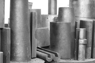
I have been asked to explain how I managed to make the metal cylinders image look so round when the original image was so flat. This was easy but not automatic, you need to apply effects to certain parts of an image only - as it happens, that's quite easy with the image above since the parts to be rounded are quite large and painting isn't critical.
The first thing was to convert the image to black and white. In the past I'd have done this with a Russell Brown routine but now use the very nice Photoshop CS3 black and white adjustment layer, in this case with a green filter - I liked the effect.
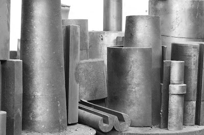
You will note that the lighting is all too even for an interesting picture and the shapes look really flat, two dimensional, dull, boring, did I say flat.
Making something look rounded is a matter of deciding where the light is going to come from. Since it didn't have any direction before, I get to choose where and all the parts that reflect from that direction need to be lightened, everything reflecting 90 degrees from that needs to be darkened. In this case I chose from behind me, though I could have chosen left or right of me.
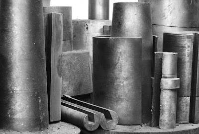
To create the effect I need to create a lighten curve and black mask it then paint into the appropriate areas. Next was a darken curve and after that a couple more doing the same thing but at different points of brightness. I then used an increase contrast curve. You see the sequence below.
As you can see we have made considerable progress into rounding the shapes. The difference between the last image and the final one at the top is just more of same, a series of curves adjustment layers.
The same thing can be done in nature too - I have added depth to erosions in the badlands through this technique. With a bit of practice it's possible to take an evenly gray circle and turn it into a very convincing sphere. In that case you could use gradients, but this more applicable in the real world manipulation of images.
In the last image there was an overall darkening then some final work with the dodge brush set to highights - 5 - 10 % effect.
If it's not a perfect match for the final image above, that's because all this was done in about 15 minutes, including writing the blog, and the image hasn't been 'toned' yet.
Overlooked Stitch
Shot n 2005 and with the images in reverse order in Bridge, I hadn't noticed that these belonged to a single stitch till this morning. I used the stitching available in Photoshop CS3, along with the black and white conversion, with yellow filtering. I did use Akvis Enhancer, but with the effect toned back to about 40%, as well as some judicious local curve adjustments. In the end the building on the left appeared to be falling over compared to the others so I did a selection of that side of the print, starting just to the left of the central building and did a 'free transform' on the selection, dragging the upper left corner to the left to correct the building.
The original stitch included all of that pipe on the far right but it also meant the image sort of 'fell off' to the right and a couple of more and more agressive cropping attempts and I came to this, I think; satisfactory conclusion.
Sunday, August 05, 2007
Saturday, August 04, 2007
Better In Black And White?
I was told this morning that the cylinder image should be in black and white, so with a bit of work, here's my version in B&W. Note that this wasn't a trivial conversion - tonalities that work in colour don't in black and white and so you have to edit the image all over again - and it isn't any simple increase in contrast - local editing is necessary for the best result.
Look back at the previous post which also included an unedited version of the image - now you have an idea of how much work goes into making a good black and white print.
By the way, I have just printed this on Crane Museo Silver Rag - so far the only semi gloss real paper worth considering - despite hopes for the Innova papers. The print is very nice.
Colour Cylinders, Before And After
This morning, rather than work more on the black and white shot, I decided I'd use another set of raw images to do a blend (in which I didn't tilt the lens and screw up the focus on the small fluted column on the lower right). This blend included a little more on the left, a little less on the right (for better or worse).
I decided if I was going to the bother of doing the image again, I'd see what I could make of it in colour. There wasn't a huge amount of colour to start with, but enough rust tones to be working with, and here you have the result. I quite like it - now of course that leaves me trying to decide - colour or black and white. Sometimes it can be hard to decide.
Below is the original output from Helicon Focus, a six image blend. Note both the duller colour but also the very flat lighting which required a lot of work to make the shapes look more round.
Friday, August 03, 2007
Pipe Benders Revisited
This was a particularly challenging (and dirty) task. I had considerable flexibility in arranging the shapes on the workbench, a subject I'll discuss later. The toned image is the final version (at least for tonight) and the next image is an intermediate step already with dozens of changes.
The last image is after the addition of a single extra masked curves adjustment layer. It was amazing how much different a single adjustment layer could make - the shapes stand out better and look more three dimensional.
The final version (the first and toned one) had a few hundred other changes made to it, adding perhaps another 30 minutes of work. I'm not convinced it's truly final - but I do think it's time to give it a rest for the night, coming back to work on it again, perhaps tomorrow but possibly many days from now - when the muse is with me.
Back At The Machine Shop
I had a chance to go back to the machine shop today. Apart from hoping to find more images, I wanted to reshoot the wood box of chucks and shapes that I'd shown you before. I hadn't noticed at the time that with the box against the wall, the bottom left corner was extremely dark. Attempts to lighten the corner just resulted in noise and linear artifacts from too much manipulation. The image I showed you resulted from massive cloning of the shapes into the dark area thus minimizing it, but I knew that a large print would probably show the flaws, and overall I just wasn't happy with it.
Today I hauled out the box and sat it on a counter where the light was better balanced. I then reorganized the shapes to hide some junk on the bottom of the box and to place the important shapes in better positions. I was somewhat limited in my options since anything that rose out of the box would suffer from depth of field problems and it was my intention to stitch this image and the idea of both stitching and doing a focus blend was not appealing. I played with the shapes for a while before coming up with what seemed pleasing. I'd have preferred that rectangle under the handle to have been on an angle instead of against the edge, but every time I did that, other problems occurred so I abandoned the idea - a matter of the lesser evils.
The second image was a major find in a corner of the machine shop I'd not checked out before. A series of cylinders of steel were sitting on top of a cabinet behind a milling machine. I tried a few angles but this was the best. I used helicon focus to increase depth of field, though a view camera stopped down would have worked well too but with some blurring in the background which might in fact have been attractive. Anyway, I'm happy with it as it is.
The machine shop has turned out to be a major find for me - more pleasing images than in a long time.
Subscribe to:
Posts (Atom)