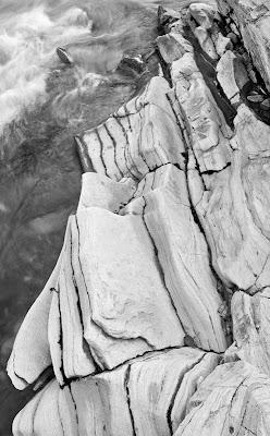
This image is a good example of an image that does better in black and white. There isn't a lot of colour in the original (see below, it's largely about form and other than the relatively neutral rock, the only other interesting thing is the waves which are white.
Also, in the original colour image, the rocks are blue white (shade), while the water is brown - not generally an attractive combination. In the black and white image I have been able to print down the water so it acts as a background to the rock formation rather than as more subject matter, even though it's only a few inches further away.
The white waves in the upper left provide a bit of balance to the rock formation and the diagonal line formed by the left hand edge of the formation.


1 comment:
Indeed - colors in the original made it a bit hard to "see" (although there was the delight of discovery).
Post a Comment