Saturday, November 11, 2006

Linear Vs. Cylindrical Perspective


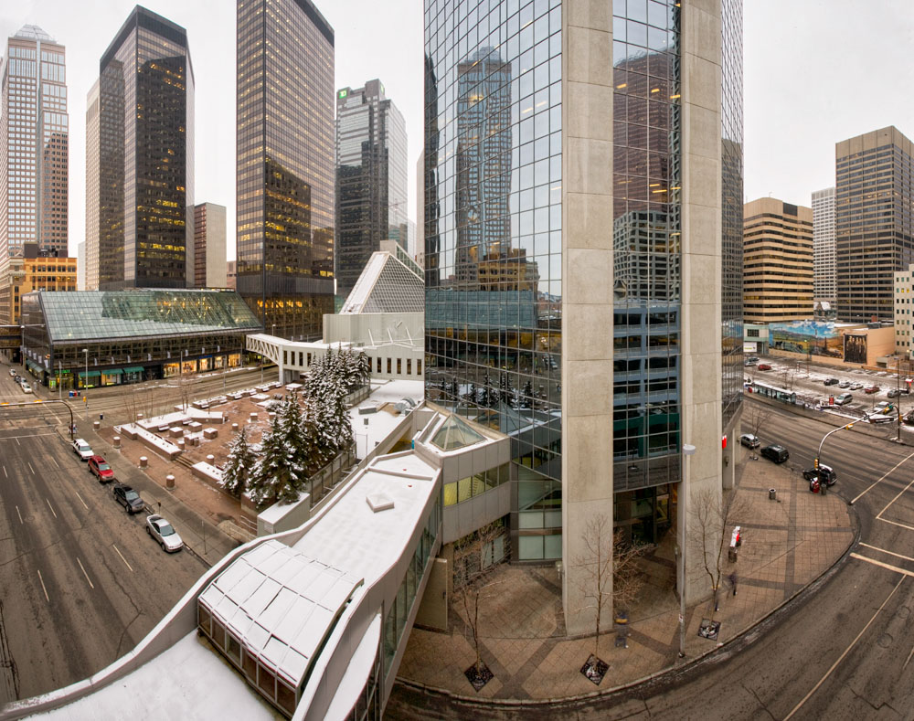
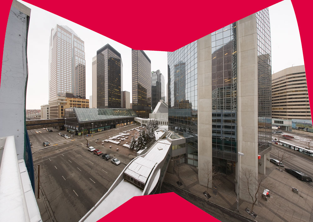
From my shoot at the parking garage this afternoon, the first image is the result of PTGui deciding that 4 images from a 17 mm. lens is too wide to stitch in a linear fashion - it is. What you see is a cylindrical perspective. This is the kind of view you used to get with Roundshot camera and other cameras which have a revolving mechanism. The net result is that everything that is the same distance from the camera is represented as the same size. You might think this is how an ordinary camera works, but not if you think about it.

In a normal camera, let's say that you photograph a group of 20 guys from a rugby team (not very tall, crooked noses, bashed ears, covered in bruises and grinning), in a line, facing the camera. Let's assume you are going to use a moderate wide angle, say a 35 mm. lens. (though it doesn't matter what focal length). With a modest wide angle lens, the middle person facing you is perhaps 12 feet away, but because they are in a straight line, the two fellows on the end are actually 18 feet from you. Since you are using flat film and a lens which focuses on a flat field, all members of the group are shown in a print as being in a straight line - thier heights are kept proportionate across the screen. The fellows on the end however appear to have gained a few pounds (they are slightly wider).

Were you to do the same exercise with a 17 mm. lens, you might have the middle fellow 6 feet away, and the end fellows 15 feet away, heights are still maintained and the end fellows have gained even more weight. This is simple optics. Were you to photograph a building from across the street and from half the height of the building, it would be recorded as rectangular.

In a cylindrical perspective image, the end fellows appear much smaller (after all they are further away). The lens makes no adjustments for perspective and the end fellows don't look fat. The building on the other hand becomes a very overweight rectangle, bulging out on top and bottom, but not sides (the camera is rotated horizontally, not vertically).

When you stitch, you actually rotate as if you were working with one of those rotating type cameras used to make 360 degree panoramas. When you rotate the camera to stitch, you aim the camera at the left end fellow, the middle fellow and then the right end fellow. Clearly the images will show the middle fellow as larger (since he's closer) and so the stitching software has to translate the images into linear perspective. It uses the knowledge of the angle of view of the lens (using exif info). The end result when using wide angles is the outside images are magnified in comparison to the middle image (to keep the rugby players the same height and to keep the rectangle from bulging outwards at top and bottom).

Note that in the top image, what appears to be two streets in the bottom corners is in fact one straight street, curving because the further parts of it show as smaller without linear perspective correction (remember the short rugby players). Note too though that the buildings aren't distorted, the cars not stretched by the nature of linear perspective (the rugby players don't look fat).

The last image below shows the result. The red areas show how the outer images are magnified. The non vertical sides reflect the adjustment PTGui made for the fact that the camera was aimed down slightly.

I continue to be very impressed with PTGui.

Humble Projects


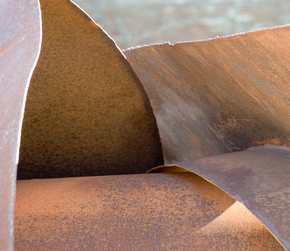
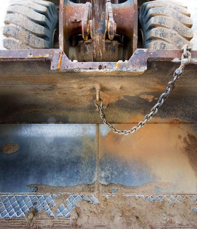
Stuck for a project, light not right, weather not cooperating for a 'grand landscape' image - here's what I did this afternoon. I have shot from parkades before and I have even photographed the parkades themselves before (late one night at the hospital). I was desperate to get out this afternoon but couldn't mount any enthusiasm for wilderness on a very dull dark winter day - so I headed downtown.

Akvis Enhancer did a great job bringing out the texture in the driveway but also dramatically opened up the shadows and strongly emphasized the flaws in the 1Ds2 sensor resulting in vertical stripes in the shadows. A bit of work with the history brush after using fade toned things down nicely. A Hue Saturation adjustment set for yellow only and a bit lighter too brightened the yellow to the left which wasn't as bright as the yellow elsewhere.

Friday, November 10, 2006

My Industrial Work


Having recommended the work of Edward Burtynsky, and the film about his work and about man's effect on the landscape, here's a few of my industrial images.

My style is quite different - getting in closer, avoiding the clues which give you a frame of reference for the images where he would include them to give you a sense of scale.

Manufactured Landscapes Documentary

Just back from watching Manufactured Landscapes, a documentary film about the work of Edward Burtynsky.He has been photographing man's effect on the landscape for more than 10 years, making images of open pit coal mines, marble quarries, the ship breaking yards at Chitagong, Bangladesh, and most recently in China, both with it's industry and specifically the Three Gorges Dam - the world's largest by 50% and creating a lake big enough to produce a detectable wobble in the earth's rotation.

The film is by turns depressing, enlightening, and beautiful. It shows a number of Edward's images as well as him setting up shots. It's not a technical film about photographing - nothing about film and f-stops. Rather it makes a statement about man's effect on the landscape, for better or worse. Much of the filming is in China but there are images from around the world including North America.

One sees workers building ships, grinding away at metal with no eye protection. But you also see workers clearly happy in their lives and jobs in clean modern factories.

All of Burtynsky's work is interesting and some of it is beautiful, even allowing for what he is photographing.

Highly recommended.

More Stitching Experience


This image is 12 shots from my old Sony 707. I stitched this a few years ago and it took hours to set up the control points for each pair of images and matching colour and contrast and brightness between images was a nightmare. Yesterday I loaded the image into PTGui and within minutes had the output file approx. 22 megapixel size. Minor blending removed some slight brightness differences which only showed when I burned in the sky a bit and I was done. Well done PTGui.

The image, by the way, is of Nakiska Ski Area in Kananaskis Country, west of Calgary, it's the Kananaskis River in the foreground and the algae on the bottom of the river really did turn the water brilliant emerald green.

Thursday, November 09, 2006

Five Heavenly Habits

Ok. so I told you what not to do when presenting work, for a little different spin, here's five things you should do.

1) take the picture you want,but once you have it recorded, ask yourself what makes it worth shooting, and is there anything you could do right now to make a shot that makes that thing come across stronger in the image. The feature might be a shape or tone, a wonderful shadow, a terrific colour, two objects that complement each other, something that stands out as different from everything else in a scene. It could be the smoothe texture of water, the roughness of bark, the weight of a rock, the delicacy of fine leaves. You could move in, move back, get on your belly, stand in the water, wait for better clouds, use a polarizer, blur the background or whatever. Shoot the second shot and make some notes so you can learn from your experiments - some rethinks will work, others...

2) Instead of looking about at random for a masterpiece photograph to jump out and say 'shoot me', try instead to look at what is interesting about where you are and simply set your sights on doing the best job possible of creating an image that illustrates this feature of the landscape. Here I'm talking about the landscape feature rather than a shape or colour. It could be that you are walking along the edge of the river - so the question is how best to show this river. You could be walking along a valley trail looking up at high peaks and your goal would be to give the impression of that grandeur, the height and majesty o the peaks. Trust me, you won't miss a masterpiece shot this way and you might just find one and in the mean time improve your skills so that you can take advantage when the great opportunity does come along. I never did have the patience to go out shooting for 3 hours and not take a single photograph - I like the process of using a camera and for me that is very important. Rather than shooting a series of random less than stellar 'would be' masterpieces, treat the time as an exercise with a specific goal.

3) After you have worked on an image to your satisfaction and made your first print, ask yourself if you haven't gone over the top - this could be too much contrast, too dark, too saturated colours, burning that looks like burning, too tight cropping, etc. and if the answer is yes, don't be afraid to save the image just in case and go back to the original (the image at the top of the history pallete in Photoshop) and start all over, or even reprocess the raw file if need be.

4) when taking photographs - ask yourself if you aren't being a bit lazy - should you really be using a tripod but didn't bring one, didn't scout the area as well as you might, didn't put much thought into the composition but simply centred the pretty thing and hoped the rest would somehow work itself out (ir rarely does). Did you wait 15 minutes for the wind to die down, are you absolutely sure the lens you have on the camera is the best one for this image? Give yourself a mark on effort - ask yourself how much skill you brought to bear in taking the photograph and do you think you deserve to be paid for any image resulting. Chances are that if you are not proud of your effort, the results will be less than stellar.

5) Do you have an effective backup system so that when your hard drive fails (not if, WHEN), you will be ok? Are your negatives stored in a way so that you can find a single image 5 or 15 years from now, not just next week? Trust me, that takes a whole lot more effort. Over the years I have become a much better photographer, but there are some images from my early years that still stand up to scrutiny and deserve to be seen. It's not enough to burn your images to DVD, you need to be able to lay your hands on that dvd, painlessly.

Wednesday, November 08, 2006

An Oldy


Shot with my 4X5 Linhof Kardan Color and a tele-xenar 360 in compound shutter (works on air going through holes). Actually the lens was surprisingly sharp but very prone to flare and needs careful lens hooding - a film slide in front of the sun isn't enough.

Seven Deadly Sins - Of Image Presentation

At workshops there are usually print critiques in which people show their work. There are some general themes which prevail and as I think that the same issues also apply when showing your work to a gallery, to a friend or a customer, it's worthwile commenting on those themes.

Deadly Sin # 1

Thou shalt not over sharpen. If I can see it, it's too much - unfortunately the photographer is often not aware of it - I can only suggest you check with someone with more experience if in doubt. Of course the problem really relates to sin # 2:

Deadly Sin # 2

Thou shalt not make prints bigger than the image file can justify. It would be nice if I could simply tell you how many pixels per inch but truth is that it depends on the subject matter and it's not enough to say landscape vs. sports or whatever - there are some landscape images which can make nice prints at 180 PPI and others that really do look better at 360 than at 300. Rocks tend to sharpen well, grass tends to oversharpen all too easily.

Deadly Sin # 3

Please, please, please don't make borderless large prints to show - they look terrible on tables and leaning against the wall, are hard to handle - they really don't show your work to best advantage - consider instead a large white border - see May 2006 blog and scroll down.

Deadly Sin # 4

Please don't show me images in plastic sleeves - and don't hold me up by slipping each print out of a plastic sleeve. Don't on the other hand treat the prints as holy relics only to be touched by white gloves. Some wear on the prints is the price to pay for showing them off.

Deadly Sin # 5

While it's true that prints don't always have to have a full range of tones from white to black, in general most good prints do and you'd better have a darn good reason if you don't. This is less of an issue in Photoshop since it's so darn easy to nail the white and black points but sure is a problem in the wet darkroom and isn't limited to beginners.

Deadly Sin # 6

Please don't use glossy paper - semi gloss is just fine, but something that looks like and probably is a sheet of plastic is less than appealing and the slightest mark spoils it. I cant think of a single reason to use high gloss paper.

Deadly Sin # 7

Take the time to flatten prints, and while you are at it, if they are flexible inkjet prints, think about mounting them, even temporarily. In most workshops prints are leaned against walls and sometimes passed around. A stiff backing makes this safer and easier and prints that gradually slide down the wall in a heap don't impress. Check with Light Impressions for some options for mounting work. Don't bother with overmats, they seem just to be a nuisence and won't lie flat when prints are leaned against the wall. These are your show and tell prints so if the material is less than archival - it's hardly the end of the world. That said, if showing them to a gallery, you probably should show that you know about archival.

Deadly Sin # 8

Yes, I know I promised only 7, but please take the time to put your prints in some sort of suitable container. Some people sneer at print boxes but frankly they are tidy, hold prints well and seem appropriate to the occasion. I've seen people slip prints out of albums, remove one print from a stack of 100, unzip economy size binders, brief cases, etc. I confess I haven't gone so far as buying a nice presntation box from Light Impressions, but I probably should. It's not that nice presentation makes up for weak photographs, it's that poor presentation detracts from good ones.

But you know what, the absolute worst sin of all is to not show your work around at all.

Tuesday, November 07, 2006

Equipment Envy

I don't know very many photographers who don't suffer from this problem. There might be a few who come from an arts background, but certainly amongst hobbyists, there is no such thing as too much.

I have a friend who has a sticker on the fridge - "he who dies with the most toys and still married, wins" and some have been known to not worry too much about staying married when it comes to feeding their 'habit'.

There are several aspects to this problem. There's the 'I like shiny new toys' syndrome and it probably wouldn't matter whether it was a new pda, cell phone, power tool or camera, they'd all provide the same temporary fix. As this doesn't really relate to taking photographs, I will ignore it particularly as I don't have a fix for it (suffering, as I do, from the condition (as do many males and some females too).

More important though is the syndrome of "if I had a better camera, I could take better pictures, the corrollary of which is - to take pictures as good as Ansel Adams, I need to use a large format camera - even if it is completely unsuited to my style, my skills and my personality, not to mention what I photograph. There are people out there who do street photography with 8X10's but except for a very few (Nicholas Nixon is one), you seldom hear from them.

So, you are convinced that better equipment would go a long way to solving the problems you are having with your images. Let's look at that premise and see where it goes.

Let's imagine that we are currently photographing with a) a 40 year old Pentax with screw mount lenses (of which we have three - inherited from our uncle, or b) we have a used Sony 707, purchased from our best friend when he 'upgraded to a DSLR, c) we have a first generation digital Rebel, 6 MP camera with it's so so kit zoom, or d) someone like myself with a Canon 1Ds2, already an absurdly expensive camera who oggles medium format backs at $40,000+ even though Hell would freeze over before my wife would let me make such a purchase. In each case the photographer desperately wants something better so he can take better pictures. All four feel the same angst, to the same degree, even though their current equipment and possibly budgets are radically different. How can it be that four people with such different equipment could all have the same 'issues'?

The four photographers make similar arguements - the pictures would be better, sharper, more detailed, larger, sexier, more impressive and somehow more like Ansel Adams (substitute your favourite photographer here).

So, what if we put some fairly strict limits on prints we are going to have in an exhibition. Each of the four photographers is told that he may exhibit a series of 5X7 prints. Let's assume that all four are landscape photographers so their equipment needs aren't all that different and issues like camera speed and long zooms are not pertinent.

Lets further stir the pot by also inviting to this exhibition three of your favourite photographers who you really admire.

So, the obvious question is: could you tell who took which photographs? Obviously I've set up the test so that you couldn't tell based on camera equipment - all four photographers have equipment capable of some darn nice detailed and sharp 5X7 prints. Likely the work of the experts would shine through in their expert printing, superb composition and selection of interesting material shown in ideal lighting.

Ok you say, but who wants to limit ourselves to 5X7 prints - well gee, there are quite a few photographers running around with 5X7 inch cameras making nothing but contact prints so they do.

Right, but 5X7 is pretty small and doesn't even take advantage of the smallest inkjet printers at 8.5X11.
OK, the old Pentax has no problems here, none of the DSLR's hesitate to produce really nice images at this size. The fellow with the 5 MP used 707 is straining a bit but he knows about stitching and has seen the lovely work by Max Lyons (some of the early work done with an old Nikon 990) so he takes four images of everything, in a square, with about 1/3 overlap. After all, he's a landscape photographer and it doesn't take long with a simple camera like this to fire off four images. Now his 8X10 prints look every bit as good as all the others, professionals included - at least technically.

We could carry on this scenario to larger and larger prints but the point is that many photographers in the wet darkroom days had no print trays or easels bigger than 8X10 and that's the biggest print they ever made, and were prefectly happy.

Just because it's possible to make really big prints doesn't necessarily mean you should, or for that matter,convince yourself you need to.

The only reason to make big prints (which you probably can't afford to get framed anyway) is because you can get some other poor sucker to buy them and let him pay for the frame, and if you are not selling your work (regularly), then the large prints is mostly an ego thing and just to prove that you can.

Large prints cost a lot to make, a lot to frame, they take up a lot of wall space (thus leaving less space for other photographs). They demand expensive equipment and perfect technique, tripods and optimum apertures, cable releases and slow e.i.'s.

Three of the four photographers can't see any difference in the quality of the prints and the fourth has a relatively painless workaround (stitching) to keep him in the game. So, really, it can't possibly be equipment that is limiting the photographers - it has to be the guy pushing the button. That's really depressing - sure would be a lot easier to upgrade equipment than photographer, not to mention it's a lot easier on the ego to blame the equipment.

Ansel Adams shot large format so he could make the gigantic prints 30X40 and up which he sold often enough to justify the trouble he took hauling 4X5's and 8X10's around. Hell, he even had his own burro. Ever suggest your wife haul your tripod to the top of the pass? didn't think so. (actually there are couples who work as a team but that doesn't count).

Well, it's true that better cameras have more features but features never take pictures - mostly they just make life easier - so how easy did you really need it?

Mirror lock is nice but I shot for 20 years without it - self timers can even replace cable releases (that's what I did on my 707). I might envy someone with a 100-400 zoom for $2000 but consider, there are not a a lot of landscapes shot with a 400, and besides, ever carry one of those suckers.

I've always discounted the inexpensive 75-300 zoom by Canon but I have seen winners in magazine contests shot with it - how many contests have you won lately?) Makes you think.

I still remember an episode of Father Knows Best from my young childhood in which the son bemoaned the quality of his trumpet, begging Dad for a better one. A guest appeared (Al Hirt?) who of course took the junk trumpet and created beautiful music with it. Do we really doubt that if Ansel, Edward, Paul, Bruce, John or any of the other greats grabbed our equipment, they couldn't make it sing? Damn right they could.

If I had a choice between some wonderful 8X10's which could never be made larger and some so so 13X19's which could, there's little doubt I'd go for the 8X10's. Most of us have probably never seen really large prints by our favourite photograhers anyway, seeing the images only in so so mechanical reproduction in magazines and books, at sizes rarely larger than 8.5X11 (and often much smaller) yet we still drool over their work and still dream of better equipment with which to equal them - yeah, right.

So that's the common sense. Unfortunately our hearts aren't listening, and we still drool over better equipment. It's human nature - drive a nice car long enough and you start oggling nicer, faster, sexier cars. And lest you think this is a male only issue, let me ask if a Gucci purse really holds more?

Truth is that for 99% of us, our equipment already exceeds our ability. Hmmn, wonder how much a photographer upgrade costs?

Enhanced and Without

Three more pairs of images, the enhanced first, the original second. Decide for yourself whether Akvis Enhancer might be useful.


you may not in fact see any difference on the web but rest assured it is significant on screen and in print. In the steam engine pair, I did use the history brush to undo enhancement of the trees in the background as it made them stand out too much. The sky and the mountain on the other hand benefited from the effect. Don't forget you can click on the images to see them much larger.

Monday, November 06, 2006

How I Go About Improving An Image

I'm writing this at the office between patients and hope to add some illustrations later, but here's some general concepts about improving the image and I believe they apply regardless of the editing programme that you use.

Let's assume that in the raw software (Camera Raw in my case) I have optimized the image parameters. I should point out that this does not mean making the image look as nice as possible. On the contrary, my main function in setting the raw parameters is to make sure that all the information I need is in the output file. Quite often this means a muddy dark print in order to save highlights.

OK, the image is in Photoshop and I'm looking at it. the first thing to do is an overall correction. I want to pin the two ends of the image, black and white points without exceding them. At this point I'd rather miss reaching white and black by a little rather than risk losing data. I adjust the curve to produce the best possible overall image. I do this by deciding on overall brightness of the image, brightness of highlights and depth of the shadows.

A particularly flat image will need an S bend curve to increase contrast and shift pixels away from the middle thus increasing contrast. An image with overly bright highlights will need a sharp drop in the curve from pure white but will then need to straighten out quite quickly or else risk being overall too dark. An image that is overall too contrasty will need near vertical lines near the black point and white point with a fairly flat midsection. Of course I actually adjust the curve to suit the image, not to any preconceived ideas of what it might need. Curves can be quite complex with several dips or bumps to tame the overall image.

As you probably know from previous articles, I do most of the rest of the adjustments with curves and black masks, painting light into the masks to apply the curves to specific areas of the image and in amounts to suit. That's fine but what I would like to try to discuss is what I'm trying to achieve by doing so - it's all very well saying that the areas that are too dark need lightening and visa versa but how do I know they are too dark. What if they really should be darker. As the late Fred Picker used to day - 'let the tones go the direction they want to go' - instead of dodging shadows, burn them in so they are nice and deep - of course that presumed a perfectly exposed and developed negative in the first place, not a rescue job on a negative you wouldn't wish on your worst enemy - funny how many of those we seem to have in our files.

OK, so how can I discuss general rules of tonality? Let's take one of my badlands images shot after sunset (and therefore in fairly flat light). Contrast containment is not a problem. I try increasing the overall contrast to give the image some snap but note that it now looks harsh. I'm going to have to be more selective. As the image is rather flat looking I do increase contrast a little but it still looks two dimensional even though contrast is now better. What I'd like to do is make it look more three D. I do this by lightening the edges of the bluffs, bringing them forward and darkening the mid part of the bluff, making it move backward. With practice the difference to the image is dramatic yet not harsh, the image looks three dimensional and comes alive. Note that this adjustment of brightness had nothing to do with improving the technical aspects of the image and everything do do with the aesthetic qualities.

Sometimes you don't want things to 'stand out'. This is your opportunity to make them recede into the image and become less important, less obvious and specifically less distracting.

You could simply burn them in by whatever method but in doing so the whites remain white, the darks go to black and all you have done is increase the overall contrast and make the feature more obvious. I find that if I drop the white point down so that in the area selected there is no white, this is more effective - while this would result in a very muddy print were it applied to large areas, when selectively applied, it can be very effective. Occasionally I will even move the black point up so there are no dramatic and pure blacks. Since I have done this as a layer and mask, I can use the opacity slider for that layer to 'tone down' the effect I have just created - this is a lot better than 'undo'ing or 'fading' the effect.

On the whole, I prefer the edges of the print to be a little darker than the centre - note the word LITTLE - if you can see it, it's too much, it should only be noticable in comparision with the undarkened edges by clicking the layer on and off. I have a particular aversion to skies so darkened in the corners it looks absolutely fake.

You will note that I have said nothing about colour, saturation, temperature etc. That's a topic for another time.

The only way to learn the technique of tone adjustment is to do it lots, to overdo it so much you have to start over, to make prints and see the effect, to hang a print for some days to see if you can live with it - what works at 1:00 in the morning often looks hidious after a good sleep. Nice bright contrast that gave the image snap at the time looks vastly over cooked afer a week on the wall.

Unfortunately, by and large I simply keep adjusting parts of the print until the image works (whatever 'works' means). Knowing what is right is based on experience, not only experience of working on your own images but looking at that of others. I've said it before but anyone working in black and white should have a subscription to Lenswork Magazine. For colour work consider "Outdoor Photography" from Britain (available at Chapters and Indigo here in Canada), and possibly Focus Magazine which seems to add more colour with each passing issue. "Black and White" magazine shows a lot of good photography, it's printing quality is improving.

Get to every show you can reach. Check out archives of local galleries, museums and universities to see if they have any collections worth looking at - this often requires permission but can be very rewarding. I was at a local group show on the weekend. Workshops are a terrific source of images. Not only do you get to look at the work of the instructor(s) but almost always there is a print critique at which you can see work of the other students. In any mixed group you see images that are techincally excellent and completely boring to images that look like they were taken with something out of a cerial box yet the camera was pointed at something wonderful. In every group though there are some gems which are both technically good and aesthetically rewarding.

To my mind the most interesting photographs are taken by people with an art background who move into photography and immediately start shooting interesting pictures, even if technically it takes them some time to come up to speed (usually a hell of a lot faster than the usual hobbyist who gets side tracked by equipment issues and experimenation with films, developers, papers, printers, computer programmes, and plug-ins.

As I too came through the hobbyist route and am most certainly guilty of experimenting in my youth (before age 50) with all of these time wasting paths, I am certainly raising doubts about my own competency. I can only say that any skill I do have has been acquired the hard way and explains why I'm where I'm at at 57 instead of 25.

There's no time to waste, select some reputable tools, stop worrying about whether they are the ideal ones (they aren't - there are no ideal tools - every tool is a compromise) and really learn to use them.

Well, I did ramble on a bit and got off topic, hope it sparked something for you.
Good shooting,

Sunday, November 05, 2006

A Non Review Of Lightzone

I commonly get feedback like, 'you should try', 'what do you think of', 'have you tried', etc. all referring to Lightzone. I have in fact used the demo version of Lightzone and for me it isn't the right product. It doesn't matter how well it does what it does, for me personally it's way of working is fundamentally opposite to how I work.

The premise of Lightzone is that one selects an area to modify, similar to making selections in Photoshop. You can then apply powerful adjustments to this area.

The problem is: when I work on an image, I use the mouse to apply brushstrokes to various masks. Each mask can have dozens of strokes of varying densities and size in no predetermined pattern. I use up to dozens of layers to work on an image. The net result is at the very least 12X12 or 144 brush strokes.

It's the same reason that multiple undo doesn't work well for me - I'd need to set it at 200 undo's and install multiple terabyte size disks to store the undo's and who the hell is going to undo 197 times to restore an image. No, I'll stick with multiple adjustment layers and masking with the occasional save as if I'm doing a lot of changes and the number of layers is getting unwieldy.

The idea of drawing 144 selections then applying adjustments to it is more than the mind can bear. Sure I could get close to the effects I want by using only a dozen selections and careful fading of the edges of these selections, but close isn't the same.

Not everyone is as comfortable simply stroking away at the image and the idea of a controllable selection which can be adjusted later is strongly appealing, especially if it replaces hundreds of brush strokes and does almost the same job.

THIS IS NOT A FLAW in Lightzone, it's simply that it isn't the way I work. It may in fact work perfectly for you and I wouldn't want to dissuade you from using it.

I would miss the plugins to Photoshop - Akvis Enhancer and Photomatix Tone Mapping for example, and Photokit Output Sharpening but perhaps Lightzone already has something equivalent or soon will.

No, for me, Photoshop will remain my image editing tool of choice.

Akvis Enhancer

Enhanced Image


Unenhanced Image


Just an example of the difference that Akvis Enhancer makes. I find myself using it quite often and almost always at least trying it to see what it will do to an image. I do however often 'fade' the effect (under the Edit menu in Photoshop) to suit.

Saturday, November 04, 2006

The "Non Limits" Of Stitching


You have seen this image before in which I stitched the entire sequence of images but I decided to use PTGui to restitch it on Auto to see how well it works (very well, thank you), and it's interesting to compare images.

This points out something one needs to consider when shooting for stitching and when planning panoramas. It's all too easy to keep shooting either left or right (or both) so long as there is something interesting to add to the panorama. It doesn't matter whether it in fact adds anything to the composition. Thus when doing the stitching, you either need to confirm that each image is in fact necessary, or simply be prepared to crop. The latter appears to be the obvious strategy but it takes guts to crop 50% or more of an image that you have just stitched.

The ends of the image risk being weak as you don't have a definite edge of frame with which to compose. I find my viewing card to be useful in this respect. It is simply a card with a cutout in it that is about 2X3 inches in size and about twice that overall.

I've actually been wondering about creating a viewing card with adjustable limits so I could create anything from a square to a 3:1 rectangle. If I succeed, I'll let you know.

Here's the original stitch of 7 images. The new one is only three.

Extremely Valuable Comments

The nature of blogspot is that comments automatically show when you select a topic from the list at the top left, but if you simply scroll down having reached my blog, you have to deliberately click on the 'X Comments' for them to show up. I urge you to read the comments that have been added to my various entries - they have been extremely thoughtful and helpful and add much to the value of the blog.

Please feel free to ignore any nice comments about me and concentrate on the responses to my own opinions and to the questions I sometimes pose (not knowing all the answers myself - yeah, no kidding!).

Thank you to all of you who have taken the time to provide these insightful additions to the blog.

What If An Image Doesn't Follow The Rules


I've been looking at this image from my recent trip to Hornby Island since returning. I love the sweeping curve of the central 'island' of rock but have been bothered by the asymmetry of the logs on the left but not right, the bright puddle on the right but not left and the general clutter at the top of the image.

Attempts to crop out the clutter left the raised part of the central rock cut off and very unsatisfactory. I played with the image again this morning because of my likes and have finally decided that despite not following compositional rules, I can live with the top of the image and that overall it works.

Questions arise:

1) am I deluding myself into accepting something less than ideal?

2) if the individual parts don't follow the rules does it automatically follow that the whole image won't work?

3) If I like an image even when it is less than perfect, do I damage my reputation, do I weaken my other images but showing this one?

Clearly by showing this to you, I don't in fact know the answers to these questions, but I think it is important to at least be aware of the issues. Perhaps next week I will be so disgusted with the flaws in this image I will deeply regret showing it, but hey, whose web blog is this anyway?

Friday, November 03, 2006

Around The House


Just had to take a picture. Popped the cover off the piano and voila...

Perhaps there is a project here.

Looking Elsewhere - Brian Ellis

I'm not a great fan of simply providing links to other websites even though they often have useful information. I'm working on the assumption that anyone who has found my blog is probably already aware of:

Luminous Landscape
Outback Photo
The Online Photographer
so I don't go out of my way to recommend specific articles on these sites - but just to say that often they are excellent.

Websites showing photography is another matter - often it's luck to discover some of these, usually made by ammateur or semi-professional photographers and now and again I will recommend one.
Here's another photographer for your enjoyment, Brian Ellis, primarily a large format black and white photographer. Note some of the nice images shot around his own house and the lack of 'grand lanscapes' in general.

Thursday, November 02, 2006

Burned Stump


A couple of burned stumps, one from about 1982 and shot on 4X5, cleared from the land by a farmer and then burned partially. The second image is driftwood along the beach near Tofino, Vancouver Island and shot last month.

Wednesday, November 01, 2006

Flogging A Dead Horse...

Anyone old enough to remember the Kenny Rogers song that went something like 'know when to hold 'em, when to fold 'em'? A very important photographic skill is to know when to walk away from an image, whether in the darkroom or in Photoshop. It really hurts to hit that close, button, then 'don'd save' but it often needs to be done.

I find that all too often an image which looked great standing there didn't in fact translate into a picture, for a variety of reasons (a topic for another time), or the picture has all the right elements, they just don't work together, or one element is missing or wrong and no matter how you try to disguise it, crop it, darken it to oblivion, it still spoils the image.

The temptation is to keep working on the image, deluding yourself into believing that if you play with it long enough, great art will ensue. My own experience is that I'm cutting my lossses earlier and earlier. I can always go back to the raw image and retry in the future - perhaps then I will see what it was that made me take the picture and make something of it, more likely I'll reject it again, but bottom line is I save myself two hours of wasted Photoshop work.

In general, if I'm not sure if an image is good - it isn't. Even if someone later comes across one of my test prints of the image in the garbage can and admires it, it still doesn't become a favourite image. Conclusion, throw it away, you're not going to miss it.

Tuesday, October 31, 2006

PTGui Stitching Software


While it might vie for the unappealing software name of the week award, this photo stitching software seems to be very good. I have done several stitches with it, two of which gave me trouble in the past. Not only was the process easier, the result was better. For whatever reason PTGui seems capable of coping with minor parallax errors which drove PTMac wild. There is still a risk that in large prints I will discover matching flaws that I haven't seen so far but tentatively I give this a thumbs up. Thanks to Roger Hein who suggested it to me.

In the image above, since I was moving vertically and didn't have a 3D pano head, rotating through the nodal point couldn't be done and eventually I had to align the ladders manually through cut and paste after the stitched image was brought into Photoshop. Errors have been common enough that I have been outputting to multiimage tiff's which created huge files and slow bringing together of the layers in Photoshop.

With this image this time, I brought the images into PTGui, did the alignment automatically (I didn't have to find the matching points in the images, hell, I didn't even have to tell the software what focal length I was using, what magnification factor, whether the images were horizontal or vertically oriented and whether they stacked likewise. The resultant image in the editor showed some rotation of the building. This was easily corrected with the editing tools in PTGui. I subsequently found that I could enlarge the editor window and the image automatically got bigger and one could do an even better job. I asked it to make the maximum size stitch (pixels 1:1) and it did this quickly and painlessly.

Once the image was in Photoshop, I did a fine tuning of the image rotation and perspective correction (I could probably have done that in the PT Gui editor with the larger version of the image but the alignment grid in Photoshop distort, lens correction made it easier and I was even able to deal with a little chromatic aberration. The result looks really good to me.

Image wise I still like the black and white version which I did originally.

10 Ways To be Kind To Yourself, For Free

1) Ever get out in the field and find you forgot something important - I have been known to discover after a hike that no, my cable release isn't in the backpack. How about a check list yout type up - you could even laminate it but then it wouldn't be free - but you could probably afford it.

2) Anything you carry need batteries? Even large format photographers have light meters. Either carry spares or make sure they are fully charged before going out. Running out of juice in the middle of a shoot isn't cool!

3) Ever lost anything out shooting? Like lens caps, CF cards, or whatever - how about carrying a few cruical spares?

4) rely on a camera bracket or tripod or something that has to be tightened? Do you have the necessary Allan wrench or whatever to fix it - I keep the specific Allen wrench (just an L shaped piece of hexagonal metal rod) for tightening my Really Right Stuff L Bracket. The other day I found a tiny light weight socket wrench for my Gitzo tripod. I have once had the entire head of the tripod come off fortunately without losing the rig over the side - it's held with one nut - I now check it regularly.

5) there's nothing more chumpish than sleeping in and missing the good morning light - so check the time of sunrise the night before - don't assume - and remember the best light is often before sunrise so be on site an hour before sunrise - yeah - I know it hurts - but you have to suffer for your art - at least be there ready.

6) Take your first shot quickly, but do yourself a favour and before you move the camera, look through the view finder again - is there anything not quite right about the composition, if in doubt, move a little and shoot again - give yourself a choice of images to work with when you get home.

7) It's a nuisence to use the waist strap on the backpack but if your camera gear is heavy and you are walking any distance, do your back a favour and do up the strap and take a lot of the weight on your hips - much easier.

8) Have a metal tripod? - ever get cold hands carrying it? How about puting insulating round the legs so you don't get cold hands on those early morning Fall walks?

9) To avoid disappointment, have a backup plan. This might apply if the old factory you plan to photograph has been flattened and new apartments are under construction but actually I was thinking more of you go to your main shoot and are really busy, but it can be a good idea to plan a secondary shoot in the same area. Sometimes the main plan turns out crud and the 'oh what the heck, might as well while I'm here' photos turn out to be the winners. A matter of not puting all your eggs in one basket.

10) Be kind to yourself and don't set yourself unrealistic goals. If Ansel took 12 great shots a year, what makes you think you can do any better - or more to the point expect any better or demand of yourself better. He got 12 great shots in probably more than 50 trips a year (one a week), many of them lasting several days. You shoot for a few hours each weekend, some weekends, and really, when you add it up, you really only have 20 excursions in a good year, most lasting half a day or less. Right, so be kind to yourself and set yourself realistic goals. Anticpate that this trip might not produce a winner at all, but go out often enough so that some of them will and the pressure on any given excursion isn't that much. It would be silly to miss a lovely day out and some gorgeous scenery because you were so worried about getting 'the great shot' that you didn't notice the experience.

It is reasonable however to set yourself the goal of prodiving the printer (likely you) with the best possible exposures and as few as possible technical issues) - make the art part the only possible excuse for lack of winners and have a good time out there.

Monday, October 30, 2006

Chip Forelli - worth a visit

Chip is a fairly well known photographer - published in Lenswork and other magazines. His website is well worth visiting for his superb black and white photography.

Pressure To Perform

Most of us shoot for ourselves. We may have ambitions to sell our work, but we get to choose the subjects we photograph and we have another source of income so we won't actually starve if we don't photograph or even harder, don't take 'great' photographs.

So there's no pressure to perform, right?

Wrong.

Pressure comes from all manner of sources, from within and without. We set ourselves up to be pressured. We share our work with others thus setting up expectations of quality that are hard to maintain, at least on a regular basis. My setting up this blog puts pressure on me - I need images to publish - all text makes George a dull boy. If we are selling our work we need new images to maintain client interest.

If we are lucky enough to publish, the glow doesn't last long and soon we are looking for new mountains to conquer - new places we can get our work published. I remember telling myself that if I ever got my work in Lenswork, that would be the be all end all and I could rest on my laurels after that - yea, right!

It doesn't matter what we accomplish, we soon want to move on and achieve the next goal. Our achievements might be modest - giving a print to a family member, showing our work at the local Camera Club, simply having an image good enough to spend $25 on a frame.

If 10 people a day visit my website or blog, then I want 20, if thousands, then more thousands.

So, lots of pressure, much of it self generated based on assumptions about what other people think.

I wrote previously about '10 things to do to get out of a slump' but here I want to discuss coping with the pressure.

First, simply recognizing that the pressure is self generated is a start - identify your enemy.

Second is to analyse the way that the pressure affects us. The obvious thing to do is to take even better photographs but this implies that we shoot more of the same thing, only better. This is a direction of very limited scope. Yes, you might eventually get a better shot of a particular mountain, but if you keep photographing the same subject in the same style, the odds of creating anything better are slim, even though that is what we want to do.

Rather we need to create something different. It may turn out to be better, it may be worse, but do we really need to make the same shot as before only better and is it even realistic to anticipate that we could make the same shot better. I mean, how could you take the same shot only better - do we look for a nicer tree, a rockier rock, a wetter stream?

I think we need to get past the idea of improving on previous photography and simply move on to new photography. Perhaps our mantra should be' been there, done that.

This isn't to say that we should abandon the places we love, but rather that if we revisit old haunts, we need to challenge ourselves to say something different about it, to try to make a different photograph, not a better one.

I strongly believe that in doing this we will improve our photography without trying to 'improve'.

Sunday, October 29, 2006

Saturday, October 28, 2006

Stitching In Photoshop


This is a three image Photoshop stitch from my 90 ts-e using the shift facility of the lens to create a left, centre and right shift image. Alignment isn't perfect since you have to loosen the tripod's grip on the camera and slide it along and reclamp but usually the variation is small enough that it's not difficult to blend the images.

Below is a description of how to use Photoshop to stitch images. While Photoshop has a stitching utility in 'automate' in the file menu, it seldom produces perfectly invisible seams and I never use it. Instead, I do it manually. In theory I could use the following technique with ordinary lenses and when the camera has been rotated between images, but as PTMac will take care of perspective and pin cushion and barrel distortion and morph the images for the best possible stitch, I reserve Photoshop for lens shift stitching.

In taking the images, I move the camera the opposite direction to the lens shift so that as close as possible the lens stays stationary and the 'film' slides over.

My technique is to first select all three images in Bridge, then command-O (control-O on a PC) to open the three into Camera Raw. There I select all and then synchronize. Note that while synchronize all should in theory make the images match perfectly in colour, contrast, etc. , in fact, if you leave the colour balance as 'as shot', then if you used auto white balance in camera, each image will have it's own white balance despite your efforts to set everything the same. It's simple to move the colour temperature slider slightly, even if you then move it back to the original position - now it's 'custom' in stead of 'as shot' and all three images will have the same colour temperature.

You may yet have differences amongst the images. You will of course have used manual exposure and manual focus so those don't explain differences, but what about differences in lighting - even the thinnest cloud will change the image brightness and even colour. Don't forget too that if you are doing a stitch in which you rotate the camera between images (ie. you aren't using a shift lens) polararizers will prevent a good match as you swing the camera to a different position relative to the sun thus affecting the amount of polarizing.

Getting back to the process however, I make the changes in Camera Raw (or whatever raw processor you are using) and open the images in Photoshop (had I been rotating the lens, I wouldn't even consider using Photoshop to do the stitch, I'd save the images as TIFF's and then bring them into a dedicated stitching programme.. Anyway, this time we are using the shift capabilities of my lens and so into Photoshop they go.

I find the rightmost image and use that as my base. I use 'Canvas Size' in the Image menu to double the size of the image. Most often I'm stitching horizontally in which case I will locate the anchor in the third column, middle row, set the units to percent and select 100 as the amount. This will double the canvas size, growing to the left.

I then find the centre image, use command-A (control-A for PC) to select all, command-C (ditto) to copy the image and once it is copied, I get rid of the image and paste by command-V after reselecting the rightmost image.

The middle image is added as a layer to the newly grown right image. I do the same with the left image, automatically placing into a third layer when I do command-V.

Use the move tool (top row, second column) to move the overlying images around. What I do is turn off the left most image so I only have two to work with. I click into the second image and just under the layers sign where it says 'normal' I select 'difference' instead. This first of turns the middle image into a negative, but more importantly, when the second image is aligned exactly over the right image, the two cancel each other out and the overlapping section becomes black. Since alignment is never perfect, I simply aim for the blackest possible alignment, while the image is magnified to about 50% size. I look for the best alignment in the middle of the join both vertically and horizontally. I do initial movement with the mouse and final alignment with the keyboard arrows. Lastly I convert the layer back to normal.

Once aligned, I add a white mask to the middle image layer, select the brush, set the brush hardness to 80, opacity to 100%, shrink the image so it all fits on screen, select black as the painting 'colour' and paint the right part of the mask so that the image underneath shows through. In practice it shows through anyway because of the way Photoshop pastes smaller canvases into larger ones but what I'm looking to do is find the edge between the two images. In painting all of the right side of the mask, as I go towards the left eventually some of the middle image will disappear (because I'd painted black into it's mask. This tells me where the edge of the rightmost image is. Having painted all of the right part of the mask and showing a thin line of the middle image out, I magnify the image on screen to 50% again, shrink my paint brush and carefully create the seam between the two images. I go round lines where I can and find places where lines blend best if I can't. The end result is a careful blend of the two images which won't show, no matter how big a print I make.

To do the same with the top image, I first turn it back on (which doesn't select it), then select it, set it to difference, move it, create the white mask and paint to blend it and now I have all three images aligned and careful seams created. At this point I have to be sure that the three images really do match in colour, brightness and contrast. Sometimes an image is soft enough it isn't obvious there is a difference. I can increase contrast with a temporary curve layer and increase saturation with a temporary hue/saturation layer.

If these steps show any miss-match, then I go to the Layers menu and select 'adjustment layer' and levels or colour balance as needed. When you do so a window appears with the name of the adjustment layer and just underneath a check box which ties the effect of this layer specifically to the layer below. In selecting this box, you make any changes in colour or contrast apply only to the layer below (based on it's mask). I then use the white, black and middle adjustments in the levels settings to match brightness throughout the seam, and adjust colours with the colour balance adjustment layer. I should now have the seam completely invisible, even with the temporary contrast and saturations layers. I can now throw those away(or just turn them off).

If I am confident I did a good job with stitching, I flatten the image. If I have any doubts, I save the image first. I found it handy to use a function key to flatten the image as I use this a lot.

And that's how I stitch images in Photoshop. The process to combine images that have been stitched with PTMac is a little different in that the canvas is already large and the surround of each modified image is black. I still use white masks and black paint to create the seams but I don't have to move the images around since they already have the optimum alignment (as created by the stitching programme). I could have PTMac do this for me but there are times when even a 3 pixel error in stitching would show so I prefer to manually select my seams.

Friday, October 27, 2006

Abstract Rocks


Exposed by the receding tide, the rocks were still wet and shiny and had the most amazing collection of colours.

Hornby Island Rock Formations


8 image stitch, shot with my 90 ts-e using the tilt facility to adjust plane of focus. I had to reduce the size of the output file so it would fit in Photoshop - seems like it doesn't like anything more than 20,000 pixels across - anyway it declared it didn't recognize the file type, yet when I reduced the pixel width to 15,000, it had no trouble.

Trying To Make Order Out Of Chaos


The picture above is one of the beautiful spots which I found very difficult to photograph - the rocks have lovely greens and blues and even magenta tinges in them, there are pools and falls, carved rocks, multiple levels. The image above encompasses less than a quarter of the rocky area which is interesting.

Even this image suffers from some clutter. The right upper corner is too fragmented. I haven't decided if I like the tip of the rock on the bottom at the left - I was tempted to crop it but doing so weakens the bottom left.

I used Akvis Enhancer but found the effect too 'over the top' but managed to 'Step Backward' so I could no longer fade the effect. No problem, I simply clicked on the prev. step and used the history brush with 30% effect to undo the parts that were overdone in Enhancer.

The rocks in the upper left were in shade and a lot cooler in colour than those in the upper right so some colour balancing was done along with reducing saturation specifically for blue, again with masking to avoid removing blue from the pools.

I like the effect of the pool at the top left, the pool in the middle to the right, then the white water bottom left, forming a triangle. The stagnant pool contrasts nicely with the fall.

I wonder if I lightened the reflections in the upper pool too much - after all the reflection shouldn't be brighter than what it is reflecting - I think its ok, but living with the image for a while will tell me.

Below is the original image - frankly it doesn't look anything like what I saw - the colours are washed out, the variation in rock colour is missing. I might have gone too far with the final image but it will be interesting to see actual prints.

Having just made my first print, the colours were so over the top I have toned them down and replaced my 'good' image above.

Thursday, October 26, 2006

Do Beautiful Photographs Come From Beautiful Objects?

This question is of more than philosophical interest. If it's true that the best photographs come from photographing beautiful things then it has serious implications for where we go looking for things to photograph.

To start, let's think about some classic images. We can start with my favourite Pepper # 30 by Edward Weston. It's possible that holding the pepper someone might see beauty in it's curves and even see the sensuousness of it that so strongly comes across in the print.

There's a Paul Strand picture of a mud guard and spokes of a motor cycle wheel - it has beautiful curves and shadows and is a very nice photograph. The motor cycle might have been beautiful to some people but I doubt anyone would have thought the wheel itself was all that exciting, it's only in the way that the spokes, shadows and mud flap come together that makes an interesting photograph.

My picture of the underneath of a railway bridge is beautiful in my opinion. It had a bicycle path running under it and I'm sure thousands have gone under there and perhaps many have even looked up briefly. I doubt any of them saw anything beautiful there - it is in reality dark, dirty, and ordinary. With enough exposure and interestingly composed and emphasizing the wear patterns and light coming through the raiway ties, it makes an interesting picture.

Many of Michael Kenna's images have a simplicity which makes them beautiful but were you to look at the whole, I suspect most often you would not see beauty.

Some time ago The Online Photographer, Michael Johnson showed a photograph taken by a recently suicided European photographer of two forks touching - it was wonderful - they were very ordinary forks, there was nothing to lead you to think it would be a magic image, yet the photographer was creative enough to place them together, light them, select a background and print them in a way that was unquestionably beautful.

It's a little harder to pick examples of not needing beauty when we talk about the grand lansdscape, but think of your drive through the mountains on holiday. Sure they were pretty enough, but hardly the stuff of famous photographs. What makes the mountain pictures exceptional is the photographer selecting wonderful light or unusual weather conditions, a different time of year. Even here though, it's often how the elements are put together that 'makes' the image. Any other viewpoint would have been pretty but nothing more.

OK - so beauty isn't essential to photographs, even landscape photographs. It's probably true though that if you want to photograph the grand landscape you are going to have to go somewhere pretty and interesting, then find the beauty in it - if you can move in a bit, then you might not need inherently pretty scenery but you might need persistence or luck. If photographing a portrait, you'd want at least an interesting face if not a beautiful one. If doing figure studies, beauty helps if shooting the whole body but if concentrating on parts, you might well be able to work with all sorts and sizes of people.

Shooting industrial and still life, it's a matter of finding the beauty in ordinary things or outright making the beauty through careful juxtaposition, use of shadows, looking for interesting shapes and lines within something very ordinary.

Does it actually hurt to have something beautiful to photograph? Perhaps in one way it does - the more beautiful and dramatic the subject, the harder it is to create something that is better than being there. You risk the post card with 'whish you were here' on the back.

A scene can be so darn pretty that it's difficult to isolate something that will make an interesting composition. On our trip to Vancouver Island we stopped at a waterfall/boulder complex which was absolutely beautiful - but it was the whole experience that was beautiful and the whole couldn't be shown in a photograph. I really struggled to find something and no matter how interesting the parts were, they never did equal the whole experience.

Conclusion: Beauty helps in a subject, in some subjects more than others, it can be distracting and it doesn't come close to guaranteeing a meaning full or beautiful photograph. If cruisin' fer snaps, it pays to head to interesting subject matter, but the definitiion of interesting can be pretty wide and your definition is almost certain to be different from mine.

Wednesday, October 25, 2006

The Nature Of Lenses

Ever stop to think about what the properties of a particular focal length are - not the lens itself but simply what does it mean to shoot with a 100 mm. lens as opposed to, say, a 25 mm. lens?

Obviously the difference is one is telephoto (or at least long focal length) and the other wide angle. They have obvious implications about close focusing and depth of field etc. but beyond that the nature of lenses impacts the look of a photograph.

Lets say that you are photographing a 3/4 length portrait. If you photograph it with a wide angle lens, you have to stand closer than if you use a long lens. The depth of field ends up the same so that isn't the difference. Two things occur. Anything closer to the camera is portrayed larger, whether it be a hand or nose. Were you to stand back and use the telephoto, the relative difference in nearness of the hand and nose are smaller so less distorted.

This can be used in landscape work where there are two objects, one in foreground and one in middle ground and you want the foreground object to dominate. On the other hand, if you want it the other way round, then stand back and use a longer length lens.

Changes in the appearance of the image are strictly a function of position of the camera, not the focal length. The change in lens simply determines how well you fill the frame with your subject from a given position.

The other characteristic of the lens is how much of the background is included. For example if you are 4 feet away from the subject and your lens encompasses a width of 5 feet at this distance, at double the distance it will include twice as much but double the distance is only 4 feet behind the subject.

With a telephoto, you might be 20 feet away and encompass the subject 5 feet wide, but at 4 feet behind, the coverage is about 6 feet, not 10 like in the wide angle example.

this of course is simply the foreground issue turned round, but it does mean that when you want a simple background, you are more likely to find one with a telephoto than a wide angle which includes so many more things in the background that the chances that some of them interfere with the image is that much greater.

As an example, your sitter is in front of a weathered barn door. With the telephoto the background is the door, with the wide angle, the background is the barn, the telephone pole, part of the tractor and the dog's tail. Perhaps you wanted an envoronmental portrait, but maybe not.

Tuesday, October 24, 2006

Travelling Light

My normal backpack is almost 30 lb. these days and the limit for carry on is 22 lb. So far no one has weighed my backpack or tried to squeeze it through the little test gear they have at the terminal gate but one of these days.

This weekend I was in Victoria for a conference and in rushing to pack I couldn't find my small backpack and in frustration travelled with my S3IS, thinking I'd have little time to photograph anyway.

As it turned out Butchart Gardens was lovely and I deeply regretted not having the 1Ds2 with me.

This raises the question of what would or should travelling light look like? Obviously it depends on what you might be able to photograph and how tight your packing limitations are and how far you plan to hike. If we assume though that you want to cut the weight of your pack in half and that you want general coverage with your lenses, here's some thoughts I have about next time.

I shoot landscapes, not sports and not wildlife so I don't need really long lenses - forget the 300 mm. lens. Most of the time I can live with 24 mm. as the widest lens and if I really needed 17 I could rotate the camera and shoot three well overlapped images with the 24 and stitch them. SO I don't need my 17-40.

For a really light load, I could travel with my old and quite trusty 28-105 - sure it's not the sharpest lens I own, but it's actually not that bad and on a full frame camera covers a good range. Had I a 30D or XTi I'd go for the 17-85 IS as the ideal travel lens.

If I could take a mini-trecker, then I would take my 24-70 and 70-200 and poss. the 1.4 ex. I'd take the Epson 2000 to save cards to and forego the laptop unless I was taking it with me anyway.

I would not consider any of the 28-200 and bigger lenses, whether Canon's or someone elses as being not sharp enough to even consider. Sure people have lovely 4X6es from them but I really wish my shot on the blog yesterday from Butchart Gardens had been shot on my good camera. As it stands it barely makes an 8X10 print but it's such a lovely scene it really deserves a 4 image stitch on the 1Ds2 and print to 36 inches. I even briefly thought of flying back to Victoria for the day just to take the one picture - almost sure I could sell the image for more than the cost of the trip - but weather and falling leaves and not being sure I could repeat the shot I probably won't.

As to using a lesser camera than your best one - unless it was very close to your best (say an XTi instead of a 30D - though why bother), or a 5D instead of a 1Ds2 (weighs half as much and is half the size), it probably isn't worth while.

For really light travel options while maintaining quality, what about travelling with a film camera like the Mamiya 6 or 7, or even my old Zeiss Ikonta which can slip easily into a coat pocket.

As regards tripods, I consider them essential - I know that at Butchart I was exposing for up to half a second at f8, ei 80 so it's absolutely essential for the kind of work I do. What I actually did this weekend was to pick up a light weight 'digital' tripod for beginners, made by manfrotto, four section legs so it would fit in my suit case, centre column because it doesn't quite make it to eye height without. Sure it isn't the most robust tripod on the market, but it is light, small, portable, and in the absence of a breeze or really long lens, does the job. It even came with a small ball head and quick release plate and a carrying bag with shoulder sling. Sure it doesn't have multiple position legs, but it does get fairly low and has a reversing centre column for really low work and it sets up quickly.

I'd leave at home extra filters and gadgets. I'd take some lens cleaning tissue and that's all - I'd live with any dirt on the sensor for the duration of the trip. I'd still have to take the spare battery but as long as the batteries on the 1Ds2 last, I'd probably leave the charger at home. For cameras like the 10, 20, 30D and Rebels whose batteries give out part way through a day's shoot, I'd carry two or three - they aren't large, and the charger, which likewise isn't large.

So, for lack of this foresight, I don't have the ability to print my image large, next time I will be better prepared - anyone know where I left my mini-trecker?

Sunday, October 22, 2006

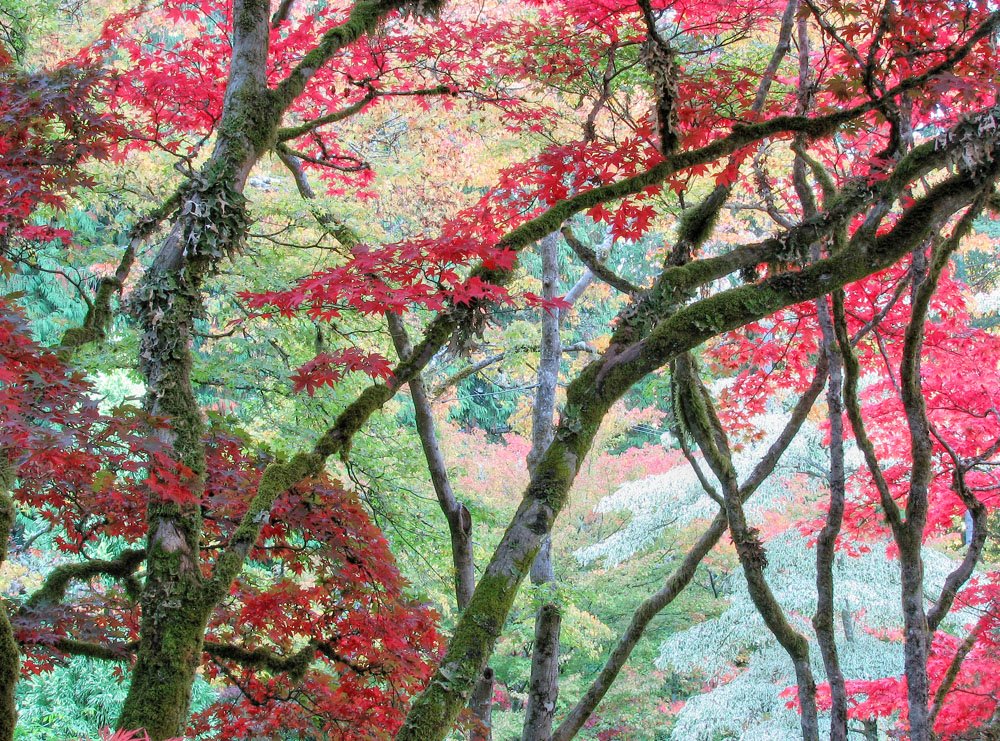
Butchart Gardens, Victoria


At a weekend conference and was able to visit the Butchart Gardens in the afternoon. The Japanese Garden was wonderful. In the rush I grabbed my Canon S3IS and not my good camera - sigh...

On Selling Photographs Part 2

First off, let me recommend you read the pertinent comments by Scott in commens on previous blogs about selling.

There are ways to sell your photographs - but I think that it is likely it won't be by any of the traditional methods - galleries, stock agengies, etc. Had I toughed out the Farmers Market a bit longer, had I perhaps been semi retired, it would have been perfect and might in the end have produced $15,000 a year in profit - hardly a fortune but fair for an artist.

I also sell my train photographs at a local Model Train Store, Trains N' Such. That has been fairly rewarding and has definitely generated a profit. I have some images at Glenbow Museum and that produces a very modest income, and more images in a small art/craft store in Bragg Creek which also produces modest sales of small images.

As I was winding down the Farmers Market sales, I actually had an offer to sell my images at a local truck stop - apparently truckers often spend money on scenery pictures. Perhaps we really need to think outside the box to make money from our photographs. Of course, it begs the questions as to whether you want your images sold at a truck stop, to hotels and restaurants.

Scott makes a very good point - is it better to work extremely hard to get your work sold at reasonable prices, or is it better to have it seen by the most people possible by selling at very low amounts?

Probably for the most of us it's just exciting to get our work out into the public - but it would be better if it didn't actually cost us a fortune. Every photographer should have a website of his or her images. Every photographer should have their best work on their own walls - even the bathroom.

One time I purchased a series of metal frames which I could rotate images through. It's possible to make very nice imitation matting with photoshop so images could go right into glass. Matte images can go right against the glass without any major problems.

What about offering your images to your local coffee shop for free - with your card and a price just in case.

One of the more lucrative markets would be downtown offices which spend a fortune on art and decoration - they tend to buy from dealers who specifically sell to that market but perhaps you know someone who know somebody...

I look for suggestions.

Saturday, October 21, 2006

Low Cost Prints, Photographers and Market

Scott's comments about selling are I think very important and deserved more than just a comment. Scott uses the experience of Brooks Jenson of Lenswork to illustrate selling large numbers of inexpensive prints. I tried selling 8X10 images for $19 at the local Farmers Market and if I was lucky I'd sell a few a day, yet sell 5 or 6 13X19 @ $69 and one or two really large ones for $250+.

I wanted to get rid of the small prints after trying this for a few months but my daughter pointed out that people looked at the $19 prints but bought larger ones - so to keep them.

I believe Brooks was selling larger images for $20 but to be fair he has a huge captured market for his work.

I found that at the farmers market anyone walking around with an slr around their neck was first off very unlikely to even stop to look at the images and second, almost certainly not going to buy one - even though they sometimes took up a lot of my time.

No, my market was the general public. I sold mostly colour images but there was definitely a population of young people interested in Black and White and also interested in the more abstact or industrial images as artwork as opposed to a pretty picture.

I note that probably one of the most successful photographers of fine art work is Alain Briot. Mind you he's a shameless hustler of his work (he even got The Online Photographer to promote his new book - nice going.

He has a picture of the month which he sells fairly reasonably ($100). He made his money off art shows to start - never galleries, and he worked damn hard, and had his wife working with him, and spent many many hours on framing and matting and packaging - a full time occupation in other words.

It's unrealistic I think for anyone who wants to spend less than 8 hours a weeks selling (not photographing) to even expect to break even, never mind make an income.

Thursday, October 19, 2006

The Cost Of A Print

One of the things you need to do if selling your work is to be realistic about the cost to you of each print - both in terms of dollars and time.

Here's a little list of some of the costs of making a print

paper - but don't forget to add in a fair share of all the trial runs, ink blotched, bent, damaged or otherwise unsalable prints - could be that in real life you use three sheets (hell, 25 is probably more like it) for every one you sell, if you start counting from the first print made.

ink - see above re trial runs though, and what about nozzle cleaning - with Epson pigment printers, that's a huge cost that you must factor in - there are some useful references on the net to ink used per print produced that take into consideration nozzle cleaning - but if you print intermittently - better double the cost to allow for more nozzle cleaning.

printer wear - printers don't last forever - if you are good enough to sell your work, you are doing a lot of printing and should realistically amortize the cost of the printer over two years. In the mean time at least two newer sexier and perhaps better printers will come out. Within a year of the 4000 coming out, along came the 4800 which apart from having epson's black and white print driver and less bronzing on gloss papers and a wider gamut, also removed the second black container making it a hell of a lot more expensive and difficult to switch from matte to glossy and back.

Containment - if you sell more than a few prints, you soon run out of print boxes. For myself I have to figure in the cost of the mylar art bags - roughly $1 each, depending on size. I have litterally spent thousands in the last two years on acid free foam core. I get 5 13X19 from one sheet, 2 17X22 but only 1 24X24 from each sheet.

Shipping: if you mail, you have the ups or post office cost but don't forget the packaging cost - for a mailing tube if rolled, plus cost of a protective sheet you roll up with the print so the image doesn't rub - I used a roll of vellum - handy but probably not the cheapest. When shipping flat, the only way I have found to reasonably guarantee safe arrival of a print is to put it in the mylar bag and tape that to a sheet of 1/8 inch hardboard (masonite).

Returns - better factor in the cost of some images being lost or damaged in transit so you have to replace the whole package. Even when not shipping, if the customer drops a print on its corner while standing talking to you, you are likely going to swallow the cost of the replacement.

Time - you might be tempted not to charge for your time, but that's only because you are selling one print - get lucky and have 50 sales and I bet you start to feel differently about how much your time is worth.

Computers - this is a bit more controversial as you know damn well you would have had the computer anyway, but you might have bought a new one because of the business being done, a bigger, faster one with more hard drives so you may want to take that into consideration.

Artistic Worth - this is a topic for a whole other discussion so we'll just say for now that opens a whole can of worms.

And I'm sure I have forgotten other factors and deliberately left out several - the cost of camera gear, travel, burned dvd's etc.

Does make you think though.

Good shooting,

On Selling Your Work

I suspect many of us dream of selling our work. It means we can buy better and more equipment, it's the ultimate sign of worth - people actually willing to pay for your photographs. I'm going to tell you about my experience first then discuss some thoughts about the whole 'business' of business.

My first experience selling photographs was as a university student. We would borrow the Crown Graphic 4X5 and shoot residence floor groups and sport teams and sell the prints - I got to learn the ins and outs of making 60 prints in a hurry - and the problems of a dryer with fixer impregnated cloths. Quite lucrative, hardly creative.

It wasn't until 2003 that it occured to me again to sell my work and at first it was more about getting my work up on the wall than it was about making money from it - just as well as it turned out.

A local coop photography gallery would rent wallspace to photographers and they had themed shows throughout the year. They juried the work so there was at least some sense of approval in getting in - though you never knew how much competition for wall space (if any) there was. I did several of these shows and sold enough images to recoup the cost of thd shows but not the cost of the framing - so yes, I earned some money but yes I actually lost money overall. Still, nice to see your work on the wall of a gallery instead of inside a print box at the bottom of a drawer - I'd encourage anyone to do it.

My next effort at sales was to set up a booth at the local Farmers Market on Sundays. I'd read bad things about working with galleries and it seemed like this might work better. The market was a busy one. I got mylar bags from Crystal Clear Bags and picked up acid free foam core locally. I printed on 13X19 and 17X22 with a generous white border (which looked a lot nicer). I used wicker baskets to hold the prints. The start was painfully slow, selling 1 - 2 images a day but gradually things got busier. In the mean time I was continuing to photograph so I kept adding prints to the selection available (eventually about 200) but as I became more successful, it took more time to make the prints and to run around town picking up supplies and ordering from the internet when local sources didn't have what I needed. I was commonly printing till 3 in the morning before going to the market so it was taking me a full day to print the images, half a day to pick up supplies every second week and a day at the market, all this while maintaining a full time occupation. I liked chatting with customers and talking photography (though in general photographers are a cheap bunch and don't buy).

After two years of doing this I probably grossed $40,000 but I know my expenses were well over $30,000 and I'm not actually sure that I made any money at all, I was tired and my wife was frustrated with never seeing me, being on errands, at the market or in the basement on the computer.

In the mean time I submitted a series of badlands pictures to "Black and White Photography" which were published and I was paid a small amount. I then submitted a series of my back and white industrial images to "Lenswork". I had hopes that this would result in print requests but the net sales from that publication was two prints. I did get to swap prints with Howard Schatz of New York which was pretty cool.
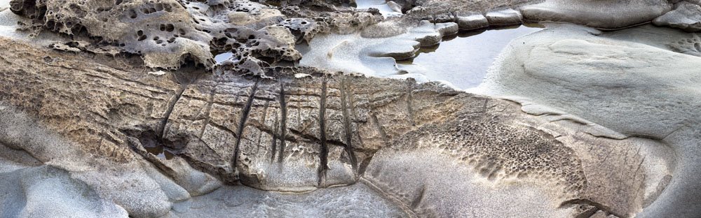
I was one of the winning porfolios in "Black And White" but that hasn't resulted in any sales. I was persuaded after submitting images to "Focus" magazine to pay for a combination publication of prints along with ads with encouraging noises about quickly paying for the publication with sales - sales = 0.

My latest effort at selling is a show in Toronto at Leonardo Gallery. They contacted me about a show. They wanted large images which meant I couldn't print them myself (having only a 7600 and they wanted 3 foot images). As is typical of galleries they split sales with the photographer 50% - ok so far. But framing is my cost so I'm currently out $5100 for the framing of 21 images. Their prices were not unreasonable but they sure add up and the net effect is that before the show opens they are $5000 up and I am $7000 down (framing, invitations, ad, shipping, print costs). This makes it extremely difficult to make money as to break even I need to sell 18 of 21 prints in the show - almost unheard of. As this is standard gallery practice, I had expected and accepted it, but none the less, it makes working with galleries a less than lucrative prospect.

I looked at self publication of a book but the breakeven point was 375 books and I couldn't be sure I could do that even while I was still at the Farmers Market.

Thoughout all this time I have had a website but it has generated only a few print sales - not enough to pay for itself. It has however acted as an inexpensive catalog for my sales locally. People could see my work at the Farmers Market and then show their spouse on the net or decide for themselves which particular image they wanted. To that end it has been invaluable - but forget internet sales - a non starter.

And that brings you up to date. Next time I'm going to reflect on some possible ways to earn money. As I haven't found the ideal answer yet - it's going to be more a matter of thinking in print.

Wednesday, October 18, 2006

Can An Inkjet Print Be Too Small?

My normal print size is 13X19 - I settled on that because at smaller sizes I couldn't tell as much about the technical quality of the image for selling purposes and besides they look more dramatic - but it does cost more in paper and ink and time to print.

I happened to have some 8.5X11 (A4) paper in the printer recently for a specific project and so used it to make some prints from the recent trip to Tofino and in doing so observed something I had seen before - prints made that small on matte paper don't look sharp, even though they look fine at larger sizes, viewed from the same distance.

I think there are two things going on.

First, there is a limit to the resolution of inkjet prints and perhaps we are getting close to that with the detail in a high pixel count image when the print is small (the drivers interpolate downwards and the inks bleed into the paper).

The second reason is that with large pixel count images, I am output sharpening with pksharpener at 300 dpi with a print size roughly 13X19 from my 1Ds2. By the time the print is downsized to 8.5X11 I am probably losing all of the output sharpening benefit. I'm going to try an experiment downsizing the image for small prints, then doing output sharpen and see if there is a substantial difference.

Tuesday, October 17, 2006

Driftwood V.2


After living with the image on my wall for a day, I decided I too couldn't stand the out of focus sand opening on the left. Also there were peculiar purple tinges to the image and I decided rather than reduce them, I'd just convert the image to black and white. this is the result of combining another driftwood on sand image.

Sunday, October 15, 2006

Driftwood Pano


The image appears here very small but in fact it is a 7 image stitch from my 1Ds2 (camera vertical). The print size at 240 dpi is 19 X 76 inches. Click on image to get larger version.

The composition is grossly asymmetrical with the large out of focus background sand on the left. It still works for me but I'm interested in other people's opinions.

This reminds me that I have had several insightful comments in the past and they are much appreciated but of course blogspot does not give me the email address of commentors so let me just say thank you to all of you who have significantly added to the value of this blog.

Stitching was done with PTMac. Despite my best efforts at stitching I could not get the error down below a maximum of 10 pixels which is really too high. This sometimes happens. I could have reduced the error had I been willing to tilt the images relative to each other - why that should stitch easier I don't know but I think it might have something to do with the horizon. I deliberately lowered the camera so that it looked horizontally at the driftwood but suspect in hind sight that even so it was at the level of the top of the driftwood, not the middle. Stitching with the horizon not accurate results in the images splaying in an arc, high middle, low either end and I didn't want this.

In fact, when I output the stitch to multi image tiff (to maintain 16 bit) I was able to bring the 7 images back into a single layered image, use white masks into which I paint black to show the previous layers and do some careful edge design so that misalignment of pixels did not occur in the middle of a line. The result is the seams are invisible, even at 100% on screen.

I used to combine the images using a black mask into which I painted white but there is a bug in Photoshop that shows the original vertical seam even after you paint 100% into the black mask where you want it - somehow I'm only painting a maximum of 99% - or some such figure - strange - but using white and painting black works just fine.

I had a lot of fun with the driftwood in Tofino. Surrounded by logging country and facing the Pacific Ocean, next stop Japan, there are a lot of driftwood piles some of which have the most amazing patterns to them. I'd like to produce an entire portfolio of driftwood if I can find 12 - 15 images which are sufficiently different - I think I can.