

traditional wisdom has photographers working in black and white or colour but generally not both. Most websites you visit, colour far exceeds black and white or else there is no colour at all.
You may note that I shoot both colour and black and white which makes me a bit of an oddity (ok, no cheap comments, that's what my wife is for).
Why do people polarize so strongly and does it have any message for me and more importantly for you?
It's my impression that colour photographers occasionally dabble in black and white but black and white photographers never dabble in colour. they seem to save colour for family snapshots.
SO the questions I might consider asking myself are:
1) Am I compromising my skills by doing both - ie. is my black and white weaker for the time I spend doing colour - or are the skills largely transferrable so time spent on colour isn't wasted?
2) Is any given photograher only talented or skilled in one medium and therefore am I wasting my time trying to express myself in both?
3) Is a certain medium suited to particular personalities or traits and does this mean I have psychiatric problems? (see prev. comment about wife)
4) Is it actually possible that creating in both colour and black and white is not only not detrimental but actually productive, helpful, and useful to strengthen skills in one's primary medium?
If we look to the art world for direction, I think we can be fairly reassured - painters, writers and musicians often change their 'medium'. They change from drawings to lithographs to oil, and acrylic, they change styles of painting over time. Musicians in the symphony orchestra quite commonly belong to a jazz band or play modern music. Writers switch to short stories or write screenplays, they sometimes drastically change their style - but they will use a pseudonym - hmmn... there's an idea - perhaps I need a nom de camera for my colour work.
It's true that painters don't work in black and white - unless you consider their charcoal work and pencil drawings, gee, I guess they do work in black and white as well as colour.
I admit I am having trouble thinking of a single famous (read well respected) photographer who routinely shoots in both black and white and colour. Howard Schatz does (16 books to his credit - twice in Lenswork, most recently for his black and white portraits of character actors but perhaps more famous for his colour work under water with dancers. Ansel dabbled in colour though isn't known for it and you rarely see it and what I remember didn't really say anything profound. Even Edward Weston got a chance to shoot some colour before his Parkinsons laid him low.
Addressing the specific questions. It seems to me that 90% of the skills used to create colour photographs are directly transferrable to black and white. While the luminous black and white print does not perhaps have a corrolary in colour, once one has learned to make quality black and white prints, it's not going to atrophy just because you do a bit of colour work. Arguably the real message here is the more photography you do, the better you get and by shooting situations that suit both, it increases your opportunities. Perhaps even more important, the success rate of a shoot goes up and thus enthusiasm increases which drives us to do more.
Arguably if one is attuned to seeing the world in black and white - it might take away from that vision to start paying attention to colour. For myself, I was a black and white only photographer for 35 years and relied on my monochrome filter to help me visualize the world in black and white (as did Ansel). On the contrary, black and white photographers have to be very aware of colour if only to recognize when a bold colour which spoils a composition in black and white, can blend in in black and white (perhaps with the aid of filtration), or for that matter, made more bold. All this does is make me more aware of the colours of things and how colour affects composition.
As to whether a particular personality is better suited, I think it has more to do with the way we started rather than inherently being suited to a particular medium - for slide shooters of family travels, it's a natural progression to taking more care and making better photographs in colour. Had we been influenced by Ansel's work growing up (I sure was), then we look down our noses at colour and insist on black and white as being the only 'pure' art. Of course, many of us, converting to digital, have colour forced on us whether or not we like and one thing leads to another. I would predict in the future that we will see more crossovers because of the technology. Even the process of making prints can be done with the same pigment inkjet printer with a bit of effort so there is no reason not to try 'the other medium'.
Could shooting both actually be good for us - I think so. I don't lie awake at night worrying that my dual habit is a sin, should be hidden like a dirty book, and only conversed about in seedy bars. I'm bi and I'm proud! (well, at least photographically)
Wednesday, August 30, 2006
Sunday, August 27, 2006
On Composing A Picture
I've discussed in the past the process of scouting out a picture but I'm going to try and take it a step further and discuss the actual 'puting the picture together'
Lets say for example that you have found a rusting old truck in a farm yard. The truck is the 'centre' of the image, though it doesn't have to be positioned that way. Lets say that you have decided to photograph the truck in it's environment rather than coming in close and photographing curves, shadows, rust patterns etc.
You have a choice of photographing the truck surrounded by farm buildings, or with a harvested grain field in the background. Which you choose will determine the character of the image but lets say that for now you have no particular 'statement' to make, you are 'cruzin fer snaps' and will take any nice picture you can.
So, you wander around the truck, looking for the best angle to photograph the truck and for what is in the background. Unless you want the junkyard look (and you might) you are going to try and simplify both background and foreground to help focus on the truck. Modern buildings or objects are not going to work well with the truck - can you find an angle from which the truck works well with the background. Let's say that despite your best efforts, the backgrounds are all absolutely terrible - you can't get a clear shot of fhe field due to telephone wires, there isn't a nice weathered barn against which you can photograph the truck.
This is working the scene, and yes, it is actually work.
Right, what are our options. We could accept the cluttered look and perhapd deliberately emphasize it to represent many old farm yards that act as mechanical grave yards and unintentional museums.
What about getting really low, belly on the grass, and using the sky as a simple background.
Perhaps you should shoot from the inside of the truck. There was an article on Luminous Landscape which deals with photographing inside a vehicle.
Could you photograph the truck as reflected in the side mirrors?
What if you were to leave the doors propped open - better shape, worse?
If the background is cluttered, what about photographing from high up - could you come back with a step ladder (or borrow one) or find something you can climb on (with permission)? Is there a barn with hay loft from which you can shoot?
Since you don't have a political agenda, you are looking for positions for the truck in which it makes interesting patterns or shapes with foreground and background objects. It might be the S bend in a dirt track, something in the background that repeats a shape found in the truck, perhaps you can compose the truck with something so obviously new and shiny that it provides a nice contrast to the abandoned truck. Perhaps the shadow of the truck can be part of the composition.
Photographing with a wide angle will necessarily include more background objects in the image, a longer lens fewer. Rather than think lenses at this early stage, I'd simply walk round the truck in smaller and smaller circles till you see what you want.
You could look for something to frame the truck - but keep in mind that anomalous branches coming from nowhere don't work in landscape pictures, the same is going to hold true in this image. Perhaps though you could use the end of a buliding or another vehicle as one side of the image. You might have depth of field problems but if shooting digitally, you could shoot two images, one focused on the truck, the other on the building and blend the images. Such a simple blend could easily be done by hand in Photoshop as the near focused image will be slightly larger.
Perhaps you always, shoot colour, or always black and white, but having invested this much energy into the picture, give some thought as to which would be better.
You have found the best position, the best height and best distance from the truck, stop and give some thought as to how you might print it - ok previsualize it. Maybe the subject still isn't going to work as the tone of the truck blends with the tone of the barn behind, perhaps filtering can help, or if shooting digitally you can filter after the fact.
You line up your camera, aiming at the car. Woops, not ready yet, not if you want a really good image.
You still have to refine the framing of the shot for the strongest image.
At this point you have your spot, your direction and your height from the ground. The choice of lens will determine how much you include. If you have fixed focal length lenses you hope you can move back and forth enough to frame just right. With zooms you don't have to compromise your ideal spot.
Your last task is to figure out just where to place the four sides of the frame. I find my trusty plastic with a cutout the format of my camera, hanging round my neck on a shoelace. I know roughly what I want to include but the question is exactly where to place the edges. I start with the left edge. I can have things meet in the corner, or I can create interesting shapes with the side of the image and either something in the image or even a dark area in the image (eg. shadow). I do the same on the right. This now gives me my focal length, though I still have to decide whether to shoot vertical or horizontal format. That's determined by the strongest composition with upper and lower sides. If I have to crop significantly, it's a message to consider stitching, which I might do anyway just to get a higher resolution image.
That pretty much does it - I'm in the right location, right height, pointing in the right direction with the right lens. I expose to keep detail in all the important areas (or shoot more than one exposure if I can't) and I have done everything I can to ensure a good image.
All I have to do now is repeat this 99 more times and the odds are fairly good that one of the images will be a keeper.
Friday, August 25, 2006
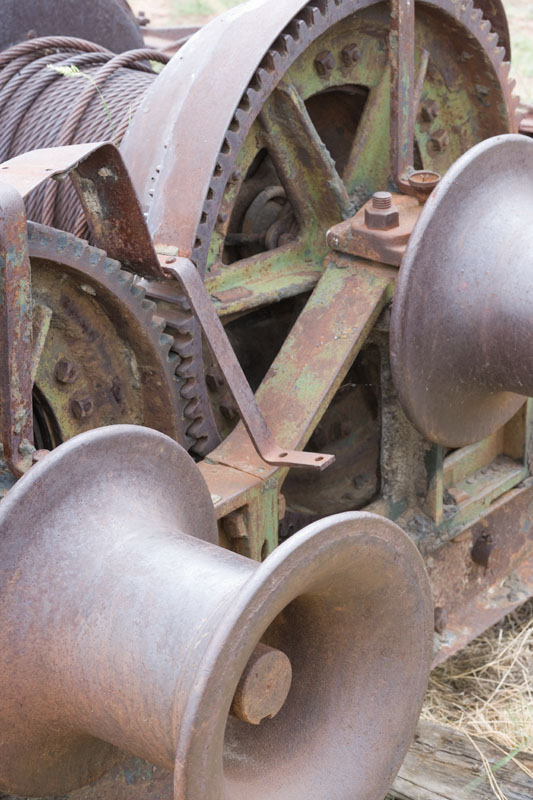
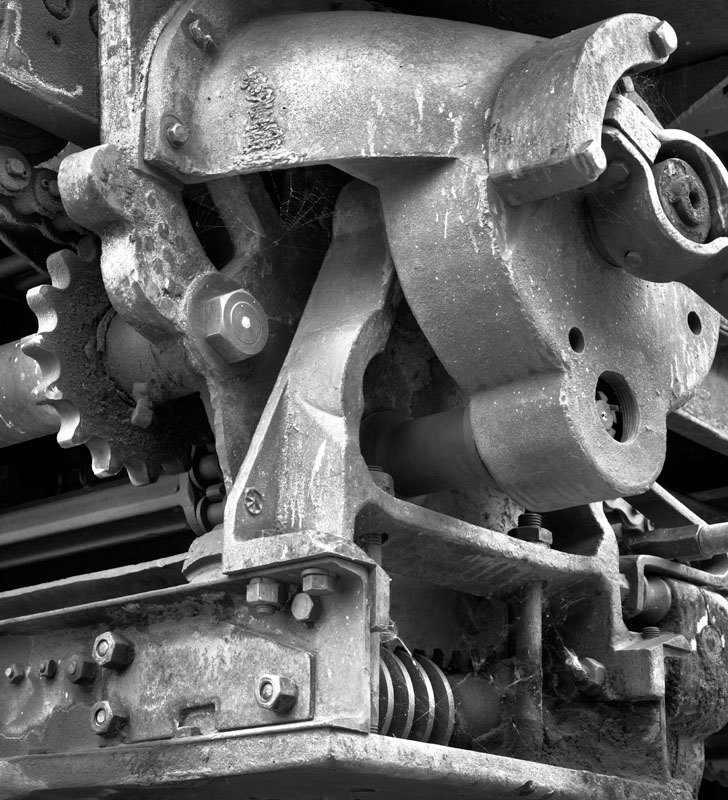
Winch, Atlas Coal Tipple
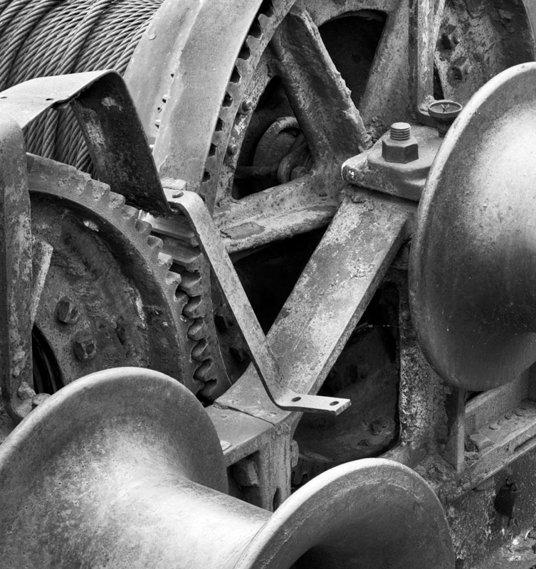
And the original file is below. Actually again I shot multiple images and used Helicon Focus to blend 5 images to give full depth of field. I cropped the image to concentrate on equipment and not surround, I used the clone tool to take out the errant blade of grass which was distracting (not easy with the braided wire behind), adjusted saturation then used the Russell Brown method of converting to black and white with filtering to increase the contrast of the textures in the metal.
Some final dodging and burning and voila...
I'm not sure I have created the optimum cropping - I would have preferred more of the lower winch drum to show, yet found the grass in the bottom right distracting and the closer to square crop seemed stronger. I may well have another go at cropping - perhaps had I converted to black and white first then cropped I might have come up with an entirely different crop. No, I've just tried it and the above is the best.
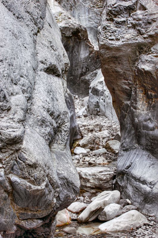
Horseshoe Canyon, Alberta
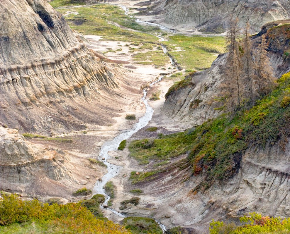
From a couple of years ago - two images, canon 10D, 70-200 f4L @ 109 mm., stitched with PTMac, shot raw, processed with Camera Raw V. 3, output from PTMac two tiff images brought into Photoshop as two layers, white mask into which I painted black to reveal the underneath part of the image (for some reason doing it the opposite way (black mask into which you paint white) leaves a faint seam visible. I use 80% edge definition of the round brush for painting into the mask. Sharpening is with smart sharpen in Photoshop, raw output on this 6 MP camera was set for 11 MP (ie. one size up) so sharpening settings were 300 1.3 and the pixel size of the final image is 5000X4000 pixels for a 17X13.5 inch print at 300 ppi.
Thursday, August 24, 2006
Blairmore Cole Tipple
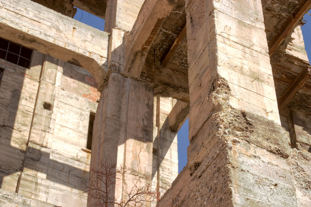
Looking like a Greek ruin, this was in fact a long abandoned coal tipple in the Crows Nest Pass in southern Alberta> this area continues to ship coal in 100 car long trains to the west coast and onto Japan and other points.
Record Distance Travelled
woke up, light pouring in, liked the shapes, grabbed camera, head resting on pillow, fire shot, distance travelled zero (pick your units of distance).
Getting Published
I'm uncomfortable tooting my own horn but it's not possible to talk about getting published without saying that I've been in Lenswork, Black and white Photography, Black and White, Focus, and Outdoor Photographer (the British one).
The following suggestions may be of help in upping the odds of success.
My first publishing forray was in Black and White Photographer from Britain and I deliberately chose my images from the badlands. Badlands photograph very well in black and white, they are completely unavailable in Britain and you don't see a lot of good published images. I provided a consistent theme for the images even though they were shot on 4X5 and digital.
I don't think presentation of the prints is a big issue - they should be clean, flat, corners not bashed, consistent in tone and surface but an expensive portfolio box is not needed.
My next success was with the industrial images to Lenswork - again a consitent theme and not your typical waterfall pictures (trust me, they see thousands of them and the odds of you coming up with a new and better way of looking at a waterfall that will interest them is close to zero.
For Black and White's portfolio constest I actually sent two entries, one industrial and the other landcape. The landscape had the theme of weather - showing clouds, ice, and snow. Focus magazine was again industrial but this time in colour (different images).
For the most part my images don't look like those from any well known photographer - fortunately I have admired so many good photographers that I now have my own style. You have to ask yourself if in fact you have a style and is it any different from hundreds of other photographers also submitting their pictures. Clearly you want to submit the ones with 'your' style, not the ones that are so typical of the genre (no matter how well done).
Catchy titles and detailed explanations of how hard you worked to get the image are totally irrelevent.
Brooks Jensen of Lenswork has had some excellent editorials about submitting work for publication and I suggest you check his website and pick up some of the back issues that address the subject.
Of course, it's a given that you have a good idea of the kind of work a magazine is likely to publish. That said, if lots of people think them good, send them anyway, maybe this is the different that is exactly what the editor is looking for.
in general, I have not sent any bio until asked - if they like the images, the'll ask, if they don't save your breath (fingers).
I had a fair idea that my work was decent going in - after attending a workshop and seeing what other people produced and comparing my work to the instructors and factoring in the comments from both instructors and attendees, I figured I was ready. I would encourage you to seek similar feedback before considering submitting. It's all very well asking friends and family but you really need an independent appraisal before sending off your work.
Good luck in your submissions, It may seem hopeless but remember that without our submissions these magazines couldn't function.
Wednesday, August 23, 2006
Massive Tree, 1978
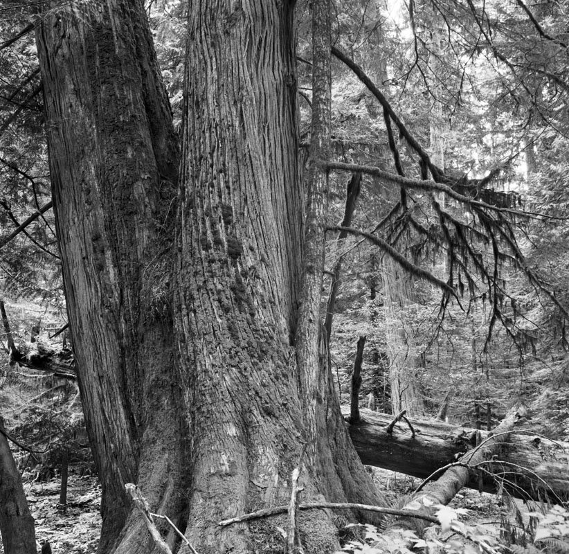
This image was shot while on holiday on Vancouver Island, at Cathedral Grove, a preserve of giant trees, both fir and cedar. The image was shot with a Zeiss Ikonta, a 6X6 cm. folding camera, 75 mm. Tessar lens. The camera was made in approximately 1938, the lens uncoated, it slips in a pocket and takes very nice pictures.
My camera (actually my Dad's) was destroyed very shortly after this picture was taken when I fell at a waterfall, managed to prevent the camera from hitting the ground, but lost the camera when the tripod socket ripped out of the bottom of the camera and the camera went bouncing down the rocks.
I picked up a replacement in excellent condition a few years ago on ebay and while I now shoot digital, I do love the camera and have occasionally shot with it.
my next medium format camera was the twin lens reflex Yashicamat 124G - a very nice camera who's only fault was a weak shutter release mechanism which didn't stand up to the wear of using a cable release and a part eventually failed one time too many to be bent back. It had a tack sharp lens, stopped down to f32 and made some very nice pictures which one of these days i will get round to scanning for you.
Why Images Work # 6 - Paul Strand
right click (or control click on a Mac) to access this group portrat image, known as Family Luzarra and move the window so you can see both the comments and the photograph.
Paul Stand had a long photographic carreer and photographed many subjects from landcapes to industrial but of all his images, this family group portrait is my favourite.
With an image like this, we HAVE to start with the non technical aspects. The expressions on the faces, the body postures and the positions that the family members line themselves up and the direction of their gaze tells us a huge amount about these people. Whether such conclusions is accurate is irrelevent, this image makes us feel we know these people. No "say cheese please' for Paul.
Note the position of the heads. Can you imagine if all the heads were at the same height - yuk!
The textured but fairly simple wall provides an excellent background - brick just wouldn't have been the same.
Look at the bottom and you note that all the feet have something to stand on - it might be tempting to crop to the feet but this way there is a unity to the image by provinding a common base running across the bottom of the image.
The choice of clothing says something about the people too.
The bicycle provides a specular highlight but also tells a story - it's quite a modern bicycle for 1953, the year of the shot, it's in excellent condition with white wall tires and a headlight - someone had some money. The large dark area of the doorway is broken by the mirror or window within but giving a sense that the doorway leads somewhere.
Little details like the incredible beat up drain pipe, the arch above the door and the worn through wall on the left give the image character.
But, this image is really all about the people and the story the picture tells, the story may be fiction, but there's nothing wrong with fiction.
Tuesday, August 22, 2006
Same Old, Same Old...
Thinking a lot of your pictures look pretty much the same - time to break out of a rut?
The obvious thing to do is change subject matter but lets say that you like photographing mushrooms and what you really want is a different way to photograph them. You could resort to tricks - prism filters and the like but it might be better to analyse your current style and see how you might change it.
First a list of possible characteristics of a photograph.
Contrast
Darkness
subject centering
subject positioning
camera alignment
focal length
height of the camera
lighting conditions
subject surround
Have a good look at the prints you have now that you think are too similar. Perhaps its because they are all mushroom pictures but maybe its the similarity of the above listed image characteristics.
Last weekend I noted that the photographer shooting with me quickly set up his tripod at a convenient height and spent no time at all checking higher or lower, left or right before pointing the camera and taking his picture. I suggested he have a look from the lowest position on his tripod and he was quite pleased with the change in perspective.
Getting back to our mushroom example, perhaps it's your style to look down on the mushroom and focus closely so that the mushroom fills the frame. You might consider getting down on your stomach with a mini tripod and looking up to the mushroom, or backing off and including some of the surround, or go the other way and have the mushroom fill the frame entirely so there is no edge visible and the image is no longer obviously a mushroom - more of an abstract - no harm in letting your viewers use their brains and wonder what you are photographing.
Perhaps you pride yourself on a nicely balanced print with good spread of light and dark tones - what about deliberately printing really dark, or really light - this doesn't mean simply lightening or darkening the print - you don't want a muddy dark print, you want a richly dark print - not at all the same thing, the latter requiring careful handling of the highlights and the right contrast for the darker areas.
You could bring along a card to bounce a little light into the shadows, or maybe you should get out really early in the morning when there is still dew, or frost. If not in a national park, what about taking some mushrooms home to photograph in a 'studio'. Hell, you could even copy Edward Weston and photograph it in an old tin funnel.
Go back to the list of image characteristics and see if there isn't a way to shake up your photography style, while not compromising the quality of your images.
Maximize Sharpness!
having discussed sharpness and resolution, here's my formula for maximizing both.
1) use the most pixels you can. Stitch where possible, make sure that you frame carefully so you don't have to crop both dimensions. This of course requires an accurate viewfinder - often with less expensive cameras the lcd is accurate but the viewfinder is not so you can shoot and double check that you got it right. Know your minimum f stop for maximum depth of field without adding so much diffraction loss that you don't gain - for me and the full frame 1Ds2 this is f 16, for a consumer grade digital point and shoot this is probably f8, for a 4X5 it's f32. If you don't need the depth of field, then use a wider apperture.
2) use a decent tripod. Use as little centre column raise as you can get away with, normally none.
3) balance the weight of the camera and lens over the tripod head. For longer lenses this means using a lens collar - technically my 70-200 f4 lens doesn't need one but I get sharper pictures when I use one.
4) consider using an L bracket. When you flop the camera over on it's side you basically create a tuning fork - something sticking out to vibrate.
5) Use mirror lock if you have it - arguably it's most advantageous from about 1/30 second to 1/2 second but I use it for every shot - given Canon's awkward way to access mirror lock, it's easier to leave it on permanently.
6) Use your lens shade and shade it from direct sun with a hat or even your hand (not touching).
7) make sure that your foot isn't an inch away from the tripod foot and actually moving the ground. Consider standing upwind to block the wind or even better using an umbrella to block the wind. Keep in mind the wind will play on large camera straps and increase vibration.
8) make sure that all settings are locked down on the tripod and that there is no movement - if there is, track it down and fix or replace the offending part. I had a lovely Berlebach tripod which worked well in almost every way exc. the join between the centre column and the camera base which had a little play. If I attached the camera directly to it, all was well, if I had a tall ball head, there was enough leverage to create sig. movement. This raises another point. Lots of heads have cork or rubber surfaces but that inherently creates more movement. Remove this where possible - better you scratch the bottom of the camera than you have blurred pictures.
9) in windy conditions consider actually puting your hand on the camera (or lens if a longer one). This doesn't work with 2 second exposures but works quite nicely with 1/30 second exposures and a 300 mm. lens. Here I'd shoot several frames to give myself a choice.
10) Use a cable release and use it in a way that puts the least strain on the camera if you wiggle the cable release. I'm fortunate in one way that the Canon cable release is electronic and therefore very flexible and long so transmitting vibration isn't all that likely. On the other hand, it's long enough to get wrapped round tripod fittings so I still need to be careful.
A poor man's cable release of course is the self timer. I prefer a cable release so that I don't have to worry that all vibration is gone by two seconds, and also because when photographing in gusty winds, I want to shoot at the optimum stillness. It's not uncommon for me to let the 30 seconds activation time for the mirror lock to expire because the wind didn't settle and I just do it again.
11) In processing the image, use a good sharpening algorithm - mine is to raw process one size larger than native, use smart sharpen 300 1.1 and then do an output sharpen with photokit sharpener matched with the dpi of the image.
The Sharp Print
For 150 years photographers lusted over sharp prints (exc. the pictorialists of the early 20th century and some portrait photographers who got it in the ear from their (mostly female) clients about wrinkles and face fuzz.
Sharpness is a far more complex subject than we might think at first.
For example, think of a 35 mm. tri-x image, 11X14 - the grain is tack sharp, the image isn't super sharp, but because the grain is, the image is perceived to be sharp.
Someone takes a picture at a football game with a long lens - framing the upper half of a single player. The print is huge and sharp and looks great at 20X24 from a 6 MP camera. Someone else takes the same model of camera and shoots a landscape showing a field of grass receding into the distance. he attempts to make a print half the size and the grass just doesn't look quite right.
It would be tempting to blame this on technique or lenses or various other equipment related issues but the reality is that what's important in the two images is completely different. The sports picture requres sharpness. There are no really fine details. As long as the shirt logo, the outline of the helmet and the eyes appear sharp, the photographer has a winner. What he's actually looking for is good edges - that is clean, well defined junctions between one colour and another, or between a dark and light area. If the picture doesn't resolve the threads of the shirt, it doesn't matter - the image looks sharp.
The poor landscape photographer however needs the grass to look like grass and beyond a certain size, he just can't do it. Better sharpening algorithms help somewhat but mush is mush. It isn't helped when you take into consideration dot gain of the inkjet print (ie. spread of the dye on the paper), the fuzzy filter in the camera (designed to prevent resolving patterns enough to make the bayer algorithm that translates rgb coloured pixels into a full colour image from going wild and creating moire patterns.
Unfortunately we seem to be in an era of customers wanting (and willing to pay for) large images. 24X36 is hardly big enough. It's all very well intending them to inspect such large prints from a distance, but truth is, they get within 8 inches of such prints and squint to check the finest details - so customers are definitly not to be fooled. Various uprezing tricks help to some degree but bottom line is there is a limit to how far you can go from a particular format or film or pixel count.
I'm getting ready for a show in Toronto and they want BIG! prints and recently sent me a list of images. I had already warned them that not all would make 3 foot prints so they asked me for the maximum size each print would go.
Knowing they want big prints, it is really tempting to stretch the maximum size but I know that I'll regret it when it comes time to make the prints and I need to be happy with the images I make. So I sent some pretty realistic sizes for them - I think they are going to be disappointed that their favourites can't make giant prints.
I could of course have shot all these images on 4X5 or larger - but its very clear to me that I wouldn't have - somee required quick setup, others long lenses, others still multiple images to get adequate depth of field or dynamic range, all of which would have been considerably or impossibly harder with film.
Even Christopher Burkett (who shoots lovely landscape images with an 8X10), also uses a medium format camera when in a hurry or when he needs longer lenses. I'm curious though about how he carries all this equipment - I'd be afraid that if I were carrying the 8X10, I'd see nothing but long lens images, or I'd be carrying the medium format camera and see detail images that I would know would have been better suited to the 8X10.
In determining the maxium size of prints for the upcoming show, the subject matter determined the size every bit as much as the pixel count. Tree Reflection (my upside down tree image) makes a lovely 3 foot square image, but others have had to be restricted to 10X15 inches, from the same camera.
Monday, August 21, 2006

Sunday, August 20, 2006
Too Blue For You?

Lit only by brilliantly clear blue sky, the raw files are much more blue than this image - the same thing would happen with unfiltered film - so the question is, since once you are in the canyon your eyes quite quickly adapt the blueness of the light - how much blue is it reasonable to retain. In this image I have toned down the blue considerably yet it is still more blue than I remember. That said, I prefer this image to one which is auto coloured to remove all the blue.
What's your thought on taking advantage of the light? One might argue that the warm evening light of a low sun should be filtered till it looks like broad daylight but we seem more accepting of that.
Saturday, August 19, 2006
If I Could Have Any Wish...
What if Fuji redid their huge GX 680 iii into a 645 version. It would be half the size and weight - it would have a rotating back, tilt and shift, built in macro. Lets have it take any digital back via adaptors. We'd need some good way to focus accurately for the tilt and shift - though come to think of it - electronic focusing aids would be ideal - forget auto focus, just let us have focusing sensors near the corners so we'd know when we are sharp.
This would be an absolutely awesome landscape, studio, fashion, architectural and product camera. It's not much of a stretch over current technology. It would have most of the flexibility of the view camera with almost the speed of the current 645 cameras. It would be a bit bulkier but nothing like a view camera. You wouldn't need a sliding back or dark cloth and you wouldn't have to flip the camera onto it's side!
Right, it's only two months to Photokina - a bit late for ramping up - so my wish would be that they started on this project two years ago and will be announcing it at Photokina. Don't want much, do I?
Friday, August 18, 2006
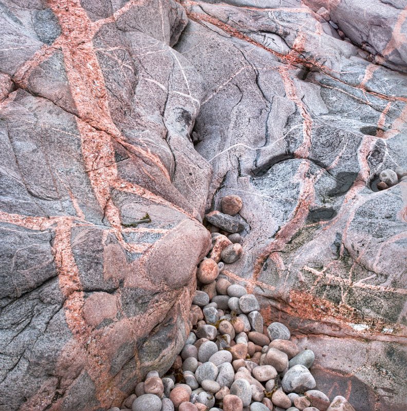
Black and White From Jura Canyon
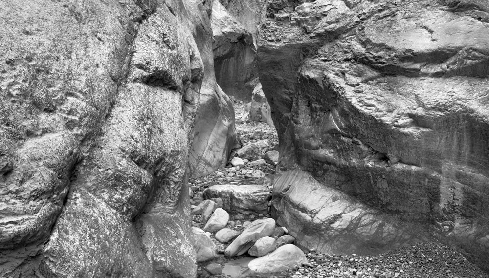
The first few images didn't seem to work in black and white even though the colour was minimal - this one seems to work just fine in black and white. A manual blend of two images for depth of field (left rock is very near) and shot with the 17-40 at 29 mm.
I've been thinking that I should really switch to fixed focal length lenses for resolution, but truth is, not only are the zooms handy, often I'm in a position where there is only one right camera position and you therefore have to use focal length adjustments to compose. Any attempt to use fixed focal length lenses would result in significant cropping which would probably cancel the increased quality from the lens.
I see that my ReallyRightStuff nodal slider has arrived at the post office so one option would be to do more stitching - so instead of cropping to adjust composition, I'd actually add pixels. Of course, stitching becomes a real pain when you have to shoot multiple exposures to handle increased dynamic range or for depth of field.
Another From Jura Canyon

Using Helicon Focus to blend three images focused at different points because this was shot with the 70-200 at 75 mm. and depth of field would not have covered the image at any f stop.
Awesome Day!
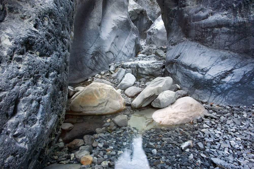
Robin and I headed for Jura Canyon this morning at - rationizing the late start (for a photographer) by saying that the canyon wouldn't see sunrise anyway. Located W. of Calgary on 1A, we parked at the Graymont Cement plant and made a short (he was right) hike to the stony river bed then only another brief hike to the start of the canyon. It just got better and better and we spent 3 hours having a great time photographing - Robin used his full complement of 6 rolls of 120 - he says this has never happened before. We worked our way up the canyon then back down, working past each other round corners so as not to interfere with each other. We saw a few hikers but for the most part we had peace and quiet (glad we went on Friday). Towards the end there was some splashes of bright sunlight on the west wall of the canyon and we both thought that perhaps after all we should have left earlier. Still, just a great day.
The image above was two images, one focused on the near rock on the left, the other for the rest of the image, 17-40 mm. on my 1Ds2 at 21 mm. f16. The left wall was only 8 inches from the camera.
Looking forward to working with some more of the images.
Thursday, August 17, 2006
Photographic Wish List
I don't suppose that anyone with any real power to change things is reading this, but just in case you know someone who knows someone, here's some things I'd like to see, and perhaps you would too.
In no particular order, because I'm a photographer, not an accountant here's my list.
Canon - I'd like you to increase the pixel count to 22meg or more in the next generation 1 series camera and I'd like enough pixels that you can offer it without a fuzzy filter in front of the sensor. I'd like you to add ultrasonic cleaning while you are at it. A painless way to adjust the custom features without going through menus would be wonderful - what about a programmable button or two. I'd like the exposure index visible in the view finder so I don't shoot 400 when I meant 100. I'd like live preview and a tiltable LCD screen. What about a series of really top performing fixed focal length lenses for landscape work - they don't need to be especially fast - just really sharp - to go with the new sensor. The number of people who shoot mostly landscapes and still subjects is pretty huge, canon could easily justify it. I'd like a better lock for the electronic cable release so that I don't have to press the plug in before every shot. On Canon's consumer cameras, it is really easy to be searching for the right setting and inadverantly reset the resolution to 640X480 thus rendering your images unprintable - I have now done this with two different canon cameras, S50 and now S3IS.
Lowepro - why is it that the only way your velcro attaching bag dividers work is if all the containers are full - my 1Ds2 is heavy enough to work it's way to the bottom of the bag unless all the lens pockets are full. Shooting 4X5 I have what I find the ideal camera bag - it was a backpack with wheels on the bottom and an extendable handle - neither of which I needed, but I was able to make a couple of wooden rails for the bottom so that it could sit upright and not tip over - what a concept. The main pocket held the camera on top and the lenses underneeth - after all what use are the lenses without the camera so the camera is always out when I'm reaching for a lens. The next pocket was also full size and holds my unexposed film, the one after that almost as large holds exposed film - reducing risk of reusing an exposed holder. Two more pockets contain various camera accessories and two side pockets hold the light meter and focussing aids. Mind you, it cost me $30 and the zip has already got a sticky spot (so I bought another one to keep spare). It sits on the rails so the pack itself stays clean and dry. It sits upright so things drop in and can't fall out - unlike the lowepro which if you pick it up thinking it's already zipped...
My Epson 2000 portable hard drive is just about perfect so no need to mess with it.
I wish my Arca Swiss ball head didn't add another 4 inches of height to the tripod and I wish it didn't stick when aiming severely down or up, friction adjustments notwithstanding. One of these days I might splurge and get the reallyrightstuff large ball head.
I wish my computer had more USB and Firewire ports - I always seem to be running out and having to unplug a printer to plug in a card reader or whatever. I see some computers are coming out with more ports - eg. the new Mac Pro.
I really wish backup wasn't such a hassle. I tried online backup but photographers have so much hard disk to back up, it isn't finished by the next morning (you did realize that with cable modems, the download speed is usually great, the upload speed is always terrible and on a par to a regular phone modem). And warnings that CD's and DVD's won't last isn't helping. We need a backup medium that is very archival while also very high density - at least 100 gig per removeable cartridge. Science fiction often refers to glass cubes - I really don't care, just give us something long term, ideally hundreds of years reliability. I'm not worried about backwards compatibility - there are still companies that will happily take your information off of your 8 inch floppy drive for you - and that technology is 30 years old!
Printers - well, thats a whole conversation in itself - I think I'll save that rant for another day.
Getting Ready - Trains Of Thought
I'm off photographing in the mountains tomorrow morning with a friend. Let's see, the spare battery for the camera is in the charger (don't forget to pack it), one of the memory cards is sitting at the computer, got to put that back, I wonder how the charge is on the Epson 2000 portable drive. Oh yes, I really need to clean my sensor. And it wouldn't hurt to clean the lenses befeore I go out - and the tripod is in the garage - and I can't find the slider for nodal point stitching - damn - it might have fallen out of my back pack last time I used it. When this friend said the hike was 1 - 2 km. I checked a map and I'm afraid he ment vertical distance, not horizontal - oh well - hope he can do CPR - really should lose some weight - might even help my tennis. Only two more weeks at the Farmers Market - sure will enjoy having some more free time but I'm going to miss chatting about photography every week, and miss the money, and lets face it, it's nice having people ooh and ah over your work every week - hope I'm doing the right thing - oh well, too late.
Wednesday, August 16, 2006
The Delights Of The Square Format
Ignoring the pros and cons of shooting with a square format camera, I'd like to address the aesthetics of the square print in a square matte and square frame.
There's something simple and elegant about a square image. Perhaps it's simply the novelty in a world of non square doors, windows, books, tv's and pictures.
Certainly the modern art painting world has embraced square images enthusiastically - it's just as common as rectangular images. That said, there is a reluctance by many photographers to print square.
Of course there is a whole line of thinking that says 'Thou Shalt Not Crop' and thus the photographer is at the mercy of his camera viewfinder. The whole business of cropping is a topic for another day. Besides, with stitching and higher resolution films and sensors it's less of an issue anyway.
Mathematically there are features to the square that relate to composition. With each side the same length, it offers a unique opportunity for composing four sides to the middle. The diagonal line between corners is half way at 45 degrees. That it isn't a horizontal rectangle actually takes away from the sense of a window onto the world and instead suggests that it is a created object - it clearly isn't a post card.
Square pictures allow for more foreground than a horizontal rectangle without entirely being about the foreground background relationship - look at the images of David Plowden, most of them taken with a 55 mm. lens on a film based square format Hasselblad.
There is a photographer whose name I cannot remember (and perhaps you know), who was published in one of the magazines. He shot long exposures in black and white of the edge of the sea, with an 8X10 camera blocked down irretrievably to 8X8. They were wonderful photographs.
Michael Kenna uses the square image. Howard Schatz often uses square format. Brett Weston allowed his format to be dictated by the camera he was using. His earlier images are 4X5, then he used a Rollei SL-66 squre format (see his Alaska images) and latterly was using a Mamiya RB67 so his hawaiian images are almost all 6X7 ratio. While we all want to use all of the negative possible, it does seem odd to me that a photographer with a particular format camera refuses to photograph anything which only composes well in something other than the ratio built into the camera.
Square format works very well for photographs of people in their environment - including just enough of the environment to interest without becoming the whole picture. Of course, some of this may have more to do with the waist level finder of square format cameras (waist level doesn't work unless you have square format or a rotating back).
Atlas Coal Tipple - 2006
This is a crop, conversion to black and white, the addition of another 12 or so adjustment layers, two different duplicate image and dodge and burn on the duplicate and when happy flatten it and adjust some more.
I'm quite pleased with the result and feel it is much better than the colour version I posted a week or so ago.
The image is three shots with my Canon 1Ds2 and 90 mm. tilt and shift, both slightly tilted and using the shift to cover more and increase pixels. I could just as easily have not bothered with the shift and swung the lens but this close, finding the nodal point of the lens around which to swing is critical for easy stitching (or stitching at all if you don't get really close to spot on).
There has been some perspective correction in photoshop since I was also looking up - theoretically I could have used the shift capability of the lens to do this but I was already using it for increased coverage so that wasn't possible.
Why Are Pictures Rectangular?
Ever wondered why we make almost every single picture rectangular? This might seen an arbitrary question but actually it has some things to do with composition. First off, paintings are almost always rectangular. Rectangles make the most efficient use of canvas and boards, they make stretching canvas easier, they take up the smallest space being stored. Rectangular pictures go on rectangular walls with more ease. It's easier to frame and matte a rectangle. A non rectangular adjustable easel would be near impossible. Photographic paper would be wasted at some point were we to print ovals or buy oval paper.
Think too that many of the things we photograph are vertical or horizontal lines - whether it be a tree, horizion or building. Many compositions rely on diagonal lines which react with the edges of a rectangular print more effectively.
Oddly the two placs where round makes sense is silicon wafers which are round, though as they typically hold dozens to hundreds of chips on one wafer, even here round is not the most efficient design, and lenses, which project a circular image and we throw away a significant part of that image to achieve a rectangle.
Next time I'm going to talk about square prints - both historically and compositionally - did it occur to you that if you had a square format, you'd never have to hold the camera vertically - hmmm.
Why Use A Mac?
Did you know that one of the biggest reasons to use a Mac is it's search ability? At any point you can do a search to help you find the file you are looking for. The search takes less than a second, to cover all your hard drives. This compares to up to several minutes on a PC - search on a Mac works, search on a PC is too slow to be useful.
So what?
Well, the ability to find things fast and painlessly at any point makes the Mac a lot more productive. Specific to photographers - the search ability across multiple hard drives almost instantly makes the mac your picture organizational tool - you can search for dates, ranges, names, part names - all instantly - want to do a backup of all your raw files, do a search on the raw suffix and every raw file can be backed up, likewise it's painless to search for every .psd image.
You remember the name of the image was 'rock something' - no sweat. I use search on a daily basis, for finding images, for finding text files that describe the images, whatever.
Tuesday, August 15, 2006
Techy to Artsy # 2
Right, I left you with a portfolio of images in the style of your favourite photographer and you were comparing them. there are two possibilities. First, your images are just as good as your favourite - in which case congratulations, you might want to try copying a few more styles until you start to develop your own style - this is not something you have to work at - it simply comes from having your own preferences - some things will move you, others won't. Any attempt to force a new style is I suspect doomed from the start.
The far more likely scenario for most of us doing this exercise is that our images don't hold a candle to our hero's. The deficiencies can be in several different areas - and working backwards - it could be a question of print quality, composition, subject matter, subject presentation and or timing (including waiting for better lighting or clouds or whatever).
With the above information you now go out again for several weeks and reshoot, all the while thinking about what made your idol's pictures better. Don't concentrate on the deficicencies of yours, rather look at the strengths of his/hers. it's better to have a target to aim for rather than a place to run away from.
If the problem is print quality - you can try reprinting.
If it's composition, then it's a matter of returning to the scene of your crime and seeing if you can move around and find a position in which the elements of the image come together in a stronger, more pleasing or more balanced relationship.
Perhaps the problem is that your images try to say too many things in which case, you work on simplifying your images. There is a risk that as you reduce the number of elements, those remaining are not strong enough to make a picture, in which case all you can do is move to a different location - the world is full of 'almost made a good image' sites and the ability to recognize when a spot doesn't quite have it can save tremendously on time, film, frustration and lets you move on to something with hopefully more possibilities.
Monday, August 14, 2006
Cape Breton Granite
From our trip to Nova Scotia last fall. I was attending a Bruce Barnbaum, Tillman Crane workshop - highly recommended, my wife was touristing - we both had a great time and loved Nova Scotia. I found the combination of Tillman and Bruce ideal - if Bruce got a bit carried away, Tillman was there to provide an alternate opinion which nicely put things in perspective. Seeing Tillman run around with his 12X20 camera was more than a little amusing. his baby camera is his 5X12 which was used for his Scotland pictures.
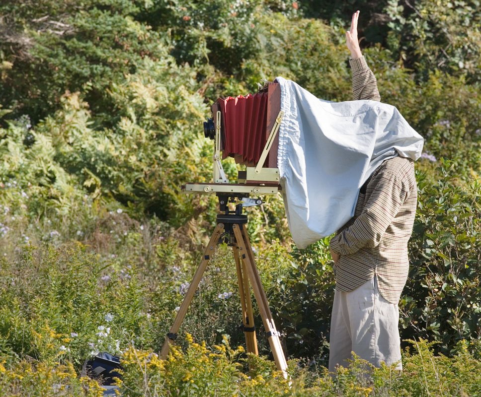
Here for your entertainment are pictures of Bruce and Tillman in action - if you can't figure out which is which, reread this blog.

Moving From Techy To Artsy # 1
So, you have been photographing for a while, you have some adequate equipment, you can make competent snap shots, but your images lack a certain something - well actually several somethings. What to do now?
Pick a well known photographer who's work you like and see what you can learn about his photography and how you could go about emulating him or her. This might mean a trip to the library, it could be internet searches, checking indexes for magazines.
You want to know how he does it. Don't worry about his equipment, equipment only determines the size of the print you can make, not the quality of the image so if you aren't greedy, you can make faboulous images with any old camera, film or digital.
What you do want to know is where does he get his subject matter, is there a time of day he likes to photograph, is there a certain style to his prints - light, dark, moody, contrasty, whatever. Study the type of images he shoots and that you particularly admire. Is there a favourite focal length, does he shoot things at infinity, middle distance or up close, or does he work on the near far type image.
If you have a choice between going to the exotic places he shoots or choosing a local city park at the same time of day and light he shoots in, pick the time and lighting every time. You are far more likely to get a good image in the city park at 5 am than you are near the top of the mountain, hanging from a cliff at noon. Several of my landscape images have been taken within the city (Calgary is 1 million pop.).
SO you try to emulate your selected photographer. You shoot for a few months and you make the best darn portfolio of 10 or more images that you possibly can - and now it's time to find out how you performed.
Take your 10 images and compare them to 10 from your selected successful photographer. Compare images that are as similar as possible.
Chances are you are going to like his images a lot more than yours - but it's the why that counts here.
You are looking for:
a) the overall tone of the prints - ignoring subject content and composition, are your prints as rich as his (be sure you are comparing small prints so techincal quality isn't a major component of the comparison - chances are you are looking at his in a book anyway.
b) shadow detail
c) subtlety of highights
d) composition - how well did you place the important parts of the subject compared to your guru.
e) lighting - did you time it as well as your hero - perhaps you slept in a bit late or got lazy.
f) subject matter - don't worry about how exciting it is, that could have to do with location more than skill - look rather to how well it is displayed - is it shown in the optimum way - this could be a matter of an uncluttered background or selective focus
g) does the expert's image say something to you that your images don't and if so why and how could you change your images to speak as clearly.
For example, lets say that you shoot industrial and that your idol is David Plowman, so you go out shooting for several weeks and you put together a set of your strongest 10 images. You print them small, say 5X7 on 8X10 paper - perhaps you even crop to emulate his use of medium format square images most of the time. David's industrial images are elegently simple - not a lot of clutter - are your images as clean? They are as strongly composed - check the balance, the use of foreground and background, does it show the subject as well as his images. Most of his images are shot on cloudy days and with soft lighting then the contrast is increased to make rich prints - rather than the more typical hobbyist approach which is to shoot on a sunny day then spend hours trying to rescue the shadows and highlights. When David shoots a ship, it really says ship - it's a clear message - is your message clear?
Next time I will discuss what do do once you have done this comparison.
Do We Really Have To Love What We Photograph?
Frequent advice is photograph what you love. If that's really the case, then great art would have a lot more pictures of girl friends and hot fudge sundaes. it completely ignores the creative photographer who photographs raw material which in itself is boring but he knows that in the darkroom or computer he can make it sing. A look at Ansel's proof sheets and you might suggest he not give up his day job - though come to think of it, that was commercial photography.
It might be better to think of a photographer as someone who is very observant and that we have to find the things we look at interesting to take a photograph. This better explains the behaviour of most ammateur photographers who are in love with the process of photography and who may or may not become observant over time.
In my experience, photographers who pick up a camera to use as a tool to capture what they observe (the artsy types) become good photographers a hell of a lot faster than the techy types who obcess about films, developers, pixels and profiles. The arty type knows what he wants and only needs to find the path to get there - the techy type doesn't know where he is going, but he has maps for everywhere and lots of gadgets to help him on the way - if only he could figure out the destination. This process can lead to a huge amount of frustration.
I think that many of us started out as techy types and now want to be artsy types and there isn't a lot written about the move from one to the other. I'm going to address this issue in the next while - how to move from techy to artsy.
Sunday, August 13, 2006
Why Images Work # 6 - Tenaya Creek, Dogwood
Right Click Here for one of my favourite Ansel Adams images. While not as graphic as 'Moon Over Halfdome' or 'Aspens', this image is entirely about light - the sunlight pouring through the trees. You'd think this would be a fairly easy shot to get but I understand from talented photographers who have found Ansels tripod holes that it isn't. This is no surprise. On the average sunny day with the sun behind this must be quite boring and with the sun coming towards the camera 'soot and chalk' is the order of the day.
No, this image is about recognizing that very special light that sometimes happens, often after rain, in which the landscape glows. All you have to do then is capture this wonderful light. Ansel took advantage of thick emulsion films which recorded a greater dynamic range than modern films, processed it appropriately and then printed superbly. We can emulate this kind of film and processing by shooting more than a single digital exposure and either blending the images or bringing them into the new Photoshop HDR mode - 32 bit high dynamic range recording - I had occasion recently to reprocess the 'Church Through Church Window' image and it was a lot easier to get a good print with the HDR image than the previous two layer sep. exposure combination that I have been doing for several years. Tutorials about HDR imply that you need many exposures to blend but this is absolutely not true - two did very nicely here covering a good 14 stop range.
While not a bold composition, it is none the less well composed. The rock balances the tree on the left, the bright leaves on the right (?Dogwoods) balances the bright leaves on the left side. Note the trees angling slightly towards each other and framing the distant tree snag which iteself shows well against the fluffy light background of leaves. Even the evergreen in the background is positioned well - can you imagine if the large tree on the left hid half of it - ugly-so.
The foreground gravel makes a nice triangle at the bottom of the image - so much better than a straight line across the bottom seen in so many images.
The dark snags in the upper right are perfectly placed. Shadows are not harsh yet are rich.
This is the kind of image that you don't want to jump out at you and slap you - it says peaceful, quiet, light.
Friday, August 11, 2006
Symmetry

Sometimes it pays to make an image perfectly symetrical - emphasizing the power and structure of the object.
Thursday, August 10, 2006
The Ethics Of Cropping To Order
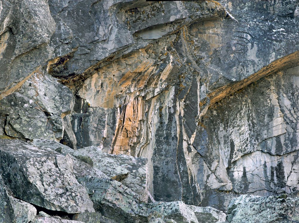

I have a customer who is interested in four 24X24 inch prints to fit between a series of bookcases. She selected four images but one of them is very definitely rectangular - what to do?
Arguably the concept of asking Monet to trim off a few inches from one end of his paintings would be ludicrous - having Ansel shorten Moonrise absurd. I didn't immeditately tell the customer to drop dead though, I looked at the image and thought it might work quite well as a square image, and in fact might even be stronger than the rectangular original - is this a cop out?
Probably, but see for yourself what you think both about the ethics of agreeing to crop and the particular image pair here.
Is it in fact unreasonable when buying a photograph which can so easily be adjusted to ask for such a change - after all, they could easily have done the trim job themselves after purchase - at least this way I have some control over how it is cropped, and I do have the veto over saying, you know what - I don't want my name associated with what I think is a weaker image.
In this case I had a suspicion it might work out well and in hindsight believe it did.
This raises questions about the value and use of a photograph - is it inherently wrong to think of photographs as decoration - if we do, we eliminate 90% of our market for our photogrpahs. Should we in fact treat the images as holy relics, to be handled with white gloves and kept in a humidity and temperature controlled vault and only to be shown to a select few. What does this have to do with The Mona Lisa with Donald Ducks head?
Why Images Work # 5 - Brett Weston
Heresy of Heresies, I actually prefer many of the images of Brett to his father Edward, both his abstracts and his landscapes. This particular image appeals on several levels. To access the image, right click Brett Weston: Cracked Glass, 1955 to bring up the image in a separate window. Resize as needed so you can see both windows at the same time.
Right off the patterns are interesting. The glass shows well against the almost black background and the glass has interesting shading. Note the large horizontal s curve starting top left then down the middle and curving back to horizontal in the lower right and hinting at curving up the right with the edge of the glass.
The delicacy of the pattern is intriguing - we all know such patterns even in glass can't last forever. Ask yourself which part of the image is surplus to requirements - I think they all work together.
Re cropping, he's almost touched the edge of the glass on the top near the left (but not quite) while giving a bit more generous space to the glass on the far right - I think this was almost certainly deliberate and the right choice.
Can you imagine the image without the two tendrils of glass that are hanging almost straight down in the large dark area in the upper left - they are essential to the image - such a large dark area would be hard to justify otherwise but in fact here provides the perfect background for them - too cluttered would have spoiled their dramatic appearance.
It's hard to see on a small web image but even here we get hints that the dark areas still contain some detail and are not absolutely black. The curve of the lower left corner matches the curve in the upper left and is of course the inverse of the curves on the right.
Altogether a very nice image.
Monday, August 07, 2006
Why Images Work # 4 Shaun O'Boyle
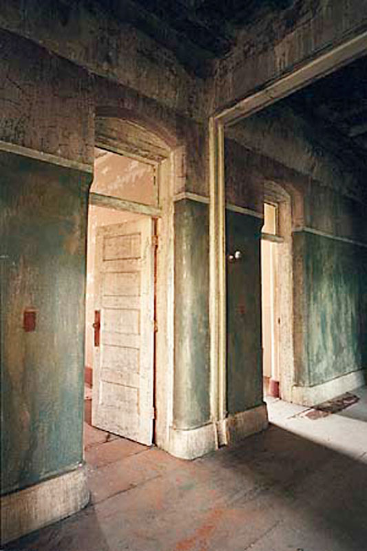
Copyright Shaun O'Boyle
After my industrial images appeared in Lenswork last year, I got a very nice email from Shaun O'Boyle, who amongst other things indicated he too had an interest in industrial and old building images. I visited Shaun's website and found lots of interesting locations. I felt at the time that he had some way to go to refine his seeing, yet there were a few very good images and one outstanding image which I feel priviledged to have swapped for and now have on my wall.
One might be tempted when a few images are strikingly better than their bretheren to assume it was luck, yet this type of image is constructed. There are lots of ways he could have photographed these same doors and hallway which wouldn't have had nearly the impact.
I am delighted to see on Shaun's site some more recent work indicating that the promise of stronger images to come is being fulfilled - I'm not surprised. His vision is becoming stronger, he knows better what he wants to say in a given subject and concentrates on the parts of the scene which help make that statement. He showed this in this earlier photo though I don't think that at the time he knew just how exceptional this image was and is. He knows now and has been able to build from this.
So, on to discussing the image above which Shaun has given me permission to show.
We have to discuss the colour - it's wonderful - the rusty red of the floor, door knobs and light switches, the well weathered rich cream of the doors, baseboards and archways, the textured green of the walls all work perfectly together. Exposure is spot on - always a challenge in colour - no detail is lost in the brightest highlights to the deepest shadows.
Note the diagonal lines of the baseboards, floor boards, and upper wall as well as those of the shadows on the floor and the sun coming in, also the archway. How about the darker edge on the right keeping your eye from wandering off to the right. I like the archway which gives a sense of this being a mirror and not more corridor to the right - yet the sunbeam clearly indicates it isn't a mirror. That it is a long shut down mental hospital makes you wonder who lived behind these doors and what stories the building could tell.
I like the way the lines come to the corners, perfectly on the bottom left and between two lines in the upper right. The upper left doesn't come perfectly to the corner and I actually prefer it this way - it's possible to be too clever.
I did wonder if the perspective should have been corrected so the vertical lines are in fact perfectly vertical - an easy job in Photoshop, but that would have been more of an architectural shot and less a tale of mood, story and statement.
The textures are wonderful. There is a painterly quality to the image which is no Photoshop trick.
I've had the image for a year and like it every but as much as I did when I first saw it - wish I had taken it but sure glad Shaun did.
DeJa Vue All Over Again

Sometimes you get a chance to reshoot an image and improve on it - the original was shot with my 10D and a consumer grade 28-105, this time I shot with the 1Ds2, three overlapping images with the tilt shift 90 T-SE. I can print it about 3X linear bigger and no longer is the gear on the left slightly cropped (which always bothered me).
Sunday, August 06, 2006

Base of wooden through truss bridge near Atlas Coal Tipple Historic Site, E. of Drumheller.
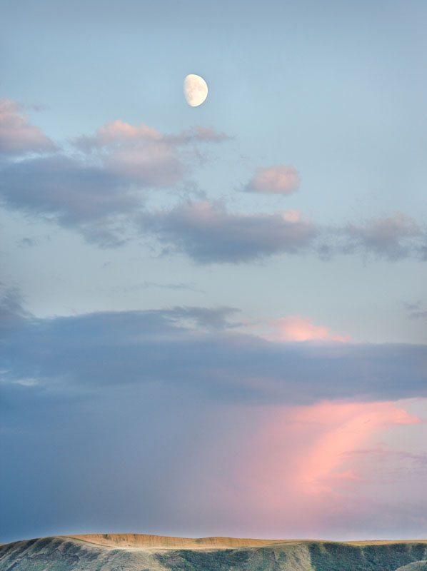
Moon Over Badlands, Red Deer River Valley, E. of Drumheller, 300 mm. lens.
Inside of top of coal tipple at Atlas Coal
Church through church window, Dorothy, Alberta, two images combined and masked - haven't masted HDR yet.

Truss Bridge, sev. images combined using Helicon Focus.

Church, Dorothy, Alberta - 17-40 mm. lens @ 17 mm. and corrected using photoshop distortion/lens correction to correct barrel distortion and vertical perspective.
Friday, August 04, 2006
Why Images Work # 3 - Huntington Witherill
Today I am going to discuss the work of one of my favourite currently working photographers, Huntington Witherill. There were a number of images I could have picked to discuss but I finally elected to choose this one of a sand dune. Right Click here to view the image in a separate window so you can read and view together.
To my mind, dune images of the usual type with bright highlights and deep shadows shot in early morning have been done so often that I really don't want to look at another typical dune image. So my first reaction to this image was 'what cool shapes' and my second was wow, someone has actually done something different with dunes.
High key images are hard to do well. I own a print of this image and trust me the highlights are superbly printed - and it's inkjet. This image certainly puts paid to the rule of images having to contain a full range of tones.
OK, so I like high key images done well and this is one, but what makes it an exceptional image? Well, the subtle tones are important, the shapes define the image.
There is something pleasing about the lines in this image - the foreground dune and its ridge, the shadowed dune on the upper left, the very subtle sweep of the dune in the upper right. While not showing well in the web image, there is good texture throughout, showing micro ridges.
I had talked before about sketching (in your mind) or for real a very simple 6 line drawing of the image you are about to take to see if it works - I think you can see here it would show very nice balance and interesting juxtapositions.
The high key gives a sense of brilliance to the light. The subtle tones make it a very peaceful image with a calming effect.
Had the foreground ridge been straight, or the foreground dune top line been convex instead of concave, the image wouldn't have been nearly as effective. Note the balance between the edge of the shadow in the upper left with the ridge line in the bottom of the image.
Below find a couple of my own high key images. You can decide for yourself whether they work and is this a technique that is worth exploring for you.

Wednesday, August 02, 2006
Why Images Work # 2 - Andre Kertesz
You will find the image here and by right clicking (or control clicking on a mac) you can open the image in a separate window.
This Andre Kertesz photograph is another of my favourites. Here are some of the things that work for me.
First, the photograph is is of an older era as indicted by the board floors, the straw boater, the less than rectangular door frame. It seems to describe a simpler time or place - there is no clutter, the elements of the photograph are simple and clear. the flower vase and flower nicely balance the stairs on the right. The dark on the left works with the light on the right. The position of the flower is perfect against the dark background and not intersecting the door frame. Likewise the stair railing is well positioned not quite coming to the edge of the wall and recess. On both left and right you have light dark, light. The wall that the hat hangs on nicely balances the recess on the right in the distance. Note the triangles created by the door frame on the right and again on the top, also triangles created by the shaddow of the flower pot on the table. Note the matching shadows at the bottom of the door, both angling down and to the left. The door mat doesn't quite come to the edge of the door frame. The light coloured wall in the distance is needing a paint job and has some real substance to it. The white of the right edge of the vase is brilliant. The hat on the left works nicely, you have the hat, then down and right to the flower vase then up and right to the stair railing and your eye is kept from wandering off by the recess and door frame. In fact it's hard for your eye to leave the image in any direction.
Emotionally it evokes a time and place. Even without the title, we wonder about who lives there, what's up stairs, who wore the hat. I can feel the sunlight pouring in.
I just find that every single element of the photograph is in exactly the right place. This does raise a point. Kertesz could only control some of the element of the image - he could move the vase and change his camera position and even wait for the right time of day. he could move back and forth and select a suitable lens to put foreground and background in the right relationships. He could even have purchased the straw boater just to help the left hand end of the image. Yet many of the elements that work had to be luck - the shape of the door frame, the shade of the light wall, the bannister and stairs. What if they had not worked as well - my guess is we wouldn't have seen the image - it would be consigned to the photogaphers 'almost worked' pile, or had he a lot more discipline than I have, he would have moved around the location, noting the elements, lining them up as best possible and when they didn't fit perfectly, folding up the camera and moving on. Personally I would have shot the best I could get, hope that some extra magic would happen inside the camera or that somehow I could correct the deficiciencies in the darkroom or computer. OF course, 99% of the time this doesn't happen and too many of these almost images can be discouraging. there's nothing worse than coming home with a bunch of almosts and puting a lot of effort into processing the film and making contacts only to realize you got squat. It's enough to make you put your camera away if it happens too often.
Update On Pepper # 30
Although I discussed the compositional elements and the wonderful shapes, I didn't discuss perhaps the most important part of the image, the wonderful tones. That pepper glows, it's three dimensional. Intererstingly it does this even in cheap mechanical reproductions and on the net. I did once however see a very light version of the image and the rich tones were ruined, it was less than half the image it normally is, yet arguably it was well exposed and showed normal tonality - were it an illustration for a gardening catalogue, it would have been just fine and arguably preferably to Edward's interpretation of the Pepper.
This does raise the question though which every photographer struggles with - just how dark to make a print. In the wet darkroom days it was all too easy to make the whole thing too dark - some of the tones would be rich, but at the sacrifice of others. Ansel went through stages of printing much darker or more contrasty so even with the masters some variation over time is normal and part of the creative process. These days with digital printing, it's easy to nail the dark and light end of things with curves or levels, yet we can dramatically affect the overall brightness of the print by how we interpret the midtones.
Prints that look right at the time you make them sometimes look completely wrong the next day. In the wet darkroom we had issues of dry down and how bright an inspection light to use and such, we still have some of those issues today. Dry down is much less (though with some papers and inks it still happens to some degree) and the quality of the viewing light is a problem.
I once went to a camera club to give a talk and after they had a print competition. They set up two flood lights one on either side of the print and about three feet away and blasted light onto the prints. Any print that was right for that lighting would be hopeless in just about any normal lighting situation from galleries to home.
Some people have never ever seen subtle highlights or rich shadows and literally don't know what they are missing. I highly recommend subscribing to lenswork magazine even if you yourself work in colour. It's superbly printed and is as close to original photographs as you can get with mechanical reproduction.
Tuesday, August 01, 2006
What Makes A Good Photograph?
The correct answer is it depends on who's asking. What works for me won't necessarily work for you, or your neighbour, family or the dog (he wants a fire hydrant). For example, lots of people insist that a photograph have a centre of interest, even if it isn't in the centre. Some of my most popular photographs don't so clearly it isn't just me who feels this is not essential.
So given this significant limitation to my ability to answer the question, let me make it very personal and say what works for me.
There is no single characteristic of a great photograph which makes it a winner. Were that so, the lovely tonality of large format contact prints would make every single one a winner - trust me, they aren't. It could be an interesting subject - but poor photographs of interesting subjects don't work either. But telling you all the things it isn't can't be very helpful so we'll quit while we are behind and concentrate on what it is instead.
Let me say that a good photograph is interesting. That may seem self evident, but I think there is something to be learned here. Can we agree that there are great photographs of fairly mundane (dare I say uninteresting) subjects. Is it possible that the dirty underside of a railway bridge, something you might cycle past daily and not pay attention to, could actually be interesting. What about peppers, dead birds, rocks, weeds, grass, cracked roads, etc. etc.? So somehow it would seem possible to make an interesting picture of an uninteresting subject. How is that done?
The interst could come from showing details that aren't normally seen (or more likely just ignored), or isolating parts of something to make interesting patterns or shapes. The interest could come from comparing two things - I think of Ansel Adams picture of fresh grass in front of a burned stump - alive and dead. The interest can come from seeing places we have never been to, or a time of day at which we are normally tucked in bed so miss out on.
Think of portraits. A picture of a beautiful woman (or drop dead gorgeous man if you lean that way), merits a quick look but normally most adults don't give it much time, don't tear it out of a magazine and don't frame it - yet there are portraits which cause us to do all of those things. Migrant Mother (by Dorothea Lange - so you can find it on the net) is a beautiful portrait and one could say that the woman shows a special kind of beauty but really, it's a picture of a tired, worn out woman who's given up hope, yet has the strength to struggle on. It is such striking image of those things though that the photograph is beautiful even if the person photographed isn't.
A news photograph might not be considered beautiful at all, but a good one is certainly interesting - interesting because it shows something we haven't seen, or is so representative of the problem that it serves as an icon for our feelings about a situation - say war, or natural disaster, politics or whatever.
As my particular interest is in landscapes and as my background is in black and white , lets limit our discussion to this. What makes a landscape picture interesting?
In Europe, landscapes are often photographed with high speed film in 35 mm. cameras and the results can be wonderful, so it isn't the format that's the answer. Prints poorly reproduced in books can still be interesting so it isn't print quality (at least not always).
Our eyes read photographs. We may read a page left to right, top to bottom, but in looking at photographs, we start at the centre and then wander around, following lines, stopping at points of interest and wandering right out of the photograph if there is not enough to hold us. The centre of interest can be anywhere but if there are not elements to support it, the eye quickly moves on and loses interest.
I'll now take you through some specific photographs that are considered classics and discuss what makes them work. As I don't have permission to reproduce the images, I'm simply going to provide the link to the sites.
Pepper # 30, Edward Weston
The image consists of some light coloured blobs, a line down the middle and a dark background. It's just a pepper, but the way the light reflects is wonderful, the shapes are interesting. I have always thought of it as a nude woman with her bottom to the lower right and her back extending upwards but looking at it today I also see a right hand grasping something and the thumb on top. The shapes themselves even without sexual inferernces are interesting. Despite the limitations of the internet and book reproduction, all images of this print look good and some look wonderful so the fact that it was shot on 8X10 isn't really relevent.
It was photographed in a funnel and you can see the circular scores in the tin funnel at the bottom of the image, giving the pepper a base and allowing our eyes to come back into the centre.
The dark background shows off the pepper nicely, a well lit scene would not have been nearly as interesting. The reflections on the surface of the peper are not so white as to be glaring yet are bright enough to be dramatic.
Notice a third of the way down the left hand side you can see a little of the background letting you know the pepper is not in isolation. Even this line keeps your eye in the image.
Look at the knobby ends of the folds of the pepper - they face each other so your eye can't wander off. S bends are generally attractive and this image has several.
Though it varies depending on your monitor, the shadows while deep are not black - no underexposure here - in fact it was something like a two hour exposure due to slow film, low light and bellows factor this close with the 8X10.
Well, that's probably enough discussion for tonight but I think I might just pick some other classic images and discuss why they work. Let me know if this is something you find useful. Leave a comment or email me directly. My email is george dot barr at shaw dot ca (you will have to type the real thing in).
Good shoting, see you next time.
George
Subscribe to:
Posts (Atom)