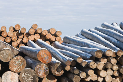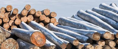

I thought I'd take you some of the issues with this image involving framing and cropping. First off, you'd be absolutely right if you thought I should have done this all in camera - but I'm nor perfect, and fair chance you aren't too, so more than likely you are going to face the same issues - besides, the same issues exist whether framing in the camera or cropping after - thus the title.
First and most obvious is the fact that the final image isn't the same ratio as the captured image - something that couldn't be handled in framing unless I stitched. In fact many of the images from the morning were stitched, just not this one.
The next issue is the large amount of sky. I don't remember why I selected so much sky and didn't choose more logs at the bottom - I presume that must have been the bottom of the pile or there was something in the way, but regardless, there is too much sky - it doesn't add to the image. Sure I could filter it and increase contrast and make it dramatic but this image isn't about sky so frankly I think it would be distracting.
On the right side, the top log on the right looks like an afterthough - just a small part of the log showing - I felt that either more should show - too late for that - or less - so I cropped the right hand side.
On the left, I was disturbed by that big black hole in the pile of logs - I hadn't noticed it when photographing but now it bothers me so I cropped the left hand side. This was a compromise decision because it meant that I would have less of that diagonal log with snow touching the left hand edge of the print - but enough would remain I felt and I really wanted rid of that black space which isn't balanced by anything equivalent on the other side of the print.
Don't get me wrong - when "balancing" a print - it isn't a matter of "weighing" the amount of black - conceivably a small black area on the right could balance a much larger one on the left, but with nothing over there...
Finally, though I was quite pleased with what I had, I also recognized that what makes the image is the bright orange log end and the blue snow covered logs on the right and that the number of stacked logs along the bottom isn't all that important to the image and more isn't necessarily better. I made a final crop along the bottom. I still wasn't sure this was a good move so used the do/undo a dozen times or more flipping back and forth from cropped bottom to not cropped and in the end felt the cropped version is stronger.
Do I wish I'd seen this before shooting? Darn right I do - by cropping on all sides I have reduced the size of print I can make - but a small print is better than no print. This is, I confess; one of the nice things about having a camera with lots of pixels - you really do have options and rescues.


5 comments:
A striking image, George. I prefer the uncropped version for two reasons. First and formally, the cloud billows nicely relate to the rows of logs and stripes of snow. Second and thematically, both trees and snow depend on clouds for their existence, so the large area of clouds feels appropriate. Also, the dark area lower left doesn't bother me; it is part of a "bass line" of dark negative spaces between the logs that adds interest.
I think the digital camera you used to capture these images have more than 10 mega pixels
True, I used a Canon 1Ds2, so 16 MP - so there was some room to crop - mind you if you crop from a 10 MP camera, it simply means you can only make small prints - keep in mind that famous photographers like Edward Weston never made anything bigger than 8X10 since he was contact printing - I'd rather have a great 8X10 than no print at all.
Another vote for the uncropped one. The sky gives it some space to breathe.
I think this is a common mistake, on every internet forum everybody always suggests what to crop off to strengthen the image. I guess because it's such an obvious step. But it very seldom helps much. Pictures tend to fly or not based on what's in them, where you were standing and in what light, and what sort of composition you were aiming for at the time. (Mild crops, to perfect the framing and straighten the horizon, rather than try to re-define the composition, are another matter.)
As for aspect ratios, I find it jarring to have too many different aspect ratios mixed up, so tend to leave everything in 2x3 if that was the aspect ratio of the camera.
Also, I think the comment at 5:05AM is a spambot not a person!
Post a Comment