


Whether 'tis nobler in the mind to show colour or convert to black and white....
Of my hundreds of images, it's generally clear whether the result should be in colour or black and white but I present two pairs here which I persist in showing and selling both ways.
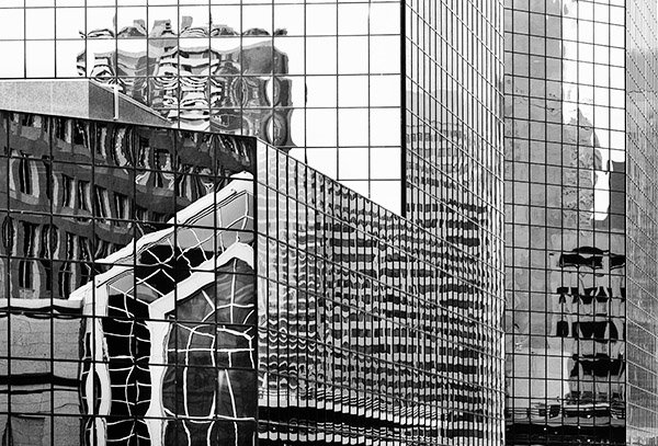
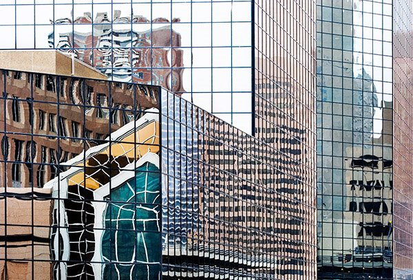
Reflections - the colour image has better separation between the various parts of buildings, yet the black and white hasn't the distraction of the colours and provides more pure form. Am curious what other people think - add your vote in a comment and specify whether you normally work with colour or black and white.
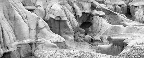
Bluffs And Bush - generally I do the Badlands photographs in black and white, but the appeal of this silvery green bush, the subtle colours of the bluffs and the one brown rock in the right foreground are appealing.
Let me know what you think, I'll tell you my opinion in the next blog.
1 comment:
I on the other hand prefer black and white for both of them. Bluffs and Bush doesn't work in colour for me, because the orange curve of rock and the green bush are all the colour there is so that's all I see. So the B&W version gives a greater feeling of space and the complete environment. With Reflections, the colour is fascinating for sure but the B&W version seems to have a flattened, 2-D, abstract feel that really appeals.
Post a Comment