Musings on photography, the art of creating images, technical talk, useful tips, rants and ravings of a published photographer of 40+ years experience.
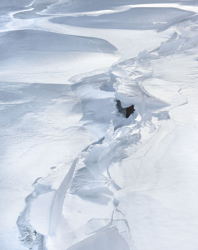
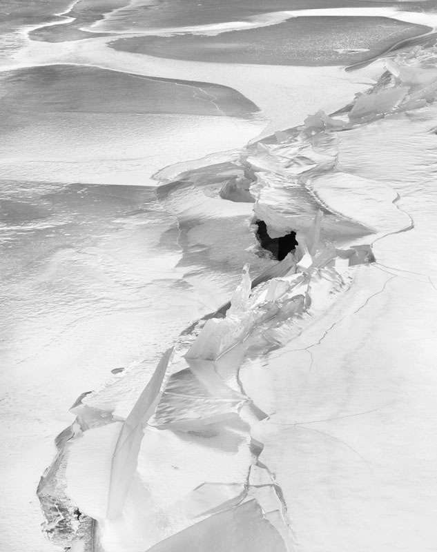
I have noted several times that some images have only a single colour and not much of that, yet when converted to black and white, I don't like the result nearly as much - odd when you think of how little colour is in the image below. What do you think?
2 comments:
Anonymous
said...
Hello George,
I've been reading this blog occasionally, but today I find myself with a bit of time, so I thought I'd check some of the older posts.
I've noticed this myself, and wondered about it. I've also noticed that you can make the b/w image work even better than the color one (with litle color), but you have to increase the contrast a good bit.
In other words, start with the "color" image, go to saturation -100, now increase the contrast until the b/w image looks good. If you now go to saturation 0, you have your color back, but the contrast is way too high for a color image. In other words, if you take out color, you must put in contrast.
Noart is right - black and white image often (but not always) need more contrast. Part of it though has to do with the subject matter and lighting - I usually photograph in quite flat lighting - early in the day or cloudy. These images often need a boost in contrast in colour too, but more boost in black and white. Part of the issue is the lack of reality in black and white - I can make the tones anything I want where in colour, too much change makes the colour very unrealistic (occ. that works - tree reflection image is good example - in favorites). Once black and white, I can send the tones anywhere I want and I do.


2 comments:
Hello George,
I've been reading this blog occasionally, but today I find myself with a bit of time, so I thought I'd check some of the older posts.
I've noticed this myself, and wondered about it. I've also noticed that you can make the b/w image work even better than the color one (with litle color), but you have to increase the contrast a good bit.
In other words, start with the "color" image, go to saturation -100, now increase the contrast until the b/w image looks good. If you now go to saturation 0, you have your color back, but the contrast is way too high for a color image. In other words, if you take out color, you must put in contrast.
Noart is right - black and white image often (but not always) need more contrast. Part of it though has to do with the subject matter and lighting - I usually photograph in quite flat lighting - early in the day or cloudy. These images often need a boost in contrast in colour too, but more boost in black and white. Part of the issue is the lack of reality in black and white - I can make the tones anything I want where in colour, too much change makes the colour very unrealistic (occ. that works - tree reflection image is good example - in favorites). Once black and white, I can send the tones anywhere I want and I do.
Post a Comment