From the start, I wanted a black and white image with rich tonalities and nice reflections off the apples. I like the circular patterns of this bowl, reminiscent of the curves Edward Weston used in the funnel in which he photographed pepper # 30.

The image above shows the first appearance of the colour image in Camera Raw. We can see immediately that my lighting was a bit harsh and the shadows should have had more fill - I'd simply turned on a light across the room, I probably should have used a reflector board just under the camera to bounce the light behind the scene into the shadows. A lot of editing of images is compensating for the deficiencies in the image - the fewer deficiencies in the raw file, the less work there is to do in editing.
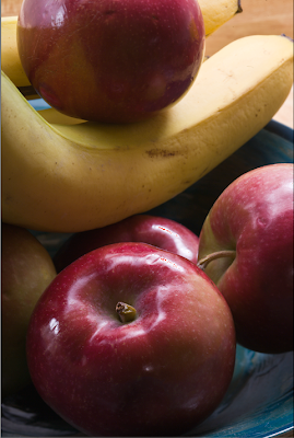
The second image above shows the results of using Recovery in Camera Raw to tame the blocked highlights. As you can see, the raw file in fact contained a lot of useful information in what seemed like pure white highlights.
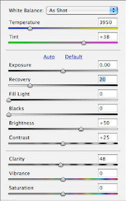
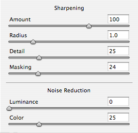
The two diagrams above show the settings in Camera Raw, first for overall settings of exposure, contrast and so on, while the second shows the sharpening I use in Camera Raw as a default for almost all my images coming in to Photoshop.
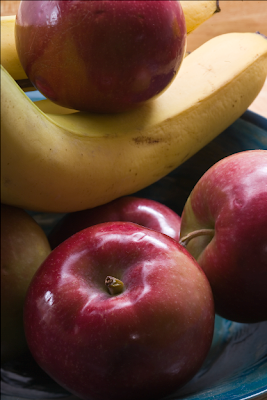
Above you see the image as it first appears in Photoshop. Clearly the shadows are too dark. I elect to control the contrast by using Photomatix Tone Mapping Photoshop filter. I might have used fill in Camera Raw but anticipated this would produce a better result.
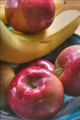
I still wasn't quite happy with the contrast control and wondered what would happen if I used Akvis Enhancer. I thought perhaps the banana might not look smooth enough, but in the event I liked the effect.
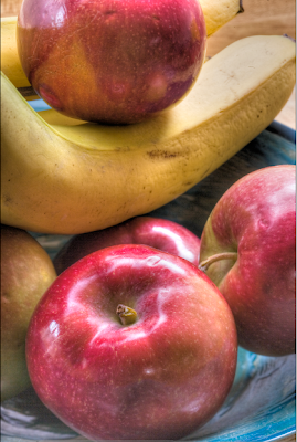
Above is the result after Akvis Enhancer. I applied it to a copy of the image as a second layer so I could undo parts if need be. As it happened I didn't have to undo anything. Such severe opening of deep shadows on my 1Ds2 produces some pretty severe noise and striping in the now very visible shadows but I plan to take care of them later with some judicious blurring.
It's time to convert the image to black and white. While there are several ways this can be done, if you are using Photoshop CS3, I can't see any reason to use anything but the adjustment layer 'black and white' which provides a series of preset filters or even more powerfully a set of sliders.
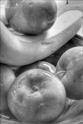
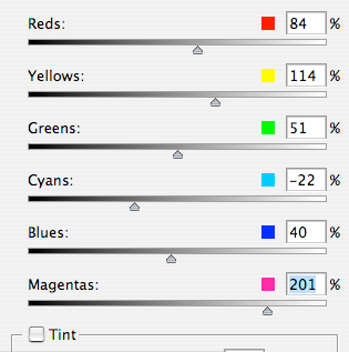
I adjusted each of the sliders to make the best looking image possible. Some, like green, really didn't do much, others were surprising in their effect. You see in the image above the result of the various changes but with magenta set very low. Below are the settings.
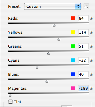
I then turned magenta up considerably.
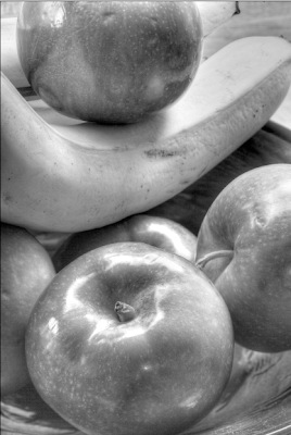
Notice the huge effect on the highlights in the bottom apple, simply by adjusting magenta as seen in the slider settings below.
By now, it's possible to see that I am getting to something vaguely resembling the subtle tonalities and rich highlights that were my stated goal in making the image, but there is a lot of work to be done yet. There are marks in the fruit that should be cloned out. I don't like the edge of the bowl showing in the right lower corner.
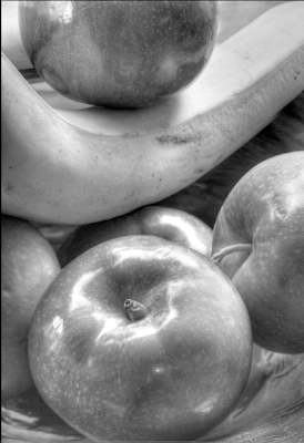
I'm not happy with the banana in the upper right corner. I decide to fertilize it a bit and grow it a bit longer with the cloning tool. and above you can see the result. It still has flaws but I can fix those. Notice that I have cropped a little of the top of the image too to clean up the background and have the banana come to the upper right corner. In doing this I would have lost the reflection in the top apple so I cloned it a bit further down the fruit before doing the cropping.
I like the overall shape of the image now, but it's a bit anaemic - the darker areas of the apples need to be made darker yet. Time for an adjustment curve.
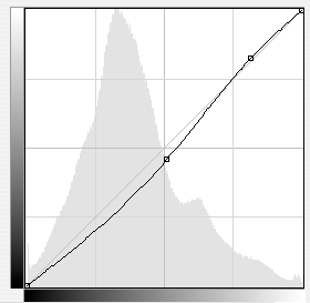
Above is the shape of the curve, a simple convex curve designed to darken but not do a lot to overall contrast. That will be achieved by applying the effect locally.
Above you see both the curve and the mask once it's been painted into. Almost all my masks start black and the effect is painted in, but sometimes I want the change applied almost everywhere and I paint black into a white mask - it's simply a matter of which is easier for any given image. Sometimes the shape that needs to be painted will determine whether it's better to paint the shape or the area around the shape, and thus whether a black or white mask should be the starting point before painting with the opposite.
I decide that I haven't darkened things enough. Rather than change the previous adjustments I decide to create a more dramatic curve.
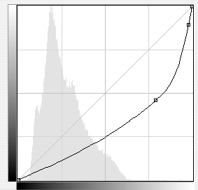
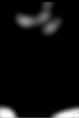
And above you see the curve and mask after painting into it.
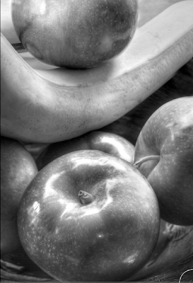
And above is the result.
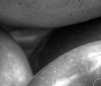
Above you see the problem with the shadows - very noisy and somewhat striated, the effect of grossly lightening the very deepest shadows recorded by the camera. It's time to apply a bit of gaussian blur to the parts of the image that show this problem.
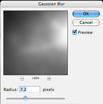
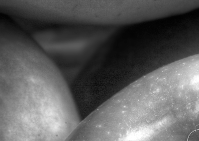
Above you see the noisy shadows then blow, the effect of blending in the blurred image in appropriate areas. This is simple. Duplicate the image in a new layer (you drag the flattened image to the second from the right icon in the bottom of the layers palette and voila you have the image in two layers. Blur the top one, black mask it and then paint light into the mask wherever you want the blurring to hide the noise.

And we are getting quite close to the image we want.
I'm still not quite happy with the upper right corner - it would be nice if the banana came right to the corner. I decide it's time to do a little stretching. Command (control for PC) - A selects the whole image. Then under the Edit menu I select 'free transform'.I then press down the command (control for PC) key and drag the upper right corner to the right as you can see below.

Since anything dragged off to the right is outside the canvas, it is lost.
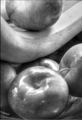
And here you have the final image above. There are a few other things of note - I cleaned up the various bruises to the fruit. I didn't like the bright parts of the bowl in the bottom two corners so I created a very steep curve in the highlights to darken them without radically altering the mid tones and shadows and now they are a bit more subtle. I have used the dodge highlights tool to improve the top apple highlights and work on the banana a little to give it more pop on the left side, while toning it down a bit on the right with the burn midtones tool.
There are a few other minor changes but there you have the significant steps in creating the image. Despite all the editing, it looks very nice at 13X19. As mentioned in an earlier comment, I did use my tilt and shift lens to focus on both of the apples. The alternative would have been to use Helicon Focus to blend a number of images as I focused through the fruit, while using a fairly wide f stop to keep the background severely blurred. This means making lots of images with only a little change in focus between each, but the software is cheap and you don't need a very expensive fancy lens.


5 comments:
Thank you so much for this detailed explanation of your workflow. You have given me some excellent ideas to play around with.
Thank you for this dissection of your workflow. This is very helpful.
Ditto, George. Your effort is very much appreciated.
George,
Thank you for the effort to lay this out. I was thinking about Weston and his pyro images when I saw this.
Dave
It probably took Edward less time to develop the film and make a print than I took to edit the image, but hey, my fingers aren't black.
George
Post a Comment