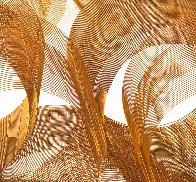
Steve Durbin has sugggested some minor (but significant) further cropping to my image of the previous post. I have posted his version above. I like it very much. I think it does three things to the image. First it eliminates those distracting background elements in the upper left corner which I have been staring at in the print I made and even wondering if I could clone them out (I think he has the better idea). Second, the way he crops the upper left corner means one of the curves comes nicely into the corner. Third, although potentially interesting, the 'lenses' (thanks Steve) in the middle top don't in fact add to the composition and I have failed to take my own advice of a previous post about eliminating everything no matter how interesting if it doesn't actually add to the image.
On the bottom, the change is more subtle but there too perhaps the new version is a little cleaner, not quite so heavy, showing that little 'tuft' of wire in the far left bottom corner to better advantage. Conceivably we could take even more off the bottom to make the curves meet the two bottom corners, but for now I think that wouldn't be a good idea. I think it's good to have some lines go to the corner but one can get a bit carried away with the idea. When two lines head for a corner, it's often better to have the two lines bracket the corner rather than have one hit it and the other miss. That way the 'material' between the two lines is what actually reaches into the corner.
This re-cropping speaks to the need to consider images a work in progress and it's worth reviewing whether in fact you have done the absolute best you can and consider other possibilities. This could be a recropping, but it might be a completely different look to the image, much darker or lighter, or it might be an adjustment to the colour balance (warmer, cooler) or to the saturation. It could even be a reconsideration that the image is better in black and white, or in colour. It's not a bad idea to go back to the original raw file or the negative and start completely over rather than further modifying the present version. Perhaps the new one won't be better but if so nothing is lost, and just maybe it will be a lot better.
There's nothing written to say that first ideas are necessarily best. Sometimes they are and everything else subsequently just weakens the image but other times...
Thanks for your input Steve, not only does it make the image stronger, it strengthens the blog to have insightful feedback and suggestions.


1 comment:
I'm glad you like the different crop. Thank you for the opportunity to play with this lovely, musical image. And thanks for all the effort you've put into this blog; I've become a daily reader since discovering it recently. I know it can be frustrating not to get more feedback, but hopefully that culture will develop in time. Meanwhile, I expect that you're gaining a lot from the experience anyway.
Post a Comment