Doug in a comment on my last post refers to the often noted phenomenon of having personal favourites that other people just don't like.
It's almost like those tests for colour blindness where you look at the subtly coloured dots and try to see the number amongst the random variation - normal people can see the number clearly, colour blind people look at you like you're crazy - 'there's no number there'. Since this phenomenon works with black and white images, my analogy has severe limits, but it seems like that.
So what could be happening here, how is it that we see greatness in an image that no one else sees? Seems to me there area couple of possibilities.
1) there is a connection between you and the subject matter which doesn't show in the picture but which you of course remember so for you it's as if the picture did show this connection.
2) You can see patterns and relationships in the picture where other people just see clutter. I know I'm guilty of trying to justify a picture because of some tenuous at best patterns in the picture - the left bottom balances the top right, blah, blah, blah... only I'm really stretching it - in those situations, I usually stop kidding myself and abandon the image, and these are never the images I feel really strongly about anyway so perhaps that's not the answer. On the other hand, perhaps there are times that patterns jump out for us but don't show for others - perhaps because we remember the real scene, maybe because it relates to something in our lives - a favourite painting or even another photograph.
One can imagine that different people like different shapes and patterns but that would explain why only some people like a certain image but it doesn't explain why no one likes an image I feel strongly about. there aught to be some people who have similar tastes. No, it's more complicated than that.
Certainly, it's the more abstract images which are usually the ones which only the photographer likes - pictures of lighthouses are easy to sell. Some abstracts though are often admired even if not always purchased while others that are favourites get barely a glance.
Any further thoughts on what explains this phenomenon?
Wednesday, January 31, 2007
Tuesday, January 30, 2007
Why Are Some Of Our Images So Much Better?
Why is it that any one photographer may have hundreds of ordinary images but only a handful of really good ones? Is this the hallmark of an amateur or do all photographers have the same issues? Is it possible to change the ratio of really good images without improving all the images? Could it just be luck and 'time in the saddle', that essentially we have no control over this? These are important questions and the last one is downright scary - the idea that I have no control over now many good images I produce is discouraging, not to say depressing. But is it true?
I would argue that every photographer of whatever genre and style has the same problem - that a small percentage of his or her images are much stronger than all the others, that each of us has a 'portfolio' of images we want to be known by. The quality of those 'best' images varies from person to person, but the ratio doesn't. I suspect that all photographers have roughly the same percentage of images which stand out against the rest of their work.
Anything which would help you make more 'outstanding' images is likely to improve the worst of your images at least as much as the best of your photographs. The gap may change but it isn't ever going to go away.
I would further argue that we wouldn't want it to go away - we NEED those few really good images which show us we are capable of improving.
The same phenomenon of sometimes excelling is present in everything we do in life. Every so often a tennis player plays above himself and its the memory of that day which pushes him to keep trying, to practice more, to take lessons, buy a new racquet, do just about anything in fact to have that happen again. Of course when he improves, the bar is just raised that much higher.
Some days we are particularly attuned to the subject matter, we just seem to see more clearly, it's easier to put the many elements of a photograph together and it's easier to recognize potential subject matter. A different day and you'd walk right by.
Myriad factors play here - sleep, stress, fitness, mood. Some days those ground strokes work perfectly, other times the brain just doesn't talk to the hand - welcome to real life.
Monday, January 29, 2007
Another Parkade Image
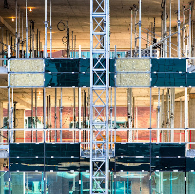
The lighting was harsh, bright sun, no clouds, a nice afternoon for anything but photography. This building was under construction (reconstruction?) and I liked the contrast between the warm colours seen through the building vs. the blue green glass covering the north wall. On screen at 100% you can see that the warm colours are in fact north facing brick walls lit by reflected light off south facing windows of other buildings.
Sunday, January 28, 2007
More From Parkades
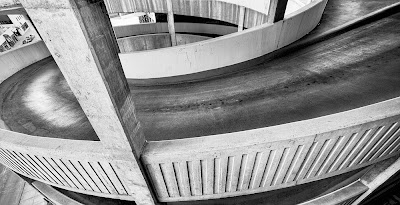
Not a very productive day, just a chance to get outside and play with the camera. This image was handheld. DOn't know about you but sometimes the tripod is just too darn big - in this case the parkade had a concrete wall and I needed to be at the outside of it - no way for the tripod to get there so I leaned through the gap, and rested the camera on the concrete at one point, then held it tilted to aim it down and shot at 1/5 of a second, 17 mm. 17-40 lens. Of course, the 17 does minimize hand shake and having two of the three axes of rotation nailed by leaning the camera on it's L bracket meant that it was manageable.
Sometimes I'd like a really small tripod. RRS makes one but it's darned expensive for a one foot high tripod. I have spare ballhead so perhaps I'll simply rig something wooden up.
Saturday, January 27, 2007
Friday, January 26, 2007
The Candid Frame - Interviews
Andy asked what the link is to the Brooks Jensen interview - it's at The Candid Frame. Thanks to Howard for this link.
The Poison of Preconceived Ideas
The idea for this discussion came out of an audio interview of Brooks Jensen by I. Perrello. The latter made the point that children not burdened by knowing the history of photography and having no preconceived ideas of what a photograph should look like tend to be much more creative. Brooks made the point that without that knowledge it's difficult to move on.
I thought I'd discuss the more mundane issue of visiting a place that has been photographed before and the images seen by you. Hell, you might even have been the photographer. Assuming the images were good, how do you go about seeing it 'in a new light' (sorry)?
You could meditate, you could spend hours worrying about it, but here's some practical ideas for seeing differently.
1) approach the subject at a different time of day.
2) figure out what lenses were likely used and deliberately exclude the possibility of using those lenses - ie. if it looked like the images were shot with long lenses, see what you can do with wide...
3) Move in or move back - ie. opposite of what was done before.
4) If the previous images emphasized lines, how about concentrating on shapes.
5) If the previous images were sharp throughout - how about seeing what you can do with a good lens almost wide open.
6) Switch from colour to black and white or visa versa.
7) Look at what was emphasized in the previous images and see if there is another feature of the subject that could be shown.
8) If all the images were shot from eye hight, how about getting down on your belly for a good crawl round.
9) Even if there is only one thing to photograph and from one position, how about planning an image which looks radically different through changes in exposure and printing style.
OK, lets make it more challenging. Lets pretend you are creating a portfolio of images on a particular location, say the Badlands, and you have shot here before, need more images, want to keep the overall theme consistent, but definitely don't want 'deja vu all over again' images.
In this case you might well decide that part of that consistency is shooting with the same equipment, even the same lenses and in similar light. 10 pictures in soft light and two with high contrast probably won't work.
A new location would be ideal but if not available, how about walking through the scene from a different direction or at the opposite end of the day. If the previous images emphasized a certain type of curve, look for different lines, straight or zig zag. Deliberately switch from diagonals to horizontals. Consider broadening the definition of the portfolio to include another aspect of the badlands - say cactus or water, rain or snow. Even Ansel hasn't published a book of images of half dome only. After the first four or five, even he would have been stressed to make sufficiently different images to warrant a whole book on this one feature (striking though it may be).
Your project might be young women at a street corner - but how about adding some guys, or extending it to a variety of ages so one could compare facial expressions, dress style, postures, etc.
Thursday, January 25, 2007
Cut And Run?
it struck me listening to Sam Abell, how much he makes his own luck by being in the right place then waiting for the last element to 'make' the image. This raises the more general question of how long do you wait for the light to change, the wind to die or the right combination of circumstances to happen, before getting frustrated or simply making the decision to 'cut your losses' and move on.
I find it a common scenario in landscape work. Some of the elements of a good photograph are there but the lighting isn't quite right. It might be an hour or more for the right light, it might be never. In that time that I spend waiting, I could be looking around for a different, possibly better photograph.
So how do you decide when to 'cut and run'?
Sometimes it's obvious - there's not a cloud in the sky and the odds of the lighting softening in the next hour has to be considered pretty darn low - maybe better to come back a different day.
Other times the odds of things improving approach 50% and if the chance of the image being really good is high, if only the light were right, then waiting makes good sense.
Sometimes I'll wait 10 minutes and if nothing happens, break down the camera and pack up - and of course sometimes that's just when you get that momentary break in the clouds and the light pours in or whatever. Many's the time I have maddly set up again, sometimes catching the light, other times not being ready.
The other strategy is one of setting up the camera and leaving everything in position, but then wandering around looking for another possible image. Sometimes this persuades me to move the camera, other times I will mark the spot by dropping my viewing rectangle.
Mathematically, it's a matter of statistics - the chance of the right circumstances happening to 'finish' this photograph are X over Y time. The image I'm waiting for is Z quality, while the possibility of a better image found elsewhere instead of waiting here is Zprime.
Now if only I could feed these numbers into my pocket calculator and it would tell me to make or break.
For now, I keep guessing and usually getting it wrong and occasionally specacularly getting it right, which compensates for all the wrong times and keeps up my optimism, not to say delusions.
Just A Bit Of Colour For A Winter Day
Wednesday, January 24, 2007
Photographing By Instinct And First Impressions
Chuck talked about the difference between a snapshot and an work of art.
As for decisions and compromises in making a photograph, that's a great description of art vs. snapshot.
For the most part I agree with Chuck, but we do need to consider the times when an experienced (not to say wrinkled) photographer sees something in an instant, in it's total including boundaries and it's simply a matter of picking the right lens and pointing the camera at the scene.
I strongly support working the scene but am also amazed at just how often there is really only one right spot and that was the one you saw the scene from first. OF course, this makes sense, for if there is only one good vantage point, then unless you are in that spot, you aren't going to see the image and no light bulb going on. Having shot the light bulb image though, it's then time to work the scene and give the poor slob who's going to print a few more options. Probably you got the best shot but just maybe there's another arrangement that right now looks second best but once in the darkroom or on the computer, it turns out to be the stronger image.
Psychology research has shown that humans can process a scene in a spit second and long before any conscious thought about the value of a scene could be evaluated, we are in fact pattern recognition machines and an experienced photographer responds to interesting patterns in the midbrain rather than the cerebral cortex. You might say we are wired to respond to interesting compositions.
An inexperienced photographer responds to objects - that's a nice rock, a more experienced photographer to the rock sitting in front of the bush and behind the grass and with great clouds in the background and with that shadow reaching across. A really experienced photographer doesn't even think of it as a rock, he's seeing a light shape and a dark shape with intersting patterns and curves and the insubstantial like the shadow weigh as much in his glance as the more solid boulder.
Tuesday, January 23, 2007
Sam Abell
I'd heard the name, knew he was a famous photographer but knew nothing about his work. One of the commenters at luminous landscape mentioned a workshop Sam tought so tonight it googled his name and came across this wonderrful find
Sam Abell Pictures and Video Interview
Check it out, there's a lot to be learned here, about working a scene, about light, about persistence, about returning when things are right and about a dedicated and skilled photographer. Highly recommended. And I'm going to go back to check out the whole site.
Canon iPF 5000 # 2
Here's the link to the first entry on this new Canon >Printer. Aaron has pointed me to the user information site for the 5000 here which looks like it is going to be extremely useful.
The latest adventure is that I note a yellow tone to warm black I don't like so I have switched back to neutral black which has a selenium toned look to it which is subtle and just right.
I am noticing some lines on part of the print. It might be banding but in fact I suspect I'm getting some head contact as it's too broad for banding and it disturbs the surface of the paper. I'm going to see if I can adjust the head position or increase vacuum or do both.
I'm getting used to confirming size and type of paper for every single manual feed sheet of paper so I don't think I would consider that a major flaw in the printer, and besides, the manual top feed is much easier than the Epson. The paper drops in until it comes against a definite stop. In addition, there is mobile guide that lines up the left side which the 4000 didn't have, and unlike the Epson you don't have to push the paper in against fair resistance before coming up against the final stop which with the initial resistance was difficult to find.
Some sheets are getting misfed - ie. they go in just fine but the printer says they are squint. The good news is this so far is happening about as often as on the 4000, which is to say, too often, but changing the paper is much simpler than on the 4000, push the up arrow and remove the paper. On the Epson you had to release the lever, wait interminably, then refeed, hoping you waited long enough.
So far the bottom line is it has the possibility of being an awesome printer but initial teething problems will need to be solved and so far I cannot recommend it until that happens. I will keep you posted.
Monday, January 22, 2007
Decisions and Compromises
It's rare for a scene to perfectly unfold, with obvious boundaries for the framing of the image and a single position being clearly the strongest. In my experience, what happens in the real world is that if I move left, that rock shows nicely but then I have that problem with the bush, if I move right, the bush is hidden but I lose the curve of the rock, and so on it goes, one compromise after another. Sometimes the compromises are such that you have to walk away, or at least that image doesn't get used. Other times there is a solution which results in a strong image, and rarely there is the image that just requires no such decisions, there is one right way, it is uncomprommised, it's obvious and you are off and running.
So this raises some questions.
DO great images only come from images which didn't need compromises?
Would a different photographer have more or less trouble making the right decisions?
Is there something we can do to help the process of making decisions?
Is there a difference between the 4X5 shooter who with 12 shots for the day has to decide once and for all which is the best shot versus the digital shooter who at least in theory can take every single possible compromize and sort out later which one is actually better?
It's my impression that great images do not in fact uniquely come from images which don't involve compromises. We will never know how much 'good stuff' existed beyond the borders of the print. We don't know if had the photographer been able to move to the left six inches, something wonderful would have been added, all be it at the cost of adding something distracting. Since this is already a great image, it doesn't really matter. We don't look at the Mona Lisa, and say to ourselves, if only she had bigger breasts, or a longer nose or whatever. We're looking at a piece of art, not arranging a 'hot date'.
It's almost a given that someone else might have an easier time making the decisions on what's best. We know for ourselves, some days we can make those decisions quickly and confidently, other days in similar situations we are indecisive, so it would seem reasonable that there be differences between photographers. It may be easy for a beginner to make the image since he's not even aware of the subtle elements about which the more experienced photographer is agonizing. It seems that like in life in general some of us are more confident in our decisions, rightly or wrongly.It's more than possible that the photographer who couldn't decide and gave himself two negatives to choose from will be the one returning with the great image.
I would argue that more images are spoiled by the addition of a distracting element than by the elimination of something nice, so all things being equal, it's better to go with the 'lesser is better' image. I find it frustrating to leave in the distracting element, persuade myself it won't matter, be excited about the image, then to be disappointed when I realize that it truly won't work with the distracting element present - no matter how I crop the image, no matter what printing tricks I use to 'tone it down'.
To be fair though, one needs to remember that elements may be distracting because they stand out from the picture in a 3D world. Perhaps with one eye closed, the element isn't distracting at all. Perhaps the element is distracting largely because of it's colour or brightness and sometimes these can be corrected in the printing.
I do wonder if the use of a large screen pocket digital camera (there are some with three inch screens and black and white modes and a zoom lens) wouldn't make an ideal viewing tool which would help in the decision making process.
Sunday, January 21, 2007
Mash Vat
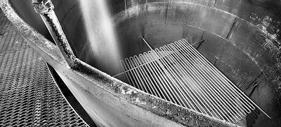
Mash pours into the fermenting vat. Once full, it starts to bubble with CO2 as the sugars in the grain are converted to alcohol and CO2. In fact, the CO2 lies so heavily over the vats that anyone falling in would die before reaching the side. I had thought they cooked the mash but in fact the special yeast cultures don't work well at higher temperatures and those are cooling tubes seen at the bottom of the vat.
Saturday, January 20, 2007
Crane Museo SIlver Rag - Oh So Close
I have been having problems with my Epson 4000 and prints are getting marked with black lines on either side of the image from a dirty head. I have been wanting to try a printer which could do the new semi gloss papers and last week broke down and purchased a Canon IPF5000 printer. My local camera store stocked both Hahnemuhle Pearl and Crane Museo Silver Rag and I preferred the surface of the Silver Rag - slightly glossier, slightly more textured and the texture appeared random while the texture on the Pearl is slightly cloth like, all be it very fine.
My very first print from the 5000 in monochrome was good, the second one excellent with a quickly adjusted tone curve and everything else at default. Two problems occurred with the Silver Rag. Firstly the paper is so thick and slightly curved that the edges catch on the print heads as they go back and forth - you can sometimes hear it and you can certainly see the frayed edges after printing. I figured I'd eventually understand how to adjust for paper thickness, though confess I haven't done so so far. The second problem was of more concern. Each and every print had what appeared to be a water mark on it - a circular area that was dull in surface. Some prints had one, others had half a dozen. They appeared to be at random locations and varied in diameter from 3 - 5 mm.
It didn't take me long to have a look at the paper before it went into the printer and there were the spots, right on every single sheet in the box. Subsequently I opened the second box I'd purchased when I returned the paper to the store, and it too had the same 'water' spots.
I have replaced the paper with Hahnemuhle Pearl but my original impressions still hold - I prefer the surface of the SIlver Rag.
I have contacted Crane and I'd like to think the problem will get solved.
I intend to order some of the Innova paper (can't be bought here directly in Calgary and no Canadian distributer) but the last time I tried I didn't know the same paper surface F came in both matte and glossy - of course I got the matte. My luck!
As regards the black and white images the printer can make - it's superb. I haven't given it a full check yet and will report back on quality as I try more prints and inspect them in various colours of light, but so far I like the printer.
Why I have to specify the paper type and size for every single hand fed sheet, even though they are all the same size, is beyond me. Michael Reichmann indicates a new version of the firmware is coming out soon, we can hope.
On the issue of bronzing. With the Canon printer and both the Hahnemuhle and Crane papers, the dark inks don't sit on the surface like they do with older printers. On the other hand, the inks on the Canon are more glossy than the paper and this means that light areas of the print don't have as much gloss so there is some surface differential (the opposite of bronzing?).
The only way round this would be the way that the new HP 3100 printer is doing it and that is with a gloss optimizer. Essentially a print varnish that is applied over the entire image. I don't have a 3100 (not that I wouldn't like one) but my experience with the R800 printer which also uses gloss optimizer is that it completely solves the differential surface problem. On the R800 at least however, the varnish does slightly grey the white of the paper. It can be seen where white parts of the image touch the image border. With the R800, the gloss optimizer isn't applied to the entire surface of the print, just to where the image is.
The other way around this would be to use Premier Art Shield Spray or something like it. I have absolutely no experience using it but suppose it's something equivalent to artists acrylic gloss medium which is basically a glossy acrylic varnish.
This raises questions about overspray, fumes, fineness of spray, nozzle clogging, air brushes, print drying, dust sticking and other fun issues. I see that Hahnemuhele actually recommends spraying their prints for longivity. What does that mean?
Anyway, the adventure continues.
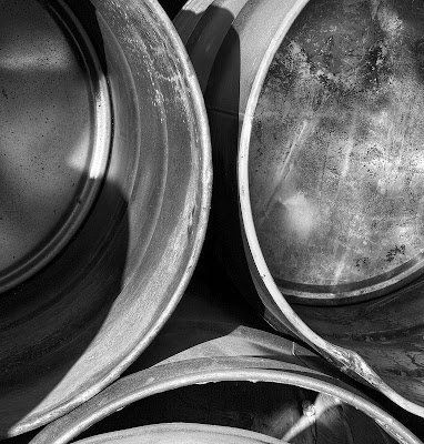
Oh, the image above is part of my drums series, three images differentially focussed and blended with Helicon Focus, converted to black and white in Photoshop (there wasn't a lot of colour to filter), and substantial dodging and burning. I used Akvis Enhancer on the image with considerable advantage.
Grain Bins
Thursday, January 18, 2007
Phot'Art Magazine
I think it was The Online Photographer who recommended Phot'Art Magazine. My first three issues have arrived and I am very impressed. Printed on heavy semi matte paper the printing is excellent. It's not up to the standard of Lenswork but few books never magazines are, but the colour work is superbly reproduced and the black and white is good. There are a variety of styles and categories of photographs from landscape to fashion, advertizing to flowers. The text is split English and French so you don't even have that issue.
So far they seem to be emphasizing a single country in each issue, China and Italy in the two I have looked at so far.
I think it's a really good idea to see how subjects are treated in other parts of the world and by different cultures.
In landscape photography there is a lot less emphasis on capturing every detail with a large format camera and more on the mood in which grain isn't a problem and can even be helpful.
Getting Past the Object
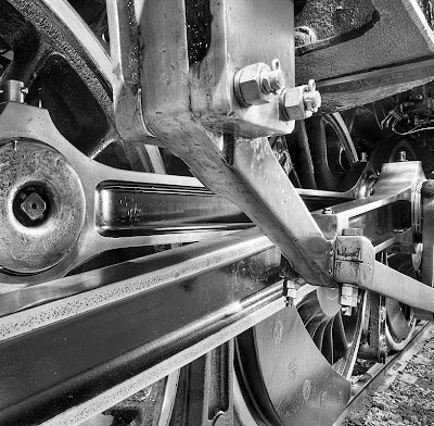
Some time ago I was photographing 2816, a steam engine, and the loved and polished locomotive had a wonderful sheen off of the drivers and other paraphenalia of the piston to wheels mechanisms. I took more than a dozen pictures and even picked a couple that looked nice to show. I have 'thumbed' through the image in Photoshop Bridge a number of times but this morning, instead of seeing pictures of 'drivers', I saw patterns and shapes and recognized that the centre of one of the images might work as an abstract.
I think this ability to see beyond the object and look at it in terms of shapes, shadows, lines, curves and edges is extremely important. Even when a photograph is quite literal - a picture of a mountain, for example, if you can see past the mountain and think of it in the above terms, composition is likely to be stronger.
Tuesday, January 16, 2007
Finding Your Level - Comments
I have been following the comments on the luminous landscape discussion forum following the publication of my article. Feedback on the forum has been mixed while private emails to me have been almost all fortunately positive (though only time will tell if I have actually been helpful).
I added the following comment of my own to the forum today and for those of you who haven't been following the forum, here's my two bits.
My Comment In Response to Hank writing about a 'Levels' workshop with Sam Abell:
Wow, I don't know which is worse, dealing with the occasional very negative comments about the article, or living up to the expectations of Hank based on his experience with the famous and skilled Sam Abell.
Still, I'm committed and the articles mostly written so I'll stumble on.
Articles on Luminous Landscape can be entertaining they can be informative, or they can be educational.
Informative articles if you already know the information are not likely to generate a whole lot of controversy even if they are a bit boring. Educational articles, on the other hand, quite reasonably risk not only NOT being helpful but criticised by those who feel this isn't the way to teach things, or who feel the person doing the teaching isn't competent to do so. Education involves strategies and quite reasonably we don't all agree on strategies.
What I think we do need to remember is that the skill set that people bring with them to Luminous Landscape varies hugely. There are people like some of those commenting above who bring many years of experience and skill to the website, but I suspect there are a lot more people who don't come with 20 or more years of experience, who have never sold a print or been published and who struggle with issues foreign or dimmly rememberd to the more experienced amongst us.
Fortunately positive feedback has far outweighed negative but lets face it, I presented a controversial idea, that there could be a better way to learn, that there might be a faster way, or heaven forbid a short cut. Time will tell if it really is useful.
The most negative comments have come from people who do fashion or sports and who see my levels as not applying to their kind of photography. As my own interests are not in sports and fashion, I dare say that to some degree they are right. Great sports shots are often not very sharp and yet large prints can be dramatic and powerful. Capturing the peak moment is far more important than perfect focus or tripod steadiness. That said though, the great sports shots are the ones which strongly convey a message, which make you feel the athlete's pain, their glory in victory, and so on. The sports photographers who use motion blurring with great skill are almost certain to have learned to hold a camera steady before they learned to move it with skill. A nude can be erotic or anatomical, so I think the levels I describe for the most part still apply, especially the aesthetic ones.
I remember some years ago attending a lecture on back pain and the ideas presented were absolute rubish and my blood pressure was steadily climbing as the talk proceded. I left cursing under my breath about wasting my time. Six months later though Things he'd said kept coming back to me and seemed to apply to situations my patients found them selves in. That information has been amongst the most useful continuing medical education I have ever experienced. A similar experience occured when I took a photograph appreciation course and found it boring and a waste of time. I have never looked at a photograph the same way since.
Whether my little contribution will be of that class is doubtful, but I can hope. Perhaps even my doubters will down the road find something that applies or is useful.
Balancing Work And Passion
A fairly common question I get, usually by other photographers, is how do you get so much done? They mean by this how do I balance my career as a physician, my family responsibilities and my photography. I'm hardly the most organized person in the world, rather the opposite I'm afraid, so that's definitely not the answer.
It's not that I have more free time than many of you, though to be fair my one daughter is grown up. I am in the office two nights a week, belong to a model railway group that meets one night a week and play doubles tennis one night a week. Just as well my wife works evenings.
If I get more done than some of you, it might be for one of the following reasons.
1) I don't watch any TV. We quite like watching movies, but otherwise the boob tube isn't a big factor.
2) Digital allows the use of short available time slots where the wet darkroom needed an entire evening or better yet an entire day free.
3) I spend very little time experimenting. Of course, going digital, I don't get side tracked by the newest film/developer combination. But also, I don't spend time testing out 4 different raw processors, 3 different techniques in Photoshop for editing an image, 5 different papers, etc. This saves untold time.
4) I use a Mac. It's far from perfect but has certainly proven to be more reliable than the PC's we use at the office and is less subject to the problems of OS updates that plague our office computers.
5) I know where I'm going. By this I mean that I have over time developed a style and each and every photograph isn't about reinventing the wheel. I risk spontaneity but I get more done. It's a delicate balance that so far seems to be working for me.
6) These days, most shoots I get something worthwhile. It may have little to do with what I went out to shoot, but compared to my old black and white only, 4X5 only days, the success rate is dramatically higher, the failure rate 1/3 of what it was. In the old days, I'd be lucky if one out of 4 shoots would produce a good image, now it's 3 out of 4. I suppose some of this is me getting better, but being able to shoot both black and white and colour more than doubles the success rate, something you might want to consider. With a greater choice of lenses shooting digitally (300 mm. equivalent on 4X5 is 900 mm. - a lens that is a yard long and almost impossible to keep steady for the typically long exposures in 4X5 - you need two tripods and accessory spars and no wind and...
7) I have been photographing for 40 years off and on and looking at good photographs though all of that time - practice does make you more efficient. While this may seem discouraging for someone who has been photographing for two years, the other way to look at it is that in only two years from now you will have doubled your experience. I can't say that. Besides, my progress in photography (as much as there has been), has been quite inconsistent, fits and starts, stalls and steps backwards. Someone new to the hobby would be well advised to do some reading to learn how to avoid these pitfalls.
Mind you - the model railway sits unworked on, the garden is getting the better of me, the house needs painted, and I have a very understanding and supportive spouse. Guess I'm just lucky I can spend the time doing what I love.
Sunday, January 14, 2007
Rock Details As Project
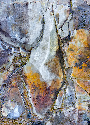
An interesting exercise is to photograph rock cuts - either natural or highway - whichever is available. In most parts of the world you can find somewhere where someone or something has cut or worn down the surface exposing rock. Quite often the rock is fascinating colours and interesting shapes. It's something I have been photographing for a while. You might want to consider it. There are no horizon lines to work round. You can photograph at many times of the day and in all sorts of weather. There are no obvious edges or other compositional markers so it's entirely up to you to use the rock to create a composition.
But Not All Photographs I Take Are At The Same Level
Mark added the following comment to my blog on rules which referred to my article on Taking Your Photography To The Next Level
I do think that even though someone may obtain a coveted '6F' level - they still must be humble enough to accept they will make many 1A images. Of course, they don't have to show those to anyone...
Mark raises a very important point. Clearly not all images from a given photographer are of the same quality - were that the case we wouldn't agonize over which images to show - whether to the neighbour or to the submissions jury. This raises questions about percentages and so on. Perhaps it might be better for the photographer to assess his level based on images shot in the last year. Since even Ansel talked about 12 good images a year, this ought to be sufficient. Yet, what about photographers who most of their lives produced fairly ordinary images yet over a lifetime produced perhaps a dozen wonderful images, icons of photography as I called them in the article. I think of Andre Kertesz. He was inconsistent, yet is deservedly famous for the selection of images which were magnificent.
In the end I don't think I have an easy answer to the concern. 6F photographers as Mark calls them will almost certainly produce some 1A's on a given shoot, but most of the time there are enough images from any one assignment to produce admirable if not wonderful images.
When I went through the process of selecting images for illustrating the article on levels, you wouldn't be surprised to find out that I eliminated the 1A's and in fact spent some considerable time and thought into picking which images were strongest and which I would be prepared to have say - these are my images, this is what I can do.
I have no intention of letting people wander through my files and contact sheets to look at the duds.
Lets say then that a photographer is going to judge his level on his best photographs and that it seems reasonable to assume that he ought to have around three dozen images from which to pick the best 10 to actually show and be judged on.
Totally arbitrary numbers, I know, and it doesn't take into consideration the number of years the photographer has been shooting - but if a photographer moves up a level because he has been shooting 40 years instead of 2, who's going to care - remember the exercise was not about labelling yourself. Rather it is about finding out what it takes to move to the next level, so I think it doesn't really matter in the end what method one uses to select the images, how many or from what period of time.
You could even 'process' yourself twice - once for your absoluely best ever images and another from your typical best from a single project over several shoots. You'd come up with different answers but you would learn what it takes to move up the majority of your images while also learning what it would take to make your absolute best images better - and it almost certainly isn't the same lesson.
Friday, January 12, 2007
Not Every Image Makes Sense
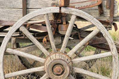
I like this image. I can't figure out why. It should be a cliche, it's very ordinary, the colours and tones don't glow, butI like the way the near wheel sweeps round and the far wheel curves the opposite way. I like the rusty fittings and that 'sawblade' adjuster thingy. The lighting is absolutely perfect - not dull and flat but not sunny either - must have been some thin cloud in the right place. It's a peaceful image but the equipment is interesting, there are some nice lines to it - note the spokes of the near wheel splaying one way, the far wheel the other. I like the back edge of the wagon ending just before the edge of the picture on the right.
I should be bothered by the asymetrical positioning of the wheel at the sides of the print but I'm not - I actually have other shots with the wheel centred or leaning to the other side, but this one worked for me.
This image also points out that you need to keep an open mind and open eyes. I went to the spot to photograph a canyon and this old farm equipment lying in a field caught my eye.
Thursday, January 11, 2007
From 2004 Algonquin Workshop

I'm as lazy as the next fellow, actually probably quite a bit lazier.
But:
Whem I'm on a workshop, I work - I photograph before the others get going and I'm out there after and when the rest huddle in the car because it's raining, I'm out there anyway. Workshops are too short to sit around complaining about the weather not being right.
On the Algonquin workshop, the above image was shot on the last day of the workshop. Two of us got up before sunrise and headed into town to photograph a waterfall. We were back in time and with a good appetite to join the others for breakfast.
Another day, we were in Algonquin itself and it was raining. Michael had already told us our cameras could handle the rain so why not get out there. I saw some lovely cliffs across a small lake and was the only one to get out and photograph it (5 images stitched for a rock face panorama with fall trees in the foreground). That one image has made me over $1000 in sales. Sure was worth getting wet for.
Fred Picker once said that you could count on the best image coming from the most uncomfortable position - wet - cold - sore - cramped - or if you were really lucky, all of them at once.
Ask yourself how much effort you put into your photographs? Are you up before dawn, in the right place before the light is right. Do you take the shot but check around to see if there is an even better one?
Rules
Robert commented on my article at Luminous Landscape to the effect that he is uncomfortable with dealing with aesthetic level definitions, fearing, I think; anything which would force people into a standard set of rules for creating good photographs.
This is a very good point. If we define levels by rules, to some extent we are doing just what he fears. I was careful in defining the aesthetic levels (his biggest concern) to describe them in ways that have to do with getting the message across, emotional impact and clarity of vision, hardly rules. On the other hand, if I say that an image should be strongly composed, am I not implying that the image follow the 'usual advice' about lines to corners, rule of thirds, etc. etc.?
There are two points I would like to make.
Firstly, being strongly composed is a goal rather than a rule. It might be my goal to drive safely, but a speed limit is a rule. There are times when many would consider it safe to drive over the speed limit (if they could get away with it) but other times when even doing the speed limit is clearly unsafe. 'divide the picture into thirds' is a rule. It may or may not result in a strongly composed image. Even if it were a really good rule/guideline/suggestion, to apply it 100% of the time would be incredibly boring.
The second point is that many great artists deliberately flaunt previous 'rules' of good art, it is my strong impression that the vast majority of them learned to work within the rules before moving on to break them. One has only to look at the paintings of Picasso and then look at his drawings to realize that he had great skills in traditional methods/rules/techniques/styles before moving on to create new styles.
If you are to design a better toilet seat, it helps if you have been constipated a few times in your life and have a working familiarity with the standard model.
Thus, I don't think that it does any harm to describe aesthetic or technical levels, nor does it force one to conform.
If it helps, think of it this way. I indicated that to move from level one to two, one would need to be able to get sharp pictures. This doesn't mean they have to be sharp =- there may be a perfectly valid reason for unsharpness, but one should at least be capable of creating sharp pictures when needed, most of the time.
I think there are alltogether too many 'artists' who couldn't produce a sharp picture for 'love or money' and who don't know when its useful to have a sharp image and when it's not.
Some new art stands the test of time and these artists are recognized later as leaders and innovators. Other new art is still junk many years later (if you can even find it). I suspect that the former group of artists learned the rules and acquired the skills before going on to break them creatively. I'm not convinced many of the latter group were so dilligent.
Alternate Reality - The Real Cabbage
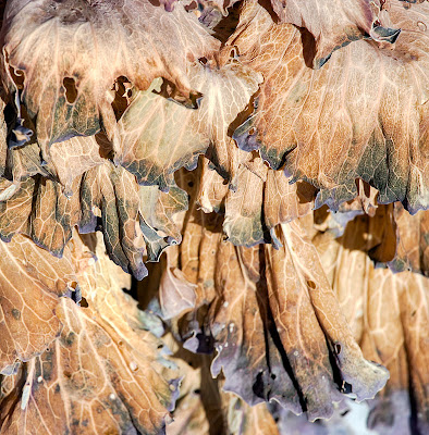
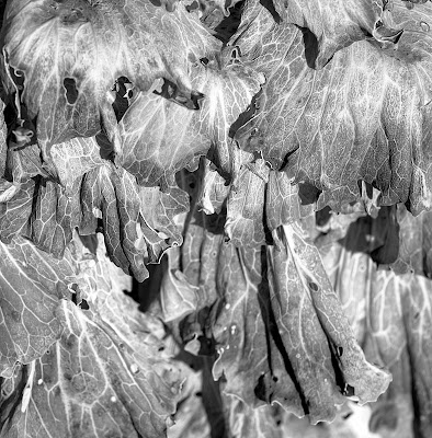
The first image represesnts the 'straight' colour image of the frozen ornamental cabbage, the second a black and white conversion, and the previous post the 'colourized' version in which I manipulated the curve to have several peaks and valleys to generate the odd coloured result.
I leave it to you to decide which version (if any) you prefer.
Wednesday, January 10, 2007
Is It Legitimate?
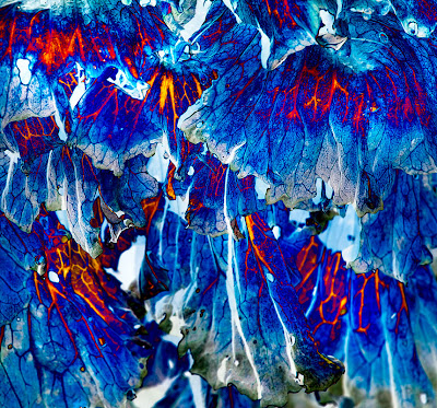
So what happens if you bring an image into Photoshop and manipulate it beyond reason, but like the result. It isn't really a photograph, so what do you call it, do with it, and do you call it art?
The photograph is of frost damaged ornamental cabbage, I happened to like the pattern, and while adjusting the curves, started doing odd things with sinusoidal waves type curves.
Barrels, Barrels, and More Barrels
Humble Beginnings
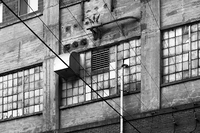
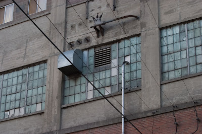
This is an image which attracted me enough to shoot it, but was so boring in the thumbnails I didn't do anything with it for a considerable time. Eventually though, during a quiet moment and looking for some possible images, I decided to see what would happen once I corrected perspective and converted to black and white.
There are two lessons here - sometimes our instinct for a photograph was right, it's just that the image needs so much work the proof just doesn't show it. If shooting only a few images, you are likely to remember this was one worth working on. If on the other hand, as so many of us do when shooting digital, you shoot lots of pictures, the odds of remembering this was a goody are slim to none.
The second lesson is that images which look awful in colour can look really good in black and white. Not only do clashing colours (the red brick and green windows) not interfere in black and white, there isn't the same ties to reality which prevent ramping up the contrast and creating texture where little was seen in the original file. Once manipulated, those windows glow. This image was one selected for Lenswork.
Raw Rebar
Monday, January 08, 2007
Article On Luminous Landscape
The first in a series of three articles on assessing your own level of skill, both technically and aesthetically is now at Luminous Landscape.
Article one discusses some fairly arbitrary levels of skill I came up with which none the less will I think give you a useful idea of how you are doing.
Since personal bias is an issue, article two goes on to talk about how you might go about getting some help assessing your level.
Since it's of only minor help to know where you are at, if you can't figure out where to go and how to get there, article three discusses some ideas of what to do with the information gathered in parts one and two, hopefully leading to more rapid improvement in your images.
All three are written though the third article needs significant polishing and I don't know what Michael's schedule is for printing the others (he doesn't even have them yet so I'm guessing not until he's back).
Sunday, January 07, 2007
Bottom Of The Barrell II
Saturday, January 06, 2007
Scouting Expeditions
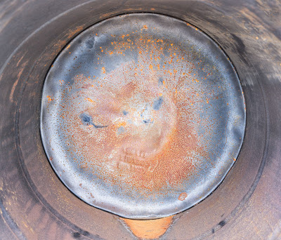
To make the above image, I first visited the site on New Years Day and shot the rebar shot posted some days ago, through the fence. I then went back yesterday and got permission to return today to photograph. I received a tour round the plant and my guide very patiently let me photograph in the cold wind. I came home, loaded the images and realized that some drums were the most interesting thing and that I should move in close. I therefore returned a fourth time this afternoon to do the close images. This is 3 images from my 90 ts-e.
Friday, January 05, 2007
Storage Bins
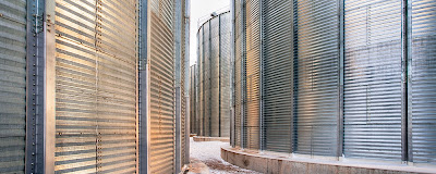
17 mm. from my 17-40, perspective and barrel distortion corrected in filters/distort/lens correction in Photoshop. Rather than warming the whole image, I used selective colour in the layers pallete and then the yellows and increased the magenta of them, thus warming the already warm parts of the image without messing with everything else. Sometimes this works better than hue/saturation even when adjusting the individual colours.
I also used Akvis Enhancer. I always sharpen the image before enhancing - sharpening an enhanced image produces some pretty wild artifacts though to be fair, they are only visible on screen and in really large prints - but you never know how large you might some day make the image.
Grain Processing Plant
More on Cropping
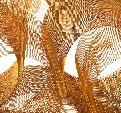
Steve Durbin has sugggested some minor (but significant) further cropping to my image of the previous post. I have posted his version above. I like it very much. I think it does three things to the image. First it eliminates those distracting background elements in the upper left corner which I have been staring at in the print I made and even wondering if I could clone them out (I think he has the better idea). Second, the way he crops the upper left corner means one of the curves comes nicely into the corner. Third, although potentially interesting, the 'lenses' (thanks Steve) in the middle top don't in fact add to the composition and I have failed to take my own advice of a previous post about eliminating everything no matter how interesting if it doesn't actually add to the image.
On the bottom, the change is more subtle but there too perhaps the new version is a little cleaner, not quite so heavy, showing that little 'tuft' of wire in the far left bottom corner to better advantage. Conceivably we could take even more off the bottom to make the curves meet the two bottom corners, but for now I think that wouldn't be a good idea. I think it's good to have some lines go to the corner but one can get a bit carried away with the idea. When two lines head for a corner, it's often better to have the two lines bracket the corner rather than have one hit it and the other miss. That way the 'material' between the two lines is what actually reaches into the corner.
This re-cropping speaks to the need to consider images a work in progress and it's worth reviewing whether in fact you have done the absolute best you can and consider other possibilities. This could be a recropping, but it might be a completely different look to the image, much darker or lighter, or it might be an adjustment to the colour balance (warmer, cooler) or to the saturation. It could even be a reconsideration that the image is better in black and white, or in colour. It's not a bad idea to go back to the original raw file or the negative and start completely over rather than further modifying the present version. Perhaps the new one won't be better but if so nothing is lost, and just maybe it will be a lot better.
There's nothing written to say that first ideas are necessarily best. Sometimes they are and everything else subsequently just weakens the image but other times...
Thanks for your input Steve, not only does it make the image stronger, it strengthens the blog to have insightful feedback and suggestions.
Thursday, January 04, 2007
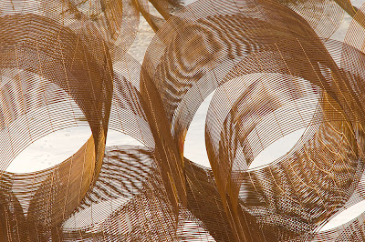
Exercise in Cropping
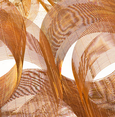
The image above is my interpretation but in doing the cropping I also realized that there were a number of ways this abstract image could be cropped. For example, I cut off the white elipses (are they elipses when they have pointed ends?) and it would seem to fit the rules of composition if I had cropped right at the point of the elipse. I didn't because I prefer it this way. How would you crop this image?
The original image is below.
By the way, this is the first ever image from my 300 mm. plus 1.4 ex. that I have actually used and I have been carrying the lenses for almost a year now.
Wednesday, January 03, 2007
The Interest Comes First
I wrote yesterday about not being stuck with preconceived ideas of what to shoot, for fear of missing something new and possibly better. I want to take that thought a bit further and say that I think that 'trying hard' is probably the worst thing you can do as a photographer. I don't mean not being careful, I mean that the harder I look for a good photograph the less likely it is that I will find one.
This of course leaves us with 'so how the hell to I take good photographs if I'm not allowed to go looking for one?'
What if instead of hunting for great images, you were to go out looking for things that interest you. I didn't look for an interesting image in my bedroom, I simply observed that the shorts hanging up made an interesting pattern and I THEN wondered if it might make an interesting photograph despite being such an ordinary subject. The point is THE INTEREST COMES FIRST.
When I photographed ADM Flour Mill, the interesting patterns made by the cracks in the concrete cought my interest and then the question was asked, could that make an interesting photograph.
Imagine your English prof assigning an essay on a particular topic about which you have absolutely no interest. It's possible to do the assignment, but the chances of creating a work of art in the essay has to be considered slim at best. On the other hand, if it is a subject about which you feel very strongly, you might well write an essay, whether anyone asks you to or not, whether anyone is going to give you credit or pay you for it or not.
Mind you, you could easily argue that unless I'm pretty odd (entirely possible), I didn't have an interest in underwear (mine at least, other than to find a clean pair), then the interest can't have preceded the photograph. But even with underwear, it was a simple observation tha clothes dumped randomly on the floor or casually hung up made interesting patterns. I looked at those patterns for a few years before deciding to photograph them.
On the weekend when I photographed the wire forms, it was the way stacks of them formed interesting patterns that interested me - I have no interest in wire forms per-se. Hell, I don't even know if Edward Weston ate peppers!
I guess what I'm trying to say is that the interest usually precedes the finding the photograph and that what we should be looking for is not the photographable but the interesting, and I don't think that's the same thing at all.
Tuesday, January 02, 2007
More On 'Cruzin Fer Snaps'
Perhaps it's just me but sometimes I don't go out photographing because I'm convinced I won't find any good images. Of course this is self defeating as the one sure way not to get any good images is to not take any. One of the ways to anticipate failure is to go looking for images that are similar to those you have already shot, only different, and while you are at it, better.
this preconceived idea of what successful images look like completely blinds us to all the wonderful images which are completely different and are just waiting to be taken. That's not to discourage assignments, only that having chosen an assignment, you should be open to whatever comes along. Do you really think that Edward Weston was on an assignment to photograph dead birds when he came across his Pelican, that Ansel was on a trip to photograph grave yards when he shot 'Moonrise over Hernandez'. Of course not, they were open to whatever subject matter came up. They didn't let preconceived ideas limit their options. No wonder they took great photographs.
When I went out shooting yesterday, I stopped at an industrial site, dirty, rusty, old, but what I ended up photographing was new rebar, with brightly painted ends, and labels, I had absolutely no conception that I would find this. Later in the day, I simply happened on a hill overlooking a large yard full of concrete piping. I realized that this was a location I could photograph into the yard without the trees and fence getting in the way. The picture I got though didn't feature the concrete at all, it was after trying to find an image amongst the stacked concrete that I started wandering down the road and discovered all the wire forms stacked up, and got excited, and spent a wonderful hour excitedly creating images.
I think the message here is to not be afraid to go out photographing no matter how unlikely you think the chances of an interesting image. If you look, you will find. Maybe not every time, but more often than not.
Monday, January 01, 2007
Manipulating Reality - Say Yes!
Just read the Alain Briot essay on Luminous Landscape about the issue of answering the question 'is it real or is it manipulated?'. I had previously discussed my dealing with this question and I find Alain's solution makes perfect sense. I too tried 'explaining' and absolutely, it's a slippery slope down which you don't want to be going. His solution to simply and proudly say Yes!, I do manipulate the colours makes perfect sense to me. Besides, these were never customers in the first place - if you define customer as someone who has even a remote chance of buying a print.
Well said, Alain.
Well said, Alain.
Rebar
Wire Forms
Subscribe to:
Posts (Atom)


