Friday, February 16, 2007

It Takes Time


The image above is from our holiday last Fall. It's not that I haven't looked at this image before, it just never quite caught my attention. It seemed cluttered and the colour didn't quite work - green water to the left and an odd green tinge to some of the rocks, but not a complementary green...

Last night I decided to work with the image as far as I could take it in colour, but with the idea that I'd almost certainly switch to black and white - can't really tell you why I didn't just go to black and white first, it makes more sense, but I guess I wanted to see if the colour could be made to work - it couldn't.

In black and white and much darker than as shot, I quite like it and feel that the clutter is starting to hang together, enough to make the photograph interesting rather than cluttered (my opinion, obviously). Haven't printed it yet, but think that I might just be able to get some lovely tones out of those rocks part in shade.

Thursday, February 15, 2007

Autofocus?

I remember the days when we scoffed at the idea of auto focus - how could a machine possibly focus more accurately than the human eye, etc., etc.. Well, we've had to retract those ideas a long time since but it doesn't hurt to discuss the uses of auto focus. In my 1Ds2 auto focus is more accurate than my focusing, it's also a hell of a lot faster. I can't comment on it's follow focus abilities since I don't tend to do that kind of work but understand that it's pretty good.

That being the case, how come most of my lenses spend most of their time on manual focus, and does that mean the auto focus feature is a waste of time?

The problem for me with auto focus is I don't know for sure where it's focusing - sure I know which little focus rectangle lit up, but was it focusing on the branch in front or the one in back. My preferred use of auto focus is focus confirmation - ie. I turn off auto-focus on the lens, focus manually and usually but not always use the focus confirmation feature (in my camera the focus rectangle lights up) to confirm that I got the focus right. I may well move the camera so that it's clear what I'm focusing on. Occasionally I will use auto-focus when I can't see well enough - this is particularly true of wide angle f4 lenses. Sometimes I will auto focus, switch to manual move the camera and then take the picture (the half press of the shutter idea not working when I use a cable release).

Where I am relying on depth of field to cover a near far situation, the traditional rule of thumb is to focus 1/3 of the way from near to far to split the depth of field equally. As this happens to correspond to the centre of the image, if the near and far limits are equidistant from the edges of the image, then I just frame and focus. If not, then I aim for focus, switch to manual, and move the camera to the final framing.

How Long And Narrow Can A Print Be?


Panoramic images are getting quite popular. The Linhof and Fuji 6X17 cameras, banquet large format cameras of 5X12, 7X17 and 8X20 are seeing a return to favour, and those of us stitching digital images can make images of any ratio we care to.

So, if long and narrow is good (and I think it's easy to prove that it can be), just how wide and narrow can one go? You could simply go with what you like, but that avoids the question of whether your viewers are likely to appreciate what you're doing.

During my two years selling prints at the local farmers market I was surprised at how popular panoramic images were. My Columbia Ice Fields image which is an 8 image stitch is particularly popular and the bottom line is people often ask for panoramas to decorate long walls - they'd rather have a single large image over the bed or the sofa than say a series of three. On a practical level, 4:1 is about as long as works in decorating and 3:1 is more popular.
I'd leave longer pans for special circumstances.

Tuesday, February 13, 2007

Jura Canyon Blend


The image above is made up of a total of 20 images. The left hand wall required 11 images blended in Helicon Focus to cope with the huge depth of field requirement while other parts of the image took fewer. The image is stitched from the output of 5 different blends. The images didn't line up properly in photoshop but were close enough that with adjusting the seams between images, the flaws were hidden. This would not have been possible had this been a less homogenious subject. It might have been possible to use PTGui or even to resize the individual images to better blend them, but it worked this way.

Grump About Camera Bags

When I shot 4X5 I had an ideal camera bag - it cost about $30, held my lenses underneath my camera, was backpackable but stood upright without risk of falling over, hell it even had wheels to roll it if I wanted. It had a pocket for 12 holders of unexposed, likewise for exposed and sev. other pockets for filters, cables, cleaning equipment etc. it was purchased in a discount luggage store. It was so good I bought a second one to replace the first when it wore out - one zip has gone a bit iffy but otherwise it's fine. I had to modify it by putting feet on it (wooden, screwed into roller support and that's what made it stable even on a 30 degree slope.

Now I'm shooting with a DSLR and so I followed the crowd and purchased a Lowepro bag. It gets dirty every time I put it down, and the bit that gets dirty is the part that then rubs up against me - ie. the back and the straps. It can't reliably sit upright. It can't be picked up safely without zipping it up all the way - I lost a lens learning that one. When my very heavy 1Ds2 sits on the top of the bag, it worms it's way downwards because the foam and velcro holders only work when the bag is completely full of equipment. That means you can't leave enough space for a long lens on the body. Larger lenses like my 24-70 are too fat to fit the length of dividers supplied and getting stuff out of the bottom involves undoing two zips and laying out the case, now getting another surface wet or dirty or both.

At 25+ lb. only a backpack makes sense but does anyone else have the same complaints, or more importantly does anyone have a solution?

Monday, February 12, 2007

The Edges Of An Image

Traditional (and even some current) photography books recommend using the edges of the image to frame the picture. They suggest overhanging branches or trees on either side.

In general, I hate overhanging branches used as a frame, particularly when they don't have a trunk in the image from which to sprout.

But that leaves us with the question of what good are the edges of the image. Do they only serve to give the subject some space, or to keep your eye from wandering off to the right and out of the picture (another traditional piece of advice)?

What if instead we considered the edges of the image - that last inch or so of the print as being every bit as important as the centre of interest (which usually but not always is away from the centre)?

Strong composition demands good use of all the real estate of the image.

Let's take the example of a long lens image of a rugby tackle - with a long lens, only the ball and the fingers of the tackler digging into the thigh of the runner with the ball are sharp, the background completely blurred.

The lines that show, all be it blurred, are part of the composition and either form interesting shapes or help emphasize the ball and the hand, or they don't. If the left edge of the image is sharp while the right is blurred, there is a sense of imbalance, not to say distraction. The blurred background could be grass or the rest of the team roaring up, but ideally it contributes to the picture. Odds are that if the tackle happened on the side lines right in front of the photographer who happened to have a 28 mm. lens on one body, the photograph wouldn't be as powerful as if shot in the distance with the isolating power of the long lens.

Lines can run parallel to the edge of the image, resulting in stability, or they can angle ever so slightly and introduce tension. Lines can cross the edge or radiate from a corner. Shapes which can be real or simply of similar tones, or they can be shadows, or just large blurred areas. the edge of the shadow can just reach the edge of the print, or almost reach it or go a bit past it or can appear to be still expanding at the edge of the print - each gives a different feeling.

An edge can give the feeling that something is continuing, or it can give you the sense that you are missing something important beyond the edge - the latter being generally undesireable. A shape that is still expanding implies there may be more, one that is already contracting at the edge isn't likely to give that feeling.

Don't forget the space between shapes - that too is a shape and can be important.

The edges of the image can be light or dark but take into consideration the viewing circumstances - if the image has to be mounted on white board - say for an upcoming show - a lot of white at the edges can be a problem. Consider changing the background colours on screen in Photoshop to test various situations. Try printing the image with a large white border and see how it looks.

Fred Picker used to recommend burning in the eges of the print as a matter of routine. While some of this had to do with light falloff in the enlarger, he was also aware that strengthening the edges helped focus the eyes within the image. An area which you might want just barely off white in the middle of the image, may be better burned down a bit at the edges even if it's the same subjet material (though remember to be subtle here).

Bottom line is make your edges earn their keep.

Sunday, February 11, 2007

Wither Black and White Or Colour?


Chuck, in an attempt to distract me from photographing any more underwear, has asked about how I decide whether to make an image colour or black and white.

Sometimes subtle tonal gradations call out for black and white and quite early I'll convert the image and see how it works. Other times, the colours clearly don't work together and the only hope for the image is in black and white - whether I realized that at the time of shooting or not.

I have to say that I'm glad we don't have to choose at the time of shooting, more than once I have planned wrongly - subtle colours were worth preserving when I thought the image only suitable for black and white, or the reverse.

Sometimes I'm well into the process of editing the image before I decide I'd like to look at it in black and white.

So: here's the list of decisions


1) if the image is part of a series, then I continue with colour or black and white as was started.

2) if the subject matter (as opposed to the colours) strongly suggests one medium over the other, then...

3) Sometimes I know which i want when I aim the camera.

4) Often but not always I will try the image both ways and see which works better, and

5) Occasionally I can't make up my mind and I keep the image both ways.

Friday, February 09, 2007

Inferno


This is a different picture of the same trunk that supplied the black and white image of the other day. This too is a crop.

Another point to be considered in cropping is that with a 35 mm. slr view finder, exact cropping is difficult - even with a view finder as accurate as the one on the 1Ds2 - giving yourself just a little room will slightly reduce maximum print size, ever so slightly over cropping in camera can ruin a picture. Mind you, we're talking an extra 2% around the image just to be safe, not 30%.

Workflow

Chuck asked about my workflow, having commented on my 'wood abstract' image. For a detailed discussion I refer you to the four articles I wrote for Outback Photo.

More particularly, Chuck is right, this image was not only cropped, it was rotated 90 degrees which doesn't often happen. the sequence was:

- camera raw 1 size up output to photoshop - 16 bit of course
- tried various crops - the whole image was of a tree trunk and included air space on either side but I wanted to concentrate on the weathering patterns. I ended up with a tall skinny crop and thought it would look better on it's side, subject to odd shadows not being a problem - there weren't any
- some increase in contrast and darkening in the light area to the left
- cloning out a dark branch that cut across the lower left corner
- Akvis Enhancer (full strength for a change)
- smart sharpen
- general tonal adjustments
- conversion to black and white using Russell Brown technique of two hue adjustment layers, the lower one set to colour and the hue slider used to 'filter' the black and white image to taste
- further contrast and tonal adjustments both globally and locally once it was in black and white to suit.

I don't think this is a particularly strong image and I doubt I'll ever get round to printing it - I confess I was scrounging old files for something to show that hadn't been displayed before. That said, the workflow is fairly typical. I try to remember to smart sharpen first before doing the akvis enhancing - but I forgot in this case and it didn't seem to matter - sometimes the changes akvis creates to increase local contrast, when sharpened, go really wild but I got away with it in this image.

Finding Inspiration

The standard advice is to photograph what you are interested in, but what if what you are interested in is the process of taking photographs? It's all very well if you are a hiker and Sierra Club member, but what about the guy or gal who just likes mucking about with cameras? The general advice is that unless you get really emotional about a subject, then you aren't going to produce great art.

Even my own articles on Luminous Landscape (first one published, next two to come) suggest that you have to be excited about the subject matter, that if you have no emotional response to the subject, how can anyone else have an emotional response to your photograph.

Can, for example, someone who thinks football is boring, somehow still take a great football picture? Can a photographer who is assigned to photograph a boxing match and who is disgusted by the whole thing still manage to make a photograph which shows the excitement of the sport?

Was Edward Weston obsessed with dead pelicans? I doubt it. What Edward Weston was excited about was shapes, curves, tones. He didn't care a whit where he found shapes that excited him - whether a pepper in a funnel or a toilet, it didn't matter as long as it had the 'light'.

I think that if you get excited about finding something interesting to photograph, you don't need to be involved with the thing itself, only with it's possibilities as subject matter.

If we take the same argument to the world of painting, was Rembrand't obsessed with rich burghers of Ghent, or was he obsessed with light and composition and conveying expressions?

Was Andy Worhol obsessed with Campbell's Tomato soup - probably not.

I like photographing weathered industrial subjects. I'm not an engineer, I don't tinker with old cars, my back garden isn't littered with odd bits of machinery. I like old machinery because it photographs well, not because of some obsession about the past. I'm happy to photograph modern structures if they have the right tones and textures - eg. my parking garage series. I do park but I'm not obsessed with parking structures.

Thursday, February 08, 2007

Matte Or Semi-Gloss

Photographers seem to divide into two camps on this issue and often feel very strongly about their choices. With semi gloss previously being plastic and usually quite thin and not having a printer which did a good job with semi gloss anyway, I had no interest in anything but matte images - I used a variety of art papers before settling on Moab Entrada bright white, quite happily.

All the comments about deep deep blacks and papers looking similar to glossy dried matte silver prints, my interest was piqued again. A recent purchase of the Canon iPF5000 gave me the opportunity to try things both ways.

It's early days but here's my impressions:

If I get to hold the print in my hands, I like the semi gloss look of Hahnemuhle Pearl and Crane Museo Silver Rag. My latest box of Silver Rag has none of the water spots that had shown up on two boxes of 8.5X11 paper.

Pinned up on the wall, where I can't move the print around, the surface is almost irrelevent, and I'm pretty darn sure that once behind glass, completely irrelevent. I needed a new printer anyway, and I'm glad I have the choice and can painlessly switch back and forth, but really, the traditional art matte papers are pretty darn fine.

If your printer can't do semi gloss, I'd not lose a lot of sleep over it. I am glad that the new papers are much more substantial than Epson premium semi gloss and premium lustre which in larger sizes are far too delicate - handling a 4 foot wide print in these papers is just plain painful.

Wood Abstract

Abstract In Steel - Exercise In Cropping


It took several attempts at cropping this image before I came up with something I liked, and definitely it involved throwing out parts of the image which were important but which were compromised by other issues. I would have liked to maintain that corner of the light in the upper right but the chain link fence background just doesn't work. I have even tried photoshopping it out and it's ok but not perfect. The rock in the bottom left is distracting and that could easily be removed in Photoshop but still leaves too much dirt in the bottom left corner.

Many if not most photographs involve this kind of compromise. Sometimes it works and other times... You can decide if it worked here.

Wednesday, February 07, 2007

Limits Have Their Uses

While I recently argued that restricting your aspect ratio to the one supplied by the viewfinder or ground glass is limiting and that images which would be best served in alternate aspect ratios are being missed, yz made the point that training yourself to use the full image size is good training. I absolutely agree. Further, other limits can be a good idea too - deciding that today you are only going to use a 'normal' lens or only going to take close ups or only work with your wide angle are all potentially useful exercises. First learn to fill the frame, then learn to trim two edges as needed. Works for me.

Are You Lazy?

I am, so this is not meant as criticism, but sometimes we get lazy photographically and it doesn't hurt to double check for less than ideal habits. So, ask yourself the following questions:

1) do you get up early enough to catch the best light

2) do you use a tripod when appropriate?

3) what about cable release and or mirror lockup?

4) do you stitch when you can?

5) do you use the best camera for the job or make compromises for covenience? (within your budget)

6) do you shoot raw?

7) do you back up all shoots within 24 hours?

8) do you have a labelling/filing system that lets you painlessly find images several years and thousands of images later?

9) do you profile your monitor? Regularly?

10) do you update the images and information on your website regularly?

Hmmn, I didn't do very well, whose idea was it come up with this list anyway?

Tuesday, February 06, 2007

Insisting On Using All Of The Image

The opposite of cropping is the person who always insists on using the full film/sensor size in both dimensions so that they don't throw away any film or pixels. For example, if they shoot 35 mm. all images are either 3X2 or 2X3. If they shoot panoramic, say with a 7X17 camera, then no image is 5X17 or 7X13.

If we assume that there are a limited number of great images to be obtained from any one scene, even if those great shot were equally distributed amongst the various image ratios from square to panoramic, the number of shots which perfectly fit the format the photographer is using has to be severely limited.

In fact, framing is a function of the elements of the scene and there's no promise that there's even a single great image in exactly one particular format. A scene may look terrific in panoramic format but completely unworkable in square format.

The alternative argument is that there are an infinite number of great photographs from any given scene. My own experience working scenes is that this is pretty unlikely. On the contrary, often there is only one way to photograph a scene that works and every other image isn't as good. Look at the contact sheets of master photographers and it's amazing how poor all the other images are compared to the one classic image. No, I can't see there being an infinite number. There may be a dozen different ways to frame a scene which results in a great image, but hundreds, thousands, millions, I don't think so.

So, there's not an infinite number and no guarantee that any of the great images suit the format the photographer is using. It is therefore logical to conclude that a photographer who insists in using his full frame at all times is dramatically limiting the possible number of great photographs he can take, or he's compromising on composition and framing to justify his format.

Some photographers who shoot full frame do so because they are making contact prints and anything less than full frame results in an unacceptably small image, not to mention cropping difficulties. Others are not using enough film or pixels and can't afford to lose any.

Some of these photographers however argue that either it's too complicated having an infinite range of possible aspect ratios with which to compose, or they need the edges of the view finder or ground glass to compose, or they like the discipline of limiting themselves to one format, possibly even to one or two lenses.

There's no doubt that it does simplify things, but frankly I find that it's hard enough to find good images out there without severely limiting myself to only one aspect ratio/format or to a single focal length lens.

Now this doesn't apply to people who are creating their images in a studio in which they can make things fit, but I'm talking about where we can't move that tree over, we can't rerun the football play with the quarterback just a little to the left.

I think the cost of simplifying one's photography this way is just too much.

On Keeping A Filter On Your Lenses

Photographers seem split on the merits of a UV filter as a permanent feature of their lenses, some decrying the decrease in quality and increase in flare generated by an extra piece of glass in front of the lens, while others worry about damaging the glass of their expensive lens.

Here's my observations on the issue.

1) if you can't afford to replace your lens if it gets a major scratch or buff, then it probably makes sense to use a filter to protect it.

2) the quality reduction by using a filter is unnoticeable 99% of the time (and could be removed that one time when photographing into the sun where flare is an issue).

3) some lenses need protection more than others. Not only is my 70-200 f2.8 IS worth more than two grand, it's front element is large and right there. Occasionally a lens cap falls off inside the camera case and there's a risk of it rubbing on the glass while you walk - not a good feeling.

4) other lenses are quite recessed - my 90 ts-e and my 50 macro are like that and I don't bother with filters.

5) some lenses don't respond well to filtering - eg. extreme wide angle lenses - eg. my 17-40 on a full frame camera already shows spots in the image from every piece of dirt on the front element - glass in front of that doesn't make sense - so I don't protect that lens.

6) lenses that are dropped have a bad habit of falling front element forward and the number of people who have protected their lens by letting a 'cheap' filter take the brunt of the damage is not insignificant - this is a common occurrence.

7) minor scratches to a lens usually don't affect image quality but can do so against the light - not something I often do other than can be shaded since it is outside the image, but if you not uncommonly shoot into the light, it's an issue.

8) lenses with even a small scratch are almost impossible to sell even though it isn't all that likely to affect the picture quality - though now that I have a system I'm comfortable with, that doesn't happen often. Still, a UV filter would ensure that the lens is in pristine condition for selling purposes.

9) UV filters are getting darn expensive - the 77 mm. filters for my 70-200 and 24-70 were over $100 each - but still well less than 10% of the cost of the lenses.

So:

I'd not generally bother protecting any lens significantly under $1000 in cost. I'd not protect any super wide lens. For the rest, it's a personal decision.

Sunday, February 04, 2007

More From The Floor

Jeans


It's been a few weeks and I wasn't consciously looking for patterns but these jeans were dumped on the bathroom floor and while sitting on the throne...

Anyway, I grabbed the camera, shot one image, then picked up the jeans and happened to lay them down in this shape, not at all what I had intended, but I really liked it. A minor movement without disturbing the folds eliminated the grout between floor tiles and I had my shot. As it happens I had to stand on the toilet so I could get the right composition with my 90 mm. lens.

Saturday, February 03, 2007

Standing In The Kitchen, Looking Out...


My wife has already nixed this image, but I like it. It certainly breaks compositional rules, dividing the image in half as it does and centreing the main interest horizontally as well. As I only shot it 30 minutes ago, there's a real risk I'll decide in the next day or so that it's complete crap, but for now I like it and thought I'd share it.

Examples Of Cropping


I thought I'd go through my files and show some examples of the various types of cropping. It wasn't easy - I had to go through a lot of images to find relatively few examples of cropping. Partly this is because I frequently stitch images and in that situation, I simply shoot enough images to create whatever aspect ratio I want - two images with about 35% overlap results in a square image, four images means recreating the 2:3 ratio of standard 35 mm. and more can create various versions of panoramic images.

Here's some examples of fairly typical grounds for cropping - losing either height or width but not both to improve composition, shooting animals in which precise framing can be problematic, using the longest lens I own so further cropping in camera isn't possible, and the occasional image which is just plain better with a bit of trimming that could have been done in camera but wasn't.

Cropping 2 - Reframing After The Fact

In order to discuss cropping, we need to define what we mean - ignoring incamera cropping and concentrating on 'post processing', one can crop vertically or horizontally to change the aspect ratio of the image, or one can crop both height and width to esssentially 'reframe' the shot.

I'd like to discuss this latter. The obvious retort is that any time you crop both hieght and width, it means you screwed up in the camera. That's true in the strictest sense, but there are times when it is justified.

The decision on how to crop an image is not trivial - all you have to do is put up a picture and ask for cropping suggestions and you end up with all sorts of ideas. I can spend 30 minutes working out the best way to crop an image - trying various crops in Photoshop, only to come back the next day and change my mind - not all good images have obvious borders and there are compromises and choices - emphasize this at the cost of that, etc.

I can sometimes take that long to decide on framing in the field - I certainly did in the days of 4X5. Nowadays, with digital, I simply shoot more than one image to give myself a choice later.

But what about when there isn't time to take even 1 minute to decide on framing/cropping? Even in landscape work that isn't uncommon - with the right light being fleeting, or the wind coming up again, or the sun going down, or whatever. Photographing animals and people, or even vehicles, you may simply be lucky to get the shot at all, never mind fussing about exact framing.

Another issue is that cropping sometimes needs to be extremely precise - even 1/16 inch / 1 mm. can make a difference along an edge. Another scenario is where you are corrrecting perspective distortion (falling backwards buildings and trees) and it's not clear exactly where the boundaries are going to be after correction. Rangefinder cameras are notoriously imprecise in framing and less expensive SLR's have viewfinders which don't show the whole image and so those images often need cropping.

So, I would argue that reframing (cropping both the vertical and horizontal edges of the image) is not only common, it's frequently justified.

But what if it isn't. What if the photographer got a little careless in the shoot - but later under the enlarger or on screen, he sees that an image which in whole is poor, when cropped radically becomes wonderful - it does happen. Are we to throw out such images because the photographer broke a rule? Of course not. So what are the consequences - well, the obvious one is that since the photographer is now relying on a smaller piece of film or fewer pixels, he simply may not be able to make such big prints. This isn't exactly a crime. Sure we all like to see just how big we can make images, but a 5X5 image in the centre of an 8.5X11 sheet of paper can be easily held and admired and may be exquisite.

I suspect that all of us have taken a mediocre image and tried to improve it with cropping, getting smaller and smaller and never finding a strong image - each time you remove a distracting element, you also throw out something worth while and the end result is no picture worth having at any crop. But just because it doesn't work most of the time, doesn't mean we should sneer when occasionally it does. In this case, 'the end justifies the scissors'.

Friday, February 02, 2007

On Cropping

There's an interesting, and controversial discussion on cropping over at Luminous Landscapein which Michael wrote an article basically shaking his head at the oddity of people who don't crop, or even worse, who always crop to fit standard paper sizes. Uwe Steinmuller of Outback Photo has asked me to write an article on the 'Art Of Cropping' which I hope to develop over the next month or so, so I guess I'm going to be in the thick of it. Over the next little while, I'm going to throw out some of my ideas on the subject of cropping.

For now, let me just start by saying we all crop, we crop in the camera or we crop in the darkroom or we crop in the computer, but we crop - in the act of framing, we decide where the edges of our image go, and that's all this is about. Stay tuned for further 'radical' thoughts.

Wednesday, January 31, 2007

Why Don't You Like The Same Images As Me?

Doug in a comment on my last post refers to the often noted phenomenon of having personal favourites that other people just don't like.

It's almost like those tests for colour blindness where you look at the subtly coloured dots and try to see the number amongst the random variation - normal people can see the number clearly, colour blind people look at you like you're crazy - 'there's no number there'. Since this phenomenon works with black and white images, my analogy has severe limits, but it seems like that.

So what could be happening here, how is it that we see greatness in an image that no one else sees? Seems to me there area couple of possibilities.

1) there is a connection between you and the subject matter which doesn't show in the picture but which you of course remember so for you it's as if the picture did show this connection.

2) You can see patterns and relationships in the picture where other people just see clutter. I know I'm guilty of trying to justify a picture because of some tenuous at best patterns in the picture - the left bottom balances the top right, blah, blah, blah... only I'm really stretching it - in those situations, I usually stop kidding myself and abandon the image, and these are never the images I feel really strongly about anyway so perhaps that's not the answer. On the other hand, perhaps there are times that patterns jump out for us but don't show for others - perhaps because we remember the real scene, maybe because it relates to something in our lives - a favourite painting or even another photograph.

One can imagine that different people like different shapes and patterns but that would explain why only some people like a certain image but it doesn't explain why no one likes an image I feel strongly about. there aught to be some people who have similar tastes. No, it's more complicated than that.

Certainly, it's the more abstract images which are usually the ones which only the photographer likes - pictures of lighthouses are easy to sell. Some abstracts though are often admired even if not always purchased while others that are favourites get barely a glance.

Any further thoughts on what explains this phenomenon?

Tuesday, January 30, 2007

Why Are Some Of Our Images So Much Better?

Why is it that any one photographer may have hundreds of ordinary images but only a handful of really good ones? Is this the hallmark of an amateur or do all photographers have the same issues? Is it possible to change the ratio of really good images without improving all the images? Could it just be luck and 'time in the saddle', that essentially we have no control over this? These are important questions and the last one is downright scary - the idea that I have no control over now many good images I produce is discouraging, not to say depressing. But is it true?

I would argue that every photographer of whatever genre and style has the same problem - that a small percentage of his or her images are much stronger than all the others, that each of us has a 'portfolio' of images we want to be known by. The quality of those 'best' images varies from person to person, but the ratio doesn't. I suspect that all photographers have roughly the same percentage of images which stand out against the rest of their work.

Anything which would help you make more 'outstanding' images is likely to improve the worst of your images at least as much as the best of your photographs. The gap may change but it isn't ever going to go away.

I would further argue that we wouldn't want it to go away - we NEED those few really good images which show us we are capable of improving.

The same phenomenon of sometimes excelling is present in everything we do in life. Every so often a tennis player plays above himself and its the memory of that day which pushes him to keep trying, to practice more, to take lessons, buy a new racquet, do just about anything in fact to have that happen again. Of course when he improves, the bar is just raised that much higher.

Some days we are particularly attuned to the subject matter, we just seem to see more clearly, it's easier to put the many elements of a photograph together and it's easier to recognize potential subject matter. A different day and you'd walk right by.

Myriad factors play here - sleep, stress, fitness, mood. Some days those ground strokes work perfectly, other times the brain just doesn't talk to the hand - welcome to real life.

Monday, January 29, 2007

Another Parkade Image


The lighting was harsh, bright sun, no clouds, a nice afternoon for anything but photography. This building was under construction (reconstruction?) and I liked the contrast between the warm colours seen through the building vs. the blue green glass covering the north wall. On screen at 100% you can see that the warm colours are in fact north facing brick walls lit by reflected light off south facing windows of other buildings.

Sunday, January 28, 2007

More From Parkades


Not a very productive day, just a chance to get outside and play with the camera. This image was handheld. DOn't know about you but sometimes the tripod is just too darn big - in this case the parkade had a concrete wall and I needed to be at the outside of it - no way for the tripod to get there so I leaned through the gap, and rested the camera on the concrete at one point, then held it tilted to aim it down and shot at 1/5 of a second, 17 mm. 17-40 lens. Of course, the 17 does minimize hand shake and having two of the three axes of rotation nailed by leaning the camera on it's L bracket meant that it was manageable.

Sometimes I'd like a really small tripod. RRS makes one but it's darned expensive for a one foot high tripod. I have spare ballhead so perhaps I'll simply rig something wooden up.

Saturday, January 27, 2007

The City As Subject


How bout looking round your own city or town for subject matter.

Grain Dust Floating

Friday, January 26, 2007

The Candid Frame - Interviews

Andy asked what the link is to the Brooks Jensen interview - it's at The Candid Frame. Thanks to Howard for this link.

The Poison of Preconceived Ideas

The idea for this discussion came out of an audio interview of Brooks Jensen by I. Perrello. The latter made the point that children not burdened by knowing the history of photography and having no preconceived ideas of what a photograph should look like tend to be much more creative. Brooks made the point that without that knowledge it's difficult to move on.

I thought I'd discuss the more mundane issue of visiting a place that has been photographed before and the images seen by you. Hell, you might even have been the photographer. Assuming the images were good, how do you go about seeing it 'in a new light' (sorry)?

You could meditate, you could spend hours worrying about it, but here's some practical ideas for seeing differently.

1) approach the subject at a different time of day.

2) figure out what lenses were likely used and deliberately exclude the possibility of using those lenses - ie. if it looked like the images were shot with long lenses, see what you can do with wide...

3) Move in or move back - ie. opposite of what was done before.

4) If the previous images emphasized lines, how about concentrating on shapes.

5) If the previous images were sharp throughout - how about seeing what you can do with a good lens almost wide open.

6) Switch from colour to black and white or visa versa.

7) Look at what was emphasized in the previous images and see if there is another feature of the subject that could be shown.

8) If all the images were shot from eye hight, how about getting down on your belly for a good crawl round.

9) Even if there is only one thing to photograph and from one position, how about planning an image which looks radically different through changes in exposure and printing style.

OK, lets make it more challenging. Lets pretend you are creating a portfolio of images on a particular location, say the Badlands, and you have shot here before, need more images, want to keep the overall theme consistent, but definitely don't want 'deja vu all over again' images.

In this case you might well decide that part of that consistency is shooting with the same equipment, even the same lenses and in similar light. 10 pictures in soft light and two with high contrast probably won't work.

A new location would be ideal but if not available, how about walking through the scene from a different direction or at the opposite end of the day. If the previous images emphasized a certain type of curve, look for different lines, straight or zig zag. Deliberately switch from diagonals to horizontals. Consider broadening the definition of the portfolio to include another aspect of the badlands - say cactus or water, rain or snow. Even Ansel hasn't published a book of images of half dome only. After the first four or five, even he would have been stressed to make sufficiently different images to warrant a whole book on this one feature (striking though it may be).

Your project might be young women at a street corner - but how about adding some guys, or extending it to a variety of ages so one could compare facial expressions, dress style, postures, etc.

Thursday, January 25, 2007

Cut And Run?

it struck me listening to Sam Abell, how much he makes his own luck by being in the right place then waiting for the last element to 'make' the image. This raises the more general question of how long do you wait for the light to change, the wind to die or the right combination of circumstances to happen, before getting frustrated or simply making the decision to 'cut your losses' and move on.

I find it a common scenario in landscape work. Some of the elements of a good photograph are there but the lighting isn't quite right. It might be an hour or more for the right light, it might be never. In that time that I spend waiting, I could be looking around for a different, possibly better photograph.

So how do you decide when to 'cut and run'?

Sometimes it's obvious - there's not a cloud in the sky and the odds of the lighting softening in the next hour has to be considered pretty darn low - maybe better to come back a different day.

Other times the odds of things improving approach 50% and if the chance of the image being really good is high, if only the light were right, then waiting makes good sense.

Sometimes I'll wait 10 minutes and if nothing happens, break down the camera and pack up - and of course sometimes that's just when you get that momentary break in the clouds and the light pours in or whatever. Many's the time I have maddly set up again, sometimes catching the light, other times not being ready.

The other strategy is one of setting up the camera and leaving everything in position, but then wandering around looking for another possible image. Sometimes this persuades me to move the camera, other times I will mark the spot by dropping my viewing rectangle.

Mathematically, it's a matter of statistics - the chance of the right circumstances happening to 'finish' this photograph are X over Y time. The image I'm waiting for is Z quality, while the possibility of a better image found elsewhere instead of waiting here is Zprime.

Now if only I could feed these numbers into my pocket calculator and it would tell me to make or break.

For now, I keep guessing and usually getting it wrong and occasionally specacularly getting it right, which compensates for all the wrong times and keeps up my optimism, not to say delusions.

Just A Bit Of Colour For A Winter Day


Not a new photograph but I thought we could use a little brightness at the end of January. This is an oriental poppy from my own garden.

Wednesday, January 24, 2007

Photographing By Instinct And First Impressions

Chuck talked about the difference between a snapshot and an work of art.

As for decisions and compromises in making a photograph, that's a great description of art vs. snapshot.

For the most part I agree with Chuck, but we do need to consider the times when an experienced (not to say wrinkled) photographer sees something in an instant, in it's total including boundaries and it's simply a matter of picking the right lens and pointing the camera at the scene.

I strongly support working the scene but am also amazed at just how often there is really only one right spot and that was the one you saw the scene from first. OF course, this makes sense, for if there is only one good vantage point, then unless you are in that spot, you aren't going to see the image and no light bulb going on. Having shot the light bulb image though, it's then time to work the scene and give the poor slob who's going to print a few more options. Probably you got the best shot but just maybe there's another arrangement that right now looks second best but once in the darkroom or on the computer, it turns out to be the stronger image.

Psychology research has shown that humans can process a scene in a spit second and long before any conscious thought about the value of a scene could be evaluated, we are in fact pattern recognition machines and an experienced photographer responds to interesting patterns in the midbrain rather than the cerebral cortex. You might say we are wired to respond to interesting compositions.

An inexperienced photographer responds to objects - that's a nice rock, a more experienced photographer to the rock sitting in front of the bush and behind the grass and with great clouds in the background and with that shadow reaching across. A really experienced photographer doesn't even think of it as a rock, he's seeing a light shape and a dark shape with intersting patterns and curves and the insubstantial like the shadow weigh as much in his glance as the more solid boulder.

Tuesday, January 23, 2007

Sam Abell

I'd heard the name, knew he was a famous photographer but knew nothing about his work. One of the commenters at luminous landscape mentioned a workshop Sam tought so tonight it googled his name and came across this wonderrful find

Sam Abell Pictures and Video Interview

Check it out, there's a lot to be learned here, about working a scene, about light, about persistence, about returning when things are right and about a dedicated and skilled photographer. Highly recommended. And I'm going to go back to check out the whole site.

Canon iPF 5000 # 2

Here's the link to the first entry on this new Canon >Printer. Aaron has pointed me to the user information site for the 5000 here which looks like it is going to be extremely useful.

The latest adventure is that I note a yellow tone to warm black I don't like so I have switched back to neutral black which has a selenium toned look to it which is subtle and just right.

I am noticing some lines on part of the print. It might be banding but in fact I suspect I'm getting some head contact as it's too broad for banding and it disturbs the surface of the paper. I'm going to see if I can adjust the head position or increase vacuum or do both.

I'm getting used to confirming size and type of paper for every single manual feed sheet of paper so I don't think I would consider that a major flaw in the printer, and besides, the manual top feed is much easier than the Epson. The paper drops in until it comes against a definite stop. In addition, there is mobile guide that lines up the left side which the 4000 didn't have, and unlike the Epson you don't have to push the paper in against fair resistance before coming up against the final stop which with the initial resistance was difficult to find.

Some sheets are getting misfed - ie. they go in just fine but the printer says they are squint. The good news is this so far is happening about as often as on the 4000, which is to say, too often, but changing the paper is much simpler than on the 4000, push the up arrow and remove the paper. On the Epson you had to release the lever, wait interminably, then refeed, hoping you waited long enough.

So far the bottom line is it has the possibility of being an awesome printer but initial teething problems will need to be solved and so far I cannot recommend it until that happens. I will keep you posted.

Monday, January 22, 2007

Half Eaten Leaves

Decisions and Compromises

It's rare for a scene to perfectly unfold, with obvious boundaries for the framing of the image and a single position being clearly the strongest. In my experience, what happens in the real world is that if I move left, that rock shows nicely but then I have that problem with the bush, if I move right, the bush is hidden but I lose the curve of the rock, and so on it goes, one compromise after another. Sometimes the compromises are such that you have to walk away, or at least that image doesn't get used. Other times there is a solution which results in a strong image, and rarely there is the image that just requires no such decisions, there is one right way, it is uncomprommised, it's obvious and you are off and running.

So this raises some questions.

DO great images only come from images which didn't need compromises?

Would a different photographer have more or less trouble making the right decisions?

Is there something we can do to help the process of making decisions?

Is there a difference between the 4X5 shooter who with 12 shots for the day has to decide once and for all which is the best shot versus the digital shooter who at least in theory can take every single possible compromize and sort out later which one is actually better?

It's my impression that great images do not in fact uniquely come from images which don't involve compromises. We will never know how much 'good stuff' existed beyond the borders of the print. We don't know if had the photographer been able to move to the left six inches, something wonderful would have been added, all be it at the cost of adding something distracting. Since this is already a great image, it doesn't really matter. We don't look at the Mona Lisa, and say to ourselves, if only she had bigger breasts, or a longer nose or whatever. We're looking at a piece of art, not arranging a 'hot date'.

It's almost a given that someone else might have an easier time making the decisions on what's best. We know for ourselves, some days we can make those decisions quickly and confidently, other days in similar situations we are indecisive, so it would seem reasonable that there be differences between photographers. It may be easy for a beginner to make the image since he's not even aware of the subtle elements about which the more experienced photographer is agonizing. It seems that like in life in general some of us are more confident in our decisions, rightly or wrongly.It's more than possible that the photographer who couldn't decide and gave himself two negatives to choose from will be the one returning with the great image.

I would argue that more images are spoiled by the addition of a distracting element than by the elimination of something nice, so all things being equal, it's better to go with the 'lesser is better' image. I find it frustrating to leave in the distracting element, persuade myself it won't matter, be excited about the image, then to be disappointed when I realize that it truly won't work with the distracting element present - no matter how I crop the image, no matter what printing tricks I use to 'tone it down'.

To be fair though, one needs to remember that elements may be distracting because they stand out from the picture in a 3D world. Perhaps with one eye closed, the element isn't distracting at all. Perhaps the element is distracting largely because of it's colour or brightness and sometimes these can be corrected in the printing.

I do wonder if the use of a large screen pocket digital camera (there are some with three inch screens and black and white modes and a zoom lens) wouldn't make an ideal viewing tool which would help in the decision making process.

Sunday, January 21, 2007

Mash Vat


Mash pours into the fermenting vat. Once full, it starts to bubble with CO2 as the sugars in the grain are converted to alcohol and CO2. In fact, the CO2 lies so heavily over the vats that anyone falling in would die before reaching the side. I had thought they cooked the mash but in fact the special yeast cultures don't work well at higher temperatures and those are cooling tubes seen at the bottom of the vat.

Saturday, January 20, 2007

Crane Museo SIlver Rag - Oh So Close


I have been having problems with my Epson 4000 and prints are getting marked with black lines on either side of the image from a dirty head. I have been wanting to try a printer which could do the new semi gloss papers and last week broke down and purchased a Canon IPF5000 printer. My local camera store stocked both Hahnemuhle Pearl and Crane Museo Silver Rag and I preferred the surface of the Silver Rag - slightly glossier, slightly more textured and the texture appeared random while the texture on the Pearl is slightly cloth like, all be it very fine.

My very first print from the 5000 in monochrome was good, the second one excellent with a quickly adjusted tone curve and everything else at default. Two problems occurred with the Silver Rag. Firstly the paper is so thick and slightly curved that the edges catch on the print heads as they go back and forth - you can sometimes hear it and you can certainly see the frayed edges after printing. I figured I'd eventually understand how to adjust for paper thickness, though confess I haven't done so so far. The second problem was of more concern. Each and every print had what appeared to be a water mark on it - a circular area that was dull in surface. Some prints had one, others had half a dozen. They appeared to be at random locations and varied in diameter from 3 - 5 mm.

It didn't take me long to have a look at the paper before it went into the printer and there were the spots, right on every single sheet in the box. Subsequently I opened the second box I'd purchased when I returned the paper to the store, and it too had the same 'water' spots.

I have replaced the paper with Hahnemuhle Pearl but my original impressions still hold - I prefer the surface of the SIlver Rag.

I have contacted Crane and I'd like to think the problem will get solved.

I intend to order some of the Innova paper (can't be bought here directly in Calgary and no Canadian distributer) but the last time I tried I didn't know the same paper surface F came in both matte and glossy - of course I got the matte. My luck!

As regards the black and white images the printer can make - it's superb. I haven't given it a full check yet and will report back on quality as I try more prints and inspect them in various colours of light, but so far I like the printer.

Why I have to specify the paper type and size for every single hand fed sheet, even though they are all the same size, is beyond me. Michael Reichmann indicates a new version of the firmware is coming out soon, we can hope.

On the issue of bronzing. With the Canon printer and both the Hahnemuhle and Crane papers, the dark inks don't sit on the surface like they do with older printers. On the other hand, the inks on the Canon are more glossy than the paper and this means that light areas of the print don't have as much gloss so there is some surface differential (the opposite of bronzing?).

The only way round this would be the way that the new HP 3100 printer is doing it and that is with a gloss optimizer. Essentially a print varnish that is applied over the entire image. I don't have a 3100 (not that I wouldn't like one) but my experience with the R800 printer which also uses gloss optimizer is that it completely solves the differential surface problem. On the R800 at least however, the varnish does slightly grey the white of the paper. It can be seen where white parts of the image touch the image border. With the R800, the gloss optimizer isn't applied to the entire surface of the print, just to where the image is.

The other way around this would be to use Premier Art Shield Spray or something like it. I have absolutely no experience using it but suppose it's something equivalent to artists acrylic gloss medium which is basically a glossy acrylic varnish.

This raises questions about overspray, fumes, fineness of spray, nozzle clogging, air brushes, print drying, dust sticking and other fun issues. I see that Hahnemuhele actually recommends spraying their prints for longivity. What does that mean?

Anyway, the adventure continues.

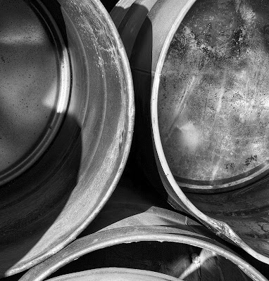
Oh, the image above is part of my drums series, three images differentially focussed and blended with Helicon Focus, converted to black and white in Photoshop (there wasn't a lot of colour to filter), and substantial dodging and burning. I used Akvis Enhancer on the image with considerable advantage.

Grain Bins


Not surprisingly, these grain bins were located nearby a rural high school and whether the farmer approved or not, provided advertising space for the class of 2006.

Thursday, January 18, 2007

Phot'Art Magazine

I think it was The Online Photographer who recommended Phot'Art Magazine. My first three issues have arrived and I am very impressed. Printed on heavy semi matte paper the printing is excellent. It's not up to the standard of Lenswork but few books never magazines are, but the colour work is superbly reproduced and the black and white is good. There are a variety of styles and categories of photographs from landscape to fashion, advertizing to flowers. The text is split English and French so you don't even have that issue.

So far they seem to be emphasizing a single country in each issue, China and Italy in the two I have looked at so far.

I think it's a really good idea to see how subjects are treated in other parts of the world and by different cultures.

In landscape photography there is a lot less emphasis on capturing every detail with a large format camera and more on the mood in which grain isn't a problem and can even be helpful.

Getting Past the Object


Some time ago I was photographing 2816, a steam engine, and the loved and polished locomotive had a wonderful sheen off of the drivers and other paraphenalia of the piston to wheels mechanisms. I took more than a dozen pictures and even picked a couple that looked nice to show. I have 'thumbed' through the image in Photoshop Bridge a number of times but this morning, instead of seeing pictures of 'drivers', I saw patterns and shapes and recognized that the centre of one of the images might work as an abstract.

I think this ability to see beyond the object and look at it in terms of shapes, shadows, lines, curves and edges is extremely important. Even when a photograph is quite literal - a picture of a mountain, for example, if you can see past the mountain and think of it in the above terms, composition is likely to be stronger.

Tuesday, January 16, 2007

Finding Your Level - Comments

I have been following the comments on the luminous landscape discussion forum following the publication of my article. Feedback on the forum has been mixed while private emails to me have been almost all fortunately positive (though only time will tell if I have actually been helpful).

I added the following comment of my own to the forum today and for those of you who haven't been following the forum, here's my two bits.

My Comment In Response to Hank writing about a 'Levels' workshop with Sam Abell:

Wow, I don't know which is worse, dealing with the occasional very negative comments about the article, or living up to the expectations of Hank based on his experience with the famous and skilled Sam Abell.

Still, I'm committed and the articles mostly written so I'll stumble on.

Articles on Luminous Landscape can be entertaining they can be informative, or they can be educational.

Informative articles if you already know the information are not likely to generate a whole lot of controversy even if they are a bit boring. Educational articles, on the other hand, quite reasonably risk not only NOT being helpful but criticised by those who feel this isn't the way to teach things, or who feel the person doing the teaching isn't competent to do so. Education involves strategies and quite reasonably we don't all agree on strategies.

What I think we do need to remember is that the skill set that people bring with them to Luminous Landscape varies hugely. There are people like some of those commenting above who bring many years of experience and skill to the website, but I suspect there are a lot more people who don't come with 20 or more years of experience, who have never sold a print or been published and who struggle with issues foreign or dimmly rememberd to the more experienced amongst us.

Fortunately positive feedback has far outweighed negative but lets face it, I presented a controversial idea, that there could be a better way to learn, that there might be a faster way, or heaven forbid a short cut. Time will tell if it really is useful.

The most negative comments have come from people who do fashion or sports and who see my levels as not applying to their kind of photography. As my own interests are not in sports and fashion, I dare say that to some degree they are right. Great sports shots are often not very sharp and yet large prints can be dramatic and powerful. Capturing the peak moment is far more important than perfect focus or tripod steadiness. That said though, the great sports shots are the ones which strongly convey a message, which make you feel the athlete's pain, their glory in victory, and so on. The sports photographers who use motion blurring with great skill are almost certain to have learned to hold a camera steady before they learned to move it with skill. A nude can be erotic or anatomical, so I think the levels I describe for the most part still apply, especially the aesthetic ones.

I remember some years ago attending a lecture on back pain and the ideas presented were absolute rubish and my blood pressure was steadily climbing as the talk proceded. I left cursing under my breath about wasting my time. Six months later though Things he'd said kept coming back to me and seemed to apply to situations my patients found them selves in. That information has been amongst the most useful continuing medical education I have ever experienced. A similar experience occured when I took a photograph appreciation course and found it boring and a waste of time. I have never looked at a photograph the same way since.

Whether my little contribution will be of that class is doubtful, but I can hope. Perhaps even my doubters will down the road find something that applies or is useful.

Balancing Work And Passion

A fairly common question I get, usually by other photographers, is how do you get so much done? They mean by this how do I balance my career as a physician, my family responsibilities and my photography. I'm hardly the most organized person in the world, rather the opposite I'm afraid, so that's definitely not the answer.

It's not that I have more free time than many of you, though to be fair my one daughter is grown up. I am in the office two nights a week, belong to a model railway group that meets one night a week and play doubles tennis one night a week. Just as well my wife works evenings.

If I get more done than some of you, it might be for one of the following reasons.

1) I don't watch any TV. We quite like watching movies, but otherwise the boob tube isn't a big factor.

2) Digital allows the use of short available time slots where the wet darkroom needed an entire evening or better yet an entire day free.

3) I spend very little time experimenting. Of course, going digital, I don't get side tracked by the newest film/developer combination. But also, I don't spend time testing out 4 different raw processors, 3 different techniques in Photoshop for editing an image, 5 different papers, etc. This saves untold time.

4) I use a Mac. It's far from perfect but has certainly proven to be more reliable than the PC's we use at the office and is less subject to the problems of OS updates that plague our office computers.

5) I know where I'm going. By this I mean that I have over time developed a style and each and every photograph isn't about reinventing the wheel. I risk spontaneity but I get more done. It's a delicate balance that so far seems to be working for me.

6) These days, most shoots I get something worthwhile. It may have little to do with what I went out to shoot, but compared to my old black and white only, 4X5 only days, the success rate is dramatically higher, the failure rate 1/3 of what it was. In the old days, I'd be lucky if one out of 4 shoots would produce a good image, now it's 3 out of 4. I suppose some of this is me getting better, but being able to shoot both black and white and colour more than doubles the success rate, something you might want to consider. With a greater choice of lenses shooting digitally (300 mm. equivalent on 4X5 is 900 mm. - a lens that is a yard long and almost impossible to keep steady for the typically long exposures in 4X5 - you need two tripods and accessory spars and no wind and...

7) I have been photographing for 40 years off and on and looking at good photographs though all of that time - practice does make you more efficient. While this may seem discouraging for someone who has been photographing for two years, the other way to look at it is that in only two years from now you will have doubled your experience. I can't say that. Besides, my progress in photography (as much as there has been), has been quite inconsistent, fits and starts, stalls and steps backwards. Someone new to the hobby would be well advised to do some reading to learn how to avoid these pitfalls.

Mind you - the model railway sits unworked on, the garden is getting the better of me, the house needs painted, and I have a very understanding and supportive spouse. Guess I'm just lucky I can spend the time doing what I love.

Sunday, January 14, 2007

Rock Details As Project


An interesting exercise is to photograph rock cuts - either natural or highway - whichever is available. In most parts of the world you can find somewhere where someone or something has cut or worn down the surface exposing rock. Quite often the rock is fascinating colours and interesting shapes. It's something I have been photographing for a while. You might want to consider it. There are no horizon lines to work round. You can photograph at many times of the day and in all sorts of weather. There are no obvious edges or other compositional markers so it's entirely up to you to use the rock to create a composition.

But Not All Photographs I Take Are At The Same Level

Mark added the following comment to my blog on rules which referred to my article on Taking Your Photography To The Next Level

I do think that even though someone may obtain a coveted '6F' level - they still must be humble enough to accept they will make many 1A images. Of course, they don't have to show those to anyone...

Mark raises a very important point. Clearly not all images from a given photographer are of the same quality - were that the case we wouldn't agonize over which images to show - whether to the neighbour or to the submissions jury. This raises questions about percentages and so on. Perhaps it might be better for the photographer to assess his level based on images shot in the last year. Since even Ansel talked about 12 good images a year, this ought to be sufficient. Yet, what about photographers who most of their lives produced fairly ordinary images yet over a lifetime produced perhaps a dozen wonderful images, icons of photography as I called them in the article. I think of Andre Kertesz. He was inconsistent, yet is deservedly famous for the selection of images which were magnificent.

In the end I don't think I have an easy answer to the concern. 6F photographers as Mark calls them will almost certainly produce some 1A's on a given shoot, but most of the time there are enough images from any one assignment to produce admirable if not wonderful images.

When I went through the process of selecting images for illustrating the article on levels, you wouldn't be surprised to find out that I eliminated the 1A's and in fact spent some considerable time and thought into picking which images were strongest and which I would be prepared to have say - these are my images, this is what I can do.

I have no intention of letting people wander through my files and contact sheets to look at the duds.

Lets say then that a photographer is going to judge his level on his best photographs and that it seems reasonable to assume that he ought to have around three dozen images from which to pick the best 10 to actually show and be judged on.

Totally arbitrary numbers, I know, and it doesn't take into consideration the number of years the photographer has been shooting - but if a photographer moves up a level because he has been shooting 40 years instead of 2, who's going to care - remember the exercise was not about labelling yourself. Rather it is about finding out what it takes to move to the next level, so I think it doesn't really matter in the end what method one uses to select the images, how many or from what period of time.

You could even 'process' yourself twice - once for your absoluely best ever images and another from your typical best from a single project over several shoots. You'd come up with different answers but you would learn what it takes to move up the majority of your images while also learning what it would take to make your absolute best images better - and it almost certainly isn't the same lesson.

Friday, January 12, 2007

Not Every Image Makes Sense


I like this image. I can't figure out why. It should be a cliche, it's very ordinary, the colours and tones don't glow, butI like the way the near wheel sweeps round and the far wheel curves the opposite way. I like the rusty fittings and that 'sawblade' adjuster thingy. The lighting is absolutely perfect - not dull and flat but not sunny either - must have been some thin cloud in the right place. It's a peaceful image but the equipment is interesting, there are some nice lines to it - note the spokes of the near wheel splaying one way, the far wheel the other. I like the back edge of the wagon ending just before the edge of the picture on the right.

I should be bothered by the asymetrical positioning of the wheel at the sides of the print but I'm not - I actually have other shots with the wheel centred or leaning to the other side, but this one worked for me.

This image also points out that you need to keep an open mind and open eyes. I went to the spot to photograph a canyon and this old farm equipment lying in a field caught my eye.

Thursday, January 11, 2007

From 2004 Algonquin Workshop


I'm as lazy as the next fellow, actually probably quite a bit lazier.

But:

Whem I'm on a workshop, I work - I photograph before the others get going and I'm out there after and when the rest huddle in the car because it's raining, I'm out there anyway. Workshops are too short to sit around complaining about the weather not being right.

On the Algonquin workshop, the above image was shot on the last day of the workshop. Two of us got up before sunrise and headed into town to photograph a waterfall. We were back in time and with a good appetite to join the others for breakfast.

Another day, we were in Algonquin itself and it was raining. Michael had already told us our cameras could handle the rain so why not get out there. I saw some lovely cliffs across a small lake and was the only one to get out and photograph it (5 images stitched for a rock face panorama with fall trees in the foreground). That one image has made me over $1000 in sales. Sure was worth getting wet for.

Fred Picker once said that you could count on the best image coming from the most uncomfortable position - wet - cold - sore - cramped - or if you were really lucky, all of them at once.

Ask yourself how much effort you put into your photographs? Are you up before dawn, in the right place before the light is right. Do you take the shot but check around to see if there is an even better one?

Rules

Robert commented on my article at Luminous Landscape to the effect that he is uncomfortable with dealing with aesthetic level definitions, fearing, I think; anything which would force people into a standard set of rules for creating good photographs.

This is a very good point. If we define levels by rules, to some extent we are doing just what he fears. I was careful in defining the aesthetic levels (his biggest concern) to describe them in ways that have to do with getting the message across, emotional impact and clarity of vision, hardly rules. On the other hand, if I say that an image should be strongly composed, am I not implying that the image follow the 'usual advice' about lines to corners, rule of thirds, etc. etc.?

There are two points I would like to make.

Firstly, being strongly composed is a goal rather than a rule. It might be my goal to drive safely, but a speed limit is a rule. There are times when many would consider it safe to drive over the speed limit (if they could get away with it) but other times when even doing the speed limit is clearly unsafe. 'divide the picture into thirds' is a rule. It may or may not result in a strongly composed image. Even if it were a really good rule/guideline/suggestion, to apply it 100% of the time would be incredibly boring.

The second point is that many great artists deliberately flaunt previous 'rules' of good art, it is my strong impression that the vast majority of them learned to work within the rules before moving on to break them. One has only to look at the paintings of Picasso and then look at his drawings to realize that he had great skills in traditional methods/rules/techniques/styles before moving on to create new styles.

If you are to design a better toilet seat, it helps if you have been constipated a few times in your life and have a working familiarity with the standard model.

Thus, I don't think that it does any harm to describe aesthetic or technical levels, nor does it force one to conform.

If it helps, think of it this way. I indicated that to move from level one to two, one would need to be able to get sharp pictures. This doesn't mean they have to be sharp =- there may be a perfectly valid reason for unsharpness, but one should at least be capable of creating sharp pictures when needed, most of the time.

I think there are alltogether too many 'artists' who couldn't produce a sharp picture for 'love or money' and who don't know when its useful to have a sharp image and when it's not.

Some new art stands the test of time and these artists are recognized later as leaders and innovators. Other new art is still junk many years later (if you can even find it). I suspect that the former group of artists learned the rules and acquired the skills before going on to break them creatively. I'm not convinced many of the latter group were so dilligent.

Alternate Reality - The Real Cabbage


The first image represesnts the 'straight' colour image of the frozen ornamental cabbage, the second a black and white conversion, and the previous post the 'colourized' version in which I manipulated the curve to have several peaks and valleys to generate the odd coloured result.

I leave it to you to decide which version (if any) you prefer.

Wednesday, January 10, 2007

Is It Legitimate?


So what happens if you bring an image into Photoshop and manipulate it beyond reason, but like the result. It isn't really a photograph, so what do you call it, do with it, and do you call it art?

The photograph is of frost damaged ornamental cabbage, I happened to like the pattern, and while adjusting the curves, started doing odd things with sinusoidal waves type curves.