Wednesday, October 31, 2007

Upper Falls Maligne Canyon


From our trip to Jasper a couple of weeks ago. In winter the climbers love to make their way up the frozen falls - they can have it, but I wouldn't mind coming back to Jasper to photograph the ice.

Over The Top?


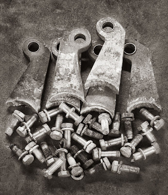
Ed suggested that the original presentation of this image looked overly manipulated. I don't always succumb to the first suggestion that I am wrong but in this case I had the same reservations. I decided tonight to work on the image again and you see the result in the top position, the original result below. The new version has only local curves adjustments and dodging and burning. I suspect that I will continue to work on it, darkening the lower pieces of metal but not increasing contrast further.

Tuesday, October 30, 2007

Creativity

Ted Byrne offered the following comment to my last entry on finding inspiration.

I've often wondered if, or why we might have more than one very good, even great, idea within us? How many one-hit-wonders have there been in script writing, song writing, architecture, or novels? And even among great artists, most are particularly acclaimed for a small part of their work.

Friends lament that the seem to continually retake the same photograph. When I look at their work I tend to agree, however in most cases it is a very good photograph... definately an artistic contribution.

Is it heresy to suggest that we may only have a few inspirations within us? Isn't it wonderful if we have only one? And once our masterpiece has been born, what's wrong with using everything we learned during that process of creation to better enjoy what others do?

Friends who were in their youth very good baseball players seem to enjoy the game at a level I can never approach.

It's not that people should give up photography after the birth of their greatest work, but rather embrace photography as a passive as well as an active experience.

Or ... or is it possible that we may have a continuing stream of greatness within us and merely need to sink new wells to tap different pools?

Dunno... but it intrigues me to wonder.


I started to write a response but thought both Ted's comment and my response deserve greater exposure.

Ted raises an interesting if somewhat scary question. Is it possible that we have only a limited number of creative ideas, that can be used up, like a cat's nine lives?

I suspect that those who are "one hit wonders" either got lucky, or the very idea of success blocked them from coming up with other ideas. Certainly writers often describe the second novel as being much harder to write than the first.

People like Edward Weston weren't famous for creatively inventing the idea of photographing nudes - people had been doing that since the invention of photography and long before that in paintings. He did on the other hand know a thing or two about lighting and how to make the human body photograph well. His poses are nothing especially unique but his technique exquisite and few have equaled it. He didn't create that skill while meditating on the toilet, it was earned with some very hard work poorly rewarded over many years.

I think this means that there is hope for anyone who feels they have only a finite number (possibly very limited) of truly original and creative ideas.

Craig Richards, a fine large format landscape photographer and Photography Curator of the Whyte Museum in Banff, has an ongoing project to teach junior high school students photography. Many of the kids are off reserves and none have previous experience. They are given used donated film cameras and sent out to create. They seem to have absolutely no trouble doing so and in fact each year Craig puts on a gallery show of the work of his students. These shows are technically quite good and creatively superb with fresh original ways of looking at the world from a large variety of students, in fact the vast majority of each class. These kids seem to have no difficulty saying important things and offering new insights into the world.

In fact, it's been suggested in the past that creativity is stifled by education, that we train our kids to behave and follow rules and look at things the same way as everyone else and thus drain thier creativity.

Craig's work with these kids suggests that creativity is not limited to a lucky few but that for some it takes more work to get it out and to "unsmother" it than in others.

People with ADD have no trouble being creative while having huge trouble with following rules and being linear in their thinking and being organized - so much so that it's nigh on impossible to beat the creativity out of them.

Perhaps the creativity is in all of us and those who are better organized and more linear thinkers merely have to unlearn the linear habits of many years of education and upbringing and following rules.

There are people and books and courses and workshops to help them do this and in the end I think that Ted is likely wrong, that all of use have an unlimited potential for creative ideas, but that accessing that creativity can be more difficult for some, and more difficult at some times of our lives than others.

Where Do We Go For Inspiration?

It's all very well to talk of a muse, but my wife for one, would likely be less than thrilled. So on a more practical vein, where do we go to get inspiration for projects?
The answer depends a bit on what your goal is. If you are a hobbyist photographer who simply wants to be the best you can, and the need to blaze new trails isn't important to you, then the following can be of value.

- check out photo.net for recommended photos - I'd take a recommendation over a high rating every time since high ratings tend to be awarded to nudes and erotica and bright colours and freak weather and great postcards. You start by finding one photographer who you like and go to the people they recommend and so on. In this case you are looking for ideas.

- How To photography books often contain a variety of subject matter and may provide ideas.

- spending a few hours at the library or at a good bookstore looking through the available books is time well spent (hey, you might even buy one)

- magazines - how about getting some back issues of Lenswork or even buying the CD of all the old issues for ideas of subject matter.

- workshops are an awesome source of inspiration, rubbing elbows with artists and fellow photographers is almost a guarantee to stir the juices.

- art - don't limit inspiration to photography - visit art galleries and museums, take art appreciation courses and attend lectures - not only may this stimulate you to be more creative, you may actually get an idea for your next project too.

Now, if you do have ambitions to blaze new trails, then simply copying the ideas of others may not appeal. In previous blog entries I have suggested though that even if you saw for example, a portfolio of lovely images of cathedrals, when you go to visit even the same buildings, there's a really good chance you will see things differently and come up with your own unique vision. Sometimes this can be challenging - for example the Gugenheim Bilbao and Walt Disney theatre, it's the reflective properties of the metal tiles which everone is attracted to and a really different style or message could be difficult. For most more complex subjects though, you are likely to find your own interests being different from those who have visited before.

In fact, all of the above ideas could still be useful, if only to point you to the general idea of subject matter. Ryujie had almost certainly seen lots of flower photographs before - but he thought of freezing them in water, so taking off on an idea already out there is perfectly respectable.

- perhaps you could read about art and creativity, starting with "Art And Fear".
- reading some of the old essays by David Vestal and Jim Hughes or Bill Jay could be helpful.

- you have looked at the images in Lenswork but did you read the essays and particularly the editorials of Brooks Jensen?

- it may be necessary to put aside your stresses and strains and do some thinking - perhaps on a retreat or via mediation or even when out for a hike. What do you care about? What moves you? How could you photograph those things?

- I haven't asked Ryujie where the idea came from to freeze the flowers in a block of ice. Perhaps the idea came spontaneously, or maybe he was hiking and noticed something frozen in the ice. Either way, there was a leap to the idea of freezing flowers. It was not likely a linear progression of thoughts - thus is the nature of creativity. In that case, perhaps you have been ignoring silly ideas and little impractical or useless impulses. Just maybe you need to follow some of those ideas up and see what comes of them. Perhaps you need to do some exercises to free up your creativity and spontineity. There are books and courses which can help.

- if nothing else, simply becoming a better observer of the world when not photographing will help you come up with projects.

- sometimes you just have to go out with a camera and see what happens - the best shots are often the ones you hadn't planned on.

As I am anything but an expert on inspiration, the above is simply the best I could come up with for myself. Perhaps you have suggestions.

Quality Improvement

I have written in the past about the various aspects of becoming a better photographer, and my upcoming book is geared specifically to that task, but becoming a better photographer takes time and effort and study while quality improvement is about using the skills you have now to make sure that the prints you make (or the images you present on the web) are the absolutely best you can do, now.

So, I'm not talking about coming up with better compositions or doing a better job capturing peak action or more skill posing a model, I'm talking the technical aspects of the image which at most might require more care focussing or paying attention to depth of field or exposure, and many of the things simply require more care making the prints or processing the images.

With that in mind, here's a checklist of quality issues to watch for.

1) Have you made the print on a paper which doesn't detract from the image, neither overly textured or too glossy to even see the image without reflections interfering?

2) On careful but not nose on print inspection can you see the sharpening?

3) Is focus spot on?

4) Is depth of field adequate? It's not necessary to have infinite depth of field but the focus should be on the important part and adequate sharpness elsewhere not to be distracting.

5) Is image manipulation obvious? You should probably ask someone else since you already know what you did and probably can't unbiasedly judge whether over the top.

6) Are the tones in the image rich, deep, subtle and most importantly, as good as the images of photographers you admire? Were the highlights blocked in the original file or negative or slide? Was there ever enough detail in the shadows? Have you overused shadow rescue to the point of "straining" the image? Check Lenswork for black and white or Phot'art for colour. Frankly if your prints are as good as their mechanical reproduction, you're doing pretty well.

7) Is there too much clutter - things which don't add to the image? To be fair, this would require a reshoot or a rejection.

8) Is the overall level of brightness/darkness of the print too much? You may not need outside advice but you certainly need to walk away from the print and come back the next day before you decide.

9) Have you asked yourself what is the one thing you could do in editing the image (or dodging/burning if in the darkroom) to make this image better? Sometimes you change one thing, then you see half a dozen other things that could be improved - never leave a print knowing that it could be better if you did X to it. It's one thing to have doubts later, but to walk away already knowing what you'd do to improve it, well that just isn't ok.

10) Well, if you have fixed all of the above, you have done most of what can be achieved quickly. If none applied, then you were ready for some harder, more long term study and work.

Monday, October 29, 2007

Sunday, October 28, 2007

Rings and loops and Rods


Originally part of a three image stitch, I found not only that in the rest of the image, one part sticks out so far it is significantly out of focus, but also I quite liked this simpler composition.

Arguably those two steel rods on the right aren't balanced by any on the left, but there are the loops on the left...

Finding Great Work By Others

Ever had the experience of discovering the work of a previously unknown to you photographer and you see some really awesome images. This can be a bit of a mixed blessing. It's always great to look at really good photographs, but it does come at a price.

First, there's the thought that perhaps this person is better than we are.

Second, they take photographs like I take so what does that say about the work I'm doing - am I wasting my time?

Third, now that I have seen their work, does that mean I can't go out and take similar photographs for fear I'm plagiarizing?

and Fourth, what if they have been more successful than me - more shows - more publications - perhaps a book or two?

Perhaps you are an amateur photographer of not a lot of experience and have yet to get into print. You are reading my blog and looking at my images, thinking some of the above about me and my work. Well guess what, I'm doing the same thing when I look at the work of others. It's not that I'm jealous of the success of others, just insecure about my own place in the scheme of things, and no matter how many nice comments I receive, no matter how much success comes my way, there's still that nagging doubt. No matter how high we climb, there's another ridge above us.

Now, it may not necessarily be entirely or even mostly a bad thing. Insecurity can drive us to try harder, though the risk is we may give up in despair.

I would like to address each of the above issues.

One - They are better.

Well, do you really want to look at the work of photographers who are worse than you? If we are to improve, from whom are we to learn? The idea that we can improve in a vacuum is pretty far fetched, we improve because we see that there is more to be achieved. We need goals and who better to suggest those goals than the people who have gone before us, even if it was yesterday afternoon at 3:30?

Two They're already doing the work I want to do.

I could decide to give up. For example I have put a lot of energy into my Independent Machinery project. Viewing the latest Lenswork Extended I saw for the first time a much larger selection of Brook's images from "Made Of Steel" and frankly, there is coniderable overlap between his images and mine, and I did think for a little while, "Gee, he's already done this stuff so is there really a need for more of same?" Fortunately several things came to mind.

a) absolutely no subjects are new in photography - they have all been done before, so we might as well relax and simply do the best we can.
b) unless we have done all our learning from a single photographer, it's almost impossible for us to see the world exactly the same way as any other photographer - rather like fingerprints - our eye is unique.
c) the odds are that even if we saw someone else's work and decided to copy it, the odds are excellent that we'd be distracted on the way by other things. Certainly that was my experience with each visit to Independent Machinery. Based on the previous trip, there would be something I'd plan to do this time, only to be distracted by far more interesting things and more often than not, the original plan is forgotten - so if I get distracted from my own plans, odds are darn good anyone is likely to be distracted from the work of another.

Three - Am I plagiarizing?

It's true that if we see a good idea that we haven't previously thought of, it's a little awkward then running out and copying them. Using Lenswork again, the most recent issue has albumin prints of fruit. Perhaps I shouldn't photograph fruit - but people have been photographing fruit since cameras were invented, and using albumin may be unusual these days but certainly in the history of things is most definitely not unique. There are images of the new Disney Theatre. Do we really believe that there are no more images to be taken of this building, that there's nothing more to be said, that adding our vision to the project won't add anything? I doubt we could be that unimaginative. There are images from New Orleans, but we have seen lots of essays of New Orleans since Katrina and frankly, they all looked quite different from each other, and keeping New Orleans in the national mind is a good thing so hopefully there will be many more to come.

and Four - They appear to be more successful.

There are several points to be made here.

a) Success and excellence are not synonymous.
b) If they are more successful, then perhaps there is something to be learned?
c) Success often comes at a price - schlepping your work round dozens of galleries, dealing with multiple rejections, making, packaging and shipping your work (and getting it back damaged (if at all). It might mean sacrificing career or family, exercise or other measures of quality of living - do you really want to be a "starving artist"?
d) If their success is well deserved, well isn't that wonderful it's nice to see good work rewarded and perhaps our turn will come some day.

And that's my thoughts on discovering some really good work. Great, terrific, glad to see it. I will continue to point out impressive work as and when I discover it.

Rust


I have always thought of myself as a black and white photographer. Yet, when you see rust, you just have to be tempted to record it in colour. In the old days, if I didn't set out with some colour film, it was a moot point, but now that the images are recorded digitally, I can't really force myself into black and white and in fact wouldn't if I could. I'm quite happy to do a shoot and then decide after the fact which would work better.

In the case of the Independent Machinery project, some of the initial images I did in colour only but later more images seemed best suited to black and white and so I converted some of the colour images (most did well in black and white but not all).

Still, when you see great rust or other interesting colours, it sure is tempting to make the occasional image a colour one.

These days I'd hate to have to commit ahead of time to only making all black and white or all colour.

Near and Far


Independent Again


Back At Independent Machinery


Finally, an overcast afternoon so I could photograph some of the steel sitting outside the machine shop. Just as well as everything was locked up. I was able to make a series of images, this being just the beginning.

Friday, October 26, 2007

Bengt Ekelberg

Another great find of the people over at Photo.net, have a look at the work of Bengt Ekelberg.

Wednesday, October 24, 2007

Surprise Result


Jasper train station has an old steam engine on display. During the day, the background is distracting so I photographed it at night. In fact it probably wouldn't have mattered for this image since I moved in so close and then cropped as well, still the dramatic almost drawing like quality wouldn't have happened during the day.

I didn't like having to crop off the spokes on the right (the original shows quite a bit more) but distracting elements at the bottom right made the price too much so trim it I did.

Athabasca Falls


The first image was shot by extending my tripod, closing the legs together then holding the camera a good 5 feet out past the railing to eliminate foreground and expose the pool.

Nothing tricky about the second image but the bright green grass really stuck out in colour but of course in black and white, it fits right in.

John Crosley

Photo.net has featured the work of John Crosley and his black and white work in particular is very strong and I wasn't surprised to find out afterwards that he has worked as a photojournalist. Looking through his colour work, it's a bit of a hodge podge, but this guy sure is having fun with his photography and some of his work is superb.

Placing The Centre Of Interest

I have a new article about where to place the centre of interest over at Outback Photo.

Monday, October 22, 2007

Jasper Cont.


Compromises and Perfection

Life is full of them, photography too. We compromise on camera equipment - what we'd like vs. what we can afford or even size and weight - sure I'd like to use medium format digital, but they don't make the equivalent of a 70-200 lens, never mind a 17-40 or 24-105. I'd lose my 90 Ts-e and I'd need a sherpa for hauling it around if it were available.

We compromise in making compositions - we frame in the strongest way possible - not necessarily the perfect way - as we compromise on what is included - more of this comes with more of that, the latter being something I didn't want in the picture - so just where to I call it quits?

When recording the image, I'd ideally like to use multi row stitching, but that would slow me down and I'd have less time to find better pictures - so I compromise and use either single images or at most a single row for stitching.

I guess the point of this rant is that if we wait for things to be perfect, we are on a 'fools' errand' and could be missing some good images while waiting for perfection. Further, previsualization not withstanding, we can't know everything about an image before we work on it and giving ourselves a series of images, each as good as we can make it under the circumstances, instead of waiting for a single image which we think is perfect (but might not turn out to be) is a better strategy.

Sunday, October 21, 2007

Back From Jasper


I'm just back from a five day trip to Jasper, mostly holiday, but of course photography too. Jasper is five hours from Calgary or Edmonton and thus is significantly less touristy than Banff and for that reason is a much enjoyed place to visit. The Banff Jasper Highway is a lovely drive and on the way are Columbia Icefield and Athabasca Falls.

I'm in the process of transferring 11 GB of images to my computer from my Epson 2000 and the computer tells me it's going to take six hours, so it won't be finished until well after I'm in bed.

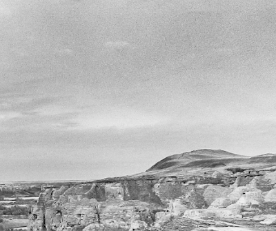
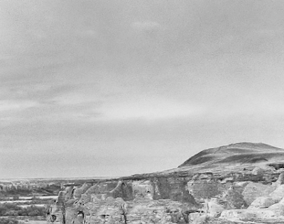
I did manage to get a peek at the images though and the above are three 'quickie' edits from the less than routine landscape work you might expect from a trip to the mountains.

More to come in the next week.

Sunday, October 14, 2007

Tough Decision


I was never fully satisfied with the first image. I felt that the left end was a bit weak, I didn't like the front edge of the shelf showing, in fact I didn't like the rubber mat showing at all. That gear on the right was nice but in doing a linear perspective stitch it became distorted from round (the same happens at the edge of extreme wide angle lenses so it isn't a stitching issue). Besides, the gear doesn't balance anything on the left - a matter of:

Just because an object is interesting isn't enough to justify including it in a composition.


I sure didn't like all that background showing in the upper left corner.

In the second version I tried to solve as many of these problems as possible, choosing to crop tightly to simplify and hopefully strengthen the composition. The image still isn't perfect. The far right edge should probably be cropped to the
edge of the lower diagonal ring and that dark mark on the bottom right corner shape needs either cloned out or minimized with appropritate dodging and burning.

I can't help feeling too that:

I threw out the baby with the bathwater.

In the first version of this blog entry I wrote the following:

I might do a bit more work on the light coloured rings in the bottom left corner, darken much of it but keep some highlights - it would fit better with the rest of the image. Just because it's different material doesn't mean I have to accept that it doesn't look similar.

You will note that I cloned in more of the arch so the background wouldn't show in the upper left corner - I'm not sure whether that was necessary or worth while - not from an ethical point of view, I'm quite happy to use cloning to improve my work, rather I'm not sure that it improves the image. Also, in hind sight, having cropped more and more off the top, it occurs to me that in doing so, I could have gone all the way to the right, ended the composition with the darker shape which would balance the darker shape upper left and solve the problem of the bright edge of the right hand shape in the cropped version above from being the very edge of the image. Of course if I went far to the right, I'd end up including the end of the arch, but that might be ok - guess that could be version 3.

I couldn't stand it and with the hour getting late I had to work on version three now. Back I went to the original image above. I made a radical decision to clone the left hand shape a bit higher to fill that left upper corner. Many of you won't be comfortable with such a radical "cheat" and I'm not totally sure I am too, but it sure as hell makes for a better image and had I not shown you the process, no one would be the wiser.

Still:

It isn't about getting caught, it's about whether it's right

and each of us has to make our own decisions. As some have said, cloning is a slippery slope.

Thus we have version 3. Will I place it in my portfolio - probably. I don't see it as any worse a "cheat" than using a red filter to create dramatic skies which never were. Even Ansel did that.. but perhaps I'm trying to justify myself here...

Am I finished? I don't think so, as I edit this blog, I think the contrast in that left hand shape is a bit weak in comparison to the shapes on the far right - i think there's room for improvement, but now it's getting really late and I have to work in the morning so goodnight to you all.

Another In The Series


Didn't notice this for a while having shot it horizontally and including distracting elements both left and right, but cropping it this way and simplifying things by cropping out the floor...

Although it includes the rack which has been photographed before, the inclusion of the window and the uprightness of the sheet steel gives it a different look and I think I would be justified in including this in the portfolio.

Independent Machinery Black And White

Once again I have used Ligtroom to creat a web gallery, this time of black and white images from the Independent Machinery series, and it can be found Here, again using the Matthew Campagna Lighroom web addon TTG Slimbox.

Saturday, October 13, 2007

Wall in Colour


While the majority of my images from Independent Machinery look good or best in black and white, some do appeal to me in colour - I quite like the subtle colours of this image.

That Bugs Me

Went to download a profile for the new Harman FB glossy paper - guess what - no profile for the Canon 5000, and even more irritating, you have to register to get the profiles - I don't see why I should give them my name address and email just so they can send me ads so that I can get the profile that is essential to use their paper.

I've written to them. We'll see how this plays out.

Hopefully booksmart will come out with a profile soon, failing that I might have to get a custom one and pay for it - hardly the end of the world, but Harman should be on this.

Still liking the paper though, perhaps a bit glossier than typical glossy dried matte.

Wall Ver. 2


Unhappy with cutting off the circles on left and right, I restored the three image stitch and recropped. I decided to remove some of the lower part of the image to the point that the vertical bars form V's along the bottom of the print, far left because there are bright things in the background that are distracting and it didn't add anything to the image and crop just a little of the right hand circles so that diagonal on one circle works nicely. I toned down the shapes in the bottom right a bit but the diagonal here matches the pipe next to it, and the diagonal of the washer material?

Interestingly, seen large in Photoshop I really like it, seen small as in the blog, it feels a bit tight on the bottom. Do click on the image to see it larger before deciding for yourself whether this was a good idea.

Friday, October 12, 2007

More On The Importance Of Print Quality

Good, someone disagrees with me, even better, it's Chuck who's a good photographer so he's speaking from experience. Of course, in some ways I'm with Chuck. I happen to think that print quality is extremely important, but the points I made about how the vast majority of people who admire famous photographers have never seen an original print still stand. Truth is their reputations are largely made through reproductions in magazines and books, and to a lesser degree (so far) from the web.

Here's two really important questions:

1) Can you think of a situation in which you really admired a person's work in reproduction, only to later see original prints and decide you didn't like his work after all?

2) Can you think of any situation in which you didn't like a person's work then saw the original prints and changed your mind?

I can't think of any examples of either situation for myself and I'd be interested in hearing from anyone who has had either of the above happen and how it came about. I'm sure it does happen, but probably not all that often.

If Chuck can't think of any examples of either of the above scenarios, does it simply mean that he like me, feels the whole process is important to him, from conception to finished print and that less than stellar quality in any aspect of the image is unacceptable to ourselves in our own work. I don't think that's the same at all. I'm sure that a great musician fusses over every single detail, often details the rest of us aren't even aware of, yet could walk down the street, hear an organ grinder and go, wow, what a great tune!

Back to you, Chuck.

How People Access Our Images

As photographers we agonize over print quality, we try dozens of papers, change printers, strive to achieve the goal of the perfect paper and print. Look at all the fuss over finding the equivalent of glossy dried matte. Think of all the furor over silver prints vs. digital and whether digital should even be taken seriously (I think silver is steadily losing that battle, people like Bruce Barnbaum not withstanding).

Here's a though though. The more successful the photographer, the greater the chance that 99.99% of the people who admire their work have never ever seen an original print, never mind owned one.

What does it mean, what does it say, when only .01%, one person in 10,000 who like your work have ever actually seen it in the original?

I happen to think it says a lot. Below are some things I think it tells us:

1) It's not print quality that causes people to decide whether they like your work.

2) Good images show through poor book printing, small online jpegs and bulk magazines with iffy reproduction.

3) If it's our goal to be known, more than to make sales, surely this says a lot about where we should be putting our efforts.

4) This kind of viewing ratio says a lot about what kind and quality of equipment we need to make good images - ie. we don't need to spend a fortune on the highest quality equipment. Unless you are already selling a substantial number of 24X36 inch prints, you don't need the top of the line cameras and forget medium format digital.

5) It says a lot about the qualities we should be emphasizing in our prints - composition over tonality, interesting subject matter over shadow detail, a unique way of seeing over blown highlights. This is almost the exact opposite of what the average hobby photographer emphasizes, agonizes over and puts most of his effort, practice and studying into. It's a lot easier to improve shadow detail than to see better.

I have been fortunate enough to see original prints by Bruce Barnbaum, Michael Kenna, Ansel Adams and Edward Weston and I highly recommend the experience to you. That said though, I had a strong liking for each of those photographers images long before seeing the originals. It's almost as if print quality and photographic quality are two almost entirely separate issues, superb print quality being an extra bonus, like getting a free coffeemaker when you purchase a new microwave.

Perhaps the message here is to stop agonizing over sharpness and resolution and print quality in general, at least for a while, and work harder on the less concrete issues of making meaningful and powerful photographs that are first and foremost interesting.

Subject Matter Vs. Technique Vs. Style

I wrote this week about versatility in what we photograph. Mike Johnson wrote about having a consistent technical style while pointing out that this can be harder in the days of digital since the equipment you use (cameras, film, developers) don't dictate a certain style.

Lee added the commment below to my entry:

i think this entry is especially interesting in light of the recent Online Photographer post where Mike Johnston essentially supports the position that one of the best ways to succeed is to have a distinct visual style, as opposed to presenting yourself as "versitile". i'm guessing that you may have already read this post since you sometimes reference The Online Photographer in this blog. do you think Mike is wrong? are you more likely to succeed by being versitile? i suppose this depends on how you define success, but i am still interested in your thoughts regarding Mike's position.

He's right, I do read The Online Photographer, though I hadn't thought we were talking about the same thing in our two entries. I think it comes down to a discussion of style vs. subject matter, and technical enters the discussion only peripherally. It's possible to use the same style across a variety of subjects. Sometimes the subject will dictate the equipment and therefore the look. For example if someone who normally shoots wide angle landscapes switches to photographing football, they are almost forced into going to telephotos lenses and that will have a strong influence on the look of the photographs.

If I started photographing football, I don't know that the look would be all that different - sure the background would be out of focus, but the concept of moving in close and eliminating surround that I often use in both my industrial and landscape work is not very different from the technique I used in university photographing sports.

Technical style is almost a non issue these days in that unless it is artifically induced into the processing, there isn't a dSLR around that can't make an 8X10 print that looks as good as something shot on medium format film or even 4X5 in the old days. That falls apart when we talk larger prints of course.

An example of deliberately introducing a technical style is the (in my opinion) all to common use of diffusing the highlights to give an image that special glow). It's an easy technique to do, is quite distinctive and has even graced the pages of Lenswork on more than one occasion. Michael Reichmann wrote about it in Luminous Landscape several years ago. I have mixed feelings about it - it was nice when it was new, and it still suits the occasional subject, but as it gets more common, I can't help feel that it distracts from the quality of the prints - that is, when I see that technique, it's hard to evaluate the rest of the qualities of the image.

I suppose the same could be said of using a Holga, even though in this case the equipment definitely determines the look. Having recommended the work of a photographer who uses a Holga exclusively earlier this week, I could be accused of being inconsistent - yet I think that the one is a quicky effect that could be applied with a single keystroke macro, the other is a whole new way of seeing due to the lmmitations and qualities of the equipment.

I have seen a lot of bad Holga photography and considerably less really good work, and the same is true of the appropriate use of the highlight diffusion technique. Perhaps I just appreciate the results that much more knowing the limitations of the Holga so that when I see a selection of really good images it sticks out all that much more.

Style is so much more though than a camera or digital technique or even the focal length of the lenses chosen. It has to do with the darkness and contrast of the print, how shadows and highlights are handled, the tonality of midtones. It has to do with the way that subjects are framed and the viewpoints chosen to photograph those subjects. It involves the ways in which compositions are made, the use of curves and lines, shapes and relationships, how various parts of the image are placed next to or in front of each other. Style relates to the mood that images portray. It's possible to photograph golf as moody and opressing or bright and sunny and upbeat.

Thursday, October 11, 2007

Machine Shop


Originally part of a three image stitch, I ended up with a crop from the middle image. The outer parts past this wall of storage had too many distracting elements. I didn't think at first that cropping off the circles would work, but I quite like the result.

To get a good black and white image, I had to increase contrast sustantially from the colour version as usually is needed, with local adjustments as well as overall. I did use Akvis Enhancer before converting to black and white which tamed the contrast for the colour image, so perhaps I didn't need it for the black and white version.

Noise And Grain


Don't know if this is of any use to anyone but this morning was printing a picture and noted that in darkening the sky, the noise in the digital image increased (it was a shot on a 10D). I experimented with ways to reduce the noise and settled on gaussian blur 8 pixels wide (which is a huge amount of blur), applied to a duplicate layer, black masked then painted into in varying amounts considerably less than 100% - at 100% screen size there was noticeable blurring of cloud edges but in the print the grain nicely disappeared.

The advantage over using something like noise ninja was I was able to apply it to the exact degree and precise place I wanted it. Using a smaller radius for the blur just made the noise uglier without hiding it.

Here's examples of before and after. Click on the images for true 100% inspection.

Subject Matter

There are landscape photographers, people photographers, those who shoot sports or glamour, street photography or stil life, nature and so on. There are photographers who shoot whatever happens to be available because it's the process of photographing they like, the challenge of working out a good picture whatever the subject. This would seem to fly in the face of advice to photograph what interests you.

I would say though that the majority of great photographers have been fairly versatile, photographing people and places, things and even critters. Ansel certainly did a fair amount of portrait work and in the early days made his income from his industrial work. His books include back yards, water towers, porches and people. He may be known to the general public for his mountains, but that certainly doesn't define him or his work.

Edward Weston was very versatile, photographing nudes and portraits, landscapes and industries, still lifes and vegetables, toilets and taps. Michael Kenna is known for his moody misty square simple landscapes, but one of his most striking series was on the cooling towers of a British power plant. John Sexton may be about as pure landscape as you can find, yet one of his three books is industrial. David Plowden is known for his recording of small town America, yet has done landscapes, industries, railways and ships. His railway pictures usually include workers while his town pictures generally don't.

Certainly my own experience is that light is light and composition is composition, whatever the subject matter, and that while there may well be some technical issues to switching subjects and even a learning curve, it makes sense that good photographers would apply their talents to more than one subject.

I've written in the past about switching subjects to get out of a rut but maybe you should be doing so anyway. I can't prove that it's good for you, but it makes sense not go go against what better known photographers than you or me have done.

I see no difficulty with photographing two or more types of subject simultaneously - well, in the same week at least. Some projects can take many years and a photographer could very easily have ongoing projects in landscape (my badlands series) and industrial (my independent machinery series).

I would predict that had someone like Arnold Newman or Robert Mapplethorpe applied themselves to landscapes, it wouldn't take them long to become very good at it. They had the eye, knew what surfaces photograph well and knew how to compose. Robert would want to know how to adjust the light and Arnold would ask for the subject to move over a bit, but I don't think they'd have that much trouble catching on.

What about you?

Cerys Connor

Reading The Online Photographer this morning and in a comment by Ade is this reference to Cerys Connor - well worth looking at the images, there's lots of them, some interesting lessons in composition and making use of very ordinary subject matter.

Wednesday, October 10, 2007

Harman Gloss FB Al

My pack of the new Harman glossy dried matte paper arrived today and I have had a chance to make several prints. This is by way of a first impressions report, realizing that with further experience I might run into troubles, but so far, wow!

Remember too that this is a test performed on the Canon 5000 and Uwe Steinmuller who is far ahead of me in the testing, says that the new 6100 does blacks a lot better and he also has Epson and HP printers for comparison, as well as samples of the other new papers from Epson and Hahnemuhle.

Anyway, do check out Outbackphoto for his comments on paper but in the mean time and for what it's worth, on the 5000, here's what I'm seeing:


The paper comes in a substantial traditional paper box. There is an inner polythene open ended bag containing the paper. In this box the paper had no dings in the corner and the surface on all sheets so far is flawless - a big improvement over my tests with the first generation papers.

There is a very slight texture to the surface. The paper looks like real darkroom paper. it has a reasonable heft to it. The paper is slightly curved from one end to the other but not across the width (which was a problem with crane museo because it made lining up the paper perfectly in the 5000 problematic and every third sheet had to be reloaded (and this was after the firmware upgrade for the printer). No false loads so far.

The surface is shinier than previous papers exc. the latest innova (which I found gray in colour). The white of the Harman paper is neutral but not the blue white of Entrada which can make matting a problem (few mattes are that blue white). I don't think the Harman will be a problem.

OK, enough talk about what it looks like before it goes through the printer, how well does it perform?

On the 5000 here's what I notice. By far this has the least gloss differential of any of the papers I have used (Innova, Hahnemuhle pearl, Crane Silver Rag). Because the paper is smoother and shinier, the uninked areas of the print aren't as noticeably different - you can see it if you hold the print at an angle, but it isn't obvious or objectionable like it was with the previous papers. The rest of the image has the same reflectivity except for absolute black which is just a hair less shiny than the rest of the image. This really is minimal and quite hard to see and frankly isn't an issue. I think I would be quite comfortable selling prints on this surface (first time I can say that about anything other than matte paper).

The blacks are plenty deep, the shadows show lovely depth, the tonality is excellent either printed as neutral black or as warm tone with the canon driver driver for photoshop. I have not been doing output sharpening and it doesn't seem to be an issue so I suspect dot gain (the spread of ink as it hits the paper) is sig. less than with matte papers.

The images do look quite close to wet darkroom glossy dried matte - a bit shinier than the darkroom prints, overall very nice.

I will continue to experiment but it's looking good.

Do You Know What Your Goals Are?

It occurs to me that there are probably a lot of photographers out there who really haven't spent a lot of time thinking about what their goals are, and more specifically what their priorities are for those goals, since it may not be possible to achieve all of them and either stay married or employed or at least have enough money to put food on the table.

O.K., you want to be famous, rich, in galleries, sell lots, hob nob with the famous, be remembered after you are dead, have groupies, make a meaningful difference and in general, have it all. But really, not everything is equally important and you probably already figured out that few of us are ever going to achieve everything on the list above. So some things are more important than others. Do you know already which is the most important for you?

Let's take them one at a time, let's also assume that I'm addressing people who have both personal lives (ie. family and friends and other commitments) and also a regular occupation, whether it be raising your kids or going to work. Below I describe some types of photographer. Don't be surprised to find yourself in more than one category.

There's the techy kind of person, usually a guy, who reads Popular Science in the doctors office, they like playing with gadgets, play with their cell phones and pda's, watches and other devices. That they don't really need these toys is irrelevant - it's just fun to play with them. Fine machinery that operates with precision really gets them excited.

How about the photographer who simply likes the challenge of making the prettiest pictures they can of whatever they turn their mind to - whether flowers, football or landscapes, grand children or pets. They may be happy to share the images but they don't "exist to exhibit" like some people do. The image provides it's own satisfaction - a job well done. There are millions of amateur photographers who fall into this category and it's respectable, rewarding and challenging.

Then there's the photographer who measures success by how much he can make from photography. It's important to sell his or her work because this is the feedback that tells them they are good. It feeds the ego to make sales, and besides it justifies buying even more expensive equipment.

And there's the artist, who needs to create, who left on a deserted island would continue to create in the absence of an audience, who often would create in other ways if photography were not possible - music, woodworking, painting and so on (even model railways?).

What about the person who's whole enjoyment in photography is centred on getting positive strokes from other people - from family, friends, customers, strangers, critics, publishers, curators and so on. They live to exhibit and publish. They attend workshops as much to be admired as to learn.

There are people who feel a strong need to leave something behind, to be remembered by, a way of still existing in some way beyond the grave. It's not enough to be clever or creative or arty, it has to be MEANINGFUL. Usually this translates in to not only different but often odd, outrageous, ugly, sordid, or strange.

I have to say that it was a good feeling when at the Farmers Market one day an attractive young woman offered to be my assistant, or when the curvy young hotel receptionist offered to model for me - why did I say no - might have brought a whole new twist to my badlands images, nudes amongst the cactus, nah!

I can see at least a little bit of all of the above in myself and perhaps you can too, but I'd be surprised if each was equally important to you. If you can identify the categories that are most important to you, you can then reflect on the kind of photography you do, how you are spending your resources, both time and money, and what steps it might be appropriate to take next to achieve some of these goals.

Tuesday, October 09, 2007

More On Looking For Images

I've written in the past about the process of looking for good photographs, suggesting that you have to star with something interesting then look for the image. I think I can fine tune that a bit, discussing "interesting" in more detail.

It's pretty self evident that your idea of interesting is likely to be different from mine, yet the best images often appeal to many people, of differing interests and backgrounds, educations and temperaments.

Interesting in the more generally appealing sense can come from:

- a group of objects that go together in an interesting way

- a pair of objects can be so different they are interesting and unexpected when seen together

- interesting could refer to the surface reflective properties of the subject, or to it's shape (think Pepper # 30), or colour.

- interesting can be unusual - eg. up close and personal with animals not normally seen that close (or at all). this could be anything from an insect to an elephant.

- interesting can come from the weather - the worse the better

- the way the image is made can provide the interest - have a look at these wonderful photographs by Pep Ventosa as found by Howard French For The Online Photographer in an article called How to use Flickr.

Pep has some absolutely gorgeous images, do go through the multiple exposure images on flickr but then go to his website to see some of his beautiful stitched images.

Do You Have A Routine?

Which pocket to you place the lens caps in? If you always use the same one, it sure cuts down on hunting. Do you have your viewing frame on a lanyard round your neck - so you can always use it - without taking off your gloves and reaching into a tight pocket? Do you always check the ISO setting on your camera at the start of a shoot? Do you remember to erase your memory card before recording the first image - darn nuisance if you forget and have to erage 90 images by hand so you can still use the card?

The more things that you can learn to do exactly the same way every time, the more likely these things won't desert you when in a hurry, or at the shoot of a lifetime. My friend left his tripod plate at home - the problem wasn't leaving it at home, the problem was that when he took it off, he should have put it in his camera bag, so he'd still have it.

It's my habit to zip my camera backpack after removing a lens, rather than waiting till I move on - once I forgot - I won't do that again! Can you tell your memory cards apart? Now, which was the one I wanted to erase...?

Do you have a place in your backpack that is dedicated to memory cards that have images, as opposed to those ready for use? keeping them in your pocket is just looking for trouble.

Do you routinely completely collapse your tripod when you get back to the car? Do you really need to or could you just collapse one section and have it fit - therefore ready for the next shoot that much faster?

Monday, October 08, 2007

Late Changes


With time, we can see things differently. Below is the first version of the image, above is a new way of seeing the image, a couple of years later. Both have their merits, neither is perfect, but for now I prefer the upper image. Don't forget you can click on the image to see it larger.

I'm not sure about having any of the wave in the top of the image - I already trimmed some off and might yet remove the rest, but I don't want to get too close to the top of the furthest rock with the edge of the image.

I should point out that I present these images in development in the hope that some find the progression illustrative of the process of working on images, trying to improve, not always getting it right, sometimes being uncertain which is better. Hopefully it will make you think about your own images and changes you might make.

Friday, October 05, 2007

Progress On The Book

With more than half the book through the copy editor, the first chapters have gone to the layout editor in Germany and I'm back working extremely hard on the book. In the last week I have uploaded more than a gigabyte of images while continuing to edit text, add text for each of the images, and try to keep track of which chapter I'm in at the moment.

Two editors are emailing me with issues on a daily basis, I'm working till 1:00 in the morning then getting up early to work some more on the book. I have seen the first chapter in it's finished form, with pictures and all and am really pleased with the work the editors have done.

It's been very difficult to keep track of more than 100 images for the book, where they go, where they came from (on my hard drives) and so on. I finally last night decided to create a database of all possible images for the book, with fields for file location, image title, whether monochrome or colour, a rating on the image, and what chapter or section of the book the image has been assigned to. I found 167 images I'd be willing to have in the book and having this database is going to make the rest of the organization a whole lot easier.

Tuesday, October 02, 2007

Converting To Black And White


Here's a little trick I have found useful.

First, if I have worked on an image for some considerable time, perhaps cropping and changing and long since lost the original image, you can flatten the image, select all, then copy the image to the clipboard, then go to the history palette and scroll up to the original loaded image and select that. Now past the edited copy as a new layer on top of the original. If you add a white mask to the top layer (the edited version), you can then paint into the mask to reveal some of the original image if you need it.

Today I was converting some of my colour Indpendent Machinery images to black and white and in the image above, noted that the right hand widget blended too closely to the background with the filtering I'd chosen with my black and white adjustment layer (I'd used blue for the best overall effect).

I used the technique above to restore the colour version, added a new black and white conversion between the original colour image on the bottom and the edited version in bw on top. I turned off the top layer to reveal the full colour image from below and played with the filters till I had the best separation of that right hand widget - it turned out to be yellow filtering.

I then painted black into the mask of the top layer, revealing the yellow filtering and cancelling the blue filtered version for the right hand widget only.