Wednesday, October 14, 2009

Images Which Don't Rely On Composition

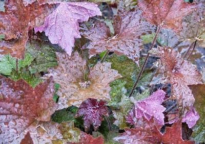
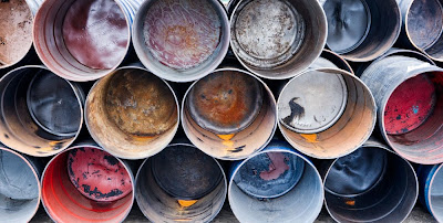
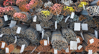
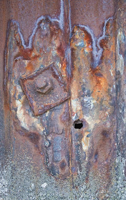
The following images are all I could find from my own images which do not heavily rely on composition, and even here, in several cases one could argue that there is an arrangement, an organization, a pattern to the elements that is not accidental.


Now it begs the question of whether it is my own bias towards strong composition which made it hard to find images which I feel work yet don't use composition to a huge degree. What is your own experience - how many of your images don't rely heavily on composition.

I note that all of the examples are colour - I could not quickly find a single example of a black and white image of mine which did not strongly rely on composition, though on the face of it, you'd think that tones could replace colours as the main feature of an image - it just doesn't in my images.

When Don't We Need Strong Composition?

Are there any circumstances in which composition isn't necessary and if so, what are they?

I don't think there is any image that couldn't or wouldn't be better if it were strongly composed. That said, there are a number of images in which other factors are more important than careful use of edges, leading lines, interesting use of negative space and so on.

The expression on a naughty child might well far outweigh any benefits from careful composition. In some images, colour is the overwhelmingly important element of the image and everything else comes secondary. A black and white image may have some wonderful tones which don't form any logical pattern or sequence yet are sufficiently strong to make composition of secondary importance.

Whether any of the above images would be even better if in addition to all its strengths it were strongly composed too is uncertain. For sure if you have two images of equal merit in other ways, then I'd select the strongly composed one every time. I can't think of any examples in which a strong composition interfered with the enjoyment of other aspects of an image - though I'd be interested in your thoughts on this. Often though, the circumstances are such that the great colour only comes without composition and if I insisted on strong composition, then the image wouldn't be. In capturing kids, often it's all you can do to catch the moment, never mind the composition, but Cartier Bresson sure managed it - by working on the composition first then waiting for the subject to place them selves just so - a matter of skill and perseverance and organization.

Thoughts?

Thursday, October 08, 2009

More On My Second Book And Discussing "Why"

GC Bakker wanted to know if the second book would in fact explain why I make changes rather than be another how to make changes book. Despite all the months writing and editing the book, I had to really think about the correct answer to his question. I certainly did show what to change and some basics on how to change it (but it isn't a photoshop manual, despite the one chapter quickie primer).

It would be easy to toss of a glib answer to the why along the lines of "Well, to make the images better, dude!" but of course that is neither helpful or friendly. I do think that anyone can learn from seeing the changes that I make to my images, but I think the short answer is no, this book does go into great detail about why I make a particular change though where there is a problem, it is often identified as to what the problem is - which is a way of explaining the why, all be it in one sentence. What my book does do is point out the problems and weaknesses and what you can do to improve images well beyond simply fixing them.

I wonder if CG really means why make the changes or does he in fact mean that he would like help knowing what to change. It's fairly easy with image problems to say why a change is needed. Over here is a yellow green tinge on the rocks and it needs fixed. The unwritten but implied "why" is that the change is because the yellow green tinge is unnatractive and doesn't balance the colour of the rocks elsewhere in the image. This is an example of what happens in chapter one.

It is a little harder to explain improvements in areas that already looked ok - or at least they did until you see the improved version. I tend to still talk in terms of there being a problem - needs more contrast, should be lighter, highlights need brightening.

Clearly CG Bakker is going to have to look at the book for him/herself to decide if the book is helpful. A few of the chapters are based on previous blog entries in which I took you through the steps in editing an image - all be it improved and edited - but if you check out the previous Athabasca Falls image discussion, you will find the basis for chapter one, the Bowl of Fruit image for chapter 3, for example. Most of the other chapters are similar.

This has been a complex answer to what seemed like a simple question. I look forward to GC Bakker giving us some feedback and further explanation behind what is meant by "Why".

How Small Should A Travel Camera Be?

I'm just back from Victoria and it seems a good time to discuss what is a good travel camera. What I took was my 40D, 18-55IS and 55-200 IS. I made good use of the full range, occasionally wishing I had wider than 18 - but probably not enough to want to carry an extra lens (and remember you can always stitch - even hand held if you are reasonably careful).
I have just read dpreview.com's review of the Panasonic GF1 which got me to thinking about camera size. No question that the GF1 is significantly smaller than the 40D, but what about the size of a 28-400 mm.(full frame equivalent) kit look like. Yes, that 20 looks small and cute - but no IS and frankly a lens that is smaller than my 18-55IS would not be all that helpful. The Panasonic 45-200 doesn't look all that much smaller than the 55-250 I have and would need an adaptor anyway. Net result is a very small camera would not make for an especially small kit. My case could be one size down but frankly that doesn't really make a difference.

What really happens with camera kits is that things change when there is a quantum jump in storage - from a carry bag to a belt clip on to a rain coat pocket to a shirt pocket.

My wife's Panasonic TZ5 (now replaced by the ZS-3) is shirt pocketable and covers better than the same range. Of course I lose a view finder, manual controls, high ISO, rapid focusing, and the ability to make larger than 11X17 prints. The GF1 will still require an over the shoulder case and two lenses and won't make a fundamental difference to carrying, storing and accessing the camera - so is it worth both the money and the compromises to have such a system? I suspect the answer for me is no. I guess it might be a nice carry around camera when you don't want to have more than one lens and are willing to live with the size of a zoom or the lack of zoom and IS in the 20 mm. lens. For some, that is all they need, it just wouldn't work for me - I'd miss the longer focal lengths.

What have you been thinking about these new small camera, decent size sensor models?

Tuesday, October 06, 2009

Victoria B.C.


This image was shot from a kayak - near ideal way to tour the harbour, but I did find that the kayak had to be pointing at the subject, not always easy in wind and current, but a lot steadier than twisting sideways and shooting. Having learned the lesson of multiple exposures when you aren't sure about hand holding, I shot several images of this particular composition. You see it with very little adjustment - the colours were wonderful.

Thursday, October 01, 2009

My Second Book

Book 2 exists as a stapled together version from the printer, so it's real, it will come out - probably mid November. The book is called "From Camera To Computer".

It consists of 23 chapters and a Photoshop Primer, plus introduction and notes on the book, and a small index.

There is a chapter on on people pictures (unlike in my first book which was quite reasonably criticized for being all landscape and industrial. There are travel pictures. There are other chapters on abstracts, sculpture and architecture, manipulations and so on. There are short discussions on stitching and focus blending.

Mostly the book is full of chapters which discuss and illustrate either working the scene and or editing images beyond simply fixing problems.

There are a few tricks, many suggestions and tips, and dozens of example images shown from raw output to final image. There are proof sheets so you can see the failed attempts as well as the successes.

There's a chapter on pairs of images, comparing two somewhat similar images, discussing why one works better than the other.

The book is aimed at enthusiasts who want to make better images, who don't really know how to go about improving images beyond simply fixing things like colour balance and overall brightness and contrast. It's for the person who wants more information about working the scene and looking for solutions to real world problems in image taking.

The book is specifically geared to image editing in Photoshop and the concept of adjustment layers.

Unlike books by commercial photographers for whom a single trick can be applied to one thousand similar images so is worth learning and using, I show you techniques that can be used with all your images.

The photoshop primer shows you the 10% of Photoshop that is needed to edit 100% of your images - making it a practical and relatively painless tool for your image editing.

I plan to put the table of contents as well as a sample chapter up on my website closer to the release date.

My first book has sold 7,400 copies, is into it's second printing, and has been translated into German, Italian, Swedish, Polish, and two different forms of Chinese. none of which has made me rich but it has generated more income than print making ever did. I understand the break even point for a publisher is somewhere around 2000 books sold - guess that's why they were happy to do a second book. Wait till they find out I have an idea for a third book - a topic for another day.

Which Camera Shall I Take?

I'm off to Victoria with my wife for a few days of R&R, but of course I'll take a camera with me. Do I take the 5D2, the 40D or even something pocketable?

The 5D2 isn't sig. larger than the 40D and has wonderful resolution and high ISO performance - but the lenses are so much larger. I'd have to take my 70-200, a 2X converter, and a 24-105 to get the equivalent of my two lens combo for the 40D 18-55 and 55-250.

I could take a traditional tiny sensor consumer grade camera but if we go whale watching, forget them for their poor focus speed. I could use a Panasonic GF1, but by the time you carry lenses that cover the same range as my 40D kit, they aren't a whole lot smaller and besides, I don't have one.

Once before in Victoria I took a Canon S3IS, at the time a decent camera, but could only make 5X7 prints with it - and I made a lovely image at Buchart Gardens that I could have sold many times over had I shot with a decent sized sensor camera. So far, what I have seen of the G11 and S90 test shots suggests that they are not going to be the panacea of a small camera, small zoom, general purpose carry around. My Panasonic FZ50 was decent but not great - great 8X10 prints but not 13X19 - so no, it will have to be the 40D. I think I'll pack my lightweight tripod too, for just in case. Will I regret not having the 5D2 - probably not - the 40D did very well for me in San Francisco and again in Germany and the two lens kit in a sling bag from Tamrac was easy to carry.

I have two batteries, just in case, and the small charger fits in a pocket of the camera bag. I'll probably take along my Epson 2000 both to view images and to back them up - it's a lot smaller than lugging along a lap top for what is supposed to be a holiday.

Tuesday, September 29, 2009

White Balance

Why do people get so het up on white balance - it is absolutely meaningless in your camera if you are shooting RAW and why wouldn't you be?

I leave my camera on auto white balance just so the thumbnails are of a reasonable colour, then when I take the raw file into Camera Raw, use the gray balance dropper (upper left) to neutralize the image. If you happen to have some tones that are supposed to be neutral then you are laughing - this weekend I was shooting white lab coats. More often you won't have a neutral colour. In that case I will do one of two things, play with the colour temperature slider (top right) or I will use the gray balance dropper on the most neutral colour I can find, then make small adjustments to the colour temperature sliders (there are two, a main one and a cyan/magenta one).

Once in Photoshop, one can do an Auto Colour in the Image menu or do a curves adjustment layer, using the gray balance dropper once again on the most neutral colour. Here I can use the layer opacity slider to tone back the colour effect and often this is just exactly what is needed to get the colour adjustment where I want it.

There are many other ways to colour balance - this is simply the method that works for me.

Tilting LCD

I was very sorry to see that the recent Canon 7D did not come with a tilting LCD screen. I have no ambition to shoot movies but Michael Reichmann mentions on Luminous Landscape that a tilting LCD is really essential for shooting video - after all the viewfinder is blacked out.

For myself, I'd find it great for low and high shots and some of those awkward positions we sometimes find ourselves in, camera jambed between a rock and a hard place, and no room for my eye behind the viewfinder - ok, it's an industrial thing - between a pipe and a ledge, right?

Anyway, I'm curious about how other people feel about a tilting LCD screen - let me know what you think - and just to guage interest level - how many of you would be willing to pay an extra $100 for a model that did have a good tilting swinging screen?

Monday, September 28, 2009

Commercial Assignments

Occasionally I have taken on a commercial assignment. A few years ago I shot Mount Royal College. There were no questions about who owned the images - I did, and I simply charged for the images produced, the prints made. I have used those images in my first book and any time the college wants to use the images in a new way, they need to get my permission and I charge accordingly. It was an arrangement that worked well for both parties.

This last weekend however, I was asked by one of my patients to handle an industrial assignment - they are redesigning their website. I was escorted and had access to the entire complex, inside and out.

It was clear from the start that they wanted to control the images, that I could not use these images for my own purposes - not unreasonable because that's what they were paying for. In fact, I did ask that if I were to find something of artistic merit, would it be possible to get permission to use specific images. Already I have found two that I would like to show you, to make prints, to publish or even to sell.

You might be wondering why I'd even agree to such an arrangement which could limit my use of the images. Simple. They wouldn't agree to the assignment under any other terms - take it or leave it. Actually they didn't say that, but it was understood.

Some time ago I was photographing a log pile and the plant manager was concerned that his competition could do a log inventory on the basis of my images and so he wouldn't let us into the middle of the plant but did let us photograph from the driveway - given the speed those log carriers whipped round corners with gigantic loads, I was very happy to be where I was thank you very much.

I was refused access to ADM flour mill - apparently there are proprietary methods and machines which they don't want their competitors to see.

In the case of this weekend, the largest concern was of inadvertently photographing a safety issue, not because they are careless, rather the contrary, because they are very aware of safety and rule issues and work hard to have a good plant, but human beings being what they are, anyone can make a mistake now and again and a photograph taken at just the wrong moment before someone else catches the mistake could create problems for the plant. I fully sympathize and simply hope that the images that I particularly like and want access to are not ones to raise any concerns.

When presenting a customer with images, it really isn't practical to hand over 1000 unedited full resolution images which might require 40 DVD's or their own hard drive. You can either set up an action in Photoshop or the equivalent in Lightroom to process the images to small jpegs and put those on a single CD, or you can publish the images to a private website, password protected for client use. In the case of my weekend customer, head office is elsewhere and so publishing to a private website makes the most sense.

You probably don't want to give your customer every image - why should they have to plow through all your mistakes or closed eyes or whatever. In fact, what I'm doing is I have gone through every image taken so far (900 or so) and marked them in Bridge as being either useable or not (zero or one score). I am now in the process of editing the one score images and saving them to a separate folder. So far I have corrected colour balance, perspective, and tonality on about 100 images, selecting the best of the one score images, and I'm about half way through. Anything for printing will likely need more editing work, but these edits are useable already. Some are cropped but keep in mind that clients often need to do their own cropping to specific shapes and so coming in really tight on the subject is going to create problems for them - one thing to crop out something that spoils the image, another to eliminate excess sky or wall when it might just be handy.

I swore that as soon as I was finished with my second book (that was last week), I'd start to switch over to Lightroom with suitable keywords for searching for my several thousand images, but it looks like it might be after this assignment. I may have to get tough on myself.

Before accepting an assignment, make sure that both parties understand who is going to hold the original files, have publishing rights to them and who is going to get printing done. For my assignment this weekend I am simply charging for my time and have given them some sample prints 13X19 on epson enhanced matte - relatively cheap, easy to stack feed, easy to look at in any light. They are welcome to pin them to the wall but have already warned them that before spending money on framing and whatnot, I'd recommend they let me make "final" prints with more editing and care in printmaking. Still, they served to let the customer know where he stands in terms of useable quality.

Anyway, these are issues you need to consider if you contemplate taking on a commercial assignment.

Sunday, September 27, 2009

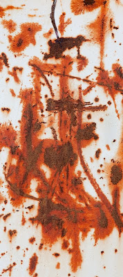
Abstract In Cracked Paint


Found a dumpster with interesting patterns of rust and cracked paint this afternoon. Once the image was recorded, the biggest question was where to crop.

Shot it with my 70-200 f 4 IS at f 11, using live view instead of mirror lock up - no initial shutter opening to shake the camera. If extended use of live view causes problems, they have been too small for me to see, but I have not done any formal testing.

Thursday, September 24, 2009

Tilt And Shift Lenses

I quite often use my 90 ts-e lens and you might reasonably wonder how important is it that one purchase a tilting lens. Perhaps you don't even know how they work but are curious.

Canon and Nikon and Hartblei sell lenses that tilt or tilt and shift. Many people are under the impression that lens tilt increass depth of field. This is incorrect. Tilting a lens does not add any depth of field at all, it just changes the plane of focus. In a normal photographic situation, when you focus a lens at 10 feet, there is a spot 10 feet directly in front of the lens which is sharp, and usually the area of sharpness extends left, right, up and down perpendicular (90 degrees) to the line from the lens to the centre of the image focussed at 10 feet. This invisible wall is usually flat but sometimes curves nearer at the edges as a flaw often seen in wide angle lenses (my 17-40 certainly has a curved plane of focus, focussing nearer at the edges and corners of the image. Anything in front of the plane of focus (that invisible wall) is progressively more and more out of focus the further from the "wall". The same thing happens behind the wall (ie. further away).

It is possible however to take that invisible wall, the plane of sharp focus, and tilt it in any direction we want. If the thing we are photographing is relatively two dimensional, ie. all in the same plane, it should be possible to shift the plane of focus to match the plane within which the subject lies.

So, for example, if in the foreground we have some short plants, in the middle distance some medium height flowers and in the background some tall ones, the flowers (but not the bases of the plants) lie more or less in a single plane from near low to far high, and it would sometimes be helpful to change the plane of focus to match the position of the flowers. This is what happens when we tilt the lens.

If I tilt the lens downwards, it is at an angle to the sensor or film instead of being parallel to it. The distance from centre of lens to top of sensor is now larger, the distance from centre of lens to bottom of sensor is shorter. As shorter distsances focus further and longer distances between lens and sensor focus nearer (think extension tubes to focus close), you now have a situation in which the top of the sensor focuses far, the bottom near. Remember of course that the image is upside down on the sensor so what is really happening is that the low foreground is focused sharply on the top of the sensor, the far high background flowers are sharp on the bottom of the sensor. Since the middle distance flowers are also on the same tilted plane, they too are sharp.

What isn't sharp is anything that lies above or below this tilted plane - so the bases of the plants are blurred, and any plant that is exceptionally tall compared to the others will also stick up out of the plane of focus and the stem will be sharp but neither base nor flower will be in focus. At wide apertures this can look quite bizarre, but with a small f stop, the unimportant parts are sufficiently sharp that the odd plane of focus isn't problematic.

In table top photography especially, it can be very effective using wider apertures and a tilted plane of focus, sometimes keeping the plane vertical but tilting it from parallel with the sensor so it is near on one side and far on the other.

When photographing landscapes with a tilting lens, the amount of tilt needed to shift the plane of focus from vertical to nearly horizontal can be very small, fractions of a degree. On the other hand, in close up photography, you can run out of tilt quite easily.

Focusing into the corners of an SLR image has always been problematic - at least until live view with magnification came into place. The ability to place the area of magnification anywhere in the image means that you can check absolutely that the plane of focus is exactly where you want, and at least on my Canon 5D2, you can stop down and confirm that the depth of field on either side of the tilted plane of focus is sufficient to handle any important part of the subject which projects above or below the tilted plane.

With my 90 ts-e lens, the tilt does not exactly centre on the sensor and so there is some shift in the image as you tilt, which will require reframing the image (or using the shift). I usually just do a minor reframing.

Given that focus blending with Helicon Focus does in fact result in greater depth of field and copes beautifully with three dimensional subjects (that don't lie in one plane) the obvious question is - so what's the point of a tilting lens?

The advantages are several and may or may not be important to you.

1) there is some loss of resolution in focus blending - not a lot, but perhaps enough that if a tilt will do the job, then it may be preferable. Mind you since any lens can focus blend...

2) you can stitch with tilting for higher resolution images where this would take a huge number of images in a combination focus blend stitch.

3) With tilting, you see what you are going to get.

4) Tilting can be used with shallow depth of field to blur areas of the image. This can be done to some degree with focus blending but in different ways.

I quite often use the shift ability of my 90 mm. lens to do a stitch, shifting the lens one direction and the body by and equal amount in the opposite direction to capture a series of three images (left, right and centre) to make a square image which would otherwise have required a crop - so instead of a 3000X3000 pixel image, I get a 5000X5000, which does make a significant difference, to wit prints that are 67% longer on a side. This is the difference between a 10X10 print and a 16X16 print.

I don't tend to use the shift capability for correcting perspective very often, preferring to correct perspective in Photoshop, though a recent demonstration of loss of resolution in the stretched part of the image was impressive - at least in theory - in practice, I have not noticed substantial quality issues in my usual print sizes (13X19) even when stretching a 17 mm. image (ie. severely leaning backwards).

I like my 90 for its close focusing and high resolution, but I probably wouldn't rush to buy it again, now that I'm happily focus blending. Then again, I sure wouldn't mind having one of those new 24 ts-e II lenses - so who knows. not going to pay $2500 for one any time soon.

Tuesday, September 22, 2009

Camera Height

We naturally see the world from eye height. Of course, children do too, just not the same eye height. It is so easy and natural to take photographs from eye height that shooting from any other height takes some conscious effort. Even with a tripod, it seems natural to crank the legs to eye height and set up the camera.

Not that many years ago, people photographed with twin lens reflexes which naturally worked best at waist level and the viewpoints offered were often very effective.

The downside to photographing from really low is that you can't avoid capturing a lot of foreground which invariably is out of focus (unless you are using focus blending or a tilting lens). Perhaps more importantly things like grasses get in the way of seeing the subject.

However, there are lots of times that a blurred foreground isn't a problem, that a low position isn't comprommised by tall grasses and the view of the subject with a plain sky background can be very effective.

Bottom line is that we should ask ourselves with every shot - what is the most effective height?

Sometimes the best height is two feet above eye level - do you travel with a small stool to shoot from a high position - might be a good idea.

Monday, September 21, 2009

Emphasizing The Important

What we see in a scene may not be what the viewer of our images takes away from the print. It is therefore important to use our skill to direct the viewer to how we want them to "read" the image, where to look first, and what to concentrate on.

We can choose subject (or at least an example of this subject) which tends to stand out from the surrounding and background. We can wait for or supply lighting that emphasizes what we feel is important. Often however, this kind of viewer direction doesn't come to us until we are editing the image (even though it would have been better to consider this from the start).

A light object against a dark background stands out, as does a dark object against light, though perhaps not to quite the same degree. A blurred background helps emphasize the important while a cluttered fairly sharp background is a nightmare for emphasizing the important. However, by reducing the contrast in the less important parts of the image, while also darkening them, we stand good chance of emphasizing the important.

While deliberately blurring a large background (or foreground) often looks artifical, done subtly or in small areas it can be useful. More importantly, you could deliberately only add sharpening to the important elements of the image. Of course, it would have been better in the first place to have given yourself a choice, one shot at f16, another at 5.6 so you could choose the best effect for this image.

Occasionally a very odd looking Curve adjustment layer can be very effective ad de-emphasizing parts of the image. The same curve might look horribly unnatural for another image but works for this one - you just have to experiment.

Local contrast enhancement is exactly what you don't probably want to do to the things you don't want emphasized, but doing it to the important parts can be very helpful. By the same token though, using local contrast to lighten shadows and tone down highlights can, if carefully applied, reduce distraction from bright highlights and deep shadows, even though there is more texture there.

Careful tonal adjustment of the important objects can render them more three dimensional and therefore more noticable.

We often use lines in our compositions - a fallen log, a linear shadow, or whatever to direct the eye of the viewer from one part of the image to the next. Sometimes the "object" used isn't obvious enough and lightening the whole thing can be helpful or even better is to use Dodge Highlights to highlight part of the object to emphasize the line. Adding highlights to the important elements can really help them stand out, without having to change the overall tone of the object. Dodge Highlights, if done well, can create highlights where there were none before.

The goal of all this image manipulation must be that the viewer isn't even aware that it ever happened. Too often, things are taken too far - if a little bit of dodging or burning is good, then a lot must be wonderful - well, no, it doesn't work that way. The viewer doesn't want to feel manipulated, doesn't need to have a sense of fakery, Not all skies have to look like the end of the world is nigh.

Saturday, September 19, 2009

Vincent de Groot

Check out the street and portrait photography of Vincent de Groot, made during his travels - some very nice work. Perhaps we can encourgage him to write about how he approaches all these fascinating people.

Back Photographing


The book is off to the printer - too late to change anything, no point in worrying so guess what - I want to photograph again - and blog.

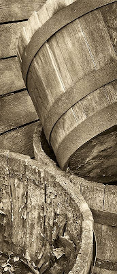
Several very old oak barrel planters were no longer in use and sat out this summer drying. I liked the texture in the barrel but also the stack of them with a wooden picnic table leaning against the background.

Shot this morning with my 5D2, live view, focus blending and somewhat cropped.
I had to increase contrast to make the uploaded jpeg look good - was fine before in Photoshop, hope it looks right to you.

Don't forget, as usual, you can click on the image to see it substantially larger in its own window.

Friday, September 18, 2009

Borders

It seems such a waste to purchase a large printer only to make a smaller image on a more expensive large piece of paper - but damn it, the images look so much nicer if we are handling the prints, pinning them to the wall, placing them in a folio or just thumbing through a stack. With my 13X19 prints and larger I normally use about 2 inches of white on the long sides, more on the ends - obviously depending on the aspect ratio of the image.

For me, a nicer print beats a larger print. What are your thoughts?

Thursday, September 17, 2009

Colour

As photographers we tend to photograph things, or people, but what about dedicating yourself to photographing colour - combined with shallow depth of field or even with the use of a wide open lensbaby, this could be a very interesting project. You might not become famous, or rich, or even get published (though you never know), but you could create a lovely set of images. Think of either a series of small framed prints for a wall or a folio of 8.5X11 prints with generous white borders - could be lovely - get to it. Time to haul out that "normal" l=50 mm. f 1.4 lens you never use any more.

Wednesday, September 16, 2009

No Need To Avoid Flaws

It might be an interesting idea to deliberately work with the flaws in our normal imaging systems - flare, dirty lenses, out of focus, distortion, exaggerated perspective, areas that have been driven to pure white or complete black, super low contrast or almost two tone.

Can you think of a project in which you might take advantage of one or more of these normally avoided flaws? Hmmm?

Tuesday, September 15, 2009

All Your Eggs In One Basket

The editing and image processing for my second book is almost at an end and it should be at the printer within the week (please) and it's time to think about photography again. One of the things I'm going to do is to make sure that I have more than one project in mind. There will be days when any given project isn't practical - wrong conditions, not enough time, lack of inspiration, subject not available, who knows. Further, any project that you involve yourself in intensively tends to come to an end at some point. Certainly that was the situation with Independent Machinery - after about 17 visits, I felt I had done what I could do. Doesn't mean that I might not check back with them a year later to see "what's up" but for all intents and purposes it has wound down. If you don't have some ideas or already a prolonged project on the go, then you could be in trouble.

For example, I'm starting a project on wind - capturing things that move in the wind - whether it be plants or flags or clouds or hair or water, but obviously that requires windy days, so I'll need a minimum of one and far more likely several other short or long term projects to keep me going.

How many projects do you have on the go at one time, both long and short term? Do you ever find yourself frustrated with nothing worth photographing?

Thursday, August 27, 2009

How Long Should A Photograph Keep Your Interest?

It occurs to me that if we think about how long we want people to remain "focused" on one of our images, it might tell us something about how to design that image, how to compose and frame it, perhaps even how to approach the subject. As I often do, I'll relate the photography situation to other creative endevours to see if we can learn anything.

If we relate attention to a photograph to attention to a piece of music, some of the catchiest songs on the radio are a minute long, while a symphony might be an hour. Jingles that advertizers use can be 30 seconds in length yet leaving us humming the damn thing for the rest of the day. Does this mean that a symphony is automatically better, just because it's longer? It probably takes more work to write one, but more inspiration? More genius? More talent? Not necessarily. Some of the most moving music ever written is short.

In literature, the length of the story relates similarly, from the shortness of a joke to "War and Peace". An editorial cartoon can create a powerful political message in a simple sketch and a few words, something you can get the entire meaning of within a matter of a few seconds.

I suggest that the worth of a photograph is not in how long people continue to look at it, rather it is in how much it makes them feel, or think or react.

A reaction to an image can be an accumulation of little things or it can be a big wallop in the first 10 seconds.

If you want to keep people looking, then you need to offer multiple layers of discovery. On the other hand, there's nothing wrong with a simple image with a lot of immediate impact, but which doesn't require extended viewing to fully "get".

An image which provides a puzzle will keep people looking at the image as they search for clues as to scale, subject, circumstances. Another image may make someone think , but the thinking can be done away from the image since the message of the image was quickly and clearly transmitted.

I would discourage you from trying to figure out which type of image your audience wants - leave that to the commercial photographers - instead make the kind of images which you need to make, which satisfy you. Should you pick through your images to arrange a show however, you might well decide to use some attention grabbers at both ends of the exhibit with your more thoughtful images scattered throughout.

Thursday, August 13, 2009

Short Questions And Answers

1. Can you stand a tripod in a river.
Answer: not if it's flowing at a reasonable rate - the turbulance of the water around even round tripod legs induces considerable vibration.

2. Should you leave image stabilzation on when using a tripod?
Answer: yes if you are using a relatively short exposure - say 1/30 second, no if it's anything longer than 1/4 second. Weird things happen to IS during long exposures, even if it is supposed to be tripod aware.

3. What do I do if specular highlights remain "blown" even when I shorten the exposure to the point the image is clearly way too dark?
Answer: specular highlights can be many stops brighter than the surrounding scene and are going to register pure white (as they should) no matter what you do. The only thing a shorter exposure will do is cut down a bit of the flare around the specular reflections so pick a reasonable compromize that won't threaten the rest of the image or do a two exposure blend, at most.

4. What is the best paper for black and white images?
Answer: for hand holdable 8.5X11 images I have absolutely no doubt that Harman FBAl is by far the best on a compatible printer (I have tested the Canon 5000 and Epson 3800). For larger images and especially images that are going to be framed behind glass, an art type matte paper can produce lovely results and there are lots to choose from - I happen to use Moab Entrada Bright White for sale prints and Epson Enhanced Matte (Ultra premium matte this week) for work prints. (it's cheap, can be loaded in trays or feeders, and I can pin a dozen images behind each other to the wall (my patients like flipping through the prints).

5. What's the best camera for serious landscape photography?
Answer: the best camera you can afford, the largest you can carry, with the sharpest lenses you can find. But remember, a good printer, decent monitor, monitor profiling divice, a good camera bag and a great tripod could easily be just as important so don't go overboard on the camera. Stitching is very easy for panoramic landscapes (or even for square images) so you don't necessarily need a huge number of pixels. Landscape photographers need sharp lenses, sharp all the way to the corner, but only at F8-16 - it is rare for a landscape photographer to need to shoot at a wide aperture so sharpness wide open is of no use to me and even a couple of stops down isn't that important. I'm really starting to appreciate live view. The number of pixels merely determines how big a print you can make but remember that the difference in print size between a 12 megapixel camera and 15 is very little.

5. What brand camera is best?
Answer: the one that doesn't annoy you with the way its controls work - quality differences amongst the top brands isn't enough to overide an irritating workflow, menu system, awkward grip or misplaced control for your hands.

6. Where should I display my prints?
Answer: any damn place that is willing to let you put them up - but start with home and workplace, then expand to restaurants, coffee shops, the local library, community hall, sports facility, etc. Don't forget washrooms as a possible place to hang a print - people actually have the time and peace and quiet to look at an image there. Movie theatres are a possibility as well as any offices visited by a fair number of people.

7. What should I photograph?
Anwser: absolutely anything that isn't something you think you should photograph because it will sell, look impressive on a resume, be arty, get you a reputation, be new for newness sake, etc. You can photograph things because you think they might produce interesting photographs even though you aren't inherently attracted to the subject, as long as the process of searching, composing, and editing images of this subject keeps or earns your interest.

8. Should I try to make money from my photography?
Answer: only if you are more interested in marketing than photographing. Mind you, the occ. sale sure is good for the ego but that's not the same as actually trying to make a profit, or using occ. sales to justify very expensive cameras.

9. What lens should I get next?
Answer: the lens that would be the most productive for the kind of photography you do, or want to do. A 400 mm. lens is nice, but if it ends up making only 1% of your good images and perhaps an even smaller percentage of your great images, do you really want to carry it around with you? Most people advise extreme wide angle lenses for landscape but I do my best landscape work with my 70-200 so go figure.

10. Which is better, a $2000 camera or a $1000 tripod?
Answer: if you assume that what you have now is a $1000 camera and a $200 tripod, then the tripod wins every single time - for the kind of work that you'd use more pixels, sharp pixels beats many pixels every single time.

Sunday, August 09, 2009

Rockface


From below Elbow Falls, near Calgary.

Sunday, July 26, 2009

Bridge


I'm absolutely in love with live view on my 5D2 - the ability to check focus in the furthest corners and high magnification is terrific - no more need for mirror lock up accessed through the menu system - just press the button. Not only that, no shutter at all till the shutter closes - I do need to remember that unlike my previous workflow in which I'd flip the mirror up, let the camera steady then take the shot, now the shot is taken as soon as I press the cable release - so let things settle first!

This bridge shot was made this morning, an old abandoned CN line.

Wednesday, July 15, 2009

Our Audience

In the past I have written about being careful not to work to please the customer, to stick to your principles and to follow your heart, which is all very well, but few artists are so self centred that they can work in a vacuum. The other night on CBC, Milton Glaser was being interviewed. This design consultant (who came up with the I Heart N.Y. concept) was commenting on creativity and pleasing the customer and other art issues - basically all the same things we struggle with as photographers. At one point he quit his commercial studio because he and his studio had such a strong reputation that everyone wanted them to just do more of what they'd been brilliant for in the past and he wanted to move on and felt he couldn't do this in the same organization - even though he'd started it.

The other day I posted the picture of the moving leaves. I rather like the image but it's been on my office wall for three days and not a single person has commented on it - and they normally do comment on my latest pictures. Clearly they don't get it. Now, my patients are for the most part quite well educated, people with university degrees or highly responsible jobs many of them. O.K., they aren't art experts, most of them. What do we do when not a single person goes out of their way to comment on our images?

When we make some more normal images and so get positive feedback for those, it helps us then move out on a limb to do more interesting work which may be appreciated by a much smaller audience, or even no audience. When there is no history of appreciation because we have never done "normal" work, it can be a bit more challenging. In that case, it can take a very strong personality (ie. being very egotistical) to be able to work in an environment of no positive feedback.

That in the history of photography there have been a number of people who quietly worked away on their own, not sharing their work with anyone only to be discovered late in life or even after death confirms that it is possible to work without appreciation. The significant difference here though is that these people didn't put their work up for evaluation and so never had any negative feedback. For those of us who do submit to shows, contests, publications and posting to the net, it is no longer possible to think that "well, my work is great, it's just not discovered yet".

I have been scouring photo.net and photosig.com for good colour work that I might then be able to comment on and the work that rates highly on these sites is frankly pretty mundane - oversaturated colours, cute babies, naked women and overly photoshopped skies. Photo.net used to have editors picks of the week which were quirky and much more interesting and several times I have been able to point you to wonderful photography but unfortunately they don't seem to do it that way any more, picking instead themes which seem to generate a lot of cliche images.

Some people are "photographers' photographers", that is they are most appreciated by other people educated in the nuances of fine print making and photography in general. Others seem to be most appreciated by galleries because their work is different and fresh (not to say weird).
I guess the trick is to find the right audience for our work. It doesn't have to be a large audience (unless we insist on making money from our photography). Fortunately the net is huge and the varied tastes of people using it, well, it doesn't matter how odd your taste is, there's bound to be other people with similar interests. Hey, if Alberta can have a gopher hole museum, there's a place and an audience for us all.

Monday, July 13, 2009

Papers

my current printer is an Epson 3800 but the issued discussed here also applied to my Canon 5000 I used until recently.

My normal gloss paper is Harman FBAL which produces wonderful images in 8.5X11. I have an order for two 17X22 prints and thought that paper this glossy behind ordinary glass might create a nightmare of reflections and wanted something with a bit more tooth. I thought I remembered Ilford Gold Silk as being like that and bravely purchased two 10 sheet boxes of 17X22 paper.

The texture isn't as much as I remembered and the gloss of the paper itself is quite low - net result is that prints show a large amount of gloss differential. Perhaps I'm unreasonable in wanting to not see this as I walk towards a wall mounted print but frankly I find the gloss differential a deal killer for me - back to the drawing boards. I went back to the store and got a refund on the unopened box and went to a second store to get some Moab Entrada Bright White, my previous standard display paper. Problem is, compared to the Gold Silk print, the image seems rather flat - the sense of the third dimension with the semi gloss Ilford paper is gone. It's odd - whatever tones I look at seem to have been reproduced similarly, yet when I look at large areas, the print just lacks that snap that has been described over the years, the parts of the image don't seem separate somehow.

Where do I go from here? I suspect the customer won't care or notice and would probably find the matte print easier to deal with but I notice and it bothers me. Prints made on Epson Semi Gloss Premium paper seem to have just the right amount of tooth for large prints, but the paper is so darn thin - if only they made a heavyweight equivalent.

I guess the paper battles continue, with no definitive answer in sight.

Sunday, July 12, 2009

Wind


After three intense months working on the book, I finally have a break as the layout editor is doing her thing. I have actually found it hard to get back photographing but today decided to take advantage of some windy weather to photograph in the back yard.

I strapped on my 10 stop ND filter only to find it so opaque I couldn't even see the image - so I took it off to focus, then tried to replace it - but guess what - that changed the focal length of the lens - so I scrapped that idea. I'd already been thinking of getting one of those Singh Ray Vari stop ND filters so this has settled the question, I will go ahead and order one in the largest size common to my lenses, and adaptors for any others. As it happened, in cloudy weather, I was able to shoot at 1/8 second and in the gusts get significant movement. It took a lot of images to get just the right amount and direction of movement and it was important to make sure the background didn't include any bright highlights from the sky.

I think this could be the start of an interesting project - recording movement - hardly original but that doesn't matter. Remember to click on the image to see it much larger.

Wednesday, July 08, 2009

I'm Still Here...


In response to Billie's query of where have I been - the last three months have been an intense series of rounds editing the second book Camera To Computer. Finally it is off to the layout editor. There's lots more work to come but a short breather is very nice thank you.

I have two requests of anyone who is still hanging around reading my blog.

1) I need some ideas for topics.

2) I have an idea for a third book "Why Phhotographs Work", which would be a series of wonderful images by other photographers along with 1 - 3 pages of description on why these images succeed. it would be a modern "Looking At Photographs" without all the talk of technique and media - and while I have a number of great black and white images, I need more great colour photography. Photographers have to be alive. Send info on how to access the particular image you are recommending.

Oh, and after not photographing for three months, I shot this spatula on the weekend.

George

Monday, June 01, 2009

The Fastest Way To Better

My entire first book was about becoming a better photographer so I'm not about to condense that into a single short essay. On the other hand, there must be some things which will improve our photography faster than others. "Study the masters" he said - well that could take a life time so, valuable as the advice is, it ain't quick. "Buy a better camera" says a small voice at the back of your head - nice try but that isn't going to do it either - though it is fast. Doubling your pixel count will simply allow you to make bigger prints, not better!

Surely photographers of different levels, interests, skills and experience will need custom advice - well maybe, but consider the following:

Try the following experiment. For the next month, for each and every image you take (or at least series of images), stop for a moment and ask yourself what it is you want the image to do, and then ask yourself if you have done everything you could to help it do that.

That's it, that's the secret to eternal bliss, just that one sentence.

Naw, it can't be that easy you're thinking, besides I already do that. DO you really, do you do it for each and every composition?

Here's a fictitious conversation that someone might have with themselves when out photographing to illustrate what I mean.

Let's say that the subject is a small meandering stream, with overhanging trees draping moss. The reason you are there int the first place is to make some nice landscape pictures - you could come up with some hokey reason that looks impressive and relates to communing with nature and forces of the earth and stuff, but that's to tell other people like curators, for yourself you cut the bull and admit it's all about taking nice pictures of a pretty scene.

Right, but that's why you are there, not why you are taking this particular photograph so the conversation should now continue:

So, I'm hanging out over the water, trying to capture that lovely S bend in the river, the overhanging trees.

Why take this image? Well, I like the reflections on the water, the shapes, but perhaps most of all, I somehow want to capture the remoteness of this spot (even though it's a city park), the coolness of the forest shade on a hot sunny day, the tranquility.

OK, I never said it couldn't be a tall order.

So, that's what I wanted in the image. Is it any surprise that the odds of achieving all these goals isn't great. Still, let's see how I do at answering the question of what am I doing to achieve these goals.

I envision a fairly dark print to reinforce the isolation and tranquility. Definitely not contrasty and harsh - does that have any bearing on the image I am about to capture.

Well, the sun is shining through the trees in spots so whether I like it or not, harsh may be exactly what I get. But, there are some clouds and every so often the sun is partially hidden. I call this "dial - a light" conditions since I can control exactly the amount of contrast I want based on my timing of the image.

I want those reflections on the water, but a check with a test exposure shows that they are off the chart and going to record in pure white - sure I MIGHT be able to rescue them with the recovery slider in Camera Raw, but I don't know - do I want to gamble - NO, I do not. I am going to have to adjust the exposure or possibly even use more than one exposure and exposure blend the result, whether HDR or not. I want softness and empty shadows do not factor into that so simply reducing the exposure to handle the reflections is not going to work - so two exposures it is. I wanted this to be as close to wilderness as possible but I see that in the distance there is a streetlamp showing - barely visible in the viewfinder but there none the less. Sure, I could Photoshop it out but what if I moved one inch to the left - Ah Hah, problem solved and I didn't even need to cheat.

So this is an example of the kind of conversation you might have. First determine why you want this particular image, then ask yourself what you are doing to make it achieve those goals and more to the point, is there anything further I can do to achieve those goals.

It took a while to write it and even some time for you to read it, but my suggestion is that you have this conversation with yourself with every shot for a month, and see if it has an impact on your images.

Let me know how it goes.

Friday, May 29, 2009

The Viewer Doesn't Care

As photographers we constantly have to evaluate how good our images are. We do so when we decide which ones are worth printing, which to put in a portfolio, or to post to the web. We do so when submitting for contests or publications. Even if we didn't have to, we do it anyway - having favourite images that we think is our best work, even if we don't show it to friends and family. We evaluate our work when deciding which images are worth a $150 frame or are worth pinning to the notice board at the office.

But,

The viewer doesn't use the same criteria t judge images.

The viewer doesn't care how far we had to hike, or how early we had to get up in the morning, or how bad the rain storm - for all they know, we stepped off the air conditioned bus, aimed our camera and fired off a "snap" which produced the print in front of them without any effort at all.

The viewer doesn't care how hard you had to work the scene or how clever you were in finding the one viewpoint which caused everything to line up properly - most of them assume we found it that way and are willing only to grant that we at least knew a good "snap" when we saw one.

The viewer doesn't care how many hours, how many attempts or to what trouble we went to edit and then make this one print.

The viewer doesn't care about subtleties of paper surface and ink type and depths of the blacks. They don't care that we went through a dozen different papers looking for the one that most perfectly presents our images.

Most of the viewers are looking at the print behind glass and can't even tell whether you printed it on matte or glossy paper.

Only a small fraction of viewers can even tell about careful highlight and shadow control.

All the viewers care about whether the picture works for them, or it doesn't - everything else ranks way down there, if at all.

Perhaps it would be better if prints were presented unmatted and thumb tacked on the wall, complete with blood stains and tear marks so the viewer could appreciate our suffering, but that won't be happening any time soon.

O.K., so the viewers don't appreciate my efforts, so what?

Well, the problem is, we as photographers do appreciate all of the above qualities, especially in our own work.

If we had to get up at 3 am and drive through the dark, hike for miles before sunrise to be in place, on 27 occasions before getting that perfect shot - our appreciation is way out of proportion to how good the image actually is. It is really hard for us not to ascribe to the print a lot more value than is seen by the viewer.

So, the next time we are evaluating our images, we need to try to remove from the equation how hard it was to make the image and concentrate only on the image itself. We may not even be capable of seeeing past our biases and here assistance can be sought from others - wives, friends, other viewers.

Next time your favourite image doesn't get any appreciation from an editor or gallery owner or even your brother in law, remember that the medals are being handed out for the strength of the image, not the sweat equity that went into it.

Perhaps we do need prizes for the best "it's a shitty image but damn it I worked hard to get it". We'd never tell the public but fellow photographers could commiserate with the winners - " you worked so long, you deserved better..." but I suspect that none of use would want to step forth to claim the prize.

Some images come easily, others with great difficulty. Fortunately we can probably honestly say that those who are prepared for luck are the ones most likely to be able to take advantage of it when it comes along. The hard work may not be appreciated by the viewer of a single image, but more than likely our efforts will be rewarded by having more good images to present to the public.

Monday, May 25, 2009

Keld Helmer-Petersen

Sandy sent me a recommendation of a photographer who made the following comments:

Keld Helmer-Petersen has been overlooked in the history of photography book's, but he has recently been re-discovered by the English Magnum photographer Martin Parr. His contribution to colour abstract photography started in the 1940's but all the credit for colour photographs was given to the American photographer William Eggleston in the 1970's. In 2005 I went to see an exhibition of Keld Helmer-Petersen's work at the Rocket Gallery in London, I was flabbergasted by the subject matter displayed on the gallery walls both in colour and black and white. His modernistic style and perceptive vision for photographing the over looked mundane subject matter, and making it look ligh abstract paintings is nothing short of amazing. In the fifties he studied with the late great Harry Callahan and Aaron Siskind at the Chicago School of Art Institute formerly the New Bauhaus. He was definitely ahead of his time and I felt humbled in the presence of his imaages.

I tried to get his book but at $317 it seemed a bit steep. Sandy also gave me a reference to a gallery site at which you could view a fair number of images, all be it pretty tiny.

Blogspot seems to be on strike but the web address is:

http://www.rocketgallery.com/ex_khp_ex.html

you will need to type this in your browser till blogspot gets working again.

and click on previous exhibitions, then 2005-2006 and then Keld Helmer-Petersen, you can then select "Danish Beauty", "Black and White" or "122 Images" to view his photographs.

Helmer-Petersen first published his colour work in 1948, clearly making him one of the pioneers of modern colour photography.

There are more of his images in 2007-2008. I have sent an email to the gallery to see if any of his books are still available.

Petersen has a wonderful sense of colour and design and I for one am going to have another go at finding his book.

Monday, May 18, 2009

My Second Book

My absence from this blog for much of the last several months will have been pretty obvious. I have been working very hard on my second book, called "Camera To Print". The deadline for the text of the book is the end of this month and there will be a lot of further editing and image organization and more editing and index production and more editing but the last few weekends have really broken the back of the work, not to say mine from sitting in front of the computer 12 hours a day - time out to eat and walk the dog.

I think it's going to be a good book, a useful book. The book complements the first book which was all about the art of photography. This one is about the practical aspects of making fine images. Much of the book is dedicated to image editing and showing what is possible with editing while several chapters discuss working the scene. There are lots of bad images compared with good, discussions explaining the differences follow.

I wish someone had written this book for me when I was getting going. Discussions about f stops are minimal but it does discuss stitching, focus blending, HDR, Photoshop techniques and tricks, and has lots of suggestions to improve images.

I think it will be an interesting read for anyone, though I suppose that if you don't like my images, then don't buy the book.

Someone wrote about my first book that I'd made a mistake in the introduction telling people to not buy the book if they didn't like the photographs. He thought the writing terrific and hated the photographs. The ideas in the book may have sounded good to him but surely if the images don't work, then the advice has to be considered questionable.

An old axiom is that "those who can't, teach" but the truth is that people teach because they like teaching, they don't become or stay professional photographers because they hate sucking up to clients or don't have the personality to sell themselves or hate the fact that being a commercial photographer is 90% business and 10% photography.

Many photography teachers could and often do make some very fine images that few ever get to see. My point is that following the photographic advice of someone who "can't hang em' on the wall" is risky at best.

I had a lot less time to make the images for the second book, almost entirely images made in the last 18 months but they nicely illustrate points I want to make. I even found a few gems as I redid a number of images for the book and had to search my files for companion images.

Well, you'll have to take my word for all of this because the book won't be out until late in the year, hopefully well before Christmas unlike last time.

Once editing is complete, I think I'll sneak an example chapter onto my website and let everyone know through the blog that it's there.

Tuesday, May 05, 2009

Composition 2 - Shapes

Last time I wrote about the different things that make up the elements of an image - things like shadows and reflections, shapes left by the space between one object and another, or between one object and the edge or corner of an image (unless you print in circles - it's been done).

The shape of an ojbect is probably its most obvious characteristic. What may be less obvious is that the shape of the shape affects the quality of the image. The most stable shapes are rectangles aligned with the edges of the image, horizontal ones being more stable than vertical (they can't fall over).Objects that are just a little off rectangular (trapezoidal or parallelograms) can be ever so much more interesting. The other night I was looking at a Matisse print and it consisted of a series of rectangles within each other and it was the slight "misalignment" of one rectangle on another that made things interesting. The lines weren't perfectly straight either and the rectangles really had a sense of life. Parallelograms suggest action while trapezoids suggest perspective - ie. one part is closer than another part of the shape.

It may be true that circles roll better than ovals, but they sure look a lot more stable.

Imperfect circles breathe life into an image and suggest change over time. At least one edge of a triangle is going to be a diagonal line which has energy and movement.

Triangles with a wide base and pointed top also suggest a receding perspective.

You may have different meanings for the usual variety of shapes, based on your experiences and that's ok, just so long as you take the shapes into consideration. Remember too that a change in camera position can radically affect the shapes in an image - narrowing them or rounding them, making them lean or not.

Next time - relationships between the shapes.

Monday, May 04, 2009

Composition 1 - Compositional Elements

Over the next several weeks, perhaps months, I'm going to write about composition, "the strongest way of seeing" according to Edward Weston.

A good place to start is to think of a possible image as a series of compositional elements. While these may be things that exist in the real world, just as easily and importantly they can be elements that only apply to a photograph.

For example, in a top half portrait, the space between the arms and the edge of the image is a shape, likely part of the out of focus background, but none the less for the purposes of the image it is a real element, with a shape and defined edges.

A strong shadow is a compositional element, even if you can't bottle it. A reflection on water can be a compositional element - or perhaps just the waves caused by a puff of wind on part of a pond which changes the tone of that part of the pond significantly.

You might find it helpful in looking at an image in terms of compositional elements to squint, or take your glasses off (if near sighted)or press the depth of preview lever to darken the view through the viewfinder.

Simply being aware of the elements that make up a composition already puts you ahead when it comes to positioning your camera and framing to make a more interesting image. There's a whole lot more to these elements and I'll discuss the relationship of the elements next time.

Thursday, April 30, 2009

The Times Are Good For Photographers

The economy may be going to hell, but photographers have never had it better. Virtually any current DSLR will take fabulous images and will outperform most photographers. Colour management, if not exactly simple, is getting more straight forward (the Luminous Landscape video Camera To Print really helps). Inkjet prints on some of the new baryta papers are producing wonderful prints. No, they still don't look like silver prints but different isn't the same as worse - they are beautiful in their own right. Not only that, we can share our work with others via the web and it's easier to become known that at any previous time in history - despite a huge amount of competition.

Control over images has never been as good, with Photoshop and Lightroom and all. Sure backup is a pain, but no worse really than sorting your negatives and being consistent about your contact sheets and negative filing system.

Now, if we could just figure out where to point the camera.

Monday, April 27, 2009

How Important Is The Subject Matter

It is common for photographers to agonize over their next project. We want something original, fresh, interesting, challenging, publishable, yet accessible. There's no point in dreaming of a project on Hawaiian rain forests if you are in Pittsburgh and your travel budget can only get you to Ohio.

It might be worth considering just how important subject matter really is to our photography. If it's really important, then perhaps there are ways of approaching the choice of subject which are better or faster or more reliable or whatever, and if it turns out it isn't all that important, then why are we agonizing over it.

Let's start of with some basic facts.

1) there are no new subjects

2) there are no new approaches

3) there are no new techniques

Yes, I know, these are pretty bold statements but let me explain. With millions of serious photographers in the world the odds of you or I coming up with something new in any of the above categories is slim. Often we come across writings from more than 100 years ago agonizing over the same issues we struggle with today - and no matter how original someone is on subject matter, someone else is likely to have done it first.

You might be inclined to ask (quite reasonably), 'well, if that's the case, what's the point of even trying to photograph?"

There are a limited number of subjects or at least categories that we can photograph - people, landscape, machinery, buildings, nudes, still life, etc. On the other hand, there are an infinite number of ways of seeing something. When you look at an object, you don't see the same object that I do. You see it through eyes and with a brain which has completely different experiences, attitudes, feelings and values and each of these subtly and sometimes vastly affects how we photograph the subject.

If the only photographer you admire and collect is Ansel Adams, then it's natural to emulate him but even there, Adams isn't you and your images will be different. This can be a problem since you can easily get frustrated when your images don't turn out like Adam's. Sure, sometimes that's for technical reasons and just plain skill, but not always.

I have a number of images from my youth which even today are strong and hold up and yet I didn't give myself credit for them at the time.

As we learn about the work of many photographers, we can't help being influenced by all this other work. There could never be another Ansel Adams because the times have changed, there are too many newer photographers who influence us.

So, picking a subject because it's new isn't going to work and fortunately we will bring ourselves into our images of these "old" subjects.

On the other hand, surely some subjects work better than others? Sure, for the individual photographer. I like photographing old industrial sites, someone else might find it nigh impossible to come up with a decent image at the sites where I revel in it.

Clearly some subjects and more particularly, locations, provide more opportunity to make images than others. They have more parts that are interesting, a better selection of viewpoints that are good, better and clearer line of sight, greater textures, more interesting shapes, shadows, lines and whatnot.

Some setups have one fatal flaw, which cannot be changed or outwaited and you simply have to move on.

Of course, the amount of available material is pretty much independent of choice of subject category and a lot to do with the specific subject or location. When photographing architecture it's a lot easier to work with a building with interesting shapes, surfaces that reflect light in interesting ways, and which is accessible - ie. not jambed up tight to parking garages on either side and immediately across the road.

You might decide to photograph glassware.It's going to be a lot easier if the glassware is interesting - in shape, tone, reflections, colour etc. Location will be important - whether it's in your kitchen cupboard or against a mirror or next to a window.

The trick then isn't in selecting glassware, it's in finding the right glassware in the best location.

This would suggest that just about any subject would do, if you have at least a passing interest in it. Where you have to spend the time and use your initiative is in selecting the right example of that subject in the correct location and under the best circumstances.

This may seem pretty obvious, but I suspect that many photographers spend an inordinate amount of time agonizing over the first part and paying little attention to the next two - to the detriment of their images.

Saturday, April 18, 2009

The Future Of My Cameras

I was reading Luminous Landscape on medium format cameras and the new Leica S2. That got me to thinking about what I need in a camera,

Photographing landscapes, industrial, or if you shoot nudes, still life, architectural and I dare say even portraits do you really need a view finder at all? Live view with a good sized screen (esp. a tilting one) would be all that's needed.

I'm amused to read of photographers discovering Live View and starting to use a dark cloth to better see the LCD in sunlight - shades of view cameras - but without the hassle of loading film, with far better ability to focus, no need for magnifying glasses and a lot of the time not even the dark cloth.

Without the viewfinder you don't need a mirror so lenses are easier to design so really great lenses should be the norm. Shutter - not really needed - after all in live view, the start of the exposure is electronic, and the closing of the shutter after is just tidying things up - not really needed.

Of course hand holding would be difficult, but we're talking serious photographers here who could easily have a regular slr for sports and such - and even this future camera without shutter and mirror and viewfinder could work nicely on a monopod, or in a pinch, hand held.

There would be no need for fancy electronic connections between camera and back- the camera wouldn't do much - oh, I suppose you might want auto f stop control - but that's about it - and I could certainly live without that - hell, a cable release could easily be made to stop the lens down before the exposure is made.

I don't suppose it would be cheap - though when you think about it, it's a lot simpler to build than a dSLR.

It is amazing that medium format backs have small poor LCD screens - a tilting, rotating large screen is such an obvious advantage. I guess that's what happens when there isn't a lot of competition.

Saturday, April 04, 2009

Second Attempt at Knuckle


This is a print I have on the wall of my office. It's been rather fun to see if anyone can guess what the image is. I prefer this to the previously posted image with borders around the coupler, more abstract, fewer clues. One of the best I have done in a while, which considering how little shooting I have been doing lately is quite reassuring.

From The Archives II


Shot in about 1982 in Kentucky - Laurel Lake Spillway, shot on 4X5, scanned on Epson 4870.

Thursday, March 19, 2009

Saturday, March 14, 2009

Scrap Abstract


When we arrived at the shop to photograph the steam locomotive, the workmen started tidying up a bit behind the loco and my last efforts were to photograph the piles of scap they' built up - I'm quite sure they thought I was mad!

Friday, March 13, 2009

Steel Beam


Sitting behind the tender were scraps of metal, including this single long beam, which end seemed interesting to me.

Back Photographing Locos


This is what it looks like when you peer into the smokebox (front) of a steam locomotive - only it's a hell of a lot darker - 20 second exposure.


This is a close up of the knuckle of a coupler on an FP7 diesel locomotive - looking more like a piece of pottery than a several hundred pound chunk of cast iron.


Cow catcher on locomotive CP 2816 Hudson (4-6-4) locomotive, weighing 232 pounds, using 10 gallons of fuel per mile, along with 100 gallons of water. You don't take this to the grocery store for bagels.


Here you have an angled view of the front coupler on 2816. It's actually painted black but lit by sodium vapour lamps - and this is after I corrected the colour!


Shots of loco drivers are common - I used a couple in my last book and I was one of a long line of photographers caught by the power, heft, and strength of these magnificent beasts. This time I found the drivers and connecting rods in a particularly interesting pattern, with the lubricator sitting above.

Friday, March 06, 2009

Camera Settings

On the off chance you might be curious, here's a list of camera settings I use:

1) manual focus - but rely on focus confirmation in viewfinder

2) manual exposure - placing the exposure mark above and below the centre as I think the image needs - I don't take advantage of the spot metering capability

3) mirror lock - always when on tripod and

4) tripod is used 98% of my images

5) EI 100 - why would you use anything else unless you need it

6) exposure blending - occasional - 1% of shots, I tend to shoot in fairly soft light

7) stitching - even with the 1Ds2, I still stitch about 1/3 of the time, especially if the image is going to differ from 2:3 - so for square images and panoramic images especially.

8) focus blending - using Helicon Focus - about 1/4 of my images

9) my most frequently used lens is the 70-200 f4L, why would a landscape photographer want to carry the extra weight of the 2.8?

10) flash - what's that?

Thoughts About Tripods

With IS lenses and high ISO getting better quality results, you may question the need for a tripod. There are many situations in which depth of field is not important and you may well be able to make the image successfully without compromise and without tripod.

That said, there are lots of situations in which there are two or more important parts to the image, not in the same plane of focus and for which added depth of field is the only remedy.

In the old days there were depth of field scales on lenses, though anyone who did serious work and made even moderately large prints knew that they needed a smaller stop than the scale suggested. With zooms we have largely given up on the tiny depth of field scales even if they are there.

With the increasing use of full frame sensor cameras, shallow depth of field is a major consideration and often it's necessary to stop down as much as possible - basically just shy of the point where diffraction really starts to become an issue. For me, with a full frame camera, this is f16.

Suddenly the shot that was 1/125 at f5.6 is looking like 1/15 at f16 - which even with IS, may not work on a long lens.

Every single time I have been out shooting without tripod, I have regretted not bringing it along.

On Tripod Quality

No tripod is perfectly steady. The less steady ones are more likely to be compromized in a breeze and require longer after touching the camera or lens to dampen the vibrations and require more care with the cable release. Lighter tripods run the risk that the camera will overwhelm the tripod and the whole rig will tip over. In my experience the tripod should weigh as much as the camera/lens combination. Mind you, that doesn't mean you can't use a light tripod - you just have to be a lot more careful. If you are using a light tripod, I highly recommend you go with an L bracket for the camera so that when photographing vertical images you don't have to flop the camera over on its side.

For a given size of tripod, carbon fibre is of course significantly lighter - but perhaps you could get away with the next size down in legs and not have to fork out up to $1000 for carbon fibre (Gitzo).

Manfrotto's newer tripods allow the centre post to swing horizontal. My feeling is that they aren't heavy enough or sturdy enough to hang my 1Ds2 from but they might work well with a smaller lighter camera and there are certainly times when getting out over a railing would have been really useful.

If you do studio work, carbon offers no advantages and might in fact be a disadvantage as here weight is all to the good.

Four and five section legs require good quality and fit, but at least they fit in your suitcase. Don't forget that you can travel with the centre column removed and even the ball head off to make the overall length less.

I used to insist on spike feet for landscape work but my current gitzo tripod just has rubber ends and frankly, I don't think it makes a difference. My tripod legs after two years of a lot of use are just as stiffly connected to the top of the tripod as on day one and can stand on slippery ice at almost any angle without requiring the spread locks to be set - a measure of quality.

Quick release plates are great and I'd not want to go back to screwing in the camera each time I use the tripod, and having the camera rotate on the tripod, just after everything is aligned perfectly.

In theory there is more risk with the arca type clamp which is open at either end but in several years of use I have never had a camera come loose, with arca, RRS or acratech devices. I find the ability to slide the camera left or right great with tilt/shift lenses.

I don't know any serious photographers who continue to use pan/tilt heads for their still photography. Ball heads are almost universal. I have a very small Manfrotto ball head with quick release plate on my 925 tripod for the 40D, making a light portable and packable combination.

For a lightweight traveling tripod I'm willing to compromise on height and will accept the use of up to 6 inches of centre column to get to eye hight.

Don't forget that on a slope, the downhill leg can never be long enough and the fact that my 1349 tripod will go well above six feet is sometimes helpful.

Although my f4 70-200 can be used without tripod collar, it's a lot steadier with it and the whole rig is better balanced.

There are times that tripod PLUS hands on camera is steadier than tripod alone - in high winds or really long lenses (300 mm.+) in which even with mirror lock, I'm concerned about shutter vibration. Mind you, this only works for reasonable shutter speeds. Sometimes I leave off the lens hood if there is a cross wind.

Since you are going to be standing there with the cable release in hand, it makes sense to stand upwind of the camera if possible.

Remember that the whole point of mirror lock was to get the vibration out of the way and firing the shutter right after locking the mirror is somewhat defeating the point - wait a couple of seconds. I confess I have to remind myself of this now and again as I get caught up in the moment.

Tripods, of course; don't defeat subject movement and sometimes an higher ISO may still be necessary to defeat wind.

Remember that you can sometimes make use of a tripod when the legs are together, simply leaning the rig against a fence or wall or over a railing to get the image you want. You can even hold the whole rig out over a canyon should the need arise.

Once on location, I quite happily carry my camera and tripod over my shoulder. I take into consideration what it might bump up against - concrete walls not being famous for their cushioning effects on camera bodies. I do look over my shoulder to see that the lens is more or less aiming down so if I do catch a branch or debris should fall, it isn't going to land on the lens.

Uwe Steinmuller carries a small plastic 2 step ladder with him in the car for those times when you have to see over a fence. Ansel mounted a huge aluminium plate to the top of his vehicle so he could stand up there, with tripod, for the best view. I have been known to carefully climb on the top of a Chevy Suburban roof but sure wouldn't do that with my car - but don't forget you can use live view with the latest cameras to position the camera above eye height and using the centre column and not even look through the view finder.
Tuesday, March 03, 2009

Snow


Two images from Mineral Hot Springs, Banff.