Monday, December 12, 2011

Image Quality

In checking into the Pentax 645D, I paid for a subscription to Digilloyd's Advanced Photography and noted his other site on image sharpness.

Below is a list of topics covered. I'm showing you this, not to promote the site (I haven't paid for this section of his site) but simply to point out the many ways an image can be degraded.

  1. Banish Blur, or Blur for Beauty?
  2. Blur by Focus
  3. Blur by Autofocus Error
  4. Blur by Manual Focus Error
  5. Blur by Manual Focus Inconsistency
  6. Blur by Focus Shift
  7. Blur by Focus Lock and Recompose (FLR)
  8. Blur by Subject Movement
  9. Blur by Camera Movement
  10. Blur by Mirror Slap
  11. Blur Caused by System Alignment
  12. Blur Caused by Image Stabilization
  13. Blur from Haze and Refraction
  14. Blur Caused by Lens Optics
  15. Blur and Haze from Spherical Aberration
  16. Blur by Purple Fringing (Axial Chromatic Aberration)
  17. Blur by Red/Cyan Fringes (Lateral Chromatic Aberration)
  18. Blur Caused by the Laws of Optics (Diffraction)
  19. Blur by Depth of Field
  20. Blur from Field Curvature
  21. Resolving to Sensor Resolution
  22. Blur Caused by Anti-Aliasing Filter
  23. Blur Caused by Digital Capture
  24. Blur Caused by Demosaicing
No wonder so many people struggle to get high quality images, and sharpness is only one of several characteristics of a technically good image. Only when you are confident you have satisfactorily controlled every single one of the above issues can you start thinking you need better equipment.

On his site, Lloyd has several examples of commonly used top brand lenses hugely changing focus as one stops down, the difference between focussing on the eyelashes and the tip of the nose or the ears type of difference.

I couldn't get a sharp image with the Phase one camera and P65+ back I borrowed for a workshop - and finally got rid of my centre post, tall ball head and leveling base that stuck up another two inches, and now I get sharp pictures consistently - if there is no wind.

On the 5D2, I have been utterly amazed at how much image blur there is at full magnification live view when the wind is blowing.

Michael Reichmann found that tripods (the best tripods) don't stop shaking for 7 seconds - using mirror lock up and a two second delay doesn't cut it.

With medium format especially, focal plane shutters can add considerably to the instability and I wouldn't be surprised if that wasn't a sig. part of my diff. with the phase one camera.

Camera straps blowing in the wind contribute to movement as do cable releases. Let's not even talk about people who press the shutter button and hope the camera stops shaking by the time the self timer activates.

I have been paying attention to what I stand on. Ground isn't ground - ground can be springy, it can be soggy or even squishy, it can be a connection between your feet and a tripod leg and there goes your image.

I`m amazed at how many people are still stopping down their camera to an f stop that is severely diffraction limited. With a full frame sensor (my 5D2) I usually use f11 and focus blend if I have to. Sometimes I will use f16. it isn`t as sharp, though I think I can pretty much compensate with local contrast enhancement.  At f22, I can`t compensate. With an APS-C sensor, I try to stick to f11 at worst, and with point and shoots, even f8 can be problematic.


Saturday, December 10, 2011

Pentax 645D

Well, some print sales, some commercial photoshop work, an old inheritance that finally got sold (40 years later), and book sales, and I'm considering getting a Pentax 645D.

I have one on loan from The Camera Store for a couple of days, and will give it a bit of a workout. Have the 55 and 120 lenses on loan, have read the detailed review on digilloyd.com  (you have to pay but well worth it for pointing out what to watch for), and managed to make a few shots with it this afternoon.

It really is a photographers camera - with all the right controls. It did take a while to find the self timer (via the drive button - so very easily accessed) and I have yet to figure out how to switch from one card to the next (camera holds two SD cards).

The real issue is going to be living without live view, upon which I have come to rely so very much. On the other hand, the viewfinder is great and I had no difficulty using it with my glasses.


Neither is a great shot, but for the amount of time I put into it, about what you'd expect. Now, whether either is any better for being photographed with the 645D is a whole other matter.

Worst case scenario is Canon comes out with an equivalent camera, featuring a cmos sensor and live view, a tilting lcd (or wireless connection to either ipad or iphone) and that allows me to use my current lenses.

I doubt my current lenses (mostly zooms) are going to hold up at this pixel count. That would mean a new series of lenses - almost certainly thousands of dollars each. I'm planning to get some used pentax lenses - I can get a complete set for $2000 (35, 75, 120 macro, 200). Granted they aren't autofocus but I never use autofocus anyway.

Canon having disappointed many with the low pixel count of the 1dX, I figure I'll get a fair part of my money back if I sell within the next two years.

What I noticed photographing today was two things - in the past, if my camera was a bit low or a bit high, I could still easily use live view on the Canon 5D2 where today I had to stretch to reach up and look down through the Pentax. This might actually mean keeping a stool in the car. From prior experience, an angle finder doesn't solve the high camera problem.

Mind you, the two best shots I have made in the last couple of months were both within 100 yards of my car - so a step stool would be very practical (hell, I could even sit on it for low shots and give my old knees a rest).

Why "waste" $12,000 on better equipment when the 5D2 is already pretty damn fine?

Well, twice this year, selling images has been compromised by the limitation on print size. There really isn't any other reason to go to such expense, when even a Canon Rebel can make fantastic prints, albeit just not as large.

I still stitch with the 5D2, but stitching, focus blending and doing HDR all at the same time is just mind boggling.

Will I return the Pentax because of missing the live view? Not sure yet. Will head out tomorrow shooting and see if I can resolve the question.

One thing I have thought of to aid focus blending without having live view is to take a couple of small plastic clamps (hardware stores sell them in packs of 20) and modify it so it grips around the lens, and has a pointer on one of the two finger grips. I'll get the framing right (which means right tripod position) then focus the centre spot on the nearest part of the subject. Then I place the lens clamp/pointer so the pointer is aiming straight up. I then move the camera so the furthest position is in focus, and place a second pointer, or a second part of the first pointer vertically.

I reframe the subject, turn the lens so the first pointer is just past vertical (so I am sure I caught the whole range of focus), and shoot a series of images until the second pointer is just past vertical.

In practice, today I just used the bright viewfinder to focus on near and kept checking till the far was in focus I found the near easy to focus manually, the far a bit harder. In neither case did I use the Pentax's built in focus check for manual lenses, and I'll check that out tomorrow.

Tuesday, November 22, 2011

Ipad 3

There's little doubt that there will be an Ipad 3, and it MAY have 2048X1500 resolution. Even if it doesn't, there likely will be one of that resolution soon. That would put it almost on a par with the wonderful screen of the iphone. As photographers we are going to have to be ready for this. For showing portfolio images this is a non brainer, but it starts to become more of an issue when we need that resolution for ebooks and Ipad versions of Lenswork and optimum display of our images and dealing with people copying that "high res" file.

A little thought though shows that a 2048 pixel file will print optimally at around 7 inches. This barely makes a print (with a generous white border) on 8.5X11 paper. Anyone who would be satisfied with a file this size for printing large wasn't going to pay for a big print anyway.

I have just placed an order with John Wimberley for his new book and am really looking forward to having it. I'm getting the collectors edition which comes with a print (the least I could do after he contributed to my recent book). But what am I to do with the print?

I can certainly frame it and probably will, but wall space is limited, both at home and at work, half our art work isn't on the wall as it is.

If an iPad of this high resolution looks as good as I anticipate it will, we are soon going to see a fundamental change in how images are viewed. How should we charge for a digital file of this size so someone can enjoy our work on their new and improved iPad?

Imagine being able to afford hundreds of fine images and view them on your iPad, able to flag favourites, divide into categories, easily read the text or metadata, then hide it again?

The fundamental block to being published has been the cost of an initial run, and the difficulty in selling enough books to pay for that. Blurb has helped, but as a commercial proposition, the cost of the books with shipping is hardly efficient, and the printing quality not as good as would be seen on the iPad.

Now, anyone can make an e-book. It doesn't have to contain a hundred images. It might just have 15, and cover only a single subject, yet could be incredibly pleasing to the eye.

Even famous photographers often have difficulty getting new books out - and old books go out of print - or the printing isn't optimal - or the time to set up a book is prohibitive when you have to earn a living.

When the cost of a digital portfolio is measured in 10's of dollars almost anyone who enjoys photography can afford to gamble.

I get roughly $3 for each of my books sold. Given the publisher has to set up, print, and promote the book, I don't have issue with this, and there is still something very nice about holding a real book, but if the option is to not enjoy the images at all because the photographer didn't/couldn't make a book, well...

I wonder how much people would be willing to pay for an e-book or digital portfolio (really the same thing other than book implies more images).?

How much would you pay for a single image you especially like?


What if photographs were sold the same way music is. Itunes could sell Ansel Adams, 99 cents for one image. The concept sure has saved the music industry. Could this be the saviour of fine art photographers. In iTunes the price is fixed for a given resolution of sound. Doesn't matter whether you are U2 or Fred Bloggs, the customer pays the same. I have no idea how artists are paid and I dare say it's tiny, but what if there a way to distribute images so that the photographer got 25 cents for each image, and lets further say that there are millions of these high res iPads (or equivalent), and that people got used to buying images like they buy music, is it possible that a really nice image would sell multi thousands of copies and generate more than $100 a year, per great image, per photographer?

There are problems. The puppy images will continue to far outsell fine art work. The number of photographers is so large that there will be an enormous amount of 'ordinary' images, camouflaging the good work. But like with iTunes and Amazon, one will be able to look up recommendations and ratings and not just popularity. There will be even more opportunity to write about photography and blog about great images discovered.

As the music industry has discovered, make it easy enough to access the music you want (and only that music) and a viable market will exist.

Is it time for the 99 cent Edward Weston, or George Barr, or (place your name here)?


Friday, November 11, 2011

Hanna Roundhouse and Turntable


From the side of the turntable bridge. Shot with 90 mm. TS-E at its nearest focus - had diff. getting Helicon to blend for depth of field properly (those rivets are half round and so considerably closer to the camera. In the end I chose two of the images, one for the flat, the other for the tops of the rivets, and placed the rivet top image on top of the flat. I then used Transform - scale to adjust the size of the overlying image till they blended very closely. Then I masked the rivet top image black, and painted in white for the nearer parts of each rivet. No more ghosts and double images.

Not really sure what went wrong with Helicon. I had to scale the top image to 98.6% and I would have expected Helicon to handle that. In fact I went back and changed the preferences and retried the blend - even worse. Also tried the default settings - still not great. I'm sure there's a book out there that explains how to use Helicon to best advantage - time to do some reading.

The tilt and shift were irrelevant to the image - it's just a good 90 mm. lens close up - though hardly a macro lens.


And two other images showing the outside and inside - more record shots than fine art.

Sunday, November 06, 2011

Another Late Image from Writing On Stone

I worked on the image for quite some time, increasing contrast, darkening the left side, darkening the shadowed areas further, adding more local contrast with Akvis Enhancer, but then reining in the saturation with a black and white layer mostly masked and a reduction in contrast to bring back some of the subtlety of the image.


As it stands, one can hardly see that there is a huge boulder on the right entirely separate from the cliff face on the rest of the image, with a gulch between. The image would have looked more realistic had I adjusted tones to separate them, but I quite like this ambiguity. Whether I'll like it in a week or two of viewing the print remains to be seen.

Friday, November 04, 2011

Wednesday, November 02, 2011

Joakim Eskildsen

Was checking out some of the work at Photography Now and came across this photographer, Joakim Eskildsen, originally from Denmark. I found several wonderful images.

He also has a website.

I see some Paul Strand in some of his portraits, but his use of colour is magnificent.

Tuesday, November 01, 2011

Friday, October 28, 2011

Sunwapta Falls Wall


From Sunwapta Falls, Jasper National Park, wet rock just above the rapidly flowing water and spray. Two image stitch, 70-200 f4L IS at 200 mm.

Sunday, October 16, 2011

Another Rockface


Jasper Continued


Interesting rock details from beside the road, a rockcut made by the construction.

Friday, October 14, 2011

Wednesday, October 12, 2011

Jasper

Jasper is the lesser known sibling to Banff, further north, further from both Edmonton and Calgary, quieter, more open, a real town and not just a tourist destination.  I'm just back from 6 days in Jasper. Had a lot of fun photographing. Went for details and small scenes rather than the grand landscape (having done that on previous visits).

This image is from the lower part of Maligne Canyon. It works well in both black and white and colour, but I think it makes an especially effective black and white print.

5D2, 24-105 mm. lens, 32 mm., f11 - editing included a combination of various curves, including ones in which the straight line reaches the top (white) before the underlying image does, also about a 2/3 dose of Akvis Enhancer, with the image set to be darker than standard.

The speckles you see on the left side are yellow leaves and you can see they are leaves on a larger print. Try clicking on the image to see it bigger in its own window.

The jpeg above was 'toned' with my beige and then selenium colours, layer sliders adjusted to taste. Having darkened the rocks, I then lightened parts again to add a third dimension.

Maligne is hard to photograph. The dramatic narrow canyons can really only be seen well from the bridges and even there the views are limited. I understand coming up the canyon in winter is especially rewarding and one of these days...

Thursday, September 29, 2011

Photographs You Don't Like

I was reading TOP (the online photographer) today, on making snap judgements on whether images are anything from wonderful to crap, and the response from one reader that the best images all were of the same style/subject that he photographs.

This got me thinking. How much can you learn from looking at images similar to yours? You might well improve your composition, tonalities, lighting, or even sharpness, but there is unlikely to be any quantum leap in your abilities as a photographer.

If instead one were to take some images you definitely don't like, but which are consistently recognized as wonderful and spend some considerable time with them, just perhaps that quantum leap in abilities might just happen.

Apropos this, I can't help but read the reviews of my books on Amazon, and of late there have been several extremely negative reviews of both my writing (which is fair enough) and of all the photography in "Why Photographs Work" which is frankly pretty darn stupid. In the end, these kind of negative reviews "I only saw three or four photographs I liked" say far more about the ignorance of the writer of the review than it does about my book, or for that matter, any book.

What they are saying, in essance, is that they don't see any redeeeming worth in the photographs of Ted Turner, Bruce Barnbaum, Michael Kenna, Beth Moon, Elizabeth Opalenik etc.

Given the multipublication of their work, the numerous books they have in print and the general respect  in which they are held, it would behoove the photographer who feels that way to spend some time studying these and other famous images they don't approve of and if over time they still can't see the worth of such images, should sit down with someone of experience who does.

One of the great joys of exploring the world of art is to find new great artists and to learn to appreciate their work.

Since the development of youtube I have 'discovered' the work of Queen, and its leader Freddy Mercury. I'd heard the name, never knew the work. It's been a fantastic trip, and such a tragedy to lose someone of his talent 'before his time'.

Anyway, I was giving a talk on photography last weekend and used a couple of music analogies, including a short clip from Queen, which not one person in the audience of more than 100 was able to identify.

You can look at this as sad, that they have been denied this great music, or alternatively be glad for them that they can come across Queen's work for the first time. Where was I when Queen was at its height. Wasn't I ready for it at the time?

Give yourself a chance to make new discoveries, and should your reaction be negative where many you respect feel otherwise, give yourself a chance to warm to the images.

Wednesday, September 28, 2011

Skateboard Ramps


For the last year or so I have noted that each Fall, a nearby city storage area becomes cluttered with interesting curved shapes. I guessed that these were temporary skateboard ramps set up in various communities for the kids, but the stacked shapes fascinated me. An attempt to photograph over the chain link fence after wading through waist deep snow last Winter was a complete bust, but today after work I stopped by and got permission to go in and photograph.

Initially the sun was very strong and I had difficulty coming up with suitable and manageable compositions. I switched over the camera to exposure bracketing (Panasonic GH2), and continued to shoot.

I love the ability to quickly set controls on this camera - from single to multiple exposure, from spot reading to average, changing ISO and so on.

I strongly dislike that my right hand almost constantly triggers the menu function while I'm trying to shoot. I may actually have to put something on the back to protect the button more.

I'm not in love with the EVF - in sunlight it really is the pits with glasses on - I understand that those lucky enough not to need glasses are fine with it - and of course in lower light it's wonderful - but I wouldn't choose a similar evf again. I constantly had to use one of my hands to shade the viewfinder and my glasses so I could see the viewfinder at all.

I haven't blended any of the multiple exposures yet - this was simply a pick of the litter so to speak - the exposure which produced recoverable highlights and adequate shadows.

Saturday, September 17, 2011

Through Barn Window

Shot last Fall, but couldn't quite find the right crop or editing at the time, and today felt ready to tackle it. Focus blend of course, though I did photograph this with the 5X7 too, lens tilt to adjust focus plane. Am yet to process the negs though.

Thursday, September 08, 2011

Andy Nixon Blog And Videos

Just stumbled on the blog of Andy Nixon and he has some very interesting content. I have just finished a short video of Michael Levin out photographing in Japan and when seen full screen, you get to see several of Michael's images at a great size.

Still to be explored are other videos on Paul Caponigro, Charlie Cramer and David Ward. I'll be back.

Saturday, September 03, 2011

Tripod Modifications


For a long time I have been using the Gitzo series 3, 4 section tripod, with a centre column and an Acratech ball head. After last weekend's shooting in the wind and watching the magnified image on the lcd waving around, I decided to do something about it and today was my first opportunity to try out the motified rig.

Out went the centre post, Manfrotto leveling head and Acratech ball head, all of which perched the camera a good 8 inches above the top of the tripod.

Instead I now have the Really Right Stuff Leveling head that directly fits the System 3 tripod 75 mm. opening. On top of that I have the BH 55 RRS ball head with lever opening.

I'm impressed with the significant addition to steadiness and the leveling head for the tripod works a treat - one hand on the camera, a twist to the handle that sticks below the tripod, eye on the level and I'm quickly set up for any panos I might make.

It really is a pleasure to use well designed equipment. I should say though, that the Acratech head was lighter, just a bit taller (3/4 inch) and has worked extremely well. It will remain on the centre column for when I still need that.

 Photos from the RRS catalog.

Wire and Fence


Just having fun. The top image was done both wide open and stopped down and I preferred the latter. The bottom image was wide open and would have been a disaster stopped down, 70-200 mm. lens in both cases.

Friday, September 02, 2011

Sunday, August 28, 2011

More On Stone


As usual, you can click on the image to see it larger. Worth it here as you can see the detail in the stone. Image toned with beige first then purple, and the percentages turned way down for a selenium look.

Lighting Is Everything


The above is a rock cut for highway expansion. The bluish gray shale was in afternoon sun and a this angle - was glowing. Other than a focus blend (poorly done, I needed at least one more image and a mid section is out of focus, damn it) the image has had NO manipulation at all. This looks just like the raw file.

The wind was blowing fairly hard and I could see on the magnified live view that the camera continued to shake, even when using my hat to block the wind. That's it for centre posts. I'll carry it in the car, but not use it. I did find that taking the lens hood off the 70-200 reduced shake to some degree. Next time I'll use an umbrella to block the wind.

Saturday, August 27, 2011

Hornby Island


From a few years ago, two images for stitching, neither on its own looking very good and therefore overlooked, but when combined...

Sunday, August 21, 2011

Glenbow Ranch


Signed up for a photographic excursion into the newly opened Glenbow Ranch Provincial Park. Located between Calgary (pop. 1 million) and Cochrane (30,000?) on the Bow River, eventually the park will connect the two. it's 32,000 acres of hills, meadows, prairie grassland and working cattle ranch


Saturday, August 13, 2011

Timing Is Everything


I'm driving home from Edmonton and as I drive past the grain terminal, I think to myself I must see if I can photograph it before they start knocking it down this winter - well, a second glance and I see I have NO time to get over there before they start...


Monday, July 25, 2011

The Beginning Of A New Project?


This rather nice image is simply a plastic grocery bag, lit from above and behind with a couple of 4 foot fluorescents, right behind my computer. There might be something here.

Sunday, July 17, 2011

Canvas Printing

It had been my intention to clean the jets of my old 7600 and load it with some Breathing Color canvas - but clogged jets and issues around stretching, framing and coating the prints, and I concluded that it might just be easier to order them online.

So, I checked out some companies. One seemed very reasonable and offered free shipping - but I noted that they didn't talk colour space or icc profiles and I wondered if this might not be what I was looking for. A few more attempts and I came across Canada On Canvas. They seemed to suit so I processed a file (the cover image from my first book - broken window, and uploaded to their ftp site after appropriate sharpening and converting to Adobe RGB.

Within the week came back a 20X30 canvas print, mirror edges (which they did) on 1 3/8 wood framing. It looked so good my office staff wouldn't let me bring it home and it has engendered a number of very favourable comments.

I happened to owe my sister a print, and wanted a couple of prints for my father, and I was behind in a Christmas present for a friend, so since the first print looked so good, I quickly arranged 3 more canvas prints. Two of the three I have seen and I'm delighted with the results - spot on colour (the joys of a profiled monitor, and at their end good profiles for printing).

Sure I'm losing some profit by not doing my own framing and stretching - frankly - they are welcome to it. I don't even have to leave home. Compared to getting prints done locally, the results are far superior - and I have cancelled any plans for replacing my 7600 with a newer and bigger printer - I just don't see the point.

Now I want some canvas prints for myself. I'd had considerable reservations about printing on canvas - texture, detail, etc. but so far I'm delighted. That the prints are light compared to a glass/matte/frame job on regular paper, not to mention a fraction of the price, and darn, they look nice on the wall. I did get frames for my Dad, thinking he might not appreciate the modern look of unframed canvas with mirrored edges, but the consensus in our office is we sure don't miss those frames and glass that hides the image.

Whether the prints will stand up to time remains to be seen. I am a bit concerned that Canada On Canvas uses a vinyl product for protecting the prints. Sure can't see or smell it which suggests to me that it isn't loaded with damaging and eventually leaving plasticizers. The product they use is well known for protecting canvas prints. If they last 30 years, I'll be well pleased.

George

Ressurecting An Oldie (but Goody?)


Came across this old image and decided to play with it. Some 30 layers later, each masked and painted, and some careful cloning in a small area, and I'm quite pleased with the result.

In total this adds several hundred subtle changes to colour, tone, or contrast in one area or another, this on top of all the changes I made last time round. Despite this, the final image is very close to the original scene that attracted me.

Sunday, July 10, 2011

Walkabout


Certainly different from my usual subject/style/equipment - shot with my new Fuji X100 as Ken and I wandered around downtown Calgary no a Sunday morning. A bit lucky with the placement of the young woman, but none the less indicating the camera is fairly responsive. Decent dynamic range too, from sunlit cloud to shaded alleyway.

Saturday, June 25, 2011

Casual Shooting


Picked up a Fuji X100 this afternoon and with the small amount of charge in the lithium battery, was able to head out and take a few snaps. Discovered this snow plow round a corner and out of sight. Had fun playing the angles, trying the EVF vs. Optical viewfinder.

Quickly found the evf quite dark, though useable, the Optical finder very nice. At 10X15 image size on print, it's tack sharp, f 11, 1/35 second, EI. 400. Later in the day I found out how to use the auto ISO - very nice - you can specify max. iso and min. shutter speed - prob. should have shot this at 1/60 to be safe and ei. 800 - but I got away with it.

As I played round the plough, I did think I missed my wide angle zoom - I actually had to move in and back to get the right framing - how inconvenient was that. Perhaps the image would have been even more dramatic with a wider lens - but a) I didn't have one with me, and b) the only reason I went shooting was because it didn't take a lot of time and effort. I do think I move around more hand holding - it's so much easier to try low and high angles - not that I don't adjust my tripod height - I always do - but perhaps not as much when you have to stop, and adjust three legs, then get back to the right position again, and make sure the legs aren't on something soft, unstable or perilous.

What I was thinking as I shot was how much better this would have been with a steady platform - but what I have to get into my head is 'the shot you get is ALWAYS better than the shot you didn't take'.

Don't know why they didn't provide the camera with an ISO dial - that really would have been the cream on the cake - but for hand holding, I think I'll take advantage of Auto ISO, setting the f stop and letting the shutter speed go where it will, with exposure compensation as needed (that is a dial on top).

What I'm less certain of is how much I'll like a fixed 35 mm. lens, but I got the camera with the idea of eliminating too many choices, and I'll let you know how it works out.

Sunday, June 19, 2011

Up Close And Out Of Focus (mostly)

So, why is it that there is so little depth of field when photographing portraits when photographing mountains and nearby fences is relatively easier?

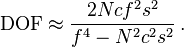
The formula for Depth of field (at least one of them anyway) is:
\mathrm {DOF} \approx \frac {2 N c f^2 s^2} {f^4 - N^2 c^2 s^2} \,.
where N if the f number, f is the focal length, c is the circle of confusion and s is the distance the camera is focused. Note that in the formula, depth of field varies as the square of the subject distance. That means that if we have 2 feet in front of the subject distance of 10 feet, we'd not have one foot if we were shooting at five feet, we'd have six inches, one quarter - so moving in close hugely affects depth of field. Changing focal length of lenses complicates things, but this explains the typical depth of field scale on an old fashioned prime lens - with almost no useable depth at near focus, and fairly decent depth at the longer distances.

The formula came from Wikipedia

Friday, June 10, 2011

Wednesday, June 08, 2011

Thursday, May 26, 2011

Further On The Value Of Projects

Another advantage of doing projects is that we tend to get better with time. Not only was Pepper # 30 Edward Weston's thirtieth attempt at a pepper, he'd also been working with a variety of other vegetables and shells. Although his other vegetable images do get included in shows and books, it is the single wonderful image that many consider one of the greatest photographs ever. So it would appear that even though this was part of a project, it's ok to come out the other end with a single iconic image.

Given a choice between being known for 20 mediocre images vs. one great one, I think most of us would vote for the one great one, in the hope that having made one, it wasn't a fluke and we can do it again, eventually.

Sunday, May 22, 2011

Depth Of Field

Wayne asks for further clarification about depth of field and comments on lenses for APS-C cameras and so on.

Right. Some basic facts.

1) depth of field is proportional to the f stop - an opening half as large doubles the f stop (2 stops) and doubles the depth of field.
2) image magnification is invesely proportional to depth of field - make a print twice as big (in linear dimension) and you have half the depth of field. Start with a smaller sensor and you have to magnify the image more, so less depth of field there too.
3) depth of field is inversely proportional to the SQUARE of the focal length. Double the focal length and you get one quarter the depth of field - ouch.

And believe it or not - that's it, no other factors play a big role in measuring depth of field.

So, in Wayne's example of a 35 mm. lens on a DX sensor Nikon and comparing it to 35 mm. film camera (or a full size sensor camera), you have a sensor 1.5X smaller. The actual focal length is 35 mm., whether designed for a dx camera (APS-C size sensor) or full frame.


Wayne notices that a 35 mm. lens on his film camera seems to have more depth of field than when he has a 35 mm. lens on his Nikon APS-C sensor camera. He's right and here's why.

We have three factors, two of which didn't change - focal length stays 35 mm., and f stop remains, say f 11. All that changes is which camera the lens is on (or which 35 mm. lens you are using, but that's the same thing).

Put the 35 mm. lens on a larger format camera (bigger sensor or bigger film) and you don't have to magnify the image as much to make the same size print - so more depth of field. It has nothing to do with angle of view. It has nothing to do with some magic lens design for DX size cameras. It applies regardless of what 35 mm. lens you use.

Now, if you did want the same angle of view, you'd need to use a wider lens on the small sensor camera, so you would be changing the focal length. Here you would still have the magification issue, but you'd have the square of the change in focal length - essentially 1.5 squared and divided by 1.5 - that is, the lens you'd need for the DX sensor camera, would be (35 divided by 1.5) mm. long - approximately 21 mm. The depth of field would be approximately 1.5 times better with this lens on this camera when compared to the same view, same print size on the full frame camera.

This explains why it is so difficult to get shallow depth of field with a point and shoot camera with a sensor one quarter the diameter of 33 mm. film.

What does twice as much depth of field mean - well a simple way to look at it would be sharpness from infinity to 4 feet instead of infinity to 8 feet, or a range of sharpness of approximately a foot behind and in front of the subject instead of 6 inches.

Tuesday, May 17, 2011

Blending Focus

Pete asks why I felt the need to use blended focus, and Helicon Focus specifically, to process the recently posted image (More From Stanley Park).

Several factors come into play.

1) I'm using a full size sensor camera (5Dii) and the larger the sensor the less the depth of field. It's possible that a small point and shoot with it's tiny half inch sensor might have had enough depth of field. Certainly an APS-C size sensor would not in this situation.

2) the reason this image doesn't have enough depth of field is that it is a close up. The area photographed is about 12 inches across, 18 high, the camera two feet away from the furthest object, six inches from the nearest. There is no f stop which will encompass enough depth of field to handle this kind of range, even allowing for blurring the stump in the bottom left. Check out depth of field tables on the net - you will be horrified at how little depth of field there is with subjects a few feet from the camera.

3) my own testing shows me that f16 is the smallest practical f stop for my camera. Beyond that, the sharp bit get fuzzier and there isn't sufficient gain in depth of field to justify this loss (diffraction).

4) even f 11 is sharper than f 16, so when blending, that's the f stop I use.

Why Helicon Focus instead of Photoshop - simple, it does a better job. Helicon has been doing this kind of blending for about 7 years, Photoshop only the last two versions (ie. about two years). Helicon's whole raison d'etre is blending, Photoshop made this one of many add-ons.

Are there limitations? Yes. Two problems occur and both happened here. First, as you change focus, the image size changes. In normal simple design lenses, as you focus further away, you include more (as if you were zooming out or moving away). Oddly, with my 24-105, the exact opposite happens, as I focus further, the image gets larger, ie it crops. So, if I frame perfectly on the near focus, it crops too tight at the far focus. The second and more serious problem is that with wide angle lenses especially, the software has trouble blending the edges of the image and you start to get double or even tripple exposures along the outside of the image. As this only affects about 10% of the image, cropping takes care of it - if you have room to crop 10%. I don't see problems with my 70-200, so in general I'm talking < 70 mm. focal length.

Other than that it works well. My preference is not to do a lot of sharpening on the image before blending - amount 25 in camera raw, considerably less than I'd use on a single image. I do not use any clarity enhancement (increased local contrast) as this tends to be exaggerated in the blending process.

Friday, May 13, 2011

Stanley Park


just back from a visit to Vancouver, to see our daughter and take a break. Found this partly burned stump on the beach at Stanley Park. Blended focus with Helicon Focus, a little bit of Akvis Enhancer to the centre only and otherwise pretty straight. Canon 5DII.

Monday, May 02, 2011

Travel Tripod

When I was in Victoria last fall, I couldn't find the ideal tripod for travel purposes, and ended up picking up an inexpensive Slik travel tripod, complete with built in ball head and mini-quick release plates. It was adequate and I got some lovely shots thanks to that tripod. The head though was the problem, especially for vertical shots. I normally use an L bracket from Really Right Stuff for my 5D2, so what I've done is order the smallest lever release head from the same company and will place that on this super light tripod. It's aluminum but reasonably sturdy and tall enough for travel purposes.

The big thing with a travel pod is it's nice if it can go on your backpack, which theoretically huge tripods can do, but in practice don't very well. Also, it needs to fit inside luggage when flying, and there are times a tripod that doesn't tie up both hands to carry is very nice.

Some might wonder 'why even bother with a tripod', especially with modern cameras great high ISO Imaging. For me the reasons are:

1) to be able to stop down for max. depth of field
2) shoot under marginal light - often more interesting light
3) to make blended images for incredible depth of field using Helicon Focus
4) blended exposures for HDR without the worry of misalignment of images.

These justify lugging a tripod, and if it can be a small light one without too much compromise, well all the better.

Let you know how the new combo works when I return.

George

Tuesday, April 26, 2011

Weathered Plywood


An old billboard, long since devoid of advertizing material. I've been thinking it would be worth photographing for some time, and on the weekend finally stopped in time to do so. Stitched of course. Images processed in Camera Raw and output as TIFF's, then stitched in PTGui Pro, output as a psb file (it's 22,000X5,200 pixels after cropping). Very little in the way of edting (for me - which means only about 30 minutes and two dozen changes - mostly to do with lightening the centre, darkening the left end a bit to balance the right).

Sunday, April 24, 2011

Saturated Colours

There's a world of difference between taking subtle colours and enhancing them to modest saturation, and taking modestly saturated colours and driving them to full saturation; the difference between sketching and cartooning; between drawing attention and screaming; between Satie and Sousa.

Both have their place, but they're hardly interchangeable. Photoshop gives us powerful tools. Skill is in knowing when not to use them, or even more, how to use them subtly.

In the days of the wet darkroom, novice and even experienced printers would struggle with how dark is too dark, how contrasty is too contrasty. Even Ansel struggled with this, though at a higher plane than most everyone else.

One problem with sneaking up on just the right contrast or saturation or tone, is that the increments are each of them small enough not to be all that noticeable, the but the accumulated changes end up taking us way past the point we might have gone, had we done it in one step.

I find it very helpful to save the image a few times under diff. names during long editing sessions, coming back the next day, with fresh eyes to revisit just how far to go. often the next day I'm horrified at just how far I took something the previous evening without recognizing just how far beyond optimal I'd gone. Often it's simpler to start over.

Friday, April 01, 2011

Do We Need To Do Projects?

Brooks Jensen has written about the importance of projects, especially from the point of view of a publisher. Sandy Wilson commented on my last blognote to the effect that projects are an artificial idea largely promulgated by teachers, critics and publishers, the implication being that at the very least projects are not needed, and implying they might not even be a good idea, or perhaps 'might not be good for you'.

I think the truth is somewhere between. Some photographers seem to do nothing but projects. They don't carry a camera unless they are on a project. Others simply carry a camera when they have the time, photographing whatever appears before them that might photograph well. Others do a bit of both.

Elliot Erwitt is famous for his dog pictures, but he photographs amusing and insightful relationships all over and often without featuring dogs. Edward Weston would go on trips, but then photograph whatever happened on hand while there, from dead pelicans to nudes, pottery to friends.

It's true that Edward Weston made a project of Armco Steel, but only insofar as he visited it and got a few photographs - certainly not enough to make a real 'project' of it, not enough to submit a portfolio of the images so he could get them in Lenswork. Yet one of those images was certainly considered a milestone in his work. Did he then go around a whole whack of other industrial sites - no he didn't.

In selecting images for "Why Photographs Work", I selected an industrial image from a photographer famous for his landscapes, and he quite reasonably asked if we could select a different image that was more typical of his work In another case, a photographer had 'moved on' since doing the image I selected and didn't want to be included if it meant going with an old project. He felt obliged to support his galleries which were all showing his new and diff. work.

Some subjects are best explored thoroughly and only over a long period do the best images develop. Other times, there simply isn't enough material to make repeated visits worth while - before long you simply make variations of the shots you made last time.

Of course, you also have the problem of defining what constitutes a project - wouild you call landscape in general a project - hardly. What if you limited it to mountain photography? Or a specific mountain - but what if you then find you don't have enough great images of that one mountain, so you have to travel and build mountain photographs over many years - still a project?

No matter what topic/subject/project you come up with, you can generalize it enough so it doesn't look like a project, or narrow it so much its unlikely you will get a whole portfolio of images from it.

You'd think that photographers who shoot almost at random and with no real plan or project in mind, would eventually shoot enough images they'd get lucky and over 20+ years produce a portfolio of really interesting, yet entirely unrelated images. Interestingly, I don't think this happens very often. Typically the people who can produce a sig. number of 'random' images of great power or beauty are the same ones who also gravitate to projects.

I suspect that projects are a natural side effect of being curious and interested - why wouldn't you want to explore more situations that have given you pleasure, challenge or success in the past.


What does happen is that lots of photographers simply don't have enough depth in any one subject to make a show or please a publisher and they don't because they like to spread themselves thin, which is just fine. They do need to be aware though, that this may mean they aren't going to get published or acquire fame until late in life by which time the apparent randomness of their work coalesces into a series of subjects of enough depth.

Of course, this raises the subject of how you define success in photography and that's a topic for another day.

Thursday, March 31, 2011

Ideas For Projects

Where do ideas for projects come from? How do we know if an idea is a good one, or is it us trying too hard or getting desperate or doing it because we think we should?

Here's some things to think about.

1) of all the great artists there have ever been, only a tiny fraction were revolutionary - most were evolutionary - that is, taking an idea and modifying it to make it their own. Why should we expect any more of ourselves? So, take a cool idea by someone else and modify it to make it your own.

Ryuijie photographed flowers in blocks of ice. So you come up with something besides flowers to photograph in ice, or a different way/veiewpoint to photograph the ice, or something besides ice (fine sand or flour?). What about photographing faces in water - you'd need either a fish tank or a waterproof camera and a pool. What if the water were coloured, unevenly? What if you used oil? How about using coloured lights shining through the ice to make interesting effects?

Get the idea?

2) Never underestimate the value of doing something for fun. Cleaning out my Dad's house the other day I came across his original leather encased folding SX-70 - and with film being made for it again, this is a great opportunity. Can't see the point of doing landscapes with it, but what about nudes, flowers, mechanical close ups?

3) I guarantee that no matter how clever you are at coming up with an original idea, someone else will point out that you weren't the first after all - so why all the angst over the struggle to find original ideas. How about instead finding a good idea by someone else ans asking yourself, "how can I use this idea around something that is important/interesting/exciting/puzzling to me?"

4) follow up on those fleeting observations. I have noticed that often large trucks have interesting patterns of mud or snow on their back doors. There's never time to photograph them on the highway, but what about going to a truck stop and spending a day photographing trucks - forecast is for snow this weekend, so might be my last chance this year.

The other day I was crossing a bridge and noted the interesting shapes of the light rail structure as I passed. I might just start a project on recording the city's rail system - think about it - you can photograph at sunrise or sunset, in the rain, at night, in a snow storm or after one. You can photograph the tracks, bridges, wiring, stations, and don't forget the travellers. You can go on the trains and photograph the people (good use for a small non threatening camera like a point and shoot). There's more chance that your efforts to record part of your city as it is now will have lasting impact than any project photographing delapidated buildings.

5) no point in pinning all your hopes on a project you are unlikely to pull off any time soon - sure it would be interesting to go to Namibia but I can't afford it, don't have the time, and it's a long way. Work instead with what you have available. Don't bemoan lack of mountains if what you have is prairie. Come up with a way to make what you have work for you.

Don't underrate the idea of a project as simple as "the people I know".

Good luck and great ideas.

George

Tuesday, March 29, 2011

Michael Reichmann

Just have to comment on Michael's latest image of a ladder on his site. Not sure if this link will survive new content on his site but do check it out. he comments that it was taken with the Fuji X-100 and that he's managed 4 portfolio quality images in one shoot. One can't help wondering if a fixed lens no zoom camera like this perhaps lets you concentrate more on the seeing instead of the fiddling - will look forward to his comments in the next few weeks.

This is a lovely image, almost abstract, simple, strong, wonderful colour. Makes you think, want to look again, ask questions or simply admire the beauty in something not inherently beautiful.

Wednesday, March 09, 2011

Image Editing Videos Now Fully Uploaded

There are now seven videos uploaded to youtube, labeled athabasca edit 1 through 7, for about an hour of real time editing with commentary. You may learn a few tricks but the more important message is the process of analysing the image to see where improvements could and should be made, about decisions on cropping and taking things too far and backing up, of trying things and seeing what works.

Just do a youtube search for George Barr

Tuesday, February 22, 2011

What Are The Best Photographs Ever?

I'd like you to name your all time favourite photographs by someone else - the top of the top, the supreme, the wonderful, the magic.

Here's why. I want to see if we can learn anything from these images - are there threads of consistency - about subject or approach, project vs. one off, obvious message or not, etc..

I think a number of us would list Edward Weston's Pepper #30 as one of those top ten photographs, despite its mundane subject and lack of political message, but you can't infer much from a single image, so bring em on, what are your top 10 outstanding choices.

Why not open it to images of yours? Simple. You might think it's because I don't think you can make an image that good but you'd be wrong - it's just that we have emotional attachments to images of our own which may not be apparent to others and that is going to confuse and analysis of common threads.

If you can supply a url that will take us to each image, even better, we can look them up.

Come on, enlighten us, surprise us, shock us with your all time favourite photographs.

George

Friday, February 18, 2011

Image Editing Video

The second image editing video is up, showing the use of Selective Color Adjustment Layer to fix a specific problem without creating more problems than I'm fixing.

Athabasca Edit 2

I should have Edit 3 up later tonight as I fix the water.

George

Monday, February 14, 2011

Videos

There are now a total of four videos on youtube

1) is a brief description of the three books I have written, to a background of me out shooting.
2) is a slideshow of images selected from those I made in 2010.
3) is a more detailed description of "Why Photographs Work" and includes 8 of the images from the book.
4) is my first editing video - this takes my athabasca falls image and shows the adjustments I make in camera raw, then an analysis of the image on what needs to be fixed or improved. Subsequent videos (not yet made) will take you through the changes I make, from cropping to colour adjustment, contrast enhancement, fixing highlights and shadows, and fine tuning an image.

Wednesday, February 09, 2011

Second Edition of Take Your Photography...

My publisher has asked me to do a second edition of Take Your Photography To The Next Level. I have made it clear that I'm not prepared to label it a second edition without substantially improving the book - at least a couple of new chapters, expanded text, more pointers and better resources. My challenge now is to deliver on this stand before the end of July.

I have some sense of where I'm going with this but am definitely open to suggestions from those who have read the book and liked it and more especially found it useful.

You can either comment on this blog entry or email me directly through the contact on my website. The latter allows for more detailed suggestions and also some privacy, as well as giving me your email address so that I can respond to you, perhaps with some questions or discussion on your suggestions.

Thanks,

George

Thursday, February 03, 2011

Lightroom For Editing?

Frank Field commented on my use of Lightroom, saying he's gone the opposite way - using Photoshop for his editing.

Let me make it clear - I was referring to the use of Lightroom for organizing my images, not editing them. More specifically, after watching the Luminous Landscape tutorial, I am even more convinced that the point of Lightroom is to make editing easier, not better, and as I've said many times, fine art photography is always about better. Easier is a distant second.

I do pay attention to easier - the whole digital workflow is what has made me sufficiently productive to get published and write books and for someone who has to edit a lot of images, Lightroom may be exactly what they need.

For example, they show editing of an image of a nearby hillside and distant hills. They want to balance the brightness of the two and use two different gradients, and it gets close, but you can still see that the blend is not perfect. Then they use local adjustments and fancy masking, and still don't fix all of the problems that the gradients caused. I could have fixed the whole thing in seconds with a curves adjustment layer and skip the gradients. OK, I have some skill in using gradients, but I argue in my second book, From Camera To Computer, that it is better to use a few tools really well, than dozens with less skill - especially when working on one image as opposed to dozens or even hundreds. It's the difference between getting a single image fantastic and getting a whole wedding shoot really good.

Wednesday, February 02, 2011

Lightroom

After procrastinating for years, I'm determined to start using Lightroom to catalogue my images properly. A new computer and even more hard drives has pretty much forced me into this.

I'm almost finished the superb Lightroom 3 Tutorial Videos from Luminous Landscape, more than 8 hours of invaluable information. I'm starting with the importing of all my raw files (some I haven't seen in years) and most importantly, adding keywords to them so all the images from each imported folder can be found, then more keywords for smaller groups of images.

I'm also looking into using Lightroom and an add-on website publisher from Photographers-toolbox to link to my Rapidweaver website - to automate updating my web images through lightroom and to better control the size of images on various sizes of screen.

Video On Youtube

I've just uploaded my first video to youtube. It's short and simply describes the three books I have written, but it shows me out photographing at one of my favourite local spots. You might be slightly entertained.

Can't sort out the link from the office but if you do a youtube search for George Barr Fine Art Photography, you'll find it.

Sunday, January 23, 2011

Heating Plant Reflection


I tried blocking the reflection with my hat but liked the version with the reflection. The dark circle bottom centre is not my head - it's the front of the 17-40 mm. lens and camera body. The lens was touching the window.

Snow Plow


You may know that I like trains, both model and full size. Was in Banff with our office staff and had a couple of hours free time. Not art, just interesting to me.

Saturday, January 15, 2011

Book Sales

Sales of "Why Photographs Work" have been very good with only 780 of the books left at the distributor. I sent off the proofs for the second printing, different printer.

For about half a day, the book was # 430 at amazon.com and # 4 photography book and in Canada, amazon had it at # 76 overall for a day., all this without any major online promotion other than the amazon reviews, which have been excellent, 6 fives, 1 four, and one 3 (he thought too simple).

I think I got it just about right - pleasant to read rather than work, yet informative. Sure the best read photographers are probably only going to pick up a few points in the whole book, but hopefully even they will enjoy reading it.

Remember that the book is meant to be enjoyed by non photographers too, and that also seems to be the case.

Happy New Year

Getting Some Exercise

While the obvious thing to do is hike with a large backpack, it is -20 C and I work for a living and can't always be out photographing - this business of writing books consumes a lot of time, which reminds me, the publisher wants me to do a second edition of "Take Your Photography To The Next Level".

I refuse to do that if there isn't significant new content, more images, new and useful text and improvements well beyond fixing the odd typo - so many hours of work.

Anyway, I thought I'd tell you of my latest purchase, an eliptical. I spent a bit more than I wanted to and a lot less than I could have, but it's solid, went together beautifully, and I'm wiped and sweaty after my first workout. Actually it was really the third workout - the first being getting the thing into the basement, the second assembling it.

It's a Horizon CE 9.2 - which comes from Canadian Tire - and is roughly equivalent to the Horizon EX-79, albeit with a heavier flywheel (23 lb. instead of 17).

The real test will be to use it regularly - a treadmill I purchased years ago quickly became a clotheshorse and progressively a cause of marital friction.

Wish me luck, and check in a month for a report card on both machine and progress - that should motivate me.

Saturday, December 25, 2010

Mea Culpa - on Profiling

Oops - sure I had all the right settings in print setup - but I forgot to turn off Photoshop does colour in the main printer dialog box. Shit...

I'll reprofile the Hahemeule in the next 24 hours and publish the results.

Hope everyone had a nice Christmas. Had planned to post a Christmas Card, but yet again blogger can't upload images - this has been more down than working over the last several months and they still don't have it working - Mac and Firefox for me. I'd switch but then I'd have to maintain all the archived articles, all > 1000 of them.

Tuesday, December 21, 2010

Print Darkness/Contrast/Tonality

Don't know about you, but for every time I have worried about print colour, I have worried 100 times more often about the brightness of print tones and even more. This was a problem with canned printer profiles, it remains a problem with home made profiles using my Color Munki - and although I don't have the $2000 to test fancier profiling equipment, I fully believe it will be a problem with the big guns too - after all that's what was used to make those profiles supplied by the printer and or paper manufacturers.

My 'standard' paper is Epson Enhanced Matte (Ultra super duper - or whatever they are calling it this week). it is so because it is easily available, not to stiff for stacking up multiple sheets in the feeder, has a good surface and behaves well. It even lets me pin up several prints in a stack on  my examining room walls and I frequently catch my patients checking out the latest images and what's underneath as well - and that's just fine.

Yes, glossy paper can look nicer, especially if there are a lot of dark tones in the image, but with modern inks even matte papers look darn nice and are a heck of a lot easier to look at without dealing with spurious reflections.

Behind glass, 90% of the difference between matte and glossy paper disappears anyway (and I'm not talking frosted glass here).


Today I had to make some prints for sale. Although enhanced matte looks fine, it is thin and tends to warp over time behind the matte and I prefer to use a proper art quality paper when I'm selling a print. I happened to be out of my usual Moab Entrada Bright White and found a box of Hahnemeule Photo Rag. I ran off a profile test on it (version 2 icc profile to keep my mac and snow leopard happy - Color Munki lets you default to version two type profiles in preferences).

I was careful to set color matching to epson from colorsynch and then turn off epson adjustments in printer settings and had no diff. making the profiles.

But wow, the prints were way off - not in colour - that looked spot on, but in contrast and overall darkness - way too much of both. I'd had no trouble with Entrada, no trouble with enhanced matte, and only a little trouble with Harman FBAL gloss but this was unuseable results.

I eventually approximated the right tones through use of a compicated curves layer, customized to each print - but this shouldn't be necessary.

So, how do problems like this happen?

1) the monitor is too bright - this is far and away the biggest problem for many people.

2) double profiling - somehow both photoshop and the printer are adjusting the colours, instead of the correct strategy of letting photoshop doing it - but I'd been careful about that (see above).

3) too bright a viewing light - you can buy proper viewing lights but they are typically at least twice as bright as room light which is just plain wrong, and besides, the light is usually the wrong colour. It isn't standard, or warm fluorescent bulb temp, nor north window. It often is closer to sunlight, which we go out of our way to keep our prints away from. It rather depends on whether you believe it is better to be consistent and always wrong or random and occasionally wrong. I happen to view my prints by fluoresent because the bulbs match my office where I do most of my print viewing anyway. When I used to sell prints at the farmers market, they were being seen by mercury vapour (which oddly didn't seem to hurt the images, but made cream paper look downright yellow).

5) using the wrong paper setting. When in the printer dialog box you go to printer settings and change from glossy to semi gloss to matte to fine art - what you are changing is the amount of ink that is laid down - some surfaces can use more ink than others. Overall, while this does affect the brightness of the print, there should not be a problem if the setting you used for making the profile matches the setting you use when making your real prints. Of coures, if you are using a canned profile, it is absolutely essential that you match your paper setting to the one used in making the profile - and paper manufacturers are not always very clear about what that should be - though it is better now than a few years ago when it didn't seem to occur to them to bother mentioning such a crucial piece of information - and you wondered why people started making their own profiles).

6) you are printing black and white and using the advanced black and white driver for your Epson printer - as this totally overrides your profiles, you might as well have not bothered. There's a good reason they offer light, medium, dark, darker and bloody damn dark - it's because you have no control over the tonality without using these settings.

and more)of course, if you haven't profiled your monitor, all this is moot and you are a lost cause.

Assuming you have not committed and of the above faux pas - then so far, the only practical solutions I have found are the following.

1) pick papers that behave well for you - the Hahnemeule didn't for me - not that it can't make beautiful prints, it can - but was far more work this morning than it needed to be. Your experience is likely to be entirely different - you MUST do your own testing - this could be the perfect paper for you. These are papers that when you run test images after profiling, require the least possible adjustments in brightness to get a good result.

2) take advantage of printer proofing in Photoshop (under the View menu) to see what you are goijng to get - with most papers it has been very helpful in predicting the final result.

3) no matter how good your profiles, how careful your procedures, how expensive your equipment, if you are fussy about your results, you will have to make multiple prints to get an image of the right brightness. The closer your profiling can get things right, the fewer 'test' (read throwaway) prints that you will have to make. I can generally get it right in two or three prints - ie. the third print is what I want - this of course after making hundreds of changes to an apparently good image on screen before I even get to the printing stage. Rarely I get it in one, occasionally it takes half a dozen prints to really get a print that matches what I have on screen - not because my equipment is bad - it isn't, but because I care about the results (read fussy, ok, very fussy).

It is possible to create a curve to make adjustments, but my experience is that no single curve works for all images on a single paper.

Remember that no one will ever care as much about our print quality as we ourselves do, both as an individual and as a group of photographers.

Typical customers can't even see the difference between warm and neutral papers, never mind the difference between ultrachrome and ultrachrome K3 and Ultrachrome Vivid. We sure know though.

I'll be interested in how others have solved the brightness and contrast issues.

Monday, December 20, 2010

Dis and Dat

Why Photographs Work is now out and orderable from the major online booksellers and instore at real ones too. It's gathering excellent reviews so apparently we're not the only ones who think it's a beautiful book. We're scrambling to arrange a reprint asap.

Mark Dubovoy had written an article for Luminous Landscape promoting the use of medium format. I don't disagree with what Mark says, but I do think there are some points that are important to make.


Pros use medium format because:

1) they often are asked to make huge prints
2) paying customers like to get noseprints on detailed lanscape pictures
3) the equipment is tax deductable
4) the equipment differentiates them from the masses - an important marketing tool (as opposed to an ego boost - pros are too busy for that nonsense)


And there are other reasons. Those of us who do photography for the love of it instead of putting food on the table can afford the time to stitch and blend our way to good photographs, and if the images look better at 13X19 than 40X60, who cares. That said, more than a few serious amateurs are going to be looking at the Pentax 645D.

One of the most useful and powerful tools for doing landscape and industrial photography is live view - totally absent from medium format. Mark talks of the problems of camera misalignment, yet he has to squint into a tiny ground glass if he wants to focus and tilt - while I simply move the magnified view to the corner and check the focus on the sensor, not a substitute - using live view. I think in a few years people will find it hard to believe people ever struggled with substitutes.

We live in interesting times - DPReview has rated the Pentax K5 as the top medium priced dSLR, topping both Nikon and Canon - we live in interesting times.


It's holiday season, Christmas for some of us. May you all thrive and find the images you want.

Thursday, December 09, 2010

Amazon Have 'Why Photographs Work'

At last, Amazon list the book as in stock, albeit with a warning about taking an extra day or two - I think they are actually between the distributor and the amazon warehouse as we speak but that means that people should have the book within the week.

Monday, December 06, 2010

Books Are At The Distributor

Have just heard from Rockynook that the books are now at the distributor. They then pass the books onto the various retail outfits, including the biggies like Amazon. Don't konw if this will result in a change in the status on Amazon but they should have the books within the week.

Thursday, December 02, 2010

Why Photographs Work - The Book Has Landed

Good news. The books cleared customs in New York earlier this week, a few days late but are already on truck on the way to the distributor. It will take a week at the most to get to Amazon and other retail sellers, so, it should be possible to get a copy of the book just in time for Christmas. Hopefully Amazon will update their release date info within the week.

As of now, no one else has read the book, not even the photographers, who only got to see thier own section (ok, the editors have), so I am both excited and scared, waiting to hear what people think of the book. Those who have flipped through the book agree it's beautiful and I feel good about the images I chose for the book. About my writing I'm less secure. I think it's good, that I have useful insights into the images and what makes them work, but it's a bit like introducing your new bride to friends and family, you so desperately want them to think well of your mate, or in this case, my baby.

Monday, November 29, 2010

Tomasz Gudzowaty

thank you to Marcin for pointing out the work of Tomasz - well worth exploring his site and images.

Sunday, November 21, 2010

Paul Caponigro Portfolio

The entire current View Camera magazine is a single portfolio of 59 of Paul's images, reprinted with excellent quality. A must have for any serious photographer. I just hope the magazine printed enough of them.

You need this issue.