
 Posts


On the off chance you might be curious, here's a list of camera settings I use:
1) manual focus - but rely on focus confirmation in viewfinder
2) manual exposure - placing the exposure mark above and below the centre as I think the image needs - I don't take advantage of the spot metering capability
3) mirror lock - always when on tripod and
4) tripod is used 98% of my images
5) EI 100 - why would you use anything else unless you need it
6) exposure blending - occasional - 1% of shots, I tend to shoot in fairly soft light
7) stitching - even with the 1Ds2, I still stitch about 1/3 of the time, especially if the image is going to differ from 2:3 - so for square images and panoramic images especially.
8) focus blending - using Helicon Focus - about 1/4 of my images
9) my most frequently used lens is the 70-200 f4L, why would a landscape photographer want to carry the extra weight of the 2.8?
10) flash - what's that?
Friday, March 06, 2009


Thoughts About Tripods
With IS lenses and high ISO getting better quality results, you may question the need for a tripod. There are many situations in which depth of field is not important and you may well be able to make the image successfully without compromise and without tripod.
That said, there are lots of situations in which there are two or more important parts to the image, not in the same plane of focus and for which added depth of field is the only remedy.
In the old days there were depth of field scales on lenses, though anyone who did serious work and made even moderately large prints knew that they needed a smaller stop than the scale suggested. With zooms we have largely given up on the tiny depth of field scales even if they are there.
With the increasing use of full frame sensor cameras, shallow depth of field is a major consideration and often it's necessary to stop down as much as possible - basically just shy of the point where diffraction really starts to become an issue. For me, with a full frame camera, this is f16.
Suddenly the shot that was 1/125 at f5.6 is looking like 1/15 at f16 - which even with IS, may not work on a long lens.
Every single time I have been out shooting without tripod, I have regretted not bringing it along.
On Tripod Quality
No tripod is perfectly steady. The less steady ones are more likely to be compromized in a breeze and require longer after touching the camera or lens to dampen the vibrations and require more care with the cable release. Lighter tripods run the risk that the camera will overwhelm the tripod and the whole rig will tip over. In my experience the tripod should weigh as much as the camera/lens combination. Mind you, that doesn't mean you can't use a light tripod - you just have to be a lot more careful. If you are using a light tripod, I highly recommend you go with an L bracket for the camera so that when photographing vertical images you don't have to flop the camera over on its side.
For a given size of tripod, carbon fibre is of course significantly lighter - but perhaps you could get away with the next size down in legs and not have to fork out up to $1000 for carbon fibre (Gitzo).
Manfrotto's newer tripods allow the centre post to swing horizontal. My feeling is that they aren't heavy enough or sturdy enough to hang my 1Ds2 from but they might work well with a smaller lighter camera and there are certainly times when getting out over a railing would have been really useful.
If you do studio work, carbon offers no advantages and might in fact be a disadvantage as here weight is all to the good.
Four and five section legs require good quality and fit, but at least they fit in your suitcase. Don't forget that you can travel with the centre column removed and even the ball head off to make the overall length less.
I used to insist on spike feet for landscape work but my current gitzo tripod just has rubber ends and frankly, I don't think it makes a difference. My tripod legs after two years of a lot of use are just as stiffly connected to the top of the tripod as on day one and can stand on slippery ice at almost any angle without requiring the spread locks to be set - a measure of quality.
Quick release plates are great and I'd not want to go back to screwing in the camera each time I use the tripod, and having the camera rotate on the tripod, just after everything is aligned perfectly.
In theory there is more risk with the arca type clamp which is open at either end but in several years of use I have never had a camera come loose, with arca, RRS or acratech devices. I find the ability to slide the camera left or right great with tilt/shift lenses.
I don't know any serious photographers who continue to use pan/tilt heads for their still photography. Ball heads are almost universal. I have a very small Manfrotto ball head with quick release plate on my 925 tripod for the 40D, making a light portable and packable combination.
For a lightweight traveling tripod I'm willing to compromise on height and will accept the use of up to 6 inches of centre column to get to eye hight.
Don't forget that on a slope, the downhill leg can never be long enough and the fact that my 1349 tripod will go well above six feet is sometimes helpful.
Although my f4 70-200 can be used without tripod collar, it's a lot steadier with it and the whole rig is better balanced.
There are times that tripod PLUS hands on camera is steadier than tripod alone - in high winds or really long lenses (300 mm.+) in which even with mirror lock, I'm concerned about shutter vibration. Mind you, this only works for reasonable shutter speeds. Sometimes I leave off the lens hood if there is a cross wind.
Since you are going to be standing there with the cable release in hand, it makes sense to stand upwind of the camera if possible.
Remember that the whole point of mirror lock was to get the vibration out of the way and firing the shutter right after locking the mirror is somewhat defeating the point - wait a couple of seconds. I confess I have to remind myself of this now and again as I get caught up in the moment.
Tripods, of course; don't defeat subject movement and sometimes an higher ISO may still be necessary to defeat wind.
Remember that you can sometimes make use of a tripod when the legs are together, simply leaning the rig against a fence or wall or over a railing to get the image you want. You can even hold the whole rig out over a canyon should the need arise.
Once on location, I quite happily carry my camera and tripod over my shoulder. I take into consideration what it might bump up against - concrete walls not being famous for their cushioning effects on camera bodies. I do look over my shoulder to see that the lens is more or less aiming down so if I do catch a branch or debris should fall, it isn't going to land on the lens.
Uwe Steinmuller carries a small plastic 2 step ladder with him in the car for those times when you have to see over a fence. Ansel mounted a huge aluminium plate to the top of his vehicle so he could stand up there, with tripod, for the best view. I have been known to carefully climb on the top of a Chevy Suburban roof but sure wouldn't do that with my car - but don't forget you can use live view with the latest cameras to position the camera above eye height and using the centre column and not even look through the view finder.
That said, there are lots of situations in which there are two or more important parts to the image, not in the same plane of focus and for which added depth of field is the only remedy.
In the old days there were depth of field scales on lenses, though anyone who did serious work and made even moderately large prints knew that they needed a smaller stop than the scale suggested. With zooms we have largely given up on the tiny depth of field scales even if they are there.
With the increasing use of full frame sensor cameras, shallow depth of field is a major consideration and often it's necessary to stop down as much as possible - basically just shy of the point where diffraction really starts to become an issue. For me, with a full frame camera, this is f16.
Suddenly the shot that was 1/125 at f5.6 is looking like 1/15 at f16 - which even with IS, may not work on a long lens.
Every single time I have been out shooting without tripod, I have regretted not bringing it along.
On Tripod Quality
No tripod is perfectly steady. The less steady ones are more likely to be compromized in a breeze and require longer after touching the camera or lens to dampen the vibrations and require more care with the cable release. Lighter tripods run the risk that the camera will overwhelm the tripod and the whole rig will tip over. In my experience the tripod should weigh as much as the camera/lens combination. Mind you, that doesn't mean you can't use a light tripod - you just have to be a lot more careful. If you are using a light tripod, I highly recommend you go with an L bracket for the camera so that when photographing vertical images you don't have to flop the camera over on its side.
For a given size of tripod, carbon fibre is of course significantly lighter - but perhaps you could get away with the next size down in legs and not have to fork out up to $1000 for carbon fibre (Gitzo).
Manfrotto's newer tripods allow the centre post to swing horizontal. My feeling is that they aren't heavy enough or sturdy enough to hang my 1Ds2 from but they might work well with a smaller lighter camera and there are certainly times when getting out over a railing would have been really useful.
If you do studio work, carbon offers no advantages and might in fact be a disadvantage as here weight is all to the good.
Four and five section legs require good quality and fit, but at least they fit in your suitcase. Don't forget that you can travel with the centre column removed and even the ball head off to make the overall length less.
I used to insist on spike feet for landscape work but my current gitzo tripod just has rubber ends and frankly, I don't think it makes a difference. My tripod legs after two years of a lot of use are just as stiffly connected to the top of the tripod as on day one and can stand on slippery ice at almost any angle without requiring the spread locks to be set - a measure of quality.
Quick release plates are great and I'd not want to go back to screwing in the camera each time I use the tripod, and having the camera rotate on the tripod, just after everything is aligned perfectly.
In theory there is more risk with the arca type clamp which is open at either end but in several years of use I have never had a camera come loose, with arca, RRS or acratech devices. I find the ability to slide the camera left or right great with tilt/shift lenses.
I don't know any serious photographers who continue to use pan/tilt heads for their still photography. Ball heads are almost universal. I have a very small Manfrotto ball head with quick release plate on my 925 tripod for the 40D, making a light portable and packable combination.
For a lightweight traveling tripod I'm willing to compromise on height and will accept the use of up to 6 inches of centre column to get to eye hight.
Don't forget that on a slope, the downhill leg can never be long enough and the fact that my 1349 tripod will go well above six feet is sometimes helpful.
Although my f4 70-200 can be used without tripod collar, it's a lot steadier with it and the whole rig is better balanced.
There are times that tripod PLUS hands on camera is steadier than tripod alone - in high winds or really long lenses (300 mm.+) in which even with mirror lock, I'm concerned about shutter vibration. Mind you, this only works for reasonable shutter speeds. Sometimes I leave off the lens hood if there is a cross wind.
Since you are going to be standing there with the cable release in hand, it makes sense to stand upwind of the camera if possible.
Remember that the whole point of mirror lock was to get the vibration out of the way and firing the shutter right after locking the mirror is somewhat defeating the point - wait a couple of seconds. I confess I have to remind myself of this now and again as I get caught up in the moment.
Tripods, of course; don't defeat subject movement and sometimes an higher ISO may still be necessary to defeat wind.
Remember that you can sometimes make use of a tripod when the legs are together, simply leaning the rig against a fence or wall or over a railing to get the image you want. You can even hold the whole rig out over a canyon should the need arise.
Once on location, I quite happily carry my camera and tripod over my shoulder. I take into consideration what it might bump up against - concrete walls not being famous for their cushioning effects on camera bodies. I do look over my shoulder to see that the lens is more or less aiming down so if I do catch a branch or debris should fall, it isn't going to land on the lens.
Uwe Steinmuller carries a small plastic 2 step ladder with him in the car for those times when you have to see over a fence. Ansel mounted a huge aluminium plate to the top of his vehicle so he could stand up there, with tripod, for the best view. I have been known to carefully climb on the top of a Chevy Suburban roof but sure wouldn't do that with my car - but don't forget you can use live view with the latest cameras to position the camera above eye height and using the centre column and not even look through the view finder.
Tuesday, March 03, 2009


Tuesday, February 24, 2009
Changing An Image To Make It Better
A long time ago, I wrote about the characteristics that really great images tend to have in common, the idea being that knowing what works, you could make images using those characteristics.
As a refresher and based on some recent talks I gave, below are some of those characteristics
1) simple structure to the image
2) limited colour palette (ie. not too many colours)
3) bold graphic design
4) repetition - in shapes, angles, lines, shadows etc.
5) easy to relate to
6) good use of dark and light areas
7) uncluttered background
8) trigger a reaction in the viewer - it could be nostalgia, shock, empathy, even disgust
9) provide more than the experience of being there
10) tell a story
this is an incomplete list, but is enough to be going on with.
So, given the list above, what does it actually mean when photographing?
1) was simple design - this might mean cropping your image or even better moving in closer in the first place, or possibly using a longer lens to eliminate extraneous elements. That said, keep in mind #4 which is repitition. It is common to have to crop to eliminate bad elements but in so doing we sacrifice some of the repetitive elements that make the image good. At this point you have to see if there is a way other than cropping/framing to downplay the distracting elements while keeping the repetitive elements that strengthen the image. This could happen through darkening the distracting element - or reducing the contrast in that area of the image, perhaps desaturating colour in that area or even altering colour to blend better. Sometimes elements are distracting because of strong light and with a softer light source, the distraction melts - if it can do so without spoiling the repetitive elements, then changing the lighting or coming back under different conditions or even simply waiting for a cloud or sunset may be all that's needed. Remember that there's nothing wrong with simply planning to revisit this on the way back when you anticipate the lighting will be better.
2) limited colours. If you find a composition that is wonderful in every way exc. the colour palette, you can always go to black and white, but sometimes I will use the "selective colour" adjustment layer in Photoshop to change particular colours to better balance with the rest of the image.
3) bold graphic design - obviously this is largely a matter of choosing what to photograph, but keep in mind that you can sometimes dramatically increase contrast - especially in black and white. Also though, you can do some selective lightening and darkening and even dodging in Photoshop to emphasize that bold design. This takes practice to not look fake but you can take a perfectly flat gray subject and through image editing, create highlights and shadows that were never there in the first place, with a result that looks totally natural. An orange amongst some pinky reds looks quite odd. subtracting a bit of yellow from the orange will nicely help it blend in.
4) repitition - you can make repitition more obvious via careful editing, bringing out the repetitive shapes through lightening and increasing contrast, suppressing all else with darkening and reducing contrast.
5) easy to relate to - not much you can do in the editing to help here, but certainly a lot can be done in selecting what you photograph and from which position. You have to ask yourself what is it about the subject which you yourself relate to. Then ask yourself if you have done a good job in selecting the camera position to show that in the photograph. If you're photographing a tractor because it reminds you of times on the farm as a kid, then you need to photograph it in a way that best evokes that memory.
6) good use of light and dark areas. The late Fred Picker used to say that instead of struggling to rescue highlights and shadows from oblivion, you ought to be pushing the light and dark areas the way they want to go. of course this requires careful exposure and suitable lighting but his point is that if you take something that is dark gray and "burn" it down, you can create luminous rich shadows reaching into true black but with lots of slightly lighter tones. Likewise highlights.
7) many are the photographs you can't take because the backdround is just too cluttered. Amongst the worst is bright sky coming through dark trees. We tend to discount these bright areas as we look at the scene, yet when seen in a print, they are horribly distracting. If really small, you could consider cloning out the bright spots coming through the trees (or equivalent). I often find with forest, it's necessary to find high ground so I don't look up and through the trees. In other situations the distracting background can be played down through image editing but you do yourself a huge favour by offering yourself the cleanest simplest background possible in the first place, through careful camera positioning and sometimes simply walking way from an "almost good enough" situation.
8) triggering a reaction in the viewer - this one is tricky and comes back to why did you feel this image should be taken. If you want a mood to be transmitted, then you need to use appropriate image editing to communicate that mood - if you want peaceful, then harsh lighting and high contrast editing are not likely to help you. If you want sadness, then bright won't cut it. It necessary for your image to have a message, but if there is one, then you need to do everything possible to reinforce it. Remember though that the message you get from a scene isn't necessarily the message a viewer will take away from the image and that's just fine. There are examples of famous photographers interpreting one of their images in print, only to reinterpret it many years later in an entirely different way, and for neither to have anything to do with how you the viewer interpret their images, because you aren't them, you don't have the same life experiences, crises, crashes, triumphs and tragedies.
9) provide more than the experience of being there. This is a fundamental problem for a lot of hobby photographers who think only to reproduce the experience as capably as possible. Real photographic art is so much more than a competent "wish you were here" type image. You need to honestly ask yourself whether in fact the image you propose to take is simply the best imitation possible of being there, or in fact does something that being there doesn't do.
The extra can come from how the image is framed, from the arrangement of the various parts of the subject because of careful search of the scene to find the best viewpoint, it can come from detailing a small perhaps normally overlooked part of the scene or it might be that after careful analysis of the situation, you are able to produce an image which focuses exclusively on what made the scene great, eliminating everything surplus to getting that message across. Photographs can show connections which might not be obvious standing at the scene, something that might require the use of a wide angle lens to show that connection (say from near to far). Through the use of long lenses or moving in close, you can provide a different viewpoint than the usual or expected.
10) tell a story - the story might be "this is how it's made" or that's where it goes" or "here's what Fred is like" or "A goes to B goes to C..." or here's small town life, or on the farm, or raising a child.
We often discount our own lives as being so prosaic that why would anyone want to photograph it. We go out of our way to photograph small town America but don't take pictures of our town, our street. Interestingly the few photographers who do photograph what is normal to them are often "discovered" years later because they now have an important body of work telling a story about life. It is not easy to see worthwhile images in the scenes we take in every day but it can be challenging and rewarding and just plain useful. We happily photograph a garage from the 40's but won't take a photograph of the new gas bar down the street. We might not make beautiful images of the gas bar, but it could be challenging to make the best possible image of it, at the ideal time of day and with the best possible lighting and carefully composed. I've been thinking for a while that it might be a worthwhile project to photograph my neighbours doing what they like to do - whether it's work with clay, potter with cars, play with model trains. I actually got a call from a fellow physician the other day who wants to do a project on doctors and their extracurricular activities, the idea being to produce a show of these images to be mounted at the local hospital. Can you think of something equivalent in your line of work?
As a refresher and based on some recent talks I gave, below are some of those characteristics
1) simple structure to the image
2) limited colour palette (ie. not too many colours)
3) bold graphic design
4) repetition - in shapes, angles, lines, shadows etc.
5) easy to relate to
6) good use of dark and light areas
7) uncluttered background
8) trigger a reaction in the viewer - it could be nostalgia, shock, empathy, even disgust
9) provide more than the experience of being there
10) tell a story
this is an incomplete list, but is enough to be going on with.
So, given the list above, what does it actually mean when photographing?
1) was simple design - this might mean cropping your image or even better moving in closer in the first place, or possibly using a longer lens to eliminate extraneous elements. That said, keep in mind #4 which is repitition. It is common to have to crop to eliminate bad elements but in so doing we sacrifice some of the repetitive elements that make the image good. At this point you have to see if there is a way other than cropping/framing to downplay the distracting elements while keeping the repetitive elements that strengthen the image. This could happen through darkening the distracting element - or reducing the contrast in that area of the image, perhaps desaturating colour in that area or even altering colour to blend better. Sometimes elements are distracting because of strong light and with a softer light source, the distraction melts - if it can do so without spoiling the repetitive elements, then changing the lighting or coming back under different conditions or even simply waiting for a cloud or sunset may be all that's needed. Remember that there's nothing wrong with simply planning to revisit this on the way back when you anticipate the lighting will be better.
2) limited colours. If you find a composition that is wonderful in every way exc. the colour palette, you can always go to black and white, but sometimes I will use the "selective colour" adjustment layer in Photoshop to change particular colours to better balance with the rest of the image.
3) bold graphic design - obviously this is largely a matter of choosing what to photograph, but keep in mind that you can sometimes dramatically increase contrast - especially in black and white. Also though, you can do some selective lightening and darkening and even dodging in Photoshop to emphasize that bold design. This takes practice to not look fake but you can take a perfectly flat gray subject and through image editing, create highlights and shadows that were never there in the first place, with a result that looks totally natural. An orange amongst some pinky reds looks quite odd. subtracting a bit of yellow from the orange will nicely help it blend in.
4) repitition - you can make repitition more obvious via careful editing, bringing out the repetitive shapes through lightening and increasing contrast, suppressing all else with darkening and reducing contrast.
5) easy to relate to - not much you can do in the editing to help here, but certainly a lot can be done in selecting what you photograph and from which position. You have to ask yourself what is it about the subject which you yourself relate to. Then ask yourself if you have done a good job in selecting the camera position to show that in the photograph. If you're photographing a tractor because it reminds you of times on the farm as a kid, then you need to photograph it in a way that best evokes that memory.
6) good use of light and dark areas. The late Fred Picker used to say that instead of struggling to rescue highlights and shadows from oblivion, you ought to be pushing the light and dark areas the way they want to go. of course this requires careful exposure and suitable lighting but his point is that if you take something that is dark gray and "burn" it down, you can create luminous rich shadows reaching into true black but with lots of slightly lighter tones. Likewise highlights.
7) many are the photographs you can't take because the backdround is just too cluttered. Amongst the worst is bright sky coming through dark trees. We tend to discount these bright areas as we look at the scene, yet when seen in a print, they are horribly distracting. If really small, you could consider cloning out the bright spots coming through the trees (or equivalent). I often find with forest, it's necessary to find high ground so I don't look up and through the trees. In other situations the distracting background can be played down through image editing but you do yourself a huge favour by offering yourself the cleanest simplest background possible in the first place, through careful camera positioning and sometimes simply walking way from an "almost good enough" situation.
8) triggering a reaction in the viewer - this one is tricky and comes back to why did you feel this image should be taken. If you want a mood to be transmitted, then you need to use appropriate image editing to communicate that mood - if you want peaceful, then harsh lighting and high contrast editing are not likely to help you. If you want sadness, then bright won't cut it. It necessary for your image to have a message, but if there is one, then you need to do everything possible to reinforce it. Remember though that the message you get from a scene isn't necessarily the message a viewer will take away from the image and that's just fine. There are examples of famous photographers interpreting one of their images in print, only to reinterpret it many years later in an entirely different way, and for neither to have anything to do with how you the viewer interpret their images, because you aren't them, you don't have the same life experiences, crises, crashes, triumphs and tragedies.
9) provide more than the experience of being there. This is a fundamental problem for a lot of hobby photographers who think only to reproduce the experience as capably as possible. Real photographic art is so much more than a competent "wish you were here" type image. You need to honestly ask yourself whether in fact the image you propose to take is simply the best imitation possible of being there, or in fact does something that being there doesn't do.
The extra can come from how the image is framed, from the arrangement of the various parts of the subject because of careful search of the scene to find the best viewpoint, it can come from detailing a small perhaps normally overlooked part of the scene or it might be that after careful analysis of the situation, you are able to produce an image which focuses exclusively on what made the scene great, eliminating everything surplus to getting that message across. Photographs can show connections which might not be obvious standing at the scene, something that might require the use of a wide angle lens to show that connection (say from near to far). Through the use of long lenses or moving in close, you can provide a different viewpoint than the usual or expected.
10) tell a story - the story might be "this is how it's made" or that's where it goes" or "here's what Fred is like" or "A goes to B goes to C..." or here's small town life, or on the farm, or raising a child.
We often discount our own lives as being so prosaic that why would anyone want to photograph it. We go out of our way to photograph small town America but don't take pictures of our town, our street. Interestingly the few photographers who do photograph what is normal to them are often "discovered" years later because they now have an important body of work telling a story about life. It is not easy to see worthwhile images in the scenes we take in every day but it can be challenging and rewarding and just plain useful. We happily photograph a garage from the 40's but won't take a photograph of the new gas bar down the street. We might not make beautiful images of the gas bar, but it could be challenging to make the best possible image of it, at the ideal time of day and with the best possible lighting and carefully composed. I've been thinking for a while that it might be a worthwhile project to photograph my neighbours doing what they like to do - whether it's work with clay, potter with cars, play with model trains. I actually got a call from a fellow physician the other day who wants to do a project on doctors and their extracurricular activities, the idea being to produce a show of these images to be mounted at the local hospital. Can you think of something equivalent in your line of work?
Tuesday, February 17, 2009
Perhaps A Better View...

A bit more subtle than the first and with a nice leading line taking you into the picture.
Monday, February 16, 2009
River's Edge

A break in the recent cold spell and off we went to see what we could do with ice along the Highwood River.
Sunday, February 01, 2009
Paul Strand Image

After my post of my own image in my last blog entry, I thought about this image. It too is quite simple. It also doesn't show a lot for the effort of blowing it up to a really large print.
I do think there are differences however.
In this case there is almost no texture to the various shapes and even in a 9 foot high print, they are simply going to be that - shapes. It's almost as if you either need a lot to offer or nothing distracting from the shape as subject.
As an image this has several things going for it. I count a total of 12 curved lines, from wheel to headlight to axle, shadow and object. This repetition pulls the image together. Had there only been three similar lines or shapes, it might well have been weaker.
You can see where I learned to move in and crop tightly - this image is so different from an image of the whole cycle would have been and is almost an abstract.
The curve in the upper left corner nicely meets the headlight at the edge of the print.
I do wonder at the worth of that little square in the upper right hand cornet - it would have been so easy to crop - but Strand may well have been contact printing and perhaps didn't believe in cropping (like a fair number of others). On the other hand he may well have felt that the square within the frame of white broke up the unrelieved dark area and been happy to keep it.
If you are unfamiliar with the work of Paul Strand, I do heartily recommend it to you. Some of his portrait work is wonderful.
Micro Detail

There are lots of ways to make a poor image but if you know most of the ways, you can avoid them if possible. The image above looks quite nice when viewed from a distance, in a small print, or very small on screen. The problem is that when seen close or with more detail (click on image to bring up the 1000 pixel version), while the shapes and shadows are still good, now you see the dirt and the patterns of rust aren't all that interesting and there's nothing more to see than you saw looking at the small image. This can happen to any image if you enlarge it enough and there are certainly images which are lovely as a 5X7 in hand, yet poor in a 13X19. What I'm talking about here is images which look good on a 3 inch LCD screen or not much more than thumbnail size on screen.
The problem is that thumbnails are what we select images from to work on - so you need to stop at some point and ask yourself if the image has enough going for it to hold up at 5X7 or 8X10. I think in this case the answer is no.
What would it have taken to work in a larger size?
- less dirt
- interesting swirls in the rust
- a small pool of water
- something worth seeing at a larger size - who knows what it could have been - it wasn't and that's the end of the story.
Or is it? What if I increased contrast in some of the rust - bringing out more colour and texture?

Better, but probably still not enough - though by this point I have been playing with the image long enough I don't trust my own judgment - time to pin it to the wall and think about it for a while - or force you to look at it and give me some feedback - sorry!
Friday, January 30, 2009

From The Archives

Searching for old raw files so I could do a "Pairs" chapter I noticed this sequence of images never ever stitched together and thought I'd give it a try.
Do click on the image to see it much larger in its own window.
For the new book I am taking a series of good images which were part of a shoot and then comparing them to another image from the same shoot that didn't quite work and discussing the differences.
Tuesday, January 27, 2009
Fame Vs. Fortune
How many hobby photographers have wanted to turn their hobby into a paying proposition?
Lots? Most?, Many certainly.
There's valid reasons for doing so.
1) being paid for your work puts a value on it and says to you that your work is worth something.
2) People can say nice things but buying your work means they really did like it.
3) Many of us stretch the budget when it comes to buying equipment and making enough to pay for some if not all of our equipment (or the equipment we'd like to purchase but can't justify for a hobby) would certainly smooth things over on the home front.
4) some just like the idea of a second career - as a backup or possibly even something to move into. There are people who retire early yet want something meaningful to do after retirement.
5) it would at least help pay for supplies - those damn ink cartridges sure add up and how come inkjet paper is more expensive than silver photographic paper - and Kodak tried to tell us it was the price of silver...
I would argue though that while the money would be nice, many of us given the choice between money and recognition would choose the latter if we couldn't have both. I think that they are quite separate and that the efforts to help one don't necessarily translate to helping the other.
If that is the case, then it would pay to decide now which of the two is more important to us and to then put our efforts into working towards that goal which is important to us.
If it turns out that recognition if not downright fame is what we seek, then getting our work up on walls is vital - whether or not it sells prints. Thus we should be offering framed images to restaurants and movie theaters, to public buildings, hospitals and so on.
We should be seeking publication, whether via contests or readers pages. You might do as I did and try your hand at writing and see if you can get an article published. The web has been a wonderful resource for people getting their work "out there". Of course the vast majority of viewers are other photographers which can be a mixed blessing (a topic for another day).
You can even self publish with things like Blurb, though the books tend to be a bit expensive to purchase so I'm not sure you will get a lot of recognition that way. You can do as I did for two years and sell your images at the local crafts/farmers market or attend craft fairs.
None of the above suggestions is going to make you much money but that wasn't the point, was it?
If on the other hand you want money, then you are going to have to sell yourself. The analogy to prostitution is not entirely coincidental and it takes a certain kind of confidence to sell yourself and to persuade others to spend thousands on your work. I don't propose to tell you how to make money from your photography because I have never made much from it and don't feel I should be advising you on things I haven't done. there are books out there on selling your photography.
Do however keep in mind that selling your work means doing more work, more print making, more matting and framing, packaging and shipping, more time spent selling yourself than doing photography. Many professional photographers have indicated that the selling is 90% of their work, photography only 10%. Is that what you really want?
Many of us are extremely insecure about the value of our work and bounce from over confidence to fearing waking up and finding out we are complete frauds - this seems to be pretty normal in the arts in general. A bit of positive feedback, especially when we didn't go out of our way to "sell" ourselves, helps alleviate doubts about our work and encourages us to push on.
Lots? Most?, Many certainly.
There's valid reasons for doing so.
1) being paid for your work puts a value on it and says to you that your work is worth something.
2) People can say nice things but buying your work means they really did like it.
3) Many of us stretch the budget when it comes to buying equipment and making enough to pay for some if not all of our equipment (or the equipment we'd like to purchase but can't justify for a hobby) would certainly smooth things over on the home front.
4) some just like the idea of a second career - as a backup or possibly even something to move into. There are people who retire early yet want something meaningful to do after retirement.
5) it would at least help pay for supplies - those damn ink cartridges sure add up and how come inkjet paper is more expensive than silver photographic paper - and Kodak tried to tell us it was the price of silver...
I would argue though that while the money would be nice, many of us given the choice between money and recognition would choose the latter if we couldn't have both. I think that they are quite separate and that the efforts to help one don't necessarily translate to helping the other.
If that is the case, then it would pay to decide now which of the two is more important to us and to then put our efforts into working towards that goal which is important to us.
If it turns out that recognition if not downright fame is what we seek, then getting our work up on walls is vital - whether or not it sells prints. Thus we should be offering framed images to restaurants and movie theaters, to public buildings, hospitals and so on.
We should be seeking publication, whether via contests or readers pages. You might do as I did and try your hand at writing and see if you can get an article published. The web has been a wonderful resource for people getting their work "out there". Of course the vast majority of viewers are other photographers which can be a mixed blessing (a topic for another day).
You can even self publish with things like Blurb, though the books tend to be a bit expensive to purchase so I'm not sure you will get a lot of recognition that way. You can do as I did for two years and sell your images at the local crafts/farmers market or attend craft fairs.
None of the above suggestions is going to make you much money but that wasn't the point, was it?
If on the other hand you want money, then you are going to have to sell yourself. The analogy to prostitution is not entirely coincidental and it takes a certain kind of confidence to sell yourself and to persuade others to spend thousands on your work. I don't propose to tell you how to make money from your photography because I have never made much from it and don't feel I should be advising you on things I haven't done. there are books out there on selling your photography.
Do however keep in mind that selling your work means doing more work, more print making, more matting and framing, packaging and shipping, more time spent selling yourself than doing photography. Many professional photographers have indicated that the selling is 90% of their work, photography only 10%. Is that what you really want?
Many of us are extremely insecure about the value of our work and bounce from over confidence to fearing waking up and finding out we are complete frauds - this seems to be pretty normal in the arts in general. A bit of positive feedback, especially when we didn't go out of our way to "sell" ourselves, helps alleviate doubts about our work and encourages us to push on.
Our Biggest Problems
I want to make my next book as useful as possible and I have been thinking about what are the biggest non technical problems that face photographers.
So far I have come up with the following which I have struggled with over the years and for which I would have been glad of some help.
1) what to photograph
2) how to go about looking for something suitable
3) working the scene
4) what to do to images in the way of editing to go beyond simply fixing them
I intend this book to be the practical companion to the first book through the use of examples, contact sheets, problem solving and specific examples of editing beyond fixing.
What do you think are your biggest issues either that you currently have or that you struggled with to get where you are and could have used some help.
You have a chance to guide the design and value of this upcoming book.
Thanks,
George
So far I have come up with the following which I have struggled with over the years and for which I would have been glad of some help.
1) what to photograph
2) how to go about looking for something suitable
3) working the scene
4) what to do to images in the way of editing to go beyond simply fixing them
I intend this book to be the practical companion to the first book through the use of examples, contact sheets, problem solving and specific examples of editing beyond fixing.
What do you think are your biggest issues either that you currently have or that you struggled with to get where you are and could have used some help.
You have a chance to guide the design and value of this upcoming book.
Thanks,
George
Saturday, January 24, 2009
Black And White On The 3800
Talking to a friend this week who told me that he always uses colour mode for his black and white prints on the 3800. He felt that metamerism was no longer a problem. Mind you he's mostly a colour photographer.
I decided to check for myself. Here's my observations.
In 16 bit Photoshop I made an image 2X8 inche, 300 dpi and used a white to light gray gradient. I then printed it two ways, first in colour, and then I printed it again, in advanced black and white mode. I used the appropriate profile for the Harman gloss paper in colour, and no profile in black and white.
The gradients didn't match in darkness which didn't surprise me but what I was looking for was overall colour to this completely gray print and also to look under magnification at how much colour was included in the printing of the two gradients.
1) both prints looked neutral gray to my eye
2) the advanced black and white printing was slightly warmer than the other - I'd say neutral was somewhere inbetween and we are talking subtleties here. You would not notice exc. for side by side comparisons.
3) under magnification, both used quite a lot of blue, perhaps a bit more in the colour print. The colour print included a little magenta and perhaps a tiny amount of yellow (I wasn't really sure - under 8X magnification I couldn't be sure).
4) I then took my prints around the house on a sunny day, checking out sun, north shade with blue sky, incandescent and fluorescent. In comparison with prints made on the 4000 (my old standard printer) colour prints showed minimal metamerism - a really tiny amount which would not be an issue in my opinion.
Now, Paul Roark makes a big thing of how much colour ink is used in advanced black and white mode, making the point that the dedicated inks for black and white printing are so much better, but here's the thing.
Carbon isn't black - it's brown - ie. warmer than neutral. The only way to make neutral prints with carbon is to add something bluish to cancel out the warmth.
Sure you can mix the ink in the bottle and the dots printed will be neutral gray - but they still contain blue ink. With colour printers, the gray dots are mixed in with the blue dots (and a smidge of magenta) to get neutral so each dot is it's own colour, not a mix (that's the nature of combining dots instead of blending inks). Since these colour dots are not visible to the naked eye, the end result is the same.
So: unless you plan to use pure carbon inks and live with very warm tone prints, you are going to be using blue/cyan somewhere along the process and frankly I'm not convinced that in the end it makes any difference whether you use dedicated inks or not.
The next enquiry I need to make is to further assess just how much more colour ink is in the colour print vs. the abw print because this has longeivity issues - carbon being more stable than colour inks (whether blended in the bottle or not).
The last concern is whether the abw mode actually handles highlights and shadows any better than colour mode - that's a test for another day.
I decided to check for myself. Here's my observations.
In 16 bit Photoshop I made an image 2X8 inche, 300 dpi and used a white to light gray gradient. I then printed it two ways, first in colour, and then I printed it again, in advanced black and white mode. I used the appropriate profile for the Harman gloss paper in colour, and no profile in black and white.
The gradients didn't match in darkness which didn't surprise me but what I was looking for was overall colour to this completely gray print and also to look under magnification at how much colour was included in the printing of the two gradients.
1) both prints looked neutral gray to my eye
2) the advanced black and white printing was slightly warmer than the other - I'd say neutral was somewhere inbetween and we are talking subtleties here. You would not notice exc. for side by side comparisons.
3) under magnification, both used quite a lot of blue, perhaps a bit more in the colour print. The colour print included a little magenta and perhaps a tiny amount of yellow (I wasn't really sure - under 8X magnification I couldn't be sure).
4) I then took my prints around the house on a sunny day, checking out sun, north shade with blue sky, incandescent and fluorescent. In comparison with prints made on the 4000 (my old standard printer) colour prints showed minimal metamerism - a really tiny amount which would not be an issue in my opinion.
Now, Paul Roark makes a big thing of how much colour ink is used in advanced black and white mode, making the point that the dedicated inks for black and white printing are so much better, but here's the thing.
Carbon isn't black - it's brown - ie. warmer than neutral. The only way to make neutral prints with carbon is to add something bluish to cancel out the warmth.
Sure you can mix the ink in the bottle and the dots printed will be neutral gray - but they still contain blue ink. With colour printers, the gray dots are mixed in with the blue dots (and a smidge of magenta) to get neutral so each dot is it's own colour, not a mix (that's the nature of combining dots instead of blending inks). Since these colour dots are not visible to the naked eye, the end result is the same.
So: unless you plan to use pure carbon inks and live with very warm tone prints, you are going to be using blue/cyan somewhere along the process and frankly I'm not convinced that in the end it makes any difference whether you use dedicated inks or not.
The next enquiry I need to make is to further assess just how much more colour ink is in the colour print vs. the abw print because this has longeivity issues - carbon being more stable than colour inks (whether blended in the bottle or not).
The last concern is whether the abw mode actually handles highlights and shadows any better than colour mode - that's a test for another day.
Thursday, January 22, 2009
More On The 3800
Further experimentation with the 3800 and getting hold of Harmans profile for its FBAL gloss paper for said printer and I observe that the Harman paper soft proof shows very little difference - a very slight dulling of highlights - in comparision to the unproofed screen image and on printing is a very close match for the print. I did have to widen the platen distance - as I'd been warned (and also had to do on the 5000. With the Pixel Genius profile for Epson Exhibition on the 3800, there is a bit more dulling of the highlights when soft proofed and again this accurately reflects the print and probably is explained but the reduced gloss of the Exhibition paper.
It would be convenient to print on the paper that most closely matches the screen without soft proofing (and with) - I just have to decide if I can live with the extra gloss. I went through my Lenswork folios again, both black and white and colour and decided that I could live with the gloss for now. I have two boxes of Exhibition and will quite happily use it up.
It would be convenient to print on the paper that most closely matches the screen without soft proofing (and with) - I just have to decide if I can live with the extra gloss. I went through my Lenswork folios again, both black and white and colour and decided that I could live with the gloss for now. I have two boxes of Exhibition and will quite happily use it up.
Monday, January 19, 2009
Profiles and Proofing
I recently picked up an Epson 3800 - I'd been less than happy with the gloss differential on my Canon 5000 (which of course had been replaced on the market by the 5100 within a year of coming out expressly because of this problem). I couldn't afford to update to the 5100 and wouldn't because of the downright awkward interface, so the 3800 seemed to make sense. Yes, I knew that it is near the end of it's cycle, yes, it still has to clean and switch to handle matte paper and yes, almost certainly a new model will be announced soon. I did think though that the time from announcement to availability is often several months and I wanted to improve my printing now.
In addition, I had admired framed prints on Epson Exhibition (or Traditional as it's known in Europe) and thought to combine the paper and printer for the best possible quality, particularly in black and white.
Anyway, I was somewhat disappointed with the quality of the colour prints I was making on the 3800 so I double checked by using the Photoshop proofing capability and behold, the proofing showed exactly what I was getting in print - that's a good thing. Bad though is how far from the screen is the final result - so far it is a completely non scientific impression that the 5000 produced prints much closer to what I see on screen - certainly with the epson enhanced matte paper. I will find a profile for the 3800 for the Harman gloss paper and check that for fit.
I can correct the image to compensate for the profile to some degree which I find odd - surely that was the job of the profile.
I'm going to have to do some proper testing to see how this plays out and will report back. In the mean time, the Epson does make some very fine black and white prints which was after all why I bought it. I find that the Epson Exhibition doesn't look anything like the paper I saw at Photokina - less shiny, courser texture. It's nice, just not what I expected. I had been fairly happy with the Harman gloss, the paper that Lenswork has adopted as the standard for their new folios. My only concern was that on the 5000 the gloss (which is further enhanced by the ink) is so much that it's hard to hold any images in any direction without getting some reflection in the shadows.
I have written before that I have a theory that it is the subtle variance in these shadow reflections which actually give prints their three dimensional appearance when in hand, which is somewhat lost when the print is dry mounted and entirely gone when behind glass (ie. not moving), but the Harman and the 5000 inks seemed to me to be just a bit too much.
I have Mitch Dobrowner's folio on this paper and I don't know what printer Lenswork is using but again it's just a little bit glossier than I like. On the other hand, I think the Epson Exhibition I'm purchasing here is not quite glossy enough, as well as being a bit too much textured.
Am I being fussy? You're darn right I am. Too fussy? Probably.
Question: does anyone actually know if Epson Traditional and Epson Exhibition are in fact the same paper - I'm beginning to doubt that they are. If that is the case, how does one get hold of Epson Traditional in North America?
In addition, I had admired framed prints on Epson Exhibition (or Traditional as it's known in Europe) and thought to combine the paper and printer for the best possible quality, particularly in black and white.
Anyway, I was somewhat disappointed with the quality of the colour prints I was making on the 3800 so I double checked by using the Photoshop proofing capability and behold, the proofing showed exactly what I was getting in print - that's a good thing. Bad though is how far from the screen is the final result - so far it is a completely non scientific impression that the 5000 produced prints much closer to what I see on screen - certainly with the epson enhanced matte paper. I will find a profile for the 3800 for the Harman gloss paper and check that for fit.
I can correct the image to compensate for the profile to some degree which I find odd - surely that was the job of the profile.
I'm going to have to do some proper testing to see how this plays out and will report back. In the mean time, the Epson does make some very fine black and white prints which was after all why I bought it. I find that the Epson Exhibition doesn't look anything like the paper I saw at Photokina - less shiny, courser texture. It's nice, just not what I expected. I had been fairly happy with the Harman gloss, the paper that Lenswork has adopted as the standard for their new folios. My only concern was that on the 5000 the gloss (which is further enhanced by the ink) is so much that it's hard to hold any images in any direction without getting some reflection in the shadows.
I have written before that I have a theory that it is the subtle variance in these shadow reflections which actually give prints their three dimensional appearance when in hand, which is somewhat lost when the print is dry mounted and entirely gone when behind glass (ie. not moving), but the Harman and the 5000 inks seemed to me to be just a bit too much.
I have Mitch Dobrowner's folio on this paper and I don't know what printer Lenswork is using but again it's just a little bit glossier than I like. On the other hand, I think the Epson Exhibition I'm purchasing here is not quite glossy enough, as well as being a bit too much textured.
Am I being fussy? You're darn right I am. Too fussy? Probably.
Question: does anyone actually know if Epson Traditional and Epson Exhibition are in fact the same paper - I'm beginning to doubt that they are. If that is the case, how does one get hold of Epson Traditional in North America?
Sunday, January 18, 2009
Issues And More Issues

I photographed this sculpture downtown Calgary this afternoon. It raises the whole issue of whether one can take any artistic credit for photographing something someone else made as a piece of art - whether sculpture as in this case, or architecture, graffiti or even an ornamental garden.
I can tell myself that the creator of this sculpture did not in fact envision their work being viewed from this particular angle, with today's lighting and the surrounding buildings looking this way - but I don't really know that - for all I know, this is exactly the spot they stood, looking up and envisioning their future work. Granted I framed it as well as positioning myself.
I find photographing sculpture quite challenging and so it appeals to me.

This image is simply a closeup of the work done by the sculptor - I contributed almost nothing to the image. Every curve, bump, surface and reflection was the work of the sculptor.
If someone photographs graffiti and frames it the same way the painter did thus reproducing it almost exactly as it was created, is the photograph a valid piece of art?
Difficult questions . What if there had been no art in the first image, just the buildings - does that make a difference?
While shooting a series of images working towards the image I showed you at the top, along came three other photographers who also photographed the sculpture. I watched as they photographed the same scene. They all took pictures but did not "work the scene". It might be that they were really "hot" photographers, instantly understanding the scene and able to quickly find the best spot to photograph from. I know I certainly was unable to do that. I tried a number of positions, refining each, yet there are so many parts to the scene, so many corners and lines and diagonals that I never did feel that I had the "best" result. I like what I got here but Still wonder if I did the best possible job.
For example, the large grid overlaps the tall building on the left - perhaps I could have found a position from which it didn't and that might have resulted in a better picture. I was using my 40D and 18-55IS at 18 mm. What would have been my choice had that not been the widest angle I could shoot at?
Still, at some point you have to say, I did my best, come and behold it - lumps and all.

In this repeat of the first image - I used the cream colour of the sculpture to white balance the image. Certainly this looks a lot more like what I saw - although if one were to colour balance for the sunlit buildings, the top image is in fact the more accurate, this city canyon being lit only by bright blue sky. So which is the more "natural", or the more correct (which isn't necessarily the same thing)?
I prefer the top image - I like the unifying blue theme - I like the image - I accept that it is not all mine - that the sculptor bears much of the responsibility for the image - but I'd like to think they would be pleased with what I have captured of their work - yes, I will display the image in the future, for whatever it's worth.
Friday, January 16, 2009


Friday, January 09, 2009
Seeing Past The Label
When we look at a chair, we see a chair - we do so because we have been doing it all our lives and it didn't take us long to learn the various shapes which immediately identified an object as being a chair. The only problem with this efficiency is that we don't see the object itself, don't appreciate it's shape, texture, shadows, the spaces between the parts and how it relates to what is around it.
If you doubt that you do this, close your eyes and try and give an accurate description of someone you know really well. Unless you have consciously made the effort to look at that person in terms of shapes and planes and features and light and shadow - it's darn hard. No wonder when we lose a loved one we rapidly lose memory of what they looked like and can't recall details about them. Of course we are reminded if we have pictures.
It makes sense in every day life to use the fastest way possible to identify a person or object - but it makes for poor seeing because we jump right from the minimum information to identify the object to the label and don't look at it again. Now, if your spouse suggests you buy a new chair - this chair - for $600, all of a sudden you start paying attention but even then, you are more concerned with overall appearance, how it "sits" and is it a good rocker.
To photograph a chair, it is necessary to notice where the shadow of the spokes of the chair back fall, how the light reflects off the polished seat and what interesting shapes are made as you tour around the chair looking at it from a variety of angles. What's behind the chair is every bit as important to an image as the chair itself (in the sense that it can make or ruin the image).
Try the following exercise. Spend 20 minutes looking at things. This could be done on a walk or simply sitting in a room. Pick an object and see how many things you can see about that object - shapes shadows, light, surface, tone, colour, texture, and so on - anything that could show up in a print. Having done so move onto the next object.
Try and find some "objects" to notice that actually don't exist by themselves - two lines crossing - one made by a wall corner, the other by something completely different, but in your view, they interact because of your position - a shadow - a spot of light on the floor from the window - a reflection as an object, and so on. Each will take a minute or so so in 20 minutes you will have studied around 20 real and imaginary objects.
Now, do the same every day for a month. You could perform the exercise in your car at a red light. Instead of seeing a building - look at the triangle made by the shadow of one roof against another and such like.
At the end of a month, you will have regained some of your childhood recognition of things as they are instead of what they represent, you will be relying less on labels and more on what you see. Odds are if you try this with faces that you will be much more aware of how things look instead of what they are.
If you doubt that you do this, close your eyes and try and give an accurate description of someone you know really well. Unless you have consciously made the effort to look at that person in terms of shapes and planes and features and light and shadow - it's darn hard. No wonder when we lose a loved one we rapidly lose memory of what they looked like and can't recall details about them. Of course we are reminded if we have pictures.
It makes sense in every day life to use the fastest way possible to identify a person or object - but it makes for poor seeing because we jump right from the minimum information to identify the object to the label and don't look at it again. Now, if your spouse suggests you buy a new chair - this chair - for $600, all of a sudden you start paying attention but even then, you are more concerned with overall appearance, how it "sits" and is it a good rocker.
To photograph a chair, it is necessary to notice where the shadow of the spokes of the chair back fall, how the light reflects off the polished seat and what interesting shapes are made as you tour around the chair looking at it from a variety of angles. What's behind the chair is every bit as important to an image as the chair itself (in the sense that it can make or ruin the image).
Try the following exercise. Spend 20 minutes looking at things. This could be done on a walk or simply sitting in a room. Pick an object and see how many things you can see about that object - shapes shadows, light, surface, tone, colour, texture, and so on - anything that could show up in a print. Having done so move onto the next object.
Try and find some "objects" to notice that actually don't exist by themselves - two lines crossing - one made by a wall corner, the other by something completely different, but in your view, they interact because of your position - a shadow - a spot of light on the floor from the window - a reflection as an object, and so on. Each will take a minute or so so in 20 minutes you will have studied around 20 real and imaginary objects.
Now, do the same every day for a month. You could perform the exercise in your car at a red light. Instead of seeing a building - look at the triangle made by the shadow of one roof against another and such like.
At the end of a month, you will have regained some of your childhood recognition of things as they are instead of what they represent, you will be relying less on labels and more on what you see. Odds are if you try this with faces that you will be much more aware of how things look instead of what they are.
Tuesday, January 06, 2009
Lenswork Folios
I am now the proud owner of three Lenswork Folios so I thought it time to comment on them. First off, I find the whole concept of a folio wonderful. They nicely sit on my lap and the print size is ideal for viewing - large enough to appreciate detail, small enough to not fold up as you hold them, nor so big you can't find an even light to view them under.
I take a folio, admire the inlaid cover image, then flip the folio over. I open the four leaves and can either take out the colophon (Table of contents/bio) to read, or I can go straight to the images, leaning them against the lower opened leave against my chest so that I can view each image with a minimum of contact. The Harman paper is a little shinier than I like for my own work but does a superb job on presenting the images. At this size you want a minimum of surface texture so you can fully appreciate the images and I feel that Brooks has made the perfect choice for displaying the images.
Each image does have the folio title and image title at the bottom but they are discreet and do not interfere with the enjoyment of the folio. The whole folio exudes quality - definitely value for money. The folios close easily.
One aspect of a folio is that you of course don't get to choose which particular images are enclosed and no photographer is so good that you are going to stare in wonder at every single image and so it is with the three folios I have - Brooks Jensen's "Silva lacrimosa", Mitch Dobrowner's "The Still Earth" and Michael Reichmann's "Landscapes From Around The World"
In each folio all images are of excellent quality, it's just that some resonate with you and others don't - it's the same with looking at a book of images. For all the superb printing quality in Lenswork itself, the folio images are another step and are of course larger too - double the size of images in the magazine.
I figure that if there are four images that I really like out of each folio, that puts the cost of each at around $25 which coincidentally is what I have been charging for images from my book (4 prints for $100) so I can hardly argue with the pricing - I think Brooks got it exactly right. This was a brave move because many will see it as setting a value of each image at around $10, creating a fundamental change in the marketplace for fine art images. And it does - and I think it was high time. As Brooks has said, you can purchase a CD of the finest music by the greatest orchestras/musicians for around $20 and the music industry is worth billions.
If you doubt the soundness of this argument, I ask the following question of you - how many prints do you own of great photographers? Few own more than a dozen and I suspect the vast majority of "serious" photographers own none at all. A sad state of affairs and Lenswork is in a position to change that entirely.
I am very excited by the whole concept of the folio. It will be interesting over time to hear from photographers included in Lenswork Folio proramme, how they feel about it after a year and what it has meant economically, especially in comparison to sales of prints in the previous year.
Yes, it is scary to value prints at $10 but only because it's so different from what we are used to - the vast majority of photographers working with galleries and direct print sales would say that the previous paradigm was not working - so what do we have to lose.
I take a folio, admire the inlaid cover image, then flip the folio over. I open the four leaves and can either take out the colophon (Table of contents/bio) to read, or I can go straight to the images, leaning them against the lower opened leave against my chest so that I can view each image with a minimum of contact. The Harman paper is a little shinier than I like for my own work but does a superb job on presenting the images. At this size you want a minimum of surface texture so you can fully appreciate the images and I feel that Brooks has made the perfect choice for displaying the images.
Each image does have the folio title and image title at the bottom but they are discreet and do not interfere with the enjoyment of the folio. The whole folio exudes quality - definitely value for money. The folios close easily.
One aspect of a folio is that you of course don't get to choose which particular images are enclosed and no photographer is so good that you are going to stare in wonder at every single image and so it is with the three folios I have - Brooks Jensen's "Silva lacrimosa", Mitch Dobrowner's "The Still Earth" and Michael Reichmann's "Landscapes From Around The World"
In each folio all images are of excellent quality, it's just that some resonate with you and others don't - it's the same with looking at a book of images. For all the superb printing quality in Lenswork itself, the folio images are another step and are of course larger too - double the size of images in the magazine.
I figure that if there are four images that I really like out of each folio, that puts the cost of each at around $25 which coincidentally is what I have been charging for images from my book (4 prints for $100) so I can hardly argue with the pricing - I think Brooks got it exactly right. This was a brave move because many will see it as setting a value of each image at around $10, creating a fundamental change in the marketplace for fine art images. And it does - and I think it was high time. As Brooks has said, you can purchase a CD of the finest music by the greatest orchestras/musicians for around $20 and the music industry is worth billions.
If you doubt the soundness of this argument, I ask the following question of you - how many prints do you own of great photographers? Few own more than a dozen and I suspect the vast majority of "serious" photographers own none at all. A sad state of affairs and Lenswork is in a position to change that entirely.
I am very excited by the whole concept of the folio. It will be interesting over time to hear from photographers included in Lenswork Folio proramme, how they feel about it after a year and what it has meant economically, especially in comparison to sales of prints in the previous year.
Yes, it is scary to value prints at $10 but only because it's so different from what we are used to - the vast majority of photographers working with galleries and direct print sales would say that the previous paradigm was not working - so what do we have to lose.
Sunday, January 04, 2009
More Lensbaby Effort

Still not sure what to do with the Lensbaby, if anything - but I do think continued experimentation is worth while. This image is another in my glass block/shower series started a few years ago, only this time with the limited area of sharpness of the Lensbaby. I do like the subtlety of this image, made possible with this lens. I do wish though that I could more reliably get the focus right - unfortunately the focus confirmation doesn't work - not sure why - the central part of the image is plenty sharp and contrasty enough, and the lens fast enough that it should be possible. I suspect though that even though in theory focus confirmation shouldn't need information from the lens, it shuts down with the lack of same. If there's a way round this - do let me know.
Saturday, January 03, 2009
Lizzie

The Lensbaby Composer, wide open (f2), the two element glass lens. Depth of field is zero - the lower lid is sharp, the iris is not and you'd best plan on a series of shots since getting focus right is extremely challenging.
I'm having fun.
Tuesday, December 30, 2008
Best of 2008
Being that time of year, it might be a worthwhile exercise to go through the images you made this year and pick out your best. I decided on 12 but it could be any number between 5 and 20. These should be the images you like best, not the ones you think will impress others or win contests or get published - simply the set of images you like most from the year's work. Although I am going to share mine, you certainly don't need to do so - simply making up a collection of your best of the year for yourself is just fine.
Having made the collection though, it would be a shame not to take advantage of the experience to learn and to move onwards.
1) what makes these images better than the others - is it better composition or a more interesting subject, technical matters or artistic?
2) is there a pattern to the images we have selected - in style, colour vs. monochrome, focal length, subject matter? If like a lot of hobbyist photographers you shoot a little of this, a tad of that - perhaps one or more of these images points to a possible project - something that interests you and that can be explored in depth?
3) how much do you really like these images - can you imagine still liking them 10 years down the road? If despite selecting your best they don't satisfy - can you figure out why - perhaps comparing them to some images of others that you particularly admire and spending some time analyzing the differences between yours and theirs.
Is it because they got up earlier and hiked harder, or waited for unique weather or were more observant, luckier or whatever - there's things to be learned here.
I'm not all that excited by my year in photography. I haven't been hiking as much, writing the second book has been distracting, it's been a stressful and distracting year all around, but I have put together the 12 best images of my year and you can see them here.
I note that 7 are black and white, 5 colour, though a couple of the black and white I also like in colour so there doesn't seem to be a pattern there.
There's only one landscape in the 12 reflecting my recent enthusiasm with industrial subjects. Sure my arthritis has limited my hiking but I could have worked within city parks so I don't think that's the answer.
There's only one person picture but shooting people is very new - who knows where that may lead.
There's certainly a hodge podge of images, from architectural to still life, portrait to grand landscape, quite abstract to very literal. When I look at the work of Michael Levin and admire his elegant clean simple and unified images I wonder what that says about me and me eclectic selection. Should I be settling down into either monochrome or colour and one style, and at most a few subjects, or does it really matter. I don't know the answer to this though have a nagging feeling I should be more consistent - but would that be to please someone else or myself? All very complicated.
Anyway, that's my year in images. See how you make out and what you can learn from the images you select.
Having made the collection though, it would be a shame not to take advantage of the experience to learn and to move onwards.
1) what makes these images better than the others - is it better composition or a more interesting subject, technical matters or artistic?
2) is there a pattern to the images we have selected - in style, colour vs. monochrome, focal length, subject matter? If like a lot of hobbyist photographers you shoot a little of this, a tad of that - perhaps one or more of these images points to a possible project - something that interests you and that can be explored in depth?
3) how much do you really like these images - can you imagine still liking them 10 years down the road? If despite selecting your best they don't satisfy - can you figure out why - perhaps comparing them to some images of others that you particularly admire and spending some time analyzing the differences between yours and theirs.
Is it because they got up earlier and hiked harder, or waited for unique weather or were more observant, luckier or whatever - there's things to be learned here.
I'm not all that excited by my year in photography. I haven't been hiking as much, writing the second book has been distracting, it's been a stressful and distracting year all around, but I have put together the 12 best images of my year and you can see them here.
I note that 7 are black and white, 5 colour, though a couple of the black and white I also like in colour so there doesn't seem to be a pattern there.
There's only one landscape in the 12 reflecting my recent enthusiasm with industrial subjects. Sure my arthritis has limited my hiking but I could have worked within city parks so I don't think that's the answer.
There's only one person picture but shooting people is very new - who knows where that may lead.
There's certainly a hodge podge of images, from architectural to still life, portrait to grand landscape, quite abstract to very literal. When I look at the work of Michael Levin and admire his elegant clean simple and unified images I wonder what that says about me and me eclectic selection. Should I be settling down into either monochrome or colour and one style, and at most a few subjects, or does it really matter. I don't know the answer to this though have a nagging feeling I should be more consistent - but would that be to please someone else or myself? All very complicated.
Anyway, that's my year in images. See how you make out and what you can learn from the images you select.
Monday, December 29, 2008
The Perfect, Boring Picture
Imagine if you will an image which is beautifully printed, rich tones, well balanced. The image is perfectly composed, the lighting ideal, yet the subject matter is boring. Sound familiar? The above is what happens when the experienced photographer tries too hard. He or she uses all the skills they have but no matter how hard they (we) try, the image falls flat.
In some ways, there is give and take in the matters of composition and printing and number of pixels or size of film or lighting, so long as the subject is interesting in the first place. The more interesting the subject and situation, the more we are inclined to give in on the other aspects of image quality - up to a point anyway. Who hasn't at some time been affected by a picture in a newspaper. Clearly printing quality is minimal, lighting is usually irrelevant and composition very much secondary to the subject.
The problem is that no matter how well all other aspects of the image are executed, an interesting subject is fundamental.
One can argue - "interesting to whom?", since if it is a subject that interests you, there is sure to be at least one other person in this world who is also interested. What you have to do though is ask yourself whether even you were all that interested in the subject, or did you shoot it because you thought it would make a good picture (or at least hoped so).
By this point you may be asking yourself what is the difference between something that is interesting and something that photographs well? You might further be excused for asking "who the hell cares?".
I don't think there is a single sentence answer to the question above, well at least the first part, but I suspect that exploring the question could be useful the next time we go out looking for images.
First here's an example. I find an interesting shadow. It might be interesting because of it's shape or tone or because of how it interacts with something else. It isn't, of course; real yet it can certainly be photographed. Paul Strand took a photograph of a woman walking down the street next to a flat wall in New York. It was the shadow projected on the wall that made the image - the woman was essentially irrelevant to the image - or at least easily replaced. From an ordinary picture of an ordinary woman, the image is transformed because of the shadow into something trudging, weary, ominous perhaps. I can't find the image on the web so you will have to use your imagination.
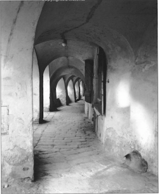
The image above is by George Todd - from his book Elements Of Black And White Photography. I think this an exceptional image and I would like to know more about this photographer. Anyway, the image above contains a number of elements that work for it - leading lines, interesting shapes and textures and a path leading to where? tends to add to interest. The little extra that makes the image is the light on the wall to the right nicely balancing the lighter parts of the subject on the left and also an interesting shape. Would this have been a decent picture without the light - certainly - would it have been a great image - I don't think so. It would be interesting to ask the photographer whether he in fact saw the arches and looked for a composition or did indeed see the interesting light projection then look for a composition within which to use it. Did he walk by her many times, possibly even taking pictures, until one day the light was perfect.
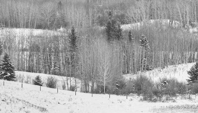
The above image, one of mine, is frankly pretty boring. It was almost the first image on a photo excursion in which the light was bad and the snow cornices, our ostensible reason for heading out, were nowhere to be seen. Often in this situation, the first scene you come across is one of "well, it isn't great, but let's get those cameras out and hope for the best, or at least get the first images out of the way so we can go find something really interesting"
I quite like the hills opposite the duck pond here. I have driven past many times and photographed here more than a few - never with any great success and frankly this day was no different.
The hills are vaguely interesting but it is the whole range of hills that is attractive, not just one segment, yet there are sufficient flaws in the scene to make a panoramic image less than ideal so one is left to photograph sections, which never have the appeal of the whole.
This particular image does have some things going for it but there isn't enough of a pattern to make a good image. I really dislike the two spruce trees at either side, one partially cut off. The lighting is totally flat. There's nothing wrong with soft lighting but this is taking things too far.
Bottom line is if you take something vaguely interesting and divide it into quarters, you should have little expectation that the quarters will offer up much for the viewer and so it is.
It is possible to make photographs for the edification of others - commercial photographers do that all the time - often with great creativity and talent and even in advertising photography it is possible to glimpse some of the photographer some of the time. Many setups though are the work of the advertising director and the skill and talent lie in translating their wants into a finished image, which pleases them.
In fine art or hobbyist photography it is most certainly possible to apply the same strategies. You decide that a particular subject or style sells well and that you ought to use it. Your pick your subject for it's reputation. Thus you decide to photograph in Yosemite and use large format in emulation of the greats of the past. To be fair, you like the outdoors but it is your first trip to Yosemite and as such you have no idea whether you have caught it on a "good" day or not, whether you have scouted the best possible images. The only thing you know of Yosemite is the images of others - from books and websites. You get frustrated when you can't find the same compositions - because the weather or season is wrong or bushes have grown or it was a dry summer. You can't find any compositions at all that don't remind you of the work of others. Emulation being one thing, outright plagiarism another. You do shoot, though not as many images as you had hoped, and on returning home you find them disappointing. You ended up with nothing that Ansel would have taken, yet nothing that you can really call your own and be excited about.
Bits and pieces of this story are repeated all over the world, all the time, by millions of serious minded photographers, many of them puzzled in the end as to what went wrong.
If you want to be excited by your own images (and who else should be as excited by them?) then you have to start with your own ideas. We can certainly borrow from the greats of history but in the end, if we aren't interested in the subject, or in doing something with the subject, then I fear we are doomed to disappointment.
This is all very well but so far it's a litany of what not to do and nothing of what could and should be done, other than the obvious "find something interesting".
I could give you a list of interesting things, but it would be my list, not yours, and were you to pick a subject from it, could you be sure you are tackling it for yourself and not because I thought you should. No, you are going to have to find your own definition of interesting. And it's not enough to say that you are interested in landscapes - do you like near, middle distance or distant vistas? Are you obcessed with near far compositions like Joe Cornish, or tightly cropped compositions like myself? Are you happier with drama in your images or do you prefer subtlety? Is it really the subject that matters or the way that light plays off a subject, regardless of what and where it is? Do you like straight lines or curves, dark tones or light, contrast or soft textures? Perhaps you are interested in S bends, whether they be highway or plant or human form? Are you mostly interested in shadows? Mayhap you most prize that which others cannot or will not see or are you most fascinated in puzzles - what is it, which angle is it viewed from and from how far?
Some are lucky and come to photography with ideas of what interests them, and like Michael Levin featured in this months Black and White Photography magazine, you are able within a relatively short time (in Michael's case, five years) to produce a body of work any of us would be proud to show. I don't know Michael but would bet that he was "seeing" long before he took up photography.
Those of us who come at serious photography from the angle of liking to mess with cameras and stuff before we learn to see have a much greater struggle. We assume our problem is equipment and we spend years and many dollars searching for the right answers. Far better we should have spent a year wandering around without camera, just to learn to see, to find out what we like, what makes us curious. When you get to the point that you absolutely can't stand not creating an image, then it's time to start shooting.
Perhaps a more reasonable suggestion would be to spend that year, with the camera you have and the lenses you own and without making a single extra purchase, to photograph the things you cannot stand not to record and at year end, make a portfolio of small prints, say 5X7 inches or so (or even to make a web folio without making any prints at all) of your year's work. Far better a folio of lovely small images than mediocre large ones. If you must spend money, then buy books, attend courses, go to workshops, immerse yourself in the work of really good photographers.
I'm going to risk telling you what interests me - though perhaps you already know from looking at my images. Remember though that this isn't your list, only an idea of how you figure out what interests you.
O.K, so I like clean simple design - whether it be a car, living room furniture or art. I like regularity - verticals that are vertical, else they are sufficiently diagonal not to pretend to be vertical. I like things with weight to them - A Henry Moore sculpture rather than something made of wire and air.
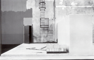
The above image by Lewis Baltz is one of my all time favourites. It's simple, geometric, monochrome, painterly, in a way abstract. How can a man who time after time has recommended and referred to Pepper # 30? I don't really know. They are certainly different in just about every way but who said I had to have only a single interest - wouldn't I be the dull boy if it were true, not to mention frustrated?
Here's an exercise for you to try - let me know how it works for you.
From the following list of values, select one or two possibilities from each list.
Your favourite:
1) tone, from black to white
2) shape
3) line
4) texture
5) lighting
6) compositional tool
7) shadow or light
8) painterly or realistic
9) flat or three dimensional (at least in appearance)
10)colours (remember saturation and luminosity)
11)warm or cold
12)sharp or rounded
13)soft or stiff
14)light or heavy
15)mobile or fixed
Feel free to add any other descriptors you can think of, without naming a subject matter.
Write out the list and read it through several times. Now, without picking up your camera and with the limitation of not leaving your property and with list in hand, spend an hour wandering around looking for things which have some of those characteristics. No cheating now - one full hour - sixty minutes of looking, searching, comparing with your list.
At the end of an hour ask yourself if you didn't see something you could imagine taking a photograph of. Even better, do take photographs of the things you found that had a connection with your list. Make yourself a little slideshow on the computer of these images, with only the most basic adjustments.
Now spend some time looking at the images you made and instead of evaluating each image for it's worth in the world of fine art photography - look at the body of work and ask yourself if it says anything about you - did the list mean anything, and does it perhaps suggest to you future avenues to explore.
I warn you that I have not done this exercise myself, nor recommended it previously and don't know how it's going to turn out. It's my feeling that it will be revealing and helpful but that's all.
I don't expect any of the images produced by this exercise to make it into your portfolios of best images of the year - that wasn't the point, but has it suggested what to look for in the future - that is the question of the day.
Do let me know if you try it - I'd be happy to see small samples of the images you produce and hear of the outcome of the experiment.
Next time I want to address the subject of "Interesting, but is it photographable?" which is, I think, our second biggest stumbling block.
In some ways, there is give and take in the matters of composition and printing and number of pixels or size of film or lighting, so long as the subject is interesting in the first place. The more interesting the subject and situation, the more we are inclined to give in on the other aspects of image quality - up to a point anyway. Who hasn't at some time been affected by a picture in a newspaper. Clearly printing quality is minimal, lighting is usually irrelevant and composition very much secondary to the subject.
The problem is that no matter how well all other aspects of the image are executed, an interesting subject is fundamental.
One can argue - "interesting to whom?", since if it is a subject that interests you, there is sure to be at least one other person in this world who is also interested. What you have to do though is ask yourself whether even you were all that interested in the subject, or did you shoot it because you thought it would make a good picture (or at least hoped so).
By this point you may be asking yourself what is the difference between something that is interesting and something that photographs well? You might further be excused for asking "who the hell cares?".
I don't think there is a single sentence answer to the question above, well at least the first part, but I suspect that exploring the question could be useful the next time we go out looking for images.
First here's an example. I find an interesting shadow. It might be interesting because of it's shape or tone or because of how it interacts with something else. It isn't, of course; real yet it can certainly be photographed. Paul Strand took a photograph of a woman walking down the street next to a flat wall in New York. It was the shadow projected on the wall that made the image - the woman was essentially irrelevant to the image - or at least easily replaced. From an ordinary picture of an ordinary woman, the image is transformed because of the shadow into something trudging, weary, ominous perhaps. I can't find the image on the web so you will have to use your imagination.

The image above is by George Todd - from his book Elements Of Black And White Photography. I think this an exceptional image and I would like to know more about this photographer. Anyway, the image above contains a number of elements that work for it - leading lines, interesting shapes and textures and a path leading to where? tends to add to interest. The little extra that makes the image is the light on the wall to the right nicely balancing the lighter parts of the subject on the left and also an interesting shape. Would this have been a decent picture without the light - certainly - would it have been a great image - I don't think so. It would be interesting to ask the photographer whether he in fact saw the arches and looked for a composition or did indeed see the interesting light projection then look for a composition within which to use it. Did he walk by her many times, possibly even taking pictures, until one day the light was perfect.

The above image, one of mine, is frankly pretty boring. It was almost the first image on a photo excursion in which the light was bad and the snow cornices, our ostensible reason for heading out, were nowhere to be seen. Often in this situation, the first scene you come across is one of "well, it isn't great, but let's get those cameras out and hope for the best, or at least get the first images out of the way so we can go find something really interesting"
I quite like the hills opposite the duck pond here. I have driven past many times and photographed here more than a few - never with any great success and frankly this day was no different.
The hills are vaguely interesting but it is the whole range of hills that is attractive, not just one segment, yet there are sufficient flaws in the scene to make a panoramic image less than ideal so one is left to photograph sections, which never have the appeal of the whole.
This particular image does have some things going for it but there isn't enough of a pattern to make a good image. I really dislike the two spruce trees at either side, one partially cut off. The lighting is totally flat. There's nothing wrong with soft lighting but this is taking things too far.
Bottom line is if you take something vaguely interesting and divide it into quarters, you should have little expectation that the quarters will offer up much for the viewer and so it is.
It is possible to make photographs for the edification of others - commercial photographers do that all the time - often with great creativity and talent and even in advertising photography it is possible to glimpse some of the photographer some of the time. Many setups though are the work of the advertising director and the skill and talent lie in translating their wants into a finished image, which pleases them.
In fine art or hobbyist photography it is most certainly possible to apply the same strategies. You decide that a particular subject or style sells well and that you ought to use it. Your pick your subject for it's reputation. Thus you decide to photograph in Yosemite and use large format in emulation of the greats of the past. To be fair, you like the outdoors but it is your first trip to Yosemite and as such you have no idea whether you have caught it on a "good" day or not, whether you have scouted the best possible images. The only thing you know of Yosemite is the images of others - from books and websites. You get frustrated when you can't find the same compositions - because the weather or season is wrong or bushes have grown or it was a dry summer. You can't find any compositions at all that don't remind you of the work of others. Emulation being one thing, outright plagiarism another. You do shoot, though not as many images as you had hoped, and on returning home you find them disappointing. You ended up with nothing that Ansel would have taken, yet nothing that you can really call your own and be excited about.
Bits and pieces of this story are repeated all over the world, all the time, by millions of serious minded photographers, many of them puzzled in the end as to what went wrong.
If you want to be excited by your own images (and who else should be as excited by them?) then you have to start with your own ideas. We can certainly borrow from the greats of history but in the end, if we aren't interested in the subject, or in doing something with the subject, then I fear we are doomed to disappointment.
This is all very well but so far it's a litany of what not to do and nothing of what could and should be done, other than the obvious "find something interesting".
I could give you a list of interesting things, but it would be my list, not yours, and were you to pick a subject from it, could you be sure you are tackling it for yourself and not because I thought you should. No, you are going to have to find your own definition of interesting. And it's not enough to say that you are interested in landscapes - do you like near, middle distance or distant vistas? Are you obcessed with near far compositions like Joe Cornish, or tightly cropped compositions like myself? Are you happier with drama in your images or do you prefer subtlety? Is it really the subject that matters or the way that light plays off a subject, regardless of what and where it is? Do you like straight lines or curves, dark tones or light, contrast or soft textures? Perhaps you are interested in S bends, whether they be highway or plant or human form? Are you mostly interested in shadows? Mayhap you most prize that which others cannot or will not see or are you most fascinated in puzzles - what is it, which angle is it viewed from and from how far?
Some are lucky and come to photography with ideas of what interests them, and like Michael Levin featured in this months Black and White Photography magazine, you are able within a relatively short time (in Michael's case, five years) to produce a body of work any of us would be proud to show. I don't know Michael but would bet that he was "seeing" long before he took up photography.
Those of us who come at serious photography from the angle of liking to mess with cameras and stuff before we learn to see have a much greater struggle. We assume our problem is equipment and we spend years and many dollars searching for the right answers. Far better we should have spent a year wandering around without camera, just to learn to see, to find out what we like, what makes us curious. When you get to the point that you absolutely can't stand not creating an image, then it's time to start shooting.
Perhaps a more reasonable suggestion would be to spend that year, with the camera you have and the lenses you own and without making a single extra purchase, to photograph the things you cannot stand not to record and at year end, make a portfolio of small prints, say 5X7 inches or so (or even to make a web folio without making any prints at all) of your year's work. Far better a folio of lovely small images than mediocre large ones. If you must spend money, then buy books, attend courses, go to workshops, immerse yourself in the work of really good photographers.
I'm going to risk telling you what interests me - though perhaps you already know from looking at my images. Remember though that this isn't your list, only an idea of how you figure out what interests you.
O.K, so I like clean simple design - whether it be a car, living room furniture or art. I like regularity - verticals that are vertical, else they are sufficiently diagonal not to pretend to be vertical. I like things with weight to them - A Henry Moore sculpture rather than something made of wire and air.

The above image by Lewis Baltz is one of my all time favourites. It's simple, geometric, monochrome, painterly, in a way abstract. How can a man who time after time has recommended and referred to Pepper # 30? I don't really know. They are certainly different in just about every way but who said I had to have only a single interest - wouldn't I be the dull boy if it were true, not to mention frustrated?
Here's an exercise for you to try - let me know how it works for you.
From the following list of values, select one or two possibilities from each list.
Your favourite:
1) tone, from black to white
2) shape
3) line
4) texture
5) lighting
6) compositional tool
7) shadow or light
8) painterly or realistic
9) flat or three dimensional (at least in appearance)
10)colours (remember saturation and luminosity)
11)warm or cold
12)sharp or rounded
13)soft or stiff
14)light or heavy
15)mobile or fixed
Feel free to add any other descriptors you can think of, without naming a subject matter.
Write out the list and read it through several times. Now, without picking up your camera and with the limitation of not leaving your property and with list in hand, spend an hour wandering around looking for things which have some of those characteristics. No cheating now - one full hour - sixty minutes of looking, searching, comparing with your list.
At the end of an hour ask yourself if you didn't see something you could imagine taking a photograph of. Even better, do take photographs of the things you found that had a connection with your list. Make yourself a little slideshow on the computer of these images, with only the most basic adjustments.
Now spend some time looking at the images you made and instead of evaluating each image for it's worth in the world of fine art photography - look at the body of work and ask yourself if it says anything about you - did the list mean anything, and does it perhaps suggest to you future avenues to explore.
I warn you that I have not done this exercise myself, nor recommended it previously and don't know how it's going to turn out. It's my feeling that it will be revealing and helpful but that's all.
I don't expect any of the images produced by this exercise to make it into your portfolios of best images of the year - that wasn't the point, but has it suggested what to look for in the future - that is the question of the day.
Do let me know if you try it - I'd be happy to see small samples of the images you produce and hear of the outcome of the experiment.
Next time I want to address the subject of "Interesting, but is it photographable?" which is, I think, our second biggest stumbling block.
Saturday, December 27, 2008
Vase

Lensbaby on the 1Ds2, wide open, hand held - the computer says 1/2500 but I know different. Did learn that the lensbaby doesn't work well with extension tubes - better to get the close up filters Lensbaby sells - not only did it not work electronically (the camera refused to take a picture), the tilt is now even further from the sensor rendering the tilt mechanism even more problematic. This was shot with the +4 close up filter.
Saturday, December 20, 2008
Web Site Updated
It's -28 Celsius and I'm not happy about it, but did take the opportunity to finally update some of the images on my website.
There are another 100 or so images between colour and black and white industrial in
Gallery 5
and
Gallery 6
colour industrial and
bw industrial gallery 2.
Most of the images have been in the blog but are now all together.
There are another 100 or so images between colour and black and white industrial in
Gallery 5
and
Gallery 6
colour industrial and
bw industrial gallery 2.
Most of the images have been in the blog but are now all together.
Tuesday, December 16, 2008
Imitation Holga

Billie expressed concerns that she might not be able to get results equivalent to her previous very successful use of a Holga 120 film camera with her new Lensbaby Composer.
The above image was shot with the Composer, full frame camera, 5.6 cropped to square, masked along the edges and some blurring of a duplicate layer, then faded back with the layer slider. It looks a bit like a Holga image and perhaps with more work we could do better.
Lensbaby Adventures 2

The image above is with the lensbaby centred and f 5.6 on a full frame sensor camera.

The image above is f 2 (ie. wide open).

Now we have the lens baby tilted up so only the upper edge has any sharpness

and in the last image above we see the lensbaby tilted modestly to the right.
I had forgotten that in a lens with peripheral aberations, the size of the sensor would make a huge difference and it does - at 5.6 and centred and small sensor, looking through the lensbaby you have to look to see the blurring in the viewfinder (though it's more obvious in the images themselves) but with a full frame sensor, the edges are extremely blurred.
Monday, December 15, 2008
Lensbaby Composer

- image above from Lensbaby website

I've been considering a Lensbaby for some time and a recent cold snap was the final impetus to go out and purchase one. It seemed sensible to pick up the latest (and presumably best) Lensbaby, the Composer model.
The original Lensbaby came with a plastic corrugated tube which could be flexed and stretched and shortened as desired. Another model added Sputnik like appendages to the outside to control the positioning of the tube. The most recent Lensbaby Composer uses a ball and socket arrangement to rotate the lens, while beyond the ball and socket is a standard rotating focusing mechanism that moves the lens in and out, much more like a traditional lens.
I had understood that one could swing the lens to align plane of focus as needed but that's not quite accurate. In reality, there is no plane of focus, rather a central sweet spot with surrounding and ever increasing blur and stretch of the image. The degree to which this happens is a function of depth of field but of course if you stop down to increase the size of the sweet spot, you reduce the blurring at the edges of the image.
What really happens as you tilt the lens is that the sweet spot moves from the centre of the image to the outside and possibly beyond the image so that nothing is sharp. It's a little more complicated though. At least some of the blurring off centre is due to a change in the plane of focus (this with the lens all squared up - by eye, there are no marks or centre detent). This change in focus means that things nearer the camera are sharp and the closer to the edges of the image, the nearer is the plane of focus. It mght be more accurate to describe it as a cone of focus, or perhaps even better a bowl of focus.
In theory this sharpness of nearer things should allow you to tilt the lens to get two things sharp at the same time which are not equidistant, but in fact the way the lens is built (unlike a regular tilt and shift lens) is that as the lens is tilted, nothing is sharp at any distance as you move away from the now off centre sweet spot. All this has to do with the fact that the centre of rotation of the ball and socket is in fact well forward of the sensor and tilting the lens puts you well into the periphery of the lens' coverage. A normal tilt and shift lens doesn't pivot around anything, rather it slides over a curved surface designed so that the curve would be centred on the sensor - thus maintaining lens maximum resolution when tilting.
Now, none of the above is necessarily a disadvantage, just a bit of a surprise to me and not quite what I had expected. It would be better to think of lens tilt in this case controlling the amount of blurring and the placement of same rather than trying to control a plane of sharpness. After all, you buy the lens for it's blurring capabilities, not its off axis sharpness.
I haven't had much chance to explore the lens capabilities but look forward to doing so and you can be sure you are going to be subjected to anything I find interesting.
I welcome comments from those who have made more use of their Lensbabies. Before purchasing it I did spend some time searching the net for images which make good use of the Lensbaby. Unfortunately there are far more bad examples than good and even most of the images on the Lensbaby site leave something to be desired. It isn't a digital Holga, but I am still hopeful it can be used effectively.
Friday, December 12, 2008
Placing The Subject/Moving The Photographer
In any given photograph there are a number of elements which make up the subject which you are capturing. At times they are fixed relative to each other - for example you are photographing a rockface or graffiti on a wall - there is nothing to arrange. Your job in that case is to find the best angle to record the image and to frame it in the best way.
Often however, the various elements of the subject are not on a single plane and your camera position will affect how they relate to each other - overlapping, next to and just touching or near by. Through height of camera position you can affect the same issues vertically as you can horizontally by moving around.
In one camera position two objects can be equidistant, but as you move left or right, one is going to be closer than the other and their relative positions change, sometimes significantly. You have to decide what relationship works best for a given image. This can be relatively painless if there are only two separate objects in the image - say a tree and a rock, but becomes much more complex as the number of objects increase. In this case you find that while moving to the left will increase the spacing of one pair of objects, it narrows the gap between others.
How do you decide where to place all these objects relative to each other through camera position? What happens if this is a still life and you can physically pick up the objects and move them where you will? Are there rules that you can follow?
Before getting to what you should do, lets first contemplate what the significance is of relative position - perhaps that will give us clues as to what to do with them.
Remember too that while I write of "objects", they may in fact not be real, touchable, things. They might be a shadow or a highlight on the background.
At a most fundamental level, placement of the objects helps us understand the image. Since an image is two dimensional, placement helps us understand the relative positions of the objects. When one overlaps the other, it is clearly in front, while if they are next to each other, we don't know that. They might touch in the image but it doesn't mean they are next to each other. You may want to use this ambiguity to supply your viewer with a bit of a puzzle - something to wonder about, or you might prefer to make it clear where the objects are to enhance understanding.
Where the objects are located within the image has some bearing on how we interpret the image. We live on a planet surface and virtually all the time we can assume that what is at the bottom of what we look at is near, and the top far. As the photographer you have the possibility to confirm that or litereally turn it on it's head.
More subtly though, we tend to see bright objects as nearer, dark as further, large as near, small as far. To some degree you can filter or manipulate the image to lighten and darken objects in the editing to change that - for example two rocks of equal brightness could have one darkened and the other lightened and now there is a strong sensation of the light rock being nearer than the dark one.
Because of atmospherics however we also have the sensation that things that are light and soft and low in contrast appear very distant, while objects that are sharp contrasty and with a full range of tones including some good blacks are relatively near. This gives you the opportunity to use depth of field to give a sense of distance to objects - being out of focus and being light and with no good blacks would mean the object is assumed to be distant.
It is natural for the viewer to go from object to object as he or she looks at the image and the relative positions offers a chance for the photographer to tell a story or to introduce the main object or to explain it. The positions of the other objects will contribute significantly to how well that explanation, introduction or story comes across.
Fundamentally some arrangements are more attractive than others and create a visual path through the image, whether this is an S shaped path or the four corners of a rectangle or three of a triangle. "Placing" the objects in one of these patterns can give an image a sense of rightness, balance, peace or just the opposite.
Placing two objects next to each other in the image creates a connection between them, whether you wanted it or not, so you need to know if that is in fact what you want.
The more experienced the photographer, the more fine photographs that have been studied, the more images made, the better a photographer becomes at simply looking at the subject and knowing what seems right. Even after years however, it is often not obvious what is right and you actually do have to think about all of the above as you move around the scene trying to find the best viewpoint. For novice photographers it can be a nightmare trying to arrange things rightly. In fact novices often don't even know when they have done it wrong - or if they do, why, which can lead to a lot of frustration. The more levels you understand your images on, the better you can find your viewpoint.
Often however, the various elements of the subject are not on a single plane and your camera position will affect how they relate to each other - overlapping, next to and just touching or near by. Through height of camera position you can affect the same issues vertically as you can horizontally by moving around.
In one camera position two objects can be equidistant, but as you move left or right, one is going to be closer than the other and their relative positions change, sometimes significantly. You have to decide what relationship works best for a given image. This can be relatively painless if there are only two separate objects in the image - say a tree and a rock, but becomes much more complex as the number of objects increase. In this case you find that while moving to the left will increase the spacing of one pair of objects, it narrows the gap between others.
How do you decide where to place all these objects relative to each other through camera position? What happens if this is a still life and you can physically pick up the objects and move them where you will? Are there rules that you can follow?
Before getting to what you should do, lets first contemplate what the significance is of relative position - perhaps that will give us clues as to what to do with them.
Remember too that while I write of "objects", they may in fact not be real, touchable, things. They might be a shadow or a highlight on the background.
At a most fundamental level, placement of the objects helps us understand the image. Since an image is two dimensional, placement helps us understand the relative positions of the objects. When one overlaps the other, it is clearly in front, while if they are next to each other, we don't know that. They might touch in the image but it doesn't mean they are next to each other. You may want to use this ambiguity to supply your viewer with a bit of a puzzle - something to wonder about, or you might prefer to make it clear where the objects are to enhance understanding.
Where the objects are located within the image has some bearing on how we interpret the image. We live on a planet surface and virtually all the time we can assume that what is at the bottom of what we look at is near, and the top far. As the photographer you have the possibility to confirm that or litereally turn it on it's head.
More subtly though, we tend to see bright objects as nearer, dark as further, large as near, small as far. To some degree you can filter or manipulate the image to lighten and darken objects in the editing to change that - for example two rocks of equal brightness could have one darkened and the other lightened and now there is a strong sensation of the light rock being nearer than the dark one.
Because of atmospherics however we also have the sensation that things that are light and soft and low in contrast appear very distant, while objects that are sharp contrasty and with a full range of tones including some good blacks are relatively near. This gives you the opportunity to use depth of field to give a sense of distance to objects - being out of focus and being light and with no good blacks would mean the object is assumed to be distant.
It is natural for the viewer to go from object to object as he or she looks at the image and the relative positions offers a chance for the photographer to tell a story or to introduce the main object or to explain it. The positions of the other objects will contribute significantly to how well that explanation, introduction or story comes across.
Fundamentally some arrangements are more attractive than others and create a visual path through the image, whether this is an S shaped path or the four corners of a rectangle or three of a triangle. "Placing" the objects in one of these patterns can give an image a sense of rightness, balance, peace or just the opposite.
Placing two objects next to each other in the image creates a connection between them, whether you wanted it or not, so you need to know if that is in fact what you want.
The more experienced the photographer, the more fine photographs that have been studied, the more images made, the better a photographer becomes at simply looking at the subject and knowing what seems right. Even after years however, it is often not obvious what is right and you actually do have to think about all of the above as you move around the scene trying to find the best viewpoint. For novice photographers it can be a nightmare trying to arrange things rightly. In fact novices often don't even know when they have done it wrong - or if they do, why, which can lead to a lot of frustration. The more levels you understand your images on, the better you can find your viewpoint.
Monday, December 08, 2008
Thoughts on Inclement Weather
After shooting yesterday in a snowstorm, a few points occurred to me.
1) wide angle lenses will show closer snow with less blurring
2) distance from subject will determine the amount of snow between you and the subject - use accordingly to control the atmospheric effect you want - keeping # 1 above in mind.
3) lens hoods are essential. Do remember, if you use a lens which covers a full size sensor on a small sensor camera that the lens hood is not restrictive or long enough. You may want to use one for a longer lens or extend it, especially on top to keep snow and rain out.
4) nothing is more frustrating than getting rain or snow on the viewfinder, and it's darn hard to reach in there and wipe off. Carrying a cloth dedicated to cleaning the viewfinder and LCD can be handy.
5) a hat with a goodly brim can avoid some of the precipitational issues.
6) wet fingers get cold really fast and even around freezing can get darn cold.
7) most cameras will handle a modest sprinkling of rain or snow especially for short periods of time but if you plan to spend two hours photographing in the rain, you want to think of protective coverings.
8) misery loves company - take someone else out shooting with you - it's harder to back out.
1) wide angle lenses will show closer snow with less blurring
2) distance from subject will determine the amount of snow between you and the subject - use accordingly to control the atmospheric effect you want - keeping # 1 above in mind.
3) lens hoods are essential. Do remember, if you use a lens which covers a full size sensor on a small sensor camera that the lens hood is not restrictive or long enough. You may want to use one for a longer lens or extend it, especially on top to keep snow and rain out.
4) nothing is more frustrating than getting rain or snow on the viewfinder, and it's darn hard to reach in there and wipe off. Carrying a cloth dedicated to cleaning the viewfinder and LCD can be handy.
5) a hat with a goodly brim can avoid some of the precipitational issues.
6) wet fingers get cold really fast and even around freezing can get darn cold.
7) most cameras will handle a modest sprinkling of rain or snow especially for short periods of time but if you plan to spend two hours photographing in the rain, you want to think of protective coverings.
8) misery loves company - take someone else out shooting with you - it's harder to back out.
Sunday, December 07, 2008


Saturday, December 06, 2008
Another Find From The Archives

My appologies for my absence from the blog in this last two weeks. I have two excuses, for what it's worth. I have been busy on my second book, tentatively called "Camera To Computer". It consists of a series of images and how they were made - either dealing with in the field issues or image processing from raw to finished. There are manual blends, Auto blends, there are even people images!
My deadline for the manuscript is May 31, and while that sounds like a long time off, previous experience tells me I'd better get my butt in gear.
Anyway, I had to reprocess one of my images for the book which meant going back to the raw files of 2003. Stitching is a lot easier these days and it took minutes to put together a stitch I'd overlooked previously and the above is the result.
I'm not too sure that the image may be too complicated, with a whole series of nice things, which don't quite come together. So far I have persuaded myself they do, but this may not stand the test of time. Fact is it's near the limit of complexity - I'm just not sure which side of the limit it stands on - yet.
In fact it is a crop of a larger pan of even more great things which clearly didn't work for me - see below.

Oh, the second excuse - I have had a fourth year medical student with me the last two weeks which while challenging and interesting, also eats up any spare minutes at the office and then some.
Friday, November 21, 2008


Subscribe to:
Posts (Atom)

