

Copyright Shaun O'Boyle
After my industrial images appeared in Lenswork last year, I got a very nice email from Shaun O'Boyle, who amongst other things indicated he too had an interest in industrial and old building images. I visited Shaun's website and found lots of interesting locations. I felt at the time that he had some way to go to refine his seeing, yet there were a few very good images and one outstanding image which I feel priviledged to have swapped for and now have on my wall.
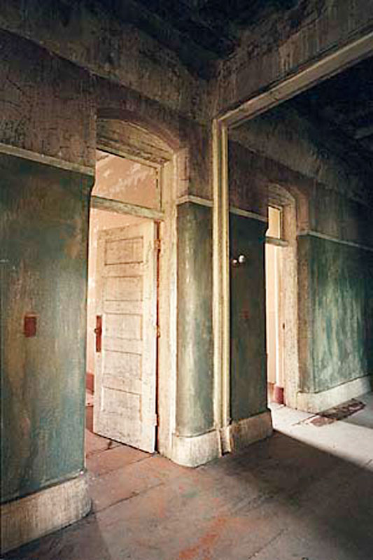
One might be tempted when a few images are strikingly better than their bretheren to assume it was luck, yet this type of image is constructed. There are lots of ways he could have photographed these same doors and hallway which wouldn't have had nearly the impact.
I am delighted to see on Shaun's site some more recent work indicating that the promise of stronger images to come is being fulfilled - I'm not surprised. His vision is becoming stronger, he knows better what he wants to say in a given subject and concentrates on the parts of the scene which help make that statement. He showed this in this earlier photo though I don't think that at the time he knew just how exceptional this image was and is. He knows now and has been able to build from this.
So, on to discussing the image above which Shaun has given me permission to show.
We have to discuss the colour - it's wonderful - the rusty red of the floor, door knobs and light switches, the well weathered rich cream of the doors, baseboards and archways, the textured green of the walls all work perfectly together. Exposure is spot on - always a challenge in colour - no detail is lost in the brightest highlights to the deepest shadows.
Note the diagonal lines of the baseboards, floor boards, and upper wall as well as those of the shadows on the floor and the sun coming in, also the archway. How about the darker edge on the right keeping your eye from wandering off to the right. I like the archway which gives a sense of this being a mirror and not more corridor to the right - yet the sunbeam clearly indicates it isn't a mirror. That it is a long shut down mental hospital makes you wonder who lived behind these doors and what stories the building could tell.
I like the way the lines come to the corners, perfectly on the bottom left and between two lines in the upper right. The upper left doesn't come perfectly to the corner and I actually prefer it this way - it's possible to be too clever.
I did wonder if the perspective should have been corrected so the vertical lines are in fact perfectly vertical - an easy job in Photoshop, but that would have been more of an architectural shot and less a tale of mood, story and statement.
The textures are wonderful. There is a painterly quality to the image which is no Photoshop trick.
I've had the image for a year and like it every but as much as I did when I first saw it - wish I had taken it but sure glad Shaun did.

2 comments:
Mr. Barr,
A precious few people have the gift to turn the "ordinary" into art; still fewer have the addtional gift to be able to eloquently write about this process. You have been blessed with both gifts! A wonderful mini-essay, beautiful images, and a Blog that I will now have to include on my list of all-time favorites. Thank you for sharing your craft and musings.
Thank you for your feedback. There seems to be an interest in this kind of information about what works in images and not a lot of it on the web. There are lots of sites which will critique a photograph but there are times that it's tempting to suggest that leaving the lenscap on would have improved the photograph - ie. I wouldn't have taken it so start over, other times the advice can't be worked on - move a bit to the left - but the photographer was standing on a cliff. I think it more useful to concentrate on what works. Imagine teaching a class in math only by giving examples of all the wrong things you can do.
Post a Comment