Friday, July 28, 2006

The Value Of Rechecking Old Proofs


Shot a year ago and ignored, I went through the 'proof sheet' with Adobe Bridge and thought I might be able to do something with these two images. Perhaps you too can find some images you quite like now yet thoroughly ignored after the shoot.

Tuesday, July 25, 2006

On Attending Workshops


I heartily recommend going to workshops. You can go for one of a number of reasons - it's a great way to get back into creating if you have been in a slump for a while. You can go to learn from the teachers - but if that's the reason, be sure you like their work - after all that represents what they know. You can go to workshops because it's a fun holiday with a bunch of like minded photographers who love to talk shop. You can go because the workshop is being held in an area you haven't visited before and the leaders have and they can save you a lot of time and hassle by showing you the hot spots.

Over the years I have tended to bring to the workshop the idea that I'd work hard at my photography and shoot what I could. The images here were all obtained during a workshop - sometimes while actually with other photographers, other times by getting up really early or by standing in pouring rain while the rest of the group peered out of the fogged vehicle windows. I've made a fair amount of money from that particular shot - sorry guys, but if you were too lazy to get out of the car into the rain, you missed the best shot of the day.

Oh So Close


Don't you just hate it when a picture might have worked. Here's an example of one that could have been. I'm not happy with the totally horizontal composition. The image was overexposed (4X5) and is grainy as all getout. Still, we live for another such day and for the skill to record it properly this time.

Repeating Patterns


Note the repeating pattern of fallen over 'A's.

This is another blended image usng Helicon Focus, in this case only two images (though 3 would have been better). Shot with a long lens and not enough depth of field even stopped down so shot two images, each focused on a different spot. In theory could have blended in photoshop with layers but not nearly as effective as letting Helicon Focus adjust image size to match (as you focus nearer, the image enlarges so you can't just lay one image on top of another (at least not often).

Monday, July 24, 2006

Limited Editions

Customers quite often ask if a print is a limited edition. This time the question is an informed one and my answer that no, they are not, is clearly unsatisfactory. Even my daughter thinks I may have to give in and limit the editions. Her arguement, after discussing it with other artists and customers and friends, is that the publishing industry has done such a selling job on the necessity for collectors to purchase limited editions, that it is now the standard.

Perhaps if they thought about it, they'd realize the following:

1) none of he great photographers of the past limited their editions - hell, you can still buy Pepper # 30, and boy am I tempted. Ansel didn't, Edward didn't, not Strand.

2) the customer loses because the price is dramatically higher - the real beneficiaries are the galleries. The photographer loses because if it does turn out to be a popular image, he's going to kick himself. Imagine if Ansel did put a limit on Moonlight Over Hernandez. The gallery on the other hand, doesn't care if a particular image runs out - on the contrary - if the price is fixed, they sell all the better towards the end of the run, if as happens often, the price goes up towards the end, then they reap the benefits, and when the series runs out, well they just move onto another photographer.

3) For the most part, for the majority of photographers and for the majority of images, it doesn't matter one toot - they were never going to get to the end of their limited run anyway. For the one or two images from really good photographers that are that popular it's conceivable that it's a problem, but I doubt that even the most popular images sell into the hundreds, not fine art images anyway.

The people who most 'need' limited editions (other than the galleries) are the investing collectors - the people who don't want an image for itself, rather as something to be held for a while then sold, rather like gold mine shares. the odd thing is, I suspect they are shooting themselves in the foot here.

Lets say they have $1,000 to invest in photography. They can purchase one limited edition print or 10 unlimited prints. Assuming equal care in selecting each of the images, I'd bet on at least some of the 10 returning enough on the investment to outperform the single limited edition print.

Does this mean I'm not going to limit my prints. Unfortunately I think that will have to be a question for the market to decide. Were I a full time photographer, I think I'd keep prices low and forget limited editions. As someone with a full time job though and worn out from two years at the Farmers Market (working 7 days a week), I'm going to have to rely on galleries to get my work seen, so...

Is It A Print Or Is It The Original?

twice this month I have been asked this question while selling my photographs. I point out these are photographs (in case they think they are paintings) but that doesn't satisfy them. I don't know how to reply. I guess it probably doesn't matter as the question means they almost certainly aren't going to buy - but my explanations seem to leave them thinking I am lying, or cheating or defrauding them - anyway they go away unhappy - I was polite, I explained the nature of photographs and original negatives, slides or digital files - but that doesn't cut it - oh well.

Is The Colour Real?


This is a question I quite often get in selling my photographs. Most people are not prepared to look at an image as an object in itself, rather as a recording of something. Why they should want a 'recording' since they weren't there seems dubious, but there you have it.

For the most part I work to create what I remember, but not always. The examples here are situations in which the colour is definitely over the top, and you know what - I don't care!

People often assume that if the image is digital, the colour must be cheating, and if from film, it can't be. This of course begs the issue of Fuji Velvia which always did make colours 'over the top' and what about Cibachrome prints which were very saturated and contrasty.

Ever see a post card with pastel colours? - I thought not.

We readily accept that a black and white image isn't a direct translation from real, and we forgive red filters darkening skies, green filters lightening foliage and polarizers seeing through reflective water surfaces. Somehow though, the fact that colour could have been a direct translation means that it must. Of course this begs the question of real colour - we don't see the blues that are real on a dull day or in the shade - yet what we 'see' is considered real and the blue is not - so who's to say.


Who's to say we even see the world the same way. We know that colour blind people see the world dramatically differently - what about the rest of us - are we all colour certified - I think not. Just as some of us have more sensitive senses of smell, there are some who can differentiate more colours and see subtleties more easily. Does this mean they see the colours as more saturated - or is it something else entirely?

What's real anyway, the last image is one many people don't believe - the rock couldn't have been that red - but everyone who has been to Red Rock Canyon agrees that it is - this is the colour they remember - only those who haven't been there question the colour. The image of Lake Louise is similar - the water really was that colour.


Wednesday, July 19, 2006

Having Found Something To Photograph


OK, so you have gone out photographing and you have found something worth photographing - now what?

Some questions to ask yourself before shooting:

1) what is it about this subject that appeals to me and is there a way to emphasize that characteristic - different time of day, different lighting, change in camera position, ultimately how I print the picture (previously on the cheap)?
2) Are there parts of the subject that don't in fact work, that add nothing or heaven forbid actually distract from the thing that makes it great? This could mean a filtering or planning black and white or cropping or a different position.
3) From what angle does the subject photograph best - this means walking around the subject if that's possible.
4) From what height should I photograph it - even portraits can change dramatically with a simple change in camera position. Many people found that the medium format waist level cameras made better portraits than pictures taken at eye level - which seems to defy common sense, but hey, it worked?
5) Is there a position which takes best advantage of the background or eliminated distracting elements (landscapes have the equivalent of the tree growing out of the head problems)?
6) Assuming you have a choice of lenses or zoom lenses, how close should you be to best photograph the subject? Try walking to and away from the subject and see at what point the subject is best. This is independent of figuring out how much of the subject to include.
7) You have found the ideal position to record the image - it has interesting shapes and lines, shadows, and forms. Now you have to figure out how much of the subject to include. It's been my experience that attempts to include as much as possible of an interesting subject often ends up with a muddled concept - the left part might be great, the right also but if they don't relate to each other, perhaps you should be photographing them separately. Unfortunately I sometimes find a subject that is full of wonderful things but they don't quite work all together and when you isolate the parts, they are not strong enough to stand on their own. Unfortunately, all you can do is smile and move on.
8) in framing your subject think of creating a painting - you need each part of the canvas to work, none along for the ride. It might mean bringing a diagonal line to the corner, or perhaps two diagonal lines to near the corner but on adjacent sides. Do you want to include all of the rock on the left, or is it stronger if you crop out part? How much foreground adds to the image before it starts to overwhelm the rest of the image?
9) A zoom is a good way to play with cropping but a simple piece of cardboard with a cut out the shape of your film or sensor works faster, lighter and cheaper. Try different framings so you can see which was strongest when you are home (there's nothing worse than wishing after the fact that you'd moved a little to the left).
10) if you have found the very best position to photograph the thing that interests you, if the lighting is appropriate and if you frame the subject the strongest way you can - well the rest is out of your hands - all you have to do is do a decent job of recording the image.

It's very tempting when something really excites you to start firing away immediately without going through these steps. Sometimes this is justified - if lighting isn't going to last, you grab the shot the best you can. But then, with your safety shot in the bag, then you go through the steps above and see if you can top the first image.

The image above was shot in 1977 or thereabouts. I was on a rare afternoon off from my residency in family practice and went for a picnic with my wife, exploring the country south west of Edmonton and west of Pigeon Lake. We found a dirt track down to the N. Saskatchewan river and there enjoyed ourselves sitting on logs having lunch and wandering around the rock flats by the edge of the river. The image illustrates several of the points described above. I found a position which showed the cloud reflecting in the pool, and with the glittering river in the background and interesting bending curves. I anchored the image with the boulders in the foreground but not with so much of them that it distracted from the reflection. I chose a height which showed the boulders to advantage and kept the reflection in position.

The image was taken with a Zeiss Ikonta 6X6 cm. camera, FP3 film.

Tuesday, July 18, 2006

On Looking For Photographs

I had written earlier about the process of deciding where to go to photograph, and when. I want to see if I can write something useful about the process of looking for something to photograph when you have already arrived.

Sometimes it's obvious, there's only one thing to photograph and I will discuss the process of doing so to best advantage towards the end of this article but what if it isn't obvious what to photograph.

Perhaps the best possibility is to illustrate with an example.

Last year I was at a Family Practice conference and typical of my style I attend lectures faithfully every morning and take off the afternoon to go photographing. As this was February, it meant missing the morning light but I'd been able to find interesting subjects at previous conferences (always held in Banff).

I had heard that a walk along an abandoned road for 4k would take me to the base of Sundance Canyon. It was on my 'must go there one of these days' list and so I headed off. The canyon walls are only 40 feet or so high, Grand Canyon it isn't, but I'd hiked 4km to get here and I wasn't about to leave without checking it out. Half the canyon was in brilliant afternoon sun. The shadows were deep and relatively short and it didn't look like I could do much with it. Colours were muted. Even the most interesting coloured rock photographs poorly at mid day in bright sun. The other side of the canyon however was more interesting. Lit by the bright other side, the light wasn't totally flat and the wall had interesting characteristics. I took several compositions as I worked my way up the canyon.

Half way up the canyon I came across the most amazing find. There was an incredibly coloured rock, white, red, pink, streaked, and in interesting patterns. Better yet a second rock sat in front of the first - perhaps the two could be combined somehow. The ultimate though was that in front of the whitish second rock was a wild rose covered in rose hips.

I just knew I had to combine the three. Depth of field would be a problem but perhaps if the background was a little blurred it wouldn't matter - I'd do the best I could and see.

I thought that if I used a wide angle I could move in really close to the rose and use the two rocks as background but no matter how I positioned myself, the background included too much - the nature of wide angle lenses. I tried several different focal lengths, finally settling on my 70-200 zoom, at 91 mm. at f32 (I have subsequently learned that no additional sharpness in any part of the image is obtained at f32 and you lose sharpness in the part of the image which was originally focused on - f16 is now my max. f stop with my full frame 1Ds2 - no matter what.


It took some effort, perhaps 20 minutes or more, even once I found the right lens, to move back and forth and find the one position left and right, up and down, two and fro that would record the image - no other position worked as well.

After finishing the rose rock combo, I continued to climb up and photographed a few more 'interesting' rocks which were all a letdown after this shot and I also made a few nice tourist brochure images which I don't particularly like but have sold ok.

The image 'sundance rose' did require substantial work to get it looking good. It wasn't super sharp (see above) but I have found that diffraction fuzziness does respond fairly well to smart sharpen in photoshop and I am able to make great 17X22 images and have even made a good 24X32 image.

Next time I will get back to my intention to discuss the process of what to do when you find something interesting to photograph.

Monday, July 17, 2006

Perils Of Digital, Part II, Computers

I'm writing this because in the last 9 days I have produced 300 prints for an upcoming Art Fair at 'Capital Ex' in Edmonton, 810,000 visitors expected. During this marathon printing session during which at one point I had three printers all going at once, I found every bug there is to find. I crashed Photoshop, I found a bug in Epson Print Utility on the Mac which can only be fixed by a cold restart (ie. kill the computer by holding down the power button), I ran out of memory (I have 6 gig) I lost communication with the printer a couple of times and had to restart the printer, I had the machines eat my very expensive 17X22 300 gm. Moab Entrada Paper.

That said, the idea of producing this much work and with consistency and high quality in the wet darkroom would have takenb months and would have been simply impossible. I think I did learn a few things along the way though.

Photoshop crashed because I used some new plug-ins - not a good idea when getting ready for a show. Uwe had touted the wonders of Akvis Enhancer and while I agree it is a good plug-in, unfortunately it doesn't work with the files from my 1Ds2 - too big - back to the drawing board. I look forward to an upgrade as I think this is well worth exploring. Once it works reliably on really large files I will let you know, in the mean time if you are not stitching and use an 8 MP camera, I do recommend trying it. Enhancer separates close tones - ie. it enhances micro contrast.

The bug in Epson Print Utility is that if you run it at the same time as you have the printer window open (the window that lists the prints being printed) or if heaven forbid you try to access the print utility from the printer window, the utility sits bouncing in the toolbar at the bottom of the screen and will not even respond to force quit. Yesterday I accidentally clicked on the utility at the wrong moment and had to restart the computer. Much to my surprise and delight, on doing so, the print que picked up where it left off and finished all my printing (20 more prints) for me.

Digital Can Be Pretty Darn Frustrating

You know, we spend a lot of time as digital photographers talking up the advantages of digital but I thought I would take a little time to discuss some of the frustrations, not so much to dissuade someone from shooting digitally (there are after all strong advantages) but to give a realistic idea of the pitfalls, hassles, costs and frustrations of a digital workflow.

The working premise here is that you are photographing seriouslly - not necessarily professionally but you have made the decision to produce a quality print, one that could be sold or given as a present, and that you are proud of your images and would be devastated if you were to lose the images.

Hassles While Shooting

Probably the worst thing you can do is to erase a memory card. This might seem hard to do but here's how you do it - first you buy 3 or more cards and you rotate them. You think you have a system so you know which card you used last, but the light is changing and you're in a rush and you grab the wrong card and erase it ready for action, only it isn't the one that is unused, it's the one you finished shooting with. Two workable solutions are 1) have separate pockets in your backpack for used and unused memory cards - this has worked very reliably for me since I instituted it. 2) always take the full card out of your camera and immediately back it up to a portable hard drive - I have an Epson 2000 and use it when out photographing more than a couple of hours. It also helps to label the cards boldly so you know which is which. You cannot afford to play with your system - always use it. Most people choose to not erase the images until loading the used card back into the camera - thus buying a little more time to save an image if the system failed.

Unless absolutely desperate, don't erase images while out shooting - good chance you will erase the one image you wanted, or the last image of a 9 image stitch (thus spoiling the other eight).

Be absolutely sure you don't clip the highlights. Depending on the camera the settings on the histogram vary but remember that gone is gone - if you don't record the highlights there is no way to save them, raw format notwithstanding. Expose to the right as is recommended, but view all three colour channels and make sure that none are clipped. If your camera doesn't show all three colour historgrams then if you are recording very strong colours, then don't move the curve quite so far to the right (one channel may be clipped while the other two are not).

CF cards are easy to drop, smaller cards even more so - be especially careful when standing in places where you won't get the card back if you drop it. Film rolls tend to be easier to hang onto.

Consider card size - with the cost dropping it's tempting to simply get the biggest card you can afford - but even in raw, that could mean hundreds of images on one card. Cards do occasionally fail and I don't think you want all your eggs in one basket. My rule of thumb is to keep the number of images to under a hundred - the equivalent of 3 rolls of film.

Next time I'm going to talk about the frustrations of working with a computer instead of a darkroom - issues like storage and backup and dealing with less than perfect software.

Thursday, July 13, 2006

New Black and White Images To Website


Just a 'heads up', I have added 15 monochrome images to the black and white landscape gallery, 7 images to the black and white industrial gallery

The image above was shot in 1977, on a 1938 Zeiss Ikonta 6X6 cm. folding camera and is of the N. Saskatchewan River S.W. of Edmonton, Alberta.

Adversity Is Your Friend

Many years ago the late Fred Picker wrote in his newsletter about a photographer who had sent him some lovely prints, and Fred included some examples in the newsletter. What was remarkable was that these gorgeous images were taken at home, on the bed (keep it clean) and were images of newsprint - simple virgin newsprint, heaped up onto the bed, then lit in ways which made for absolutely wonderful images. I have long since loaned my newsletters to someone and lost them but will always remember the example. The photographer was young, had a limited budget, had young children who tied him down and he absolutely made the best of the circumstances. If anyone knows who the photographer was I'd love to see his work.

Flowers Can Be Monochrome Too


Some of the most beautiful flower pictures are in fact in black and white. Here's a couple of my efforts to get you thinking.

Wednesday, July 12, 2006

Thoughts On Tripods

1. any tripod worth it's salt should reach to just below your chin without using any centre post rise - unfortunately this eliminates 90% of all tripods - it's not that all photographs should be made at eye level - talk about boring - it's that you often can see over things and a shorter tripod can't, and sometimes you do want eye level or even higher (and that's the only time you can justify the centre column - set the camera with the column down, raise the column - this requires a column that isn't rotating so you don't re-aim the camera on raising the column. Which leads to point 2
2. center columns are a good idea - it's all very well saying that it decreases stability, but there are times - 95+% of my images are shot with no rise on the centre column - but at least some of those 5% wouldn't have been possible without it.
3. leg braces - you know - those braces that run from the bottom of the centre column out to the legs - utterly useless, with one possible exception - there are a few tripods in which the distance of this brace is adjustable and thus the angle of the leg - still a well made tripod doesn't need this and has better ways to deal with leg spread.
4. centre column cranks - useless - just how heavy is your camera anyway - left over from 30 lb. movie film cameras.
5. tubular metal legs - I once had a bogen tripod and managed to catch a leg in the car door - it took some tricky work with padded pliers at home to almost take out the kink that was created and even then the leg stuck a little bit.
6. wooden tripods - I loved my Berlebach tripod for it's tough toss it around, drop it in water wooden legs. It was a bit light for the large cameras and long lenses I tend to use. It's weakest point was not the wooden legs, it was the top of the swivelling centre column (the tripod has a sort of ball head/lock for the centre column that is just wonderful). The base upon which you sit the camera was a bit light weight and had slight play. Still, it worked well for several years for 4X5 on down until I broke down and purchased a carbon fibre gitzo 1348 (4 section, goes higher than me) and then has a centre column on top of that. Mind you it cost 3 times as much and while a bit sturdier, does require more care.
7. tripod locks - take your pick - levers are faster but occasionally catch part of you, rotating locks are slower but don't stick out, don't catch on things and you can control the tightness - the gitzo has rotating collars and frankly they are just fine - I don't find them terribly slow. Not everyone agrees though.
8. tripod heads - the absolutely worst head is a tripod with no leveller and a three way pan tilt head on it. These are horrible and should be relegated to 8 mm. movie making. That said, ball heads are less than perfect - some are huge yet not super sturdy, others seize up at the wrong time.I use an arca swiss with a knob tightener only because I took the lever base and put it on a wooden slider for stitching - I love lever locks - I distrust knobs - with a clamp that allows the camera to slide right out either end unless perfectly tight I'm always checking the knob to see if it is tight enough, and carrying the camera on the tripod and over the shoulder is only done after checking the knob, again. With the lever, it's on or it's off. I suppose a branch could catch it and flip it but it hugs around the Really Right Stuff base so it's not much of a risk and has never ever happened.
9. the lower the head, the steadier the tripod - sticking six inches of ball head on top of a tripod is like permanently using six inches of centre column. I have an arca swiss and am tempted by the new Really Right Stuff ball heads.
10. feet - my own preference for outdoor work is a metal pointed foot - but that's not what I have on my Gitzo so perhaps I'm too fussy - and at least the gitzo feet are easier to clean mud off of and are ready for indoor work.
11. quick release plates - are great, few serious photographers try to fiddle with finding threading and tightening a tripod screw - they use quick release plates of one type or another.

Tuesday, July 11, 2006

Places To Photograph


You might consider photographing at a heritage village. Many areas have something equivalent - whether it's a restored railway, farm displays, old time village, restored town, etc. Somewhere that actually does things is ideal, I remember years ago picking up a silver bracelet with my wife that was made at Colonial Williamsburg.

The above image was shot at Heritage Park in Calgary. It's not great art but it's fun and after all this is a hobby for most of us and you can't photograph 'great art' all the time!

The image below is very much a record shot but I think might well be worth returning to to see if I can come up with something a bit more creative. Think of it as raw material.


By the way, the smithy image was a 1 minute exposure in the middle of the day - man, it was dark in there - there were in fact a few flare spots in the image that I hid in photoshop though had I cleaned the lens they might not have shown - still, not bad when you think of the light pouring in the windows during such a long exposure - Canon 17-40mm. L zoom lens.

Monday, July 10, 2006

Textures, Shapes and Lines


A not previously shown image from Coleman Colliery in the Crowsnest Pass in southern Alberta.I needed permission to go into the plant but Luscar Mines was very cooperative and I followed the rules.

The second picture is the image right from camera raw with no adjustments other than turning the saturation down to show the starting black and white image.

Saturday, July 08, 2006

Shooting Often To Avoid Disappointment


An all too common experience when photographing is to not find anything worth shooting, or worse, to shoot anyway, knowing you aren't getting anything really good and somehow deluding yourself into believing that magic will happen after the image is recorded. Of course it doesn't and you look at the proofs and sigh - all that work for nothing.

I was just reading a 'despatch' by David Noton talking about going out on a lovely morning yet not finding anything really worth it.

The obvious suddenly occurred to me - the only way to avoid major letdown is to photograph so often that a single day's shooting isn't all that important.

If you are like me in the past, photographing every few weeks when I finally had a day free - there was a lot riding on that one day working out. I had previously thought my success with digital had to do with shooting more images - but I think perhaps it had a lot more to do with getting out more.

I also note in David's 'despatch' that he shot anyway, he worked the scenes hard and tried his best - I suspect this kind of 'practice' is vitally important.

It's still a disappointment not to capture one of the 'great' images on a given day, but it sure beats staying home and cleaning out the gutters.

The image above was a stump in a front lawn noticed as I was walking the dog half a dozen houses away. It's a pleasant enough image but not 'top drawer' and other than as an illustration of a point, I wouldn't show it. If it's not a keeper, why shoot it? Well, my 'eye' was active, looking for compositions and textures and shapes that are interesting - that exercise is always worth while, the process of shooting the image (actually moving round the stump looking for the strongest composition) is useful. The actual process of recording the image isn't that important but producing a well toned rich print is...

Friday, July 07, 2006

Some Things Are Worth Photographing and some...


I think there are things that are not worth photographing and if you think about it you can save some time and frustration. For example, no matter how good a sunset picture you get, wouldn't you rather have been standing there watching the sunset? Pictures of grand canyon look lovely, but standing on the edge of the canyon has to be more thrilling, no matter how many pixels you used, no matter what size film you recorded it with. To be fair, the wonderful lighting that happens so seldom isn't available to most of us when we visit so recording it to show what you missed is I think relevent, but I would argue we'd still wish we were there during that wonderful lighting and the image is a pale shadow of the real thing.

On the other hand, and to flog an old story again - who would rather have Edward Weston's actual pepper # 30 vs. the image he made of it? The image is so much more than the vegetable. People have visited the spots that Ansel shot in Yosemite and been disappointed that the real thing wasn't nearly as gorgeous as the image.

The image above of ADM Flour Mill is I think more interesting than the silos it records. It's been published twice and sells well, yet I don't see lines of cars driving past the flour mill to get a glimpse of the silos.

Does make you think about what to photograph and what is the point of your photographing. Hmmn...

Tuesday, July 04, 2006

Example Of Changing Subject


Oriental Poppies from my garden.

10 Suggestions For Getting Through A Slump


Shot last night after deciding I had to get out, no matter what - followed a lead someone suggested for a new location.


Ever had a period when you couldn't seem to create a good photograph for love or money - everything you shoot turns out to be crap and after a while you lose enthusiasm? Thought so!

My life in photography has been a series of ups and downs, sometimes fairly dramatic (I gave up for 15 years). That said, I haven't had a serious slump for the last five years and perhaps my experience can be of help to a few other 'slumpers'.

1) You may be a dedicated LANDSCAPE (substitute your own main interest here) photographer, but if you want to avoid slumps you need some other areas of possible interest - that's how I got started with bridges and industrial. They had a number of advantages to me - they were closer, were less dependent on weather, and are inherently less common. How do you find your 'backup' enthusiasm? You have to try a variety of subjects and styles of photography which have provided other photographers with lots of subject matter.

2) Change style - are you normally a wide angle shooter - then deliberately force yourself to use your longer lenses - perhaps you will start to see in a different way and add to your repertoire.

3) Change formats - this was an important one to me - no matter how I like to think of myself as a large format landscape photographer - the slowness and methodical nature of large format just doesn't suit the way I shoot - perhaps after 40 years of photography I should finally recognize that. That said, there may well be people who are frustrated with their small format work who would benefit greatly from going to a larger format. Some have found fun again by going to pinhole.

4) Change shape - this is somewhat tied into 3) above but you can of course crop or if shooting digitally stitch, so what about radically changing your images - normally shoot 2:3 ratio, how about cutting out a square hole in cardboard and use it as a viewing tool to deliberately look for square format images. Or go the other way and shoot nothing but panorama ratio images (at least 2:1).

5) Normally shoot for maximum depth of field, everything in focus - how about going out and shooting close to wide open with very selective focus - this will force a complete change in the type of images you take.

6) Change from colour to black and white or visa versa.

7) Stop photographing - give yourself a break, but spend the time (and money) adding to your collection of books of photographs, visiting galleries, swapping prints, and learning.

8) Take a workshop - you may not learn a lot but it's great for getting the interest back up.


9) Normally shoot everything from a tripod, then get rid of it and run around snapping things handheld, or if you don't know one end of a tripod from the other then buy, rent or borrow one and see if slowing down a little actually helps.

10) Regardless of trying to find other subjects to be interested in, what about giving yourself assignments. For example, how about giving yourself one day to create and print the best possible image of the contents of a drawer, of anything in the back lane behind your house, the best possible portrait of your dog (or borrow one). There are a million possible self assignments - think of Bill Brandt with his warped mirror images, Josef Sudek photographing from his window. Your goal isn't a great photograph. Rather the object is the best possible image within the parameters of the assignment - none of the images need to be keepers - but trust me, practising is better than not shooting, and making a rich toned image of a junk drawer is still going to help your other photography.

How about adding your own suggestions on how you get out of a slump in the comments section.

Sunday, July 02, 2006

Work In Progress


Perhaps you are tired of looking at this image, but the iterations it goes through as I work towards what I hope is a good print, is, I think; useful.

I was very clever - I shrunk the image for web publication, then came back later in the day and noted the image hadn't been saved, so of course did so, thus saving the small version on top of the big, and losing the full size version. This kind of error is essentially terminal as once saved, the original is gone. Fortunately of course I still had the three images which had been morphed by the stitching programme and could be put back together, and even better, I had decided part way through editing the image to save an unsharpened version so that I could upsize if if need be for making a really big print - say 3X4 feet.

I started with this unsharpened version. Of course, I had made hundreds of changes since saving the unsharpened version - all lost to my carelessness. Still, with a bit of work removing hundreds of rain drops from the image as well as reinventing the cropping, colour balance, contrast, burning and dodging, I have arrived at this version, which fortunately I prefer.

Colin of Auspicious Dragon had suggested the reshot image was weak across the bottom so in recropping the image, I decided after all to include the grass and also the full depth of the interesting rock mid bottom. The grass does take away from the completely abstract feel of the 2005 image but I think does provide an anchor and I don't think it hurts to identify it as a real rockface. Besides, I still have the abstract version which I am not going to hide.

I wanted to warm up the image a little and used photofilter warming to achieve that end - not something I have ever done before but it did the job nicely. I desaturated the blues as being a bit over the top (a side effect of increasing the contrast in the image earlier).

Thursday, June 29, 2006

Feedback on Pair Of Images

I recently had the chance to rephotograph one of my favourite abstract rock images and am interested in feedback as to which one people prefer. I reshow the original here for ease of comparison.


New Image


Old Image

The new image was shot with my 90 mm. tilt and shift, shifting vertically for three overlapping images and it prints quite well to 3X4 feet.

I have a show coming up Oct. 16 in Toronto at Leonardo Gallery and they want 'big' prints and the new image will definitely print larger. But the real question is which image is better?

My own first reaction was disappointment with the new image but I'm getting to quite like it but perhaps I'm deluding myself - a not unheard of phenomenon. I've been known to work hard to save an image that is basically crap and should have been abandoned at the beginning.

Wednesday, June 28, 2006

Printer Profiling and Soft Proofing

I have struggled for a long time to understand colour management and having finally understood all the more important pieces (and having had difficulty getting said information from any one site, here's my explanation of colour management.

In days of yore, to get really good colour you needed dedicated equipment, all calibrated against each other, unique and totally inflexible about making changes - no change in paper, printer, scanner, monitor, etc. Then there was light. Apple computer came up with Colorsync and we now have a definition of colours that can be shared, measured, adjusted to and from, and generally worked with to make colour management with personal computer realistic. It was this that gave Apple the huge lead in the graphics and photography industries.

Eventually colorsync was adopted by the rest of the world - people like Adobe and other major players and eventually even by Microsoft and Windows. Photoshop became colour savy.

You often see colourspaces as brightly coloured blobs representing in two dimensions the three primary colour world of shades and tints and saturation and brightness of colour. The bigger the blob, the more intense the colours are that can be described by this colour space. If it happens to be the colour space of a monitor, it's the colours you can see on your screen, if it is the colour space of a particular printer/paper combination, it lets you know what colours can be recorded by that printer and paper.

Once you have a defined colour space, you can translate from one colour space to another. That process is called a profile. For example. Lets say that your computer screen when asked to display red, actually displays a rather purplish red (magenta) instead. You need to know what signal to send the monitor so it will show a true red. The translation of the original red to what the printer needs to see to actually print red is controlled by the profile. It might tell you something like to get a real red on this particular monitor, send 95% red and just a bit of yellow on the side and voila - no more puple - just a nice bright red.

Of course I'm simplifying, but basically that's what it does.

There are lots of colour spaces and some of them are fairly standard, but the beauty is no matter which one you use, there are ways to translate to and from it any any other standard colour space.

For example, my previous blob article on adjusting colour space for the net told how to go from an image that looked good in Photoshop to one that looked good on the net. This involved converting the profile of the image from whatever Photoshop used to what the net uses (which is sRGB). The image doesn't change on screen but the tagged colour profile for the image does and when the image is put on the internet, the colours come out right (because the conversion undid the distortion built into the internet's own colourspace. Were you not to bother converting profiles, there would be a one way adjustment of the colours into the internet and there would be radical changes in colour.

You can have colour spaces that define cameras, scanners, monitors, printers and any other device. You have colour spaces that define what colours Photoshop is working with. sRGB is one of the more restrictive colour spaces - ie. it can't describe any of the more saturated colours. Adobe 1998 has been the standard computer colour space for several years (say from 1998 by coincidence...) though recently an even larger colour space has become fairly common, called Prophoto Colourspace.

When shooting digitally, images are converted in colourspace into what Photoshop is using (assigned in 'Colour Settings' in the edit menu of Photoshop. Photoshop can be told what profile you are using for your monitor (so colours are translated so the show true on screen). In printing, another profile is used for a particular printer/paper combination to convert the colours so they show up most accurately on paper.

Soft proofing is a way to simulate what the final print will look like, but on screen. This is done also through the printer profile (as well as the monitor profile). Printing profiles actually consist of two tables. The first describes the adjustments to the colour sent to the printer so that you end up with the colour you wanted (or started with), while the second table describes the limitations of the printing process - ie. just how bright and saturated colours can the printer, ink, and paper combination make?

So, that's the theory, here's what you actually do:

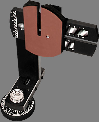
1) profile your monitor - this means buying a spectrophotometer that can read the colours and brightness on screen and create a profile to adjust that colour so it matches the image file. I use a Spyder.

2) set up your printer/paper profile. If you are using your printer manufacturers papers, you may already have the profile installed, but keep in mind the possibilty that there are better profiles out there or even an update of the manufacturer profile. Some manufacturer profiles are better than others - I have been disappointed with Epsons and there's quite a bit of work on the net by concerned and qualified people producing better profiles - for example Bill Atkinson of Macintosh and Hypercard fame (his are free for the taking). Paper manufacturers produce profiles for their papers in commonly used printers - I use Moab Entrada paper and have been delighted with it's profile for the Epson 4000. You can purchase profiles - either premade (can't really see the point unless not available any other way) or made to measure. In the latter case you download an image file and print it using exactly the settings they recommend, you return the print which they then scan with the spectrophotometer and produce a custom profile for your printer, your paper. These can cost $25 - $100 but you may well make that back in not wasting paper in a relatively short period.

On my Mac I simply download the profile then open colorsync and load the profile into it and the NEXT time I open Photoshop the profile is available for use. Usually they come with pretty clear instructions on where to put the profile if you are using Windows.

2) set the colour preferences in Photoshop by going under the Edit menu to Colour Settings. If you are doing colour the only important setting here is the first one - what colour space are you going to use. Adobe 1998 is what I use though prophoto is another possibility. All the other settings in this window are less important. Grey dot gain I set at 20% mostly because it doesn 't seem to matter what I set it at, black and white prints don't match the monitor without some major adustments on my part - someday I will invest in full profiling equipment that can do a printer profile for black and white, but until then...

3) You might want to go to proof setup under the View menu to select the printer profile with which you do your proofing. I'm note yet convinced that proofing is all that valuable but confess I'm new to it and will experiment further. It might in the end save some iterations of paper use.

OK, you have an image, you bring it into your raw processor (hell, if you are using jpegs, might as well not bother reading any of this, you are so handicapped already that this is way beyond you - the only possible exception would be when shooting action but you still need that football jersey the right colour.

You can specify the colour space in your raw processor but it will get converted to the colourspace you set in Photoshop once you bring it into Photoshop, no matter what. Of course you want to maintain 16 bit as long as possible.

You edit the colour image as desired until you have the perfect image on screen. You can then either print the image and compare, or you can soft proof by hitting command Y (or control Y on Windows), and you will see the image as the printer will make it (more or less). Keep hitting Command-Y and you will toggle back and forth.

To print an image, hit command-option P to bring up the print dialog box. You select the printer, then the paper size and orientation, then the magnification of the image (so it all shows up on the paper with an appropriate size white border. Then you go down to the area which is labeled 'colour management'.

You set the options to 'let Photoshop determine colours' and printer profile to your chosen printer paper profile you loaded earlier. Set rendering intent to perceptual, black point compensation on. Select print to bring up the second dialog box which then again selects the printer and the presets. The latter lets you choose the amount of ink to be applied to the paper. Plain paper can't hold much ink without turning to mush, good art papers can soak up a lot of ink and in fact without a lot of ink will look too pale. The settings basically should match your profile. In the case of papers by the printer manufacturer, there is no problem, just match the paper, but for third party papers like I use (Moab Entrada Bright White) you need to find out what the recommended settings are, or at least play with the settings till you find the one that makes the prints that most closely match what you see on your profiled monitor. Again you hit print, and this is it, you are on the way to making your first profiled print.

OK, now you know how to do it, but a few explanations will explain why you were choosing the various settings.

Rendering intent refers to the rules by which you deal with colours which exist in the original file but which cannot be reproduced by the output device, in our case, the printer.

You can choose:

Saturation - suitable for the graphics industry - so forget it

Perceptual - the normal and usual choice. In this case all colours are scaled down by a percentage based on the highest saturation in the image as compared to the highest the printer can produce with a given ink and paper. You will lose intensity of colour but everything will be in it's same relative position to the other degrees of saturation.

Colorometric (relative and absolute) leave colours alone if they are in gamut (ie. they can be reproduced by your printer), but compresses all the out of gamut colours till they are within the colourspace of the printer. This normally produces an artificial look but occasionally can actually help an image. Watch though for banding (sudden transitions from one saturation or brightness to another). I never use it - preferring to use Photoshops normal controls to work on an image rather than hoping this will rescue it.

You might wonder why you have to tell the computer twice which printer you are using - arguably you are telling it for different reasons, though there's no real reason why Photoshop couldn't have done it more intuitively. The first time you are telling the computer which printer because it affects the maximum paper sizes, the minimum border width, and even the maximum length of roll paper. My Epson 4000 on my Mac can only print 44 inches - try anything larger (and it lets you) and you get a tiny image on large expensive paper. With my 7600 it will print 96 inches long (and I have one image I print 17X60 inches centred on 72 inches of paper.

The second time you specify the printer, you are telling the computer which actual printer to use. A 'feature' of the Mac is that every time you change printers, you have to reset the presets too - even if the correct preset is now displayed. So remember, first set the printer, then the preset. If the preset is already correct, just click it and let go. Presets are printer specific and should be labeled as such as if you use a setting for the wrong printer, the settings don't take. I label my settings by the printer name - the paper type and if need be the dpi setting (dots per inch - 1440 or 2880) and possibly the ink type (eg. matte vs. glossy black). So '4000 Ent Br.Wh. 1440 man' tells me this is the 4000 printer, Entrada Bright White paper, manual feed, 1440 dpi (my usual setting).

In presets, the only parts that are of any concern are print settings and colour management. It is print settings in which you choose the paper, the dpi and the speed (high speed or not). I find that with modern printers they are so accurate that I can't see a difference between fast and slow printing. What happens in high speed is that ink is laid down as the head goes both left and right, while with high speed off, ink is only laid down as the head travels to the right, doing nothing as the printer head returns to the left edge. Of course to be able to choose these settings you click on advanced which then makes these settings selectable.

You can also set feed - roll, manual or tray feed.

Colour management is simple - it's off - you don't want your printer driver messing with all the careful work you did in Photoshop.

Of course settings for black and white printing are a whole other story and depend on whether you are using the regular printer driver or a rip. As anyone concerned about quality is using a rip and they vary, I will leave that to the appropriate instruction manuals.

Happy colour printing!

Sunday, June 25, 2006

Ice and Clouds


From Highway 40 in Kananaskis yesterday.

Friday, June 23, 2006

Kananaskis Today


From this mornings drive through Kananaskis Country. This image is from the same rock face that 'wet shale' image came from (see below)

Tuesday, June 20, 2006

Photographing From A Balloon


Can't think of a good photo project - how about going on a balloon ride? Photographing is both more interesting and more challenging than you would think. Of course weather is important but you don't need a sunny day and you don't have to fly over the Serengetti Plains - though I guess it wouldn't hurt.

Cost of a balloon ride is typically $150-$300 so it's certainly not cheap but I was able to get several interesting photographs on my one hour ride.

I chose to shoot with my 1Ds2 and my 70-200 f4 lens. Had I realized how much the other passengers make the basket move around, I would have rented or purchased the 70-200 f2.8 IS lens instead (as I did for my tour of Vancouver Harbour by boat). Most, but not all of my images were sharp and of course it was the ones I really wanted that had the most problems so be warned.

The basket weighs 600 lb. - incredible. It's divided into segments so that two people are in each segment - I chose a corner. This does mean though that if something you want to shoot goes under the basket you are out of luck - it's almost like shooting sports - anticipate and grab the shot at peak positioning and move on to the next image. Most of my shots were taken aimed almost straight down, some at 45 degrees and very few horizontal - I did shoot the city skyline but the lighting and weather were less than perfect and frankly I have seen a lot better images done from ground level so...


There were a few times I could have used a shorter lens but not enough to warrant carrying the extra lens and taking the time to change - more likely to miss something even better. At the longer end there were more occasions that I could have used 300-400 mm. but who's to say I could have held it steady enough - perhaps the 100-400 might have been a better choice, though with it's push pull zoom and aimed straight down - and with the steadiness issues... Overall I was really happy with the focal length range of the 70-200.

Balloon rides often go early in the morning when winds tend to be least so coincidentally you also catch the early morning sun and long shadows - ideal for photography.

As to subject matter, it depends of course on your path - even within the city you are dependent on the wind to pick the launch point and the actual course - no chance to predetermine a particular image - on the other hand it means each balloon trip is different.

In my case, we launched from a local park in the Fall so there were fall colours, golf courses, a river valley, the local reservoir, railway yards, the Bow River and residential areas. The last I would not have predicted as being interesting but patterns of roofs and trees and roads can be interesting - things that are just roads at ground level are interesting patterns from the air.

I shot 156 images in the hour so take along enough CF cards to handle that kind of shooting. If you are lucky enough to find a great horizon, do consider doing a stitch for a panorama - as everything is at infinity, you can get away with hand holding and simply swing the camera. Don't take too long to do the shots though as the balloon can move along at a fair clip - at ground level there was no wind at all, at the height we were traveling at, we were moving at 10 knots (11 mph, 17 klicks).


A very enjoyable experience in itself and a real photographic challenge. What better - Oh, and by the way, you don't have any issues with fear of heights from a balloon, they told us on the way to the launch site that people don't have a sense of height and of falling - something about lack of a reference point - not like standing at a cliff edge - they were absolutely right.

Sunday, June 18, 2006

Seeing - Resources For Better Vision

I'm frequently told 'you have a good eye', whatever that means. That I hear if fairly often in almost exactly the same words does I think imply that I can spot interesting things when not expected, that I can compose fairly competently and that I present things in a way that is interesting.

So, if, after looking at my images; you agree (and there are lots of people who glance at my images and walk on so this is definitely not a given and is a critical question), then how did I get here and is there anything to be learned from the experience which you might find useful.

I didn't start attending workshops till I was already quite experienced so I don't think that was the answer for me. It wasn't having shows and getting feedback as most of my images have hidden in print boxes most of my life. I don't live in New York and have access to photo shows every weekend.

What I do have had though over the years is a number of bookstores which stocked the usual classic books. For a time I joined Aperture - till they got too weird, and Friends Of Photography. Through those two organizations I acquired a number of the important photographic books.

I started with the big names - Ansel Adams, Edward Weston, Minor White, Paul Strand, Alfred Stieglitz, Paul Caponigro, and "Brett Weston. I poured over these images time and again. I picked my favourites. I consciously decided why I didn't like some (knowing others did).

By this time I had a pretty good appreciation for the classic landscape, but about almost nothing else.

I took a photographic appreciation course. We spent an hour looking at a single image by Stieglitz, a picture of a porch - nothing else, boring photograph - I left the weekend course frustrated and disappointed. It hadn't been anything like what I had expected.

But, within six months I was looking at photographs in a completely different way. Hubert Hohn had taught me to look at a lot more than whether it was a pretty picture. He had us look at the edges, he pointed out coincidences - not the random kind, the kind where the photographer very carefully put things next to each other, or in the corner or opposite each other. He had us look at the shadows and their interesting shapes. He pointed out that when something was in front of something else, there was generally an excellent reason for it - not just dumb luck.

This experience of being given new information and thinking it total crap has happened a few times in my life, only to find months later that it has soaked in and changed me forever. Don't you hate people like that, and don't you wish that could happen to you more often?

Along the road, I found 'Zone VI Workshop' a very small book with some radical ideas about shooting, processing and printing which not only simplified my life, it dramatically improved the qualities of my prints. Fred was an extremely opinionated bastard and not occasionally contradicted himself over time, denigrating both his former and future opinions without ever recognizing or admitting to either. That said, he had some very good ideas. He was a great proponent of the KISS system - 'keep it simple, stupid', and was a great advocate of not taking anyone's opinion as gospel, his included - you had to test and find out for yourself - how far can you stop down - don't look up tables, don't look at formulae, definitely don't ask anyone else - find out for yourself.

With my Canon 1Ds2, stopping down beyond f16 results in absolutely no more sharpness in the out of focus areas and blurs the sharp ones - I tested it and found out for myself. Your results might be different - don't believe me!

Fred was not the easiest person to get along with and as such I think his photography has been under appreciated - his images tend to be rather quiet and take some time to appreciate, but were well worth looking at. His newsletter published for several years had a lot of interesting ideas and some of them were even useful - and the ones that weren't were entertaining to read. He had learned composition from the likes of Paul Strand and had some good things to say about framing and composing.

Other photographers I lucked into - on the remaindered pile I found a paperback book of images by David Plowden - I found myself identifying with his images even more than those of many better known photographers.

Over the years the usual collection of photo mags would occasionally publish images by masters and that would lead to a search for books of images from that photographer. In the early days and on a very limited budget the library was of some use.

A local photo gallery brought in someone called Bruce Barnbaum for a workshop and at the same time had a show of his work - 'wow', this man could PRINT. He had some lovely images.

The advent of the internet has been a real boon - there are a huge number of images on the net worth checking out. I found the work of Michael Kenna, Kerik Kouklis, Roman Loranc, William Neill

Somewhere along the way I discovered 'Lenswork' magazine - good photography and superb printing, three photographers per issue - a great resource for black and white photography. 'Black and White Photography' from Britain is another excellent resource especially for wet darkroom printers and with good photography in every issue. 'B&W' has become an invaluable resource and their recent Portfolio Annual (which just happened to feature my photographs first (joys of being at the beginning of the alphabet) was particularly well printed. A new magazine is 'Focus' which has been similar to 'B&W' but now features some colour in each issue (and also has four of my colour images in it this month).

I have to say though that the first time I saw a real Ansel Adams image, I was blown away with the quality - reproductions didn't do justice to the superb prints. Mind you, book printing has come a long way since. Screens have gone from 150 up to 600 line, dots are sometimes stochastic (random, instead of in neat rows - which show in skies and other smooth areas). Multiple inks are used for really good blacks. Even paper quality has improved. The gap is narrowing and a lot can be learned from the printed image - but I'd still grab every chance you can to see real images. If you can get a chance to see the prints bare, not behind glass, even better.

Many years ago, Fred Picker offered a set of four 'fine images' to use as examples of good quality printing. They weren't great images but they were certainly printed well and were a good start. There are a lot of photographers offering images on the internet often at quite reasonable prices and should they have a good reputation for their prints, you might well find it worthwhile to purchase a few images just to have as a target at which to aim.

Brooks Jensen (Lenswork Editor and photographer in his own right) recently offered one of his images for $20, shipping included - how could you possibly go wrong? Brooks, by the way, has some interesting and thoughtful insights into photography. He photographs, publishes, talks to the greats, and knows a lot about the industry of fine art photography (not all of it very encouraging - but it doesn't hurt to have a reality check).

Brooks makes comments like, "How can photographers expect people to pay hundreds or thousands of dollars for photographs when they themselves have never ever paid that kind of money for any art work?"

Well, hope these are some ideas for broadening your own perspective. If nothing else it should show you that not ALL landscape images have to be shot with a 17 mm. lens with an extreme near far composition and the horizon an inch from the top of the image - come on guys, you can do better than that.

Yes, I Have A Banana


I prefer the colour image with less blurring of the background. Note the great depth of field created by using Helicon Focus, yet the blurred background by shooting at f5.6.

Thursday, June 15, 2006

Banana # 2


I've a long way to go to get to 'Pepper # 30' but you have to start somewhere.

Wednesday, June 14, 2006

60 New Images On Website


I finally got organized and went through my good images and compared the list to the images uploaded to my galleries - there are 60 new images added to Colour Landscapes and to Colour Industrial.

Tuesday, June 13, 2006

Angel Fish In A Rock


Another from my canyon series, shot on Saturday. A cropped single image from the 1Ds2.

Problem with a work in progress, is just that, it keeps progressing - it took 5 uploads before I was reasonably satisfied with what I have done with this image - adjusting brightness, toning down some areas that looked too over the top - even though the colour was real - it didn't balance the image.

In model railroading, we say 'there's a prototype for everything', that's to say, no matter how wild you make your model, somewhere there is the real thing that looks just as odd - only problem is no one will believe you - so where does that leave you.

Click On Image For Large Version

Just a reminder that all the images in the blog can be seen much larger if you click on then use the return arrow to get back to the blog.

Monday, June 12, 2006

Favourite Locations


This image was shot Saturday at Elbow River Canyon, about 40 minutes west of Calgary and a mile below Elbow Falls. It's 5 images stitched, from my 1Ds2 and my 300 mm. F 4 lens, stitching with PTMac.

The final image is 9000X4500 pixels or 40.5 megapixels.

Sunday, June 11, 2006

Don't Read This!


No One has ever purchased this image. This wouldn't be strange except that I get a lot of nice comments about it - then they read the back of the print, and that's it, end of story, no sale!

So, if you don't already know what the image is, think about what you could possibly know about the image which would make you change your mind about the image.

Personally I see a couple of skeletons or ghosts in the image, one facing each way. But then, I'm the person who when Batman came out, couldn't figure out why the logo was an oval with a couple of teeth hanging down - it was years later that I found out it was a bat - must be something to to with being left handed, or maybe just odd.

Anyway, back to the image.

So, do you want to know what it was that stopped all sales?

Are you sure?

Ok, I'll tell you.

Last chance, the image will never be the same again!

Right, you have been warned.

I was having a shower in our bath/shower cubicle with a glass block window and noted the interesting patterns through the glass block, supplied by various items outside providing the colour. In this case it was a blue tarp lying on the back patio, left there after cleaning the patio of leaves. The surface of the glass block was covered in beads of water. I dried off and retrieved my camera and had fun coming up with a variety of compositions.

See, I told you. Now, just to warp your mind, what if instead of an overweight 56 year old guy, I'd been a drop dead gorgeous young woman, think that would have affected the sales.

It might just be easier just to lie on the print blurb. Please forget you read this!

Saturday, June 10, 2006

Wounded Trunk


I was photographing this morning at Elbow River Canyon, a spot about a mile below Elbow Falls in kananaskis Country, W. of Calgary. While my labrador retriever did his best to empty the fast flowing river, I was photographing the incredibly coloured rocks. On the way back to the car, this wounded Aspen caught my attention. Shooting with my 300 mm. lens and shooting six images which I subsequently blended with Helicon Focus
and adjusted the brightness with multiple adjustment curve layers in Photoshop.

Friday, June 09, 2006

Dodging And Burning


After dodging and burning


before dodging and burning (and removal of skid marks)

You will soon see part three of my four part article on black and white image processing at Outback Photo. In the mean time if you haven't seen parts one and two, you might find it useful. It is of course only one persons way of doing things and Photoshop being the amazing tool that it is there are many ways of doing things - it simply happens to work for me.

Anyway, just to whet your appetite, I enclose the two images from the article illustrating final dodging and burning above, with the final image above the undodged image.

Tuesday, June 06, 2006

Optical Brighteners

Uwe at Outback Photo has some interesting comments about optical brighteners. I found I had a particular problem with papers as illustrated below:

In selling at the local farmers market lit with a combination of incandescent and mercury vapour - I am unable to sell prints without OBA - they look strongly yellow, not cream like at home. Those with lots of OBA like Moab Entrada Bright White and Enhanced Matte look the best, Hahnemuhle Photo Rag is fair, Crane Museo was unusable (and I have a box of 32X40 paper!). Personally I like the bright white of the Moab paper though confess that finding a matte board that is even remotely as white is nigh on impossible, making white matting with the signature showing on the print problematic. I did find one board labeled 'digital white' but can't remember the manufacturer - not one I'd heard of before but app. fairly big in the art world. It wasn't quite as bright as the paper but had the same colour - all the others looked sickly next to the Moab paper.

I have not been overly concerned about optical brighteners since they have a 50+ year history of use in photographic papers that no one seems to have complained about. I personally don't like uv protective glass - I'm convinced it has a definite green tinge to it. Ordinary glass has some uv protection - try getting a tan through a window - can't do it. With ordinary glass, I don't notice a radical change in the paper brightness or colour behind the glass suggesting that the paper whiteness isn't just about brighteners. Photographic paper has a baryta coating which makes it white. OBA's are added to that. I'm sure that bright white papers also have a white coating which affects the colour and doesn't in fact fade. The OBA's are just the icing on the cake.

If you look at the back of enhanced matte, you will notice that the paper stock is very warm coloured - clearly the paper has a white coating that is independent of brighteners. Try putting the backside of enhanced matte under uv protective glass next to the front side and compare - I suspect they will still be radically different - ie. it isn't the oba's that make paper white - they just make it bright.

A check on the net shows that baryta consists of barium sulfate - the same thing patients get to drink for x-rays.

Saturday, June 03, 2006

Cool Pano Head


I think we are onto something here. While I have not yet purchased this very reasonably priced device ($75), or even laid hands on one, it sure looks like it would be ideal for anyone wanting to do stitching with point and shoot digital cameras and lighter digital SLR's. My thanks to the anonymous commenter who pointed this out to me.

Unfortunately one of the cameras that won't work with this device is my very heavy 1Ds2 - I had run into the same problem with the Liere medium format view camera - the 1Ds2 weighs 1.535 kg. without lens, more than the upper limit recommended for this device of 1.4 kg. lens and camera combined.

Perhaps they will consider manufacturing a heavy duty model for my camera.

The pano head is available from Panosaurus

On Where To Photograph


The flower above (Columbine) was against a fence in the back lane behind my house. I think that many of us started out wanting to photograph the grand landscape, and with limited time and equipment, found ourselves frustrated and photography not as much fun as we had expected - especially after a few photographic trips which didn't produce anything resembling the grand landscape.

This didn't have to be a flower - it could have been a weed or a rusting bicycle or a fence badly needing painting. It could have been about interesting shadows or odd shapes or funny colours or about the oddest things that people throw out, park or dump behind their houses.

Friday, June 02, 2006

Thoughts On Stitching


CP Freight Hwy. 1/1A Junction 2 blend, two stitch


There's already a how to article on my website on stitching, but I thought I'd discuss the whether to stitch issue. The image above illustrates some of the points. What you see above is a fairly wide shot - ideal for stitching - but it includes a moving object - no good - except that it's only in one half of the image - we're ok. Now, to complicate things, the frost was really great when I arrived but was disappearing while I waited. Fortunately I did a two image stitch after arriving, then took a third image with the train, blended the train with the right first image and blended the two with the left first image and voila. Of course you can't always get this lucky.


6 image stitch

Some things generally don't lend themselves to stitching - waves definitely comes to mind. Waterfalls aren't a problem so long as there is a decent overlap in images so you have some control over where the stitch occurs. The second image is a six image stitch - 2 columns, three rows with about a 50% overlap - from a Sony 707 and makes a quite nice 22X22 inch print. Borders between images had to follow lines of water, not across them.

I'm probably not the only person drooling over the incredible detail the new P45 and other similar medium format digital backs produces, yet at $40,000 cannot even imagine owning one unless I win the lottery (and I don't buy tickets). It's generally agreed that even good 35 mm. format lenses aren't up to any more pixels than the current 16 of the Canon 1Ds2. Think about it though. When stitching, you use a longer focal length lens (which is just as sharp) and by 'getting closer' this longer lens sees more detail than a similar resolution shorter lens (like using binoculars to look at a bird). So, when you multiply the focal length of the lens by 2 to crop to a partial image, which is then moved and repeated for other sections of the image, you get exactly twice the resolution of the ultimate image - cool huh? And remember, this is twice linearly, so that means the equivalent of 4 times as many pixels, each resolving as sharply as the original pixel.

Here's the math, just to confirm this:

16 MP camera, 5000X3300 pixels for a horizontal shot, now rotate the camera 90 degrees and zoom in or change lenses by a focal length increase of 5000/3300 or 1.5 to get the same field of view vertically as before. Now shoot 3 images overlapped to cover the old width of the original single image. This gives you 5000X7500 pixels =37.5 Megapixels which is almost the same as the P45 back. Remember though that you increased the image resolution by a factor of 1.5 by increasing focal length so you not only have the pixels of the P45, you have the resolution of the absolute best lenses around.

Now, depth of field changes too - since you are shooting longer focal lengths you have less depth of field so just like a regular medium format camera, you don't have the depth of field of 35 mm. That's the downside of stitching. Mind you, since Canon make shift and tilt lenses (24, 45, and 90 mm.) arguably you don't need to purchase both a Linhof 679 and a Hasselblad H2 as Michael Reichman did. Of course there are advantages to his system (apart from selling your house) for shooting people, waves, moving vehicles, moving machinery, and also for just plain convenience (you don't have to stitch).

I find shift stitching with my Canon TS-E lenses ok except that tiny changes in alignment as I move the camera over on my tripod head (Arca-Swiss) means that alignment isn't perfect and I still need to use a proper stitching programme. I can't simply bring the images into photoshop.

The two biggest problems for me with stitching are:

1) when you aim your camera up or down with your ball head, you have to either guess the nodal point, or you have to purchase a large, heavy and very expensive 3 dimensional stitching adapter for your tripod. Both Really Right Stuff and Bogen/Manfrotto make these devices.

2) and perhaps the biggest issue for me, in reviewing the images for consideration of printing, you can't pick out the winners without first stitching them - which means that it can be a year or more before I decide that a particular series of images will stitch together to make something worth while. I do sometimes let photoshop stitch the image but even that takes time and the temptation is to keep the Photoshop stitch but I absolutely cannot recommend that - the stitches are almost always flawed, don't align and often show seams. The simple solution is to shoot an initial single image, but this sometimes involves changing lenses, and I don't know who thought landscape photography was slow - for me things change way too fast - clouds move position, the wind picks up, the light changes. I don't want to blow the stitch by fumbling with a different lens first. I'm thinking that I might get a small light digital consumer camera with a big screen, put it on black and white and use it for viewing and for taking that initial image. Then of course I'd have to somehow relate the stitching images to this single image from a different camera - hmmn, not as handy as I thought. Back to the drawing board!

Now you know why most people aren't willing to stitch. Absolutely no question though - stitching with my previous 10D has allowed me to make some lovely large images. I recently restitched my columbia icefields image and made a 15X60 print that is very nice even up close. I confess that with the 1Ds2 I do get lazier and don't always use multiple images since it produces a very nice 16X20 but for bigger prints...


Columbia Icefield Jasper National Park


Crop of Above