

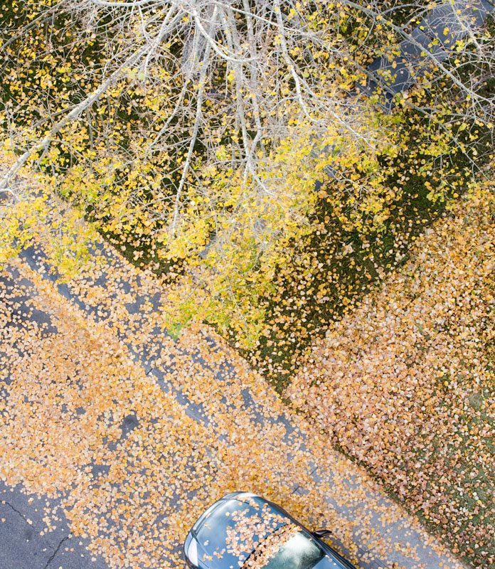
Old Crop
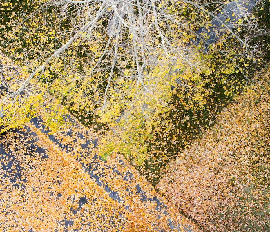
Who's to say that the first attempt at cropping an image i necessarily the best one. Was thumbing through my images looking for something worthwhile that I might have overlooked previously (occasionally a rewarding search) and I noted the full image of this shot included the car at the bottom. Here's both versions, the new crop and after it the old.
The bottom (original crop) image is more graphic and simple - but perhaps too simple as it hasn't been a particularly popular image even though I like it. The top image (the new crop) isn't as symetrical with the bare pavement in the lower left but the leaves on the car hood and the reflection of clouds off the windshield are interesting - hmmm...
Your thoughts?

5 comments:
For several reasons I like the new landscape crop.
The inclusion of the car hood has several positive effects for me. It provides point of visual focus. Perhaps more important, the hood points into the image and directs my vision actively into the rest of the image. (Seeing only part of the car makes this more so than if you had included the whole thing.) The contrast of the shiny metallic car against the natural complexity of the foliage actually makes the foliage more interesting to me. For some reason the addition of space at the bottom of the image also strengthens the interest of the geometry patterns of the scene.
With the car, there's a sense of scale that was missing in the previous version (although I'm not saying that's a bad thing, just a difference). However, I also see a pleasing/surprising effect that if you start from the top of the photo & scan downwards, it initially looks small-scale; as your eyes see the car hood, it looks like a toy car, then you realise it's not a toy & have to mentally re-scale everything. Very enjoyable composition.
I agree whole heartedly with the two previous comments. Including the car causes the picture to be read/decoded in several different stages, creating a layered and more complex experience. The diagonal lines in the new crop are also a lot more dynamic. The square format (which I often prefer) in this case is too balanced; the added asymetry in the new crop adds tension and from the first peeks the viewer's (or at least my) interest.
Thank you all for your feedback, thoughtful and helpful.
Sorry to post again (wish I could edit my previous comment), but looking at the images again, it occurs to me that I was wrong about why the new image feels so much more dynamic to me.
Space in both versions of the image is divided into multiple triangles, either actual (streets, sidewalk, space marked off by the branch on the top left corner), or implied (top right corner branch, the top right black mass, etc.)
The reason the square version feels too balanced to me is that the implied triangle at the top right is too big. Taken together with the triangles in the bottom corners, it causes me to imply the largest possible triangle in the top right (if the other three corners are walled off, given even a hint, I'll expect the other one to be walled off too). These triangles take up a lot of the image area, and due to their size, don't communicate well with each other. Once in the corner, there's no reason to leave it, except to go to the other corners, which you contemplate as spaces and shapes, nothing else. The corners also balance the image. (The image may be weighted to the bottom, but because the large pile of leaves in the middle bottom implies an extension of the triangle in the right bottom corner through the sidewalk, balancing the bottom right corner by mass, any emphasis on the bottom of the image only reinforces a sense of balance--at least left to right.) What's left--the space not otherwise spoken for--is a square (tilted almost 45 degrees on axis) in the middle. But your eye doesn't stay there. I recognizes it as a space or shape, like the other spaces and shapes, and then it travels again around the borders of the image. Those shapes cause the mind to organize the image and impose order on the chaos of the other branches and the leaves. It's a nice abstract image, but not very dynamic.
The new crop, by contrast, disrupts that balance. The triangle in the top right is much smaller. The car disrupts the implied line created by the pile of leaves in the street that in the old crop created a larger triangle on the right bottom corner. Instead of walling off the corner, the leaves on the lawn are now a triangle pointed sharply into the frame. The car too becomes a focal point, playing down the graphical nature of the bottom left corner and complicating it. That part of the composition is no longer just about the simple geometry of a triangle. That leaves the tree at the top, and the space in the upper middle part of the picture. Where the tree before was a minor graphical element (overwhelmed by the heavier triangles in the corners and mired in the center, without a natural reason for the eye to dwell on its lines instead of the space it inhabits), now the tree becomes a subject. In the new crop I notice how the triangle created by the branch in the top left corner is about the same size as the triangle implied by that branch and the next branch to the right. Whereas before, my eye would move from corner to corner, section to section, now my eye jumps from the upper left corner to the space immediately to its right, and from there to each successive branch. I'm captivated by how the branches radiate outward, and I pick up the many triangles they imply. There's a vitality to them that is missing (at least for me) in the old crop (even though the branches themselves are unchanged). And as I follow the branches, they point me toward the car (or toward the triangle on the lower right, which points me toward the car).
Looking at the image again, I'm struck by how often my gaze shifts from the car, one subject, to the tree, another subject. In a sense, it's two images in one: one about the modern geometry of the street and car; the other about the natural geometry of the tree and leaves. The tree and the car are at opposite ends of the image, which enables you to have two subjects without clash. When focusing on the car, the tree is peripheral, a (very important) counterpoint. When focusing on the tree, the car is the peripheral counterpoint.
The new crop works on so many more levels than the old one. The more I look at it, the more I see in it, and the more I like it. If that's not the hallmark of a strong image, I don't know what is.
Post a Comment