

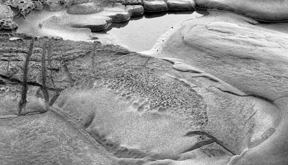
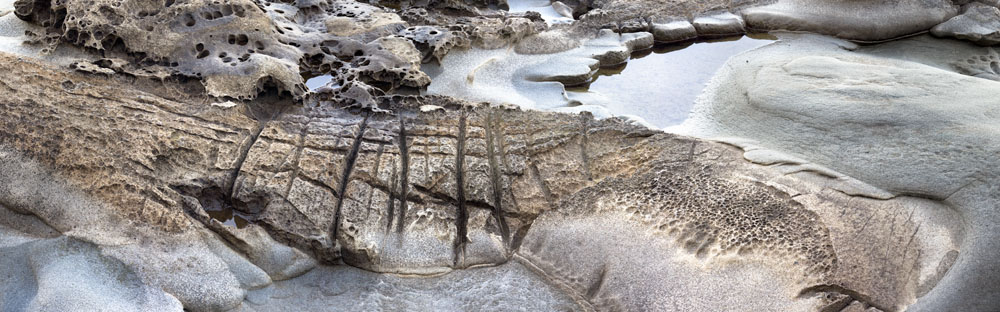
You have seen this image before in which I stitched the entire sequence of images but I decided to use PTGui to restitch it on Auto to see how well it works (very well, thank you), and it's interesting to compare images.
This points out something one needs to consider when shooting for stitching and when planning panoramas. It's all too easy to keep shooting either left or right (or both) so long as there is something interesting to add to the panorama. It doesn't matter whether it in fact adds anything to the composition. Thus when doing the stitching, you either need to confirm that each image is in fact necessary, or simply be prepared to crop. The latter appears to be the obvious strategy but it takes guts to crop 50% or more of an image that you have just stitched.
The ends of the image risk being weak as you don't have a definite edge of frame with which to compose. I find my viewing card to be useful in this respect. It is simply a card with a cutout in it that is about 2X3 inches in size and about twice that overall.
I've actually been wondering about creating a viewing card with adjustable limits so I could create anything from a square to a 3:1 rectangle. If I succeed, I'll let you know.
Here's the original stitch of 7 images. The new one is only three.

2 comments:
Looking at the second (later) composition - the elements seem to 'gel' together a lot better than those of the original version.
The little pool at the top, fringed with rocks, the (nearly) elliptical shape in the foreground, the two strong vertical lines on the left that join them together. The more I look at this the more I see. Works very well in B&W.
Alan Rew
WRT your earlier article about having too much in a photo,
http://georgebarr.blogspot.com/2006/10/trying-to-make-order-out-of-chaos.html
I feel the original (colour version at end of article) has too much in it to work, the second version (B&W at beginning of article) is spot-on. By reducing the number of elements, the viewer's eye/brain is less confused when trying to 'digest' the photo. What a lovely result.
BTW I'm finding your blog a valuable resource while I'm doing some self-driven study on composition, as well as getting out of my 'slump' of the past year.
Thanks, George!
Post a Comment